

Closed (duplicate)
Project:
Drupal core
Version:
7.x-dev
Component:
Seven theme
Priority:
Normal
Category:
Bug report
Assigned:
Unassigned
Reporter:
Created:
3 Aug 2009 at 12:23 UTC
Updated:
23 Sep 2010 at 03:06 UTC
Jump to comment: Most recent, Most recent file




Comments
Comment #1
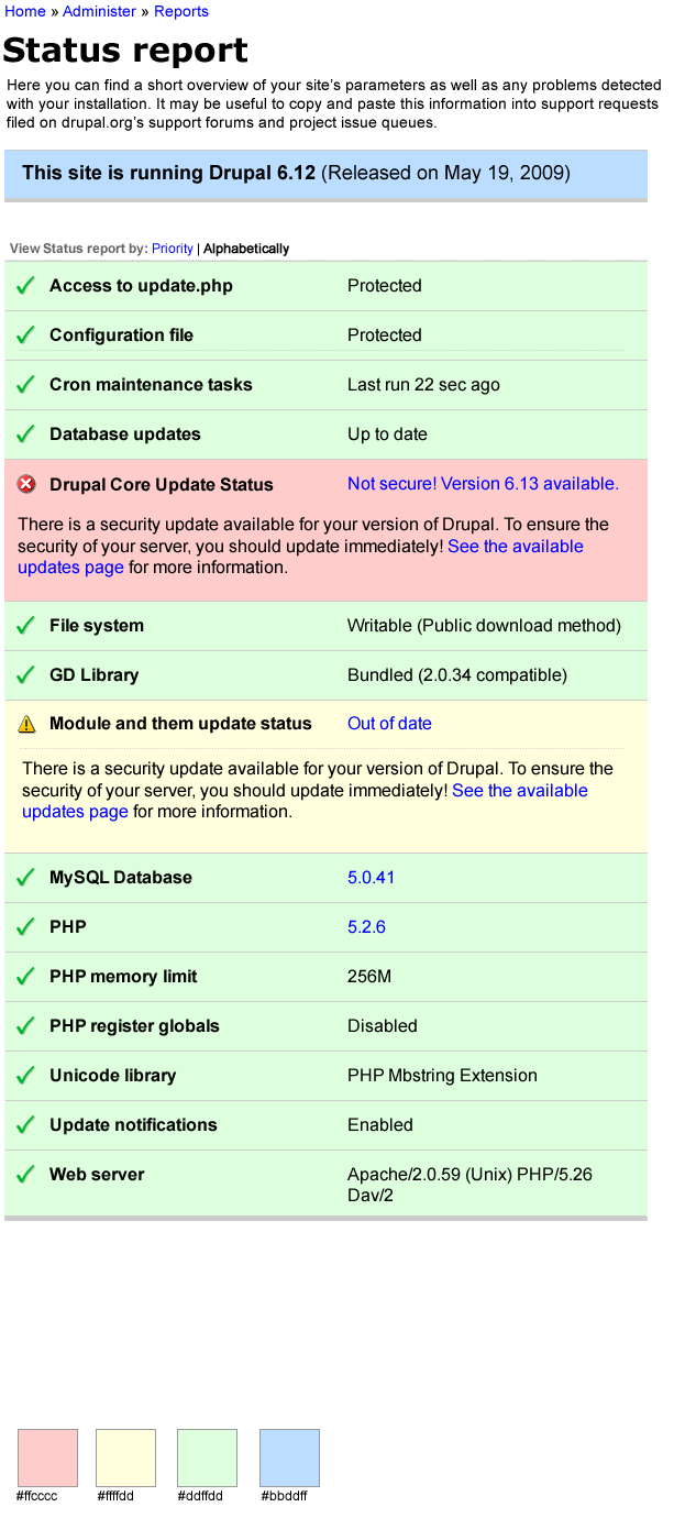
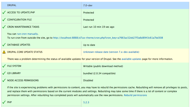
laura s commentedOne thing the display as it exists now does is give instant and unmistakeable feedback on items by coloring the entire row. Green = good, yellow = concern, red = alert/error. Losing the green is I think a loss when we're talking about these three states.
Borders are neither here nor there, imho.
Comment #2
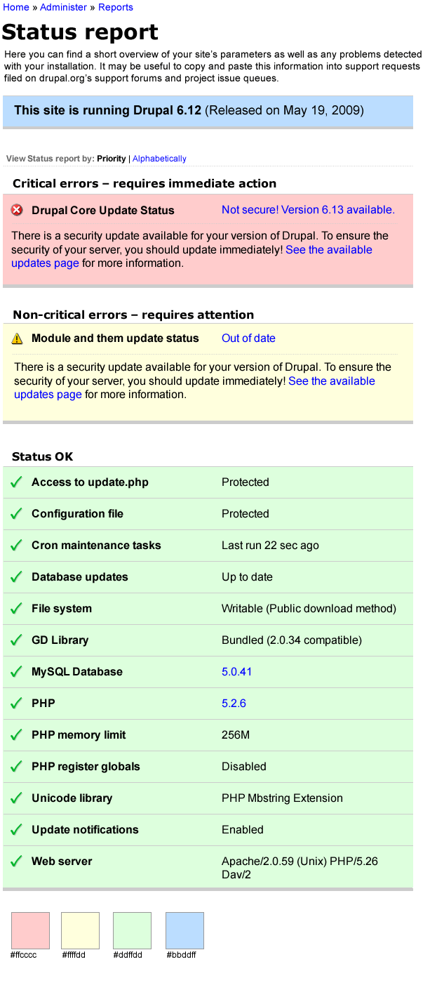
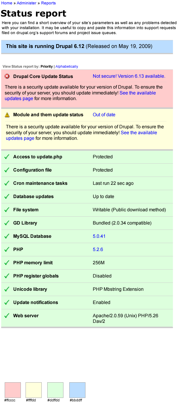
gábor hojtsy@Laura: the unmistakable colors might not be the right treatment for color blind people or for those for that matter, who have many modules enabled which output data to this table. It can go long-winded, and you still need to scroll through it to find issues. Bubbling up the important stuff to the top will highlight them unmistakably (regardless of color) by putting them into the top area where they get more user attention. Like how things needing attention are highlighted on the config and modules page: #508458: Config and modules page
Comment #3
eaton commentedWoo, shout-out to the deuteranopia folks! I'm red-green colorblind, and I didn't see anything in the first screenshot that was colored red. Is it the text? For reference, 'text colored red' is pretty much impossible for me to distinguish from black text -- it drives me batty when sites do that to highlight fields that had errors in them, too. ;-)
Aesthetically, I like the look of the first one better, but yeah... not seeing any hue changes in it.
Comment #4
laura s commented@Gabor: As both versions have icons, I don't see the import of the color-blind exception. Maybe more prominent, attention-grabbing icons would help.
The thing is, this is a status board, not so "long-winded" as other areas. This is whether you have a functional, secure system on a fundamental level. If something is wrong, I think users/admins need more than a little icon over on the left edge. If all is right, then there's nothing to examine, in the end. Maybe you're looking for your PHP version. But needing to zebra lines of "ok" has little use.
Thinking of this as more of an alarm panel might help focus design.
Comment #5
gábor hojtsy@Laura: ok, let me try to explain it a third time.
- We'd loose background colors for the table.
- We'd split up the "status" info from the "hey look here info" and move the "hey look here" info to the top, so you don't need to read it through at all, just look at the top.
- We might even loose icons, at least at the bottom area, where it is all about the "boring" greens.
Comment #6
laura s commented@Gabor Explain a third time in your second comment? ;)
I was going by the screenshots up top. I'm undecided about jumbling around the items to put problems up top. Might work. Especially if it's treated like a panel instead of a table.
|-------------------------
| alarm / error
|-------------------------
| caution / non-critical
|-------------------------
| status okay
|-------------------------
Yeah, I think that's better than either mock-up.
Comment #7
gábor hojtsy@Laura: well I've already attempted to explain it in the topic starter, so in total:
Comment #8
laura s commentedMy mistake. I followed Mark Boulton's tweet to the node.
Still can't comment on the idea that's not mocked up, except with a qualified "maybe."
Comment #9
Anonymous (not verified) commentedA few thoughts:
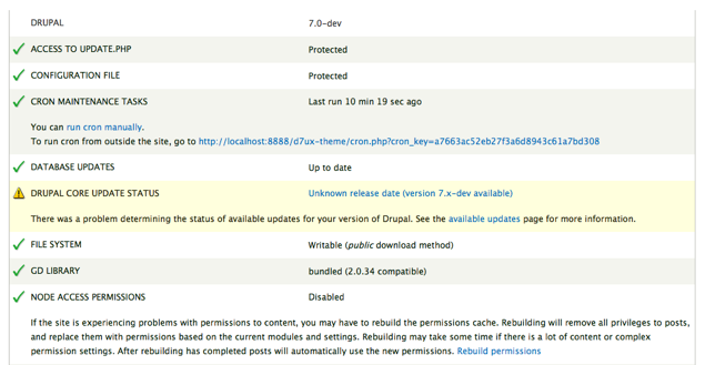
1. It's unclear to me what the relationship is between the data listed in the first column and the table header "Drupal" (if this is going to be coded as a table) - more so for the "7.0-dev" header. Maybe the labels should read something like "Drupal Site Parameters" and "Status"; perhaps my suggestions don't accurately define the displayed data, but I do feel the labels could better describe the data listed in the tables.
2. As someone who's in the middle of the Drupal learning curve, it'd be useful to me to have both the option to list all site parameters in an alpha sort (allows me to become more familiar with the system by a familiar organization scheme) and an option to display results by bubbling 'take action' items to the top of the list.
3. I agree with Laura in comment #4. I certainly benefit from the icons and color coding of design 1; the zebra striping of design #2 makes me work harder to visually discern problem areas (they interrupt my scanning) and I find they create more visual noise.
4. Curious, have you run the color scheme through a red-green simulator like Vischeck? http://www.vischeck.com/downloads/
Comment #10
markboulton commented+1 for column headings. We need those as this is a table.
With regards to colour, using colour as a *single* identifier is bad practice (for colour blindness issues). However, that's not the case here. The colour is building upon the content. As long as it's clear through use of content or iconography (in this case ticks and ! icons - we'd need a third for red/error states).
So, I'd suggest the following:
1. Add column headings.
2. Keep the colours in Laurau's suggested 'bubbling up' format:
|-------------------------
| alarm / error
|-------------------------
| caution / non-critical
|-------------------------
| status okay
|-------------------------
3. Keep the icons as they indicate status without relying on colour alone.
Comment #11
gábor hojtsy@cattlecall: "Drupal" and "7.x" look like headers because they are up top on the table, but originally, the right column cells are all the header cells. And the left column cells are the data cells. This is a "rotated table". For a comparison, it looks this way in Garland:
Notice that only the first row is blue still, so it would probably evoke the same misguided feeling in you that it is a table header, while it is not. The rest of the table has the header cells bolded, so that highlights them. This is a kind of a rotated table we don't have elsewhere in Drupal IMHO.
On the ordering, we can certainly code some kind of custom ordering scheme for this table via PHP, and can put ordering on the icon column (= severity), although that might get to be a little hackish.
Comment #12
Anonymous (not verified) commentedThanks for pointing out the markup, I see what you mean. And certainly you're right - the design/display of the Drupal Version row does mislead me into thinking that it's a column label when that clearly is not the intention. Maybe that row of data should be detached from the table?
After I wrote up the suggestion for the sort feature, I began to rethink the use case. I'm on the fence between the need for this page to help me better understand Drupal 'in the round' (to steal a term from sculpture) vs. the need for the page to reveal _its_ purpose and functionality as a specific Drupal admin tool. Contextually, if I want to have the question answered "What is this admin page supposed to do?" then the 'bubbling up' layout immediately reveals purpose to me without having to read a whit of instructions. What are your thoughts - does a "View by Alpha | View by Priority" feature enhance the page?
Since I brought up the sort issue I've created a few crude comps (Fireworks/PNG) for review - sorry if I'm intruding/stepping on any toes, it's sometimes easier to communicate with a comp.
EDIT: Labels are a bit weak and there are a few typos in the comp, don't let them trip you up too much :)
Comment #13
gábor hojtsyWhat about just putting actual table headers on and let them direct the ordering? That would make this consistent with the rest of Drupal using table markup.
Comment #14
Anonymous (not verified) commentedI'm all for consistency - this would be smooth if there is no need to distinguish the critical/non-critical/status ok sections (ie, the no-label mockup). Is this the case?
Also, what's the level of concern for distinguishing the 3 alert levels to a screen reader (maybe this belongs in a different thread)? I recall from my US Section 508 compliance days that screen reader users benefit from text that, when read aloud, clearly states "Error." It'd be cool if alert messages were semantically tagged as alerts.
Comment #15
mgiffordAdding tag for a color review. This should go through red/green checker as per #9.
Comment #16
cliffMike, what really needs to happen is a color contrast analysis using, for example, the Paciello Group's free Colour Contrast Analyzer (http://www.paciellogroup.com/resources/contrast-analyser.html).
I have done that analysis on the screen shot above. If its colors are accurate, this color scheme is inaccessible. Basically, we're looking for a minimum color contrast ratio of 3:1 (better would be 4.5:1) for large text and 4.5:1 (preferably 7:1) for regular text text. Here are the values I read from the screen captures above:
These results basically mean that much of this page is too hard for almost everyone to read. With the Paciello Group's tool, you can also get values for each of these pairs for the four most common forms of color blindness. We should check the values of the final colors selected to be sure they work under those conditions, too. Of course, for a complete analysis of this color scheme, we must also examine these ratios for text and icons displaying a "bad" status (presumably some shade of red).
By early next week, I'll revise the Color and Contrast page in the Accessibility documentation to explain this more fully. If you would like to research the information in the meantime, go to http://www.w3.org/TR/WCAG/#visual-audio-contrast and scroll down to 1.4.3 Contrast (Minimum) and 1.4.6 Contrast (Enhanced).
By the way, in doing this analysis, I ignored the ratios for the lightest colors against one another because those pairs are not essential to the understanding of this page. If we use a color scheme that has sufficient contrast, even people who can see only in white, black, and shades of gray will be able to tell these apart:
If, however, "bad" were to use the same icon as "caution," then many people would not be able to tell those two states apart. So, to be sure this page is accessible:
Comment #17
cliffHaving said all that, I guess I should update the issue status to "Needs work."
Done.
Comment #18
mgiffordCliff, can you add some of this text in #16 to the documentation here http://drupal.org/node/394094
Comment #19
cliffDone.
Comment #20
marcvangendThere hasn't been much activity here lately, but I wanted to point out that a similar conversation is going on at #665790: Redesign the status report page.
Comment #21
cosmicdreams commentedDoes that mean we can mark this issue as a duplicate.
Comment #22
mgiffordCould be, but think we need to move over the contrast concerns by @Cliff from comment #16 in this thread:
# Marginally acceptable color pairs
* Medium blue on light yellow ("check manually"): 3.52:1
# Unacceptable color pairs
* Leaf on mint (the check marks): 2.37:1
* Medium blue on mint ("run cron manually"): 2.61:1
In my review of #665790: Redesign the status report page these color changes haven't been addressed by @yoroy's patch in #18.
Comment #23
mgiffordtagging & adding link to #639368: Contrast between error and link colour causes death to eyeballs these messages should be consistently themed.
Comment #24
mgiffordI've got a solution for a more consistent look of the status report, but sadly I nixed the icons....
http://drupal.org/node/639368#comment-3211194
We added an extra wide borer here.. I'm really not sure though how to re-add in the images. I like them, know they are important, but they aren't fitting nicely.
Any ideas other than working to embed them into the html (which would be the right way to do it I believe so that they can have alt text too).
Comment #25
marcvangendThe icons are not just decoration, but they contain information. So, it would be appropriate to insert them as img tags with proper alt texts.
Comment #26
mcrittenden commentedSub.
Comment #27
mgiffordAgreed on the icons. This is a bit rough, but it works. This is annoying to style with CSS as you only want to style the first TR of the message and add an icon there..
It's way better to have icons.
Comment #29
mgiffordgetting rid of notices.
Comment #30
dmitrig01 commentedscreenshot?
Comment #31
mgiffordSorry.. Forgot.. Guess there wasn't a visual change I was seeing. Here are two after shots.
Comment #32
markabur commentedLinking to related issue #906738: Status report need identifying icons (WCAG 2.0) where icons are being added.
Comment #33
mgiffordI'm going to close this in favour of #906738: Status report need identifying icons (WCAG 2.0). I think it can be fixed better Jeff's way than my approach here of inserting images.