
Web designers have taken to blogging platforms as a foundation for their portfolio websites. It has always bothered me since, as a web designer, I believe in user-centered design. Blogging systems are not ideal for showcasing a portfolio, as it’s coming at the project from the perspective of “what’s easy to build and how can we fit what we want into it?”
I think a lot of designers feel overwhelmed by Drupal, because of all the capability and power it has. But Drupal is capable of not just managing newspapers and portals – Drupal can easily and efficiently handle small-time operations, as well.
I knew I needed to redesign my own website, www.headlinercreative.com, and I was determined to use Drupal. I approached the project like any client’s website, starting from the very beginning: figuring out the goals and purpose of the website, figuring out what content I wanted to display and the best way to display it. I wanted something that would be easy for me to use and update, and that would be intuitive for visitors to view my work and participate in blog discussions. I knew that whatever I came up with, Drupal would handle it superbly.
The Home Page
 The primary navigation uses CSS image replacement to use images instead of text for the links. I have seen many Drupal sites actually insert image tags into the nav to make it look good, but this is not good practice for accessibility and search engines.
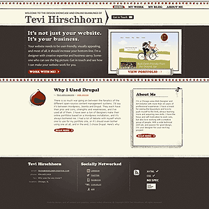
The home page starts off with a greeting to newcomers - which was placed an a new region I created for this theme - introducing myself and succinctly explaining my design philosophy. Then things start to get fun!
When a visitor clicks to "work with me" right after the greeting, the contact form elegantly glides into view. The contact form is the standard configurable contact form built into Drupal, set to display in a block at the top of every page (hidden, by default, and made to appear into view via a simple jQuery script).
To the right of the home page greeting, there is a random image from my portfolio, and a link to view the entire portfolio. Portfolio entries are a custom content type and displayed using a views block. Below that, there is a blog feed, which is only set to display the most recent article. Using the “Submitted by” module, I was able to customize the look. A small block to the right of the blog is teaser biography copy, leading visitors to the “About Me” page.
Custom themes for the different regions and blocks are utilized throughout.
The Portfolio
I created two custom content types for the portfolio – a Portfolio Entry, and Featured Project. Portfolio entries are simple images which link to Lightbox views of larger images, with title and description. Featured projects have complete write-ups with up to three screen shots/images attached. A custom block with a jQuery carousel at the top of the page highlights featured projects. Each portfolio entry and featured project has at least 3 ImageCache settings per image, to display it in the various locations on the site. I also needed to use Content Template to make a more customized layout of the featured projects pages.
The Blog
 The blog is fairly straightforward. I did some customization in terms of appearance, using “Submitted by” module again, ajax comments, and Mollom for spam protection. I also set up taxonomy navigation for easy browsing. Since I wanted to create a small illustration for each blog posting, I created a cck imagefield to hold the image, and used ImageCache to size it properly. PathAuto and URL Alter give me SEO- and people-friendly links to content pages, and other modules work in the background to help deliver an easy and enjoyable user experience.
My goal was to create a pleasing site where the platform is not apparent and is completely irrelevant to the end-user. The website works as it should, and is not jammed into an ineffectual-but-easy-to-use blogging system. There are so many case studies of gigantic and complicated websites, and this project is a demonstration on how Drupal can be easy and efficient even for small, but specialized uses.
Drupal isn’t just for mega-corporations! Drupal is for you!
Some of the Important Modules I Used
- Views 2 - Used for creating the home page portfolio feed, and portfolio page
- CCK - Created custom fields for portfolio and featured projects content types
- ImageField - Used add images to portfolio and featured projects content types
- ImageCache - Resized images to various sizes depending on the view being used
- Advanced Blog - allowed a custom blog title in place of "[user]'s Blog"
- Submitted By - allowed custom display of the "submitted by" information
- Wysiwyg API - Used for installing TinyMC editor
- Image Assist - Allows images to be inserted into WYSIWYG editor
- AJAX Comments - Fancies up the comment form using AJAX
- Mollum - Protects again spam
- Content Templates - Allowed editing of layout and content in the $content variable
- Lightbox2 - Created popup windows for portfolio images
- URL Alter - Allows the creation of custom URLs
- PathAuto - Automates the creation of custom URLs to make more user- and seo-friendly

Comments
Nice look. I'd suggest that
Nice look.

I'd suggest that as it's a portfolio site, and a graphic showcase, you should try upping the quality on the jpeg compression. A few of the screenshots are looking pretty crunchy around the text:
.dan. is the New Zealand Drupal Developer working on Government Web Standards
Thanks for the comment. I was
Thanks for the comment. I was using the standard ImageMagick/ImageCache for resizing and compression. I know this isn't the "imagecache support forum", but do you think there's some fiddling to be done with that to have better compression?
thanks again!
easy
/admin/settings/imageapi/config/imageapi_imagemagickbumb it up from 75% to 85% or 90%
.dan. is the New Zealand Drupal Developer working on Government Web Standards
thanks - i reflushed all the
thanks - i reflushed all the images. still looks crunchy?
yup
It even updated the image I embedded directly above, so yes, I'd say that's an improvement!
Good one.
.dan. is the New Zealand Drupal Developer working on Government Web Standards
You might want to check you
You might want to check you validator link ;)
Some errrors are returned on most pages..otherwise nice :)
Thanks for the case study. I
Thanks for the case study. I like your approach. It's a valuable use case for many people. I just find it confusing that you don't get to the project description if you click on the images below the carousel. Did not expect to see the image directly. Now I need to scroll through the projects to find out about the details...
Thanks for the comment - your
Thanks for the comment - your usability issue has been noted, and I'll mull over the best way to handle it! My thought (before your comment) is that some projects would be "featured" while others that I felt were not worth the complete write up simply got a short description.
But, due to your comments, I will try to write up each one and have them link to project pages. It will take some time, though!
Regarding the validator errors, checking for CSS3 only returned -moz and -webkit css properties as errors, and I consider that grossly inappropriate since that is the correct way to refer to those specific browser properties that have not yet been universally accepted and implemented (i.e. border-radius).
Thanks for your interest!
Great looking site, congratulations
Great looking site congratulations,
what module did you use for the
previous next project sliding preview
in your /portfolio page ?
------
GiorgosK
Web Development
I used views to display items
I used views to display items in a list, and hardcoded a custom jQuery carousel block to display that list. The drupal views carousel module I found seemed very buggy, and it was easy to just have views output the list and create a custom block and theme to power the carousel.
[edit]
Not sure that made sense... I created a views block to output a list of projects. I then created a custom themed template for that block view which had the carousel hard-coded in.
Portfolio
How can I visit the sites in your portfolio?
You have a beautiful and
You have a beautiful and professional looking website, good job. I'm in the middle of improving my own website and learned some good ideas from your site.
Thanks for sharing :)
BTW : You can use cache module router and also enable built-in CSS,Javascript aggregation to greatly improve your site's response time without actually loosing anything.
sina.salek.ws, Software Manager & Lead developer
Feel freedom with open source softwares
Thanks for the tip! I looked
Thanks for the tip! I looked into the css/js aggregation and apparently it's built in? I went to site configuration > performance and saw css and js optimization, but is that the same thing? I had js issues when I tried that.
Yes it's the same thing and
Yes it's the same thing and it's built-in. some javascripts may have problem with aggregation, if you experienced any problem you might want to try javascript-aggregator module. i used this module in druapl5 it allows further optimization and also lets you exclude incompatible javascripts with aggregation and optimize the rest.
There is also another module css-gzip, it compress css files and saves lots of bandwidth which results in instant load. it's useful when you have lots of css
sina.salek.ws, Software Manager & Lead developer
Feel freedom with open source softwares
Great work
Nice to see others using Drupal for their portfolio sites. I decided to do the same a while ago and it's been a breeze when making updates to the site as I'm sure you know.
Thanks for listing out the modules you used and why, that's good information to have. Overall it's a really nice design and implementation. Love the fact that you are using Cufon too.
--
Jeremy Caldwell
www.eternalistic.net
Great looking site
Just wanted to say great job on the site... I love the detail. Did you start with a base theme? Zen?
I did start off with Garland,
I did start off with Garland, but stripped everything out to bare php and dumped the CSS completely... I even stripped out some of the php and added my own, plus additional template files. So, not sure if that qualifies?
I guess you've changed it
I guess you've changed it completely,so i don't know if you could use this way or not , but personally i use sub-theming. This way i actually override the parent theme so when the parent theme updates i can simple apply the update and enjoy all the bug fixes and perhaps new features it brings :)
sina.salek.ws, Software Manager & Lead developer
Feel freedom with open source softwares
Well done! One thing I
Well done! One thing I noticed when turning off the CSS was that the text inside your H1 is ". $site_title .". You should check the PHP in your page template.
Blimy! 8o Thanks!! You guys
Blimy! 8o
Thanks!! You guys are awesome! Thanks for the fine-toothed combs!
confused
you wrote:"The primary navigation uses CSS image replacement to use images instead of text for the links. I have seen many Drupal sites actually insert image tags into the nav to make it look good, but this is not good practice for accessibility and search engines"
could you clarify that? Thanks.
Drupal automatically inserts
Drupal automatically inserts a class for each menu item. As such, I'm able to target each link with CSS and replace the text with an image, like so:
The line-height, block height, and overflow: hidden all work together to hide the text, and then I use a single background image instead. I used a single image for all links and link states, and simply show the portion of the image I want using background-position.
noticed this in the markup
noticed this in the markup that's being put out:
<a title="" href="/">. $site_title .</a>forgot to close quotes? :P
not sure if u care at all about progressive enhancement or graceful degradation, but the "get in touch" thing with the contact form isn't what it's suppose to be when js is turned off... I'd say have
<a class="workwithme" id="btn-showhide">Get in Touch</a>actually link to the page, and use js to hijack the click even, ajax in the form and show it that way. It's much better than to have the form on the page on load, covering up half the headersame for
<a class="callout workwithme" href="#">Work With Me!</a>, hrefs like that are generally considered "not cool" :Pcoz I dunno about you, but it pisses me off when I open a link in a new tab/window just to see the base url with a # at the end, or even worse, some sort of
javascript:someFunction()also, did you consider @font-face techniques instead of cufon? it's pretty easy to implement, and most browsers nowadays support it. ofc, IE6 will get some fallback to a system font, or u could make an IE6 specific one that uses image replacement -> http://paulirish.com/2009/bulletproof-font-face-implementation-syntax/
you might also want to enable aggregation and put the js in the footer, 5s loading time for a site this simple isn't very pretty :x
The design of this site really appeals to me, I like how the tight and polished look is flirting with pure grunge and sketchy stuff
Congratulations on your new son btw :)
Great tips! The buttons are
Great tips! The buttons are now pointing to the contact page if JS isn't enabled. I suppose I over-thought that one; I was hiding the div with js for accessibility reasons (search engines, primarily), but a contact page makes much more sense. And luckily, Drupal already made the page (that's really the contact page in a block, anyway)!
@font-face makes me nervous. I'm not a fan of most of the browsers' font rendering. Canvas and flash (sifr) do a splendid job, though.
I think it's more acceptable to have js in the header, although I hear reasons for both. Compressing JS messed up other JS on the page. (Lightbox wouldn't work)
Thanks for the kind words! :)
Looks Great
The site looks awesome. I love the look.
Nicely done! I especially
Nicely done!
I especially appreciate your comments about blogging platforms as portfolio sites and how Drupal powers the little guy as well. Those have been key philosophies of my development with Drupal. Too many people these days see a blog as an outlet for the business, portfolio, whatever, when they really don't work. And I use Drupal for individuals, corporations, and me! So I think it fits with any circumstance, it's just about making it yours and unique to what you're doing.
Congrats on a great site!
Degrading gracefully
The website looks very beautiful, but it handles javascript degrading very poorly. Because you rely on jQuery to hide your form, if js is disabled the layout is completly ruined as the contact form is blocking the view on every page. Instead you could use CSS to hide the form and jQuery to show it, that way if there is no javascript, you wont have the contact form blocking the view on every page. Another thing is that the work with me link is going nowhere. What you could do is make the link to go the actual location of the contact form and in jQuery click handler return false. That way if you click with js enabled nothing happens, but if js is disabled you would get to the contact form. I guess there are more of these issues around, but haven't looked. You don't need to do much to make your site degrade gracefully in the absence of javascript.
Thanks! Someone else
Thanks! Someone else mentioned that above, as well, and this has now been fixed!
Another thing about Drupal which should have been mentioned in my case study - designers need not feel timid about approaching Drupal. The community is open and helpful! Thanks again for the fine-toothed comb, folks!
In four words: Most excellent
In four words:
Most excellent layout, dude
Thank you for the write-up.
I'm finding the key to understanding the complexity that Drupal sometimes seems/ can be (in the beginning) is writing your own modules. Thusly allowing for a completely hand tailored design with the code I want for a specific use case. Then combining this with theme design. :-)
I'd like to submit a case study too!
Thanks for this case study! I'd like to submit one of my own! Where did you submit the case study?
look.
See the very top of this post : Home » Forums » General » Drupal showcase
... although if you are not familiar enough with Drupal.org to find that yourself, you'd better work pretty hard on making a really good write-up the right way.
.dan. is the New Zealand Drupal Developer working on Government Web Standards
The site looks great.
The site looks great. Navigation is particularly pleasing.
Great
The website looks really, good it is very important websites have blogs as this keeps your website looking nice and fresh