
 Come together with the global Drupal community in Rotterdam, 28 Sept – 1 Oct 2026. Sessions, contribution, connection, and Early Bird savings until 8 June.
More focussed styling for the ui elements involved in customizing the dashboard, a patch in progress.
| Comment | File | Size | Author |
|---|---|---|---|
| #26 | dashboard-customize-rewording-633086-26.patch | 1011 bytes | David_Rothstein |
| #18 | 633086-17.patch | 5.35 KB | xatoo_ |
| #17 | screenshot-draggable.png | 25.67 KB | xatoo_ |
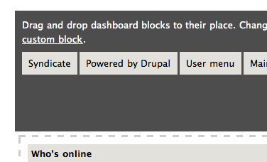
| #17 | syndicate-block-dashboard.png | 17.48 KB | xatoo_ |
| #17 | syndicate-block-elsewhere.png | 21.06 KB | xatoo_ |

Comments
Comment #1
yoroy commentedFirst round:

Much lighter background color for the 'widget tray' on top.
Repositioned 'Done' button. all of our submits are on the left,
Blue highlights on hovering a widget, using /misc/grippie.png to indicate draggability
etc.
Not yet happy with borders and boxes in the two columns.
Needs work for sure.
Comment #2
yoroy commentedhttp://vimeo.com/7619218 shows this in action
Comment #3
drifter commentedLooking good. Tested in Firefox/Mac OS X and IE6 and IE8/Windows. IE6 won't show the blue background and the grip, but still highlights and drags fine - degrades gracefully. IE8 and Firefox work as expected.
Comment #4
yoroy commentedThanks for checking drifter. Here's round 2:
- adds hovers for blocks already in the dashboard to indicate they are draggable too
- styles the static dashboard page as per http://www.flickr.com/photos/mboulton/3748580107/sizes/o/
Behaviour is still finicky but fixing that is not the goal of this patch.
I'm uploading a screencast as well.
Dashboard page:

Configure, 1:

Configure, 2:

Comment #5
yoroy commentedscreencast: http://vimeo.com/7643079
Comment #6
kika commentedhere's my proposal: use standard "dragabble" icon.
Comment #7
yoroy commentedYep, more familiar and not as ugly as I would expect. position to the left looks good.
Comment #8
yoroy commentedIf only draggable.png wasn't such a mess.
Also shows the importance of solving #601932: Allow dashboard to limit available blocks
Comment #9
dries commentedI like this but (i) the colors look a bit weird and (ii) it feels a bit cramped -- we could use with one or two more extra pixels, IMO.
Comment #10
yoroy commented1. which colors?
No new colors added here, I'm re-using what's already defined in Seven. I see now that the cursor didn't make it in the screenshot, so to clarify: the blue widget is the one being hovered over.
2. where?
Comment #11
drifter commentedI'm just assuming:
1. the 1px white border looks weird on the drag icon when it's on a gray/blue background, hurts the eye. Maybe a pure white drag marker would look better?
2. maybe a bit more spacing to the right of the drag icon
Comment #12
drifter commentedHere's an attempt... I'm no pixel artist, so it's more of a concept than a final version - the draggable arrows are a bit too thick. But here's a version with white arrows. Plus added border-radius for webkit too.
Couldn't figure out how to add a binary file to a patch, so just move draggable-white.png to /misc.
See attached screeshot.
Comment #13
drifter commentedLazy sunday afternoon... here's a thinner white drag thingy.
Comment #14
xatoo_ commentedI think this drag indicator is the best so far. But the margins are lot looking good in Firefox and Safari afaik.
Comment #15
dries commentedAgreed that the new icon looks much better. As s.toonen said, the margins need some extra work. This is getting close.
We'll want to rename the old draggable.png to draggable-black.png, I think. That keeps it nice and consistent.
Comment #16
drifter commentedActually, draggable.png is a sprite image (it already has two phases), so I can just add the white version to the bottom. So the filename can remain the same, no need to patch all other uses of it in core + contrib.
Here's an updated draggable.png, + a patch with the margins fixed hopefully.
Comment #17
xatoo_ commentedBetter, only when moving back a block (or draggable thing, whatever they are called) the margins are still incorrect. (See screenshot)
Also in the Garland theme the Syndicate drag thing is to heigh which is due to the float: left; in this part in garland/style.css file:
This also makes that having the Syndicate block on the dashboard looks ugly. I believe the float statement has been added to get the syndicate icon on the same level as the block title (see syndicate-block-elsewhere.png), but that's quite a hack isn't it?
Comment #18
xatoo_ commentedDon't take my CSS for granted, but this is how is works for me.
Comment #19
dries commentedCommitted to CVS HEAD. Thanks.
Comment #20
David_Rothstein commented1. Seems there was an image here that was supposed to be committed as well (the one in #16 should replace misc/draggable.png, if I'm following the discussion above correctly).
2. Any discussion of this change?
First, the word "these" needs to refer to something - I suggest we get the word "blocks" back in somehow.
Also, it seems that a fair amount of thought went into the "add a custom block" workflow (see http://drupal.org/node/544360#comment-2127478), so need to think about whether removing that link is correct. Maybe it's true that it's not the most common thing people would ever do here, but for #601932: Allow dashboard to limit available blocks we're probably going to need some kind of additional link on this page anyway....
Perhaps it should be a local action rather than an inline link?
Comment #21
drifter commented1. Indeed draggable.png in #16 needs to be committed, it is not there yet.
2. You have a point, the original wording seems more descriptive. Yoroy, any specific reason you changed the text?
Comment #22
seutje commentedsubscribe
Comment #23
yoroy commentedI changed the text mostly to remove the link to add a new custom block, it's not the most obvious 'next action' in this context. A link to whatever solution we get for #601932: Allow dashboard to limit available blocks is much more appropriate. As for less decriptive, maybe. Is there really less useful info in there now?
Comment #24
yoroy commentedOh, and the new draggable.png has been committed.
Comment #25
Bojhan commentedsubscribing
Comment #26
David_Rothstein commentedOK, this issue seems mostly fixed now, but the "these" is still grammatically ambiguous. Let's add the word "blocks" and be done with it :)
Comment #27
yoroy commentedAgreed
Comment #28
webchickCommitted to HEAD.