
Designmess is a online community aimed at web designers and developers. Designmess provides high quality articles and tutorials on a multitude of topics in the fields of web design and development, graphic design, advertising, and branding. We also provide a online hangout of sorts for our users. We encourage user submitted content to power our site and provide us a steady stream of content.
Designmess started as a personal project of mine to try and build a great community on Drupal. I started building the site in early December with the idea to launch in the beginning of January. And so, Designmess was built in roughly a month. One of my personal philosophies is to never think that my site is good enough. I believe there is always room for improvement. With this in mind, I will continuously update Designmess with new features and the latest modules that I think fit.
I urge you to check out the current site at http://designmess.com
and follow us on twitter here: http://twitter.com/designmess
The Goal
From the start, I wasn't really sure what I really wanted to do with my site. I just just purchased the domain name, and I knew that I was looking to start a design blog of sorts. In time, the site emerged from that and developed into something unique. After some messing around with Drupal, the goal quickly became to create a site that incorporated the social elements that we all love into a design blog. This was something that I found was lacking in the other design blogs out there. Sure, users could sign up and create an account, but that would pretty much be the end of it. They wouldn't interact, and there was often little communicate between users.
In Designmess, I wanted to change that. A large part of the site depends on a social element; including friendlists, private messages, and user profiles. Hopefully, this will provide a unique experience for our users and set us apart from our competitors. Also, most of our competitors are running on Wordpress, which makes it much more difficult to build a community upon.
In the end, I want Designmess to grow and become a lasting community with a lot of readers and more contributors. If you are interested in writing an article or tutorial for us sometime, please send us a message.
Theming

I'm no Drupal developer. I don't pretend to be one. I am just a web designer/developer, with little experience developing modules. I do however possess a pretty good knowledge of HTML and CSS. From the start, I had noticed that one of the biggest reasons more people don't use Drupal is the lack of themes. The ones that were avaiable quickly became overused. With this in mind, I set to design a unique theme for Designmess. Since I didn't have much of a background in Drupal theming, I took existing themes and exaimed them. With what I learned, I overwrote most of the code, and almost all of the CSS for my new theme.
After that, I added some jQuery scripts including animated scrolling and a few other things to help me achieve what I need to. While it wasn't the best way to go about it, it was the way I knew best, so I did what I could to manipulate Drupal's theming structure.
I occasionally find a few bugs in the theme, so I end up updating the CSS every once in a while. I also plan to redesign the site next year.
Content Types
We have a variety of content types we allow users to submit at Designmess. This is vital to us provide many different types of content due to the many mediums in our field.
Articles And Tutorials

These are one of the most important node types at Designmess. These nodes are the main focus of the site, and what attracts the most traffic.
Structure
- Title
- CCK - Preview Small
- CCK - Preview Large
- CCK - Teaser
- Body
- (Tutorial Only) CCK - Demo Link
- (Tutorial Only) Filefield Upload - Source Files
We try to keep our node forms pretty simple, so I tend to try and not clutter the form as much as possible. The Preview Small and Preview Large are filefield upload elements that accept images files. These will be used as the image preview thumbnail and large preview, respectively.
Portfolio Items

These nodes are displayed in our showcase as well as on user's profiles. I used views to generate a gallery of a user's portfolio items and displayed it on their profile as a block.
Structure
- Title
- CCK Upload - Media
- CCK - Category
- Description
- CCK - Relevant Links
- Creative Commons License
In these nodes, we ask the user to upload the media (we accept image file types). Then based on the category they select, the node will be placed on that page. Finally, we ask if they want to provide any relevant links and select a license.
Critique

Critique nodes are aimed at users who want to receive feedback and constructive criticism on their work.
Structure
- Title
- CCK Upload - Image
- CCK - Type
- CCK - Category
- CCK - Intended Look
- Description (Body)
- CCK Upload - Relevant Files
- CCK - Related Links
We ask for a bit more information in these nodes. But things are pretty self explainitory.
Assistance
Nodes for users who want to ask the community for help.
Structure
- Title
- CCK -Type of Problem
- Description (Body)
- Related Files
Once again, pretty basic.
Community Modules

We depend heavily on the available community modules out there for the functionality of Designmess. Our project wouldn't happen without all the wonderful contributions from Drupal users.
There were a few modules where I overwrote the CSS for or replaced icons with my own. (Activity Stream, Print Links, etc)
- Activity
- Activity Stream
- Advanced Forum
- Automatic Nodetitles
- Backup and Migrate
- Boost
- Buzzthis
- Chaos tool suite
- Comment Notify
- Comment Upload
- Conditional Fields
- Content Templates
- Creative Commons Lite
- CSS Gzip
- Cufon
- Custom Breadcrumbs
- Drafts
- Facebook-style Statuses (Microblog)
- FileField
- Fivestar
- Flag
- GeSHi Filter for syntax highlighting
- Google Analytics
- Gravatar integration
- Guestbook
- Image
- Image resize filter
- ImageAPI
- ImageCache
- Imagecache Profile Pictures
- ImageField
- jQuery Update
- Lightbox2
- Messaging
- Mollom
- Nodewords
- Page Title
- Panels
- Pathauto
- Printer, e-mail and PDF versions
- Rules
- Search 404
- Service links
- Signatures for Forums
- SpamSpan filter
- String Overrides
- Tab TamerThemer
- Themer
- Token
- TweetMeme
- User Relationships
- User Stats
- User titles
- User Visits
- Video Filter
- Views
Getting Constant Feedback
It is very important we get feedback from our users. Which is why we have a feedback tab located on every page so that registered users and submit any bugs they see, but most importantly, give us feedback on the page. We also encourage users to leave comments as well. In addition to this, I monitor our Google Analytics stats to see which pages users land on and which ones they leave at. This information affects our future decisions regarding topics of articles, changes to the user interface, and location of buttons.
Hosting and the Web Setup
Designmess is currently hosted by Media Temple on their Grid Service. In time, I know I'll end up upgrading to the Dedicated Virtual service. I've had no problems with Media Temple so far, and their customer support is excellent. Designmess is currently running the latest 6.x version of Drupal, on a 5.1.26 MySQL database.
Optimizing
After a week or so of using Drupal, I found out that the site was starting to get pretty sluggish. When we opened the site for public beta, things got worse. So, I had to optimize the site for production. I installed gzip for javascript and CSS, enabled caching, and installed the Boost module. I also integrated Amazon's Cloudfront and S3 services as a content delivery network. After all that and getting rid of some modules I decided I could live without, the site ran much faster.
Advertising
We are hoping to add advertising from Buy Sell Ads, a advertising provider dedicated to the design community, in the future. I hate to push advertisements on our users, but I want to use most of the money I get from advertising into paying our future authors. When we can pay for articles, we will receive more frequent, high quality articles, and provide better content to our users.
The Future of Designmess
It takes time for a site to be known in the design community. With time, dedication, and a continuous supply of quality posts, we'll make an impact. Within a month, we've experienced wonderful growth in our site. At the time of me writing this post, we have over 150 registered users, gaining an average of 5 users a day. I can say things are really starting to pick up for us as we get more and more visitors every day. The future looks bright, and hopefully you can join us for it.
You can check us out at: http://designmess.com
And follow us on twitter at: http://twitter.com/designmess

Comments
One of my favorite drupal
One of my favorite drupal websites i really like how the idea behind it and the innovative approach i'm sure there's some performance issues don't know if you've tried yslow (firefox plugin) that will help you for this part
Good luck
Thanks for the kind
Thanks for the kind words.
Yeah, I've tried that. We get a B grade from Yahoo.
The main things yslow says are the problem is combining images (which I can't do), and using a CDN network (which I am planning to look into).
Not well polished
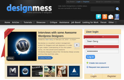
My reviews may upset you. But there are many things need improvement in the design.
1. Inconsistent style.
You use blured font on the title, then inset style on User Login, then shadow style on introduction. It's overdo to use so many style in same site.
2. Inappropriate highlight.
You have put the user login in a dominant place. I can understand it for a community site. But it is not good to highlight it even more using red banner. It stick my attention on it, instead of featured content, which should be more important.
3. Usability on User Login.
"Register" don't look like a tab though it is. What is the difference between "Register" and "Create a new account"? It will only make user confusing.
4. Colors.
I have not dig that though the entire feeling don't look very harmony.
5. Inappropriate badge.
The badges are ugly, sorry for saying that.
1) The tail draws lots of attention which make no sense.
2) It's hard to differentiate "Latest", "Showcase", "Job board" etc because they are all in same color and style, and the contrast is not high. I suggest you use some less saturated and light color to differentiate them if you feel necessary. Or in a light style with clear text and same color.
The footer is nice. I like it.
performance sucks because of
performance sucks because of so much modules
if your site becomes popular and more loged in users will be your site will freezze
use authcache, lower nr of modules, install memcache , and check the high performance group on drupal groups
http://loadimpact.com/view-te
http://loadimpact.com/view-test.php?testlogid=139541
check this out to improve your performance. i tested it today
i do this for all of my sites
Thanks for the feedback. I
Thanks for the feedback. I appreciate your honesty.
I'll take your thoughts into consideration as I start tweaking the site a bit more.
Haha, check out this guy! You
Haha, check out this guy!.... Billychan
You sound like a pretentious, little, wanna be, know it all that's just knocking someone else's hard work for no reason other than the fact you couldn't do it yourself.
Yeah, the sites not perfect, but to say it's not well polished, and then just list a bunch of personal opinions as to why you think that is just obnoxious. Take a step back look in the mirror and tell yourself "I'm not as cool as I think I am." You'll have to try and really believe what you're saying to yourself or other people will just never like you.
~kraymer
i dont think billy chan was
i dont think billy chan was being cruel or nasty. and although the he was critical, he was was quite specific in where improvements can be made and suggestions like that many folks can appreciate even though it stings.
...
Yeah, you always get one git whose rude and obnoxious claiming that others are rude and obnoxious, its the irony they never get...
Pimp your Drupal 8 Toolbar - make it badass.
Adaptivetheme - theming system for people who don't code.
I am here
Hey kraymer, no need to check out, I'm here :-)
I have no offense to either the site or taz3r. We, include taz3r, come here to make the site better and enhance our skills, doesn't it?
Your wording is not pleasant, but it comes a bit more understandable after I check the site again. taz3r had already done lots of hard work to improve the site. It is much greater now, different from the first version I commented.
For your saying I'm pretentious, I don't think so. You really don't need to be as good as Jordan on basket ball skill to be a NBA judge.
Hey taz3r, great job! The site looks much better and harmony! But I still reserve my points on login block labels and the badges.
One thing more, why do you use a sidebar first layout? That is not very good for SEO.
Cheers,
Billy
Thanks for the detailed write
Thanks for the detailed write up, very much appreciate when people take the time to tell us about how they built there sites.
I think your site looks great and I can see you put in a lot of work into the theme - the styling on the Views slide-show is fantastic.
I can tell you that Search 404 has brought my server to its knees more than once, I had to switch it off. It might be alright now when you have lowish traffic, but if it grows... Since you are using Boost your site should have almost instant page loads, but it does not, so that's seriously something to think about. A social networking site won't work if page loads are slow, and I bet when users login its very slow. I would be leaving boost behind and thinking more hard core (big hardware, memcache...) and most certainly running on at least a VPS with a lot of RAM.
Check that you have a PHP cache installed on the server, such as APC, eAccelerator or xCache - if you dont, get one installed fast.
Pimp your Drupal 8 Toolbar - make it badass.
Adaptivetheme - theming system for people who don't code.
IE
Saw your website in IE.
that message "Hey there! Looks like you're using Internet Explorer. Please consider upgrading to Mozilla Firefox." was interesting! :-)
How did you do this?
You must be knowing this but this message is hiding Login, Register, About Us, Advertise, Contact links in IE.
A bit overdesigned
taz3r,
I admire your work on designmess.com and you are absolutely right about the main Drupal weakness:
I'd correct you only with word good, well designed with top CSS, typography and visual style. Wordpress excels here.
I would agree with billychan, designmess is "overdesigned", it is still cluttered somehow. With too much elements with emphasize you actually loose the emphasize.
Here are my points:
Help make Designmess a better place. We are currently in Public Beta.from header or at least from that place. If you want that message, then include link to form or forum where one could post its opinion. Then, I would put it either under title or to the rightHope this will help you make it even better.
Every beutifull Drupal site raises standard for the future ones.
_______________
Use Brain. Use Mac.
Mladen Đurić
Koder, Professional Development School
this is great design I love
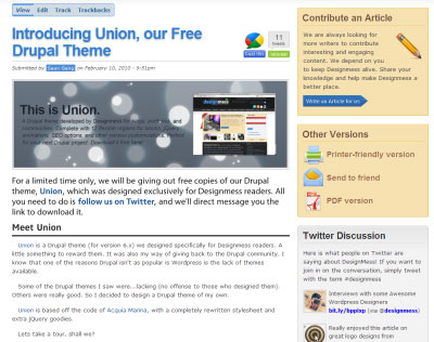
this is great design I love it. taz3r can you tell me how you did the Latest block with slideshow [views_slideshow_singleframe]
Just joined designmess
Just joined designmess community. I tried the demo of the free drupal theme (Union), seems the primary menu is broken. Cool preloader and parallax effect.