I think this page needs more work.
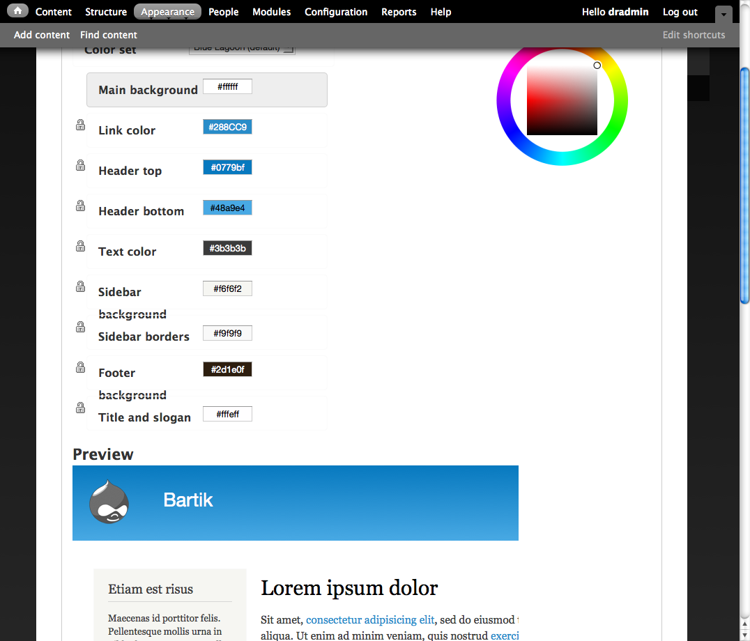
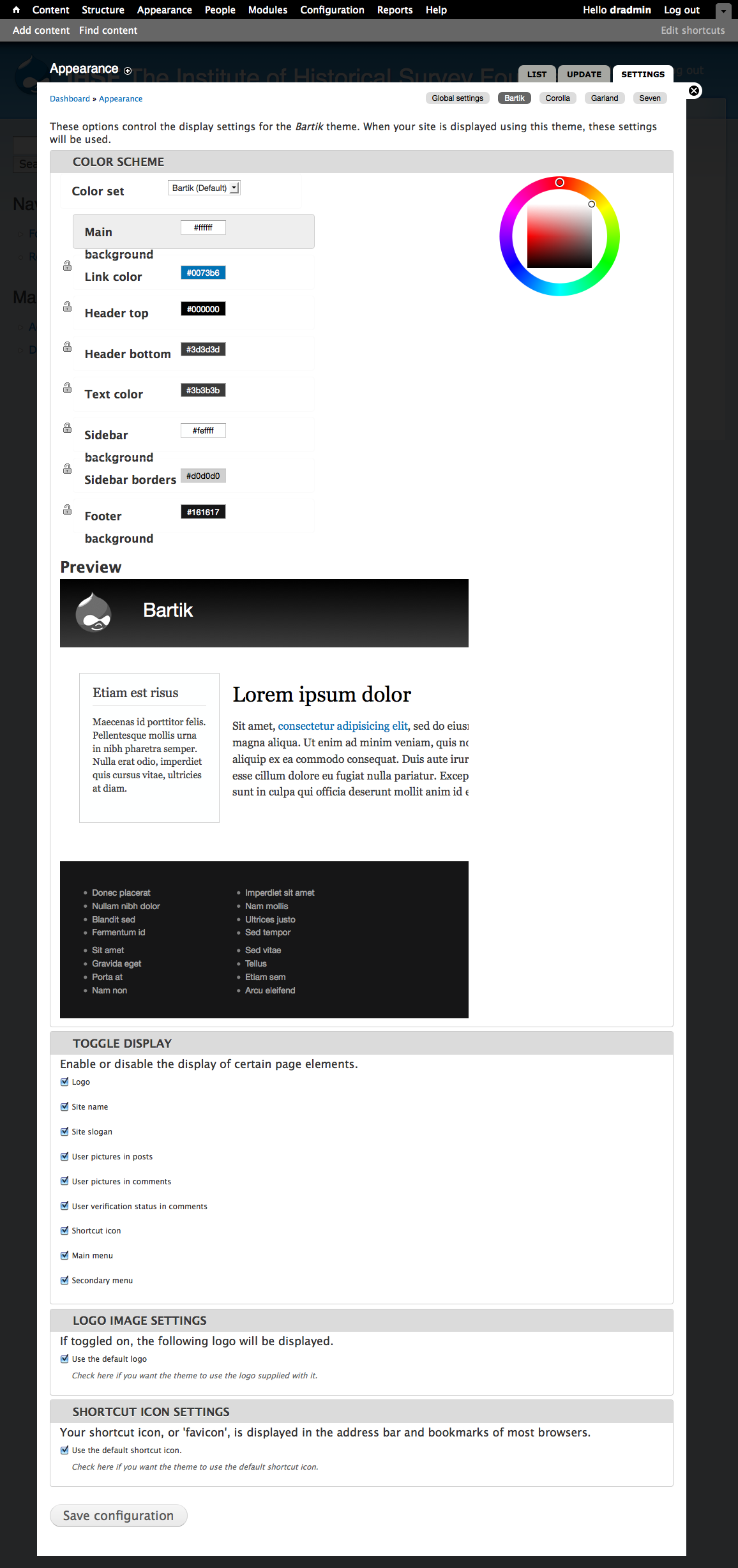
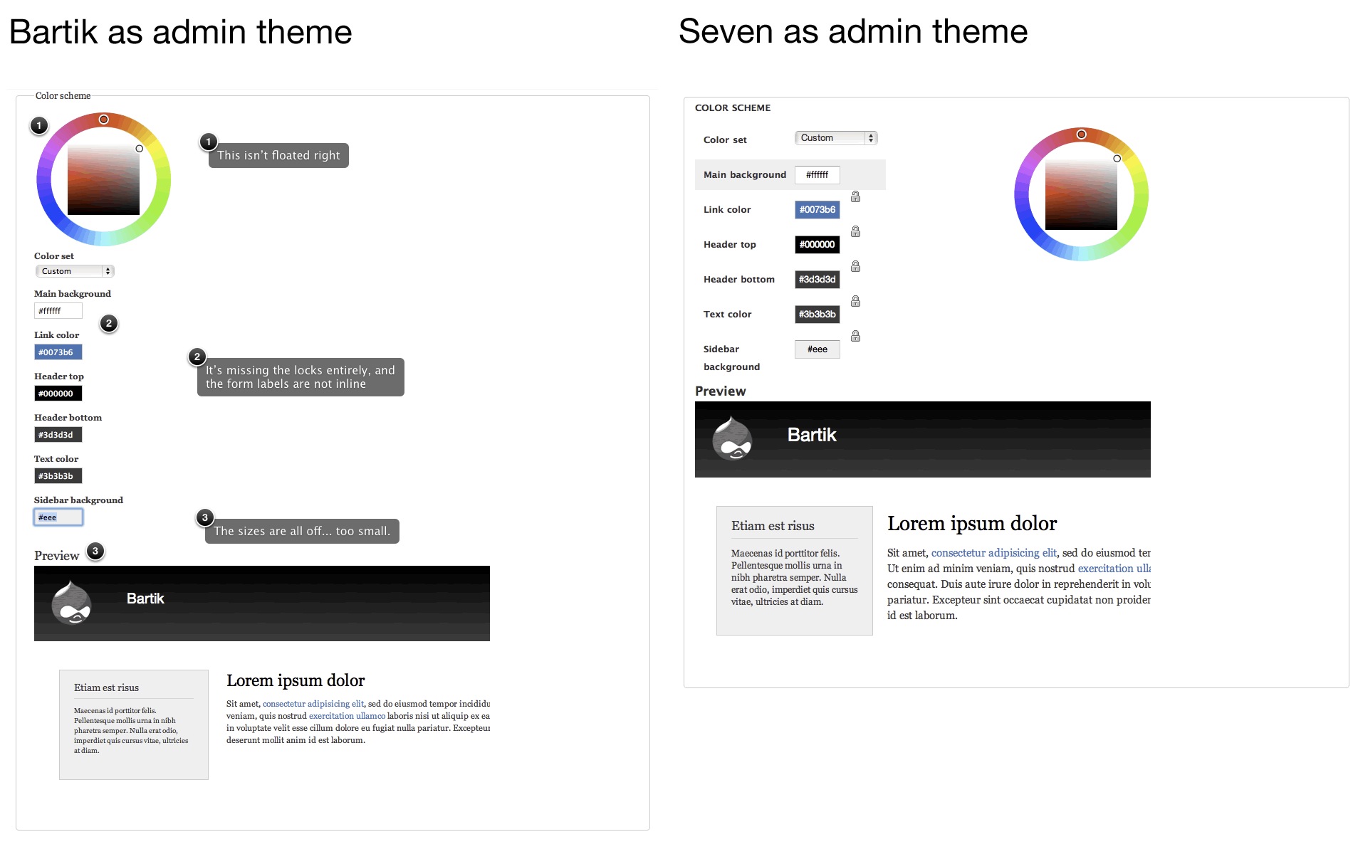
There are quite a few differences between what this page looks like when Bartik is the admin theme vs. when Seven is the admin theme. See the attached screenshot for a comparison.
I'm also really not a fan of the #preview h1, etc code this preview is having us add. I would prefer to see it all in the preview.css file. I understand it's like that for people that may end up changing these things, but I don't think the preview needs to be flexible in this way at all. For example, I think using pixels sizes for fonts here is totally fine, given the special circumstances of having to deal with Seven's massive reset and other CSS files. It's also likely going to be a problem with other admin themes people decide to install down the line.


Comments
Comment #1
jacinehere's the screenshot, oops.
Comment #2
bleen commentednot sure if I agree about the #preview styles ... but obviously the color form needs to be fixed .. on it
Comment #3
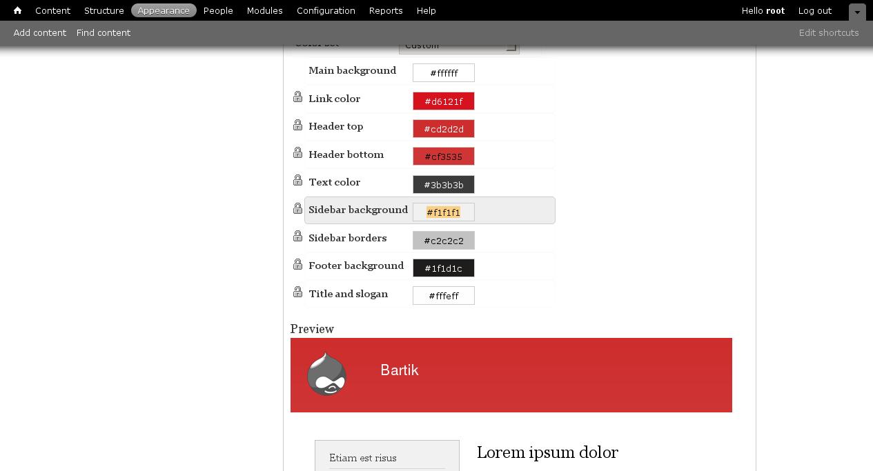
Jeff Burnz commentedThis is actually a very logical mistake in the theme - Bartiks color css is named color.css - this overrides color modules own color.css, which in effect removes cores styling and messes up the page.
Patch fixes it - but presents us with new problem, see screenshot...
Comment #4
Jeff Burnz commentedops forgot screeny...
Comment #5
jensimmons commentedRather than adding the color.css styling back into bartik's color.css -- we changed the name of Bartik's file to colors.css.
I believe it's much better for us to use colors.css to only list the few colors that color module overwrites. And leave all the preview page stuff either in core, or overwrite it in our styles.css
#783698: rename color.css to colors.css (and fix it in .info) made this change. So we don't need the patch in comment #3.
Comment #6
jacineAh, ok well that would explain the problem.
I still think the font-sizes are off and CSS is messy, but I'll live :P I guess this is fixed.
Comment #7
bleen commentedI think this is much more prettier. see here: http://skitch.com/bleen/dy75x/d7
(also tested in RTL)
Comment #8
jensimmons commentedComment #9
jensimmons commentedIn response to comment #4:
I think we should make a policy that if people turn off the overlay, AND make Bartik the admin theme, AND use both sidebars, even for the admin pages........... then they are either a) doing it wrong, or b) such an edge case that it's hardly going to happen.
And that in either case we can expect they will simply have to do something about the 2 sidebars.
And we don't have to try and make Bartik work in that case.
We have more important things to worry about!
So let's not spend any time on worry about how to jam the whole admin interface into the tiny space between the 2 sidebars. I am closing that flavor of discussion as "won't fix".
Comment #11
jensimmons commentedCommitted! Great job, bleen!!
Comment #12
jensimmons commentedComment #13
jensimmons commentedOh this was not critical either.
Comment #14
Jeff Burnz commentedThe community is very split on overlay as it is + its totally inaccessible to a percentage of users who simply cannot use the overlay.
I don't think you can make assumptions at this stage about what will be an edge case etc, the fact is the Admin features should work, otherwise this would be the first theme ever to be in core that didn't. I'm not quite sure that's going to pass muster.
Right now I can set this as my admin theme, go to the theme settings page and its broken to the point of unusable - imo that's just not acceptable. These are basic core features.
Comment #15
jensimmons commentedThis is the first version of Drupal that ships with an administration theme, where switching to make the front-facing theme also be the admin theme requires finding a sort-of obscure setting and changing it. That does not mean we should do no work to make Bartik work for admin. But it does seriously change the priority of that need to a lower priority. Seven is the admin theme for Drupal 7. That's the default. That's the expected behavior.
Also the default install creates one sidebar, not two. So if someone switches the admin theme to Bartik, it does work with the one sidebar. If people really want to use Bartik as their admin theme, they can always set the blocks in the sidebars to not show on admin pages.
I just want us to focus on the truly critical bugs and unthemed parts first. Admin stuff can be done later. It would be awesome to get to it, but making sure forums are themed and the comment submission form is themed and everything works in IE 6, 7 and 8 is way, way, way more important.
Comment #16
bleen commentedConsider this: currently the content area of Bartik is 960px wide and each sidebar is 240px. If we forget about padding and margins, that leaves 480px for the center content area. Several of the tables that are used on admin pages are just plain wider than 480px (ex. the table of modules on admin/modules).
This leaves us with only a few options: either rejigger Bartik to be a liquid layout or hide one of the sidebars on admin pages.
IMO hiding a sidebar is too much of a WTF for users who are wondering where their blocks just went which leaves us only with making Bartik a liquid layout. If that is required than we are saying that no fixed-width theme can ever get into core with more than one sidebar.
I believe that the concept of an admin theme in Drupal has made this an unreasonable restriction. If a user tries to use Bartik as their admin theme (with overlay off and with both sidebars having content) they will see that this is not an appropriate theme for them and they will pick another.
= my 2 cents
Comment #17
Jeff Burnz commentedI rather see this as improving the user experience at every level, as opposed to giving the user an unexpected moment, where they hit a wall and don't really know where to go next. I'm just trying to put myself in the shoes of the user who is brand new to Drupal, maybe they don't know about block visibility settings, they are just playing around, setting up their new site, pushing lots of buttons etc.
Look, I can fix this, so less talk, more patches!
Comment #18
Jeff Burnz commentedSorry, I changed the status, not sure it really matters, its somewhere in between I think...
Yeah, I take the points bleen very much, its totally right, but if something like can be fixed, which it can, it should be, tables are bug bear I know, thats a harder proposition.
Comment #19
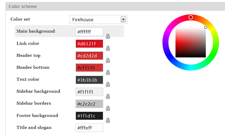
Jeff Burnz commentedVery small patch that fixes this for when Bartick is admin theme, and maintains the normal appearance in overlay (farbtastic color picker on the right or left etc).
Bascially this just positions the color picker above.
I made some margin on the pallette also, the locks were bleeding over the edge of the fieldset, so I pushed it over 20px, plus cleaned up the redundant floats that were added, and made adjustments to the RTL.
Tested in FF3.6, Safari4.0.5, IE7 (Win7).
Screenshot shows in RTL mode in FF....
Comment #20
Jeff Burnz commenteddang nabbit...
Comment #21
bleen commentedI have no problems with any changes in the from #19 ... and I totally agree that wherever we can fix things we should, so RTBC++
Comment #22
tlattimore commentedLooks great on my end. Great Job Jeff.
Comment #23
jacineThis is a good improvement. Thanks :)
Committed.
Comment #24
rasskull commentedI hate to have to post in a 'fixed' Issue but I am seeing some odd behavior with the color picker on more than a few browsers. It looks like it's going underneath the form - Screenshot attached.
Comment #25
rasskull commentedSorry for the false issue, it had to do with the site cache and updated files. It looks good so plz ignore this :)
Comment #27
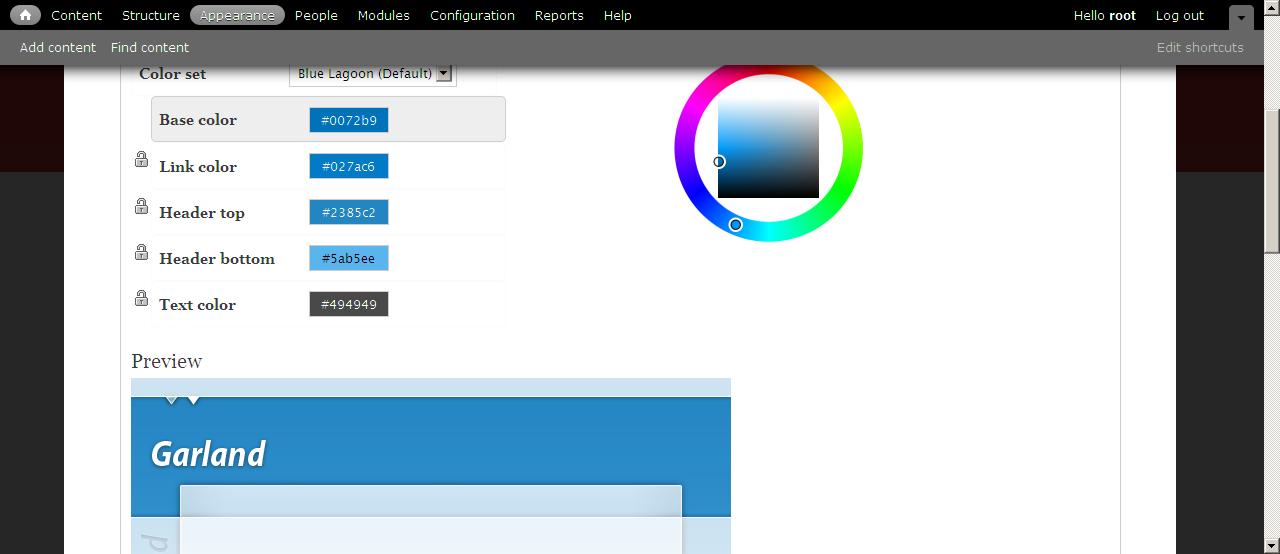
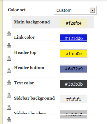
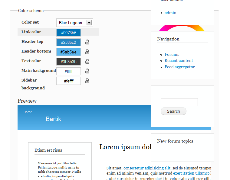
dcrocks commentedMy eyes are old and weak so I set my browser preferred font size to 22. This appears to screw up the color module settings page for bartik(see attached). It doesn't have the same affect on other admin pages(content, modules, etc.).
I think that any browser font size than the assumed one will cause that layout to distort/break, the bigger the difference, the more the displacement.
Comment #28
jensimmons commentedYeah, this problem also forces us to use short names for colors. Anything much longer than the ones we have break the layout here too, in the same way.
I have a feeling this is the layout in the core color module — legacy bad code. :( We can only do so much to fix up color module (and people working on it so far have done a lot!)
Does anyone have any doable (simple) ideas for a fix here?
Comment #29
dcrocks commentedI am using firefox 3.6.3 with drupal 7.x from 5/24 cvs and bartik from 5/24 cvs. The problem shows up on safari as well. The other themes that use the color module(garland and corolla) don't have this problem. It would appear to be in one of the "preview" files or the "preview" entries in style.css.
Comment #30
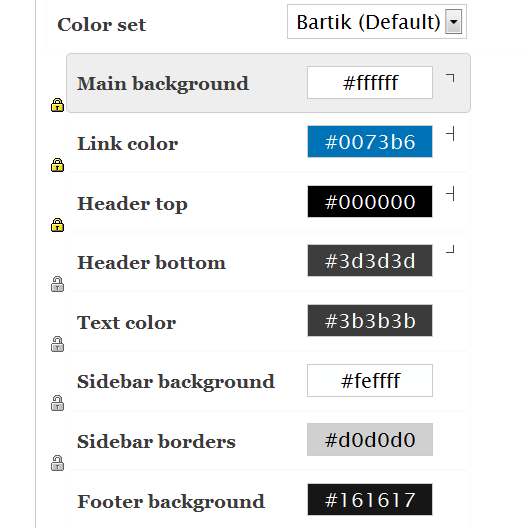
dcrocks commentedActually, all the themes using the color module have problems. You will notice that in all 3 themes the last lock symbol is missing and the others are in the wrong place. The big problem for bartik is that the 'label' field in the 'palette' div only has 10ems available from modules/color/color.css, and I figure any label taking more than 14 spaces is going to have problems. With seven as the admin theme all the admin pages have these settings:
body {
color: #000;
background: #fff;
font-style: normal;
line-height: 20px;
font-size: 0.8em;
font-family: Lucida Grande, Lucida Sans Unicode, sans-serif; }
With my browser font size of 22 that means a size of 17.6px(which is what firebug shows).
So part of the problem is bartik(shorter labels) and part is the color module. The color.css file could be modified to to be more generous in its spacing. It needs to be fixed to clear up the 'lock' positioning problem. But since seven's style.css is the last css file loaded I don't see how the font size issues can be resolved without screwing up a lot of other things.
So what's next?
Comment #31
Jeff Burnz commentedIts not that the last lock is missing, its the first lock that is missing - afaict you cannot unlock Base. The locks are probably misaligned so it looks like the last one is missing, but in fact they should be lower down.Hang on, no, that is wrong - the locks "chain" the fields together, so they are supposed to be between the fields, so it appears a lock is missing but in fact there is always one less lock.
Its just a very crappy UI and its not at all apparent how it works until you start playing with it and getting a feel for how chaining the fields together shifts the colors.
Comment #32
Jeff Burnz commentedGive this patch a crack dcrocks - this removes the widths and sets the label width in ems, attached a screenshot of text zoomed right up also.
Comment #33
bleen commentedI think the intent is for the locks to be on the right side in between the linked-lines that appear when locked ...
Comment #34
Jeff Burnz commentedYes they are bleen, I know we moved them over, I still think that looks OK and works as a UI. We can always change back.
Comment #35
dcrocks commentedIncreasing the field width will certainly help but there is no successful end game to this. Just people with worse eyes than mine will have the problem. But I don't see what you can do given the constraints.
The font size is still being overwritten. When I look at the element attributes with the 'web developer' extension for firefox it still figures out to a 0.8em base. That is another way to fight display constraints, start small.
Whatever the locks are supposed to do it is not intuitive from the way it is being displayed. Maybe if they were actually between the chained elements instead of to the side, or perhaps a different icon metaphor(chains?).
Thanx for looking into this. Good documentation may be the only solution.
Comment #36
jensimmons commentedIs this something that should be fixed in Seven (and Bartik) or is it something that should be fixed in core? Let's fix it at the root.
Comment #37
dcrocks commentedMight not need changes anywhere else. I made some changes to bartik's style.css independent of #32. They result in the locks being back in a position with other color module themes and work out to a very large browser font size. A diff and a screenshot are attached. Only tested in firefox and safari.
Comment #38
Jeff Burnz commentedThe patch in 32 removes the width restriction, and sets the label width in a relative unit, so no, users will not have the problem - the width keeps growing as the user zooms the text.
I'd say they're not intuitive either way and it really doesn't make a lot of difference.
Comment #39
dcrocks commentedShouldn't the layout and styling of the "palette" part of the color module be the same for every theme that uses it? I know that bartik is to be a 'core' theme and should modify these admin menus to reflect its individual theme 'Look'. But shouldn't it have the same behaviors as garland or corolla?
The change in #37 also makes the label size relative. It just allows for longer labels.
Comment #40
yoroy commentedChiming in here with #39: Bartik applies custom styling to its own theme settings page, overriding Seven, the default admin theme. I think this custom styling should be removed. Seven is the default admin theme and I strongly feel all core themes should support that notion, even on its own theme settings page.
Comment #41
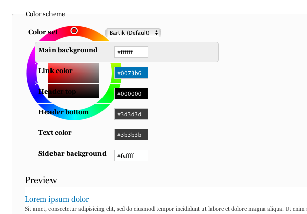
mlncn commentedDifferent but related? issue-- when Bartik is made the admin theme, a misalignment of the form item divs around each color selection makes some of the label/colors (eg, Main Background: #FFFFFF) difficult or impossible to click. The lines that should not be overlapping the colors are just visible in this screenshot. (Patch in #32 does not change this.)
Firefox 3.6 on Ubuntu.
Comment #42
alanburke commentedConfirming the Problem in 41.
Only Firefox 3.6 Ubuntu.
Should this now be a core issue?
The problem relates to this item in color.module's css file.
color.css?l515su (line 70)
Increasing the width
Two ways to fix this.
1. Color Module
I just removed the rule -
Patch a attached.
Screenshot attached.
Looks pretty much the same in FF Windows, Chrome Windows.
Or
Increase the Width a few em rather that removing it.

Patch B attached.
Screenshot attached.
FF Ubuntu
FF Windows
2. In Bartik theme.
Increase the width of this element.
Patch C.
Same visually as B, but just for Bartik.
Comment #43
alanburke commentedMoving to core.
Comment #44
jensimmons commentedtagging
Comment #45
dcrocks commentedStill get distorted field labels on color picker on fonts larger than 18 pts. I realize there is a limit, which may or may not be defined somewhere, but it should be able to go larger. It is not hard to do and the patch in #37 allowed much larger fonts.
ps. I still don't like the lock icon on the left and its not hard to fix. Just me though.
Comment #46
dcrocks commentedSorry, forgot pic.
Comment #47
Jeff Burnz commentedChanging the font-size up or down destroys the color settings - assigning to myself and getting this fixed - will review the previously posed patches and see what comes out of them - either way we need to fix this now. Set as major but really its dam near critical.
Comment #48
Jeff Burnz commentedThis removes many of the custom styles yoroy raised this earlier) and uses the fixes in #37 as a base, with some modifications to support down-sizing fonts as well as up-sizing. This is working very well on Firefox 3.6.8 - needs some broader browser tests and RTL review - tested with and without Overlay also.
edit: image removed, appears I had some issues with that image...lol, see the next post...
Comment #49
Jeff Burnz commentedComment #50
Bojhan commentedDid we address http://drupal.org/node/783574#comment-3166978 if so, lets get this a code review.
Comment #51
Jeff Burnz commentedIn essence yes, it does - I think yoroys main concern was the locks being shifted to the left, that said Bojhan, this is really a core issue because with core styles it fails - its really core that needs to be fixed, Bartik is still special casing its CSS to get the "accessibility factor" into it.
Comment #52
Bojhan commentedSo fix the core issue? See no reason why we couldnt
Comment #53
Jeff Burnz commentedOK, I'm submitting this patch which in essence does this:
1) Removes much special casing from Bartik
2) Changes color modules CSS to allow for text resizing - from very small to very very large
The upshot is that form elements wont break or be obscured, and the locks maintain there relative position and still look good in small and large font sizes.
I've been quite meticulous with each property and value, however I have not had time to test in many browsers - it should be pretty good but needs testing all the same. I have tested in Firefox 3.6.8 with Garland, Seven and Bartik as admin themes, with Overlay on and off.
Comment #54
Jeff Burnz commentedok, will help to attach a patch...
Comment #55
bleen commentedooo ... this is much much more better!
I only had time to testdrive on Chrome5 Mac LTR so still needs more review, but definitely right track
Comment #56
sun.core commentedCSS-only changes cannot be major, especially when touching an optional core module.
Comment #57
tim.plunkettI think between the changes made in #844734: Bartik, do not import style.css from preview.css and #1164796: The lock icon attracts unwanted attention, and its purpose is not clear., the page is much better, but perhaps this is still worthwhile.
Comment #58
markhalliwellI'm closing this issue. It's undergone too many project/version changes and is hard to follow. I'm in favor of #1164796: The lock icon attracts unwanted attention, and its purpose is not clear., but will also probably open a separate issue to cleanup the admin area in D8.