This is a followup to #716612: Overlay is not accessible to screen reader users.
It was concluded there that for some screen reader users, the overlay module may still remain difficult to use, so they should have a clear, quick way to be able to either go to their user profile page and disable it, or disable it immediately.
The patch that @seutje started there basically looked like this:
diff --git modules/overlay/overlay.module modules/overlay/overlay.module
index eb1bb49..4bbba43 100644
--- modules/overlay/overlay.module
+++ modules/overlay/overlay.module
@@ -304,6 +304,10 @@ function overlay_preprocess_html(&$variables) {
     // Add overlay class, so themes can react to being displayed in the overlay.
     $variables['classes_array'][] = 'overlay';
   }
+  global $user;
+  if (overlay_get_mode() != 'none' && $user->uid && isset($user->data['overlay']) && $user->data['overlay'] == 1) {
+    $variables['overlay_disable'] = l(t('Disable the overlay'), 'user/' . $user->uid . '/edit', array('attributes' => array('class' => array('overlay-exclude'))));
+  }
 }

 /**
diff --git modules/system/html.tpl.php modules/system/html.tpl.php
index 7ef8fc2..2c254bf 100644
--- modules/system/html.tpl.php
+++ modules/system/html.tpl.php
@@ -47,6 +47,11 @@
   <div id="skip-link">
     <a href="#main-content"><?php print t('Skip to main content'); ?></a>
   </div>
+  <?php
+  if (isset($overlay_disable)) {
+    print '<div class="element-invisible" id="overlay-disable">' . $overlay_disable . '</div>';
+  }
+  ?>
   <?php print $page_top; ?>
   <?php print $page; ?>
   <?php print $page_bottom; ?>
Several people pointed out that we don't want to add overlay code to the system.module though, and suggested putting it in overlay.tpl.instead.
Additionally, my in-depth review was as follows:
- It looks to me like the intention is to show this to "overlay users" even on non-overlay pages also (or at least that seems to be the effect), in which case overlay.tpl.php wouldn't work, right? Can overlay module add it to the top of the 'page_top' region via hook_page_alter() maybe? Or can we clarify where we do and don't want this link to appear, to see what would work...
-
+ print '<div class="element-invisible" id="overlay-disable">' . $overlay_disable . '</div>';
I thought we couldn't use "element-invisible" to contain a link, since it means keyboard users will be able to tab to it but not see it. Probably this needs to use the same mechanism as the "skip to main content" link instead....
-
+ if (overlay_get_mode() != 'none' && $user->uid && isset($user->data['overlay']) && $user->data['overlay'] == 1) {
This check seems incorrect for a couple reasons - forgetting the first part, shouldn't the rest be more like user_access('access overlay') && (!isset($user->data['overlay']) || $user->data['overlay'])? That is what is used elsewhere. The current patch seems to have the effect that it only appears when the user has already visited and saved their user account page, which kind of defeats the purpose :)
- If we're going to do this we really need to discuss the usability. For someone who wants to continue using the overlay it will be annoying to have this on every single page. And for someone who wants to turn the overlay off right away, it will be pretty odd that the effect of clicking this link is to...... take them directly into the overlay.
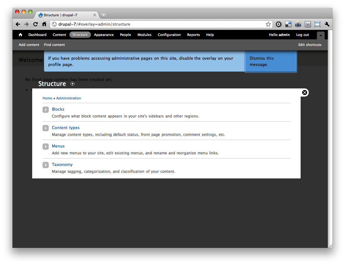
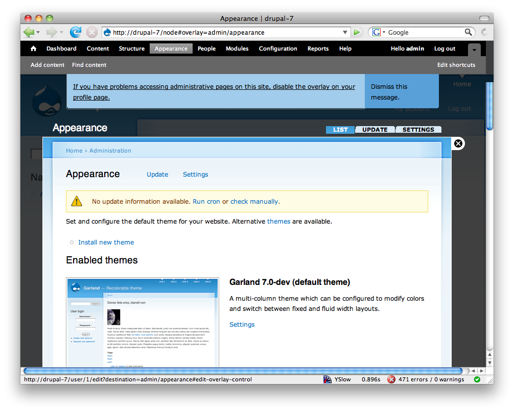
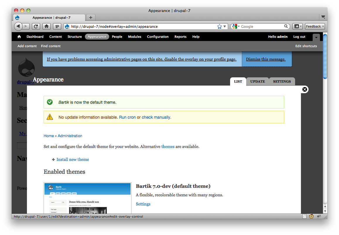
The right way to do this is something more like "Disable the administrative overlay (dismiss this message). You can also change this setting later on your user account page."
Only show the link on user_access('access overlay') && !isset($user->data['overlay']) - i.e., to people who have not made a choice yet. The "disable" and "dismiss" links would have to go to callbacks (or even AJAX) that saved the user account with $user->data['overlay'] explicitly set to TRUE or FALSE.
This is a little complicated but in my opinion is the only reasonable way to do it.


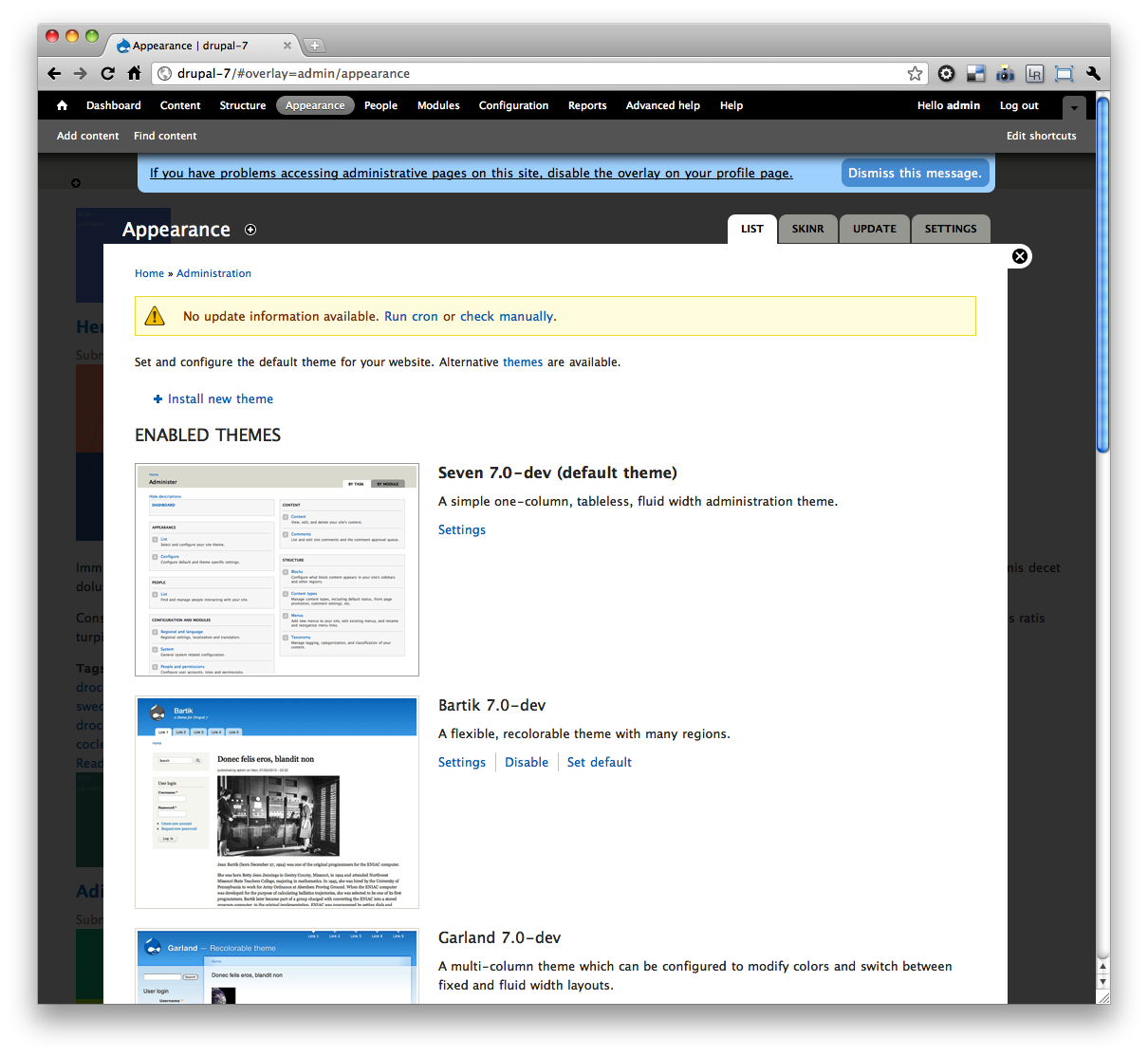
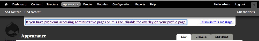
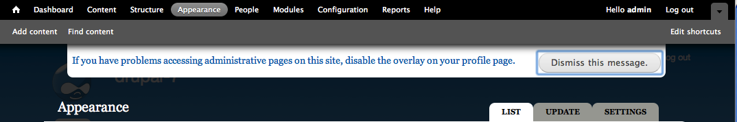
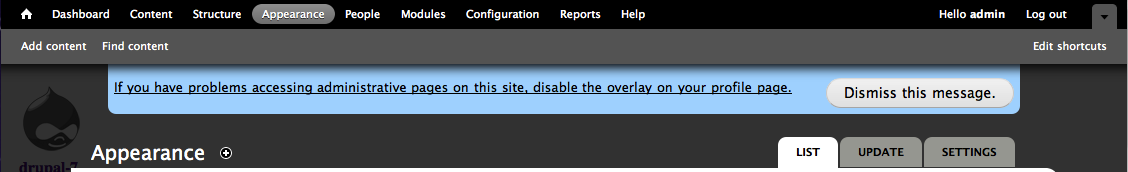
Comments
Comment #1
David_Rothstein commentedBetter title - I keep getting reminders in other issues that screen readers are pieces of software, not people :)
Comment #2
David_Rothstein commentedBojhan asked for a little more background here.
The goal here is to give screen reader users (who, depending on which particular screen reader software they are using, may be confused by the overlay interaction) the ability to quickly disable it if they choose to.
Each administrator's user account page already has a setting to turn the overlay on/off for that user, but the concern was that wouldn't be obvious to find.
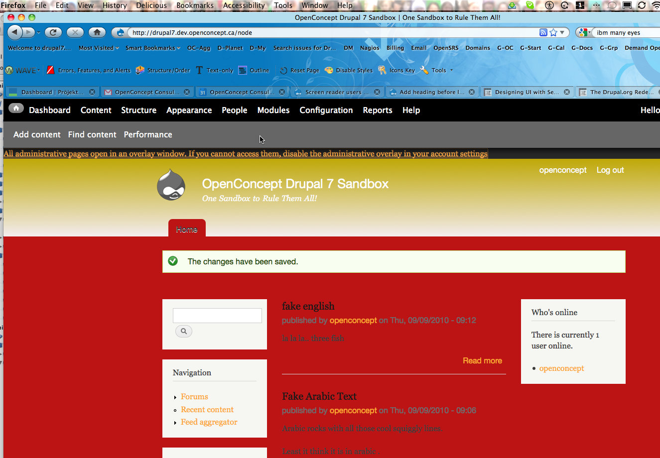
So the proposal is to make it easier to find by putting text that only screen reader users can read (or, probably, for technical reasons, also which keyboard users can see, although for them it would only appear when they tab to it with the keyboard) at the top of every page of the site.
The code I pasted above adds a link "Disable the overlay" at the top of the page, and clicking it takes you to your user profile page (where you then have to toggle the setting and save the form in order to actually make the overlay disabled).
My review above addresses that approach and makes additional suggestions.
Comment #3
shunting commentedDamien Tourmond writes:
It would seem, then, that giving the option to disable overlay during installation is really the cleanest solution. And otherwise -- hoping I'm not oversimplifying -- if we force everyone to install it, aren't we placed in the position of telling users with accessibility concerns to disable something through the very interface that is not accessible to them?
Comment #4
Everett Zufelt commented@shunting wrote:
This is partly correct. What is missing is a reference to situations where users may be attempting to use a site that was built without accessibility in mind. We are doing our best to ensure that functionality native to Core be natively accessible.
I don't think we are doing this.
My recommendation is that the UI to disable the Overlay appear:
1. Only when Overlay is open.
2. At the top of the DOM and at the top of the Overlay segment of the DOM (before the skip link).
This may still cause problems for some screen-reader users, depending on the technology (screen-reader / browser combo) they are using. But, this is the best we can do without disabling the Overlay by default in Core, which is not an option, and which would still not solve the problem for sites where Overlay is enabled.
Comment #5
chx commentedClear, quick... can't we add a fasttoggle like menu path? I have already asked this in the per user overlay toggle patch. Don't forget that we are talking of new users. You click on a "disable overlay" link and met with a sea of checkboxes, text fields and whatnot. Awesome UX!
Comment #6
Bojhan commented@chx If its technically possible, I think we would always favor that kind of approach. Was under the impression that is hard to do.
Comment #7
frega commentedHi, a first stab at the issue. Patch attached. It displays a "disable overlay"-link early in the html and exposes an additional menu path (as suggested by chx above). All the Javascript-ARIA-Stuff from #716612 has been left out. It does not address comment #4's point that the "disable overlay"-link/UI should only appear when the overlay opens; I don't have a JAWS or similar setup (nor experience :) and have only tested this in lynx and FF w/o CSS.
1) The link text should perhaps be a bit more expansive/comprehensible for new users; maybe: "If you are using a screenreader, you might encounter problems using the administrative overlays. Please click here to disable them.".
2) David_Rothstein wrote: "For someone who wants to continue using the overlay it will be annoying to have this on every single page". To address that, we could show the following text/links for screenreaders only until a choice has been made: "If you are using a screenreader, you might encounter problems using the administrative overlays. Link 1: 'It works fine for me, I want to keep the overlays' and Link 2: 'Deactivate the overlays'". Once a choice has been made these links wouldn't be displayed anymore. That is easily implemented.
Comment #8
cliffsubcribing
Comment #9
chx commentedHrm, that's not CSRF protected. http://drupal.pastebin.com/0cgEAUgX
Comment #10
frega commentedUpdated the patch.
1) Incorporated chx's code (but maintaining 'access arguments' => array('access overlay')).
2) Moved (for the time being) the CSS for the #disable-overlay wrapper into a separate file (overlay.css) because overlay-parent.css is not loaded on pages normally opening in overlays (e.g. /user/1/edit) thus "exposing" the disable link; using class .element-invisible was rejected in #716612 and the only other option seemed to patch all themes (style.css) like in the case of #skip-link. Looking for a more elegant solution - maybe a shared class for #skip-link and #disable-overlay (or all "screenreader" elements?)
Comment #11
webchickThere's a patch; marking "needs review".
Comment #12
chx commentedYou can get back to my simpler menu callback IMO. drupal_goto handles $_GET['destination'] I believe. Also, we almost never check the return value of user_save...
Comment #13
frega commentedOk, cleaned up overlay_user_disable() as per chx suggestions; kept feedback message and drupal_goto to user edit page / or given destination.
Outstanding points:
1) Finalise wording of the link text (and/or link title) to be more comprehensible for new users (see comment 7 above, point 1)
2) Functionality: display message to screenreaders only until a first choice (keep/disable) has been made? Or show disable link always when overlay active? (see comment 7, point 2)
3) CSS: Can #skip-link and #disable-overlay share a class? Where do we put #disable-overlay-CSS?
Comment #14
yoroy commentedping testbot
Comment #15
casey commentedshould be disable_overlay
we could use .invisible-element if we handle #897638: Make .element-invisible work for focusable elements like links first.
Comment #16
Anonymous (not verified) commentedCan we use a key binding? Although I believe people prefer not to have these, if I understand the literature correctly.
And/ or add a explanation to the top.
Pseudocode:
Only problem with some of the above is that if people adjust their themes or use an incorrect heading structure, the theme is no longer fully accessible, which could throw people off.
It would give a clear area for people to find information.
Comment #17
Everett Zufelt commentedA key binding is an interesting idea. But, since this is likely going to be a one time use thing I'm not sure that it would be that benificial. Also, it is difficult to find a key binding that doesn't conflict with key bindings for the OS / Browser / Assistive technology combos that may be in use.
Comment #18
Anonymous (not verified) commentedHow about on the registration form?:
----
User name:
User name field
Password:
Password Field
Accessibility
Check box: (default empty) Check this if you want to enable the accessibility administration theme.
Submit button
-------------
Or something to that effect. Then store this in the user settings. Allow the user to change the option in their user profile, in case some one by accident checks the check box?
Comment #19
webchickWe're not cluttering up areas such as the installer, the user profile form, etc. for options that only affect the 0.0001% of users out there who are Drupal admins, as opposed to end users on a Drupal site. No.
Comment #20
Anonymous (not verified) commented#19 -1
It would add Drupal to the fore-front of Accessible CMS's implementing a proper accessibility feature.
And Drupal is spending a lot of time making it accessible, which is to be commended.
Sad to hear though that people with bad sight are seen as a demographic small number, and that this would be the basis for a decision.
Speaking as someone with a disability.
Comment #21
Everett Zufelt commented@design_dolphin
I agree that the user registration form is the wrong place to put this option. It is best, usually, to place a control nearest to the feature that it will deactivate. As a simple user I would have absolutely no idea what I was choosing to enable or disable from the registration form.
Speaking as a person with a disability :)
Comment #22
yoroy commentedThe distinction webchick makes is that between admins and regular users and content creators, not between people with and without a disability. We´re still working on solving the actual issue, too.
Comment #23
Everett Zufelt commentedOT:
My experience with other CMSs is limited, but I think that it is safe to say that the Drupal community has put more effort and time into accessibility than any other. Also, since my involvement with Drupal began I have not seen an issue not resolved because the quantity of users affected was marginal. We are doing a great job, the concept of placing the overlay disable link on the user registration form is just a poor design option.
Comment #24
webchickYes, to be clear, my comment was about the ratio between "number of users reading / commenting on / rating stuff / whatever on site X" to "people on site X who will actually see the Overlay". It makes zero sense to expose options to all people that only apply to a tiny, tiny subset of people who are actually affected.
Putting this option on or near the actual Overlay, though, makes a lot of sense, because then the people actually affected by it can make the decision. AFAIK that's what this patch is doing.
Comment #25
chx commentedWhy redirect to user/X/edit?
Comment #26
Everett Zufelt commented@chx
We have two choices. 1. Provide a toggle that turns overlay off and then modifies the setting in the user profile. 2. Direct the user to their profile page to disable it them self.
1. Is more transparent for the user, and faster.
2. Gives * some * context to the user should they wish to enable again.
I'm quite happy with either approach.
Comment #27
Anonymous (not verified) commentedTo be clear, I wasn't pushing that the registration form would be the best option.
@webchick
Thanx for clearing that up. I appreciate it.
Comment #28
chx commentedWell context is good. I am OK with the patch, then.
Comment #29
Bojhan commentedchx, is good with the patch if Everett is too all we got to fix is the wording "Disable administrative overlay" - is that what we use on user profile to? I feel its handy to refer in this sentence to the user profile, rather then the action?
Comment #30
Everett Zufelt commented@Bojhan
The title of the iframe in which the Overlay content lives is "... dialog" e.g. "People dialog". IMO dialog is more understandable than Overlay (since it maps to desktop applications. I had never heard of an "Overlay" as part of a UI before D7. In another issue I have suggested switching the text for the close button from "Close Overlay" to "Close dialog" to be more consistent with the iframe title.
The problem is that Dialog is likely easier to understand, but Overlay is what we are calling it in D7, and what we call it on the User Profile page.
We also somehow need to communicate that this dialog / overlay thing, that I have the option to disable, is the thing that might be causing me problems accessing administrative tasks on the site.
I'm not sure how to communicate that clearly and concisely.
Comment #31
Everett Zufelt commentedIf nobody comes up with something better:
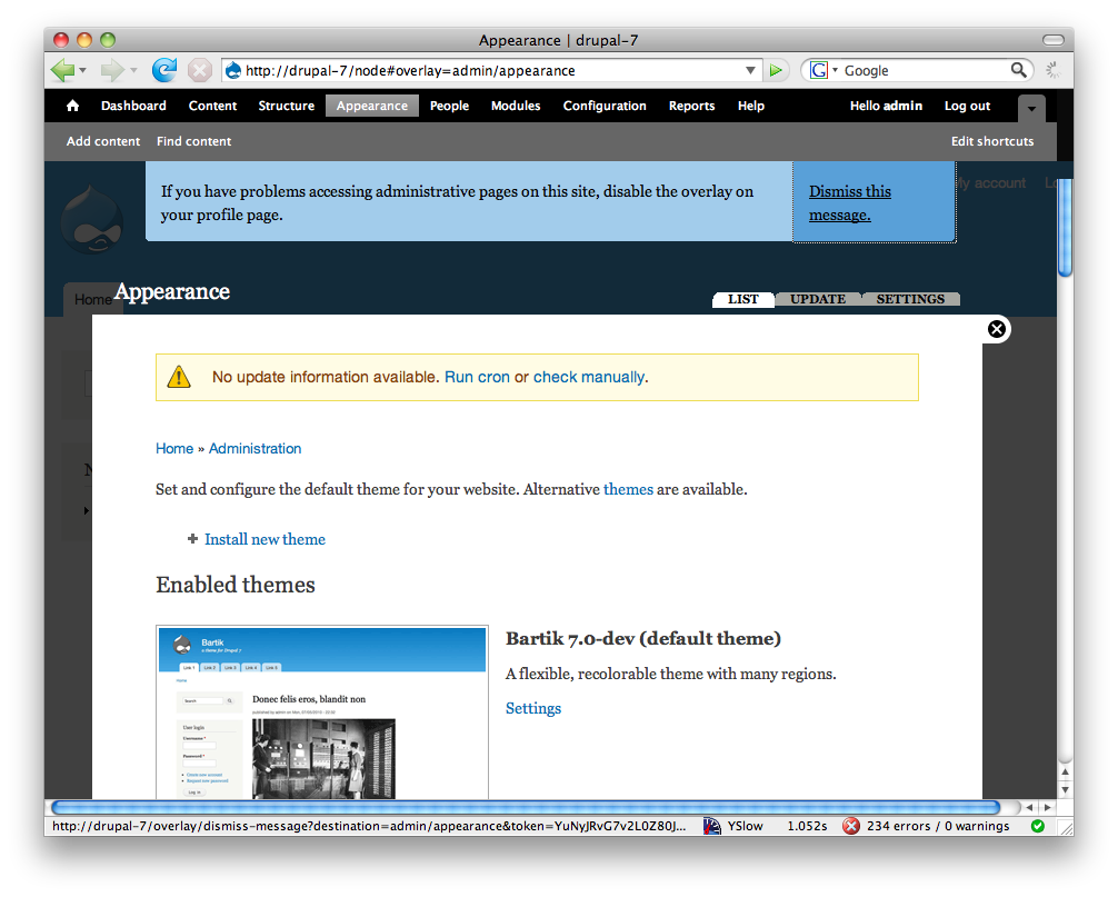
This site presents administrative pages in a dialog (Overlay), which may not work properly with all assistive technology. Disable the Overlay from your User ProfileDo not show me this message again
The problem with the second link is that a keyboard only user may be confused. Show me what message? Since the message will likely be hidden with .element-invisible
Comment #32
yoroy commentedMy suggestion would then be:
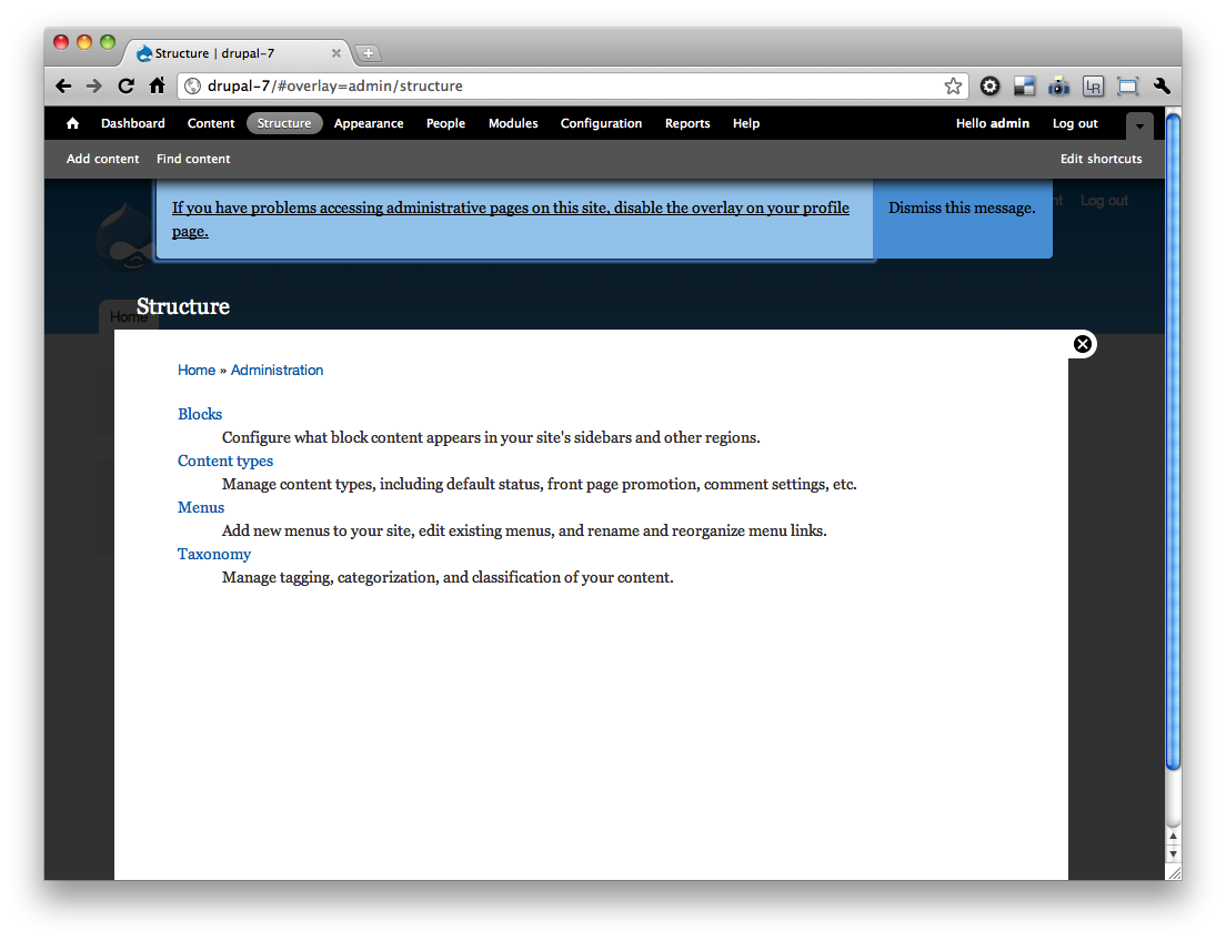
Administrative pages are shown in an overlay. Disable the overlay if you have problems accessing administrative pages. (Do not remind me again)
Comment #33
frega commentedI'd loved to reroll the patch according to #13, #28 and #31 but am still a little confused :) and have a suggestion myself, hth.
So just to restate #31 for myself: A) We display the following in an ".element-invisible"-div to logged-in users w/ overlay access permissions:
"This site presents administrative pages in a dialog (Overlay), which may not work properly with all assistive technology"
-> Disable the Overlay on your User profile (->user/{x}/edit)
-> Do not show me this message again (disables this information message and reloads the page)
B) Alternative/My suggestion: display the message above only as long as *no explicit choice* to enable (or disable) it has been made and offer following choices:
-> Disable the Overlay (->disable the overlay ->return to current page and provide "context" in the status message instead: "The overlay has been disabled. You can enable it on your user profile [linked to user/{x}/edit]")
-> Keep the Overlay (->explicitly enable the overlay -> return to current page and provide "context" in the status message: "The overlay has been enabled. You can disable it on your user profile [linked to user/{x}/edit]")
But i am happy to adjust the patch according to A) or B) :)
EDIT: Oops, didnt see #32 - I like the wording; does the link take the user profile or does it directly disable the overlay?
Comment #34
Anonymous (not verified) commentedShould the text include letting the user know that they can still use the admin even though the overlay is disabled? (New) users might otherwise get the idea that they can't use the administration?
Comment #35
Everett Zufelt commented@32 with some tweaks
Administrative pages are currently shown in an overlay. Disable the overlay from your User Profile if you have problems accessing administrative pages. (Do not remind me again)
We still need to address how to show the message. .element-invisible is not acceptable for the links, as they are focusable. Also, the second link still doesn't make sense out of the context of the message (which is what a sighted keyboard only user would get if the links alone are shown on focus). Can we make the entire message invisible by default, but show the entire message if either link has focus using a technique similar to that used for skip links?
Comment #36
Everett Zufelt commented@design_dolphin
Does the message in #35 address your concern in #34?
Comment #37
Anonymous (not verified) commentedNo, it is confusing.
It should be made clear that the overlay is an extra option/ feature, and not needed for normal administrative navigation. This until the overlay is accessible.
I like the rest of it, but maybe something like:
Administrative pages can be shown in an overlay. This overlay may not yet be accessible with all accessible technology. Disable the overlay from your User Profile if you have problems accessing the administrative pages in the overlay, in order to use the normal administration menu. (Do not remind me again)
Comment #38
Everett Zufelt commentedWe might even consider having the disable link go directly to the label for the Overlay disable checkbox on the user profile edit page.
Comment #39
Everett Zufelt commented@design_dolphin
I agree that it is necessary to be clear that no admin functionality will be lost. I don't think that we necessarily need to refer to assistive technology.
Comment #40
Anonymous (not verified) commentedWouldn't #38 have a 'Where am I going' effect? If routing to the top of the user registration form the user would know where they are.
Comment #41
Everett Zufelt commented@design_dolphin
I don't really see a problem with linking to the label for the Overlay checkbox on the profile page. Users know they are going to the user profile page (the link says so). Any drawback of not starting at the top of the page is mitigated by the benefit of landing exactly where you need to be to disable the Overlay.
Comment #42
Anonymous (not verified) commentedSo something like?
Administrative pages can be shown in an overlay. If you have problems accessing the administrative pages in the overlay, in order to use the normal administration menu disable the overlay from your User Profile. (Do not remind me again).
I have some qualms about making a distinction between visual and non-visual users. Hence some kind of note that it is being worked on making the overlay accessible, as far as I understand.
It might be nice to add a text somewhere that people can help with getting the overlay accessible, testing it? Wouldn't know what the best place for that text would be though. Somewhere on the drupal.org site, with the message above, or near the registration form.
Comment #43
Anonymous (not verified) commented#41 o.k. sounds good. I can follow that train of thought.
Comment #44
Bojhan commentedLets get a patch up that does #35 - we need to show the whole message.
I do not share design_dolphin his concerns, we can't afford to clutter this message. The most important thing is to conceive the thing that might be causing trouble can be disabled on the user profile page. All other things will be adding clutter.
I don't know if we can route it directly to the checkbox, it would need a href?
Comment #45
David_Rothstein commentedFYI, one of the reasons I suggested this text originally was that I think it provides both: "Disable the administrative overlay (dismiss this message). You can also change this setting later on your user account page."
You get the convenience of turning it off right away, but the info you need to know where to go to change that again later. I don't see why we need to choose between transparency and context here.
(And also, as stated above, having people who want to turn off the overlay for accessibility reasons have to go into the overlay - where the user account page is - to do it strikes me as at least a little odd....)
Comment #46
Anonymous (not verified) commentedI'm fine with doing it like #45, except that it does not yet make clear that there will still be an administration menu, when you turn the 'administrative overlay' off.
Edit:
Correction: if the user cannot get to the user page if it is on the administrative overlay, then how can they change the setting later? That might be confusing.
Comment #47
yoroy commentedLets test that with an updated patch :)
Comment #48
Anonymous (not verified) commentedLet's get some concensus then on what the patch should contain. Then one of us can build it, and we can review, and sign it off. :-)
Comment #49
frega commentedI hope it's not in too bad form to just go ahead and write a patch w/o consensus; had a few minutes at hand to work on patches right now :)
Approach:
A) Single link on top: "Click here if you have problems accessing the administrative pages (opening in Administrative overlays) or you want to dismiss this message" and linking this to B)
B) Page for more details what's happening and why; two links to 1) directly "Disable the overlay" (without *ever* going into an overlay) and 2) "Dismissing the message" (and keeping the overlays on).
Reasoning:
A) keeps the message (relatively) short and avoids another invisible link "appearing" on focus (see #35 above) B) gives more space to flesh out in detail what's going on. Overlays will be possible to disable without opening an overlay (see #45).
Texts certainly need rewriting. I hope this helps :)
Comment #50
yoroy commentedTestable patches are a great way to work towards consensus, so thanks for this. Certainly not bad form!
Comment #51
casey commentedI think we easily could use one user data variable to store user's overlay preference by using some constants.
If we store this value into $user->data['overlay'] we don't need $user->data['overlay_message_dismissed'].
Comment #52
Anonymous (not verified) commented@frega, I agree with @yoroy. Wanted to avoid 10 people writing a (the same) patch, and wasting the time and energy.
Comment #53
casey commentedPatch incoming in 15min or so.
Comment #54
casey commentedSorry it was more like an hour.
I didn't really like all the new pages of previous patch.
Attached patch:
- Direct link to account edit page having the "overlay-exclude" class to prevent opening in the overlay.
- The disable message disappears as soon as the user has set his overlay preferences (We could extend the account edit page to reset overlay preferences so the message becomes visible again).
- Disable message/link becomes visible on focus. Not too sure about its looks; tried to keep close to toolbar/overlay style.
Comment #55
casey commentedFeel free to post new patches
Comment #56
Everett Zufelt commented@Casey
Does your patch render the link before or after the skip to link in the DOM? I am thinking that after is better, so that we can set focus to the skip link and this link will be after.
Also, does your patch add this link both to the top of the Overlay and the underlying document?
Comment #57
casey commentedAfter, but only to the parent (underlying) page. You think we need it on both? Thinking about it, you may be right then.
Comment #58
Everett Zufelt commented@Casey
Since we can't really predict how the overlay will work for all AT / Browser combos I'd like to see the disable link at the top of the DOM and the top of the Overlay (both times after Skip to ...) This means that if the user lands in the iframe they will have the link, if they land at the top of the page they will have the link.
Comment #59
Anonymous (not verified) commented#54 +1
#58 +1
One thing that did come up: How does a first time user register? By looking at it, I think #54 en #58 will cover it. Anyone see any usability problems, and should the first time registration be made clearer, or is it fine like this?
I like the title, but for the description I don't understand the part 'you started from'.
How about?
'Show administrative pages on top of the page.'
or:
'Show administrative pages on top of the page you're on.'
Any thoughts?
Comment #60
Anonymous (not verified) commentedI can't patch from here at the moment, but feel free to do so.
Let's get this bug fixed.
Comment #61
frega commentedBased on casey's patch in #54, tries to address issue raised in #58.
Attached patch:
- Uses template_preprocess_overlay() to insert the $disable_overlay_link into overlay.tpl.php (hook_page_alter wouldn't have gotten us to the 'top')
- Adjustes overlay.tpl.php
- overlay-child.css copies CSS from overlay-parent.css and adds a z-index:101 (to lay on top of e.g. #overlay-title-bar)
- Uses NULL/!isset instead of the constant OVERLAY_PREFERENCE_INITIAL introduced in #54
Comment #62
alexiswatson commented@59: Good point, we would need something that states the context and the functionality, without being too redundant or jargon-heavy. Perhaps something like "Show administrative features on top of the current page" would work?
Comment #63
chx commentedCan't we put this long text into the attribute title instead of the link text itself and make the link text shorter (a lot shorter)?
Comment #64
Everett Zufelt commentedWe can not trust assisitive technology to reliably use the anchor title since:
1. Most don't and,
2. There is no API stating that this is expected behaviour for AT.
Comment #65
sunHere's my initial review. Note that I have tried to remain as ignorant as possible as to what's been going on in this issue, so that I can give it a totally fresh set of eyes. Apologies if any of this was already mentioned above; I'll read the issue once I'm done here.
Please remove those constants. There is no other state, so it can only ever be 0/1, and that's entirely and sufficiently communicated via 0 and 1.
This can be reverted, too - without type-agnostic comparison, the old and the new are identical (in PHP).
Does Overlay implement other modes than 'child' and 'parent'? If it does not, then we can revert to the old if/else condition.
(and elsewhere) All comments should wrap at 80 chars. See http://drupal.org/node/1354 for details.
(and elsewhere) This link text needs to be shortened to the point - to be improved suggestion:
"Click here If you cannot access the overlay. It can permanently disabled in your account settings."
Instead of suddenly using l() here, we should use the same renderable array (ideally, even through a helper function), assign it to the template variables, and use render() in the template.
To do that, FALSE has to become array(), I think.
Powered by Dreditor.
Comment #66
yautja_cetanu commented"Click here If you cannot access the overlay. It can permanently disabled in your account settings."
Would people have a problem understanding what "the overlay" is? The original text talks about "problems accessing administrative pages" and then explains the reason is due to an overlay , hence why they would want to turn it off?
How about?
"The administrative pages open an overlay over your website. Click here If you cannot access the overlay. It can permanently disabled in your account settings."
Comment #67
sun"All administrative pages open in an overlay window. Click here If you cannot access them."
After clicking, and only after clicking, we display the following message:
"Disable the overlay permanently in your <a href="@account-url">account settings</a>."
Not sure whether we have a neutral message type anymore. A green/positive status icon would look odd to me, so I'd perhaps go with the 'warning' type.
Comment #68
verbosity commented#67 +1
Comment #69
Everett Zufelt commented@Sun
Can you please explain how we are doing the message switch? Are you suggesting that we dynamically change the message, or that we redirect to a page with the second message?
I think that ideally there would be one message that directs the user to their edit profile page.
** that being said wording of this message is not a sticking point for me. I will give a big +1 to anything that reasonably solves the problem of:
1. Communicate that Overlay exists, what it does, and how to disable it.
2. Provides a way to get to the UI to disable Overlay.
Comment #70
frega commented@sun - thanks for the review in #65. I rerolled accordingly (see details below).
Finding the right phrasing seems really tricky; I for sure can't come up w/ anything short & decent :)
I don't yet entirely get what intended plan in #67 is. How would you let the "Disable the overlay permanently in your account settings." show up in an *accessible* way - i.e. respecting tab order (and no JS)? I like the idea though, and suggested in #49 to introduce a dedicated page which could keep the link short "Click here if you are having problems ...". The link takes you to a dedicated page with more illustrating text. On that page we show either a dedicated "disable"-link/menu-callback or a link to the user profile (my patch in #49 went in that direction, but i'd do it *way* simpler now).
EDIT: i think i raise a similar question like Everett in #69 :)
Patch (addressing review in #65)
- constants removed
- keeping the elseif ('child', 'parent' and NULL are possible modes; null value occurs when an admin page [that should normally be a "child"=in the overlay] is opened directly via URL)
- re-wrapped comments
- changed link text to: "Click here if you cannot access the overlay. The overlay (and this message) can be permanently disabled in your account settings."
- introduce a helper function for the renderable array (incl. converting l() to renderable array), adjusted overlay.tpl.ph
Comment #71
sunThis should cut it. If we link to the user account edit form (like the previous patch already did), then there's not even a need for a message or any kind of toggle, IMHO.
Comment #72
Everett Zufelt commentedCopy of markup for link from the DOM:
1. The title attribute is an unreliable method of presenting information related to accessibility, since most screen-readers, keyboard only usrs, etc., do not have access to an anchor's title.
2. This appears to work as expected: link appears at top of DOM and top of iFrame, link takes user to profile edit page and lands on Overlay option.
Looks like if we can get the wording on the link correct we are good to go.
Comment #73
chx commentedAsked for wording help http://twitter.com/chx1975/status/24496311046
Comment #74
yoroy commentedIf you have problems accessing administrative pages in this overlay: click here. You can permanently disable the overlay on your user account page.
Comment #75
chx commentedSo far this is the shortest, by far: You may turn off the administrative overlay and dismiss this message in you account preferences. (based on josiahritchie's , i just changed the "or" to "and")
Comment #76
sunMixed in Everett's and yoroy's suggestions.
re #75: There's no message any longer, just a link.
Comment #77
Bojhan commented"All administrative pages open in an overlay window. If you cannot access them, disable the administrative overlay in your account settings."
The requirements set by Everett are met?
So RTOTHEBC!
Comment #78
Bojhan commentedComment #79
yoroy commentedOh I misunderstood, there's only 1 link to show. 'You may' is unnecessary and I don't think we have to explain that the message will disappear either.
"Turn off the administrative overlay in your account preferences."
Hmm, that's rather blunt.
"You can turn off the administrative overlay in your account preferences."
Do we have to specifiy the destination of the link though? Seems more important to give a hint as to why you'd want to disable it:
"Disable the overlay if you have problems accessing administrative pages."
Seems good. Action first and enough context to decide on whether you want to.
Comment #80
yoroy commentedOops
Comment #81
Bojhan commented@yoroy Hah, I think we are cross posting, last patch is ok or not?
Comment #82
yoroy commentedYup, sounds good to me
Comment #83
cliffLooks good!
Comment #84
David_Rothstein commentedThis issue has taken lots of twists and turns, but it still comes back to the original points...
Comment #85
sunI've added the isset() + TRUE condition, because I assumed that an administrator could mistakenly save a user's account, in which case the option would be unintentionally set. To account for both scenarios (no annoying link after configuration), I think we'd have to add a $user->uid == $account->uid check to overlay's hook_user_presave(), so as to not ever save that value in case it wasn't changed by the user himself/herself.
d'oh on the .element-invisible. Looks like it would be a good idea to postpone this issue on the other one then, since duplicating all the CSS that has been added previously really does not make much sense.
Powered by Dreditor.
Comment #86
Everett Zufelt commented1. Didn't realize element-invisible was in use, my bad. This needs to appear on focus.
2. There does need to be a way to make the message disappear (but I do not see this as critical, although others might). The message should only be able to be made to disappear with an explicit action by the user of either disabling the Overlay or disabling the message.
Comment #87
Anonymous (not verified) commented+1
The link could be short and just say: "Click here if you are having problems with the administrative overlay". This could give the possibility to link to a page, and explain the situation clearly and concisely.
(It would also save time in our breaking our heads, possibly needlessly, in order to get a short link that says it all. As well as providing an accessibility page for people (with just some of the basics). Which may be a good thing for more information to be put on accessibility in Drupal in general, but I digress.)
Otherwise maybe a link?: Trouble with the overlay? Click here for alternative
or something like: Trouble with the administrative overlay? Click here for an accessible version
or something like: Accessibility trouble with the administrative overlay? Click here.
But you better make sure all the navigation is accessible then. Otherwise explain that it is a work in progress, and all input is welcomed. This has to do with expectation levels.
There are limits to how short you can make a link, and still be descriptive, but please prove me wrong. Please keep in mind that the directive is to keep links descriptive.
As I recall this is a temporary solution till the overlay is accessible, please correct me if I am wrong. So let's not spent more time on it than needed.
This topic is going a bit in circles at times. For those replying: Please keep in mind that it must remain clear that a user can use the administration pages without the overlay. A link which says to only turn off the 'administrative overlay', and giving no alternative will leave users undoubtedly confused, and put off.
Keep it rocking! =)
Edit: changed and added link text.
Comment #88
Bojhan commented@design_dolphin we already decided on the text.
Postponing on
#897638: Make .element-invisible work for focusable elements like links
Comment #89
David_Rothstein commentedYes, this is a good point, which the current text does not address; I think people will figure it out, but may indeed stumble on it. Perhaps could be handled just by tweaking it, though. Instead of this:
maybe something more like this:
I think the problem with these goes back to the fact that a lot of people won't understand what "overlay" means.
The accessibility will certainly improve (via the other critical issue), but accessibility isn't a binary thing. At least for some older screen readers, there will still be some issues remaining that may make it difficult for some people to use. I think the unfortunate conclusion was that we'll need this message at least for Drupal 7.
Comment #90
mgiffordI completely missed this before @sun pointed me to #897638: Make .element-invisible work for focusable elements like links.
Adding accessibility tag.
Comment #91
Everett Zufelt commented+1 for David's suggestion
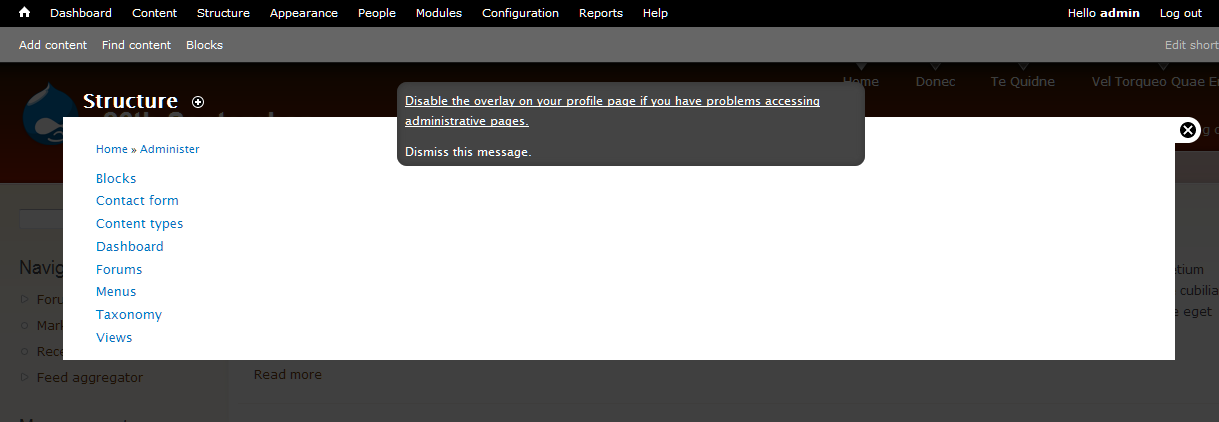
Administrative pages are configured to open in an overlay window. If you cannot access them, disable the administrative overlay in your account settings
Comment #92
mgiffordThis is what the screenshot looks like in Firefox with the text as per the patch applied in #76 & also the patch I rolled up for #897638: Make .element-invisible work for focusable elements like links but both patches need to be changed if we're changing around the name space to use .element-invisible-focusable
Comment #93
mgiffordOk, here's a new patch which goes snugly with #897638: Make .element-invisible work for focusable elements like links and also uses the new text provided by @David_Rothstein.
The attached screen view is in English displayed RTL, so it looks a bit silly.
Comment #94
sunStill needs to address #85.1
Comment #95
mgiffordSo using something like this instead:
To check the value in "case it wasn't changed by the user himself/herself."
Comment #96
Bojhan commentedSince the other issue is going t be committed, can we get a patch up for #84.2? #84.1 is now adressed with the other issue.
Hide message - should be enough, or something like that.
Comment #97
frega commentedAdjusted patch from #93 to incorporate #85.1 (altering hook_user_presave and conditions in _overlay_disable_link).
If other users' preferences shouldn't be altered by anyone but themselves, the form-element for overlay preferences should not appear for anyone but the user him/herself (or be disabled with an explanatory text), IMHO - hence the adjustments in overlay_form_user_profile_form_alter().
Re: #96 - just to clarify, comments #84.2 and #85.1 aren't 100% the same thing: there is no "dismiss"-functionality intended. All hinges on the overlay preference being set - the message disappears thereafter. Consensus seemed (to me) that having two invisible-focussable-accessible links (edit your profile AND dismiss message) is unnecessary and difficult to accomplish in a way that is accessible, "non-confusing" and efficient.
Comment #98
Bojhan commentedSo how do peopel dimiss the message? I am confused, if it can only be done by disabling the overlay you are creating an issue for those it is accesible.
Comment #99
frega commentedHi Bojhan, the message is dismissed after the user chooses (i.e. saving your profile w/ "Use the overlay for administrative pages." checked) to keep the overlay activated as well as after the user chooses to disable the overlay - i.e. the message is only shown until a choice has explicitly been made (i.e. the user profile saved by the user him/herself).
Comment #100
Bojhan commentedI think its obvious thats not what we want? A user having to save his profile, keeping the checbox checked is total magic that will make the message dissapear.
Comment #101
Everett Zufelt commentedSince we know that JS is available when this message appears (since the Overlay is loaded), can we use some jQuery goodness to show both links when either has focus?
The first link what we have now, the second link to dismiss the message.
Comment #102
frega commentedbojhan, just to be clear: the message will disappear no matter what you choose as your preference - as soon as you save your profile the message will disappear/be dismissed - and only then. It seemed to me to be the emergent consensus (after #54) that an anchored link to the user profile should suffice.
Personally, I'd prefer for this: A) one short link on top ("Having problems accessing administrative pages or want to dismiss this message?") taking you to B) an explanatory page with some text and C) links or a form for enabling/disabling overlay (and/or dismissing the message). Am happy to roll a patch for that (improving on my patch #49 and incorporating some #54 etc.) - but i'm a new to this and certainly don't want to step on anyone's toes/push my approach :)
Briefly why injecting a second "dismissing"-link is, IMHO, is not really a good solution: assuming e.g. a keyboard-only-user - the second link ("Dismiss this message") would become only "visible" once you tab out of the first link ("'Administrative pages are configured to open in an overlay window. If you cannot access them, disable the administrative overlay in your account settings") breaking the "context" of what the user is really dismissing. If that is no concern, we can just add a callback "dismissing" the message - happy to provide a patch for that, too :)
EDIT: @Everett: the link (or links) is also be displayed in the "parent" page not just in the "overlay" therefore we cannot assume JS to be available for a solutions, IMHO.
Comment #103
Bojhan commentedI will leave this up for Everett to decide a direction on.
Comment #104
Everett Zufelt commented@frega
Why are we showing the links when JS (and therefore Overlay) are not present? That isn't a major problem, but really makes no sense to me.
My suggestion:
1. Only show the links when Overlay is actually present.
2. Show the link in current patch, and a second dismiss message link.
3. Show both links when either link has focus.
Any technical limitations or usability issues with this approach?
Comment #105
frega commentedIf we want the links only to show when JS is enabled, we'll have to move stuff to overlay.js. The issue started off in CPH with such an approach, but @seutje mentioned some issues with this approach ("it seems to cause the link to be rly late in the tab order") which drove the solution "server-side". Can have a look at that again tho ... keeping both links visible shouldn't be v. hard w/ jquery (and maybe a bit of css) ...
Comment #106
Everett Zufelt commented@frega
Thanks for the explanation. Would everyone be content with this solution:
1. Links are generated server-side (like they are now).
2. Links are not hidden by default.
3. Links are hidden with jQuery / CSS before page is displayed in browser.
4. Focus on either link displays both links.
5. Only users without JS enabled would see the links without the links receiving focus. This only until they click "dismiss". Of course these users will be confused, since for them admin pages never load in Overlay.
I think that this is optimal, satisfies all requirements, only drawback is (5).
Comment #107
Bojhan commentedWon't (5) effect all mobile users without propper JS?
Comment #108
mgiffordI want the bot to test #97.
Comment #109
Everett Zufelt commented@bojhan
I think the answer to your question is yes. So, we need to decide if this is an acceptable trade-off.
Comment #110
frega commentedI've been able to successfully inject the links via JS in the "parent"-pages; they respect tab order and both links are visible when either is focussed which would solve #104 points 1-3. I've successfully tested keyboard accessibility ("tabbing") in FF3.6 & Chrome5 on Linux, but I'd need help&feedback on other platforms/setups ... i'll post a patch in a few minutes.
Comment #111
sunThanks for #97, @frega! That's exactly what I had in mind.
We have a .js-hide class, but we don't have a .js-show or .no-js-hide class.
Comment #112
sun- There should be just one link to the user account edit page. To dismiss the note/link, a user simply saves the user account.
- We should not use JavaScript to inject this note/link, nor to hide it. It slows down page rendering performance for sighted users. Ideally, we'd use a .js-show class, but that's fairly hard to implement, especially in combination with the .element-hidden and .element-invisible classes. If at all, then the only acceptable approach for me would be to render the note/link with .element-hidden by default and use overlay-parent.js to change .element-hidden into .element-invisible.
Comment #113
frega commentedI clearly understand why @bojhan is unhappy with the UX with just one link in #100. On the other hand, having toiled to get the JS-injection and the focus magic working (or working at least in my setup :) I have to agree w/ @sun, that the complexity and performance tradeoff is probably not negligible and maybe not worth it (albeit the sighted users will incur this slow down only until the first time they save their profile) ...
Well, new patch expands/builds on #97 but uses JS to inject links into the "parent" pages. To avoid patching the system-behaviours.css-patch (from #897638: Make .element-invisible work for focusable elements like links) in this patch, I have duplicated some css in overlay-parent.css and overlay-child.css (could be moved to system-behaviours.css in due course). You need to apply that CSS-patch. Hope this helps, otherwise jsut ignore it :)
Patch:
- Adds a second link: "Dismiss message".
- Adds new menu callback (overlay/set/%/%) - enables/disables the overlay directly; please clear menu cache
- Injects the links into the top of the page w/ JS
- Makes both links visible when one of them is focussed w/ JS
Todo:
- Decide: is this worth the hassle?
- Proper accessibility test (keyboard accessibility/tabbing works in my setup FF3.6, Chrome5 - Linux)
- If we do keep two links: Should they not read "Disable overlay, if you have problems with accessing administrative pages" (link to /overlay/set/0/...), "No, I am fine, dismiss this message" (/overlay/set/1/...)
- Provide better "URLs" - overlay/enable overlay/disable and overlay/dismiss instead of a "cryptic" /overlay/set/ and according feedback "You have now enabled the overlay" etc.
Comment #114
sunThanks for working on it. I'm opposed to introduce a giant new page callback that does the same as saving the user account does. We definitely need more custom user settings, and an easy way to toggle every single of them, but implementing this properly is D8 material at this point. We need CSRF protection for such quick toggles. Which leads us directly into the working space of #755584: Built-in support for csrf tokens in links and menu router, which is definitely NOT D7 material anymore.
Comment #115
David_Rothstein commentedThe patch in #113 already has CSRF protection.
Needs a little cleanup, I think, to put the token in a query parameter instead (that's best practice) and use drupal_valid_token(), but functionally it should work fine - that is not hard to do at all, and definitely doesn't need to wait until the D8 generalization. We have a lot of quick toggle links in core already.
Comment #116
Bojhan commentedI don't know what the technical issues here are or what is D8 stuff. Sun states "To dismiss the note/link, a user simply saves the user account." - I have no idea how a user would know that?
Comment #117
mark trappAs @Bojhan is pointing to, the current text has no call to action for users that find the overlay usable:
Instead, the only call to action is for a very small subset of users to disable the overlay. Everyone else, should they follow exactly what the message states, would never get rid of the message. That's less than ideal. I think most users are going to expect a "dismiss this message" link when confronted with a system message they can't resolve.
If it's really impossible to add the second link, the current copy needs to be reworded to something like:
Comment #118
Everett Zufelt commentedHaving not tested the patch, I have to agree with @bojhan, some performance trade-off (only until the user selects the dismiss link) seems reasonable to me to improve usability.
However, 99% of all users will likely never know that these two (4 really 2 x 2) links exist. So, that kind of throws a wrench in the situation.
I think this would be a good time to sum up where we are and where we need to be. Please provide comment. Particularly, provide comment on what problems exist with proposed solutions.
Summary of problem:
1. Overlay is broken for some users (it is in no way our fault).
2. We cannot detect those who need Overlay disabled, it will have to be disabled by user action.
Requirements for solution:
1. Users must not have to 'find' how to fix the problem that Overlay is creating for them.
2. Clearly communicate that Overlay exists, what it does (how it relates to Administrative pages), and how to disable it.
3. Provide a method to disable Overlay, and a method to permanently dismiss information in 2.
4. Limit interference in user experience for those for whom Overlay causes no problems.
Proposed solutions:
1. Where to generate links?
1.1. Generate two links on server to disable Overlay, and dismiss message about Overlay.
1.2. Generate two links through Javascript to disable Overlay, and dismiss message about Overlay.
2. What action do links perform?
2.1 Links activate menu callback to save user Overlay preferences (enabled or disabled).
2.2 Links take user to profile page where they manually set and save preferences.
3. To whom are links visible?
3.1 Show message to all users by default.
3.2 Hide message (only showing to screen-reader users and when links receive focus).
Comment #119
frega commentedHi Everett, thanks for summarizing the issue. My comments:
#97: falls short of your stated requisites (e.g. two links) and gives little "call to action" or guidance; but is a clean and simple patch.
#113: fullfils your requisites (2 links), but is relatively complex (still needs testing for full accessibility) and duplicates some functionality by introducing a user setting toggle menu callback for the overlay.
We could cut the injection of links via JS from #113, but without an additional menu-callback, we could not and should not have a second link to dismiss the message.
A compromise approach (incorporating #97 and short of #113):
1) Have one slightly longer link: "Administrative pages open in an overlay. If you are having problems opening these pages, want to learn more about the overlays or want to disable this message click here.".
2) The single link goes to admin/help/overlay#acessibility
3) overlay_help is expanded to include a section explaining the accessibility problems and state clearly: "If you want to dismiss the message regarding the overlay or need to disable the overlay, please go to the overlay preference in your [user profile], check or uncheck the overlay preference and press save".
The compromise avoids an additional callback and at the same time allows for a better "call to action" than a single link at the top of every page could; but no "one-click" dismissing or disabling.
Rolling a patch like that is a question of minutes - but i don't want to flood this issue w/ another alternate patch :)
Comment #120
Everett Zufelt commented@frega
I would be happy with what you have proposed. I think the question for some others will be that there are several clicks required to dismiss the link / message.
Comment #121
sunHelp module is optional and not guaranteed to be enabled. Instead of linking to a help page and from there to the user account edit page, why don't you simply link directly to the user account edit page, also using a fragment/jump target, and put the help text below the checkbox?
Comment #122
Everett Zufelt commentedI like @Sun's suggestion. Again, some others might want a menu callback so that the message can be dismissed in one click. I, for what it's worth, do not care if multiple clicks are required to disable overlay, as long as the path is short and clear.
Comment #123
Everett Zufelt commentedFYI: update in class name for .element-invisible (focusable) class.
http://drupal.org/node/897638#comment-3468306
Comment #124
frega commentedLiked @sun's suggestion and adjusted #97 accordingly; rerolled the patch to reflect change in #897638: Make .element-invisible work for focusable elements like links (apply this new patch); small wording changes to link at the top:
Patch extends description of the overlay option in the account settings *only* for users that haven't set their preference with this:
Please advise on wording; maybe we should always show the first sentence of the accessibility notice and only append the last sentence (dismssising the message) to users that haven't set their preference as they are the only ones seeing it?
@Bojhan and @Everett - is this still too subtle or do you think this will be sufficient?
Comment #125
sunCan you upload a proper .patch?
Comment #126
frega commentedsorry - proper.patch now attached.
Comment #127
sunThanks!
"Display Overlay preferences only if the current user can access the overlay and when a user edits the own profile."
The faster condition should always come first; i.e., let's flip the conditions.
btw, this fieldset violates UX guidelines - there's only one form element in it.
I think we should always display this help in the regular description.
1) No paragraphs.
2) We can skip the "Accessibility note" prefix.
3) When appending to the regular description, this can be shortened:
"Disable this option, if you have problems accessing the overlay. Save your profile to dismiss the accessibility message shown at the top of every page."
"Prevent someone else from setting the overlay preference for a user."
Powered by Dreditor.
Comment #128
yoroy commentedGood review too, sun. Omit Needless Words. :-)
Comment #129
Everett Zufelt commented"Disable this option, if you have problems accessing the overlay. Save your profile to dismiss the accessibility message shown at the top of every page."
Confusing, since most people will never see the message.
Comment #130
frega commentedHi sun, thanks for the swift review. I'll rectify the points in the next patch; just to clarify regarding the wording - can we maybe drop the first sentence and alter the '#title' of the checkbox to the following instead:
Description for users not having set preference would be shorter and read then:
Description for users having set the preference (i.e. having disabled the message shown to screen reader users)
Comment #131
sunComment #132
mark trappI think the language from #130/#131 needs to be reworked:
#titleshould match the wording of the notice:The word overlay means to lay above: there's no need to be redundant.
and
Comment #133
Bojhan commentedLet me try to move this issue a bit, I think we are very close - and we shouldn't worry to much about copy writing. My suggestions
Top title "All administrative pages open in an overlay window. If you cannot access them or want to dismiss this message, see your account settings."
Option description "Disable this option, if you have problems accessing the overlay. Save your profile to dismiss the message shown at the top of every page."
Lets recognize this though :
Fairly sure we can't fix all those issues, especially the wierd workflow we introduce by having one link just sucks. But we have to get this solved soon and maybe these trade offs are oke? Anyway, I only really wanted to comment on the copywriting.
Comment #134
Jeff Burnz commentedIndeed this seems like some pretty heavy trade-offs.
@Mart Trapp & Bojhan - the word "overlay" can be a noun, but is most commonly used as a verb. As a noun it refers to a veneer or an ornamental covering. As a transitive verb is means to superimpose. The module name "Overlay" is a Drualism and cannot be understood as a proper noun outside the Drupalsphere. I really wish we would stop using the word "overlay", its "Overlay". Its usage as a common noun is wrong and very confusing to native English speakers unfamiliar with Drupal.
"overlay window" is not bad, but "a superimposed window" is far more comprehensible.
I think Mark Trapp's version is actually better...
...however, we must really think twice about using the word "overlay" as a common noun - we're all far to close to this be fully objective about it.
@133 - totally agree, there are some major usability trade-offs here. We really need to try and solve some of these - not least of which the rather strange option to save my user profile to dismiss a message I cannot see.
Comment #135
Bojhan commentedI understand that "Overlay" is a druplism, but quite honestly "a superimposed window" sounds horrible and I do not understand why you see it more comprehensible.
The overlay is a concept relatively new on the web, unless we represent it as some kind of giant modal dialog I do not see us coming to an easy solution on this one. Lets not forget the bigger picture, its to get people to simply move on - administrative pages that open in "something" that you can disable if it's not accessible. Untill we test it, it will be hard to know what the word overlay conceives, going with "Overlay" is somewhat oke - as long as its preseeded by administrative pages open in ...
Comment #136
Jeff Burnz commentedWell, "superimposed window" was just a silly example, however its more comprehensible because they are familiar words used correctly. I'm certinaly not saying we shold use it!
I think I wasn't clear enough - I really think we should use "the Overlay", so at the very least we have correct grammar. Its better to coin this as a proper noun and run with it everywhere.
Comment #137
Bojhan commentedHah, darn issue queue communication. Oke,
Comment #138
mark trappIf it's capitalized on the assumption that—at the point the the word is used—the user doesn't know what it is, it seems like the word should be defined at the time of usage. "The Overlay" is no better than "overlay" or "overlay window" if the user has no idea what "the Overlay" refers to.
But the proper way to reference the window seems like a weird thing to be discussing this late in the development cycle.
My original point was based on the assumption that "overlay" is clearly defined already (either by convention or earlier documentation) by the time the user encounters it in an actionable item, and that trying to sneak in a half-hearted definition of it in the title of an option on the user profile page, after the user has acted on a message that doesn't define what "overlay" refers to, makes for an awkward piece of copy.
I like Bojhan's copy for the notice to disable or dismiss; the title of the option could be changed to match that new notice:
with a slightly-modified description I originally suggested:
The problem is that the description describes a set of actions that is not the same as what the option is for. Ideally, the description should be used to clearly explain what the overlay is, not how the checkbox and saving the form is connected to seemingly unrelated tasks (dismissing the accessibility message or making Drupal accessible).
But the core issue is that it's really awkward that the only way to dismiss the notice is to perform an unrelated task.
Comment #139
frega commentedIf were are so unhappy with the placement of the overlay preferences on the account settings page (@bojhan: "weird placement", @sun: "violates UX guidelines"), can we move it a separate tab (MENU_LOCAL_TASK) like e.g. the shortcut-module?
This would certainly give us more freedom with the form ... i'll roll a small patch if that seems reasonable and productive to anyone but me :)
Comment #140
sun@frega: Absolutely not. A fieldset containing a single form element is already bad, so an entire new page containing a single form element can only be worse.
Let's incorporate Bojhan's suggestions from #133 and be done with this, please.
Comment #141
roper. commentedYeah I definitely think saving an unchanged form in order to make a message (that you can't see..?) go away is very very strange. Especially because a user could easily save their profile for a completely different reason altogether (change their email, contact settings, etc), and that action would disable the message unintentionally. Maybe make it radios..?
* Display administrative pages in an Overlay window
* Disable administrative Overlay windows
And have neither selected by default..?
Also, I realize that the lingo has been a bikeshed-fest, but I'd like to just point out that specifically mentioning accessibility concerns in any of the messages isn't necessary is it? Plenty of people will want to disable them even if they're not experiencing accessibility problems.
edit: Also, there's a typo in the last patch:
Should be "edits their own profile."
Comment #142
Jeff Burnz commentedRemove the comma in the second sentence, this will read better if its allowed to run on, i.e.:
All administrative pages open in an overlay window. If you cannot access them or want to dismiss this message see your account settings.If the intention is for the 2nd and 3rd phrases to be a description they should be in brackets, else remove the comma and allow this to run on, its does not read correctly (it's grammatically wrong, there should not be a pause here), i.e.:
or...
Comment #143
Bojhan commentedI think we are all waiting for a patch, mine or jeffs suggestions in #142 will be fine!
Comment #144
David_Rothstein commentedThe recent discussion about the way the overlay setting is displayed as a fieldset on the user account page seems a bit off topic - the issue for that was #659480: Per-user setting for the Overlay, not here.
***
As for the patch, sorry to be a pain, but...
As others have mentioned above, this isn't going to make sense to anyone. For the small percentage of users who see that accessibility message, this interaction of saving the profile to dismiss it is really odd, and for everyone else, they won't have a clue what the "accessibility message" refers to.
I don't understand what was wrong with the solution of having two links, a "dismiss this message" callback, and using JavaScript to force the whole message to be visible when either link gets focus (i.e., something like #113, but simplified)? We don't necessarily need to use JavaScript to actually inject the message on the page (it's fine if the message shows for people who have JS turned off), but binding something simple to the focus event won't hurt performance (especially compared to everything that is already in overlay-parent.js) and is a way cleaner solution.
We should avoid phrases like "click here" in general, and especially when a large percentage of the intended audience for this message doesn't use a mouse... :)
I don't see why we'd want to do this - it is unexpected behavior, and there may be legitimate reasons to edit someone else's overlay settings. If we decouple the "dismiss this message" functionality from the saving of the form, this is no longer necessary.
If we can get some consensus, I'll try to spend a little time working on this patch. IMO, the only reasonable way to do it is with a separate "dismiss this message" link.
Comment #145
Everett Zufelt commented1. I would agree that two links are better than one, but I can go either way.
2. I am quite happy with everything that David has suggested above.
3. #897638: Make .element-invisible work for focusable elements like links has been committed in case anyone didn't notice.
Comment #146
Bojhan commented@David There is no time, to endlessly discuss and build consensus. Unless you have a patch up its unlikely to get comments on the code direction.
Comment #147
Jeff Burnz commentedIn the last patch (#131) when I check the option to use the Overlay I am not redirected back into the Overlay when I save my profile. I have to go back to another non-overlay page to re-enter it.
This is assuming I have unchecked the option, then changed my mind and want to re-enable it.
Comment #148
David_Rothstein commented@Bojhan, it's a waste of time to keep writing patches with no clear idea of where we're going. That's what's been happening in this issue so far. Ideally, we first come up with a desired code direction, then write it and get into the specifics.
However, some of the discussion above was the fear that this would be too much JavaScript to run for all users, including users who would never see it. To address that, here's a rough sketch of all the JavaScript I think we'd need in this patch (based off of #113 but not requiring all of it):
I may not have that right because I haven't tested it nor fully understood the new 'element-focusable' class yet, but that's roughly the idea, and everything else is handled in PHP like in the later patches.
The callback for dismissing the message would also be similar to #113, but perhaps storing this info in a separate user variable to keep things simpler.
Comment #149
Everett Zufelt commentedIn agreement with David. We need to come to consensus on the solution. I was hoping that my issue summary in #118 would help us get there, but it has only in part.
Comment #150
Everett Zufelt commentedI discussed this issue with Bojhan on IRC this morning. We have agreed on the following implementation.
Comment #151
Bojhan commentedI have spoken to Everett about this and I think his sum up is pretty complete. I hope this will bring the discussion out of its stall, its mostly a technical discussion really.
Comment #152
Jeff Burnz commentedIs there a show stopping reason why the "Disable Overlay link" cannot be a fast toggle so users never need to deal with their profile page.
- any performance reason why not?
- am I thinking like a sighted person - would this be in fact more problematic for the visually impaired?
The only real problem I see with #150 is that the only users likely to disable this message are the visually impaired - I haven't read the implementations at all in the this thread so I do not know if these links are being added server side or client side - if they are client side this seems like a performance hit to end users who can use the Overlay, server side probably not so bad.
Comment #153
Everett Zufelt commented@Jeff
Nothing show stopping about making the disable link a callback. However, it is nice to give the context of sending the user to the profile page so that they know where the option is should they wish to re-enable.
As far as performance, it is a hit, not sure how much. I'm not too particular, I suppose they cold be in parent and child tpl.php files.
One note I forget to add above, and I will add here for completeness is that the links should appear at the top of bothe the parent and child frames, so that it is more likely that they will be found.
Comment #154
frega commentedAs agreed w/ bojhan in IRC this mornign, a patch implementing 6 out of 7 points from #150 (building on #113 and some #131) attached.
Approach taken in point 7 of #150 ("Message display setting should be separate from Overlay state setting") had little support earlier and would - in the vast majority of cases - lead to the message *never* being dismissed, as few sighted users will ever encounter the "Dismiss" message (as pointed out in #152).
Patch introduces a toggle-callback (that i know @sun has been opposed to ...) but i hope this helps to move the issue along nonetheless.
TODO:
- Markup and wording for "invisible heading"
- Wording of status message after dismissing message.
Comment #155
frega commentedComment #156
Everett Zufelt commented@Frega
Haven't registered a user account on D7 recently, however, isn't the first step in the workflow, after getting registration email, to set and save a password for the account? This means that virtually all users will unintentionally dismiss the message after logging in for the first time. This isn't going to work.
Let me know if I'm just completely wrong, or if we can think of a better method of implementing this.
Thanks again for rerolling.
Comment #157
Jeff Burnz commentedI agree with Everett, its not fool-proof enough, even if the user does not have access to the Overlay initially, they might escalate their privileges later on and acquire access, in which case they are immediately stuck.
Comment #158
Everett Zufelt commentedNote: A patch is RTBC that removes the ARIA roles from Overlay. Discussion of the patch should be had in the other issue.
http://drupal.org/node/716612#comment-3494762
You might want to apply this patch before rerolling again so that the patch you write is more likely to apply when the other is committed.
Comment #159
frega commentedEverett, you're right: unblocking a (new) user (with 'access overlay' permission) has the user save the profile (implicitly the overlay preferences); this would dismiss the message before the user properly realises what's up.
Rerolled the patch using a separate flag and a dismiss callback. #150 should now be covered. Markup and wording for "invisible heading" still needs work. Includes applied patch from 716612 as advised in #158.
Overall not very happy with this: a) another flag and b) the accessibility message adds but for most users this message will be "unknownable" (if relatively light) bloat on admin pages; I added a dismiss-link to the checkbox description on the profile for sighted users (but who'll use that).
Maybe this calls for a different approach - will find you/bojhan in IRC to discuss it :)
Comment #161
frega commentedrerolled #159 (to heed #158, sorry).
Comment #162
David_Rothstein commentedGlad that we are all coming around to that consensus - this looks good :)
I think the patch is almost ready. I have some time later today I can dedicate to driving this home, so assigning to myself for now. I will post an updated patch later.
We should remove this from the patch - everyone who needs to see a 'dismiss' message already has it at the top of every page, so I don't see why we would want it on the profile too where it will confuse everyone else?
We should remove this too, since with the new patch and separate "overlay_message_dismissed" variable, saving the user account no longer has any unintended consequences. (This is also bad because it can be called via the API, which shouldn't depend on the logged-in $user.)
I like how this JavaScript is nice and simple. It does seem to contain within it the assumption that all text within the accessibility wrapper is in the form of a link, though (in other words, this would not work correctly if the text said something like
You can disable the overlay on your <a href="...">account page</a>) but that assumption is correct for now, and it may be worth it to keep this simple and lightweight. Someone who overrides the message could also override the JavaScript, I suppose.I also wonder if instead of adding a new "force-visible" class we couldn't just remove the "element-invisible" one instead? I'd need to test that out.
Comment #163
David_Rothstein commentedRerolled patch is attached, with the changes listed above, as well as some smaller ones (mostly code style and small bugfixes and that kind of thing). Among the other changes worth mentioning:
I changed it to this (to make it more direct and actionable and try to remove technical language):
STILL NOT DONE:
It does not give a clue about what the overlay is; I think we need to borrow a little text from the user account page to explain that, or no one will understand this message.
I'm also not sure if it should say "profile page" here vs "account page" - we actually aren't consistent with that throughout Drupal, but "account" sounds better to me personally. This is less important.
Comment #164
yoroy commented1. I'd look into re-using the styling for the 'back to the blocks page' link that is shown on the blocks demonstration page
2. sounds like a 'needs work' :)
re: 3. The text doesn't have to explain what the overlay is. It's function is:
"Go look for the Przwalski button over there if you have trouble getting to stuf in here."
We don't need to explain the finer details of the *cause* of the problem. We only need to provide the name of the*fix* that can be obtained elsewhere. Basically: "Go look for this word on that page and flick its switch". That's all.
Comment #165
Bojhan commentedPlease avoid working on 3, for now - lets focus on getting all those technicalities out of the way.
Comment #166
Jeff Burnz commentedWhat about something like:
Comment #167
Bojhan commented@jeff Why not go with yoroy's suggestion of using the back to blocks page styling, rather than creating a new one?
Comment #168
Jeff Burnz commentedIts not new, its the Skip Nav styling which David suggested in #163. The left aligned/blue background of the blocks page styling doesn't work very well because the Skip Nav appears first, then this message, so its visually jarring to go from one to the other (it actually looks really bad), its much better visual flow if its centered (the colors could change of course, but its still quite visually jarring - which could be a good thing?).
Comment #169
Everett Zufelt commented@Jeff
Can you please provide a description of overlay-disable-message.png?
Thanks
Comment #170
Bojhan commented@jeff I agree that doesn't work very well. Not sure if creating such a intrusive element is favorable - but I'd generally be oke with it, since its a hacky element anyway.
Comment #171
Jeff Burnz commented@Everett:
The links are contained in a box which is very dark gray, which contrasts with both the overlay modal background (semi transparent black) and the overlay page (which is white) - it needs to do this because it can overlap both. The box is centered and has width of 36em, so it can grow if the text size is increased.
There is no border or any other "width adding" styles applied to this box, we can't add any width or height to it or it will show all the time. Instead the links have some padding and margin.
The links are white, to contrast with the dark gray of the containing box and are underlined on focus. Both links are set to display block, so they are not inline, the Dismiss message is therefor on a new line at the bottom.
Comment #172
cliffOK, for the wording: Let's lead with the "if" phrase. If it includes me, I get more interested as I keep reading. If it excludes me, I know I can skip the rest of the sentence and find something that does matter. Basic good technical communication.
Following that approach:
If you cannot operate this interface:
[link]Close this window[/link].
With this approach, all I need to know about overlay is what I've just read: it's the setting to look for on my profile page and disable if this interface is giving me trouble.
Comment #173
willmoy commentedJust read the thread, plus the ancestor. Quick summary to save others the time: summary in #118, agreed approach in #150, active (and nearly there) patch in #163. 3 outstanding issues listed in #163.
I have tested the patch:
- It works.
- It matches all the requirements in #150 except #150.4 (see below).
- The workflow is not too annoying, although I haven't tested it with a screenreader.
- Only problem is 163.2: we fall out of the overlay after dismissing the message.
Outstanding issues:
163.1 - visual styling. no comment.
163.2 - odd redirects after you click to dismiss the message. This is what happens:
- Dismiss link goes to http://example/overlay/dismiss-message?destination=admin&token=blahblah
- Redirects to http://example/#overlay=admin (with the message saying "You can change your overlay settings at any time by visiting your profile page.") but outside the overlay.
- Redirects to http://example/admin (without the message) again outside the overlay.
This needs to stay within the overlay after the message is dismissed, and the second redirect needs to be stopped.
163.3 - text needs some work. 150.4 stipulated 'Links to be preceeded by invisible heading "Options for administrative Overlay", we can work on copy.' I think this would help. Specifically, it should say: "Accessibility Options..." or "Screenreader options..." The current text, without the accessibility context, makes it sound like there's a problem with drupal/that we've shipped something buggy (I accept there's an argument there, but let's not have it in the UI).
[EDITED to correct what I said about 163.2).
Comment #174
cliff@willmoy, on your comment on 163.3, I proposed "If you cannot operate this interface…" because it addresses the accessibility issue directly. Although other patches address the issue of whether people using screen readers can operate the interface, that's not the only accessibility issue. As one example of another accessibility issue, people with attention deficits might find the interface distracting. To work efficiently, they might have to turn overlay off. I'm sure I could think of others; even if I can't that doesn't mean there aren't others.
At the same time, people who don't know what accessibility is won't be wondering what that is, whether it affects them, and how changing a profile setting could improve the situation. (Yes, those people are out there — a friend recently encountered a web developer who said, "How could my site not be accessible? It's online!")
And as for trying to avoid implying "that we've shipped something buggy," I don't think we are implying that. Many people might assume that the problem is that noncompliant browsers won't render the interface properly — and, in fact, that is part of the problem. Briefly stated, this interface has three problems:
But even that brief explanation is too much to put on the page. And even if we did state those facts, someone could still infer that the problems resulted from something we did wrong, not from the constantly evolving nature of Web coding and design.
Comment #175
willmoy commented163.2 - redirects.
AFAICT, redirecting the entire page from the overlay (as now) won't do, because it loses anything the user may be doing in the underlying page, which is hard to justify. I'm not sure if it's possible to do the redirects in the overlay but the most elegant solution from the user perspective is probably to call overlay_user_dismiss_message() via AJAX, like overlay_ajax_render_region().
...which I don't have time for right now, sorry.
Comment #176
David_Rothstein commentedFor 163.1: I definitely like Jeff Burnz's screenshot in #166. Was that made with code, or just a mockup for now? :)
---
For 163.2: I've fixed the redirect bug in the attached patch. The "dismiss" link now returns you exactly where you were, regardless of whether you started inside the overlay or out of it. (I agree with @willmoy that an AJAX effect on top of that would be nice, but I don't think it's of critical importance.)
---
For 163.3 (the message wording): While I see what yoroy is saying in #164, the reason I think that might not apply here is that we are showing them this message so early. This is basically the first message people will encounter at the top of every page (in fact, the first message they will encounter after they install Drupal), and they may not have even visited any administrative pages yet at all. So without any context it really will come out of left field.
Something like what Cliff suggests might work though, maybe: "If you have problems accessing administrative pages on this site, disable the overlay on your profile page".
I do think an 'intro sentence' approach wouldn't hurt either:
Comment #177
roper. commentedI don't think this should change. While mentioning accessibility concerns within the .element-invisible section makes sense because it's designed for screen-readers, the checkbox on the user account page is for everyone, and many people will want to disable the Overlay even if it is perfectly accessible.
There's also a grammatical error here, ending the sentence with a preposition. Should be "Show administrative pages on top of the page from which you started." although I admit that might sound confusing.
That's my only input, I can't actually test the patch ATM. I just wanted to throw this out there again, because while Overlay accessibility is a big part of all this, this particular issue isn't necessarily specific to that user-group. Screen-readers need a direct correlation between the Overlay itself and where to disable it yes, but ALL USERS need a clear way to disable the Overlay.
Comment #178
David_Rothstein commented@roper: There is no grammatical mistake in that sentence. http://www.google.com/search?q=ending+sentence+preposition
I am not sure at what point that "Disable this option if you have problems accessing the overlay" sentence got added to this patch or why. I agree that by the time you get to that screen it might be stating the obvious and could probably be removed.
Comment #179
roper. commented@David_Rothstein: Sorry, I didn't mean to imply that you had added that extra sentence to the description, in fact I was aware that it had been added much earlier. Glad we're in agreement on that point though, I had mentioned it earlier in the issue but it got glossed over.
As for the grammar, I'll cede to you on that point though I didn't see anything in particular when browsing through some of the results of that Google search. I'll leave it alone though, as this issue has been about verbage for far too long. :-P
Comment #180
yoroy commentedI'm uploading a screencast of the different workflows associated with this patch: http://vimeo.com/15544526.
Here's a rough transcript. This is from a freshly installed HEAD with the patch from #176 applied:
- Go to the config page because we want to do some administration
- Tab once for the skip to content, Tab twice for the message this patch introduces.
- The message consists of two parts: 1 link to go to the place where you can disable the overlay. And 2: a link to do nothing but simply hide the message itself
Now lets click that first link, because we really want to disable this overlay thing:
- click
- look for the setting, oh quite nicely jumps to the right position in the page
- lets uncheck that box then and save
- Voila, back at the page where we started from, but now without the overlay. beautiful
- lets tab to double check…
… So far so good.
Now lets check the case of wanting to enable the overlay again via this route:
- Lets say I remember that this setting lives on my profile page, so lets go there
- Check the box to start using the overlay again and save.
- We stay on the profile page, which is ok
- But now: let's directly click a toolbar link for an admin page
- None of them opens in the overlay
- Lets visit another page in the front end first, and then go for an admin page:
- The overlay is used as intended.
So:
- dismiss link works as intended
- workflow for disabling the overlay works well
- the interactoin for re-enabling the overlay is not ideal yet.
Using the same styling as for the skip-link makes perfect sense (would have been nice to make these and the 'blocks demo back link' consistent with eachother but lets pretend I didn't say that and work on the actual critical ;-)
Needs work for:
- add styling
- what's up with the "I'm not opening in the overlay before you hit another page in the front end first" scenario?
- maaaaaybe tweak the wording a bit, but lets not go there yet.
Comment #181
yoroy commentedOh, and another thing: I made the screencast using Chrome. I tried Firefox but tabbing there never got me to show the skip-link nor the overlay message. Instead, the search box in the underlying Bartik page gets focus. This is on a Mac, would be good for someone to double check this: when in overlay, hit the tab key. do you get focus on elements in the overlay or on elements in the underlying page?
Comment #182
Jeff Burnz commentedYoroy suggested using the blocks page message style so I tested with this and its pretty nice actually, I changed the skip link to match so its all consistent.
I am adding a screenshot and a patch for Seven only - we probably should make up some default style to go in Overlay module also, for now I just styled Seven - I also made a short video to show tabbing between the skip link and the disable messages (FF on Win7) - http://bit.ly/cAdV6M
The patch just adds styles - you need the patch in #176.
Following on from what yoroy says about FF in Mac, I have many issues tabbing in IE7 also. For example, when the link is totally unstyled (link in yoroys video) in IE7 when I focus it I can see the background page being pushed down - which is very strange - both the skip link and disable messages appear to be in the wrong layer - no amount of positioning and z-indexing will pull them up above the Overlay background (they are always below the translucent layer and thus pretty borked in IE7).
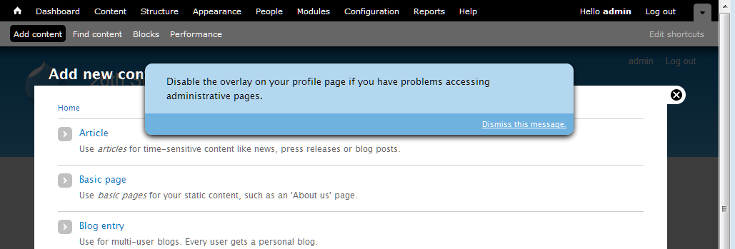
Comment #183
David_Rothstein commented@roper:
Oh, sure, I understood that - I was just pointing out that not only did I not do it, I don't know why it was done :) Whoever did come up with it should probably speak up and explain or we will just take it out...
@yoroy:
That's actually a separate bug (it exists without the patch too) - can you make a separate issue for it and link to it from here? I think I might know what's going on and have a theory for how to fix it, but better to handle separately since we have enough going on over here :)
Comment #184
yoroy commentedAgreed! #931730: Enabling 'use overlay' setting on profile page does not immediately use overlay for admin pages I suspect this is more general than this specific checkbox, but there you go :)
Comment #185
Bojhan commentedI am very wary of this direction, it is very intrusive and even more so with this patch. Is this really what we want? To me this message should not render the underlaying contents unusable - which the proposed does, this because its overlaying the actual content. Another point is that the styling and shape of this element is not found anywhere else in core, the blue color is - but using a "modal" with a bottom bar for dismissal is not a common element.
I would highly favor if we go for something far less intrusive, for example the "back to blocks admin" styling and shape we have on the blocks demo page. I see the patch already tries to use the blue, but the position and shape is the most important part.
Comment #186
Jeff Burnz commented@Bojhan -I'll keep playing around with it, it quite tricky to position this element correctly and account for toolbar/shortcuts draw states + font size - if we apply positioning to this we'll need to thoroughly test that out in case it gets hidden behind the toolbar etc etc under certain circumstances.
Comment #187
Bojhan commentedA visualization to my idea
Comment #188
pcwick commentedI recenlty installed d7-dev for a looksee. I think I would have been confused by the message "Disable the overlay on your profile page if you have problems accessing administrative pages."
From a first encounter frame of reference, I might be mumbling these questions. What is an overlay? Where is the overlay? Is this interface I'm looking at the overlay? Everytime I click on a link, I get this interface... Does that mean I'm having problems accessing the administrative pages? Is there something on the administrative pages I need that I am not getting in this interface which is going to cause me problems?
Its longer, but I think this would be more instructive.
"For alternative access to the administration pages, disable this administrative overlay on your profile page."
This might work.
"For alternative access to the administration pages, disable this overlay on your profile page."
I think "profile page" needs to be a link to the profile page.
I like the look of #187. I'm wondering how desirable and how difficult it would be to have the message appear above the administrative menu until dismissed?
Comment #189
Jeff Burnz commentedWorking on a new design patch now - #187 is mostly doable but I need to know if we want this to push the content down or live in its own layer, I think it actually looks better if the content is pushed down. The radius styles are not doable because the dismiss message can wrap when the browser width is narrow (also when the font size is very large).
IE7 nightmare report - this is a separate issue altogether - right now when you start tabbing the underlying page gets focus in IE7 (maybe IE8 also, have not tested), this is very serious issue because if you "click" (hit enter) on the skip link you will be taken to the main-content of the underlying page not the overlay page. This is an extremely bad ass situation and can someone else confirm/deny, would be so good if this is an artifact of my system.
Adding two screenshots to show it on one line and wrapping, + a pretty rough patch just for testing. I have removed the full stop on the dismiss message in these screenshots and my font-size is quite large (text re-sized up a few notches in my browser).
Note: this question of whether to push the content down or not is curcial to how this can be styled, its gets somewhat harder to achieve the "all on one line and centered" style if we want it to overlay the page.
Comment #190
yoroy commentedJeff: I reported something similar in #181: In firefox when I tab, the searchbox in the underlying bartik page gets focus :(
Comment #191
Jeff Burnz commentedyoroy - found this issue, seems to be appropriate: #841184: "Skip to main content" link doesn't work correctly in the overlay
Am I right to assume this is totally blocked by #841184 ?
Comment #192
yoroy commentedyep, let's figure out what we can do about #841184: "Skip to main content" link doesn't work correctly in the overlay first. That has to work reliably before we can use the same approach for disabling the overlay. Better figure out if that is fixable at all over there before we continue here.
Comment #193
ksenzeeLet's continue work here if possible. The skip link problem is nontrivial -- I've spent several hours on it and gotten nowhere -- but it absolutely has to be fixed. And whatever we come up with for that issue should fix the ordering problem here too. So let's get the toggle links working and styled correctly, and worry about tab order in the other issue.
Comment #195
ksenzeeBojhan: Are you 100% sure you hate the styling in #182? Remember this only appears if you're tabbing through the page and the focus is on that link. The second you click or tab outside the links, it disappears again. So it shouldn't render anything unusable at all, which AFAICT is your main concern with it.
The reason I'm leaning toward the style in #182 is that it seems a lot easier to stick in the overlay module and have it apply generically to all themes. And IMO that generic styling is more important than the seven-specific styles. Users will see this message on every page view - not just when overlay is open - so it needs to look good no matter what the theme is.
Comment #196
Jeff Burnz commentedThe #182 CSS is a lot less fragile than later iterations because it does not rely on being positioned as accurately, its just "near the top" so to speak. Later styles rely on being positioned near pixel perfect to pull off the rounded corner "reverse tab" look, and this could be fragile.
Comment #197
Bojhan commented@ksenzee I am 100% sure its too intrusive. Which is why I favor #189.
Comment #198
Jeff Burnz commentedIsn't the whole point to be intrusive at this juncture in a users journey? Whats your proposal, that we be diminutive and hope they don't miss it :P Personally I am not a huge fan of the dialog look an dprefer the reverse tab, it stands out a hell of lot in any regard.
What about pushing content down vs overlaying the content. To me it makes more sense to push it down, this feels more clean and does not obscure anything.
Comment #199
Bojhan commentedI think the blue is enough to make it stand out, its quite a unique element in terms of position, color but more importantly in terms of occurrence - it only occurs on the blocks page - making it something you rarely see thus stand out. It has to be important but not necessarily intrusive, its a small nuance but it creates a very different setting to what we design.
I am not sure I follow your last suggestion Jeff? Perhaps an example? I would love to know if the code is good to go, I am not sure why we are holding back the critical on styling.
Comment #200
Jeff Burnz commentedTry the patch in #189, that should give you pretty much what you are looking at in 189 screenshots - instead of overlaying the overlay like a dialog would, the message will take up space and thus push the entire page content down to make room for itself.
Comment #201
willmoy commentedI'll test the patch in #176 for functionality tonight.
As for the style, "nothing matters very much, and very few things matter at all," or to put it another way, I don't think think the issue should stay critical just for that.
Comment #202
Bojhan commentedWhy would you not try the last patch?
Comment #203
ksenzeeBecause the patch in #176 is the last one that actually works. The rest are add-ons for styling only.
Comment #204
Bojhan commented/me shuts up
Comment #205
willmoy commentedLol! Bogged down, but will get there in <6 hours.
Comment #206
cliffOn wording, OK with David Rothstein's wording in #176, except flip the "if" statement in front in the first bullet:
Trust me — it's clearer with the "if" before the "do." If you need more background, look for Ginny Redish's book on Writing for the Web.
And a preposition is a fine word to end a sentence with. If you think otherwise, look for and read through John McIntyre's blog for many, many screeds against that deeply ingrained grammatical falsehood.
Comment #207
Jeff Burnz commentedJust one thing - its much easier to style this is the entire sentence is a link - so the whole thing is focusable, we can't add any width/height to the containing DIV and can only do this on the anchors when they come into focus.
Comment #208
willmoy commentedScore 1: it installs against HEAD.
On IE6, Win XP: register a new user (and new users having the right permissions to see the overlay and toolbar).
- The message appears when I tab
Good news: dismiss works—
- Go to the edit my account page in main window, and change the email address slightly (but without saving)
- Click configuration on the toolbar and that loads in the overlay
- Tab through to dismiss this message
- Something happens (screen flickers, possibly reloaded) and I'm back on the overlay on the config screen, with the message saying it's been dismissed and I can change settings on the overlay page
- The message no longer appears on tabbing through
- Close the configuration page on the overlay and I'm taken back to the view my account page. The edit page is closed and the half-done change are gone. But this is what happens even if I just load the overlay and then close it again, so isn't a bug with this patch.
Good news: disable the overlay works—
- Go to the edit my account page in main window, and change the email address slightly (but without saving)
- Click configuration on the toolbar and that loads in the overlay
- Tab through to 'Disable the overlay...' and press enter
- Taken in the main window to my edit account screen. This is reloaded so that my unsaved change is lost.
- Untick the box and press save.
- Returned to the configuration page outside the overlay. There is a message saying "The changes have been saved."
- Click Home
- Click Configuration on the toolbar, and it loads outside the overlay.
Bad news: turning the overlay back on doesn't have immediate effect—
- After switching off, go into account | edit
- Select use the overlay, save
- Message saying saved
- Click configuation, opens in main window
- Click a few others, stays in main
- Click home, click account | edit, opens in overlay (I could swear it didn't used to, as the notes above say*)
- Close that and configuration opens in the overlay
* So I tried a fresh install with the patch and edit account opened in the overlay. Human error, probably?
Other questions:
1- When you are redirected to the edit account page to unclick the overlay box, whatever the underlying page was is lost. Does that matter? It would annoy me if I were, for example, halfway through editing a node. It's not critical because it's so unusual but it's certainly inelegant.
2- Small thing, but might it be a good idea to modify the account editing page to add a more specific message when it's saved so that the overlay is being disabled, saying that administration pages will no longer appear in the main window?
Other than fixing it so that turning the overlay back on works immediately I think this functionality is ok but it would be good if someone else could think about those two questions.
I haven't looked at the code at all yet.
People are welcome to create users at http://overlay2.fullfact.org/ to test for themselves. Would be good to follow the steps above in other browsers and esp. with a screen reader for usability.
Comment #209
Jeff Burnz commentedIs there actually a way to do that (am I missing something here), if the Overlay is enabled then it gets used for adding/editing content always doesn't it?
Comment #210
David_Rothstein commentedThat was already discussed (see @yoroy's reviews above) and is a separate issue at #931730: Enabling 'use overlay' setting on profile page does not immediately use overlay for admin pages
Comment #211
David_Rothstein commentedI believe the idea of not using the overlay in that case was that the person who is clicking that link is doing so in order to disable the overlay (likely for accessibility reasons) so it would be bad to make them go into the overlay to do it :)
An alternative would be to have them able to disable it without actually visiting the profile page, but I believe the discussion above concluded it was better to take them to the actual place in the UI where the overlay setting lives.
Comment #212
effulgentsia commentedI just spent a couple hours reading some of this issue's history, and referenced issues. I will spend some time next week trying to help keep this moving.
@David_Rothstein: since #176 is your patch, and from what I can tell, the latest functional one, do you want to re-roll it to include feedback since then, or do you feel that's still the important one to be reviewing?
Comment #213
David_Rothstein commentedHere's a reroll of #176 with the following changes:
Still to do:
Comment #214
Bojhan commentedI think Jeff and me agreed upon #189 just need to clean up some bugs that accompany such style.
Comment #215
Jeff Burnz commentedI'm happy with 189, be good if someone else wants to drive that forward, I am very busy the next few weeks.
Comment #216
effulgentsia commentedThanks. I'll re-roll #213 with #189, and post a new summary of the issue (building on the excellent summaries already here, like #150).
Question: Why is it necessary/desired for the message/link to become visible on focus? As I understand the issue, the message/link is for screen reader users using legacy/lame screen readers that are unable to handle any kind of modal dialog. Does the message benefit anyone who is able to see the screen? Sure, people who can see might want to disable the overlay just because they don't like it, and they can do that by disabling the module or by going to their account profile. That's not what this issue is about though. This issue is about addressing the problem that people using some screen readers cannot do that, since both of those steps involve using the overlay by default, so it's a catch-22. The message/link is there to:
1. Notify someone that there might be content that's not being read to them.
2. Give someone a way to edit their account settings outside of the overlay.
So, again, this message must be audible, but why does it ever need to become visible? Just wondering what the motivation is for figuring out how to style it.
Comment #217
David_Rothstein commentedI am not the best person to answer, but my understanding is that because the link is focusable, a keyboard user will automatically "land" on it when tabbing through the page.
If they land on it but we don't make it visible, then they have the experience of having hit the tab key but not seeing focus on anything on the screen. Someone described this in another issue as "tabbing into a black hole". Basically they would have to hit tab again (actually, in our case, two more times, since there are two links) in order to move on to the next visible, focusable element on the screen, and that could be a confusing experience.
So basically, showing it to them is a lesser-of-two-evils kind of situation.
Comment #218
Everett Zufelt commented@effulgentsia
The only thing I would add to David's explanation is that there * may * be some keyboard oly users who for some reason (user agent) might not be able to properly use Overlay. This will provided the added benefit to them of an easy path to disable for their account.
I can't necessarily point to users or UAs that might result in this being a problem, but since there has been practically no usability testing of this UI component with keyboard only users it is likely better to err on the side of caution.
Comment #219
effulgentsia commentedThis is just a straight combo of #213 and #189. Review coming in next comment.
Comment #220
effulgentsia commentedOverall, I think the patch has come a long way. It feels like we're getting close to consensus, and a genuine solution to the accessibility problem without sacrificing usability. Here's some problems I found in my testing:
display:nonefor no js? If so, what's the best practice way of doing that? We have a html.js selector, but no html.no-js selector.Also:
I don't understand the code comment. What's an "accessibility wrapper" and why do I want to show all focusable links in it? Perhaps something like: "There are two links within the message that informs people about the overlay and how to disable it. Make sure both links are visible when either one has focus."
See above.
Finally, the changes to Seven's style.css look pretty extensive. But all site pages (including the home page) can be an overlay parent. So that means Bartik, Garland, and all contrib themes are gonna have to do something similar? Yikes! See also #639460: Evaluate CSS of #skip-link, .element-focusable, and upcoming "disable overlay" links for their impact on contrib/custom themes, where I'm worried about that same problem existing for the "Skip to main content" link. Is there any way to put more into core CSS files, and require less theme-specific rules to make a "visible on focus" link visible and legible?
Comment #221
yoroy commentedThanks for the review. I don't have answers but I can tell this needs work :)
Comment #222
effulgentsia commentedThis includes code to address my concerns from #220 regarding anonymous and no-js access. I don't know if the CSS code added to overlay-parent.css is any good, so please feel free to change that.
Regarding the last paragraph in #220, I escalated #639460: Evaluate CSS of #skip-link, .element-focusable, and upcoming "disable overlay" links for their impact on contrib/custom themes to critical.
See #213 about remaining todos regarding bike-shedding the text. On the one hand, perhaps that's not critical. On the other hand, we need to freeze strings in RC1, so maybe it is.
Comment #223
Bojhan commentedI dont think we need to change the text anymore its good + people stop calling it bikeshedding.
Comment #224
babbage commentedOne minor suggested improvement to the text (despite #223):
The previous text was ambiguous in that it could be interpreted that the overlay was "on your profile page" when in fact it was the control to disable it that was on that page... Using "from" instead of "on" eliminates this minor potential confusion and does not lose any of the previously intended meaning.
Comment #225
yoroy commentedThe CSS introduces loss of spacing above the page title:
Before:

After:

Testing in Safari 5 I have focus in underlying Bartik when in overlay. I do get to the message in overlay in Seven eventually, but that's 21 tabs for skip to content and 22 for this dismissal.
Chrome works immediately. Nice. The overal workflow feels pretty good.
Actually dismissing the message works fine in both browsers.
I can't tab through anything in Firefox, but that may well be me.
FF, Safari, Chroe all show the missing top margin for the page title.
We're not changing the text at this point.
@todo:
- Needs CSS review and work on the title margin
- Needs review of functionality in Firefox and Safari (and IE!)
Comment #226
yoroy commentedEffulgentsia in #222 asks for someone else to improve the CSS part of the patch: needs work for that
Comment #227
yoroy commentedWhatever helps to get the right folks in here :)
Comment #228
effulgentsia commentedNice CSS simplification was achieved for #skip-link in #639460-60: Evaluate CSS of #skip-link, .element-focusable, and upcoming "disable overlay" links for their impact on contrib/custom themes. It would be awesome if someone could see whether something similar could be done for the CSS in this patch, as well as also implement the necessary CSS for Bartik and Garland (#222 contains only CSS for Seven, but all themes can contain the new links added by this issue). Again, we need to make sure to not overwhelm contrib theme developers with an "OMG: I need to implement several dozen lines of complicated CSS, or else my theme isn't accessible" first impression of Drupal 7. To the extent that theme CSS in #222 is just about making it look good, we're fine. But to the extent there's rules that are required for it to be accessible, let's make sure we move those to system files.
Also #841184: "Skip to main content" link doesn't work correctly in the overlay is now RTBC, so we're really quite close on this.
Comment #229
Jeff Burnz commentedYes, I think this should definitely work out of the box (be usable) without themers having to do any work at all - and right now a lot of the usability is tied up in the CSS for Seven (because this was prototyping, but it should not get committed like that).
Comment #230
ksenzeeI tried pulling the CSS out of Seven and into overlay-parent.css, and I was totally unsuccessful. So we could use a CSS wiz here.
Comment #231
james.elliott commented@ksenzee The hide overlay link that you see when you first tab is the one rendered inside the overlay. So overlay-child.css is the file that the styles should go into. overlay-parent.css stylings don't pass through the iframe insulation to the contained.
I'm going to take a stab at this and should have a patch up shortly.
Comment #232
ksenzeeJames, don't we need to style the hide overlay link on the parent page as well? (Of course, that one can be below the toolbar... blech.)
Comment #233
Jeff Burnz commentedI think a relevant question here for the UX team is - do we consider this a type of "core message", in which case it may be legitimate to apply heavy styling like other core messages.
We can go two ways on this - minimal styles in core, just enough to make it usable i.e. probably just a link color, (e.g. white) + hover/focus style (probably underlined), OR treat like a core message and give it everything so in effect themers would do nothing.
Given a choice, as a themer, I'd punt for the latter and treat it like a core message - I just don't want to theme admin stuff anymore in my themes unless I am specifically building an admin theme (in which case I can still override it if I feel the need to, which I doubt I would anyway).
Comment #234
james.elliott commentedHere is my patch. I think I've addressed all the remaining issues. Any concerns about the specifics to how I handled the core themes should probably be filed as bugs against those themes and outside the scope of this critical issue.
I've not done any cross browser testing other than Chrome, FF 3.6, and IE9 that I always have open on my dev system. So testing is still required.
Comment #235
ksenzeeThis looks super to me, but I defer to the CSS experts. I would love to get Jacine's input on whether there should be some default styling in core. I tend to agree with Jeff that this should be styled by default. If you don't use the keyboard you might not even know these links exist, let alone be moved to style them. But since we're trying to do as little default styling in core as possible, it would be great to hear from more themers.
And I'm still really confused about James's #3. If you just go to the homepage (while logged in as an admin) and start tabbing, you should see these two toggle links appear right after you leave the skip link - even when the overlay isn't open yet. Don't we need to style that as well?
Comment #236
james.elliott commentedThis is my DOM structure on the home page
http://www.screencast.com/users/james.elliott/folders/Jing/media/906dcb3...
There is no disable overlay link there. Am I trying to work off an outdated patch?
Comment #237
jacineThe patch no longer applies, probably since #639460: Evaluate CSS of #skip-link, .element-focusable, and upcoming "disable overlay" links for their impact on contrib/custom themes was committed. I think I managed to apply it correctly though.
Okay, you asked :)
I was expecting to actually see a message, not for it to be hidden. Once I saw it, I was surprised because it looks really messy in general. I'm really not a fan of this as hidden text. We are literally scattering easter eggs throughout Drupal. I don't understand why we are going out of our way to hide this, instead of just making it a regular message, but 236 comments into the issue, I'll just say that once and move on to what I was called here for (sorry, had to say it).
I absolutely agree 100% this needs to be styled. I don't think it needs to be heavily styled though, and it should not try to mimic a skip-link because it's purpose is completely different. Why are we not just letting this
<div>just stack underneath the toolbar (or at the top of the page when there is no toolbar), and setting a background and foreground color? I think we are really overcomplicating this.Here's a review of the latest patch:
whitespace.
Both are users. How about: "Hide the message about displaying the overlay from all users..."
Also, I really don't see the point of any of the border-radius properties. I can barely see any difference and I think it just makes it messier looking.
Powered by Dreditor.
Comment #238
Everett Zufelt commentedAgreed. If you have CSS enabled and are a keyboard only user you might not find this message. if you don't use the keyboard you almost certainly will not see the message (not that this is really that big of a problem).
Comment #239
Jeff Burnz commentedIn #189 we stepped away from skip link styling to use the blue color used for the block region demonstration page link. With the blue style the border radius will make a lot more sense than it does now.
My personal preference is for the message to push the page content down rather than sit in its own layer on top.
Don't think it makes a lot of difference in this situation to use keyword font sizing or ems, keyword has the distinct advantage of locking the relativity to the browser default as opposed to relying on the theme.
The min-width is set to 700px - how does that par with Overlays overall min-width?
Need a re-roll.
Comment #240
jacineI like consistency and this isn't inconsistent. The patch also sets "small" in some themes and ems in another. I don't really see why relativity to the browser default is more important in this case than with anything else, but it's a pretty minor issue in the scheme of things, so I'll stop complaining about it. :)
So... I think most of us agree that default styling should exist for this, so I suggest we take the "Stark" approach first and have the themes adapt from there.
'#prefix' => '<div id="overlay-disable-message"><h3 class="element-invisible">' . t('Options for the administrative overlay') . '</h3>',Not sure why this isn't in a theme function, but can we get a class to style against for this that tells us it's focused? We can't easily style the container, i.e. adding padding or borders, without introducing visible issues otherwise. I tried adding a class in the code below, but it doesn't work inside the overlay:
Any ideas? :(
Also, this is not desirable:
'#title' => ' ' . t('Dismiss this message.'),If you choose to style the links with text-decoration: underline, the space looks abnormal (see screenshot). If the space is removed the links are just on top of each other. That space should be added to #prefix, so this doesn't happen:
Comment #241
Everett Zufelt commented#841184-55: "Skip to main content" link doesn't work correctly in the overlay explains that it will likely be desirable for some keyboard only users to disable the Overlay (IE6 / IE7). Right now the ability to do this is on their Account edit page, or invisible in the Overlay (made visible on focus). We're asking people to hopefully find something that is an Easter egg to do what they need to do.
Now, we have done our best to put the links in the best possible place in the DOM, so that it is most easily discoverable, like hiding the Easter egg in a really easy place to find. But, let's not forget it is still hidden.
Edit: Although I have always wanted (as much as I recall) this message to be visible, I was content about it's being hidden, because we were unaware of issues for keyboard only users at that time. This is no longer the case. The purpose behind element-inivisible.element-focusable is * not * to display content to keyboard only users, it is a method of making sure that the focus doesn't get lost in a focus black hole. If there is content that a sighted keyboard only user may need (like the 'show row weights' link on table drag) it needs to be visible.
Comment #242
Jeff Burnz commentedCan someone summarize why showing this would be preferable and why showing this would be helpful, I am not clear why this would be the case. I can see this scenario - keyboard user is having many troubles (say IE7 user), they can see this message so keep tabbing in order to get to it, which will happen eventually?
Comment #243
jacineAssigning to myself. I figured out the problem JS I was having, so I'm working on a patch.
PS - The current approach (hiding the text on every page) is really growing on me. It provides an opportunity to solve what I consider to be a very annoying issue, which is that the Overlay is completely useless for administering Drupal on iPad/iPhone, and other mobile devices, etc. Using media queries, and overlay classes, it's actually really easy to show this message under very specific circumstances. That makes me happy.
Comment #244
ksenzeeI think hiding this message for mouse-only users - and possibly showing it on touch-screen devices, as Jacine suggests - is going to serve everyone well, no matter what their circumstances. I have tried and tried to think of accessibility concerns we haven't addressed that will keep sighted admins from using the overlay easily, and outside the touch-screen issue, I can't come up with a single one. Cognitive impairments, limited mobility, color blindness, seizures, low-literacy sighted screenreader users, attention deficit, low-vision high-contrast environments, keyboard-only, mouse-only, mouse+keyboard combination -- none of it should be a problem. If you can see the screen at all, and you're using a browser from anytime this century, you will be fine. Either the overlay will work for you, or it will be patently obvious how to turn it off. For example, some keyboard users will find it inconvenient to use the overlay with IE6 and IE7. Not impossible, mind you; just inconvenient. Those users will see this message loud and clear at the top of every single page.
So I beg you all, please, pretty please, let's not revisit the question of whether these toggle links should be shown to mouse users. We're almost done with a patch that I believe will serve everyone's needs. And when it's done, we'll have finished every single critical issue, and we can release this amazing piece of software.
Comment #245
mark trappThe overlay works fine on an iPad/iPhone/iPod Touch (and, likely, Android) with the patch in #878020-15: position:fixed prevents iOS devices from scrolling the Overlay. Displaying the message for them is really not necessary at all.
Comment #246
Jeff Burnz commentedI agree with #244 quite strongly, I also have thought long and hard about this which is why I asked for good arguments as to why this is being raised again (showing the message by default). I can't see any real benefit, on the other hand showing this would add cognitive load to all users and be one more thing in the way of getting on with using Drupal. So I would ask also, no bikeshed on this please, lets get on with it and IF over the course of D7 this becomes an issue for some unknown/unforeseen reason then we revisit it in D8, otherwise this is looking good to go bar the shouting over style.
@Jacine - I just now realized why I used small font keyword (I was racking my brain as to why I would not just use ems), it was because the block region demo page link uses small, and I largely cut/paste the styles when I was prototyping.
@240 - this would be hugely helpful for styling these messages, any takers?
Comment #247
Everett Zufelt commentedFor example, some keyboard users will find it inconvenient to use the overlay with IE6 and IE7. Not impossible, mind you; just inconvenient. Those users will see this message loud and clear at the top of every single page.
Do we have * any * sighted keyboard only users in the community who can test this preposition?
Comment #248
jacineOk, Here's a patch and a gazillion screenshots.
I took direction from the screenshots posted above for the default styling. The structure is pretty much the same inside and outside the overlay. The main difference is that inside the overlay it's constrained to 80%. I added wrapper divs to the markup and styled it like a 2-column layout (80% for the profile link, 20% for the dismiss link). Since it's fluid, it works nicely when the window is resized and should work fine for translation. I took screenshots of most browsers where it's wrapping to demonstrate this. In case it's not obvious, when the browser is wider, no wrapping occurs. I also added a class to the wrapper in the JS when links are focused indicating that, because it was need in order to add certain styles, like padding, to the links inside without affecting the page while hidden.
Semi-unrelated, but fixed in this patch, is the following:
In Stark, for example there are user agent margins being applied to the body (8px). This was being inherited in the overlay, and causing a vertical scroll and the toolbar with to be off.
Other oddities, unrelated to this patch, but worth noting for testers:
- In Seven, in IE6 and IE7, the #skip-link div is causing an extra space at the top, so in the screenshots it's not flushed with the toolbar.
- In Garland (when it's set to the admin and user-facing theme), in IE6, I cannot get the overlay to load.
After having done this, and seeing what these colors look like with all the themes, I'm thinking it's probably be best to leave those colors to the themes to deal with entirely. As of right now, all the non-structrual styles are in system.theme.css. I'm not too keen on them being in there, but I suspect that they will end up in themes, and it beats having to put them in overlay-parent.css and overlay-child.css twice, or having to create another CSS file just for this. This is less of a big deal ATM, those can always be moved around and the theme-specific styling can be done in follow-up issues, as long as we are all good with the rest of it.
Please review :)
Comment #249
jacineOops, forgot the patch :P
Comment #250
coderintherye commentedWell this is pretty big, so I think it will take a few reviewers. I can say that the patch applies cleanly for me on a fresh D7-dev and that I get the behavior of providing the link to disable overlay, as well as the link to dismiss the message, both in hidden divs. I get the divs as expected on Chrome 7.0.517.41 Beta and Firefox 3.6 on Ubuntu 9.x in Bartik and Seven and they both appear as would be expected when tabbing. Patch also runs cleanly through Coder.
Hopefully, I can do some more thorough reviewing tomorrow or others can come in and add their voice. I do agree that we shouldn't bikeshed this issue, and the current behavior is very good.
Comment #251
Bojhan commentedFrom a UX perspective it seems good, it might not look exactly like it did before (not sure why it doesn't) in #189. But that shouldn't hold it up at all from being committed. If we can get a markup review, which is good I think we are ready to roll this in.
Comment #252
plachJust gave a quick look to the patch and noticed some trailing whitespaces.
Powered by Dreditor.
Comment #253
jacineOk, I did not realize that the design in #189 was decided upon. It definitely wasn't clear at all from that first patch I tested here, and I guess I got a little lost in this huge issue. Sorry about that.
Here are my issues with #189:
I don't like the "Dismiss this message" button-style link in #189 as a default style. It requires too much special-casing to style. Both Seven and Bartik already provide button styles for links using the class
.button. This is a pretty common thing to do in a theme. I see no good reason not to use that class here. If themes provide styles for.button, they'll get the added bonus of it matching out of the box. If not, they'll just get an unstyled link, that will match the links in their theme, which seems fine to me.@Bojhan expressed a concern (in IRC) that this might confuse users because it triggers a form submit mental model that isn't appropriate in this case. I don't necessarily agree with this because of what these 2 links actually do:
As far as I'm concerned #2 looks like a button in #189, and qualifies to actually be a button based on what it does, so I see no need to special case another color button in here that will definitely not match most themes.
That said, Seven is free to special-case this...
This brings me back to the colors and them not matching outside of Seven. While I think default styling should be provided, I think it should be minimal (i.e. just structure). If not, we end up doing more damage than good IMO.
Here's what the new patch does:
<div>that floats the first link left and the second link right.<div>gets a class called.overlay-disable-message-focusedwhich is applied via JavaScript when either of the links are focused. This allows the contents of the container to be styled freely without affecting the page while invisible..buttonclass that is already styled in both Bartik and Seven already.In short, it's #189 without the colors and with the "dismiss" message using the
.buttonclass instead of special casing it.How it will be dealt with by themes:
This is not my domain, but I'd also recommend going with a much lighter blue for Seven that better matches the other Drupal messages and allows the link to stay it's default color, instead of black because it looks kinda odd to me.
I'm much happier with this approach from a "Markup/CSS" standpoint. I've attached a few screenshots of what this looks like across themes. I'd appreciate feedback on this (yay or nay, with alternative suggestions) before taking a gazillion (cross-browser) screenshots again, because it takes a really long time to do.
Comment #254
Jeff Burnz commentedHaving themes style this message is rather inconsistent with other messages in core - all warning, error, OK, status reports, block demo link etc etc have core styling and do not rely on the theme. This enforces a consistent UX and frees themers from the tyranny of having to account for back-end stuff. I'm not entirely thrilled we now have to special case for this one system message.
From a usability standpoint I am interested to hear the thinking behind showing these messages outside of the overlay when no overlay page is loaded - this seems rather odd because if I have not used the admin section / overlay then I have no real idea what this means. I did test this on some willing dinner party guests and mostly they shrugged shoulders and moved on (they were able to "muddle through") so maybe not a big deal?
Hitting "Dismiss this message" gave me a 404 error (Seven as admin, Garland as front end theme) - because of this I can't really comment about the "button mental model" concerns, although theoretically I would tend to agree with Bojhan.
Bartik appears to be hiding the skip link in Overlay causing all sorts of hilarity, need to look at that more and open a new issue for Bartik.
Comment #255
Everett Zufelt commentedFrom a usability standpoint I am interested to hear the thinking behind showing these messages outside of the overlay when no overlay page is loaded
I don't really see a need to show the message if the overlay is not in use. That being said, I think it is important to have the message at the top of the DOM and of the Overlay segment of the DOM so that when a UA / AT doesn't properly follow focus the message is still reasonably (?) easy to discover.
Comment #256
Jeff Burnz commentedYes, that is what I thought, but only when an overlay page is actually loaded, not all the time.
Comment #257
Everett Zufelt commentedYes, that is what I thought, but only when an overlay page is actually loaded, not all the time.
Agreed.
Comment #258
jacineThis is not like the other core messages:
drupal_set_message(). Applying.messageswould likely introduce unwanted margins and padding, icons, etc.drupal_set_message(). It's not unreasonable to assume the.messagestyling totally depends on it's container which is totally different in this case.My main concern is throwing in all sorts of colors on this thing, that will not usually match, and that most themes will need to worry about undoing. It's very clear to me that the proposed design does not look good in all the core themes, and what happens when someone does a theme that has a scheme with deep reds or blue colors? Do you think this pastel blue color is going to work? The worst part is that most themers will never even figure out that it exists.
I'm fine with the way it is in Stark, with this patch, TBH. It has structure and it will inherit my theme's font and link colors. I think that is just fine. No need for my themes to special-case anything. IMO this really does not need to be a Christmas tree with all sorts of flaming colors. It's really not that complicated.
If you don't like what I'm suggesting, can you please suggest something else that takes the concerns I've raised into account? I was asked to come here and provide my input and try to help, and I'm trying, but I really don't know where to go from here.
Comment #259
David_Rothstein commentedJacine's approach (and implementation in the patch) makes a lot of sense to me. The main reason we're providing default visual stying for this message is to make sure it's readable, and to prevent it from being so ugly that it's insulting. But for a message that only a very small percentage of users will ever see (and most of whom will dismiss it soon after seeing it), it's not worth delaying this too long over the visual styling, and it's better to sacrifice a little beauty for a more robust implementation that is likely to be automatically functional across all themes.
That said, looking at the screenshots I am noticing a nitpicking thing which is that the message and "dismiss button" don't seem to be vertically aligned in Bartik or Seven. Just sayin' :)
Also, relying on the "button" styling is a little bit of a hack (is
class="button"ever even output by a theme function in core??) but I guess if core themes already have styling for it they are already assuming it as a convention for whatever reason.Agreed that would be a lot better for usability. I am guessing that to implement this without opening up a new rathole, we would need to still always output it in the DOM, but have it be
display: noneby default when the overlay is not open, but then opening the overlay causes that to be removed from the parent window.Agreed with the review above that we should do this via a #theme_wrapper function instead.
I am not sure what the #prefix accomplishes here?
Screen readers are software programs, not users, so I assume that was the reason for referring to them separately in the original code comment. But I agree that simply saying "all users" is a lot better :)
Comment #260
Jeff Burnz commented@258/@259 ok I'm not going to argue here for the sake of moving on. The style does need work to align things better.
If we can remove the message from the DOM when outside the overlay with display:none; that would at least removes the wtf. I assume we need a little JS magic to insert a class.
Right now the biggest problem seems to be the 404 for the "Dismiss this message" link.
Comment #261
effulgentsia commentedWorking on some of the feedback above. Will post new patch soon.
Comment #262
effulgentsia commentedThis patch adds a theme function to separate the functionality of overlay_dismiss_message() from its markup. Because of this, it also removes the leading "_" from that function name.
It also changes the CSS in overlay-parent.css to use html.overlay-open instead of html.js to undo the "display:none". This also removes the need for the inline comments, since it's now obvious what the purpose of that is. This should be tested with screen readers, IE6, IE7, and modern browsers to see if it has the desired effect of hiding the parent document's message until the overlay is in-use, while still making it accessible when the overlay is in use (accessible both to screen readers and to keyboard tabbing).
I couldn't reproduce that. I think you just need to empty your Drupal cache after applying the patch.
The setupDrawer() function in dashboard.js adds a "button" class to a link. Therefore, I see no problem in theme_overlay_disable_message() doing so. If we think it's good UI for the link to look like a button, I think this is the correct way to do it. I leave it to others to decide if this is good UI, but it makes sense to me, since it is an action link rather than a resource link.
Comment #263
jacine@David_Rothstein, thanks for the feedback :)
In my experience, call to action buttons often look the same as form submit buttons, so I style this class and add it wherever it needs to be (more buttons, etc). That's basically the convention in a nutshell.
It prevents this happening, as I mentioned in #240. Although, @effulgentsia's latest patch makes fixing this easier. :)
We don't need an extra class for this. It would actually work just fine with the classes we've got now.
Comment #264
coderintherye commentedI also cannot reproduce the 404 on "Dismiss this message" claimed in #254, on both patches in #248 and #262.
@Jeff: Can you give the steps to reproduce? (After clearing your cache)
If we can't reproduce the 404, can we get some consensus on what needs to happen for a pass here? For what it's worth, the patch applied cleanly for me, but I'm not sure from the above what needs to be accomplished concerning theming/UI/design before this gets a pass.
Comment #265
effulgentsia commentedTo summarize #262:
html.overlay-open #overlay-disable-message {display: block;}rule kicks in, making the links in the parent frame (theoretically) available to screen readers and tabbing. Plus, the contents of the overlay includes another copy of those links.Based on the above, I have three questions (probably for Everett or someone else familiar with the quirks of different screen readers):
Comment #266
effulgentsia commentedCopying Everett's statement from #255, that is I think relevant to #265, I'm just not sure how:
Comment #267
jacineHere's an updated patch that does the following:
Removes the CSS that applies visual styles in overlay-parent.css, since this will always be hidden and doesn't need styling.Screenshots of the fixed alignment issue also attached.
EDIT: Whoa, I was previewing and did not submit the form. Hmm.
Comment #268
jacineOk, that was totally weird, and scary. I didn't submit that comment. I was only previewing. :s
Anyway, the patch does not remove the styling from overlay-parent.css as I mentioned in the first bullet. I'm still not clear whether that needs to exist or not based on @effulgentsia's summary in #265 and #266.
So, the patch does only this:
Comment #269
jacineMeh, adding the tags back. Sorry for the SPAM.
Comment #270
Bojhan commentedI still don't get the whole design argument on the button (honestly, I don't care at all - I just want D7 out already) but your argument is basically :
1) I don't want to special case it.
2) It might not look good in other themes.
3) Its technically a button.
All of which are technical arguments, not actually design arguments. 1) To me this is a non-argument, because we are already special casing it - would just mean one extra element. 2) We can't help it if people don't style something like this. It not matching with other theme headers is of little concern to me, the same applies to the toolbar which doesn't work well on darker headers. 3) The user does not care what it technically is, if it confuses him/her.
You cannot convince me that from a design perspective this is good, people do not see this as a "button" in the Drupal context (the smashing web article, is not applicable in this context) and will therefor be somewhat thrown off by it showing up like this. Whenever I read something like "sacrificing beauty" for something else, those two words already tell us we are doing it wrong :)
Anyways from a usability perspective, this does not make sense. But I honestly don't really care, if we get to something that looks technically oke - we should just push for commit.
Comment #271
Jeff Burnz commented+1 to what Bojhan said, yeah the button really looks odd in this context, there's no real special casing argument here either, with the button it's being special cased as it is (positioning), the difference in CSS is negligible, its likely a .button class will always need special casing because its not a real input element and not in a form (with the form element wrappers), imo the fact that its NOT an input or button element should raise a flag.
Comment #272
jacineWhatever. Fine I will remove the gray button and give you a blue button for Seven.
It was just a suggestion to avoid adding a completely new design element that does not exist anywhere else in Seven, therefore is not consistent with anything, for a simple one-off message at the 11th hour of the Drupal 7 cycle. It clearly looks and acts like a button to me in #189, but no one else's opinion actually matters...
Standby for a new patch.
Comment #273
jacineHere you go.
Comment #274
Everett Zufelt commented• Does this work for screen readers? If we only show the links when the overlay is open, I don't fully understand why we have them in the parent document at all. Whatever that reason is, is this use of keeping the parent one's "display:none", followed by CSS that sets "display:block" only once the overlay
is opened compatible with it?
The point, perhaps a bad call on my part, is to help users be closer to the links when their UA / AT doesn't properly follow the focus being set to the iframe / Overlay child. AFAIK this will work for screen-readers.
• Is the fact that we have JS code setting tabindex=-1 for the parent dom's links if the user is on a modern browsers a problem, with respect to the above? Some screen readers skip over links with tabindex of -1, do they not? Or is it ok, because these same screen readers will find the ones that are in the overlay's dom?
Screen-readers will skip links with tabindex -1, but only when tabbing. Keep in mind that most (AFAIK) screen-reader users don't tab through a web page, they use other reading commands. Again, having the message in the parent is only a hack to assist users when focus is not properly set to the Overlay child.
• Should we also set tabindex=-1 for the parent dom's links in IE6/IE7 too, to match the other browsers? For performance reasons, we can't do this for EVERY link in the parent dom, but we can do it for these two. If we do so, then we don't need to worry about any styling within overlay-parent.css, and it also means that themes not intended to be used as administrative themes wouldn't need to worry bout any styling for these links, since only the ones inside
the overlay would ever be visible. But, would this make these links less accessible to the very users who will likely need them?
Possibly, once again, they are there in case focus isn't properly set to the Overlay child. So, if this happens to a keyboard only user it might be helpful.
Comment #275
effulgentsia commentedThanks for #274. I'll post another patch soon, based on that feedback.
Comment #276
effulgentsia commentedThis is #273, but modified to make the parent document's message unreachable by tabbing in IE6/IE7 as well. See #265 for more details. I think this significantly improves the experience for theme developers, because it just gives them one message to style, rather than a second one that is only visible in IE6/IE7, and it also means this message is only visible when the theme is an admin theme, which means custom themes for a single site don't have to worry about it at all.
Based on #274, this seems acceptable, since the purpose of the parent document's message is for screen-reader users navigating the document with screen-reader commands that don't follow tab order.
I don't think this is a problem. Even on IE6/IE7, focus begins in this overlay, so the message in the child will be seen early in the tab cycle. The problem in those browsers is just that after tabbing all of overlay and then the toolbar, instead of cycling back into the overlay, you keep tabbing through all of the parent document. It is at this point, that an IE6/IE7 keyboard-only user will probably:
1) wonder what's up
2) hopefully, remember reading the message that if they're having problems with the overlay, then can disable it
3) hit the browser refresh button (at least that's what i do when i'm on a web page that isn't doing what i think it should be)
4) start hitting tab, and see the message again, and maybe this time, follow the link to disable the overlay
Of course, the above is just a guess. Any real feedback from screen-reader users and keyboard-only users on this patch would be greatly appreciated.
Comment #277
effulgentsia commentedBack to the community.
Comment #278
Everett Zufelt commentedPatch in #276 sounds reasonable to me.
Related, how does a keyboard only user get to the toolbar from where they land in the Overlay child? The real question is is it apparent how they get to the toolbar, does it make sense? Not looking for a long discussion to derail the issue. If there is a problem I'll open a new bug.
Comment #279
james.elliott commented@Everett Zufelt: You can tab to the toolbar from the overlay child as you would normally.
Regarding the patch. I have 2 minor issues. Well, 1 minor issue that occurs twice. CSS attributes need to be in alphabetically order.
and
I rerolled effulgentsia's patch from #276 and only changed the order of those attributes.
I'm also confused as to why we're adding the link to the parent frame and giving it display: none; Why add the links there at all?
Comment #280
KeithH commentedThe patch seems to work pretty well for me.
I'm using IE 8 if that helps, using JAWS for Windows primarily for testing.
Also as for getting to the admin toolbar it is a heading at level 2 so I just hit h once after logging in and I'm at that heading.
An alturnitive option is to press control-f, type the word toolbar or ever the word "tool" without quotes, and press enter.
That's another way to get there.
Seems extremely clear to me personally how to get to the toolbar.
As for someone that's sighted, they probably drag the mouse and such.
Now if you're just a keyboard-only user without a screen reader program, I have no idea honestly how you might get to the toolbar other than control-f in IE, and finding the text "toolbar" or something.
Any comments on this are appreciated.
Comment #281
KeithH commentedBy the way, what is the point of this "link placement" discussion?
The longer you developers gripe amungst yourselves the longer you stop the closing of this outstanding bug issue in my personal opinion and thus, keep Drupal 7 on the backburner from finally becoming an RC in the near future (hopefully).
How long are you folks going to continue to argue about the link being in the parent document, and such?
I don't know how many times I've seen similar comments.
Figured I'd just give my two sence here.
In my opinion, you might as well go with what you have. If something doesn't work, you could always update the module later. Once again, that's just my thoughts on this. Sure does not seem like productive development going on here.
Is this some visual issue as far as the link being in the parent document? As for the display none functionality, I thought that was to help screen readers focus the link?
Thanks.
Comment #282
boombatower commentedMuch agree with #281, lets get something in...then we can unblock release candidate and you can always fix during RC or even after actual release. For those who need to wait for this they can use the tried and true tabs that are implemented in virtually ever browser to keep the page they were on while they do administration...lets worry about something else.
Comment #283
jacineThe patch in #279 is ready as far as I'm concerned.
Comment #284
Andy B commentedI use JAWS for Windows 12. I haven't applied any of the patches in this thread, nor have I closely followed it. My question(s) are these:
What exactly does the supposed close overlay link/button supposed to actually do? Does it close the inaccessible version of the overlay and keep the html version open? or does it close the admin pane altogether?
Here is my experience with the overlay:
1. Go to drupal7 beta 2 install and sign in as superuser (user 0).
2. Go to an admin page. admin/build/modules will work.
3. The modules list/admin section opens in a frame (from the current layout, I would think on the bottom of the window?). Can't see, but that's the impression I get based on its placement in the code.
4. The content inside this frame is already accessible. Why mess with the overlay?
5. There is a link that is called "close overlay". When I press enter on it, it closes the frame the modules list was in and returns me to the home page from what it looks like. Since "close overlay" is quite confusing, isn't there a better title for it? Wouldn't be so bad if "close the door..." and "open the door..." (whatever that is?) were removed (or at least called something else). Any ideas? or am I just blowing steam off the wall here?
Comment #285
james.elliott commented@Andy B
This patch adds two links near the top of the tab index when the overlay is opened. These links allow you to either dismiss the links, or to access your user profile page where you can disable usage of the overlay.
Disabling the overlay would mean that a user would see administration pages on their own, as opposed to loaded into an iframe that is positioned in front of a non-admin page.
The "close overlay" link that you mention removes said iframe from the page, leaving you with the underlying non-admin page.
Comment #286
Jeff Burnz commented@Andy B - I'll let Everett comment more here but it looks like Jaws 12 for Windows is working in the Overlay, but as I understand earlier versions and other screen reader software does not, so that is the main reason for the disable overlay links.
Comment #287
ksenzeeI've just filed an issue about the "Close the drawer" text, which is very confusing for screen reader users: #961292: "Close the drawer" needs a better title for screen readers
Comment #288
Andy B commentedOk. So from what I understand:
1. The patch listed a few comments back will add links to disable the overlay and/or just close it. Is the patch going to be applied to D7-dev soon?
2. Older versions of JAWS (earlier than 12) wont work with the overlay very well. So either upgrade to a newer version of JAWS (12) or/and disable the overlay.
Another question, is the overlay available to anonymous users? If so, do they have a way of turning it off as well?
Comment #289
effulgentsia commentedThis issue is close, but is not yet sufficiently tested to be RTBC. I'm going to summarize everything the latest patch does and why (for people who don't want to read 288 comments to know what's going on), and ksenzee is doing functional testing across screen-readers and browsers. If those tests are all successful, she'll RTBC. Otherwise, she'll indicate what's still needed.
Comment #290
David_Rothstein commentedAgreed, this patch is very close but there is no reason to rush it at the end. This issue certainly isn't blocking a release candidate, especially not when webchick has already said there will be at least one more beta before the RC is even considered.
I'm not totally sure I understand what happened between #268 and #273.... I think I might test this out on some real themes to see the difference.
A couple small things looking at the code again:
Please, lord, let's not link to this 300-comment issue in the codebase :)
I'm not sure we have to link to anything here, but if we do, seems like #890284: Unauthenticated users cannot disable Overlay might be a more directly relevant issue.
Why are we using an array for #theme? It works, I know, but seems non-standard to do that when it is only expected to have one element.
Comment #291
effulgentsia commentedThanks, David. I'll fix those two, and include a new patch, when I post the summary.
Comment #292
jacineIt was made clear to me that:
.buttonclass is just not wanted.So...
.buttonclass.Comment #293
effulgentsia commentedThis just implements the two changes from #290.
Issue summary:
Background: none of the below paragraphs and the issues being linked to are required for being able to review this patch, but I'm including them for those who want more background. If you don't want this background, feel free to skip to the bulleted list futher down in this comment.
In #716612: Overlay is not accessible to screen reader users, we came a long way in addressing some of the accessibility problems with Overlay, but we didn't solve all of them. There's a follow-up, #890288: Improve Overlay accessibility by using modal dialogs, to help address some more for modern screen-readers, but it's not clear whether that is possible for D7 without causing negative side effects for older screen-readers, or without a major rewrite of some of Overlay's architecture. We should proceed with the assumption that that issue will not be solved for D7, but will be work for D8. Even if that issue is solved, it is still the case that there are accessibility problems with Overlay on older screen-readers. Unlike browser upgrades, screen-reader upgrades cost a lot of money, so we have to assume that old ones will continue to be in-use for a while.
So despite the excellent work and efforts already done, for accessibility, we must provide a mechanism by which the Overlay can be disabled. One proposal was to either make it disabled by default when Drupal is installed, or else make it an installation setting. This was discussed in #775084: Allow users to opt-out of the overlay during installation for accessibility, but ultimately declined for various reasons. However, in #659480: Per-user setting for the Overlay, we did create a checkbox on the profile edit form for opting out of the overlay. This way, the Overlay module can be enabled, and people who like it can use it, while people who don't like it can turn it off just for themselves.
The per-user setting, however, isn't fully sufficient for solving the accessibility problem, because 1. how would someone who's having accessibility problems with the overlay know that that's what's happening, and that they need to go to their profile page to fix it? and 2. by default, editing your profile is considered an administrative action, and therefore, happens within the overlay.
So, the purpose of this issue is to provide a message whenever the overlay is in-use to solve #1 above, and for this message to include a link for editing your profile outside of the overlay to solve #2 above. Since messages on every page are annoying to people who don't need them, this issue also includes a "Dismiss" link to indicate you never want to see this message again, and styling to make it invisible (since it's primarily for screen-reader users, not for sighted users). However, the invisible links become visible on focus, just like the "Skip to main content" link does, so that keyboard-only users who navigate a web page via the TAB key don't run into a keyboard "black hole", where they press the TAB key and nothing appears to have focus. Therefore, since the links are sometimes visible, they require some styling.
Secondarily, in the course of discovering and fixing #841184: "Skip to main content" link doesn't work correctly in the overlay, we realized that keyboard-only users using IE6 or IE7 will also have some problems using the Overlay. If they tab through all of the overlay contents, and then the toolbar contents, instead of restarting the cycle within the overlay, they will next have to tab through all of the focusable items in the underlying page before focus is returned to the overlay. While this doesn't completely prevent them from being able to use the overlay, it significantly worsens the experience. These users can also benefit from the links added to this patch, and fortuntately, by making the links visible on focus, we also solve this secondary goal.
Ok, on to an explanation of what this patch does:
Comment #294
effulgentsia commentedRe #292: As can be seen from that comment, #293 represents a reluctantly reached compromise between Jacine, Jeff Burnz, and Bojhan (#270) with respect to how to style these links. I think it was critical that this patch include acceptable CSS, both from a visual perspective, and in terms of validating that we're not placing unreasonable requirements that every contrib theme developer implement complicated CSS just to make these links properly accessible and usable, which was a real problem before Jacine stepped in to clean things up (thank you so much, Jacine!). Personally, I thought #268 was fine as well, but I'm also happy to stay out of UI debates as much as possible. If #293 is acceptable to everyone (which it seems to be), let's go with that. Follow-up CSS tweaks can be debated in non-critical follow-up issues.
Comment #295
Andy B commentedOk. Now I understand it. Sounds good. Going to get a copy of D7-dev from cvs and check it out (if the patch has been committed). Will let you know how things go here.
Comment #296
David_Rothstein commentedJacine, if you feel that strongly, it seems worth discussing a bit more. It ought to be possible to come up with a compromise.
As you said earlier, it isn't really clear why people who believe it shouldn't be a button think that in the case of Seven, this (the current patch) is OK:
http://skitch.com/effulgentsia/d6wka/content-localhost
But these (from Jacine's earlier patch) represent improper use of buttons:
http://drupal.org/files/issues/seven-disable-message-alignment.png
http://drupal.org/files/issues/bartik-disable-message-alignment.png
All three of them sure do look like buttons to me.
And comparing the Bartik screenshot above to this (from the current patch), the current patch does not provide any hint to the user that the second link ("dismiss this message") is an action but the first link isn't:
http://skitch.com/effulgentsia/d6wmu/content-localhost
So it seems to me like a very reasonable compromise would be to continue to use the special "blue button" styling for Seven (the one that was designed, i.e. the first screenshot above), but for the general case, fall back on the standard button styling that was provided by the theme. That said, the current patch certainly isn't the end of the world; it's just not clear that it's actually the best patch produced so far in this issue.
***
By the way, in trying to understand and help explain how the visual styling evolved, I went and made some screenshots (this should not distract from the issue summary above, but may be useful).
I made the screenshots with Garland, but in doing so treated it as a "typical contrib theme", meaning I removed any changes that these patches happened to add to Garland itself (which the first patch did). Because realistically, we can't expect that any contrib themes are ever going to go out and style this directly. In that case, here's what you get:
Comment #297
ksenzeeI can confirm that this patch works as @effulgentsia describes it in the following browsers. (Please note I'm not a real screen reader user, so the screen reader tests are basic. I don't use lists of links or skip around the document very much. I just listen in markup order and follow links.)
IE6
IE7
IE8/XP (see notes)
IE8/Win7
IE8/Win7 + JAWS 11
IE8/Win7 + NVDA
IE9beta/Win7
IE9beta/Win7 + JAWS 11
IE9beta/Win7 + NVDA
FF3.5/XP
FF3.6/Win7
FF3.6/Win7 + JAWS 11
FF3.6/Win7 + NVDA
FF3.6/Ubuntu
Chrome/Ubuntu
Note: When I was testing in IE8/XP with NVDA, I somehow got turned around and ended up in the underlying page instead of the overlay. That's exactly the situation that this patch is intended to fix, but I haven't managed to do that very often in testing. So I was finally able to test whether or not the toggle links on the parent page show up for screen reader users. And indeed they do, at the very top of the DOM, right where I needed them. And they were still entirely invisible and unreachable without a screen reader. So yay, nice work!
If anyone is able to confirm these tests on a Mac, or using a screen reader on IE6 or IE7, or on any browser using Window-Eyes or VoiceOver, that would be great. But I think the testing we have is sufficient for commit.
Comment #298
ksenzeeForgot the most important part! RTBC.
Comment #299
mark trappI spent a little time testing this in Mac OS X 10.6 with VoiceOver and everything seems to conform with what the patch intended: the disable overlay/dismiss message comes up just before tabbing into the overlay.
Comment #300
jacineThanks @David_Rothsein & @effulgentsia for the awesome summaries of this issue you've posted.
What I feel strongly about is the attitude and tone of some of the replies. They've been largely argumentative and defensive of a specific case that doesn't make sense outside of Seven. There's also been no attempt that I can see to reach a compromise to provide default styling that could work across all themes, which is what Jeff Burnz wanted.
Instead the concerns I raised were deemed invalid (by some) and just met with complaints and comments like "I don't care" and "I'm not going to argue" instead of providing reasons or suggestions other than "I don't like it" and "your concerns are not my concerns," etc. That kind of feedback is useless. It doesn't help us get anything done. Personally, I was more than willing to reach a compromise, but not at the expense of imposing unwanted styles on every theme out there. I was not trying to ram any one solution down peoples throats and personally, I have no clue how to proceed after feedback like that.
I just wish we could all try to work together a little better. No one group's concerns have any more weight than another's and if we are all willing to accept that and understand that there are implications for what we do in these patches beyond a single use case, we'll all be better off.
Because nothing else was suggested, we've got structural markup for other themes and no styles, which is completely fine with me. Can the styling of this still be improved? Sure, but we don't have to and probably should not do that here in this issue. It's not critical.
So, RTBC + 1.
Comment #301
Andy B commented#296, what exactly were the visual references you were making? I want to understand what you are talking about, but screenshots don't help screen reader users. #300, wouldn't it be best to just leave the dismiss/turn off overlay links unstyled so most other themes can use them? Another interesting point about the hidden links:
1. If the links are invisible to everyone and the screen reader user is new to D7, wouldn't they run into issues trying to explain to a sighted person about these invisible links?
2. If the links show up in both places invisible outside the overlay and visible inside the overlay, wouldn't it get confusing for screen reader users who can use the overlay when they see 2 sets of the same thing?
Not really critical things, but would need to be fixed soon.
Comment #302
Everett Zufelt commented@Andy
1. If the links are invisible to everyone and the screen reader user is new to D7, wouldn't they run into issues trying to explain to a sighted person about these invisible links?
Yes, possibly.
2. If the links show up in both places invisible outside the overlay and visible inside the overlay, wouldn't it get confusing for screen reader users who can use the overlay when they see 2 sets of the same thing?
Yes, that being said the fact that two entire pages are loaded in the same window is far more confusing. So, I think that although the two sets of links may add some confusion for some screen-reader users, it is still a good idea to provide two sets so that they are easily discoverable.
Comment #303
yoroy commentedEverett if you are ok with the latest patch, it would be good to get your signoff on it, too. The last couple of questions are all relevant but seem to discuss *possible*, non-critical issues we can only really confirm exist with a committed patch. At 300+ comments in, it would be good to defer further refinements to follow-ups.
Comment #304
Jeff Burnz commentedJacine, I am rather sorry if you feel that you have been brow beaten on certain issues, that was not the intention at all. That said this stuff about no compromise is not quite right. I wanted all the style ripped out of Seven and put into core - you vetoed that. I thought the simple white/rounded corners looks fine, thus a compromise was met.
The button patches radically changed the UI/UX. Some disagreed, myself included. I thought it was very late in the game to be introducing this UI pattern - a real looking button in a message - not done anywhere else, and I mean a real looking button, as in all forms the user will look at, but this is not a form, nor is an input element, I had concerns about that and raised them. I think we have the right to disagree when we see something don't agree with. The button class was as much an imposition as the style I wanted in core - I don't want this message inheriting my button styles, so would have to special case it away - that argument could go either way, so I felt there was no real special casing argument that was definitive. My apologies if I was not clear on that in earlier posts.
If there's a reason why my messages seem abrupt its because I'm in a middle of house shift of ten thousand miles (yes, seriously) and have limited time to reply and actually discuss things - my apologies for this, but I really have very little time, however the button styling was the only thing that I really objected to, everything else is well and good.
And yes RTBC, if it hasn't already gone in :)
Comment #305
effulgentsia commentedThe same problem already exists in HEAD with the "Skip to main content" link. I don't fully know the history, but somehow it was decided that in D7, by default, we wanted links that are only intended for screen-reader users to be invisible unless they have focus. This patch continues that pattern. This decision will be revisited for D8. Also, D7 contrib themes can override this decision. For both the "Skip to main content" link, and the links introduced in this patch, their markup can be overridden in theme functions/templates, so a contrib theme can easily remove the "element-invisible" class from the corresponding anchor tags.
Comment #306
Andy B commentedA confusing matter for me here. As of 11/03/2010 4:55PM Eastern time [Michigan USA], I took latest from cvs head and decided to take a look at the problem. Well, I don't actually see an overlay anywhere at all by default. No overlay, no frames, no links or buttons to disable it and no links/buttons to throw out the warning about the overlay not possibly working with accessible technology. What happened?
Comment #307
catchAndy. If you disabled it, and didn't reinstall from scratch with a new database, then you probably need to re-enable it from your user account.
Comment #308
Jeff Burnz commented@Andy B - the patch has not yet been added to core, it does not get added automatically, if you want to test it you need to apply the latest patch, or wait until it gets committed, else someone might setup a test site where you can test it.
Thats not quite right, the only links/messages that are invisible and then become visible are those that are useful to both screen reader users and keyboard only users. The other hidden messages are more like labels for unsighted users, that keyboard uses (sighted) do not need.
Comment #309
Andy B commentedOk. I started from a blank database and everything. There isn't any files sitting around that would remember a disabled overlay. This one came straight from cvs with a clean db. really strange. Overlay module is enabled and the use overlay is checked in my profile.
Comment #310
Andy B commentedWhat # was the newest patch in?
Comment #311
catchLatest patch is at http://drupal.org/node/896364#comment-3662966
Comment #312
David_Rothstein commentedAndy B:
Apologies, I tried to provide some context along with the screenshots but I didn't provide enough.
Essentially, I was trying to show this progression:
class="button"styling applied to it, but the message itself was just a regular link; so for a theme like Bartik which provides styles forclass="button"that make it look like a form submission button, the two links are visually very different from each other.class="button"to the "Dismiss this message" link, so in Bartik the two links are now both styled like a normal link (the only difference is that one is aligned left and the other aligned right).Hope that helps.
Comment #313
David_Rothstein commentedActually, writing the above made me realize: If the patch has the overlay module define a default white background for the message but inherit the link color for the theme, it seems like we could run into color contrast problems in some cases (e.g. for a theme that had off-white text on a black background, the default inside this message would then become off-white on white)?
I think at 300+ comments we can defer fixing that until some other issue :) (The theme itself can always override the defaults anyway.) But ideally it seems like if the overlay message inherits the link color from the theme it should also inherit the background color from it...
Comment #314
Everett Zufelt commentedI think at 300+ comments we can defer fixing that until some other issue :) (The theme itself can always override the defaults anyway.) But ideally it seems like if the overlay message inherits the link color from the theme it should also inherit the background color from it...
I would agree with you if this was an issue of style / preference, or if the message box was visible to themers to notice the problem. But, since in a large number of cases the themers won't know that this message exists (maybe I'm wrong about this?), I think we should tweak the patch to solve this potential problem.
More thorough review of the patch tomorrow, but from following the discussion my initial thought is that we're good to go.
Again, great thanks to everyone who has contributed to this issue.
Comment #315
Andy B commentedOk. #313. Makes sense. I would think that the back-color and color should be inherrited from the theme. Good easy fix. Waiting for a new patch.
Comment #316
jacineJeff you said:
I explained why I didn't think it was like a core message and reiterated that the proposed colors were my main problem with it. It wasn't a "veto." Then you said:
Then, you +1 Bojhan's post where he dismissed every single one of my concerns and then just said he doesn't care. I'm not sure how I was supposed to take that as a compromise, but I'm glad that you appear somewhat satisfied. What I meant specifically by compromise was coming up with a better color scheme for other themes. I'm over the button issue, it's fine, really. It was only a suggestion. I just don't find the spatty back and forth stuff that went on helpful. I think it should just be kept to a minimum because it's not necessary to get your point across. That's all, no hard feelings.
Good luck with your move. :)
@David_Rothstein, @Everett & @Andy B:
This is only a potential problem only with admin themes, and we cannot fix it without seriously rethinking the CSS in the overlay module, and even then it might not be possible. The colors inside the overlay are inherited from the admin theme, BUT the overlay module:
background: transparentonhtml.js and html.js bodyin overlay-child.css.body { background: whatever; color: whatever; }.#overlay-content { background #fff; }. This selector wraps the entire page content and also overrides what the theme has done.If you want to see for yourself, try the theme I attached (called "Black") in both of these situations:
Basically the overlay module ruins the themer experience for admin themes. Admin theme creators will have to override all of overlay module's assumptions to make a theme with a background color other than white work properly, so that is completely outside the scope of this issue IMO. I think we could and probably should try to improve the selectors used in the code, however we'd still end up with the same problem: Styling the overlay is not easy, and extra care will need to be taken regardless.
The good news is that there are very few admin themes in contrib-land and of those probably an even fewer number use a dark background. I think it's pretty safe to assume that this potential issue has a very low probability of even being a problem and that the best thing we can do is make contrib theme developers aware of this and tell them how to resolve it.
We simply cannot account for and solve every use case under the sun. I think we have done an excellent job in this issue, covering as many situations as we possibly can.
EDIT: Forgot to note the most important part, that #overlay-content specifies
background-color: #fff. Oops.Comment #317
Everett Zufelt commented@Jacine
Thanks for the response, +1 from me on not fixing this in this patch.
Comment #318
Everett Zufelt commentedI do not have the time today to do a thorough review. Having followed the discussion and trusting in the testing performed by others I would give this a +1 for RTBC. Anything that may need to be tweaked can be done in follow up issues.
Comment #319
coderintherye commentedI would also like to add +1 to RTBC, but solely as someone who has to implement 508 and other accessibility standards and sites and wants to see this get in. If anyone feels there are still blockers can we sum them up very succinctly?
Comment #320
Jeff Burnz commented@Jacine, yes, no hard feelings, you have done a great job here as with everyone else's excellent contributions to this thorny issue.
Agreed. Actually I think there are none with dark backgrounds, I recall doing a sweep a while back of all the admin themes in contrib and can't recall any with dark backgrounds, except for one which I built for Drupal 6, which I have no intention of dragging over to D7, at all.
Comment #321
Andy B commentedIf everyone is satisified with the patch, can we commit and move on?
Comment #322
effulgentsia commented"reviewed and tested by the community" means everyone's satisfied with it (or at least no one is dissatisfied enough to set it back to "needs work"), so we can move on.
There are only two people who can commit: Dries and webchick. They will get to this when they get to it. It'll probably be soon, since they watch the critical queue closely, but very few issues go from RTBC (#316) to commit in a matter of hours. Even for criticals, it can take a few days.
Dries/webchick: latest patch and summary is on #293. Conversation since then touched on a couple minor points, but nothing that invalidates that patch.
Comment #323
dries commentedWelp, longest issue evah! I read up on the issue and I'm glad that we reached this point. Certainly quite a journey. And while there might be some additional tweaking to do, I'm quite happy to commit this patch. Committed to CVS HEAD.
Comment #324
radoeka commentedDon't want to spoil the party, but I believe that the following problem is caused by this issue. Afer clicking on the link with the name 'Dismiss this message' in the sentence: - If you have problems accessing administrative pages on this site, disable the overlay on your profile page. Dismiss this message. - I get a page not found. I have no problems accessing the administrative pages, and want to get rid of link.
This happens by the way after installing beta-3, some minutes ago.
Screenshot attached.
Should a new issue be opened for this problem?
Comment #325
Everett Zufelt commented@radoeka
I do think this should be a new issue, since this issue has 300+ comments. This has been discussed in comments #250, #260, and #262. I was not able to reproduce the error on beta3.
1. Log in as administrative user.
2. Select Create content from Navigation menu
3. Activate the 'Dismiss this message' link in the Overlay options message box.
It worked as expected for me.
Comment #326
radoeka commentedI had sweaver (module) active. I disabled that, and logged in and out, restarted the browser did that a couple of times. Switch on sweaver again. The link is gone now. Don't know what made it work.
Comment #327
webchickActually, that's going to happen until the Drupal cache is cleared (by whatever mechanism; running update.php, enabling/disabling modules, etc.), because this patch adds a new menu item. Nothing to be alarmed about.