

Closed (fixed)
Project:
Drupal.org Redesign
Component:
Home
Priority:
Critical
Category:
Task
Assigned:
Unassigned
Issue tags:
Reporter:
Created:
7 Oct 2010 at 22:16 UTC
Updated:
3 Jan 2014 at 02:04 UTC
Jump to comment: Most recent, Most recent file




Comments
Comment #1
lisarex commentedWe could use more cross browser testing on this (and I know there are several other issues open about this particular element)
Comment #2
lisarex commentedTagging for design review
Comment #3
heather commented1) Search box is ever so slightly too tall.
#edit-search-theme-form-1
min-height should be 14px not 18px
2) Also, the right alignment of the search section is wrong. Needs to line up on right. See comparison of the mock up with the current beta.
3) The margin height above the search is in relation to the size of the text + box. Right now it is squished by quite a bit.
Mock up 34px
beta: 46px
Comment #4
drummThe horizontal shift is okay, we need to be consistent with the grid system as it got implemented, which is preferred.
Comment #5
gkatsanos commented@Heather the elements you mention in the menu do not align obviously because the font in the prototype and the one in the beta are completely different. (font-family, font-size..)
From my side:
I know this is not on the Prototype, but why the bullets do not align horizontally with "Search Drupal.Org" , the searchbox itself, and "Refine Your Search" ?
Also, vertically, Refine your Search does not align with any other element on the left.
Check printscreen.
Comment #6
drumm12px fonts were bumped up to 13px for readability. Helvetica was taken out since it doesn't do well on Windows. Variants of Lucida were added so Windows and Mac are a bit more consistent. And the black text got added to.
Comment #7
gkatsanos commenteddrumm, you mean Arial was taken out? (that's what I see in prototype.)
Better take this there : http://drupal.org/node/943244
Comment #8
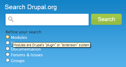
alex ua commentedI'm sorry if this is the wrong place for this, but IMO we should really have a checkbox at the top that says "All". At the very least we need a way to uncheck our selection. Getting trapped in searching within results seems bad to me (I do realize that you can change that on the next page, but by that logic we should remove all of those choices)...
Also- is there a reason we aren't using the slick js dropdown that's on every other page? Right now it seems to be causing an extra 50-60 pixels of padding under the main intro text (Come for the Software...).
Comment #9
c4rl commentedCleaned up some alignment based on comments #3 and #5 and committed -- visible at redesign.drupal.org instead of beta.drupal.org since redesign.drupal.org receives code updates automatically.
I agree with @Alex UA's take on having the "All" option, but that seems more like a dev issue rather than theming. Perhaps discussion already took place about this since the form is intentionally different from the prototype?
Comment #10
vmiliano commentedStrictly from a usability perspective, "Search Drupal.org" being a label is great, but in changing from checkboxes to radio buttons, once you pick one, browsers don't let you easily "unpick" one. The search results page lets you change between them, but users will want to "deselect" before they search, and they can't.
If you can't add in an "All" button that is selected by default, perhaps changing the text above the radio buttons would be enough not to frustrate some people, from "Refine your search" to "Show me these search results first" or something similar. Example attached.
Comment #11
vmiliano commentedDepending on how newbie-friendly the home page needs to be, you might also consider putting additional help text alongside the search options that describe what "Modules" and "Themes" and "Groups" etc. are to non-Drupal people. If you want to keep the area to the right of the search options free for future enhancement, tooltips (title attributes on the label element) might be enough.
etc.
Example attached.
Comment #12
pbull commentedRegarding the search radio buttons, there's no discussion happening yet, but there is an issue filed at "Refine your search - no way to reselect 'everything'": http://drupal.org/node/941116
Comment #13
verta commentedAt 1024x768 (with or without the Google Desktop app docked on the right), the Search radios are cut off on the bottom margin.
IE 7.0.5730.15
Comment #14
c4rl commented@verta Thanks, noticed that too.
Comment #15
c4rl commentedRelated issue #935330: QA: Search Results pages [Theme]
Comment #16
c4rl commentedComment #17
c4rl commentedThe layout issue should be resolved with changes to #935330: QA: Search Results pages [Theme]
Comment #18
alex ua commentedI think this looks much better. Marking as RTBC-- the issue I came here for is resolved, and so (it appears) are the other issues listed in the issue. I think this looks good.
I am still curious why we aren't using the javascript dropdown, but that's a minor issue (if it's one at all)...
Comment #19
c4rl commentedThanks for you input
Comment #20
WorldFallz commentedI couldn't find where the decision to go from checkboxes to radio buttons was made, but I find the radio buttons unnecessarily restrictive. Is there a technical reason we can't let users decide the grouping of items they wish to search (ie documentation and forum threads)? And why do we force a search of issues and forum threads exclusively? I frequently search forum threads alone.
I just think we're making too many decisions on the part of the user here, unless there's a technical reason it has to be done that way.
Comment #21
drummThe 'or filter by…' block on search results pages only allows single-selection. Checkboxes would lead to otherwise-inaccessible pages.
Grouping Issues & Forums, I'd like to turn the question around. What is your goal in searching, what are you trying to find?
For example, if you are trying to solve a problem with your site, both forums and issues often have answers, or at least clues to get started. And new users might not think to look in the issue queue.
Both of these are separate issues to consider, and shouldn't be tacked onto this QA issue. "Making too many decisions on the part of the user" is a good thing if we are able to save people time. In addition, we do want to provide appropriate tools for power users to get exactly what they want, but not necessarily present those choices upfront.
Comment #22
WorldFallz commentedAs a site maintainer and primary contributor to the forums I'm probably not the best 'generic' example to use, but I frequently search just the forums for threads I remember to which i'd like to respond or threads that I know i've participated in and would like to update with additional info. For example, I may pass over a thread I don't know the answer to but stumble across an answer later on and want to return to that thread to provide the solution. It's not something I can bookmark, because I don't know ahead of time that I will stumble across the answer.
I know I need to give myself time to adjust to all the changes, but I'm getting concerned that my forum maintainer workflow seems to be much more burdensome than it used to be. I know I'm having to click lots more than I used to and having to wade through issues when I know i'm looking for a forum thread is just making it even more difficult and unnecessarily time consuming.
I know the forum is the redheaded step child of drupal.org, but there actually are a significant number of users who use it as their primary method of support. If we make contributing more difficult than it already is, we'll have even less people bothering to do it. :-(
And I did use the beta site before the cutover, but i didn't actually do any real maintaining there-- my bad for not seeing these kinds of things sooner.
Comment #23
michelleI marked #947982: Forum posts and issues no longer separate duplicate and set this back to active since there's discussion on the problem here.
I have the same concern. There are times when I want to search just the forums and times I want to search just the issues. For me as well it's more of a maintainer thing than a looking for help thing. Ideally, you could go back to checkboxes and then people could choose either or both.
Michelle
Comment #24
michelleHmm... Sorry, I jumped in because WorldFallz pointed over here and didn't catch what Drumm said. If you'd rather have the discussion in the other issue, that's fine, too. Just needs to be had somewhere.
Michelle
Comment #25
verta commentedI agree, it's disappointing to not be able to separate issues from forum posts. I always know whether I want to look at one or the other and it is darn disappointing to have read through hits in forums when you want hits in issues.
Comment #26
verta commentedI wanted to also mention, Modules and Themes both have their own search engine, and I can't think of any time, now or before the redesign that I used the main search page to look for a theme. Are there any stats to refute (i.e. that "it's actually really popular, we're keeping them there")?
You could add some other area of interest and split Forums and Issues apart if you kick Modules and Themes out of this box on the main search. Marketplace or News would be my suggestions. Promote the platform by getting work for professional people (marketplace) or increase the general awareness (news) -- both more beneficial in the long run and big picture than modules and themes.
Comment #27
WorldFallz commentedKeep in mind you can still search issues only at http://drupal.org/project/issues. But as far as I can tell, there's no way to search forum posts only.
Comment #28
verta commentedGood point (@WorldFallz), I have used that in the past, but since the relaunch it's been hard for me to remember to use that URL - it's hard get to that page using the new UI nav, it seems to have dropped off the semantic radar (reporting bugs as a destination).
I'm attaching another downside to grouping "Forums and Issues" - it's a lot of letter, so it' wide and tends to wrap on non-home pages. Of course, this is "only on some browsers/platforms" but keeping the item text short might at least minimize this to people scaling their windows.
Comment #29
c4rl commented@verta What browser and OS are you using?
Comment #30
verta commentedSorry for leaving that off - WinXP and Firefox.
I really do like the new design, both the new modules/views and the theme, but especially the dashboard.
Comment #31
Amazon commentedAssigning to @csevb10. Keeping the forums an active area of participation is critical. I'd request that the people who have a good workflow for working in the forums find some designers to help them make suggestions of how to improve navigation in the forums.
Comment #32
lisarex commentedClosing this one down to clear out the Redesign queue, but the Forums/Issues problem is still being discussed #955928: Split apart "Forums & Issues" in search filters