
This project is not covered by Drupal’s security advisory policy.
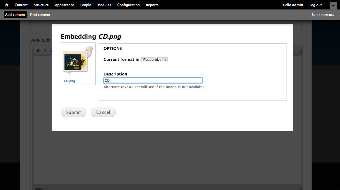
This module adds a responsive images view mode when inserting images using the Media module browser.
The view mode sets images to have a width of 100% and it will also use core image styles to shrink the image to the maximum width of your widest layout. Max-widths are set on images whose orignal source is less than this maximum width to prevent upscaling.
Tested with 7.x-1.0-rc3 of Media.
Project information
- Project categories: Media
 32 sites report using this module
- Created by justafish on , updated
 This project is not covered by the security advisory policy.
Use at your own risk! It may have publicly disclosed vulnerabilities.

