
This project is not covered by Drupal’s security advisory policy.
Responsive Background Images is an easy to use, simple helper module for making your background images responsive. It can be used with either static or slideshow background types, and will always fill the full window space with your image(s). The slideshow background effect is automatic with this module if you enable more than one image.
The module achieves this by first recognizing the screensize with which a user is viewing your site, then loading the best file size (image style) for that screen. For example, a 320x480 image will load for iPhone viewers, and a 1600x1200 version for those on a large desktop.
Responsive Background then resizes the image dynamically to match the browser width exactly, maintaining the proportion of the image even if the user resizes the window. If the user were to view your site first on a small screen and then maximize the window, the module will automatically load a new image size so that the background does not become pixelated. If a user were to zoom in or out while viewing your site, the background image will stay the same and not resize with the rest of the page.
This solves theming issues with sites that have standard responsive features, and offers an enhanced user experience for all browser sizes. (description by Jenna Colbaugh)
Features:
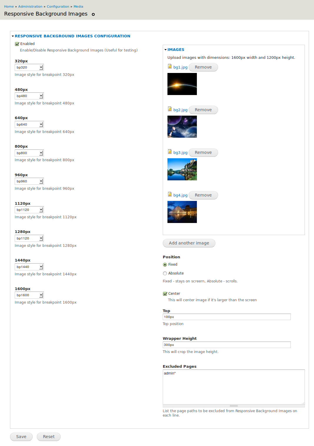
- Loads the correct image size depending on the set image breakpoints, this means that you have to set image styles for these breakpoints.
- Responsive images directly depend on the window's width
Available Settings:
- Enable/Disable
- 320px - image style if screen is equal to or less than 320px
- 480px - image style if screen is equal to or less than 480px
- 640px - image style if screen is equal to or less than 640px
- 800px - image style if screen is equal to or less than 800px
- 960px - image style if screen is equal to or less than 960px
- 1120px - image style if screen is equal to or less than 1120px
- 1280px - image style if screen is equal to or less than 1280px
- 1440px - image style if screen is equal to or less than 1440px
- 1600px - image style if screen is equal to or more than 1440px
- Position - Fixed/Absolute
- Center - Centers images when the they are wider than the screen
- Top - Top position of the Background Images
- Height - Wrapper height to crop the background images
- Excluded Pages - page paths to be excluded from Responsive Background Images
Similar Projects
Sponsors
Promet Source, an Acquia Drupal partner company
Daniel Honrade, author
Project information
- Project categories: Content display, Developer tools
 67 sites report using this module
- Created by danielhonrade on , updated
 This project is not covered by the security advisory policy.
Use at your own risk! It may have publicly disclosed vulnerabilities.

