
 Support for Drupal 7 is ending on 5 January 2025—it’s time to migrate to Drupal 10! Learn about the many benefits of Drupal 10 and find migration tools in our resource center.
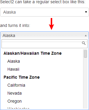
Integrates Drupal autocomplete and select fields with the Select2 jQuery library.
It provides a render element (for usage in forms) and two field widgets.
One for simple select fields and another for entity reference fields.
The render element supports several select2 features:
- Single and multiple selection
- Internationalization
- Integrates nicely with the seven theme
When the field widget is used in the entity reference context this module provides more features:
- Autocomplete: The select options will not be rendered in the page and instead fetched by API during typing.
- Autocreate: Like core's entity reference field this widget can create new entities on the fly.
Dependencies
- Select2 library (>=4.0.x)
Installation
Install this module like every other Drupal module. Also, it's needed to get the select2 library.
Composer (recommended)
If you would like to install the select2 library with composer, you probably used the drupal composer template to set up your project. It's recommended to use asset-packagist to install JavaScript libraries. So you will need to add the following to your composer.json file into the repositories section:
    {
        "type": "composer",
        "url": "https://asset-packagist.org"
    }
It's also needed to extend the 'installer-path' section:
    "web/libraries/{$name}": [
        "type:drupal-library",
        "type:bower-asset",
        "type:npm-asset"
    ],
And add a new 'installer-types' section next to the 'installer-path' in the 'extra' section:
"installer-types": ["bower-asset", "npm-asset"],
After this you can install the library with "composer require oomphinc/composer-installers-extender npm-asset/select2" and the library will be downloaded into the libraries folder.
Usage
Render element
You can use the select2 element in your forms like every other form element (see Form and render elements).
    $form['select2'] = [
      '#type' => 'select2',
      '#title' => t('My select2 form element'),
      '#options' => ['foo', 'bar'],
    ];
The select2 element sets useful defaults for the select2 configuration options. Nevertheless, you are able to override them:
    $form['select2'] = [
      '#type' => 'select2',
      '#title' => t('My select2 form element'),
      '#options' => ['foo', 'bar'],
      '#select2' => [
        'allowClear' => FALSE,
      ],
    ];
Themes
The select2 library provides the possibility to use your own theme for the select2 widgets. If you have your own theme, you can customize the appearance of the select2 widget:
Add a 'select2.theme' entry to the libraries.yml of your theme. This module will use your defined theme automatically.
    select2.theme:
      css:
        component:
          css/my-select2-theme.css: {}
To start with your own select2 theme, it's recommended to copy all style definitions with a '--default' from the select2/dist/css/select2.css file into your my-select2-theme.css file. Then replace '--default' with '--my_theme' (machine name of your theme) and start customizing.
Note: This module already provides a theme for Drupal's claro theme.
Supporting organizations:
D8 port and maintenance
Project information
- Module categories: Administration Tools, Site Structure, Developer Tools
 21,208 sites report using this module
- Created by goron on , updated
 Stable releases for this project are covered by the security advisory policy.
Look for the shield icon below.
Releases
8.x-1.15
released 5 May 2023
released 5 May 2023
Works with Drupal: ^9 || ^10
✓ Recommended by the project’s maintainer.
Install:
Development version: 8.x-1.x-dev updated 21 Jul 2023 at 10:11 UTC
7.x-1.0
released 12 December 2015
released 12 December 2015
Works with Drupal: 7.x
Development version: 7.x-1.x-dev updated 5 Aug 2016 at 12:38 UTC


