

Lightweight. Responsive. Mobile-first. Content-first. HTML5. Square Grid theme provides a framework for your page layout ... and that's it. It incorporates responsive design settings to present usable layouts for mobile and desktop. That's it. We want your theme to load quickly, with as little grid framework css as possible.
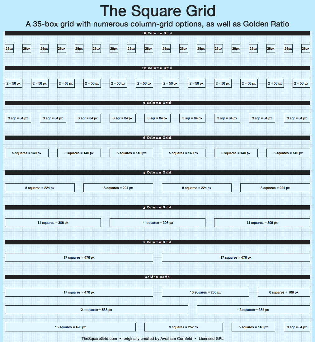
The Square Grid has some nice advantages over other grids:
- Flexibility: Its 35-column breakdown of space allows great flexibility in grid selection, including popular favorites 6-, 9- and 12-column grids, as well as Golden Ratio layouts.
- Resizability: Its algorithm is easily adapted to various screen sizes.
- Whitespace: Gutters are defined by the squares, resulting in pleasing whitespace between columns while staying within the grid framework.
- Use of screen estate: It uses the full width of the grid; no dead space on the left and right sides within the grid.
Features
7.x-3.x
- HTML5
- ARIA roles
- Fully responsive design
- Mobile first
- Content first
- Fluid layout of grid display
- Configurable width settings for sidebars and design break-point
- Configurable layout of content and sidebars (e.g., both sidebars on left, both on right, etc.)
- Configurable inclusion of html5shiv for older Internet Explorer browsers
- Configurable "web app" mode for iOS browsers
This branch ends up with a lighter footprint than 7.x-2.x, with fewer lines of css as well as improved markup cleanup for easier theming.
7.x-2.x
- xhtml
- Mobile First
- Content first: Main content loads before the supplementary content
- Grid layouts for medium- and large-size screens
- 770px, 980px and 1190px grids by default (Compare with the 940px usable space in the 960 grid)
- Responsive design principles.
- Configurable Theme Options:
- Toggle grid display on or off (useful during design work).
- Toggle rebuild theme registry on or off (useful during design work).
- Select options for Responsive Design adaptation to screen sizes.
- Select options for Internet Explorer 6-8, which do not support media queries.
- Alternative option to select a single grid for all displays, for child themes not updated for responsive design, as well as themes serving a narrow screen-size use case.
Installation and Use
Install the theme as normal. It's recommended to use Square Grid as a base theme for your own theme. Configuration settings can be found in your sub-theme's Theme Settings. For more, as well as info on upgrading Square Grid, see the readme.txt and online documentation (linked from the sidebar on this page).
Status (or: "Which branch should I use?")
Branch 7.x-3.x
This branch is in active development and where all new features are being implemented. Stay with stable releases to avoid breakage of ongoing projects. Bug reports and feature requests are appreciated!
Branch 7.x-2.x
Bug fixes only. There are no plans for backporting 3.x branch features to this branch. (As always, bug reports are appreciated!)
Branch 7.x-1.x
No longer supported.
Creators/Maintainers
The Square Grid theme was developed and is maintained by Laura Scott. Development and maintenance is sponsored by PINGV.
The Square Grid theme is based on the Square Grid CSS framework by Avraham Cornfeld, for use by designers and front-end developers for creation and implementation of original Square Grid-based design.
Documentation
- Drupal.org Documentation on Square Grid Theme
- Square Grid Theme 7.x-2.x readme.txt
- Blog posts on Square Grid Theme [rss]
Design Templates
For more information on the Square Grid, and to download design templates, visit http://thesquaregrid.com.
Project information
 5 sites report using this theme
- Created by laura s on , updated
 Stable releases for this project are covered by the security advisory policy.
There are currently no supported stable releases.

