
This project is not covered by Drupal’s security advisory policy.
Basic use
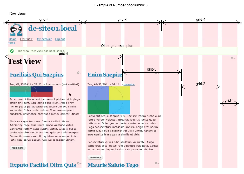
This module is a style plugin for views. After it is installed an option will appear amongst the other format style options. This helps developers to markup the views output so that it can easily fit in with a grid system. The benefits of this are that the page can be more easily styled in a responsive way which will enable the view elements to appear correctly on multiple screen resolutions.
Easily apply grid-3 to row elements and fit within the boundary of a container of grid-12. Normally there is a margin of 10px on the left and right of each grid-3 element which is 20px too much for 4 items at grid-3 to appear in each row of the container of grid-12.
If you use a base theme that used a grid system you can easily assign grid- values to the list class of the style format and then alpha for Class for left column and omega for class for right column.
Additionally, you have option of displaying classes in each row output by views with it's position in the column structure that you wish to implement. (e.g. column-1, column-2, column-3, column-1)
Advanced Feature’s
Advanced classes field that allows the developer to apply this technique multiple times. A use case for this is that you may wish the blocks to appear in 4 columns for larger screen resolutions but only 1 or 2 columns for smaller screen resolutions.
So you can apply alpha to the 1st, 5th, 9th blocks and omega to the 4th, 8th, 12th blocks but also apply alpha-mobile to the 1st, 3rd, 5th blocks and omega-mobile on the 2nd, 4th, 6th blocks. This gives the freedom to the theme to apply the styles that would render a display of 2 columns for smaller screen resolutions and 4 columns for larger screen resolutions.
I've also added the ability to set a class prefix for each row. So, if you specify a 4 column layout then the first 4 items could have a class of row-1 (row-) being the default row class prefix. I have not had a need for this yet but it would allow you to do different things with the styling of the views output. It was a very simple and natural addition as well. Again, let me know how you get on with this.
Thanks for supporting this module.
Project information
 341 sites report using this module
- Created by nlisgo on , updated
 This project is not covered by the security advisory policy.
Use at your own risk! It may have publicly disclosed vulnerabilities.


