

Experimental project
This is a sandbox project, which contains experimental code for developer use only.
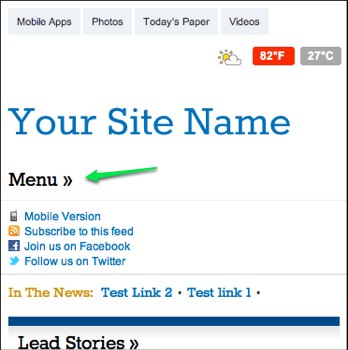
This module creates a block with a "Menu" link that, when clicked, initializes a jQuery slideToggle effect to hide or show the Menu Zone of the Omega Theme.
This is beneficial for initially hiding a large menu on mobile and allowing the user to slide it open.
To Use:
After installing and enabling the modules, go to the blocks page and find the block called "mobile menu toggle". Add this block to any region *except for the Menu region*, like Branding.
Then be sure to place your menu block itself, like "Primary Links" inside the menu region. If its not there, go to the blocks page, find your menu block, and place it in the menu region.
If you are using the Omega theme, be sure the menu region is enabled and is inside the menu zone.
Example site:
https://www.drupalcampatlanta.com/
4/5/13 Update
- Refactor of code was rolled into 7.x-1.x today and now allows user customizations. This release rips out the default CSS in favor of letting the default hide/show of menus and media queries be handled by the individual theme layer.
- Menu to hide/show is now customizable via UX on configuration page.
- Optionally a CSS selector can be provided to hide/show instead of a menu.
- This release removes dependency on Omega and should work for any theme.
- Adds README.txt for further installation instructions.
Project information
- Created by kbasarab on , updated


