
 Support for Drupal 7 is ending on 5 January 2025—it’s time to migrate to Drupal 10! Learn about the many benefits of Drupal 10 and find migration tools in our resource center.
Problem/Motivation
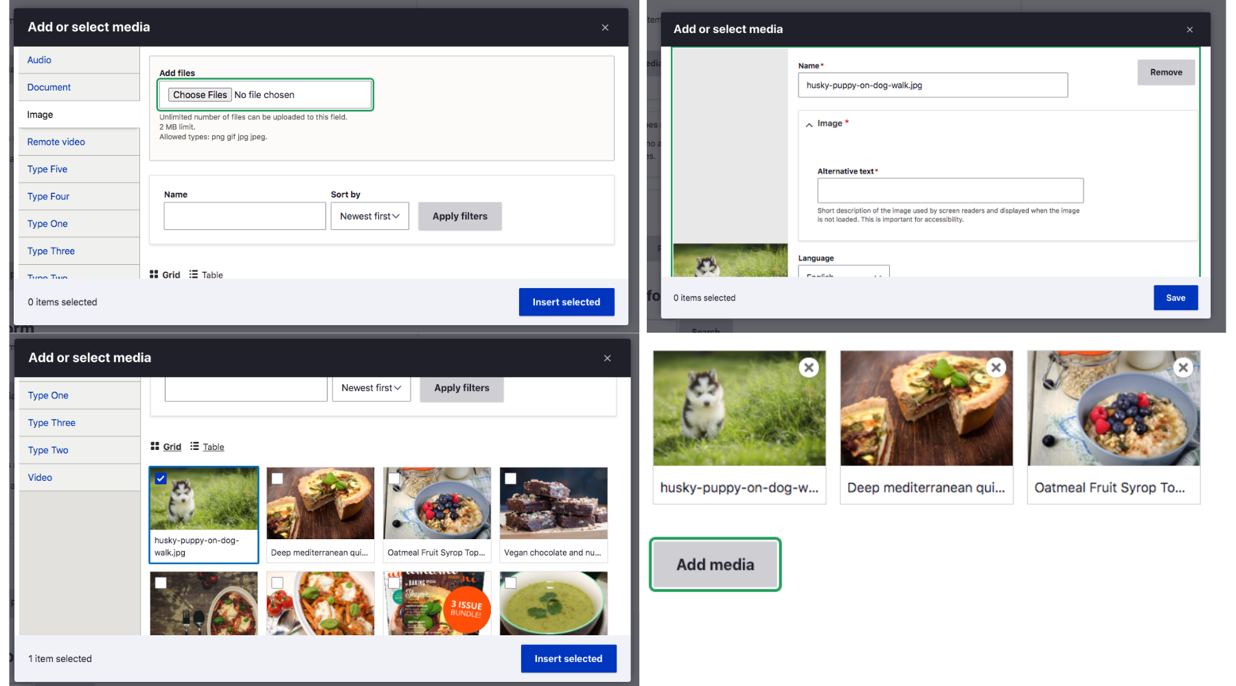
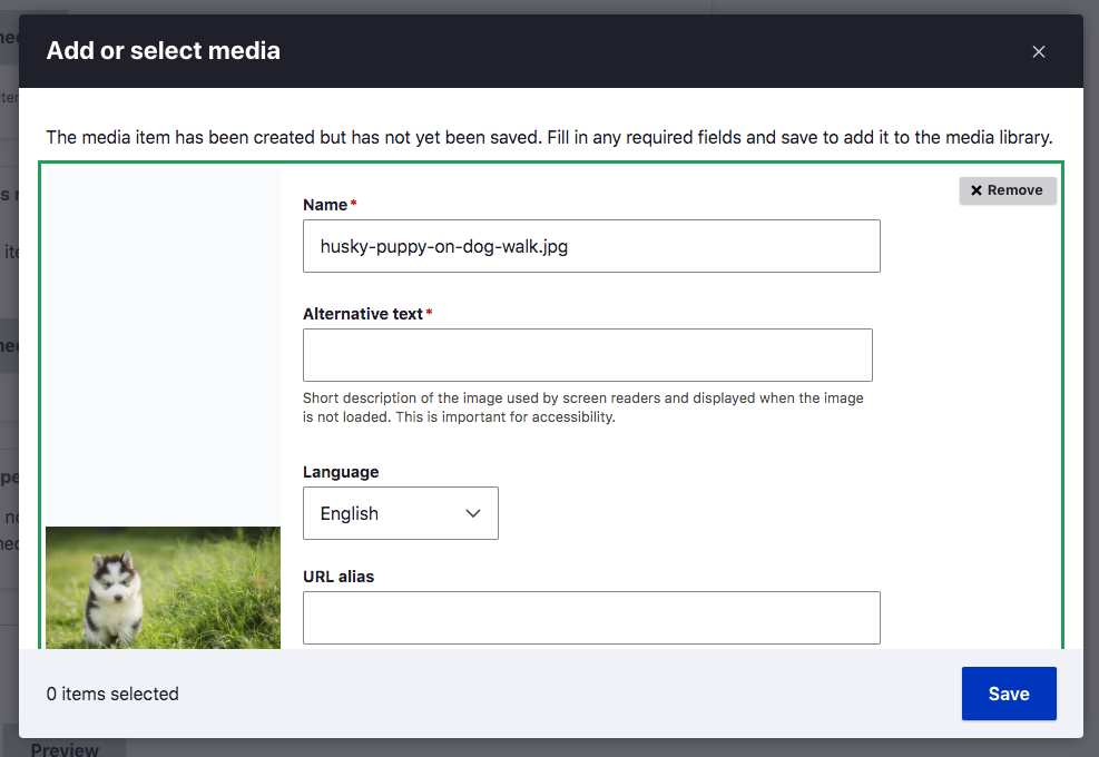
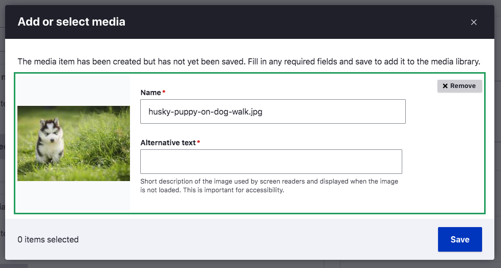
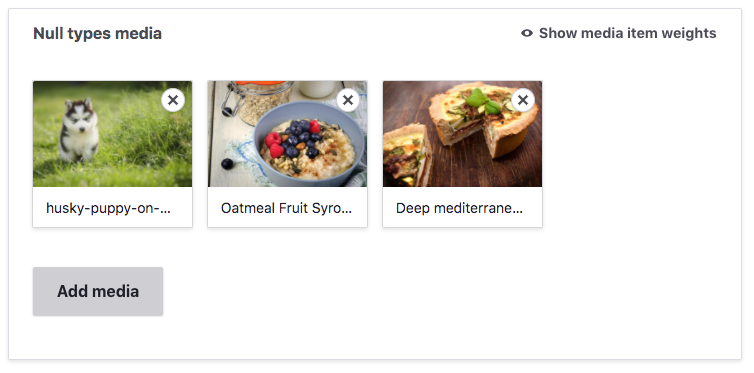
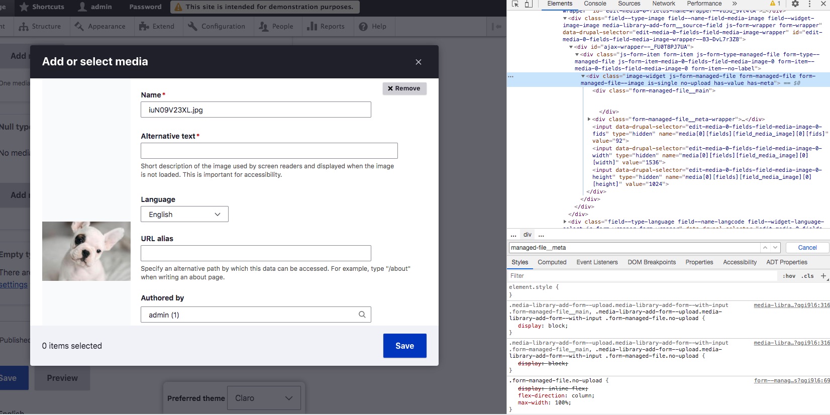
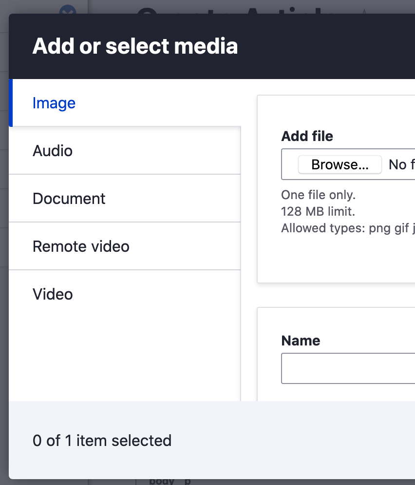
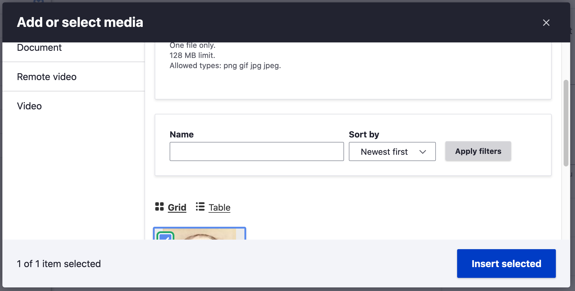
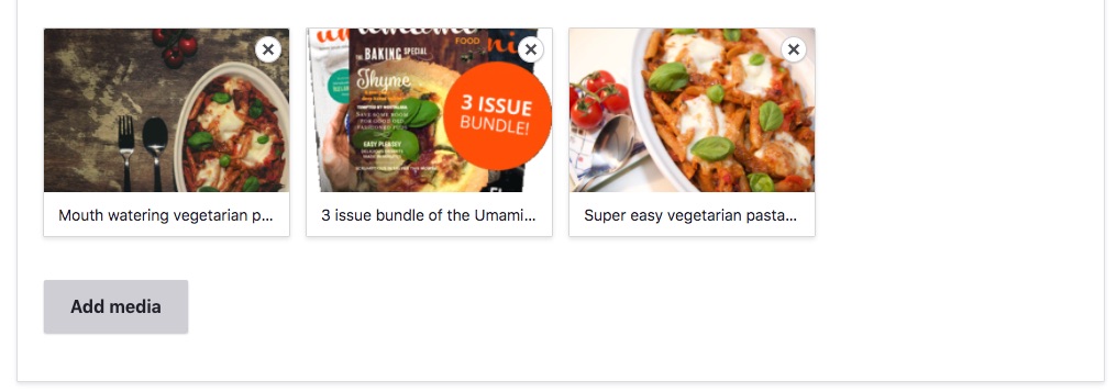
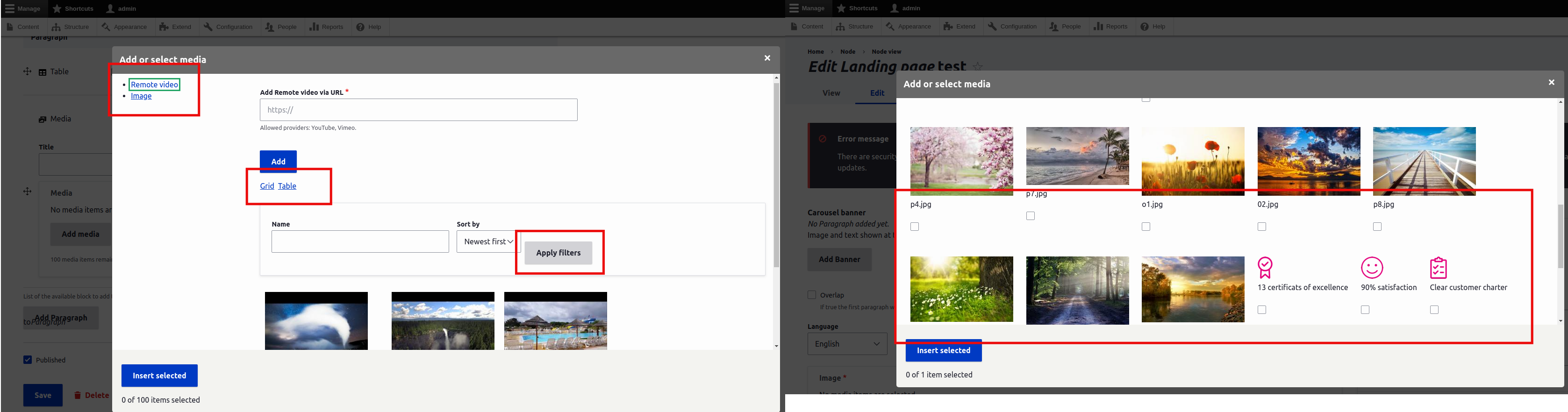
This issue is to redesign Media and the Media Library. Designs are currently based on seven (as above), and were updated via video call/screenshot review, per #23. Designs were approved based on screenshots as work progressed. The screenshots below represent current approved designs.
Remaining Tasks
To start, we need screenshots of all the pages/workflow.Done in #7 and #8We have Seven screenshots, we need Claro screenshots to know current status.Create a list of all Media components and pages to be designedCreate a patch
Followup
#3179755: Figure out solution to two ex icon variants in Claro and #3177181: Decide how media library will utilize small form elements in Claro are to follow up, and should not prevent this issue from being closed.
User Interface Changes


| Comment | File | Size | Author |
|---|---|---|---|
| #84 | media-library--current.png | 710.34 KB | katherined |
| #80 | 3062751-80.patch | 55.03 KB | katherined |
| #79 | 3062751-79.patch | 53.59 KB | joseph.olstad |
| #79 | interdiff_svg_optimising_75_79_3062751.txt | 3.03 KB | joseph.olstad |
| #75 | 3062751-75.patch | 53.76 KB | katherined |


Comments
Comment #2
kay_v CreditAttribution: kay_v as a volunteer commented"To start, we need screenshots of all the pages/workflow we can have on Media to plan the components."
Sounds like a great task for first-time contributors who are getting to know the issue queues. Adding the 'novice' tag. Also, for keyword search, adding #D4D19
Comment #3
lauriiiComment #4
lauriiiComment #5
huzookaComment #6
shimpyI am attaching some of the screenshots for media and media library pages/workflow in claro experimental theme. Please review.
I hope it will be helpfull.
Comment #7
antonellasevero CreditAttribution: antonellasevero at Nestlé commentedI am attaching screenshots of adding Media in a node page (single and multifield). Attached is a zip file and a word document referencing the workflow. When we break out the tickets later, I will add the screenshots individually.
In a separate email I will add the Media Library screenshots.
Comment #8
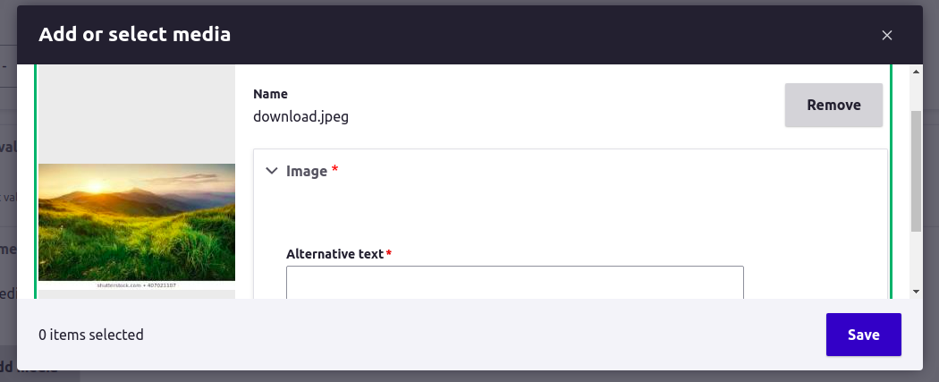
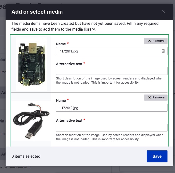
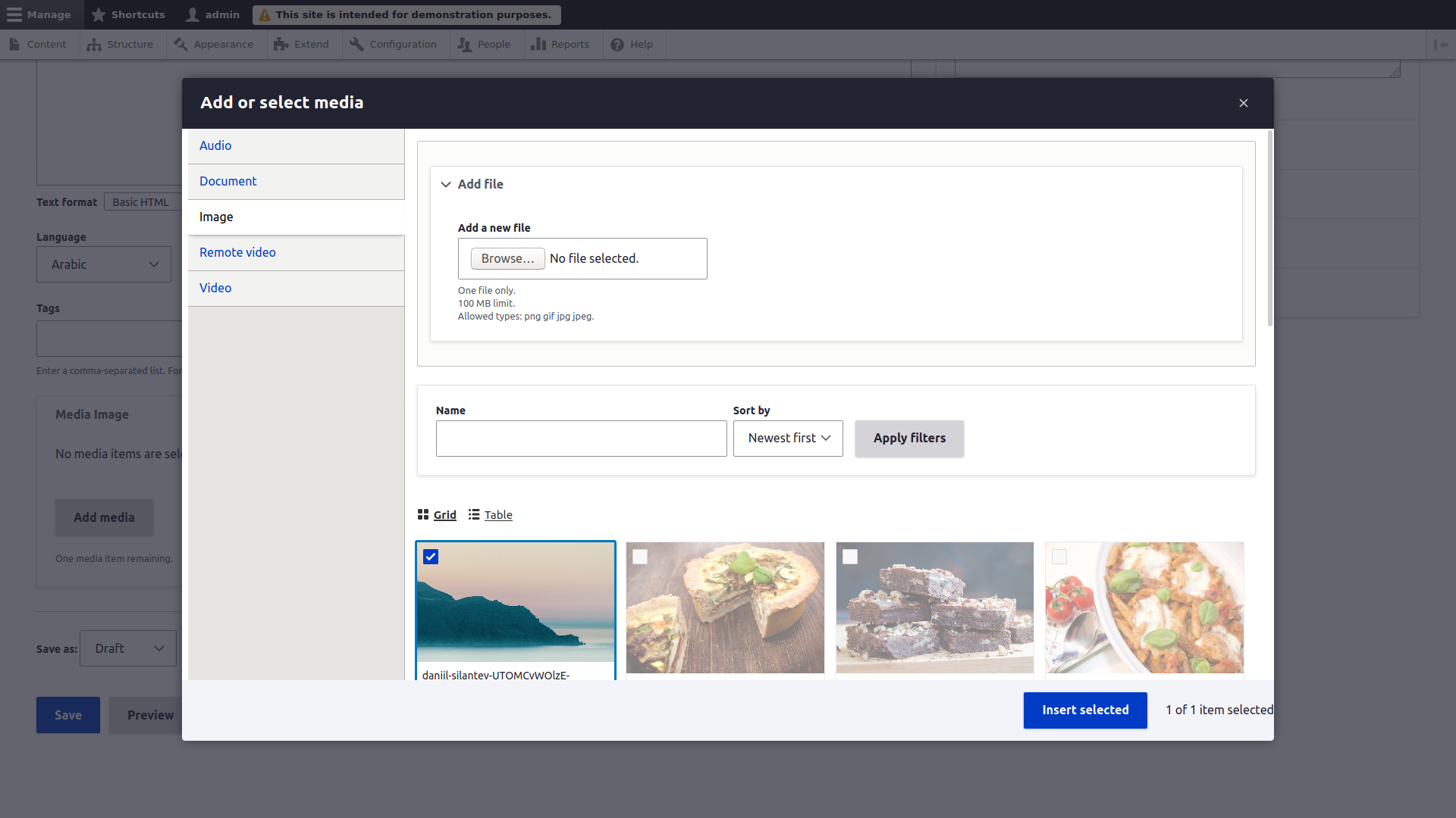
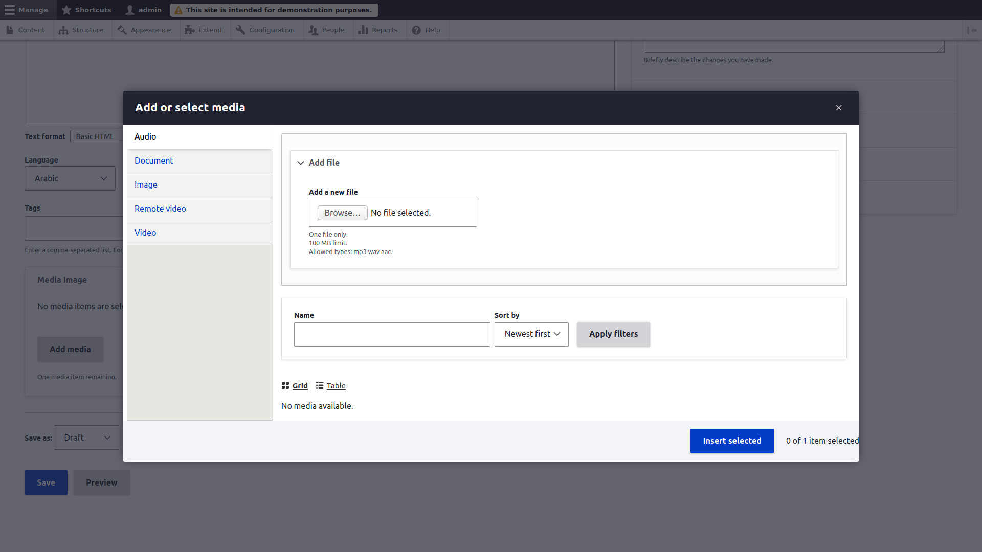
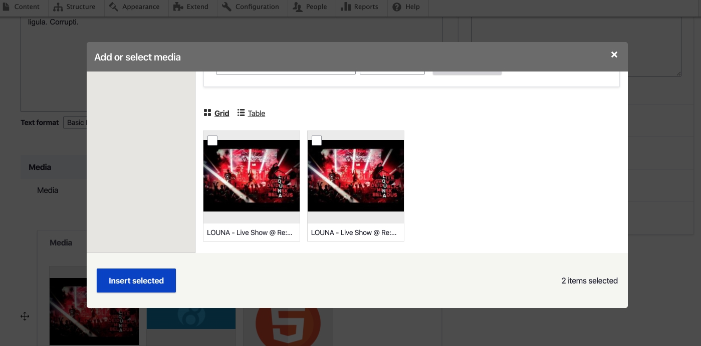
antonellasevero CreditAttribution: antonellasevero at Nestlé commentedAttached is the Zip drive with the Media Library screenshots and reference doc. These were taken with the Seven theme in 8.8.0 alpha 1.
https://www.drupal.org/files/issues/2019-11-04/Media%20Library%20Screens...
Here is a list of the samples taken:
1a - Seven - Media Library – landing – table view – desktop (with unselected, selected and hover states)
1b - Seven - Media Library – landing – table view – mobile - with unselected and selected states on 2 rows
1c - Seven - Media Library – landing – grid view – desktop
1d - Seven - Media Library – landing – grid view – mobile
2a - Seven - Media Library – landing – table view – desktop (after media attached with success message
2a - Seven - Media Library - add media options – mobile (similar on desktop)
3a - Seven - Media Library – add document – desktop
3b - Seven - Media Library – add image – mobile
3c - Seven - Media Library – add image – mobile
3d - Seven - Media Library - add image metada – mobile
3f - Seven - Media Library – landing – table view – desktop - after img attached success msg
4a - Seven - Media Library – edit image – desktop
4b - Seven - Media Library – edit image – mobile
4c - Seven - Media Library – delete popup – desktop
4d - Seven - Media Library – delete popup – mobile
Comment #9
antonellasevero CreditAttribution: antonellasevero at Nestlé commentedComment #10
ckrinaThanks everybody for the screenshots!
This is a META issue and its goal is to plan and overview all the child issues and the state of the work, so moving this back to active.
Comment #11
ckrinaAnd removing the novice tag since no patch or screenshot is needed anymore.
Comment #12
KondratievaS CreditAttribution: KondratievaS at Skilld commentedFor entity reference media field styles are missing in popup
Comment #13
HOG CreditAttribution: HOG at Skilld, Drupal Ukraine Community commentedComment #14
HOG CreditAttribution: HOG at Skilld, Drupal Ukraine Community commentedComment #15
kostyashupenkoComment #16
ckrinaAdding next steps needed:
Also adding back Novice tag because anyone can help doing this investigation.
Comment #17
HOG CreditAttribution: HOG at Skilld, Drupal Ukraine Community commentedComment #18
HOG CreditAttribution: HOG at Skilld, Drupal Ukraine Community commentedI checked issues that was displayed in the https://www.drupal.org/project/drupal/issues/3062751#comment-13457719. Now popup is fine. I fixed buttons positions as well.
Comment #19
ckrinaThanks for your work here @HOG! Ideally screenshots would get the full media library showcasing all its elements, so would it be possible to take them with a bigger height?.
Also, this issue is a META to split small issues from it, so no patch is expected here. The goal is to detect what needs work and create child issues for it.
Comment #21
boulaffasae CreditAttribution: boulaffasae as a volunteer and at Fullwave commentedSome new screenshots
Comment #22
boulaffasae CreditAttribution: boulaffasae as a volunteer and at Fullwave commentedHere is another screenshots after applying #3023311 patch:
Comment #23
ckrinaWe just discussed this issue on today's weekly Admin UI call and we're going to take a new approach, similar to the one taken for #3066006: Convert Views UI to new design system where a MVP design is done directly on code + video call/screenshot review.
Comment #24
lauriiiBased on #23, making this a feature request, not a plan.
Comment #25
katherinedHere's a patch that covers a lot of the Media Library designs, but it depends on and incorporates the work being done in #3083256: Create smaller variations for form elements (so I think both will need to be applied to test this patch), and defers to bulk operations issues in favor of #3070558: Implement bulk operation designs.
Comment #27
bnjmnmJust did a quick pass of the patch. Will install and do a deeper review soon.
Stray dash at 189
It may be helpful to give the
#media_library_uploadproperty a more generic name that more closely describes its purpose, since this could be useful in non-media-library situations. A good name could eliminate the need to add comments to when it is added, too.Add each item to the class array on a separate line. This happens in a few spots.
In the variables pcss file, we're not adding whitespace above the comments.
There are some missing units in these calc() calls.
The various z-indexes are a good place to use css variables and calc, since their individual values are less important than how they differ from each others
If a class is being tripled for what I assume is specificity, it should be noted what it's up against in order to necessitate this. This may help others find a solution that requires less specificity or indicate the need for a followup for whatever is forcing the hoop jumping.
Comment #28
katherinedThis patch addresses #3062751-27: Media and media library. On #5 and #6, these are mostly copied from vertical-tabs.pcss.css, and I've moved one of the complex calcs and z-index values to variables. Maybe more should be consolidated?
I've combined the patch in #3083256-39: Create smaller variations for form elements so this can be reviewed as it is intended.
Comment #29
katherinedThe previous patch was incomplete, so disregard #28. I'm adding an interdiff too.
Comment #30
bnjmnmThis doesn't seem to target every possible form that can appear in a media library dialog. For example, if you use media_library_test the upload widget on "Type Three" and the embed input for "Type Five" appear in their default sizes
Looks like this got missed in the property renaming.
This should get separated into variables for top, right, bottom, left since they are all different. The refactoring based on these new variables should then include the RTL rules
Right and left have different values, so an RTL version is needed. On RTL the left edge of the form is not flush with the modal container.
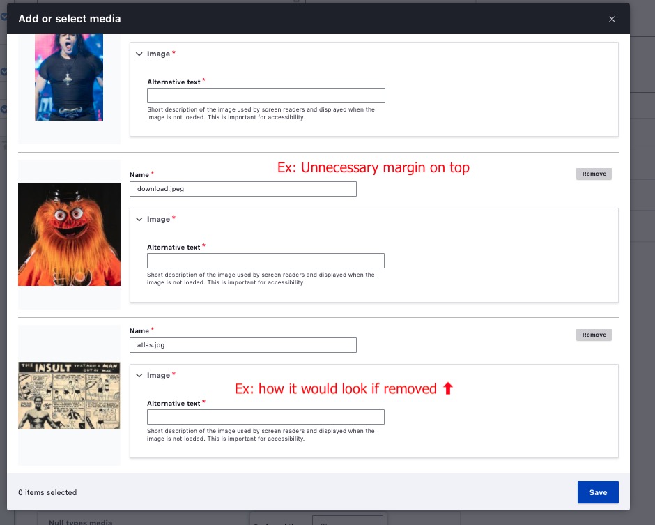
There's some unneeded top margins when in the meta form list after adding media
Comment #31
katherinedI think I've addressed everything in #30 except for #1. I'm having trouble duplicating that and may need more information. I removed some top and bottom padding on #5, but we are seeing different things, so I'm not sure if it is addressed.
Comment #32
bnjmnmComment #33
katherinedThanks for the detail on #1! I think this should cover it.
This also aligns the remove button per #2, and removes the first child exception on the button position.
Comment #34
bnjmnmComment #35
katherinedI noticed that the remove button now overlaps at smaller widths, so per a conversation with @bnjmnm, I tried replacing the remove button with an icon button, which I think is even more consistent with the Media Library styling.
Before:
And after:
Comment #36
katherinedThis should make the modal close and the remove buttons align.
Comment #37
lauriiiIt seems like the ajax throbber is not visible when media library item is being removed.
Would be great to get confirmation from an UX expert on the change in #35. The icon looks a bit similar to the close dialog button, so it might be possible that they get mixed, especially given the positioning on the first item. As an alternative solution, we probably could just move the bfsmallutton up so that it doesn't overlap with the input.
I'm also adding a reference to #3083256: Create smaller variations for form elements since this issue has a dependency on that.
Would it be possible to get a version of the patch that doesn't include changes from #3083256: Create smaller variations for form elements which would make reviewing easier?
Comment #38
katherinedHere it is with the small forms patch removed, and I changed the z-index so the throbber is back.
Comment #39
katherinedtrying this again + interdiff
Comment #40
katherinedAfter the community Claro meeting and discussion with @ckrina, @lauriii, and others, I've gone back to the prior remove button, but aligned it with the save button, and adjusted the focus border a little so it isn't too close to the buttons.
Comment #41
Vidushi Mehta CreditAttribution: Vidushi Mehta at gai Technologies Pvt Ltd commented#40 was no longer applied so rerolled again. Not able to create interdiff as #40 was failed to apply.
Comment #42
SharmaAnmol CreditAttribution: SharmaAnmol commentedI have applied the #41 it seems that save button is not properly aligned with remove button . Added before and after screenshots for the same.
Comment #43
katherinedThat scrollbar looks like it's an IE issue. I think this should take care of it.
Comment #44
katherinedUpdating after our Claro sprint conversation.
I've checked the blue border colors around checked and .is-hover states, and the colors are currently the default blue for active and the correct hover color, so this may need additional follow up.
I've added a border-radius and box-shadow on the appropriate elements on the media library thumbnails on the node form, which is a subtle but nice improvement, IMO, so thanks @ckrina for spotting it.
I've removed the green focus border that appears when thumbnail items are clicked on the node form, [edited] and this is not the right answer, but I'm still working on it. :)
I'm also attaching a version of the patch for manual testing that includes the patch in #3083256: Create smaller variations for form elements, as this patch depends on it.
Comment #45
katherinedOops, this needs a re-roll, but the manual testing patch should apply as-is.
I'm also adding some supporting screenshots.
1. I forgot to mention that I also changed the remove button padding. It's now 1.5rem of left padding, and 0.5rem on the background position, like we discussed on the call.
2. The border-radius and box-shadow on these look much more polished, IMO.
3. The blue border on the checked state is currently
--color-absolutezero: #003cc5and the hover state is--color-absolutezero-hover: #0036b1. I find these hard to distinguish, and this may need more discussion on a future call or in Slack.Comment #46
lauriii#45.3: We could use lighter shade of blue. For example, #b3c9f5 "focus". I don't think hovered items should use color that close to the checked items because it could create confusion around which items are checked.
Comment #47
boulaffasae CreditAttribution: boulaffasae as a volunteer and at Fullwave commentedA patch for the #45.3 @laurii comment.
When hovered + focused, should we prioritize the focus border color or the hover border color?
Comment #49
katherinedI think the lighter blue border works, but I think the checkbox background should match, so I picked a different lighter blue that I think might be easier to see because it's not quite so light.
This patch also addresses the green focus border padding problem.
Comment #50
katherinedtrying that again so it's not missing the icons.
Comment #51
katherinedComment #52
katherinedThis one should apply. The previous manual testing patch should apply manually for testing.
Comment #53
katherinedI'm removing a remnant of another patch from the claro.theme file and some comment changes in the compiled css files, as well as a small styling change to the Media Library grid view action buttons.
I updated the manual testing patch, which includes the small form elements patch on issue #3083256.
Comment #54
phenaproximaI gave this a quick manual test and I think it. looks. great. It takes everything that is good about the media library in Seven and transfers it into Claro -- a big step forward towards Claro being the default admin theme in Drupal.
I observed a few things while testing, but I'm guessing they are all out of scope. Maybe some could use follow-ups, maybe others don't need it.
First, after adding a couple of media items in the media library, I saw that they are not the same width in the administrative grid view, and are a little small at that:
That said, it was still clear and usable, so maybe not a big deal.
I also noticed that, when selecting media items in the administrative table view, the selected rows are highlighted, like so:
However, selecting media items in the media library's table view does not highlight them:
There is also no column click-sorting for this table, but that's definitely out of scope here and I think it's due to a known bug in Views, for which a dedicated issue exists.
This next thing is probably also well out of scope. But, when I add a media item in the media library, focus is returned to a...weird effin' place. Halfway between the gutter and the stars:
I highly doubt Claro is responsible for this, nor am I sure that Claro can do anything about it even if it is causing it, but I thought I'd call it out, since I'm actively trying to turn up issues. :)
Finally -- and I'm pretty sure this isn't something Claro is doing, but Claro might have control over it to some extent -- the phrasing of "0 of 1 item selected" is weird. Shouldn't that be "items"? Or is that weird too?
I believe there is a dedicated issue out there to make this text themeable, if it's not already. In which case, once it lands, Claro could certainly improve on this if it wanted to :)
So there you go. Them's my findings. I think these are all pretty minor, and most likely outside of Claro's control. The current patch is still head-and-shoulders above what's in HEAD, so I'm +1 for getting it landed as soon as possible!
Comment #55
katherinedThanks for the thorough review. :)
I'm unable to duplicate the first point in #54. This is what I see:
Seven and Claro both show the inconsistent background color described in the second point, as the selected Media Library item is not given the
selectedclass. I think this is a Media Library issue, rather than a Claro issue, so I opened a new issue. #3169841: Media Library selected row background color is inconsistent with Media table view.And I believe all the remaining points are also present in both Seven and Claro, so out of scope as mentioned.
Comment #56
lauriiiLet's open follow-up issues for the issues discovered in #54.
Comment #57
katherinedI opened a new issue for the focus location feedback: #3170150: Media library focus returns to unexpected place after media upload.
It looks like the question of item/items was resolved in this issue: #3033943: MediaLibraryWidget selected items count is not conveyed to assistive tech correctly
I think we're seeing the intended behavior.
+1 to future themeability!
Comment #58
lauriiiDid a bit of manual testing and reviewed the code. Overall this looks great! Here's couple of things I noticed:
Can we expand this comment to explain why this is needed?
Is this rule needed because it seems like there's a typo in the selector because
.form-managed-file_metashould probably be.form-managed-file__meta?How can I reproduce this scenario?
The remove button icon should use the same gray color as the text when the button is disabled. This state is applied to the button when the ajax request to remove an item is being processed.
Comment #59
katherined1. Done, good idea.
2. It's not needed. Good eye. :)
3. You can see this after uploading a new file to the media library.
before:
after:
4. Changed.
Comment #60
katherined1. Done, good idea.
2. It's not needed. Good eye. :)
3. You can see this after uploading a new file to the media library.
before:
after:
4. Changed.
I'm leaving out the patch that incorporates small form elements for now, as that issue has diverged a bit from the changes in this patch. The form size variations will need to change based on the outcome of #3083256: Create smaller variations for form elements
Comment #61
joseph.olstadLooks great, thanks so much for your attention to detail. The media library needs these improvements. I have already added css to override claro in a recent project and with these improvements I can back off my custom css overrides.
Comment #62
lauriiiThanks for the review @joseph.olstad! Moving this to postponed for #3083256: Create smaller variations for form elements. This can be moved back to RTBC after it has been committed. 😇
Comment #63
bnjmnmComment #64
bnjmnmReroll in #63 was missing a few files
Comment #65
bnjmnmFound a few small things
This has an /* LTR */ without a corresponding RTL style
Needs /* LTR */
The floats don't seem to be needed since they are wrapped in a flex container. Maybe I'm missing something?
This comment can be removed. It's using a class instead of the li element.
Multiline comments should be formatted a bit differently https://www.drupal.org/docs/develop/standards/css/css-formatting-guideli...
Commented out declaration should be removed.
Comment #66
bnjmnmThis comment seems like it may be outdated. From what I can tell the focus is no longer hidden, but displayed in a child element.
Needs an /* LTR */
Comment #67
katherinedThanks!
65.1 Removed, unnecessary.
65.2 Added.
65.3 Correct, not necessary.
65.4 Removed.
65.5 Fixed.
65.6 Removed.
66.1 Replaced.
66.2 Added.
Comment #68
katherinedAs an alternative to postponing on #3083256: Create smaller variations for form elements, I'd like to propose considering a patch with the references to
.form--smallremoved. I've included such a patch here. This would allow for faster compliance with the Claro designs in the Media Library interface. We could then open a separate issue to then incorporate smaller form elements when that issue is resolved.In my testing of this patch, I do not see any regressions from the current Media Library implementation.
Comment #69
lauriiiI think it's fine to move forward even though #3083256: Create smaller variations for form elements is not done yet. Let's just add some updated screenshots to the issue summary and open a follow-up to make a decision how media library will utilize small form elements.
Comment #70
katherinedI've updated the issue summary with new screenshots, and the follow-up is here: https://www.drupal.org/project/drupal/issues/3177181
Comment #71
lauriiiPatch needs reroll
Comment #72
KapilV CreditAttribution: KapilV as a volunteer and at Innoraft for Drupal Association, Drupal Care commentedComment #73
KapilV CreditAttribution: KapilV as a volunteer and at Innoraft for Drupal Association, Drupal Care commentedComment #74
bnjmnmThese can get changed to rems for consistency (I don't believe it depends on it being em), and would benefit from a comment explaining that these negative margins exist to both offset the dialog padding AND compensate for positioning that would otherwise hide the active tab indicator on the left.
This little deal here is part of a comment that is a @todo that is not relevant to Claro (and it references a closed issue), so that should get removed. To find more easily, this is the comment to remove
Because of this addition there's a rule + comment a bit further down that appears to be no longer needed. Would be good to double check that.
There's another set of styles that aren't needed just prior to here. These styles are the same as default button styling, so they + the @todo can be removed.
Item not found at this address
Item not found at this address.
The outline rule in this style is not relevant to Claro for multiple reasons and can be removed. Among the reasons it isn't relevant: focus rings in Claro include box-shadow, so outline: none wouldn't address it | another big one: we also shouldn't be hiding a focus ring from anything that receives focus anyway.
The comment above
The added media container receives screen reader focus since....can also be removed.No image at this path.
Comment #75
katherined1. Changed and comment added.
2. Removed.
3. Yep, no longer needed, so removed.
4. Removed.
5., 6. , and 8. It looks like the new files were left out of the reroll, so three icons and the two icon-link css files. Added here.
7. Removed.
Thank you!
Comment #77
katherinedComment #78
bnjmnmHope the repeated kickbacks aren't too discouraging 😊, it's tough with larger patches.
I ran a few of the added SVGs through the optimizer at https://jakearchibald.github.io/svgomg/ to confirm they weren't already fully optimized. Both of them can have their filesize reduced by using that service.
In other recent Claro issues, we've been adding Claro-only SVGs to the Claro images directory instead of misc/icons. It may be worth a second opinion, but since there's already a mix of core and claro SVGs requested in this file, keeping ones only used by Claro in Claro is a nice way to know what items can participate in a move/remove of Claro several years from now.
The whitespace that got removed here was intentionally there, to precede the comment block beginning with #source_field_name is...
This comment isn't accurate, the flag doesn't remove the details element, it prevents it from being added in
\Drupal\claro\ClaroPreRender::managedFileLets add a class in media--media-library.html.twig so we can use a BEM selector instead of > article (and you'll need to move the template and update ConfirmClassyCopiesTest)
Comment #79
joseph.olstad@katherined , great work on this patch.
I looked into the comments by bnjmnm ,
Reason: it was suggested to move these icons from core/misc/icons/545560 to core/themes/claro/images/icons however I noticed there already is an ex.svg image in the core/themes/images/icons/545560 folder , so to move the ex.svg to this folder if it is a different file we'd have to rename it. pencil.svg was not present in that folder however so we could easily move that.
with that said, @katherined approach is consistent with the rest of the pcss.css /.css
add a class in media--media-library.html.twig so we can use a BEM selector instead of > article (and you'll need to move the template and update ConfirmClassyCopiesTest)
unfortunately for me to jump in and help out here more than this is difficult for me because I'm not familiar with the core standards for pcss.css and I don't know if my version of compass even recognizes these files for compiling.
With that said, I did do as many changes as I could here for the svg optimisation and have attached the interdiff here for the other minor changes.
Optimizing the svg images, this part is fairly easy using the hyperlink provided by @bnjmnm https://jakearchibald.github.io/svgomg/
however @bnjmnm, what options should be selected? just the default options? I used the default options.
I hope either @katherined or @bnjmnm can drive this one home , I pitched in a bit hope this helps.
I think we really need these changes and there's been a lot of great work here, really rooting for the team win here. Thanks and good luck.
Comment #80
katherinedI went ahead and moved the pencil icon to the claro directory, but left the new ex variants in the core directory to avoid having two ex variants in Claro, but that may require some more thought, possibly in a follow up issue?
I addressed the BEM point in #78-4 as well.
Thank you @bnjmnm and @joseph.olstad for your help!
This also required a reroll, so no interdiff this time.
Comment #81
katherinedComment #82
katherinedComment #83
katherinedComment #84
katherinedComment #85
bnjmnmI think this is ready. During this last review all I spotted were potential refinements maybe be worth discussing, but none that need to happen here. This is a clear + significant improvement to the Media Library UI that should be made available to users ASAP. If minor adjustments are desired, they can happen in a future issue.
Comment #88
effulgentsia CreditAttribution: effulgentsia at Acquia commentedPushed to 9.2.x and 9.1.x.
Comment #89
joseph.olstadThanks @effulgentsia and everyone else (especially @katherined and @bnjmnm)!