
This became especially apparent while reviewing the #308272: Improve test selection page patch: it's placing a checkbox in the table header, which is consistent with what other pages like admin/content/node are doing, but it looks like a bug.
![]()
I'd lke to see the usability of this meme in core improved, as it's very non-obvious that that's what that checkbox is there for.
| Comment | File | Size | Author |
|---|---|---|---|
| #57 | Screenshot 2020-10-08 at 10.52.11.png | 23.79 KB | Lendude |
| #57 | Screenshot 2020-10-08 at 10.41.36.png | 23.81 KB | Lendude |
| #36 | Header_below_select.jpg | 43.06 KB | bcn |
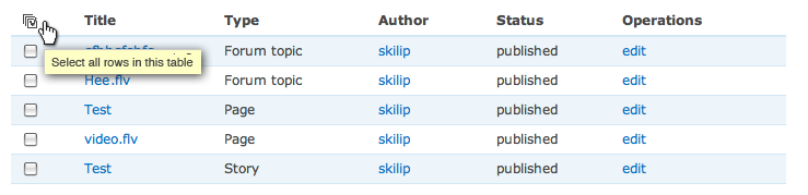
| #35 | table_select_operations-308468.png | 24.27 KB | skilip |
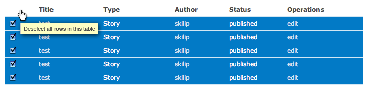
| #35 | table_deselect_operations-308468.png | 24.27 KB | skilip |


Comments
Comment #1
webchickIdeas kicked around in a brainstorm session in #drupal:
Gmail/PHPMyAdmin use links for select all, select none, etc:
A select all / deselect all button (don't know what this is from; found it in Google image search):
Hotmail and Horde do it basically like we do:
Comment #2
webchickIt's also possible that what we have there is perfectly fine, and the only reason it looks so bizarre is because it's not obvious where the page header stops and the table header begins.
Comment #3
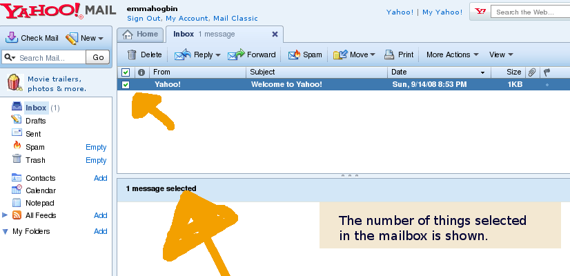
emmajane CreditAttribution: emmajane commentedYahoo mail tells you how many things are selected. I think that's kind of nice. (As you can see from my welcome message being the only mail in the folder, I'm not a huge Yahoo! mail user...so I can't say if this is a feature that I actually love to use.)
Comment #4
yoroy CreditAttribution: yoroy commentedJust fixing the alignment and bringing all table header content a bit closer down to the table body would be a solid improvement.
Another thing I noticed now is that in Drupal table headers do not have the convention of having slightly darker background colors. This is another factor that adds to the lost-in-spaceness of our little checkbox there.
There is a 'select-all' class assigned to the th element, but I couldn't find a
"th.select-all" in core's css files (checked on 6.4 though).
Maybe something to be added to admin.css?
Comment #5
floretan CreditAttribution: floretan commented#308272: Improve test selection page doesn't use the default tableselect.js to add the "check all" checkbox (I'm not sure it was intentional). This might be what causes the unusual alignment issue.
However, I agree with Yoroy that table headers are generally not clearly defined visually. This could definitely be improved, but I'm not sure how it would work with Garland's design.
Comment #6
yoroy CreditAttribution: yoroy commentedThe checkbox is consistently mis-aligned in other admin pages with other core themes as well, for example in admin/content/node
Comment #7
catchI reckon the missing background for Drupal tableheaders is partially to blame.
There were many, many followup patches to the sticky tableheaders towards the end of the D6 cycle, all kinds of alignment issues etc.
I personally quite like gmails 'select all' link - but I'm not sure if it'd be any good when it's only one link.
Comment #8
webchickWell, if we went for links, we'd need at least two: All and None.
I'm kind of leaning more towards a patch that just does what's suggested in #4: fix the alignment of the checkbox and move the table header closer to the table so it's more obvious they belong together.
Comment #9
catchIf we could have All, None, and 'Invert selection', that'd make me so happy. But fixing how the existing checkbox works ought to be done anyway.
Comment #10
illuminaut CreditAttribution: illuminaut commentedUsing a checkbox for "select all" is fine, but #4 and #5 are correct in that the main problem is the table header. It's not clear where the table header begins and ends, or that in fact it even is a header. Properly aligning the header columns with the table columns and giving the table header a background would make this more usable.
Comment #11
catchWhile we're on this subject, it'd be great to have a select all checkbox at the bottom of the table as well as at the top. The amount of times I jump to the bottom of the screen, then have to go back up the top, then back down the bottom to press the button.. well a big amount.
Comment #12
p.brouwers CreditAttribution: p.brouwers commentedI read this topic and I agree with #8
A link with All and None are a bit more clear.
I'd also like to see these links at the bottom of the bottom, with the update options (See attached image)
Though this should only be useful if there are allot of nodes on the page and you need to scroll, but I feel that having your actions also at the bottom of the page after selecting your nodes is more user friendly.
Think about it, you're selecting your nodes and you're at the bottom of the page then you need to scroll all the way to the top again to do your actions.
If we could decide what's best within this topic I'd be happy to make a patch for it.
Comment #14
edmund.kwok CreditAttribution: edmund.kwok commentedI'm seeing that the alignment issue is fixed in HEAD? The header row's checkbox is aligned with the rest of the checkboxes.
For the node admin screen, I also prefer the Gmail links as suggested by catch and webchick. And the Update options at the bottom as suggested by p.brouwers in #12 also improves usability as the user won't need to scroll up to perform the update options. Gmail also has the options control at the bottom ;)
Comment #15
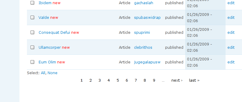
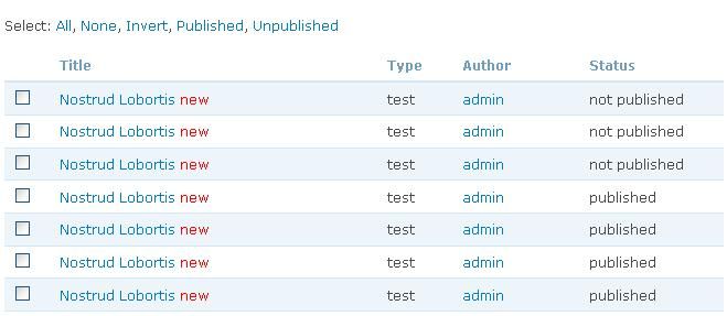
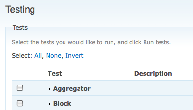
edmund.kwok CreditAttribution: edmund.kwok commentedAttached patch implements the Gmail type select operations - All, None, Invert
The operation links are added at the top and bottom of the table. Check screenshot for an example on the testing page.
Comment #16
edmund.kwok CreditAttribution: edmund.kwok commentedChanging issue status.
Comment #17
edmund.kwok CreditAttribution: edmund.kwok commentedAdd additional select options in node admin form, Published and Unpublished. Not sure if it's best for the select options being declared in the node_operations hook. Seems like it should be a hook on it's own.
Thoughts?
Comment #18
bcn CreditAttribution: bcn commentedI tested both patches (#15 & #17) and they both work as advertised. I definitely think that we should go with text links vs. a checkbox, and putting the links on the top and bottom of the table is crucial (for usability) as well. Attached is screen shot of the patch from #17.
At first I really liked the idea of having the ability to select 'published' or 'unpublished', but I'm leaning toward the idea that "All", "None", and "Invert" are sufficient.
1) Keeping this patch simple will increase the chance of it getting in sooner;
2) As you point out, using the _operations hook seems like a hack and might not extend cleanly to the other objects (e.g. users and comments) and will likely hold up this patch (file another issue to create a select operations hook?);
3) You can use filters to limit the results, and then use the "All", "None", or "Invert" options;
4) If you have "Invert", you only need "published" or "unpublished" not both, since you could just select "publish", then "invert" (okay, that's not a good reason against)...
Other than that, I think that we should continue to look to gmail for some inspiration. Specifically, if (in another issue) we could come up with some way to select ALL (as in, across all pages) items, that would be a HUGE time saver. The other thing gmail does nicely is to put the split the common operations out into buttons, and keeps the less common ones into the dropdown...
Comment #19
catchI really like the idea of being able to select published/unpublished like this (and then hopefully simplifying the node admin filters a bit as well) - but it shouldn't be introduced with this patch - can we move the additions in #17 to a followup issue?
However #15 looks like a viable patch to me, would be great to get some reviews both from the UX team and some javascript people.
Comment #20
catchComment #21
Bojhan CreditAttribution: Bojhan commentedThis patch looks sufficient, the position seems good - we could try moving it slightly more towards the chechboxes, not sure if garland allows this (but even without that, good patch).
I would say, remove the option "invert" as the use case for this is quite rare and adds a lot of clutter (mentally - what does it mean again).
Comment #22
yoroy CreditAttribution: yoroy commentedYep, agreed with the above:
- try to move it a bit closer to the table
- remove 'invert', it makes people think. thinking hurts :-)
Please provide a screenshot of how the links look at the bottom of the table as well. Thanks & good patch.
Comment #23
edmund.kwok CreditAttribution: edmund.kwok commentedThanks for the reviews guys. Attached patch removes the Invert operation, as well as Published and Unpublished. Agreed that the latter should be in a separate issue; let's get this in first. The select operations are also moved closed to the table - changed the table's margin-top. It's around 18px top and bottom now.
The onus is on catch to provide more use cases on the Invert operation since I added that on his suggestion ;) Screenshot of top and bottom of table is also attached.
Comment #24
catchAfter discussing the 'revert' thing with Bojhan in irc, I recant my suggestion - very happy with this as it is now.
Comment #25
webchickFirst, some minor code comments:
+ var strings = { 'selectAll': Drupal.t('Select all rows in this table'), 'selectAllLabel' : Drupal.t('All'), 'selectNone': Drupal.t('Deselect all rows in this table'), 'selectNoneLabel' : Drupal.t('None') };I know this falls under "wasn't my fault!" but could you please put those onto separate lines so they're easier to read? like:
var strings = {'selectAll': Drupal.t('Select all rows in this table'),
'selectAllLabel' : Drupal.t('All'),
'selectNone': Drupal.t('Deselect all rows in this table'),
'selectNoneLabel' : Drupal.t('None')
};
Same thing with:
+ $(table).before('<div class="select-operations"></span>').after('<div class="select-operations"></span>');(make it match the lines below where you have the various .somethingsomething indented.)
For comments...
+ // Create select operations link...
+ // Append select operations link to the top and bottom of table
...
etc.
All comments should "Be formatted like a sentence." (start with capital letter, end with a period/full stop) for consistency.
Other than that, this looks great, and has the Usability team's thumbs-up. :) I am cool with committing it, however, just some food for thought...
Here's a screenshot of Gmail's interface, and what my eye does when I look at it. It is very obvious which part of the table is the data part, and which part is the operations part. This is due to a number of factors, including colour and positioning:
Here's a screenshot of admin/content/node, and what my eye does when I look at it. The various "Select" links are invisible to me, because the filtering options and the table data itself are so prominent:
Without turning this into a kitten-eating, bikeshed, train-wreck of an issue, is there something small that we can do here to help alleviate this problem?
Comment #26
catchIf we gave table headers a background in Garland, then the operations would appear closer to the table. The other option is remove all that crap and replace it with a search filter.
However I think any changes like that are should be in followup issues - there's so much wrong with that page, this fixes a tiny part of it in a very nice way.
Comment #27
webchickI thought that might be it, too, but then I looked in Bluemarine, which also doesn't have colours behind the table headings, and it's still more clear there what's going on. This is because of the positioning of the links relative to the table:
Contrast with:
So could we try playing a bit with adding/removing some padding and see if that helps, perhaps?
Comment #28
yoroy CreditAttribution: yoroy commentedGood feedback and it shows we need large screenshots that show the complete environment.
Notice how Gmail does *not* use a table header at all (not suggestion we should that here).
The other elements being so prominent is what needs fixing next, it's not like we should make these text links blinking, purple h1's to make them stand out, rather tone down the surroundings, esp. the filters above.
Follow-ups:
- add a darker background to table headers in Garland, probably include the operation links visually (give them the same darker bg color)
- something with totally reworking those filters on the top of the page, we should brainstorm some options for that.
So yes, small steps please :-)
Comment #29
catchCut margin on the tableselect down to 0 for comparison which does indeed seem to help a bit, didn't fix any other issues in the patch.
Comment #30
catchScreenshots.
Comment #31
bcn CreditAttribution: bcn commentedA re-roll of the patch from #29, with the code comments from #25 incorporated.
Comment #32
p.brouwers CreditAttribution: p.brouwers commentedI see there has been quite some activity since my last suggestion, nice!
I'll see if I can brainstorm with some people on reworking those filters.
Comment #33
skilip CreditAttribution: skilip commentedsubscribe
Comment #34
yoroy CreditAttribution: yoroy commentedhow's this:

Comment #35
skilip CreditAttribution: skilip commentedFirst of all I don't see why we need to add the select all / none links at the bottom of the table. Since we have sticky table headers, the buttons will be always present.
Secondly, I really like the way GMail displays several selection options, however this is only useful when having more than two selection options. Just for select all / none it is just waist of space IMO. Therefore I'd suggest to keep the buttons inside the table header.
We already have an sort status indicator (the down- or upwards pointing triangle), so why don't we add a simple icon on top of the checkboxes? A single icon would do. You can check all / uncheck all with the same icon.
Comment #36
bcn CreditAttribution: bcn commentedI think #34 looks okay, but I think that if we're eventually going to join (even conceptually) the update options with the select options, we might want to keep the table header below the select links.
Attached is a screenshot with the header below the select options, which I'm not really saying looks better, but is useful for comparison.
Comment #37
webchickIf we can possibly avoid it, I'd really love to *not* pursue a colour-based approach to solving this issue because:
a) Then we need to have a bikeshed discussion over the exact shade of blue
b) It'll look inconsistent across themes
c) Themers will rail against yet *more* core CSS they have to override.
Comment #38
bcn CreditAttribution: bcn commentedRegarding #35:
Having the select options at the top and bottom is nice if you don't want to have to scroll up to the top of the page to make select all items, which granted at this point (without update options also at the bottom) doesn't make a huge difference. If we are not putting update options at the bottom too, then I would agree that the might not be needed at the bottom, but I think the real win here will be to have the select and update options at the top and bottom of the table.
As far as using an image vs. the text links, I'm strongly in favor of the text links.
Comment #39
p.brouwers CreditAttribution: p.brouwers commentedI see there's a new form element tableselect: http://drupal.org/node/242962
We should try to make the functionality work for this form element too.
Comment #41
Bojhan CreditAttribution: Bojhan commentedI am postponing this issue, until we touch the update part of the content form. The usability issue regarding select all is addressed by alignment of the checkbox.
Comment #42
Aren Cambre CreditAttribution: Aren Cambre commentedComplementary issue at #516234: "Select all" should allow selection of non-displayed nodes.
Comment #43
jix_ CreditAttribution: jix_ commentedInteresting. I was just thinking about this while working on #491258: Create issues for UI decisions reached, but not yet implemented
The checkbox works fine for table views I guess, but a Gmail-like text link approach is more bullet proof; it works for other types of views as well, like thumbnails. Plus you'd indeed have the ability to provide more selection options; 'published', 'unpublished', etc.
Example of usage in media library:
http://www.flickr.com/photos/mverbaar/3959012750/in/pool-drupalredesign
Comment #44
Bojhan CreditAttribution: Bojhan commentedWe dont seem to be touching the "update" part soon, but I have my hopes.
Comment #45
nod_Comment #46
dawehnerMove to node module, but in general this page is using a view now
Comment #55
larowlanComment #56
pameeela CreditAttribution: pameeela commentedWondering if anyone involved in the earlier conversation has thoughts about this issue now? IMO the checkbox is the standard now, even if it wasn't in 2008. Gmail is referenced several times, but it now uses the checkbox too.
Certainly I don't think it qualifies as a bug, but I'm not really sure that it should stay active as a feature request either?
Comment #57
LendudeYeah 12 years on, this looks pretty standard
With a View:
Not with a View:
So without a View, there is no checkbox anymore, so if there is anything still worth doing here it probably needs to be addressed at the Views level.
But I agree with #56 that we should probably just close this.
Comment #58
quietone CreditAttribution: quietone as a volunteer commentedThe IS refers to problems with the checkbox, which I agree are no longer relevant. But the title suggests a solution of having links for 'Select all/None/Invert' and supported by catch in #5. Is there a need for a followup to consider that?
Comment #59
pameeela CreditAttribution: pameeela commentedNine months on, no comments in support of further changes, so I'm going to close this. To @quietone's point though if anyone feels there is additional functionality to be added I think it should be a new feature request.