 Support for Drupal 7 is ending on 5 January 2025—it’s time to migrate to Drupal 10! Learn about the many benefits of Drupal 10 and find migration tools in our resource center.
Form elements
A form element is any item within a form used to collect data from a user.
Most commonly it consists of a title, an input field, a description, and possibly a prefix, a suffix, or both.
Contents of this Page
- Title
- Description
- Radio button
- Stand-alone checkbox
- Checkboxes
- Select list
- Label for radio button, checkboxes, or select lists
- Fieldsets & Details
- Vertical tabs
# Title
Use a simple and complete word or phrase which describes the form element as a title.
Only capitalize the first word, unless a proper noun or acronym is used.
Don't use punctuation at the end.
# Description
A description should be in full sentences.
It should give more information about the field, and it can provide an example for the user to follow.
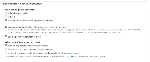
# Radio button
Use for lists of two or more options that are mutually exclusive, and where the user must select exactly one option.
Always provide a default option.
If the options describe a range (such as None, Standard, High), always start with the lowest value. (None in this case.)
If dual-radio buttons can be described in terms of true/false or enable/disable, use a stand-alone checkbox instead.
If there are more than 7 options, consider a select list instead.
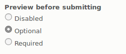
Radio buttons on the Article configuration page
# Stand-alone checkbox
Use when the user should be able to turn a single option on and off.
If the option cannot be described in the form of true/false or enable/disable, use a radio button instead.
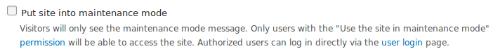
Stand-alone checkbox with description on the Maintenance mode page
# Checkboxes
Use when the user needs to select zero, one, or multiple options.
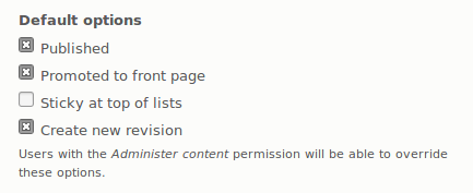
Checkboxes on the Article configuration page
# Select list
Use for 7 or more options, or when layout space is limited.
If possible, limit the length of the list to 5 to 15 items.
For long lists with predictable content, consider an autocomplete list.
Multiple option select lists (using the #multiple properties) are discouraged. Use radio buttons or checkboxes where possible.

Collapsed select list

The same select list open
# Labels for radio buttons, checkboxes, and select lists
The label should be a statement or a descriptive phrase.
Don't end with a period or a question mark.
Avoid beginning with Enable..., Is... Choose to... or Select to... because this is usually redundant.
Avoid negative phrases such as "Don't show this on the page" because this turns into a double-negative.
# Fieldsets & details
Pages with a lot of form elements without grouping and hierarchy are confusing and hard to use, especially when some form elements are not important enough to see all the time.
Use fieldsets or details (in Drupal 8)
- when there are a lot of form elements that need to be grouped logically;
- when there are very different form elements on a page; or
- when there are very similar form elements, but with a distinctive difference.
Use details if you visually want to organize a group of form elements.
Use fieldset if the fields are semantically related like a date field with year, month, day, and time.
Fieldsets/details should stay within a one-page scroll.
Avoid nested fieldsets/details because it confuses users.
Position default-collapsed fieldsets below expanded ones.
If a fieldset is collapsible, then the default state should be collapsed. If it is important that its content is displayed initially, then don't make it collapsible.
API for Fieldsets; Drupal 8, Drupal 7
API for Details: Drupal 8
Collapsed and open fieldsets on the Create article page
Details on the Account settings page
# Vertical tabs
Group subsets of related settings together and put them into vertical tabs, so that only one vertical tab at a time is displaying its form elements.
Use vertical tabs
- when you have a group of form elements that users can safely ignore, such as metadata elements or elements with good defaults; or
- for situations similar to the Emails settings on the Accounts settings page.
If you only have two vertical tabs, then use a fieldset instead.
Do not use vertical tabs for the main interaction in the form.
Do not use more than 9 vertical tabs, because it takes up too much vertical space.
Do not use nested or multiple vertical tabs, because it disorientates the user.
Don't use a pane that is too long. Vertical tabs are meant to be in view with the content of the page to allow orientation.
Placing functionality that is part of a certain workflow within vertical tabs is discouraged because the user should be able to skip the vertical tabs.
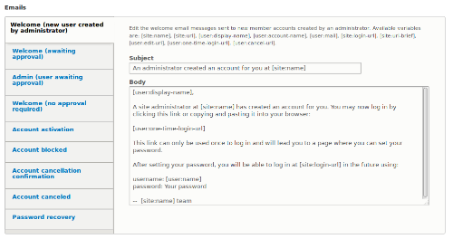
Vertical tabs on the Account settings page
Help improve this page
You can:
- Log in, click Edit, and edit this page
- Log in, click Discuss, update the Page status value, and suggest an improvement
- Log in and create a Documentation issue with your suggestion


