Style Guide: API
To change the list of items displayed by Style Guide, third-party modules
Style Guide: Helper functions
Style Guide uses the following helper functions to generate content:
Style Guide provides a visual testing page for Drupal themes. Quickly compare the display of common elements across your themes, and verify that your new theme addresses all common style elements. Check out the demo site to see it in action.
The Style Guide module creates a preview page for displaying common theme elements in all active themes for your Drupal site. The module comes with previews for common HTML elements, such as tables, forms, links and lists. The Style Guide module creates an API and preview page for displaying common theme elements. Use it to preview items such as tables, menus, and lists in your custom themes.
The purpose of a visual style guide as both a general theming and development tool is to ensure that common site elements are styled in a consistent and intentional way. For further reference see
See Installing contributed modules
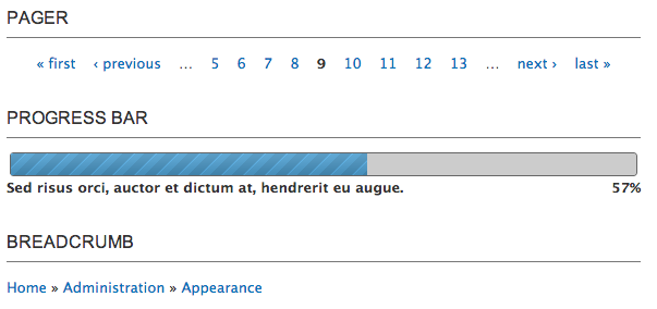
styleguide_palette module that's bundled with the styleguide module.Check out the demo site to see it in action. Screen shot example of of the pager, progress bar, and breadcrumb elements in the Seven theme:
To change the list of items displayed by Style Guide, third-party modules
Style Guide uses the following helper functions to generate content:

Drupal is a registered trademark of Dries Buytaert.
