
 Support for Drupal 7 is ending on 5 January 2025—it’s time to migrate to Drupal 10! Learn about the many benefits of Drupal 10 and find migration tools in our resource center.
I was playing around with the grid settings to try to understand how they effected the page layout. For the most part, they worked as expected, although I am still trying to get my head around it.
I did notice that with the following settings:
Grid System: Default (960px)
      Default (960px) layout settings
        -Responsive settings
            Enable the responsive grid  (CHECKED)

    Default (960px) layout settings
        Fluid layout - Use this layout with the responsive grid (CHECKED)
                        - Weight: 0
        Narrow layout - Use this layout with the responsive grid (CHECKED)
                            - Weight: 1
        All other layouts - Use this layout with the responsive grid (UNCHECKED)
Then (as expected) all the fluid CSS that was the same as the narrow css was crossed out in firebug.
But when I reversed the weight for Fluid and Narrow layouts, that was NOT the case. Only some of the CSS code for Fluid was overridden by the Narrow CSS.
I also note (with little to no understanding of media queries on my part) that the media queries input text boxes for these two layouts are identical.
| Comment | File | Size | Author |
|---|---|---|---|
| 960grid-Fluid_weight_1-Narrow_weight_0-NoOthersChecked.png | 72.99 KB | JSCSJSCS | |
| 960grid-Fluid_weight_0-Narrow_weight_1-NoOthersChecked.png | 73.28 KB | JSCSJSCS |


Comments
Comment #1
fubhy CreditAttribution: fubhy commentedI bet you didnt change the media queries? Only changing the weight but not changing the media queries will break it of course. The weight just tells the system how to sort the media queries (from most narrow to widest). Your media queries need to represent that order of course.
Comment #2
JSCSJSCS CreditAttribution: JSCSJSCS commentedAs I mentioned in irc chat, I assumed that if two or more media queries resulted in TRUE, then the WEIGHT of the layout should resolve the priority cascaded of CSS elements. I found this to be the case except when playing with the fluid layout in conjunction with the narrow. You had mentioned the problems might be that the default media query for the fluid and narrow layouts were identical, and regardless of what Firebug shows, to determine if it WORKS as designed.
Still using just fluid and narrow layouts, I changed the media query of the fluid layout by adding a test for a color screen so it would not be identical to the narrow. I changed it to:
all and (min-width: 740px) and (min-device-width: 740px)and (color), (max-device-width: 800px) and (min-width: 740px) and (orientation:landscape) and (color)
This should have made both fluid and narrow media queries result to TRUE and make the weight resolve the stylesheet cascade conflict.
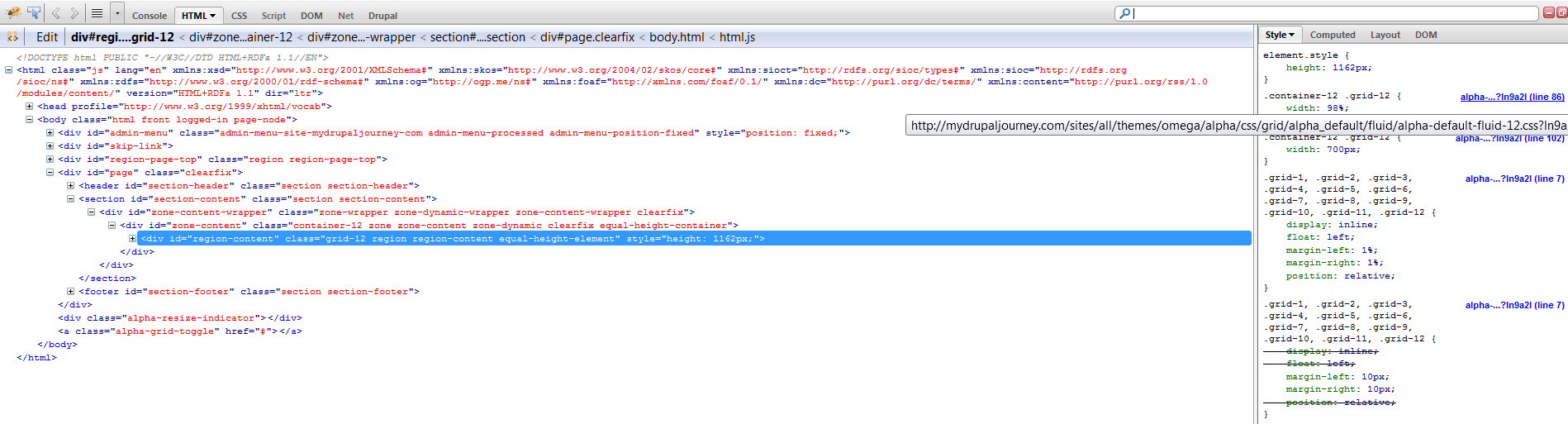
With Fluid set to Weight of 1 and narrow set to 0:
In Firefox 4.0.1, the content region showed up in 700 pixel fixed indicating the narrow layout was being used instead of the fluid, while the margin elements appeared to respond as if from the fluid css. Kind of a mix of both layouts, rather than one or the other.
In IE8, the mobile.css stylesheet was invoked and content at full width was displayed.
I am not learned enough to debug further, so unless someone else want to take up this flag and run with it, please feel free to mark it as works as expected.
Thanks again for the suggestions.
Comment #3
fubhy CreditAttribution: fubhy commentedIE8 does not follow the responsive grid and loads the "Primary layout" by default because it doesn't understand CSS3 media queries. Also, what I said about the identical media queries is that they just wont work as in "The lower weighted grid version will never be visible." but it won't break anything as the higher weighted version would just override the lower weighted version and nothing else would happen. I put the fluid grid into the package (deactivated by default) to REPLACE narrow if a user wishes to have a fluid grid for the narrow version. So using both at the same time is probably not what it was designed for anyways. However on my machine it works even if the narrow and fluid version are active. There must be something wrong with your setup. Anyways... It can't work in IE8 anyways since it will always load the primary grid (which is probably "normal".. or... since you say "full widht" it was probably even the fluid grid...). That really depends on what you set as your primary grid layout.
Comment #4
JSCSJSCS CreditAttribution: JSCSJSCS commentedFor IE8 and below, maybe something like this light javascript could be used to switch between stylesheets?
See the heading "Doing it with jQuery"
http://css-tricks.com/6206-resolution-specific-stylesheets/
Comment #5
marcoka CreditAttribution: marcoka commentedComment #6
Cellar Door CreditAttribution: Cellar Door commented