
Closed (fixed)
Project:
Drupal core
Version:
7.x-dev
Component:
CSS
Priority:
Minor
Category:
Bug report
Assigned:
Unassigned
Issue tags:
Reporter:
Created:
4 Sep 2011 at 13:31 UTC
Updated:
10 Jan 2014 at 21:50 UTC
Jump to comment: Most recent, Most recent file

Comments
Comment #1
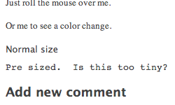
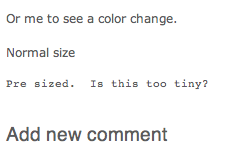
Everett Zufelt commentedCan you please attach a before / after screen-shot, and provide an objective rationale as to why you believe the current size is too small?
Comment #2
Everett Zufelt commentedComment #3
hass commentedCan you add a PRE to a test content, please? Than you will see. With original value - everyone need a magnifier also people with very good eyes.
Comment #4
droplet commentedfont smaller than 12px are hard to read.
Comment #5
droplet commentedproblem exists in Bartik only.
Comment #6
Everett Zufelt commentedSetting back to CSS so that proper people see the issue :)
Comment #7
Everett Zufelt commentedI'm not sure if this would be unreadable, but I'll leave that to someone who can actually see the output.
/themes/bartik/css/style.css
Comment #8
droplet commentedOkay. When to use Bartik Component ??
Even it can be fix in CSS but which it's more like a theme style issue. Bartik maintainer may missed this...
font-size: 1em = 14px in there. maybe too big ?
Comment #9
Everett Zufelt commented@droplet
If the primary issue is related to CSS / JS / Markup then use those components. If the primary issue is with the theme itself (perhaps there is a warning / notice being generated by template.php) then use Bartik.
It is sometimes difficult to know where to put the component for an issue.
Comment #10
yoroy commentedTo check if something is introduced by a theme or by unmodified core output you compare the output in Stark theme, which shows bare-bones core output, with Bartik (or Garland). If the problem is seen in Stark, then use the base CSS/JS Markup components, otherwise, use the specific theme component.
I think this needs specifying in which browser(s) this has been noticed. I can only check Safari, FF, Chrome on OS X and there it looks readable (not really smaller than regular body text size).
Comment #11
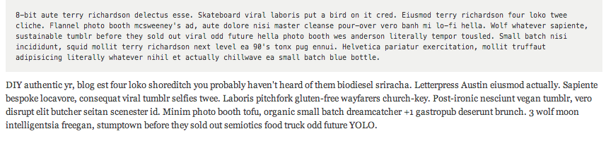
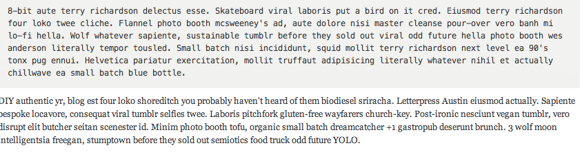
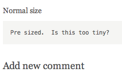
mgiffordJust posting screenshots of all 4 core themes & their pre sections.
Bartik is small and against a shaded background producing less contrast. This is different than all of the other themes. It helps the PRE content stand out more from the other content (which is good), but probably it shouldn't be smaller.
Given I haven't changed the theme & was just switching between them it is surprising how much variation there is in the text that was captured.
Comment #12
droplet commentedthe problem is we used EM on font size. It will getting smaller & smaller inside deeper layers.
e.g: example.com/filter/tips
Comment #13
mgiffordIs there a neat way to peg this in relation to the base font rather than allowing it to get persistently smaller for pieces like the filter tips?
Comment #15
mgifford@droplet if we set pre's font size to 1.0em then there won't be that problem of getting smaller as it gets deeper, right?
Comment #16
droplet commentedno. only PX or REM (css3) would help.
until today, I'm only see it will have problem inside table, might be add an extra css rule to it too.
Comment #17
josernitos commentedI think it's okay as it is now. 0.77em
Comment #18
hass commentedNo it's not. See the code examples at http://www.hass.de/content/how-create-msi-packages-multilingual-user-int...
Comment #19
droplet commented@hass example is a font issue.
If im remember correct "Consolas" come with Windows Vista / Office and sooner. So most Windows XP will use monospace to render the texts.
EDIT:
also suggest to patch the geshifilter modules
Comment #20
mgiffordWe discussed this at A11ySprint and there was some question about the use case for for PRE. Often preformatted text (if it is used for code or formatting) to simply needs to be copied. It isn't really intended to be read as it is usually in a format which has fixed width and is slightly less readable). The exception to that (that I can think of) is poetry, in which the formatting & spacing sometimes should use a fixed font width like Courier.
Now although there was a great conversation about the need for a website dedicated to Responsive Drupal Theme haiku's, there just aren't that many poetry sites in the Drupal world that we know about that would need this.
So, what is the use case for making it larger in core?
But ultimately, is PRE content likely to be read?
We weren't sure what the use case is and don't think there is a WCAG regulation that would tell us if 0.77em is too small or not.
It's also text which if enlarged won't wrap anyways (as that's one of the functions of the PRE tag.
Comment #21
droplet commentedalso read this issue #1653406: "monospace" is a font generic family name, this is more make sense now.
Default sizing in CORE is good enough. We can raise another issue for PRE in tables.
Comment #22
hass commentedLooks like all has been rolled back over there.
Comment #23
droplet commented@hass, looks at your own site.
It has render bug (#1653406)
EDIT: 0.77em, computed size is 11.53px. If you're a FF/Chrome user, computed size is 9.38px.
Comment #24
mgiffordFor Bartik I've bumped up the size here to the font size for of a table for consistency.
It seems larger than the baseline in Seven.
Comment #25
andymartha commentedAfter testing the patch Bartik-pre-larger-1269166-24.patch in #24 by mgifford, I confirm that the pre text is more in line with the size of regular text in a fresh installation of Drupal 8.x-dev. See screenshots in Google Chrome on Macbook.
Comment #26
webchickCool, I guess this works. It's certainly been RTBC long enough for someone with a problem to say something about it. :)
Committed and pushed to 8.x. Thanks!
Comment #27
hass commentedLet's move to D7. Should apply and RTBC, too.
Comment #28
mgiffordAdding D7 patch.
Comment #29
hass commentedComment #30
hass commentedComment #31
David_Rothstein commentedAlright, I guess this is unlikely to cause any harm, especially with a release notes mention. (Personally, it looks a bit too big to me after the patch, but whatever - this patch has been here for a long time and no one has complained.)
Committed to 7.x - thanks! http://drupalcode.org/project/drupal.git/commit/a009ee6