On this page
- Field display settings
- View modes
- Image styles
- Creating and editing image styles
- Example implementations of view modes and field displays
- Separate images on the front page and node view page
- Kitten-style images
- Exercises: documentation site
- Tables of attachments on comments
- How to demo
- Preparation
- Suggested solution
- Comments
- Retro style user images
- How to demo
- Preparation
- Suggested solution
- Comments
- Exercises: News site
- Section banner images
- How to demo
- Preparation
8: View modes and field display
Drupal 7 will no longer be supported after January 5, 2025. Learn more and find resources for Drupal 7 sites
As administrator you can add different types of fields to node types, comments, users and taxonomy terms, as the previous chapters have shown. These fields can be used to store just about any kind of data you need on the site, but it is also important that the data is displayed in the way you want.
Getting all data on your website displayed in a correct and aesthetic way is an art in itself, and too big a topic to be covered by this book. But the first steps are easy, changing the field display settings, and tweaking these settings for different view modes.
The initial version of this section of the Community Documentation came from the book Drupal 7: The Essentials, courtesy of NodeOne and Johan Falk.
Field display settings
A good place to start looking at field display settings are nodes. At the page for overviewing your node types (Structure, Content types) are links named Manage display. They lead to a page where you configure how the fields for the selected node type should be displayed. (See figure 8.1)
On that page you will find each entity field in the node type, along with settings for how the field content and field label should be displayed. You may change these settings in the following ways.
- You may change the order of the fields by clicking and dragging their sorting arrows.
- Labels can be set to be displayed above the field, inline with the field content, or not at all.
- The format setting dictates how the field content itself should be displayed. Which formats are available depends on the field types and widgets. For example, texts may be displayed in full or trimmed version, term references could be links or plain text, and files can be displayed with file names or full URLs. Some fields and widgets, such as images, have further settings you can access by a gear button on the field's row on the page.
- All fields can have the <hidden> format, meaning that they aren't displayed at all. Hidden fields are moved to the bottom of the list and marked as disabled.
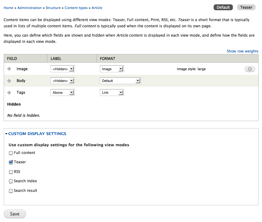
Figure 8.1: The field display settings for articles allow you to select which fields should be displayed and how.
View modes
How a node is displayed depends on the context in which it is viewed, such as the difference between full nodes and teasers. On the page for field display management there are extra settings under the label custom display settings. The settings consist of a check box list of all view modes available for nodes, marking which view modes should have customized display settings. In a standard Drupal installation only teaser is checked, resulting in two sub tabs on the manage display page – default and teaser. The sub tabs lead to separate settings for each view mode.

In a standard Drupal installation, the following view modes are available (machine names in parentheses):
- Full content (full): This is normally used only when visiting the URL for a particular node.
- Teaser (teaser): This is used on two list types – the front page and taxonomy term lists.
- RSS (rss): These settings are used when including the node in RSS feeds.
- Search index (search_index): This is used when Drupal core's Search module indexes content on the site. Fields that are hidden in this view mode will not be searchable.
- Search result (search_result): This is used when presenting search results on the website with Drupal core's Search module.
While nodes have a number of different view modes, other entities only have one view mode each. They are full comment (comments), user account (users) and taxonomy term page (taxonomy terms).
All entities have their own pages for managing field display. They are accessed as a tab from the pages used for managing their field settings.
In Drupal 7, additional View modes can be added to entities using hook_entity_info_alter().
Example Code:
/**
 * Implements hook_entity_info_alter().
 */
function MYMODULE_entity_info_alter(&$entity_info) {
  $entity_info['node']['view modes']['alternate'] = array(
    'label' => t('Alternate'),
    'custom settings' => TRUE,
  );
}
In Drupal 8, adding a custom view mode can be accomplished without code. To add one, expand Custom Display Settings on the Manage Display tab of a content type, then click Manage View Modes.
Each view mode can have a separate template. A template for an article node (machine name: article) is defined as node--article.tpl.php, then a template such as node--article--teaser.tpl.php can be defined specific for the teaser view mode. By adding more view modes the same piece of content can be re-used in other places with different markup and selected fields. To allow for templates per view mode just create a template suggestion in THEME_preprocess_node:
/**
 * Implements template_preprocess_node()
 */
function THEME_preprocess_node(&$variables) {
  $node = $variables['node'];
  $view_mode = $variables['view_mode'];

  // Set up template suggestions for non-standard view modes
  if ($view_mode !== 'full') {
    $variables['theme_hook_suggestions'][] = 'node__' . $node->type . '__' . $view_mode;
  }
}
Contributed modules can be leveraged to add View modes to entities via the UI without writing code.
The Display Suite module makes it possible to add more view modes to your entities.
The Drupal 7 successor to Build modes which will allow administrators to define custom view modes for entities.
Image styles
Drupal has built-in functionality to automatically scale and resize images. This is managed by image styles, which, in classic Drupal style, may be manipulated and extended by administrators. Each style is available in the field display settings, where you can select which style best fits each view mode.
Image styles are created and edited from the toolbar, Configuration, Media,Image styles. The resulting page contains an overview of all available image styles, links to edit each style, and also a link to create additional styles. (See figure 8.2)
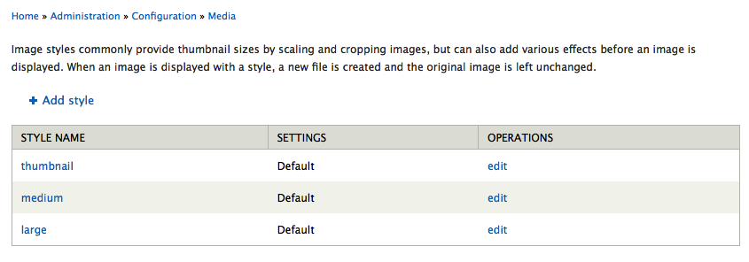
Figure 8.2: A standard Drupal installation contains three image styles – pre-defined ways of displaying images.
TIP: Image styles create image derivatives that are stored in the file system – but will never change the original images.
Creating and editing image styles
The first step in creating a new image style is to provide it with a machine name. (This is one of the few places in Drupal where you have to enter machine names manually.) The name will be used in the path to style's image derivatives and should only contain lowercase alpha-numericals, dashes (-) and underscores (_). A common practice is to name a style by their use case ('sidebar_small') or their actual sizes ('180x180').
Saving the machine name creates an empty image style and redirects you to the page to edit it. (See figure 8.3.) Here you may add one or several effects, used to manipulate the image. A standard Drupal installation provides the following effects:
- Crop: This cuts the image down to selected measurements. You can specify which part of the image should be in focus.
- Desaturate: This converts the image to grey scale.
- Resize: This streches or shrinks the image to a size that you define, without any cropping.
- Rotate: This rotates the image a number of degrees. You can set which background color should be used on any blank spots revealed by the rotation or you can optionally have a random rotation, with a specified maximum angle.
- Scale: This scales down the image to fit within a specified width and height. (You may set only one dimension to scale the image.) You may optionally allow the images to be scaled up too, if it is smaller than the given dimensions.
- Scale and crop: This scales the image to cover a given width and height, cropping any parts outside the given frame after scaling.
The most commonly used effects are scale and scale and crop. You may chain several effects to create combined image effects. Administrators may reorder effects in a style, add or remove existing effects.
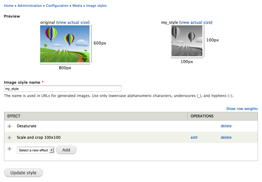
Figure 8.3: Image styles consists of a number of effects, used to process the image.
TIP: Image styles defined by modules, such as the ones included in a standard installation, can't be deleted. You have to actively override the standard settings to be able to edit their effects. You can revert the styles to their default settings later on, if need be.
TIP: The ImageCache Actions module provides a number of new effects for image processing.
Example implementations of view modes and field displays
This section contains examples of how the concepts and functionalities in this chapter may be used. You can find more examples in the exercises.
Separate images on the front page and node view page
As editor on my news site I want to be able have separate images for articles when viewed on the front page compared to the article's own page. This is important since it allows me to create more attractive article teasers.
The functionality above can be achieved by the following steps:
- A new image field teaser image for articles.
- The display of the teaser image is hidden on the full node view.
- The display of the original image field is hidden on teaser view.
- The teaser image is set to be displayed in a suitable image style, on teaser view mode only.
Kitten-style images
As member of a forum for kitten lovers, I would like uploaded kitten photos to be displayed slightly aslant rather than in the regular, right-angled fashion. This is important since it gives me cuddly feeling that I appreciate.
The functionality above can be achieved by the following steps:
- A new image style, aslant, is added.
- The style gets two effects that (1) scales and crops the image to 240 by 240 pixels, and then (2) rotates the image a random number of degrees – maximum 15°.
- A new image field is added to the node type kitten photos (assumed to already exist).
- The field display is set to show the image in the aslant style.
Exercises: documentation site
These exercises build on previous exercises in the documentation site suite. They can be carried out individually, with some preparation, or in sequence with the previous exercises. The exercises require using the concepts described in previous chapters in this book, including part A.
Tables of attachments on comments
As a site member posting a comment on a documentation page, I want to be able to attach files, just as I can when editing the documentation page. I want the attached files to be displayed in a table. This is important since file attachments are useful when discussing documentation.
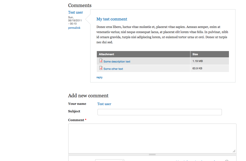
Figure 8.4: An example of how the file attachments on comments may look.
How to demo
- Log in to the site.
- Post a comment to a documentation page, attaching at least one file.
- Verify that the accepted file types are the same as when attaching files to documentation pages.
- Verify that the attached files are displayed in a table.
Preparation
- The site should have a documentation page content type, as provided by the first exercise in this suite.
Suggested solution
- Go to the tab comment fields for the documentation page node type. (See comment and user fields.)
- Add the existing field – the attachment field used on documentation page nodes. Set the configuration identical to how it is used in the documentation page node type. (See reusing fields in the fields chapter.)
- Go to the tab comment display. Set the format for the attachment field to table of files and hide the label. (See field display settings in this chapter.)
Comments
- Since the user story explicitly says that files should be managed in the same way on comments as on documentation pages, it may be a good idea to reuse the field rather than create a new one. Still – while creating a new field takes a few more minutes, it may save you many hours of work later on.
- Since the client seems interested in using attachments in the same way in both documentation pages and their comments, it is probably a good idea to display files as tables on the node as well.
Retro style user images
As a site member I want user images to be displayed in a retro coarse-grained pixel style. This is important since it reminds me of old video games, providing a positive feeling on the site.

Figure 8.5: An example of how retro style user images may look.
How to demo
- Log in to the site.
- Edit your user account and upload a user image of normal quality.
- Verify that the image is displayed in a coarse-grained pixel style on the account page.
Preparation
- The user accounts should allow image upload, as described in the exercise user information in the fields chapter.
Suggested solution
- Go to the overview page for image styles. Add a new image style retro. (See image styles.)
- Add an action scale and crop to reduce the image size to 16 times 16 pixels. (See creating and editing image styles.)
- Add another action scale, to increase the image size to 240 pixels squared. Make sure to check the option upscaling allowed. (See creating and editing image styles.)
- Go to the display fields tab for user account fields. Change the image format to retro. (See field display settings.)
Comments
- When using so heavily distorted images, it makes sense to use the same format for the image preview used when uploading the image. This setting is changed within settings in the field itself.
Exercises: News site
These exercises build on previous exercises in the news site suite. They can be carried out individually, with some preparation, or in sequence with the previous exercises. The exercises require using the concepts described in previous chapters in this book, including part A.
Section banner images
As editor I would like to be able to set section banner images, appearing at the top of each section's news list. This is important since I believe that it helps visitors recognize each section and makes them feel more comfortable reading news on our site.
Note that this user story would be better phrased in terms of what site visitors want, not the site editors. Investigating end user needs and expectations is imperative when developing websites.
How to demo
- Log in to the site as editor.
- Edit a section list page and add an image to it. Save.
- Verify that the image appears in a flat and wide style at the top of the section's article list.
Preparation
- The site should have a section vocabulary, as described in the exercise sections and sub sections in the previous chapter.
Help improve this page
You can:
- Log in, click Edit, and edit this page
- Log in, click Discuss, update the Page status value, and suggest an improvement
- Log in and create a Documentation issue with your suggestion
