
The currently used CSS for the progress block is not the best solution.
It exist problems width the weight setting for the list elements - general and particularly on smaller mobile devices.
The patch provides a better solution.
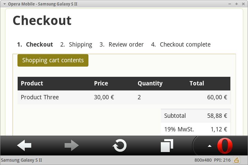
Small device screenshot
| Comment | File | Size | Author |
|---|---|---|---|
| commerce_checkout_progress.css_.patch | 850 bytes | quiptime |


Comments
Comment #1
jcisio CreditAttribution: jcisio commentedI'm not confort with adding extra styling into the module. Those customisations could be done with your theme. Add them into the module could break all current websites using it.
Comment #2
quiptime CreditAttribution: quiptime commentedI'm sure, you have not tested the patch.
At one point you're right:
These are all the pages that have fixed the bad CSS formatting of the module.
But,
a fresh Drupal installation can not be broken with the CSS code from my patch.
This means that the module does not work out of the box.
This fact should be documented on the project site!
(I can not understand and accept your attitude to the development of contributed modules.)
I have reopened the issue to be told by others, what they think.
Comment #3
jcisio CreditAttribution: jcisio commentedWell, Drupal core adds extra margin/padding into UL/OL tags. Some core theme (Bartik) even change the padding etc. after that. But it is done at the template level. If a site want to change the CSS, the theme CSS files will be modified. IMHO, adding lines like:
in a contrib module will:
1. Break current websites (solution: 1/ add them at the beginning, or when it was not widely used)
2. Add extra resource: many sites could override them with e.g. margin-left: 1em;margin-right: 1em; etc. so it will take extra bandwidth to download module's CSS that is not used.
I should have changed the status to "Works as designed" instead of "Won't fix". This is not a bug.
Comment #4
quiptime CreditAttribution: quiptime commented@jcisio,
can you understand the problem?
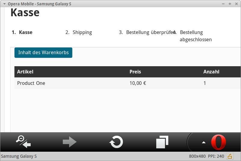
The currently CSS code breaks other themes - see screenshot. But, not my CSS code from patch.
Screenshot to demonstrate broken layout:
The currently implemented CSS code to format the "Checkout progress indication" is more a case study than a ready-made solution!
???
Comment #5
jcisio CreditAttribution: jcisio commentedThen I think only this one is necessary:
Comment #6
jcisio CreditAttribution: jcisio commentedI'm even not sure about #5. I've just read the code:
* To keep the ol as expected. Width assumes up to 6 pages.So the 16% is there for a reason: 1/ to keep each tab the same width 2/ to support up to 6 tabs. I don't understand why you don't want to change it in your theme. In anycase, when the page title is too long, it breaks. It's at the theme to fix it (reduce font size, make text more condense etc.).
Comment #7
quiptime CreditAttribution: quiptime commentedYou don't understand the problem. Really.
Your CSS produce unused white space appears between the checkout step titles.
You say, this can fix a user with own CSS code in the theme CCS file. But,
such fixes are not necessary if the module uses better CSS code.
The use of fixed weight 16% or a different width is not the solution!
Note
What makes a user with 3+ different languages of the website?
In any language, the checkout step titles has a significant different length. It is not simple to use language-dependent CSS formatting. A language-dependent solution produce unnecessary overhead.
This can be done. But,
this is completely nonsense. Such fixes are not necessary if the module uses better CSS code.
My patch offers a generic solution to avoid additional CSS code by themers.
And this ist the best way what should implement the module.
In other words
Your CSS code
Comment #8
jcisio CreditAttribution: jcisio commentedThere is NO CSS ship with the module, except only ONE to make the inline list. The while space is added by Drupal core (or a theme, I don't care, but it's not the module). Please don't try to fix theming issue in this module.
I thought the only line that makes sense is "width:auto". However, it breaks the default behavior: each tab has the same width. Auto width or fixed width, it's a personal choice. And the choice was made (not by me, anyway). And I don't intend to change it.
I understand what you want to do by resetting the CSS. But it's under your assumption. If a user doesn't want zéro margin, he/she will add
margin: 1em. It makes the extra CSS in your patch useless. That's what has been said in #3.Set as NW so that if the patch changes, there is a chance another maintainer commit the "width:auto" part.
Comment #9
quiptime CreditAttribution: quiptime commentedYou know really, what are you talking about?
The white space is added by the module:
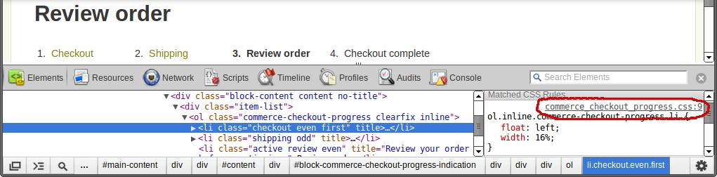
The "Checkout progress indication" is in some ways like a pager.
Have you ever seen a Drupal pager which used such spaces as "Checkout progress indication"?
You ignore in your argumentation my Note of #7.
Thus, it becomes clear: You do not know what you are talking.
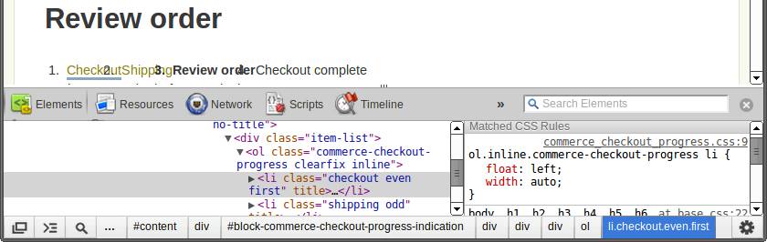
You want to see the result of the change "width: 16%" to "width: auto"?
Here it is:
The debate has reached a point where it is pointless for me.
I will not discuss further. Thanks for your time.
Comment #10
jcisio CreditAttribution: jcisio commentedSorry, but half of my Commerce sites are like that.
- The so called "white space" in your image is what I call "fixed width" in #8. I don't have any problem with that. That's why I won't commit the "width: auto". Hope you understand it now.
- I thought you said about "white space" that you were trying reset with "margin:0" in your patch. Sorry for having misunderstood that.
Then it works as designed. Close the issue so that it disappears from my list. You don't have to do anything more if you keep thinking that your interlocutor does not understand, it just poison the conversion. Please reread what you wrote, it does not have any respect.
Comment #11
quiptime CreditAttribution: quiptime commentedI will say you what I think over the process of the CSS code implementation.
You resultet the problem to display a inline ordered list.
Now, you ask google or an other search service. All search results for "CSS formatting inline ol list" offers the solution you have implemented in the module.
Your problem at this point is, the implemented CSS solution is not final. Is not final for Drupal. Is not final for real fluid usage. Is not final for use on small devices.
Your next problem at this time is, that you think: It exist many installs with your simple and not final code. And this is the reason for you to believe the code is ok.
Your problem for the last instance in this discussion is that you not willing to think differently.