
Closed (won't fix)
Project:
Drupal core
Version:
8.1.x-dev
Component:
responsive_image.module
Priority:
Normal
Category:
Task
Assigned:
Unassigned
Issue tags:
Reporter:
Created:
26 Jul 2012 at 08:02 UTC
Updated:
24 Sep 2014 at 19:33 UTC
Jump to comment: Most recent, Most recent file

Comments
Comment #1
webchickCopying a bit from #1170478-150: Responsive Images:
The current thinking of the Spark team on how breakpoints could be defined in a visual way is at about 1:25 in this video: http://www.youtube.com/watch?v=Ek2eyWZPI1c This design is not yet implemented, but our similar "raw values form fields" stuff which is implemented currently can be found in the Layout module: http://drupal.org/project/layout if you want to take a look. Currently, this is actually targeting the content area (ala Panelizer), not the entire page, but we do hope for it to be able to do both.
I do think that defining breakpoints "globally" is going to make more sense to users, rather than defining some for the global page area, some for the content area, and still others for where images will break. Ideally, you'd define your global site's breakpoint sizes, and then these would be selectable from image styles.
Comment #2
attiks commentedI had a look at the video, the problem with limiting breakpoint to px (or em) is that it will limit themers, I like the UI but would like to see an 'advanced mode' link so people can go crazy with MQ, unless that's out-of-scope.
As it is now, I think one UI will not be sufficient, it will depend on their 'role' (non-exhaustive list)
Related: #1693036: Responsive layouts & responsive images: both need breakpoints
Comment #3
webchickCreated an issue to track that feature request in the Layout queue. #1701716: Add the ability for "advanced crazy" settings for people to add their own breakpoint-specific media queries. Let's keep the discussion here, though.
Comment #4
rainbowarrayI think the visual way in which breakpoints are set is really cool.
I would concur with attiks that it's essential that those breakpoints aren't defined solely by px. In fact, I would strongly suggest that px should not be the default. Ems are a much more robust way to set breakpoints. The really big advantage of ems is that if the user changes the font size (rather than the zoom level), then the site's layout will adapt along with it. A good example is that if a user is on a desktop, but has bumped up the font size, then the tablet layout might be used. This helps to keep line lengths reasonable and improves readability.
There are other units, like rem, and maybe vw and vh, that should also be options.
Just to be clear, the breakpoint should be set with em (as a default), the point at which the layout shifts. However, the actual width of the region should still be set with % to create a fluid layout.
Comment #5
rainbowarrayThe other question is what breakpoints image styles should use.
To take a step back, it's important that there can be several different styles available for images. For my main content area, I might have three types of images (or more). I could have a Hero image, that will always be the full width of the content area, even on very large displays. I might have a smaller image that would be full width for mobile, and maybe small tablets, but would float to the right or left at larger sizes. And I might have a medium image that would be somewhere in between. There might also be several other different style groupings for other regions, such as banner images, carousel images, footer images, etc.
Let's just say, for the sake of argument, that each of these image types has a different file field or file entity associated with it. As a site builder, what I would like to do is to go into the settings for each file field/entity, and select the responsive image style for that image type.
If I look at the responsive image styles, I want to basically have a set of styles that are grouped together, associating breakpoints with image styles. I definitely want to be able to use the theme's breakpoints as the default options for that responsive image style group. However, I also want to be able to create my own custom breakpoints for that responsive image style. For example, I might find that when working with the design that my medium image size looks awkward if I shift it at the theme breakpoints. However, at a little bit smaller or little bit larger breakpoint, it works just fine.
This fits in with the larger philosophy of responsive design. It's critical to remember that we're not shifting layout at various device sizes. Device sizes come and go. We're shifting the layout at the points where the design gets awkward. Breakpoints are based on content, and how it looks at different viewports, not on different devices. Responsive images are essential content, and thus may well have their own breakpoints.
Simplicity is a great thing. The average user might not think to create breakpoints for certain image styles. However, that power should be there (under the hood), for those advanced users who want to take advantage of all Drupal has to offer.
Intelligent defaults coupled with fine-grained controls is a beautiful thing.
Comment #6
attiks commentedFYI: There's now a D7 version of breakpoints.
Comment #7
Jeff Burnz commented#5 is bang on correct, its in fact rare that layout breakpoints would suffice in all circumstances, I have never built a responsive theme/site where this was the case, its the exception rather than the rule. Ability to define fine grained breakpoints is not "crazy advanced" is par for the course of responsive design.
That said I don't think a default in em's is workable - people don't understand this unit, whereas they do understand px implicitly.
Comment #8
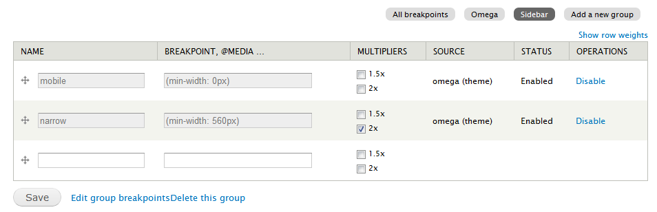
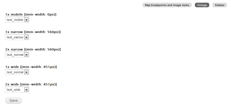
attiks commentedBoth breakpoints (7.x-1.x) and resp_img (7.x-2.x) are updated:
Breakpoints
Responsive images
Comment #9
shyamala commentedAgree with #5 for all practical applications there will be multiple images with sets of images styles that will need to be associated with a specific breakpoint. We need a matrix to map all image styles to breakpoints. In Responsive images as defined in #8, only one set of image styles can be associated with a group.
Comment #10
andypostSuppose first we need to implement List/Form controllers for breakpoint's entities. Probably separate issue
Comment #11
attiks commentedThere's already some work done, but it's old by now I think, see http://drupalcode.org/project/breakpoints.git/tree/refs/heads/core_ui
Comment #11.0
attiks commentedadded related issues
Comment #12
rainbowarraySince this issue is quite old and contains discussions of UI that are no longer possible to get into Drupal 8.0, I've postponed this issue and created a new issue (#2271529: Move breakpoint settings to theme and module *.breakpoints.yml files at root level) to focus discussion on a basic UI that could we could get in place for Drupal 8.0, probably based on the Drupal 7 Breakpoints module UI.
Comment #13
rainbowarrayComment #14
andypostComment #15
attiks commentedSince breakpoints are no longer config and only exists in yml file, this is no longer needed.