
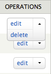
A new dropbutton element was introduced in core. The dropbutton consists of a primary operation link alongside a dropdown arrow. Clicking on the dropdown arrow presents secondary operations.
There are many situations in which a list of operation links is presented alongside a view or entity. When one operation is more common than the others, the dropbutton should be used, and the most common operation should be presented first.
You can render a dropbutton by setting its renderable array #type to 'operations'. In this example, the #subtype is set to 'node' since this dropbutton is displayed alongside a node (example adapted from content overview page at admin/content):
$element['operations'] = array(
  '#type' => 'operations',
  '#subtype' => 'node',
  '#links' => $operations,
);
Where $operations is an array of links.
Here is an example of a dropbutton on the content overview page:

| Attachment | Size |
|---|---|
| operations-dropbutton.png | 4.53 KB |
