More Seven Theme issues: #1986434: New visual style for Seven
Problem/Motivation
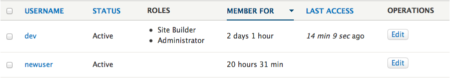
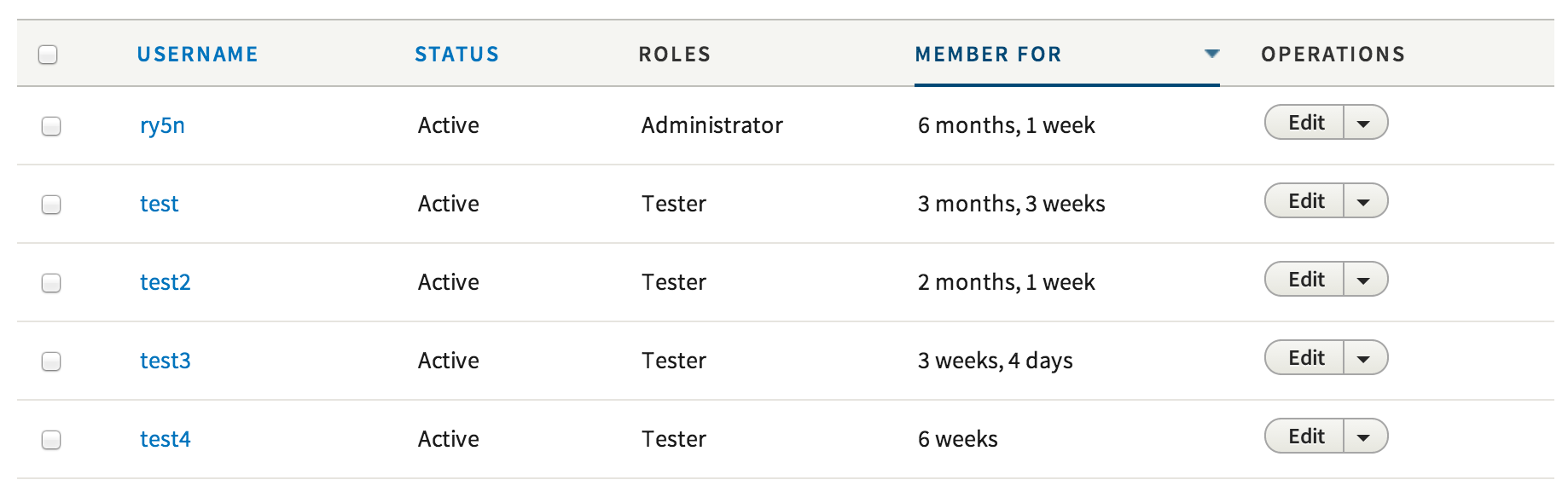
Tables have seen little issues, the only improvement we saw was to remove some of the distracting elements and improving the whitespace.
We developed Proposal: A Style Guide for Seven. This issue aims to introduce the proposed styling for tables to core.
To quote the rationale provided:
To improve the ratio of information to UI chrome, this guide recommends removing zebra striping and using thin rules to separate table rows. A progressive enhancement creates a subtle highlight on the hovered table row, allowing the eye to more easily move horizontally along the row, even when large stretches of whitespace appear between cells contents. (Note that this effect, being an enhancement, has no planned touchscreen equivalent and does not pass WCAG contrast standards.) For similar reasons, this style also removes left and right borders from the table and table cells.
The style used here for the sort-active table header cell is a motif carried through to other elements, such as secondary tabs and pagination. This consistency is both good for usability and for Drupal’s credibility (part of the brand).
Proposed resolution
In #1945546: Add Table component and variants we laid the ground work for this change.

We propose to change the zebra styling, the headers, the on hover styling and the spacing.
Remaining tasks
- Make a patch
- Review accessibility
User interface changes
The table style will be changed, no functional differences.
API changes
None


Comments
Comment #1
oresh commentedFor no reason I had so much time on trying to create the patch, oh - took more than making the changes themselves.
Includes 4 images for table sorting and removing images for sorting from template.
Comment #2
Bojhan commented@oresh Great! Thanks for kicking this off! Its so exciting to see this inside Drupal, my first review:
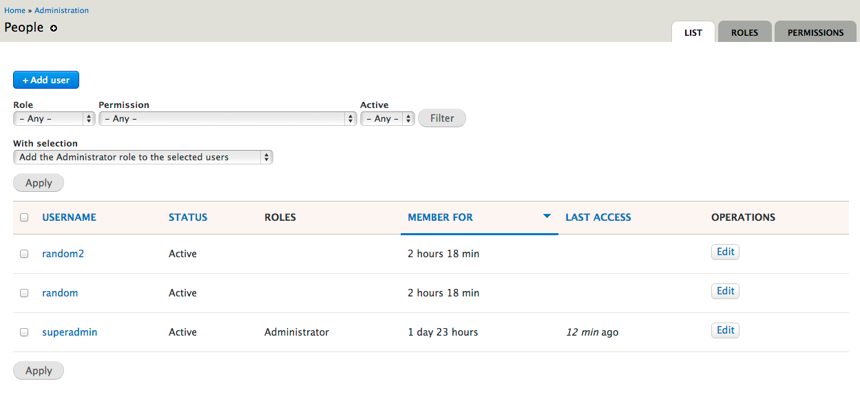
Below is an image of the current implementation
Comment #3
oresh commentedFixed all above.
The font is different, that's why it looks like that :)
I didn't touch the font family in this patch. I think it's work for another patch.
Comment #4
aspilicious commentedIf you're changing these kinda things you need to be sure it is rendered correctly in RTL mode. You can do this by switcing from LTR to RTL in the language settings. Its possible that you need to enable an aditional language to get the settings page.
BTW: please provide screenshots.
Comment #5
oresh commented@aspilicious thx!
I've did that and found one small bug.
But now I need more information - how a table should look with RTL language?
Attaching screenshot how it looks like right now. (with a small fix for the bug above)
I doubt that rtl table doesn't need any changes.
Comment #6
Bojhan commentedThis seems to be bugged on the content type page (any page with no checkbox).
Comment #7
Bojhan commentedComment #8
Bojhan commentedComment #9
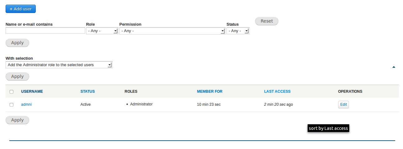
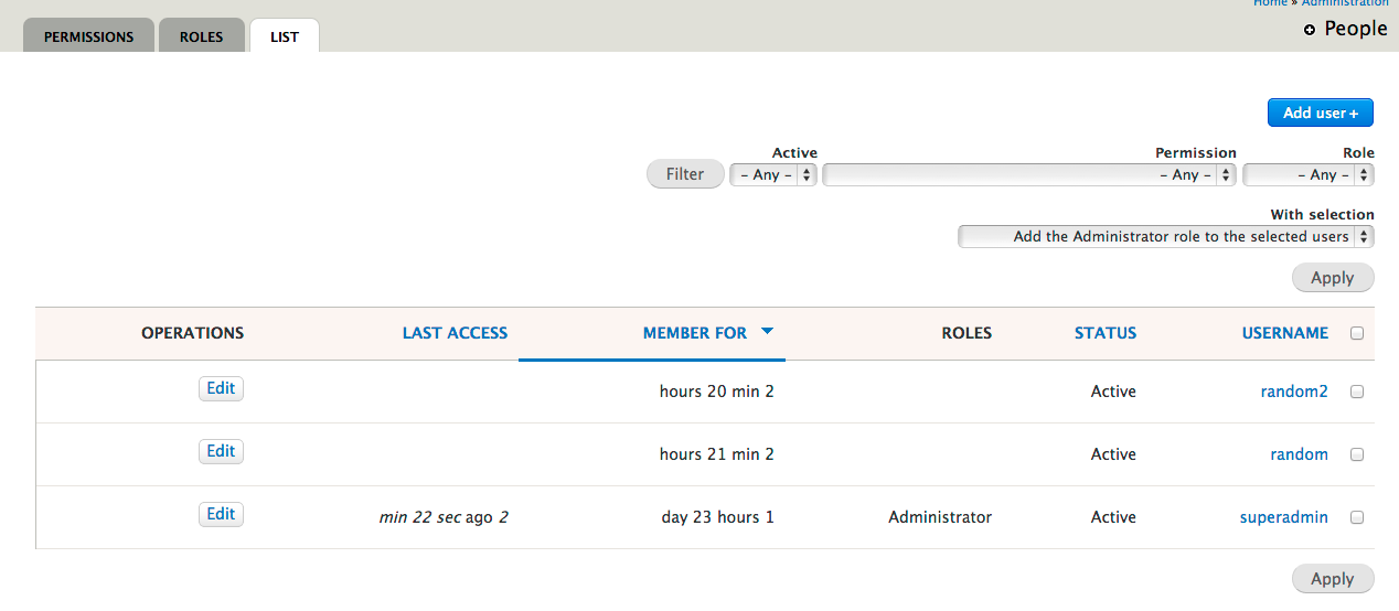
lewisnymanWhy are the table headers red?
Comment #10
ry5n commented@Bojhan:
- looks like maybe there's something rendering as a list-item in there, creating a bullet and some extra space.
- Why do you say those two columns should be right aligned? Is this an RTL display? If so, all the items should be right-aligned.
Comment #11
Bojhan commented@ry5n my image reviews the RTL display.
Comment #12
Bojhan commentedThis should be quite easy to fix, adding sprint tag.
Comment #13
echoz commented#9, thead is mistakenly #faf5f2 rather than #f5f5f2
Comment #14
wim leersOptimized PNG files! YAY! :)
(Note: I'm no CSS expert, so this is a best-effort attempt at feedback.)
This only works in IE>=9, which is acceptable now that we don't support IE8 anymore :)
Why is this in px if the font size is defined in rem?
I thought this might be problematic on touch devices (like it was for contextual links) but it is not. Yay :)
What's this for? Why the transition?
A bit of docs would be helpful here.
Nitpick: missing space after colon.
These selectors appear to be a tad too broad? http://www.w3.org/TR/wai-aria/states_and_properties#aria-sort says this should be used for tables *and grids*. Though I guess this is sufficient for the 99%? If so, ignore this.
Comment #15
wim leersd.o WTF
Comment #15.0
wim leersmeta issue added
Comment #16
ironkiat commentedHopefully I'm doing it correctly...
Interdiff:
https://dl.dropboxusercontent.com/u/1539612/1986400-4-interdiff.txt
Some notes:
Screenshots:
Comment #17
echoz commentedI'm assuming status should be NR since #16 submitted a patch.
Comment #19
ironkiat commentedWoops, I guess it always happens for the first patch :P Will check on why failed and submit another patch.
But I think some help needed, the review failed didn't mention much details...anyone have some idea?
Thanks!
Comment #20
ironkiat commentedOk I realize why, missing 2 new images for the hover arrows...fingers crossed!
Interdiff here: https://dl.dropboxusercontent.com/u/1539612/1986400-tables-styling-5-int...
Comment #21
echoz commented#20 is not ok, it's a 1MB patch, I assume patched from the wrong location.
I've started from scratch, implementing the table as in seventy-eight, including new arrow images using seventy-eight colors.
Notes:
* The aria-sort is not currently implemented, and this needs help.
* Yes, text is larger since the design's font is not in use.
* I left the bullets in for clarity with multiple roles. If any line wrap they would be unintelligible.
* seventy-eight's padding on th and td differs. Unsure if intentional, I equalized them since unusual that checkboxes don't line up, and just looked like a mistake.
Comment #22
Bojhan commented@echoz Awesome work, I checked out the patch - it works really nice, only a few bugs:
Your decision to align the padding and bullets feels right. This is starting to feel close :)
Comment #23
echoz commentedThanks @Bojhan!
* The dropbutton has a space under it (pushing it up from vertically centered), that will need to be corrected in the dropbutton code.
* I can't reproduce 2 arrows, can you tell me or show where? I see "Updated" at admin/content with one arrow. Browser cache?
* Next patch, I will not change font size and it will look proportionately sized.
* The original patch began with the aria-sort attribute selectors, but they never worked. Was there a discussion that this would be the method for toggling the sort arrows? I do not know how to implement this.
Comment #24
ideogram_nl commentedI applied patch #21 on a fresh Drupal 8 installation from 'git'.
It strikes me that the arrows do not 'flip' when changing from 'ascending' to 'descending' sorting. The arrow always points downward. ▼
Lastly, I do not see the nice underline under the active table-header.
Comment #25
ideogram_nl commentedI've edited the CSS file to address issue with the underlined table-header.
Comment #27
ironkiat commentedI realize why my original patch was 1mb instead of few kbs...so I did a pull again from the 8.x branch and create the patch again.
Understand this and echoz version is different, but I agree the aria-sort may not work again in this as well.
Comment #29
echoz commented@ideogram_nl, #21 and #23 explain that the arrows don't flip. Also, the underline css is there and works, shown in the screenshot.
@ironkiat, what is your patch correcting over #21? It is up for review, you're welcome to review it :-)
Comment #30
echoz commented#27 deviates from seventy-eight and in part is why I had started clean in #21.
This is #21 patch with only the original font size unchanged. This is mainly to keep this patch as the one already under review.
Comment #32
echoz commented#30: table-style-1986400-30.patch queued for re-testing.
Comment #34
echoz commented#30: table-style-1986400-30.patch queued for re-testing.
Comment #35
echoz commentedI propose using the current core method providing inline images for table sort indicators, where we get the sort arrow direction toggle but no hover arrow color change, rather than deleting seven's theme_tablesort_indicator override and using background images, where we get the hover arrow color change but no sort arrow direction toggle (#30 patch).
Also this version does not display arrows on hover of non active headers, just the underline and hover color. Seventy-Eight has arrows on every hover, but the previous sortable tables do not, which I believe makes more sense, keeping the arrows only about the sort.
The active arrows are still included in case we invent how to use them.
Comment #36
lewisnymanRemoving a theme function is another conversation entirely. Let's try and keep the scope if this issue down.
Comment #37
echoz commentedYep, #35 patch is keeping it. There's a lot of existing code for tablesort, and this patch is the first that takes advantage of it and has toggling sort arrows.
Comment #38
echoz commentedCorrection on arrow placement for previously untested RTL
Comment #39
Bojhan commentedHow close is this?
Comment #40
echoz commentedIMO this can go in. The sort indicator arrows toggle correctly. They do not have a color change on hover. #35 and #21 note other variations from Seventy-Eight and the reasoning.
Comment #41
echoz commentedRe-roll since #2015789: Remove language_css_alter() (RTL stylesheets) in favor of HTML 'dir' attribute got committed.
Comment #42
lewisnymanThis patch causes some problems on tables that don't have links to the header. Ideally we would have a conditional classes or some kind of mark up to distinguish this situation and add some padding to the
s themselves.
Comment #43
echoz commentedI moved the th anchor's top and bottom padding to the th. The th links function the same.
Comment #44
rteijeiro commentedPatch applies well and everything seems to work well.
Comment #45
lewisnymanNice one echoz!
I've added the tag "styleguide-independent" which means this issue can be committed on it's own without causing regressions.
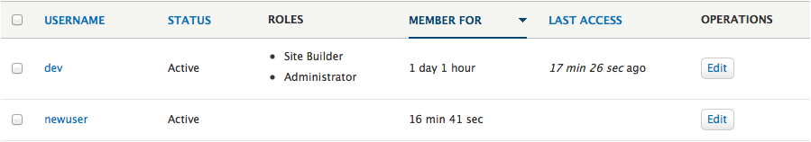
Here are a few more screens of various tables:
Comment #46
lewisnymanI forgot to post a field UI table
Comment #47
Bojhan commentedTrying the latest patch, in chrome there is a 1px white line between column headers.
The views UI is a little weird now, the view name should not be vertically centered like that.
Comment #48
echoz commented@Bojhan I can't reproduce what you report in #47. I still get the same as we see in #43, #45, #46. Browser cache? Can you provide a screenshot?
Comment #49
echoz commentedI'm setting this back to RTBC since I can't reproduce #47 and I see a new tag "RTBC July 1" and concerned this isn't supposed to miss out.
Comment #50
yesct commentedThis issue was RTBC and passing tests on July 1, the beginning of API freeze.
Comment #51
echoz commentedre-roll since #2030925: quote rtl attribute selector landed
Comment #52
Bojhan commentedBack to RTBC
Comment #53
effulgentsia commentedThe fixes here are CSS and images only, which are not subject to API freeze, so removing the "RTBC July 1" tag since it is irrelevant.
Comment #54
nod_A UI patch with only 52 comments to RTBC? I've been away too long…
Anyway, problem on Firefox 22, see below. I'm pretty surprised actually. I knew position-relativing a cell doesn't work very well but I would have expected IE to complain. The patch even works on IE8…
Love the new style btw :)
Comment #55
Bojhan commented@nod_ Hehe, can you explain what the error is, I cant spot it? Maybe I am too tired.
Comment #56
nod_The border is below the table instead of at the bottom of the header cell. Look for the arrow indicating the sorting order too, it's above the table on the right instead of inside the header cell.
Comment #57
Bojhan commented@nod Ahh! Nice catch :) Thanks.
Comment #58
echoz commented@nod_ right about Gecko not understanding position: relative; on table cells! I'm am working on this, and looks like I have a solution.
Comment #59
echoz commentedFix with position: relative; working on anchor tag.
Safari
Firefox
Comment #61
echoz commented#59: table-style-1986400-59.patch queued for re-testing.
Comment #62
nod_works, thanks :)
Comment #63
alexpottManually tested and looks good... whilst testing found an unrelated bug #2048895: Dblog CSS results in background image repeating
Committed 7272a71 and pushed to 8.x. Thanks!
Added ry5n to the commit message as the designer.
Comment #64
gábor hojtsyGreat, great improvement! Here are two bugs that have cropped up due to this though in the language tables (interface translation itself and content translation configuration): #2049387: Locale string change styles applied too excessively. Let's fix those!
Comment #65
traviscarden commentedSorry to come so late to the party with this, but is everyone satisfied with the table row hover background color? It's so light I didn't even see it at first, and I have a nice monitor and good vision. Any chance we could darken it a bit?
Comment #66
tim.plunkettI doubt this had any accessibility testing
Comment #67
Bojhan commented@Tim As far as I know the contrast of the table header hovers is enough to pass WCAG, the hover on rows is purely decorative so doesn't need review. I am not sure this had any functional html changes, so not sure what else to review. I did post all style guide issues to the a11y group, several times. So I am not sure what else to do.
Comment #68
tim.plunkettYou removed zebra striping in favor of that hover.
Also, you tag the issue 'needs accessibility review' and it doesn't get committed until that's done.
That's how the rest of core works.
Comment #69
Bojhan commented@tim No idea why you're being so hostile.
Added the tag and reopened the issue, hopefully that will get us the review we need. The zebra striping is decorative, as far as I know. The current Drupal 7 zebra striping doesn't pass WCAG.
Comment #70
tim.plunkettSorry, I was typing on my phone. Was being brief, didn't mean to be hostile.
I'm not 100% sure that zebra striping is an accessibility improvement by itself, but like @TravisCarden I'm having a harder time than usual seeing it.
Comment #71
lewisnymanIt does seem a bit faint, not that the hover is an essential accessibility feature. We could tweak it slightly, as long as we update the global colour scheme.
Comment #72
Bojhan commented@tim.plunkett Hehe, oke :) Read it wrong then.
@Lewis we can try some things (a more bold hover, light zebra etc.), The zebra striping used in Drupal 7 is very strong (making it harder to actually scan vertically). I wouldn't like to return to that.
Comment #73
lewisnyman@bojhan definitely not, I think the hover is a more elegant solution, I just think we need to tweak the shade of blue to be a bit more visible, maybe even a slight transition will help draw the eye.
Comment #74
echoz commentedThe blue of hover is noticeably fine for me, although I have quality displays. If it were darker it might be fine, but if we loose the delicacy of that lightness, a darker blue could get ugly.
@LewisNyman, I thought a transition would be a great idea, but it actuallty makes it less noticeable because it's a subtler change, where without a transition, the instant pop of the change is most noticeable.
Comment #75
Bojhan commented@echoz As far as I know in terms of visual perception theory - movement is more noticeable than instant change. Therefor transitions are often more easy on the eye but also more noticeable than popping. I suggest to try it yourself whether you notice a underline that appears slowly (still 200ms or so) to an instant appear. You will notice the animating one more.
Comment #76
echoz commented@Bojhan of course that makes sense, and is why I wrote I assumed it was a good idea. I did try it (began to create a patch) but on a a background color fading in, I thought it was less noticeable, but this is subjective and I'm certainly ok with deferring to designers :-) I just didn't want it to end up less noticeable and because of that made a darker blue that wasn't as delicate.
Comment #77
Bojhan commented@echoz Hehe :) Well its in the details, lets explore a few ways of doing this.
Comment #77.0
Bojhan commentedUpdated issue summary.
Comment #78
mgiffordI love animated transitions. That being said, this patch no longer applies.
Comment #79
echoz commentedThe last patch was committed in #63. This got set to needs review because it needs accessibility review.
Comment #80
mgiffordIt looks good to me. Thanks for the clarification @echoz
Should it now be set to fixed?
Comment #81
echoz commentedyes :-)
Thanks @mgifford