
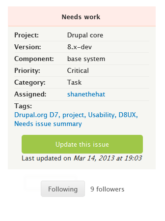
Closed (fixed)
Project:
Project issue tracking
Version:
7.x-2.x-dev
Component:
User interface
Priority:
Normal
Category:
Task
Assigned:
Issue tags:
Reporter:
Created:
10 May 2013 at 09:16 UTC
Updated:
2 Nov 2013 at 00:30 UTC
Jump to comment: Most recent, Most recent file

Comments
Comment #1
yonailo+1
Comment #2
eliza411 commentedI agree that it's much harder to find the follow button in its new location, especially since it's gray, but I haven't been following the design choices.
I'm setting this to "needs review" so it can be addressed and maybe linked to relevant discussion issues.
Comment #3
thamasScreenshot with the recomended move.
Comment #4
dwwI think tvn should comment, since she's been driving most of the final UI choices like this.
Thanks,
-Derek
Comment #5
webchickTwo big green buttons next to each other would be too easy to click the wrong one accidentally.
Counter-suggestion:
Comment #6
webchickAlso, #2097925: Rename "Edit" to "Update" for consistency with the "Update this issue" button (at the bottom) is an example of a tester not seeing it where it's currently located. And FWIW, of the ~10 people who were reviewing the D7 site found jarring, too.
Comment #7
webchickTentatively moving to major as a result. Not a release blocker, certainly, but also more important than "Unclear label 'Description'"
Comment #8
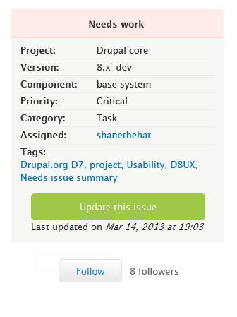
tvn commentedDecision about the current location and colour of the "Follow" button was made back in May, when Bojhan, yoroy, dww and I were reviewing and finalizing new issue page UI. The colour was changed, because we can't have 2 big green calls to action on one screen. We want to make new way of updating issues obvious since it changed significantly, so 'Update this issue' button is huge and green. Follow button has to be smaller and of a different colour. Grey was the only colour we were able to use for it from the current Bluecheese palette.
Location changed because Follow button didn't really fit inside the new Issue details block and we were trying to find a place for it outside of the block: either next to it or outside of sidebar completely. Advantage of the current location was that it's not too close to the main action button on the page. Considering that people have troubles finding the button now, we should move it back to the sidebar.
The mockup we worked on for the sidebar location:
Comment #9
tvn commentedComment #10
yoroy commentedIf we agree that 'updating issue' should be more prominent than 'Follow' then this design seems fine to me. The arrangement in #8 makes the follow button much more discoverable than current position so that would be an improvement.
Comment #11
webchickLooks good to me!
Comment #12
yesct commentedupdating makes people follow anyway, so I think this is ok.
Comment #13
jthorson commentedComment #14
jthorson commentedThis should be all that's needed, after #2001014-7: Port "Jump to" links to D7, which handles the css style changes that would also be needed.
Because it alters an existing update function, this change would require a full migration before it appears on git7site.
Comment #15
jthorson commentedScreenshot from dev site, with all patches applied.
Comment #16
yoroy commentedRtbc it is?
Comment #17
drummCommitted.
Comment #18
jthorson commentedLooks like this didn't take on git7site ... re-activating to take another look.
Comment #19
jthorson commentedMy bad ... this wasn't committed before the last migration would have started. Will wait a few days first.