

Closed (duplicate)
Project:
Drupal core
Version:
8.0.x-dev
Component:
block.module
Priority:
Normal
Category:
Task
Assigned:
Unassigned
Issue tags:
Reporter:
Created:
15 Sep 2013 at 20:48 UTC
Updated:
29 Jul 2014 at 22:55 UTC
Jump to comment: Most recent, Most recent file



Comments
Comment #1
yoroy commentedlets do smaller screenshots.
Comment #2
tim.plunkettTagging.
Comment #3
jessebeach commentedComment #4
tkoleary commented@yoroy
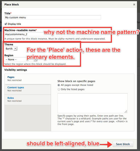
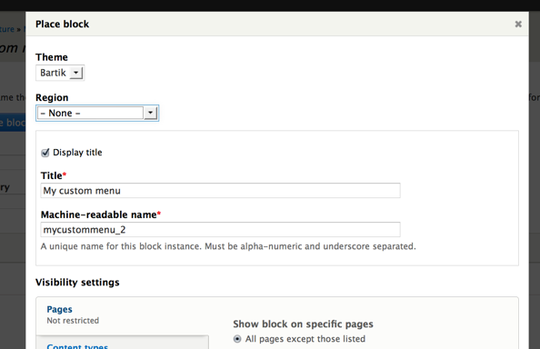
Totally agree on the machine name comment but I think that fixing that will solve the second problem by bringing those options up much closer to the top of the form.
Pushing the title down in the form is definitely an antipattern, and in this case even more problematic if we remove the Block name from the main blocks table and show only the title as is proposed.
Comment #5
yoroy commentedApplying machinename will definately help clean things up. The interaction is about *placing* a block. Instead of getting to the point of placing it, the current form first offers the busy work of setting a title, not sure which is the antipattern here.
But lets start with applying machine name and see how far that gets us.
Comment #6
tkoleary commented@yoroy
Ah. I think I see one thing you might be missing. In another issue we have removed the block name form the table and the block title is required.
So now the way you identify your blocks in the UI is with the title, not the name, which makes it more of a primary task.
Comment #7
tkoleary commentedComment #7.0
tkoleary commentededit img links
Comment #8
tim.plunkettIt seems something has changed since this issue was opened:
For one, the machine name is now working.
Secondly, the button is now blue.
So is the only remaining change floating the button to the left?
The float:right comes directly from jquery.ui.dialog.css
Comment #9
webchickHm. If it's consistent with other buttons in dialogs, I'd say close this one out. If we want to override jQuery UI's styling, we should do it on a global scale. However, if it's something weird to only this form, then yeah, CSS to fix it would be great.
Awesome that this got magically fixed already. :D
Comment #10
klonos...there used to be a theme selection drop-down besides the region selection one. Was removing it an intentional thing?
Comment #11
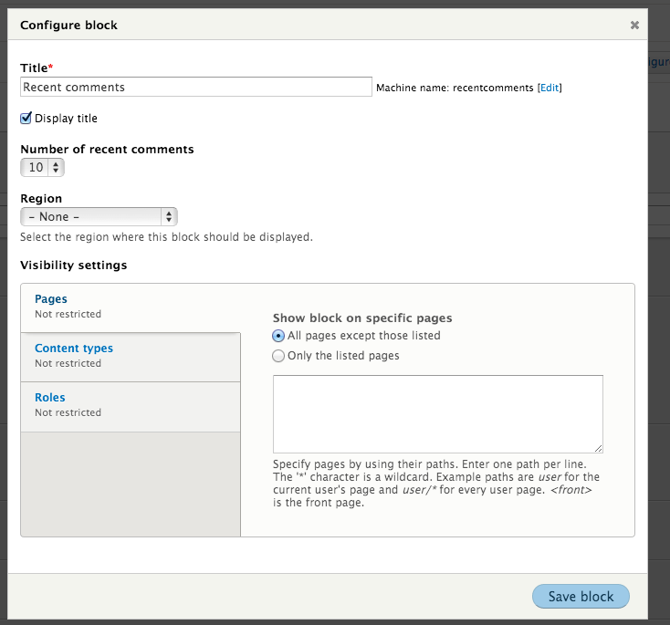
Bojhan commentedIt looks like this UI has gotten worse over the months. See #2269881: [meta] Unifying condition UIs.
Comment #12
tim.plunkettThat issue is a duplicate of this one I guess.
Though it is more up to date and raises other points, should we close this one?
Comment #13
Bojhan commented@tim sounds good. I am not sure if any of these block issues will receive attention though :( I will try to drum up some people around Drupalcon
Comment #14
tim.plunkett