
Closed (fixed)
Project:
Blazy
Version:
8.x-1.x-dev
Component:
Code
Priority:
Normal
Category:
Feature request
Assigned:
Unassigned
Reporter:
Created:
21 Jun 2016 at 13:01 UTC
Updated:
29 Nov 2016 at 18:34 UTC
Jump to comment: Most recent, Most recent file

Comments
Comment #2
gausarts commentedThank you for the report.
I couldn't reproduce it, yet.
It seems the
media--loadingclass is not removed in your case.That class defines the loader icon.
What Blazy version? Please try v1.6.2 if lower.
Possible solutions:
When updating modules, be sure to always re-generate JS and CSS at:
/admin/config/development/performance
Especially during DEV releases, since JS and CSS may always be updated frequently to reflect any possible bug fix, or improvements.
I believe you know the steps, but here for just in case we are not on the same page:
If still an issue hit "Clear all caches".
Press
F5orCTRL (CMD) + Rto also refresh browser cache for just in case it is still holding the old assets.Some browsers, like Opera, Safari, maybe others, stubbornly hold old assets for a while.
Please let me know if that solves it. Otherwise we need to investigate things somewhere else.
Comment #3
lilee commentedthank you for reply so much detail.
Photos it's all my simple configuration, and I'm have been disable aggregate css and js file and clear cache many times.
I use blazy v1.6.2, I download from github few week before. I use fresh drupal 8 site to test.
but I still get the same result.
My Chrome console only have this warn and nothing else:
Synchronous XMLHttpRequest on the main thread is deprecated because of its detrimental effects to the end user's experience. For more help, check http://xhr.spec.whatwg.org/.
It's that cause by this?
Comment #4
gausarts commentedAh, now I see.
Thank you for detailed screenshot.
Blazy is not working with PICTURE element, yet.
I should have had written it somewhere ;)
Solution:
Try using regular IMG element, not PICTURE.
Comment #5
gausarts commentedI am going to close this as I am not planning to support Picture in the near future.
But I am open to patches if any.
The other reasons, Picture are not always needed as mentioned elsewhere here:
http://blog.cloudfour.com/dont-use-picture-most-of-the-time/
https://www.smashingmagazine.com/2014/05/responsive-images-done-right-gu...
#2457443: Use <picture> is bad and harmful.
#2348255: Provide option to use srcset and/or sizes attributes on img tag instead of the picture element
#2450863: Option to only use img with srcset
Comment #6
lilee commentedThanks a lot. It's work fine now.
img element is realy a good solution. But it's need to clear browser cache to test whether it work ;)
Chrome does not switch the size because Chrome already has a larger image in cache, so there is no need to download new data of the same image.
Comment #7
killua99 commentedBefore I comment about the use of Picture, should I open a new issue or reopen this one?
I'm interest to use picture with the Drupal Core solution instead use the list image query media (easy for site builders)
Comment #8
killua99 commentedAdding info:
http://caniuse.com/#search=srcset
http://caniuse.com/#search=picture
https://usecases.responsiveimages.org/#proposed-solutions
https://css-tricks.com/responsive-images-youre-just-changing-resolutions...
Picture follow art direction, srcset don't.
Until Responsive Image don't support srcset
https://www.drupal.org/project/issues/drupal?version=8.x&component=respo...
Comment #9
gausarts commentedFeel free to re-open this. As said, always open for patches. Thanks.
Comment #10
tjwelde commentedHi there,
We really need the picture element to work, since people want to use their theme breakpoints as media-queries in responsive images.
The patch provides this functionality.
I'm open for feedback, suggestions and discussions.
Comment #11
gausarts commentedThank you for contribution. Please allow some time. If any RTBC, I will be happy to push it without further ado ;)
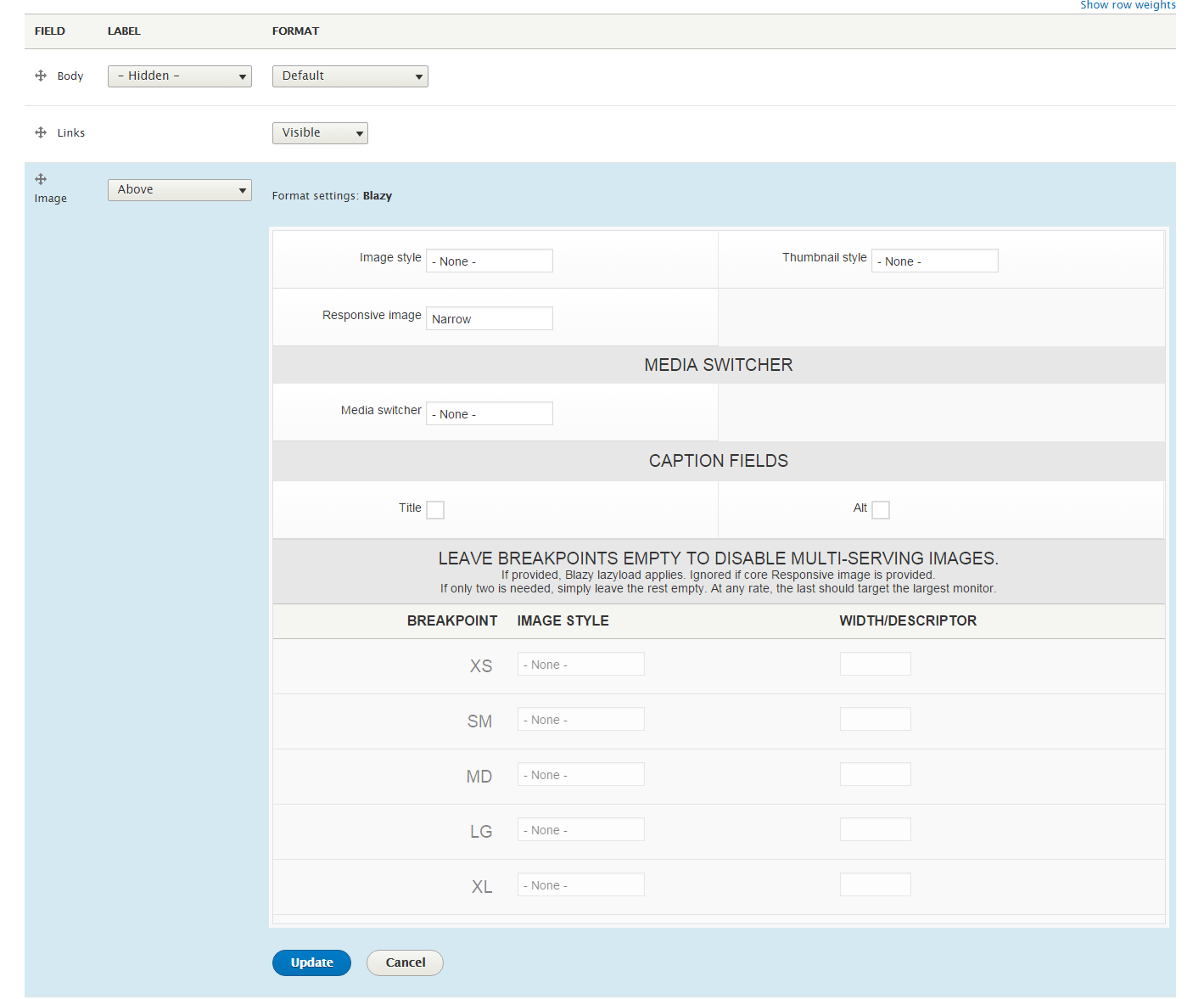
I haven't tested it yet, sorry. Is the #uri, or equivalent, available at picture element like the IMG element below (
$variables['img_element']['#uri']).Normally Blazy expects [data-src] to be the real fallback IMG as defined by option "Image style", not the 1px placeholder.
If available, is it OK to replace the placeholder at [data-src] mentioned above with that #uri instead? Thanks.
Comment #12
tjwelde commentedThe picture element is really just a container for the img and the sources.
The responsive_image module has a commit regarding the use of srcset
responsive_image.module:200So I wouldn't recommend using the src. I actually tried different combinations, but it could happen, that two images were loaded (the fallback and the source).
Comment #13
gausarts commentedThank you. I read possible issue with double downloads, too, but not really concerned about it last time as Blazy didn't use picturefill.
I didn't mean
src, but[data-src].I meant that this line:
$variables['img_element']['#attributes']['data-src'] = Blazy::PLACEHOLDER;Changed to:
$variables['img_element']['#attributes']['data-src'] = $variables['img_element']['#uri'];Or any relevant variable available which supply #uri at picture element.
Simply because the Blazy script expects [data-src] to be real (fallback) image, not placeholder.
Maybe it is not that important to have the real IMG fallback in the [data-src], in the first place, and just use
Blazy::PLACEHOLDERas you proposed?If it is OK without real IMG fallback, we can commit it. I just want to make sure it is on your consideration.
Comment #14
tjwelde commentedYes, I understood what you meant. I think I wasn't clear in my last answer.
I considered and tried to use a real image in
[data-src].Unfortunately the image doesn't have a
[#uri]or[src]set, so it would only be possible to use the[srcset]for the[data-src], which doesn't seem right.Also, when using the
[srcset]in[data-src], the fallback image gets loaded, before the responsive image (so two images are loaded), which would negate the purpose of reducing bandwidth with the picture element.I don't think it is important to have a real[data-src]fallback in the image, because the[data-srcset]is already the fallback of the sources.The core maintainers of responsive_image decided to not have a fallback
[src], so I think it is ok to leave a placeholder there, so that blazy works.Comment #15
gausarts commentedI see. Glad it is not the big deal ;)
If anyone has tested it, feel free to RTBC so I can commit it.
Otherwise please allow some time for me to check it myself first. Thanks.
Comment #16
gausarts commentedI tested and it works great, thank you.
Leaving only one nitpick to the controlling element (IMG):
Needs to remove the no-longer relevant attributes:
width, height, srcset, data-srcset, exceptdata-src.I removed things to focus on the cleaning part.
Original:
<img srcset="fallback.jpg" />Your patch:
<img class="b-lazy" data-srcset="fallback.jpg" data-src="data:image/gif;base64,R0lGODlhAQABAIAAAAAAAP///yH5BAEAAAAALAAAAAABAAEAAAIBRAA7" srcset="" width="200" height="200"/>Ideally, based on sample:
<img class="b-lazy" data-src="fallback.jpg" />Feel free to re-roll. Else please allow me some time to work with it again.
Comment #17
gausarts commentedAttached to remove the no-longer relevant attributes for the IMG tag.
Basically, like core Responsive image, all dimension attributes are now removed, as otherwise improper sizes.
If any issue I am not aware of, please let me know. Thanks.
Comment #18
gausarts commentedAdded a few more refinements:
Comment #19
gausarts commentedI am wondering if it is "polite" to enforce "one pixel" placeholder for this lazyload thing. This should reduce some lines, and possible double downloads in the first place. Thoughts?
Comment #21
gausarts commentedIf any issue regarding this change, feel free to re-open, or create a new one accordingly.
Committed for wider feedbacks. Thank you all for contribution.
Comment #22
tjwelde commentedThanks for committing ;)
Any reason why you altered the output of the responsive_image module from
<img srcset="fallback.jpg">to<img src="fallback.jpg">?Because of the blazy example? I'm just wondering, since the core maintainers had reasons to use srcset here.
Comment #23
gausarts commentedYes, by sample, as I am working with Blazy here ;)
The other reason is I noticed double downloads last time.
With two basic understanding:
srcfor a single image,srcset(a set of SRCs) for multiple image sources.We only have 1 fallback image on the controlling element (IMG), a 1px placeholder.
I thought
srcsetis no longer relevant.https://developer.mozilla.org/en-US/docs/Web/HTML/Element/picture
Do you have a link to the mentioned reasons, or explain shortly if we should keep
srcsetoversrc?Comment #24
tjwelde commentedAlso if srcset isn't supported in older browsers, it wouldn't show any pictures. Since the content of the link, in the comment #12 I posted earlier, has changed, I can't understand what lead to the decision to just use the srcset on the fallback image. They say, to prevent unnecessary preloading in older browsers, but as I said, browsers who don't support srcset wouldn't show any pictures.
Because we modify here, what the responsive_image module wants to output, I just thought it would be better, to leave the decision to the maintainers of that module. That's why I wanted to know your reasoning.
But I'm still fine with the solution we have now. I'm just curious ;)
Comment #25
gausarts commentedOk, I am always open to better solutions ;) Feel free to provide one if any better.
I forgot, the other reason is my mindset after reading the Blazy script,
[data-src]is always treated as fallback which expects a single SRC. I am not sure I understand the core decision, CMIIW, but I thought it is likely it doesn't consider client-side manipulation while Blazy is all about client-side thing.