
Closed (duplicate)
Project:
Drupal core
Version:
7.x-dev
Component:
node.module
Priority:
Normal
Category:
Task
Assigned:
Unassigned
Issue tags:
Reporter:
Created:
13 Mar 2009 at 05:28 UTC
Updated:
13 Mar 2009 at 23:27 UTC
Jump to comment: Most recent file

Comments
Comment #1
michaelfavia commentedplease forgive the 1 automatic whitespace cleanup line. im aware it wasnt necessary but my editor has a place for everything and everything in its place. i didnt notice it.
Comment #2
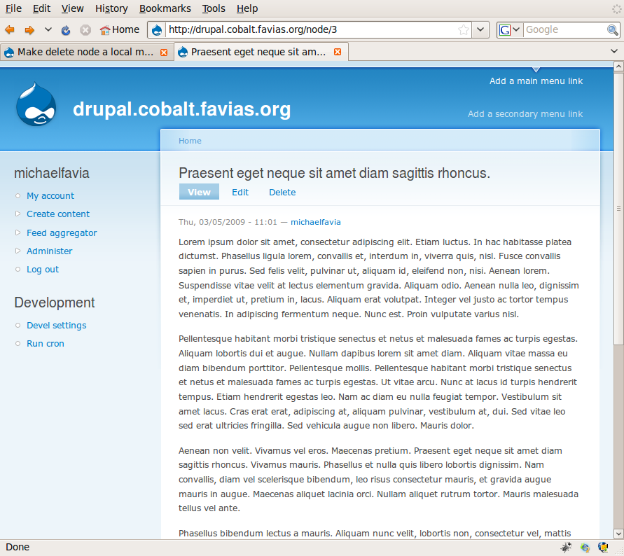
michaelfavia commentedAdding screenshots so everyone can see. There is no code changed between the two shots just the narrower screen. Youre probably used to seeing local menu tasks below the title if you have the devel module on or if you have long titles, but by default they aere next to it if there is room. The only thing this patch did was add the delete option.
Comment #3
ultimateboy commentedDuplicate of #196758: Having delete as a button on the node edit form means certain users don't have access to it when they should
Comment #4
michaelfavia commentedmoved discussion to parent thread mentioned above.