
Active
Project:
Commerce Core
Version:
7.x-1.x-dev
Component:
User experience
Priority:
Normal
Category:
Task
Assigned:
Issue tags:
Reporter:
Created:
25 Feb 2010 at 16:16 UTC
Updated:
22 Feb 2019 at 16:22 UTC
Jump to comment: Most recent, Most recent file

Comments
Comment #1
Bojhan commentedComment #2
redben commentedHave a look at invoicemachine.com and how they approached the invoice (order) editing
Comment #3
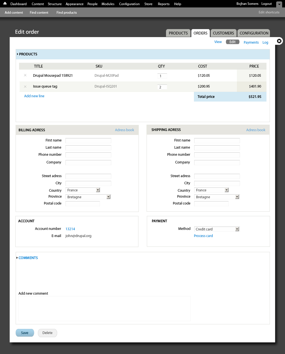
Bojhan commentedEditing an order
Navigation
Going from my conversations with ryan I have reduced the ammount of secondary navigations, to 4 items.
I will work some more on the other tabs, but for now this should be good enough to provide direction.
I purposely didn't include line item interface, for that see : #725692: Line item UI
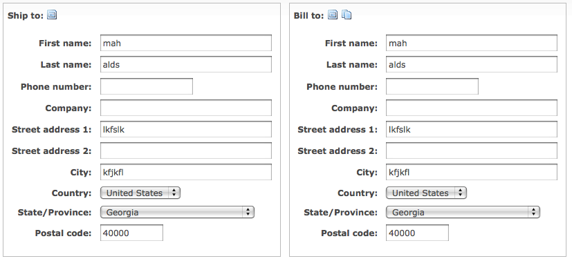
Billing adress
As opposed to common forms in Drupal, these forms will be center aligned. This because of the density
of forms, having verticaly aligned labels and forms would take up to much vertical space. Given that,
there needs to be a very specific ammount of white space to allow good scanability.
The adress book, which will either open a model, go to a new page or open an inline element is positioned
on the far right - to decrease its importance and with that visibility. But more importantly to show its
associated to the billing adress, and influences the whole form.
Shipping adress
Its prettty much the same as the billing adress, one element we might look into later on is making
the fields more transperant when they are the same as the billing adress.
One thing both forms have, is a background in their header - this is also to show importance. These
form elements are more important then others in this form. And therefor have a background, its a subtle
diffrence but really helps in leading the eye.
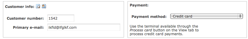
Account
The change I made is really going for displaying data. The account links to a user id, and the e-mail is now
easily selectable. With that there are two actions missing, as I wasn't sure if they should be included.
Payment
Obviously this is very diffrent, forms like these should really not have any help text if we can do without.
It complicates the scanability of the interaction significantly. Process card, is a link off this page.
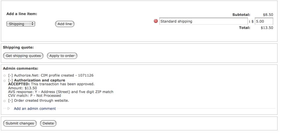
Comments
I left this mostly untouched, since its unclear to me what will actually go here - other then simple comments.
I am going to leave Payments and Log for now, since it seems the contents of that still need to formalize a bit. And is also not as important for our initial version.
Comment #4
rszrama commentedI do like bringing the products / line items front and center like you have. Makes perfect sense.
I don't get from this how you conceive of someone setting or changing the customer on the order. What you're showing here only seems useful for viewing.
Also, it's been discussed elsewhere (does anyone remember the Ubercart issue by any chance?) and I think people have said that selecting the country first in address selections is the most helpful. This will allow us to swap out all the name / address fields as necessary before data has been entered, like including the "Greeting" for Japanese addresses.
I'm also wondering if we shouldn't just scrap the Payment edit pane altogether. The idea was it could be used for storing details of the current payment, but it falls short on orders that have multiple forms of payment, recurring payment, complex payment systems, etc. I think we'd do better to make a more robust payment terminal for data entry (i.e. a two step form where you choose the payment method and then enter the data : ?) and figure out how to list payment receipts on the order view screen in a better way.
I also don't understand your comments section here. Can you explain a little?
Comment #5
redben commentedGreat work bojhan, some suggestions :
1 - Wouldn't it be better to put the paymant box (if you keep it) on the Payments tab ?
2 - For the billing and shipping address, having the address book as a simple dropdown (if it only lists the current customer's addresses) would be simpler. Also, the shipping box could have that "same as billing" checkbox.
3 - don't know exactly how but i think Vertical tabs can be usefull here...
4 - Lessening the number og objects in the page : We should thing if there is some items that are not necessary in the edit order page and that can be removed. For example, do we need to show the customer's email address ?
5 - Last "and may be least" . I don't think that the order's table should be wrapped in the box titled Products, as this is the main part of the form, the order content. And that could spare some white space :)
PS : This is not directly related to this issue but while we are at it, ryan, it would be great to have the order columns swappable (using weight maybe ?). Not all countries use the order title/SKU/qty/unit price/total.
Comment #6
Bojhan commented@rszrama I am unsure what you mean regarding customer, it makes sense one needs to change a particular detail? Otherwise Ubercart has it completely wrong too?
Ok moved, country to the top.
What I am worried is that if we move payment, we need to at least display some data - requiring them to go to a different page. Doesn't help them much, unless you require payment information to be placed on the View page?
So my comment section has no comments for now, which is probally why its confusing - but I assume an order can have comments and those should be displayed.
@redben
1. Yes
2. Actually, I didn't want to do that - since it takes up to much cognitive load, for a feature that is used only once in a while. Hence why I hid it behind a link.
Also: Definitly, preferbly even making that visually distinctive.
3. No, Vertical tabs are not meant to be used for this
4. We do need to show that, as that is a primary contact point.
5. I am very inclined to agree, the only reason I put in in a field-set for now - I didn't know if there would be more items in that table. Lets try that with a somewhat more actual patch though, as it could also look to stretched.
Comment #7
Bojhan commentedOke, here is revision 1 - obviously the account box still needs some work. But you get the general idea.
Comment #8
rszrama commented"I don't get from this how you conceive of someone setting or changing the customer on the order. What you're showing here only seems useful for viewing."
Hmm, yeah, I probably wasn't clear enough. What I meant to question was how would someone change the user on the order? It should be possible to change the user, although you're right, it's not necessary to be able to change the e-mail address and not the uid (well, unless we allow truly anonymous orders, which I think we should... so for anonymous orders there would be an e-mail field with no uid).
In other words, would someone have to click on the uid (I see you have it as a link) to be able to change it? Or would that link redirect them to the user profile? That would be unfortunate if they had unsaved changes. : D
Comment #9
Bojhan commentedFor anonymous orders the e-mail should indeed be changeable. I didn't imagine you could change UID on a non anonymous order? The question about unsaved changes, is true - but sad fact of Drupal core.
I am more then happy to remove the Account fieldset if you feel thats possible.
Comment #10
rszrama commentedHmm, I don't think it's possible to remove entirely. The reason it should be changeable isn't so much for changing the uid of an existing order, but for when you're creating new orders manually and need to specify which user it is for.
Comment #11
Bojhan commentedSo why wouldn't the form be diffrent when you are creating a new order?
Comment #12
rszrama commentedHmm, well, the way it works now, there's a simple step where you specify the user for the order and then click "Create order." From then on out, it's the same as the edit order form. I think that's fine and dandy, but we'd have to think through the workflow of what to do when creating an order and a user does not already exist (i.e. would we want the admin to just be able to put in an e-mail address and automatically match that to an existing account or create a new one on the fly?). Even still, I don't see any reason to not make the customer user reference editable on the order... mistakes can be made or accounts might need to be consolidated where switching the user from the edit screen would be justifiable.
Comment #13
Bojhan commentedYup, so after talking to you on IRC some of the requirements for the Account fieldset :
Username, E-mail should be editable (i.e autcomplete / possibly be linked?)
Potentially could cause accidental change (i.e in ubercart its disabled, editable upon activation)
So I for now imagine a field which is enabled, not disabled (like ubercart). As the potential accidental change could be in effect to any part of this form? Making less visual differences, also means the load isn't put on the user - to understand why its disabled, and also changing it potentially could be less of a probability if you need to do a second-step in the interaction, choosing from a drop down in auto-complete?
Comment #14
rszrama commentedHmm, I just realized we might need an additional fieldset that lets you edit the creation date / user of the order, like the "Authoring information" fieldset on nodes. Presently with Ubercart we don't have creator uids but have specified adding them in for DC, and there was also never anyone to change the date on an order if you needed to.
Comment #15
harrisben commentedI'm loving seeing the progress of the UI designs. Here is some input I hope will be helpful:
* the check box to specify that the shipping address is the same as the billing address might be better placed above the address rather than below
* The order status seems to be missing. The best implementation of this that I can think of off the top of my head is including a small table summarising the history of all order statuses which have occurred. You could probably incorporate any order comments into this as well. Any items in this small table could link to the appropriate detailed record elsewhere.
Comment #16
rszrama commentedQuick question - is the x on the far left of line items for draggability or for deleting?
Comment #17
Bojhan commentedDeleting
Comment #18
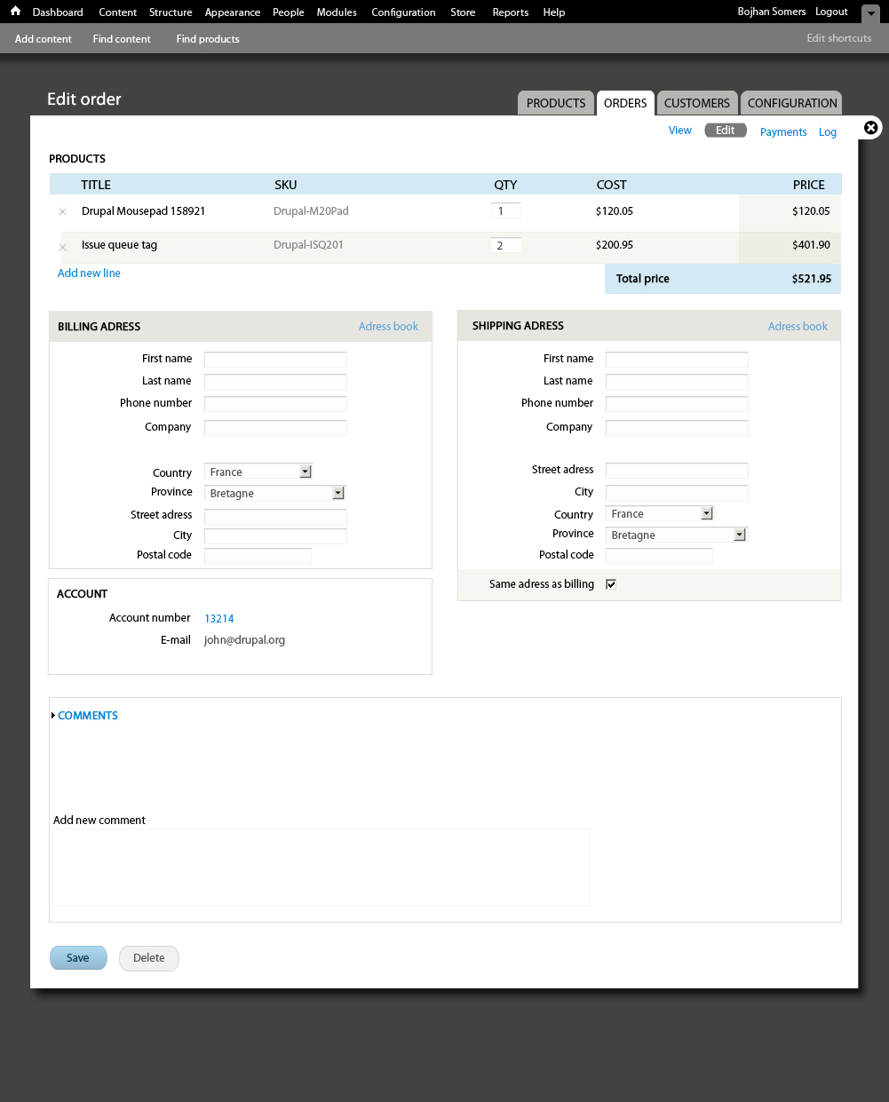
rszrama commentedHere's the latest version of the line item UI as available from my GitHub (click for full version):
I've done a little styling to make sure the table's caption appears to the left and over the table like a fieldset label. I also moved the "Add line item" button beside the type selector, although there wasn't actually a selector present in Bojhan's mock-up. Perhaps what can happen is we can default it to be a link that when clicked will swap it out with this form... but then it's just one more click to add something to an order. : ? Maybe we have it appear this way on new orders but for existing orders hide the form behind a link...
Also, I don't currently have a two-step process for adding a product line item to an order. It's simply a 1) click the "Add line item" button, 2) select the product, and 3) click the "Add product" button. This interface will need to change... most likely some sort of autocomplete would be sufficient. I don't think we need to have a product type filter, but that could be addressed.
I'll most likely need someone else to do further styling, like on the colors and borders of the table and to change buttons to look like links (i.e. for the Cancel button on the form that shows when you click "Add line item").
Also note that the "Remove" checkbox will be themed into an icon as specified and altered via JS to submit the form so items can be removed on a single click. I'll be doing something similar on the shopping cart form... which can probably reuse this field. Nice!
Comment #19
patcon commentedLooks great!
Just a quick comment on the "same as billing address" checkbox:
Would it make more sense to have that above the other fields? It would seem that this would be the first thing you'd want the user to notice before they started filling out any fields :)
Comment #20
Bojhan commented@rszrama It might be worthwhile to still add the link instead of the type/additem button if the interaction becomes more complex.
Here is a "delete" button. Might need some extra styling when we see it working in context.
Obviously this needs to be done in html/css and not with a picture :P, just a mockup
Comment #21
rszrama commentedComment #22
redben commentedJust a quick suggestion : Shouldn't "delete" button (actions in general) be on the right side. It seems like in general (and specifically in drupal) actions go on the right and status messages (icons) on the left.
Comment #23
Bojhan commentedIf your primary shoppers are Drupal admins, yes :) But I believe we should be consistent with large webshops.
Comment #24
mertskeli commentedBeing an ordinary buyer myself I would prefer it on the right, at the end of a line. Its a kind of Cancel...
But its a matter of habbit. When I came to Hong Kong I was shocked that all the cars where driving the wrong side of a road :)
Amazon places it on the left, for example.
Probably, functionality now is more important than UI, and later everyone will position it according to personal tastes.
Comment #25
Bojhan commented@mertskeli Yhea, for now my feeling goes with putting it on the left. Its more consistent to the shops I have used, but as you say it might just be a habit. We should be able to put real testing on this once Drupal commerce gets used.
Comment #26
BenK commentedSubscribing...
Comment #27
DjebbZ commentedRegarding #7, I've started to style the "Billing information" address fieldset using only css. I tested it in the last Firefox 3.6 and Webkit engine to date.
Problems :
- the drupal_add_css may not be at the right place, so the css file may be loaded in un-necessary places
- it's css-only changes, deeper changes may need html markup changes, which may need patches in addressfield module (not sure, couldn't find the proper place to edit addressfield fieldset in code)
- the sizes are wrong, in small width screen the labels overlap
- didn't test in IE
Code found here : https://github.com/DjebbZ/drupalcommerce/commit/d3e47beef123540a639dd807...
Comment #28
rszrama commentedTagging.
Comment #29
rszrama commentedHere's the documentation for the #attached property I mentioned for adding a CSS file to a form:
http://api.drupal.org/api/drupal/developer--topics--forms_api_reference....
Comment #30
rszrama commentedComment #31
recidive commentedThe problem here is how to make it work across multiple themes. We can't have a nice UI that only works in Seven theme.
Also having form field labels on the left of form fields is good for lowering the vertical space, but it creates another problems like when you resize the screen, the labels can wrap the line and mess the entire form. This also can happen with a translated text, that's bigger than the one it was designed for. There's no way to make this work consistently.
To improve the page we can do two things:
If that's ok for now, I'm going to work on that.
Comment #32
rszrama commentedUntagging. recidive raises good points in #31 that deserve further discussion, and though I would've loved the interfaces to be nicer for the release, a beta is about function not form. This is obviously still a priority item. : )
Comment #33
Bojhan commentedFyi, I am fine if we have code specificly for Seven. At the end of the day, we chose that with core because we want to provide a good default - I see no reason why Drupal commerce would be diffrent. The trade offs that recidive races need visual examples.
Comment #34
rszrama commentedThat was my hunch (and I think I talked w/ recidive about it in IRC) - we'll still need a solution for viewing that works on Seven for administrators viewing / editing orders but that is a little more bland for viewing orders on the front end. (Although this is the edit issue, so that comment may not be as pertinent in here. : )
Comment #35
recidive commentedHere is how it looks with Djebbz patch plus some more work I did in it (removing fieldsets backgrounds and making css rules target classes instead of ids).
In 1024 x 768 resolution it looks ok:
https://skitch.com/recidive/rtuim/order-1-drupal-commerce-1
In 768 x 1024 (iPad in portrait mode):
https://skitch.com/recidive/rtui2/order-1-drupal-commerce-3
It's not that bad.
But look when I change admin theme to Bartik:
https://skitch.com/recidive/rtusx/order-1-drupal-commerce
I think the forms should be at least usable across all themes, which means messing around less with CSS, not more. We can't rely on some theme positioning, floats, etc. Also Seven fieldsets are already themed this way, if we add more styles to it relying on Seven CSS rules, this can display even bad in other themes.
Comment #36
essbee commentedWould this also be the appropriate area to note we currently dont have a way to use existing customer profiles when creating or editing an order via the admin interface.
Should this be a separate issue or can it reside here?
Comment #37
rszrama commentedLet's make that a separate issue - I can't recall if it already has one or not, but look for an issue in the "Contributed modules" component regarding address books. I think that's where the discussion's been thus far.
I do think as part of that I mentioned to Bojhan we need mock-ups for addressbook inclusion, though. So maybe this isn't a horrible place for it to be.
Comment #38
Bojhan commentedI will update once the Shipping module has added something.
Comment #39
liupascal commentedIs there a sandbox or something where we could follow up this work (like the Inline Entity Form) ? Or this will be directly in core ?
Comment #40
bojanz commentedThere's nothing to follow, no work was done on this.
Kickstart v2 should have some work done on the order workflow, once there's something to share, the issue will be updated.
Comment #41
vasikethis sounds more like a Commerce backoffice issue/task.
here is patch that put the profile form elements in 2 columns.
Comment #42
bojanz commentedThis is a historical issue at this point, so let's open a new backoffice issue for the patch.
Comment #43
vasikeCommerce Backoffice issue opened, including the #41 patch:
#2064201: Order edit UI
Comment #44
tim.plunkettFixing input format.