Closed (fixed)
Project:
Privatemsg
Component:
Code
Priority:
Normal
Category:
Feature request
Assigned:
Unassigned
Reporter:
Created:
25 Jun 2010 at 18:24 UTC
Updated:
11 Nov 2010 at 03:00 UTC
Jump to comment: Most recent file


Hey Berdir and everyone,
I've gathered below some usability suggestions when reading an individual message thread (/messages/view/[messageid]).
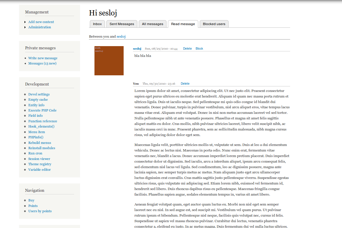
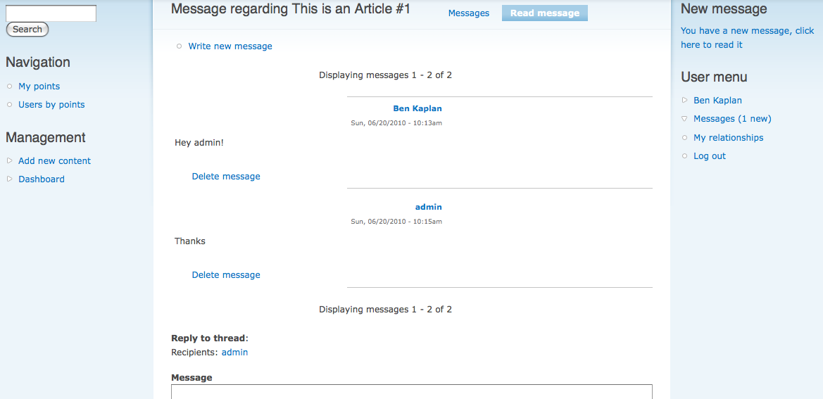
When reading a specific message (new or old), the CSS display is currently a bit funky if you have content in the left sidebar. To show you what I mean, I've attached a screenshot to this comment. As you can see in the screenshot, while the actual message body is aligned flush left, the message author and date information is pushed over to the right a couple hundred pixels. This makes it so that at first I thought that the actual messages were blank because I didn't see them next to or below the sender information. So here are two suggestions:
A. Improve readability by making everything flush left (this is what Gmail does).
Some of the CSS that causes the huge left margin issue includes:
* .privatemsg-view-pager (which has a 200px left margin)
* .privatemsg-message-participants (which has a 250 pixel left margin)
* .privatemsg-message-participants (which has a left float)
* .privatemsg-bottom-border (which has a 250 pixel left margin)
* .privatemsg-message-column (which has a width setting of 300px)
Because there are so many different possible column widths (based on your theme) and browser widths, it might be easier to have out-of-the-box readability and a consistent appearance by going to more of a flush left visual look.
B. The message pager text (Displaying messages 1 - 2 of 2) is a bit confusing (especially since it is displayed twice, at the top and bottom of the messages). It actually took me a few seconds to understand what was meant.
I'm wondering if things would look a bit cleaner by removing the pager (and possibly numbering each message in the thread). We could then follow the example of Facebook, which adds an "Older Posts" link at the bottom of the News Feed to see older items. So if there are more messages on a thread that can be displayed on one page, perhaps we add a "Older Messages" link at the bottom of the page.
Thoughts?
| Comment | File | Size | Author |
|---|---|---|---|
| #28 | view_cleanup_backport_4.patch | 25.1 KB | berdir |
| #27 | view_cleanup_backport_3.patch | 25.17 KB | berdir |
| #25 | view_cleanup_backport_2.patch | 24.53 KB | berdir |
| #23 | view_cleanup_6.patch | 22.14 KB | berdir |
| #22 | view_cleanup_d6.patch | 22.14 KB | berdir |


Comments
Comment #1
BenK commentedI recently noticed one additional issue. If you include a moderately long URL in your private message (like I did when testing out new token features), it is possible that the URL will be too long for the width of the message area. As a result, in some browsers, horizontal scroll bars are shown in the message area (to account for the excessive width).
We should probably increase the allowed width and allow the text to overflow beyond the column width. Most people don't care for horizontal scroll bars.
--Ben
Comment #2
berdirAny chance that you can provide a CSS file (feel free to change the template too if you like) that looks like you would expect it to?
Comment #3
BenK commentedOkay, let me take a closer look at this... My CSS skills are decent, but the difficulty is always making things work across browsers properly. If you have any suggestions, Sascha, let me know and I can try to incorporate them in revised CSS.
--Ben
Comment #4
berdirThere is no need to be cross-browser compatible at this point. All I need for a first step is something that works in at least one browser (FF, Chrome, Opera, not IE ;)) so that I can test it and play around with it.
Once we're both happy with the result, we can look into making the whole thing cross-browser compatible.
Comment #5
BenK commentedOne more thing that needs to be fixed with CSS: When you attach fields to a Private Message, the width of that field is limited to a few hundred pixels. So if you attach an image that is, let's say, 400 pixels wide (or if the imagecache preset is that wide) you're going to end up with horizontal scroll bars to see the whole image.
--Ben
Comment #6
BenK commentedFound another CSS issue that needs to be fixed... When a message is new, the word "New" is displayed, but it's the same font, color, and size as the message text and only one line above. As a result, it looks like it's actually part of the written message.
Comment #7
BenK commentedHey Berdir,
Based on our conversation in IRC, here is a list of to-do items for cleaning up the display of the message view page (/messages/view/mid)...
Pager:
A. Hide the pager if there are no more messages to display
B. Remove the pager from the top of the page (keep it at the bottom only)
We can deal with the mechanics of the pager itself on a separate issue thread. I'll post that shortly.
Message Links:
C. Put the message author, timestamp, and message links all on the same line. Change the "delete message" link to "Delete". Change the "Block author" link to "Block". Any links added by other modules would appear to the right of these links. (I'll adjust the CSS for this, making the links smaller, once we have this done. I'll use Facebook as a model.)
Text:
D. Instead of "Reply to thread" we should just use "Reply" as the label.
E. Change the "Participants: BenK, Berdir and Dries" format to "Between BenK, Berdir, and Dries". We'll basically follow Facebook's syntax on this. Move up this line so that it is appearing at the top where the pager is now (and so there is a line between it and the start of the messages).
F. Hide the "Write new message" link from the message view page.
G. On the message view page, hide the "Message" label above the text field (since we already have "Reply" to be the label instead).
H. Change the "Recipients" section to use the following logic: 1. Hide the recipients. 2. If all participants are blocked, show them and why. 3. If you can write to some participants, show an information about those that were blocked after sending the message"
Layout Positioning:
I. Improve the current patch to hide text format and preview button. This includes making sure that text format and preview are separate options. This can be done by making preview a setting and format a permission ("use available text formats in private messages"). The existing patch and thread is located here: http://drupal.org/node/864554
J. Add token browser to the Field UI page. Place it in its own fieldset and make this fieldset collapsed by default. Make it immediately below the body text field by default.
While you are working on all of these items, I'll work on cleaning up all of the CSS. Various CSS items on my to-do list are posted in the prior comments on this thread.
Sound good? ;-)
--Ben
Comment #8
BenK commentedBerdir,
I've attached a patch that cleans up a bunch of CSS on the message view page. Take a look and let me know what you think. I can do more CSS cleanup once you implement some of the to-do items in #7.
--Ben
Comment #9
BenK commentedBased on a conversation in IRC with Berdir, here is another item to add to the to-do list in #7:
K. Add classes for "New" messages: To do this, add a "privatemsg-message-new" class both to that span (so you can theme it differently than the default "New" text if you want) and in the most upper div (the one that has the "privatemsg-message" class).
--Ben
Comment #10
BenK commentedSince Berdir has reviewed my CSS changes and is currently working on the to-do list, I'm changing this to "Needs work."
Comment #11
berdirD. + G. I disagree on hiding message and using "Reply" as the label. Reason: You can add additional fields and place them above the message textarea. Then these would either show above "Reply" or between the Reply label and the textfield. Instead, I made "Reply" a h2 header. (We can also make it h3 or so, but h2 looked better (visually) to me). If you want to customize it on a special site, you can always use hook_form_alter() when you know that you don't have any additional fields for example. Also wondering if we want to add a bit more space between Reply and Message.
H: Hidden by default and showing warnings after replying. I think we still want to improve how that is done, because the messages shouldn't be warnings in my opinion. The user did nothing wrong in fact, he could not have done it differently. Make making them informal messages (green) only? Also, the "show recipients and blocking reasons" special case is currently part of the privatemsg_limits issue currently, will integrate that into this issue or a follow-up later on.
I: Let's keep that in the separate issue since this doesn't affect the other improvements.
J. Done. Note that if you already customized the order or added (even if you removed them again) fields, you probably need to update the settings because the default weights where changed.
Everything that I didn't mention should be implemented now. Note that there has been *quite* a rework of both the view tempate and the corresponding css file. In fact, almost every single line in the CSS has been changed in one way or another :) I think it looks much cleaner now but can probably use a few tweaks and more testing in different themes and browser (I tested it with all core themes except seven and several browsers. A test with IE would be nice for example).
Patch also contains a bunch of test changes because of the text changes.
Comment #12
BenK commentedHey Berdir,
I've tested the patch in #11 and things are looking and working great. Here are my notes:
D + G: I agree with your points here. :-) And I think it would be good to add a bit more space between "Reply" and "Message".
H. I don't mind the yellow warning (at least it's yellow in bartik). To me, yellow means something very different than red.... I view red as more of an "error" and yellow just as a "notice". But green might not be appropriate here because the message wasn't exactly sent successfully to that user.
J. The token browser in the collapsed field is looking and working great!
Other fixes:
1) Remove the period at the end of the "Between" line.
2) One thing I noticed from Facebook is that in the "Between" line, they replace your username with "You" when you're a message participant. So I don't think this is essential at all, but I thought I'd mention it. Since those other than message participants could be reading the thread in the user's inbox (those with "Read all messages" permission), we'd only want to convert to "You" if the current user matched the mailbox page. But maybe this is more trouble than its worth.
3) Add CSS styling to the "New" indicator. Probably we want to make this red and aligned right. Also, I noticed that the new indicator has a around it, but we may want to change it to a
4) If you have an extra text field attached to a message and it's placed at the bottom of the message, it is appearing very close to the top of the next message (or the "new" indicator of the next message if the next message is new). We should add some white space below the last field in a message and the next message.
5) What do you think about tweaking the CSS as follows:
.privatemsg-message-column {
float:right;
overflow:visible;
width:80%;
}
.privatemsg-author-avatar {
text-align:left;
}
.privatemsg-author-avatar {
float:left;
padding-top:2px;
padding-bottom:10px;
text-align:left;
width:20%;
}
That's it for now. I'll continue to do more testing in different browsers.
--Ben
Comment #13
berdir- Added more space below it. bartik actually explicitly defined h2 inside content to have a very small bottom margin.
2) This was already suggested way back in #445020: Minor visual enhancements to read/write tab. Let's do it :) Will probably require some testing, though. The patch does:
- Display you (always as the first entry if there are multiple) instead of your username both for the Between... line and in the message/thread listings
- uses lower case for the between... line and uppercase for the listings
- Also shows "You" instead of the user name as the author (Not sure about this, feedback is welcome)
- The case you mentioned is not a problem/special imho. Reason is that the "read all"-mode is only triggered if you are *not* a recipient. If you are, then *your* username will replaced which is ok and if you are not, then there is nothing to replace with "You". Privatemsg doesn't know for which user you are viewing a thread anyway.
3) "Also, I noticed that the new indicator has a around it, but we may want to change it to a ". It seems that drupal has eaten your HTML here :) Not sure what you mean. I left the HTML as it was and made it aligned right, red, bold, 80% size (like the everything else there) and float right. Looks great imho :) I just discussed an possible approach to make possible to have a light background color too and making it easy for themes to remove that. Not yet part of this patch, though. See http://bit.ly/cshEyL
5) As an information, 20% and 80% doesn't work. There needs to be a % or two free space in there or it overlaps and falls apart. I went for 20/78. It will probably also totally fall apart when you mess around with the default image size and make it wider than the avatar column. But In that case, you simply have to change the default CSS. I also added the padding-bottom as margin-bottom on the whole div instead. Should give the same result.
- Also note that this is going to give a ton of test failures because of the You-change. Will fix them later...
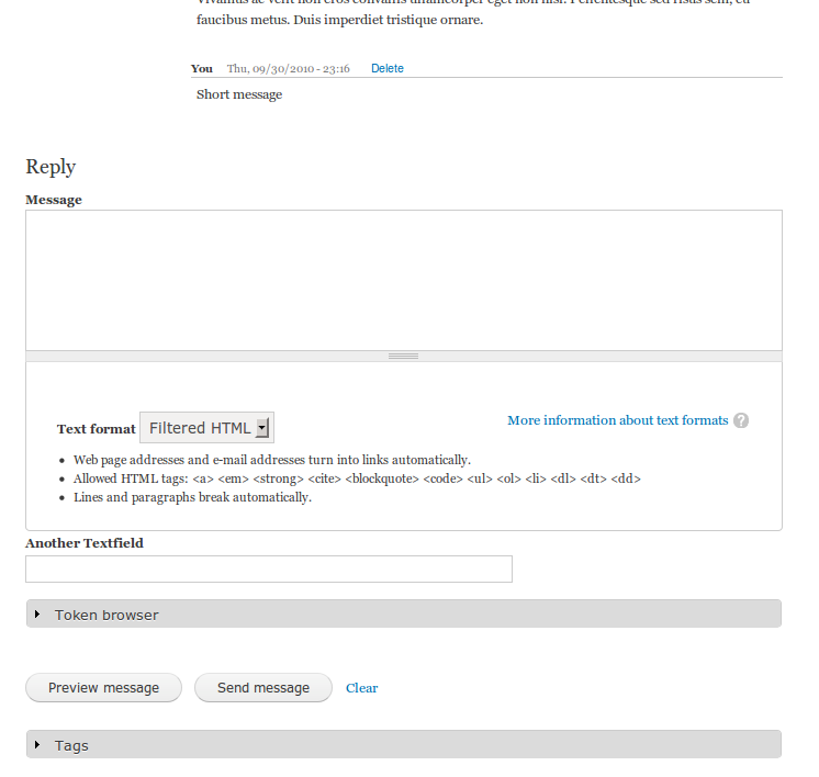
Also adding some before/after screenshots...
Comment #14
berdirComment #15
BenK commentedIt's looking great! Very close to being done. Some notes:
2) The "You" functionality is working great. Since it's new, I expected to have some bugs to fix, but I couldn't find any.
3) Your "New" styling looked great, too. Yeah, I think a light background color would look nice as well.
4) How about adding the following CSS to allow a little more spacing after a field:
div.privatemsg-message-body div.field {
margin-bottom:15px;
}
Other Items:
6) For the ".privatemsg-message-body" CSS, change the margin-left to 10px. I think it looks a little better with a bigger indent on the message body text.
--Ben
Comment #16
BenK commentedAlso, while testing these changes, I noticed a bug involving viewing another user's message list. I've created a new issue for this bug here:
http://drupal.org/node/933214
--Ben
Comment #17
berdir3) Added a very light (pretty much the lightest I could come up with) red background. Also added a padding of 5px around the whole message. Not really sure about this, try yourself..
4) As discussed, not for now.
6) Yep, looks better.
Obviously, we don't have any tests for the Participants/Between line or the tests would have failed :)
I think I removed them because the order of these messages was not stable. Added back a simple test for it, because you is now always first.
Comment #19
BenK commentedAs discussed in IRC, we're going to remove for now the light red background on new messages and the extra padding that was added to messages (which caused the horizontal lines of the message and thread to not quite line up vertically). Once this is done, this is RTBC and is a big stylistic improvement! :-)
--Ben
Comment #20
berdirCommited to 7.x-1.x, yay!
We can probably backport a big part of this to 6.x-2.x.
Comment #21
webwriter commentedsubscribe for 6.x backport.
Comment #22
berdirAttaching a patch for D6, please test...
Comment #23
berdirSame patch without d6 suffix.
Comment #25
berdirNew patch, should fix the fails.
Comment #27
berdirComment #28
berdirRe-roll.
Comment #29
berdirCommited.
Comment #30
webwriter commentedThe new layout is excellent. Thanks so much for all the work you put into it!