
Closed (fixed)
Project:
Commerce Core
Version:
7.x-1.x-dev
Component:
Payment
Priority:
Normal
Category:
Task
Assigned:
Issue tags:
Reporter:
Created:
30 Jun 2010 at 19:06 UTC
Updated:
3 Jan 2014 at 01:42 UTC
Jump to comment: Most recent, Most recent file

Comments
Comment #1
rszrama commentedTagging.
Comment #2
mertskeli commentedLooks logical for now.
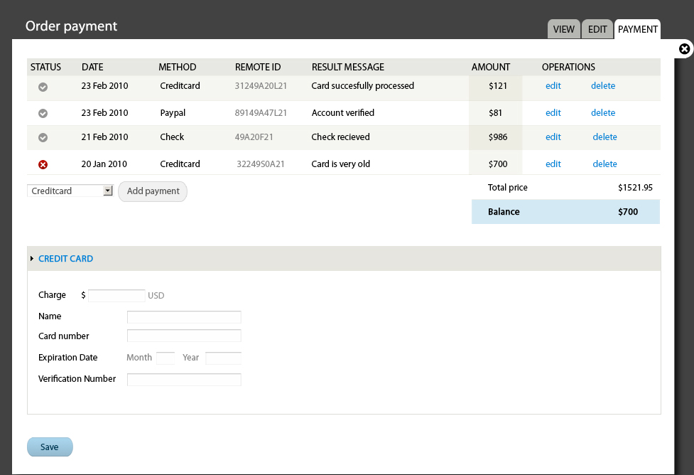
Result message is a status also, and could be titled as Details, for instance. If Status has green checkmark it means result is successfull.
Comment #3
rszrama commentedWorks for me. And I wasn't sure about "Remote ID" at first, but I think I like it b/c it definitely avoids confusion with local transaction IDs.
Comment #4
Bojhan commentedAgreed, icons!
Comment #5
patcon commentedI might suggest keeping the grey icon. I know it's a common convention to add color, but in dashboard design, don't you want to minimize noise -- ie. unremarkable items should sink into the background. There's no reason to yell "Hey! This payment SUCCEEDED! HIGHFIVE."
Anyhow, just my two cents :)
References:
Information Dashboard Design > 13 Common Mistakes in Dashboard Design > Highlighting Important Data Ineffectively or Not at All
http://books.google.ca/books?id=NomqOzZfHqoC&lpg=PP1&dq=information%20da...
Information Dashboard Design > Eloquence Through Simplicity > De-emphasize and regularize the non-data pixels that remain
http://books.google.ca/books?id=NomqOzZfHqoC&lpg=PP1&dq=information%20da...
Information Dashboard Design is a great book, by the way! Lots of little tips that seem so intuitive once they've been pointed out :)
Comment #6
Bojhan commentedI actually have that book :) But yes, I am a bit on the fence whether its a good choice to go with green - not sure yet :)
Comment #7
patcon commentedNiiiice... might get a kick out of this Bojhan, if you haven't seen it already:
http://omnipotent.net/jquery.sparkline/
Comment #8
rszrama commentedImplementing this now. : )
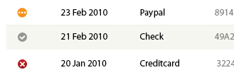
One thing I think we'll need is some way to represent a pending status for transactions - this is for things like e-checks that haven't cleared, Credit Card authorizations that we capture later, or expected COD payments.
Comment #9
rszrama commentedRegarding the pending icon... I did some Googling and saw that a lot of applications use clocks, others hourglasses, and others some image that attempts to represent a spinning circle / arrows. I was concerned the clock would look too much like the check mark at first, but it actually works well in this one:
http://qc.iguza.net/IssueTracker/Default.aspx - see the greyish clock icon by the first issue, compared with the green check marks
There's another clock in pending.gif on this page, representing scheduled actions - which really is what pending is all about. It's meant to indicate something has happened, but we're waiting for something else to happen before the transaction is considered a success or failure.
http://marketyahoo.com/help/16466.htm - see it in the first table of icons
I don't really know this application, but it uses spinning arrows to indicate something is happening behind the scenes. This is fine, but I think in our case this might appear too automated... : ?
Oftentimes we're waiting on user action to finalize a transaction. If we went with something like this, I like the visual style here but not the color. ; )
https://dev.myid.is/seblanc.id - labeled Pending beneath the screenshot
Other than this icon, the only thing really remaining to implement is the add payment form... working on that now.
Comment #10
rszrama commentedI still have more work to do on the "Add payment" form - it has a rough placeholder for now. I've created a separate issue for that, though, so the only thing remaining here is to come up with a pending icon. I doubt we'd be happy with what I can produce. Bojhan? : D
Comment #11
mertskeli commentedIcon can be changed at any time. For now I would use hourglasses.
[edit] If it's gonna be a round icon, it could be (-) or (?)
[edit2] Or even just a yellow triangle, so that it matches the Drupal core watchdog icons.
Comment #12
redben commentedHourglass, credit goes to http://www.webalys.com/design-interface-application-framework.php
Comment #13
rszrama commentedIt's a good hourglass, but I wonder if it shouldn't fit into a circle somehow like the others. : ?
Maybe the separation is actually a good thing, though...
Comment #14
mertskeli commentedWe are not obliged to use circles. Just Drupal's own watchdogs were used.
Hourglass is very good in that "processing" idea.
Comment #15
rszrama commentedAlrighty, went ahead and used the hourglass from #12 so I can close this out. Eventually I'd like to replace that with something a little more visually uniform.
Comment #16
Bojhan commentedYou mean, like to replace that with something less ugly? Anyways, lets leave this open - I will get to it, eventually. Please reconcider your current quality standards on design in Drupal commerce if you want it to end up looking good.
Comment #17
rszrama commentedhah, I don't have a standard - the standard is yours, and it looks like marking this fixed had a good outcome. (Didn't know if you were still tracking this one at all. : )
Comment #18
redben commentedAnalog watch ?
Comment #19
Bojhan commented@redben Yhea, thats the idea - I think we just need to adjust its styling to fit Seven.
@rszrama I have soo many issues, its hard to track anything :) But I think the best way to make Drupal Commerce look good, is to have a high standard when committing - just like we do for code.
Comment #20
patcon commentedGo team!
Sorry, I'm clearly just here as a representative of the rah-rah squad.
Comment #21
redben commentedOr better yet, 3 dots (...) in the 13px
squaredisk. Too small to hold any complex symbol. Plus the analog clock might look like a rotated tick.Oh and yellow :)
Comment #22
mertskeli commented3 dots is a very good idea.
Comment #23
Bojhan commentedCan anyone tell me why this is a good idea? I found #18 fine, but I have no idea what we are trying to communicate with dots? I think this needs pictures!
Comment #24
rszrama commentedYeah, I think a clock works just fine for something awaiting action... I mean, pending can mean a lot of things, and some payments may never leave pending, but dots will be generally meaningless whereas a clock of some sort at least means "waiting".
Comment #25
redben commentedThe idea behind the three dots (Ellipsis) is for its meaning: "unfinished"
Sure the clock is just fine. But later i thought that it was not at the same level of "abstraction" as the other two very simple symbols (tick and cross). So maybe Ellipsis are...
These are just suggestions though!
PS: http://en.wikipedia.org/wiki/Ellipsis
Comment #26
mertskeli commented@Bojhan
It must be a matter of personal preferences. Clock is fine. But in business a clock has always been associated with credits (time/money). Also, it contains some "delay" meaning in it, which is a negative thing.
Well, both are ok. Not a big deal, it is going to be an icon (like pending.png, I assume) so everybody can change it anytime.
3 dots is good at showing an unfinishned process, like ... to be continued
But clocks is fine.
Comment #27
Bojhan commentedOk, my version of the clock. I am no icon designer so, its probably not perfect :)
Comment #28
Bojhan commentedMy source
Comment #29
patcon commentedGave it a shot it to tweak it a bit, and remove some minor jaggies :)
Comment #30
patcon commentedTweaked the diagonal arm a bit.
Comment #31
rszrama commentedTagging.
Comment #32
rszrama commentedOk, I've used patcon's latest iteration... I think that makes this issue ready to be closed, no?
Comment #33
Bojhan commentedYes