

Closed (fixed)
Project:
Drupal core
Version:
7.x-dev
Component:
Bartik theme
Priority:
Normal
Category:
Bug report
Assigned:
Unassigned
Reporter:
Created:
8 Aug 2010 at 11:10 UTC
Updated:
23 Sep 2010 at 21:10 UTC
Jump to comment: Most recent, Most recent file


Comments
Comment #1
Bojhan commentedCan't we align there buts?
Comment #2
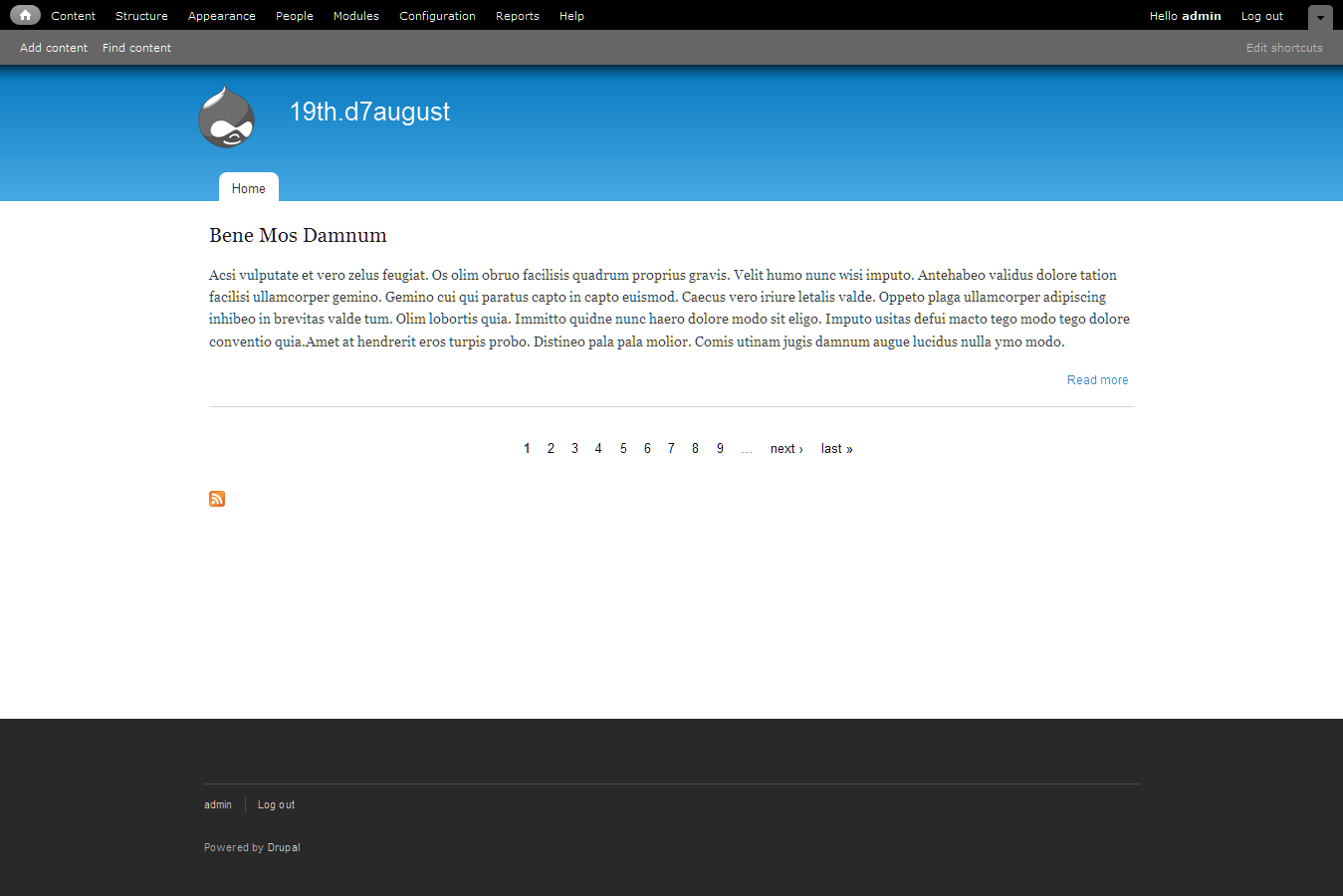
Jeff Burnz commentedTechnically they already are, Georgia is a non-lining, old style font which use text figures: http://en.wikipedia.org/wiki/Text_figures, which is real good when you want numerals to stand out, say within a paragraph of text or as a headline, but in something stand alone like the pager it looks rather odd.
Comment #3
aspilicious commentedwe should choose another font for the pager, this doesn't look good.
Comment #4
Jeff Burnz commentedSet to font-family: "Helvetica Neue", Helvetica, Arial, sans-serif; and 90%.
Comment #5
aspilicious commentedLet Jensimmons deside or Bojhan or ... someone else if they don't respond.
For me this is good to go.
Comment #6
bleen commentedI'm fine with this too ...
screenshot from #4:
Comment #7
Jeff Burnz commented#4: bartik-pager-font.patch queued for re-testing.
Comment #8
Bojhan commentedI am not sure I like it in terms of typography, but indeed the current is hard to scan = unusable.
Comment #9
yoroy commentedThis uses the same typefaces as defined for the main menu tabs, so it's consistent with that. RTBC it is.
(I did scan Bartiks style.css and there are a lot of slightly different font-size statements in there, 86%, 90%, 92%… which may be fine but the overall size of the text seems too small to me. other issue, I know :-)
Comment #10
dries commentedCommitted to CVS HEAD. Thanks.