This issue addresses the larger concern with the color scheme of Bartik, the current default has sadly gone in with almost no design review meaning that its quality is not up-to-par with Drupal core standards, for something that is our initial face - our brand this is unacceptable, hence the critical state.
Short list of concerns:
- The current header and footer do not match in color scheme
- The header visually has a lot of resemblance to Garland (see themes page)
- The visual style has a lot of resemblance to Drupal.org
With that in mind and our current timetable lets discuss while keeping a few constraints in mind, I don't think we should be discussing the logo, labeling, elements on the page, new features ect - instead keep it focused on the color scheme and bringing that to a "good" state.
So key elements that need to be fixed: header and footer.

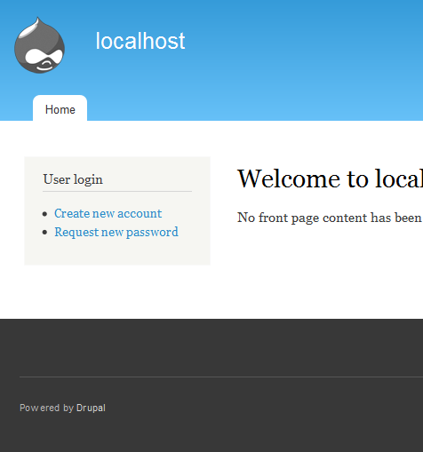
As you can see the color scheme doesn't match, for it to match we should avoid deviating to drastic from the original chosen colors, it will remain a blue color scheme (although the footer can change). The only real change we should make is change the tone of blue, the gradient - all the subtle changes that can make a world of difference but don't require complete overhauls of a theme.
So after talking with yoroy, jensimmons and webchick shortly on this topic we need to fix this asap, as with Drupal soon going into beta we can't be making any changes to late in the game.
For reference:
#873086: Change the default footer color in Blue Lagoon color set of Bartik









Comments
Comment #2
Bojhan commentedSo I spend quite some time exploring alternatives before making this issue but due to time constraints I can't continue working on this.
Working on it I found the following issues :
I havn't experimented to much with the footer yet, but I believe that one is actually quite easy to find a good balance with. I hope others in this thread can collaborate visually, providing mockups of ideas.
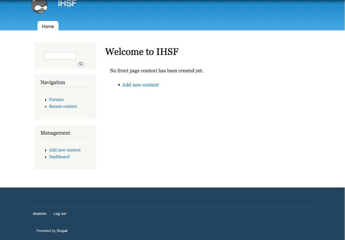
Alright so this one is far from perfect, I wouldn't call it my favorite but its one of the alternatives I found most worthwhile. I still believe a lot of work on the gradient, changing it from a big to a more subtle gradient while still keeping that shaded affordance is possible.
The parts I don't like about this proposal is that the footer still doesn't visually come close with the header, it can be visually distinctive especially when there is content, but it shouldn't therefor look bad without content.
I personally consider this issue perfectly fixable before freeze as long as the focus stays on small visual explorations.
Comment #3
Bojhan commentedAny other proposals? Please include screenshots.
Comment #4
jaymiejones86 commentedI know there was supposed to be nothing said in regards to the logo but I think from a branding perspective that the Drupal logo should stay as the blue drop and not as a grey drop.
Comment #6
tim.plunkettjaymiejones86, please see #848312: Create a new Druplicon logo for Bartik
Count this as a sub, I'll be back to actually say something later.
Comment #7
webchickI think the idea is nothing about the logo in this issue, because we already have #848312: Create a new Druplicon logo for Bartik for discussing that. :)
Also, I marked #873086: Change the default footer color in Blue Lagoon color set of Bartik as a duplicate, even though it's older, since this issue attempts to resolve the issue more holistically.
Guidance from Jen there on footer colour was:
Looks like that's on the order of what Bojhan's suggestion is doing. (though I must say, I vastly prefer the current header gradient to this new one...)
On the short-list of concerns, could you elaborate on 3? (The visual style has a lot of resemblance to Drupal.org) The other two are clearly sub-optimal, but I'm not sure why this one is.
Comment #8
dcrocks commentedHow about blue-grey(#23445F). Passed color contrast analyzer test.
Comment #10
thamasHow about blue-grey(#23445F). Passed color contrast analyzer test.
-1 – I don1t like that #23445F :o(
Thanks for creating a more holistic issue about Bartik's default color set! But I have to say that I like the recent header gradient too. :o)
It' s importatnt to remember, that Bartik has Featured and Triptchy regions, however they can't be seen in a fresh D7 install. They are some kind of light grey, and when we change the Footer (and maybe the Header...) we have to remember them. (If they weren't there I would try to set a light gray to the footer, just like the redesign of drupal.org...)
I think a dark grey works well, when the site has content. But it's too strong without content (think of a fresh install!). So I still recommend (to test) #0368a7 as footer color!
Comment #11
Bojhan commented@thanas For the record we are not touching Featured and triptych I believe we can tackle them after this issue if needed. I wish if you do a suggestion to include a visual example of this. Also I do not think -1 are inappropriate in this discussion, this is a profound discussion on a key design element - if you have a -1 it needs to be argument-ed
Eitherway your proposal is :
I am not sure, it now looks very close to the header.
@webchick Looking similair to drupal.org (the redesign) means you are mixing two brands the drupal.org and the drupal product although this might seem good, for a website this is bad. Because that means many sites will look similar to drupal.org thereby weakening drupal.org brand.
Onto the gradient, I know you all love it - but we need to explore alternatives, which might mean dropping it all together if it looks better.
Comment #12
mertskeli commentedOk, if it is allowed to critisize current Bartik theme, I'll share my thoughts as well.
Its design is primitive. Simple and primitive are two different things. It is another a-la Bluemarine theme, with no individuality. And Bartik has a mission of the first impression for the upcomming D7 release. One of the reasons - colours. I understand that we have to stick to Drupal's corporate light-blue colour or gray, but still we can make it more interesting.
Font... Sorry who decided to use all those Georgia, Helvetica Neue, Lucida Grande fonts? Windows has 95% market share and lacks all those fonts. So, Times New Roman is going to be the theme's default font?
I tried to imagine the whole idea of this theme.
Keywords: woman, technology
Tags: retro, printed circuit board (pcb), punched card
I'm almost sure the header fill shouldn't be monotone. We can make it look "more rich" with gradient fill, or with some pattern (see attached samples).
Please have a look at: http://en.wikipedia.org/wiki/Punched_card
And especially this one - http://en.wikipedia.org/wiki/File:Blue-punch-card-front-horiz.png
Its blue-gray colour fits perfectly, and provides good background for both white and black text.
I would go even further and would suggest a "watermark" for the header, or something like that.
Comment #13
mertskeli commentedOne more possible watermark. Just a general idea.
Comment #14
thamasI don't want to touch the color of the Featured and Triptych, just wanted to remember ourselves that they are exist and the color of Footer and Header must go with their color... Thanks for doing a picture about my suggestion.
I'd like to apologize for the "-1", I didn't know that I shouldn't use it here. I just wanted to say that I dont like that blue-grey. It does not looks nice, so that is not a good idea IMHO.
I' don't think that my recommendation is the best, it is an idea, a way to try.
I think that drupal.org colored drupal sites don't weaken the drupal.org brand. Drupal.org has is own layout which makes it different from standard drupal installations. But if you are right, maybe we should not use a blue color set as default, instead of we should use something else.
Comment #15
tim.plunkettBojhan, I like the grey footer in #2, and it fits in with jensimmons's request to use a dark grey.
I agree with webchick, I think the current header is fine.
I think the similarities between Bartik and the d.o redesign, and even Garland, is a huge plus. I don't think it weakens the brand, I think it reinforces it. It is an immediate sign that "This is a Drupal site". Re-coloring is so simple that we're not forcing this on them, but I think it provides a unified experience when first installing D7.
mertskeli, almost everything you said is out of scope. We're discussing the color scheme, not adding a background image (which wouldn't work well with color.module), and the font stack is completely unrelated. Also, Georgia is web-safe and released by Microsoft in 1996, and bundled with IE4.
Comment #16
webchickI tend to agree with tim.plunkett on the branding issue.
On concern #2 (the header visually has a lot of resemblance to Garland), one 5-second solution to this would be to make one of the other colour schemes in Garland the default, and change the screenshot accordingly.
Comment #17
tim.plunkettPatch and screen shot attached.
Comment #18
Bojhan commented@webchick , @tim.plunkett I get you disagree, lets get over it and continue iterating :) - the other issues still stand. Yes webchick we can fix the theme page by changing the default garland color scheme, however that should be a separate issue - this one is on fixing the visual look, which we need to fix anyway.
@mertskeli Like tim.plunkett said, your suggestions are totally out of scope. We will not add background images, neither will we change the font stack - I never said this issue would be the home for talking about everything thats wrong. No its about finding a solution for a very well defined problem, without adding to much.
I find the thought that it being close to the "Drupal" brand a good thing somewhat misleading, it would indeed be great if our visual brand was strong and positive. But realistically, when someone says "ohh that looks like a Drupal site" it often referring to an outdated and inflexible look (I am not even talking about the opinions of the design world on this). So saying, that the current visual brand of "Drupal" would be a good thing to replicate I find somewhat misleading.
Bartik should introduce a new visual brand, it should make Drupal 7 look different, new, refreshed - we can definitely keep the header tone, but it has to look different enough to look beautiful and not make people think of "Drupal" - hence my thought we should be dropping something that makes it look similar to Garland. I am totally baffled by the reluctance to drop our old brand, I know your attached to it but outside the Drupal world its really not that strong in terms of design.
Moving on, again - I hate it if this would turn into a brand discussion, we can simply fix the header and footer. I think we are on a very good road with the footer, I might suggest for it to be somewhat lighter towards blue (like #8 but darker)? I am gonna try to do that a bit.
Comment #19
webchickEr. Well I don't understand how we can fix the header/footer colour if we can't answer the question, "Is Drupal looking similar to Drupal.org (post-redesign) desirable or not?" Or are you saying that within the confines of this issue, we aren't changing the base colours of the theme, just making them match? Because if so, I can definitely get behind that idea: it helps scope the discussion to "We're doing a blue header, similar or equal to what's there now, and we need a good matching footer colour."
But if that's not what you're saying, I don't see how we can kill off the brand discussion on this issue, at least as it relates to the colours of our brand.
Comment #20
Bojhan commented@webchick We could have done this in our initial IRC meeting, but either way my response. We are making subtle changes to the header and more drastic to the footer to make them look good.
Having the core theme look similar in terms of style to the new Drupal.org is desirable, but its important to note - in terms of style, not a straight copy - which it is now. I want to avoid creating a blurry line between the "Drupal" product and "Drupal.org website", there has to be a clear visual distinction on first sight.
We are indeed still doing a blue header and a matching footer, but we need to apply some nuance to the header to make it not look so similar to other brand parts as Garland and Drupal.org, I understand deviations from unique brand elements is hard to understand - but we should be very wary when it all starts looking to similar.
Comment #21
mertskeli commentedOk, sorry for interference. I worry it not to become less "expensive" than Garland.
Comment #22
cosmicdreams commentedGreat discussion here. To me #8 reminds me of bluemarine color scheme. Blues and Greys. I must say that it looks a million times better than bluemarine though.
Comment #23
webchickOk, perfect. That helps scope this issue down to something decently manageable, rather than the true definition of a "What colour to paint the bikeshed?" argument. :)
I'll now try to stay out of this issue and let the designers work. :)
EDIT: Duh. I now see this was in the original post all the time! /me obviously needs reading glasses... :\
Comment #25
tim.plunkettThe patch failed due to CVS being stupid, but I won't bother to reroll it until we've come to a consensus.
So far all we've done is tweak the footer color (with no decision yet), which was what #873086: Change the default footer color in Blue Lagoon color set of Bartik was about.
Those who want to change the header, please make a suggestion so we can keep things moving.
Comment #26
geerlingguy commentedI'm quite happy with the look of #18 - although I'd love that druplicon changed (that's not in this issue, I know I know...).
Comment #27
tim.plunkettGood, #18 is the screenshot I uploaded. Reroll!
Comment #28
bleen commentedI think #18 is an improvement ... and the patch in #27 looks good.
Comment #29
Jeff Burnz commented#18 looks bloody great- the blue is very clean and crisp and brings more definition to the tabs, the dark gray footer compliments well. Good work.
Comment #30
Bojhan commentedNeeds to be reviewed by maintainer
Comment #31
eigentor commentedSo we are indeed wanting to stay with blue for default ? :(
I can see it would have been to bold a step for d.o., but for our base theme...
This would be missing a big chance to show "This is not the drupal you used to know".
Comment #32
Bojhan commented@eigentor I think we are still gonna fix that somewhat. This patch atm only touches the footer, hopefully with some direction from jensimmons we can also fix the header.
Comment #33
eigentor commentedFor the blue style it should be enough to give the footer a better fitting, non-brown color. #27 makes it quite a bit better, while I'd rather suggest the footer to be a bit less dark, using #444444 looks fine for me.
The scope of this issue is wider, though: It is (so I hope ;) ) not yet decided we go with a blue style for default. Let's leave it with the blue one for the moment and instead develop a bunch of nice color styles and improve the existing ones over here:
#883422: Add Green Color Scheme to Bartik
and choose one for default if we made some that are good. If it be for the blue one in the end, be it. But not without having tried other ones...
I started out with a green one (attached as patch). It is not set as default, but is named "Grass". I also made the content headers recolorable to allow for more variations. Leaving the patch over at the other issue to not confuse with the existing one here.
Screenshot of Grass style:
Comment #34
Bojhan commented@eigentor its not wider, i said it like 5 times. Can you please stop doing things like this?
Comment #35
eigentor commented@Bojhan So it is decided that blue will be default?
Comment #36
Jeff Burnz commentedAs far as I know its decided the default is the blue scheme (it was one of the changes made by webchick prior to the core commit as far as I recall), we need to focus on the blue scheme and get that looking really good.
Comment #37
Bojhan commented@eigentor yes. This issue is clearly focused on the blue color scheme too, you read it - I said it, stop derailing it.
Comment #38
bleen commentedMaybe this title will help keep us on task ...
@eigantor: making blue lagoon the default color scheme was a requirement enforced by webchick before she would commit Bartik to core, so yes the decision has been made. If you want to open a new issue to discuss changing that decision, please do
Comment #39
gábor hojtsyI agree making the default Bartik look resemble drupal.org too much can easily be a misfire. Let's keep that look/brand for drupal.org.
Comment #40
David_Rothstein commentedWhy is this "critical" rather than "major"?
Also, why isn't it RTBC? :) Is the idea that we'd prefer to change all the colors at once rather than committing an interim patch just for the footer? Otherwise, seems like this should be committed...
Comment #41
geerlingguy commentedTo avoid bikeshedding, this issue should focus on the default alone. That is what 99% of Drupal installers will see, and it's the only important scheme by a very large margin.
There seems to be a consensus (at least somewhat) that the patch/scheme in #27 works well, and doesn't infringe too much on the new drupal.org look...
Follow up issue #1: #848312: Create a new Druplicon logo for Bartik
Comment #42
webchickNeeds sign-off from Jen.
Comment #43
dries commentedLet's have Jen mark it RTBC then. :)
Comment #44
moshe weitzman commentedAt code sprint, we agreed that this is non critical. We all want it of course.
Comment #45
David_Rothstein commentedCan we also agree that RTBC != RTBJ? :)
I mean, it's great we have maintainers and all and obviously maintainers' input should get a lot of weight, but I don't like the idea that only one person can mark something RTBC and we have to wait around for them no matter what. When I signed up at #621618: Revamp MAINTAINERS.txt to be a maintainer, that's not what I signed up for... Bartik is part of Drupal core and therefore belongs to everyone, and this is a small patch which could easily be rolled back if it turns out there is some reason to.
Comment #46
Bojhan commented@David Yes, you are right - its getting a bit silly. Then again, for something as critical as this its also a bit silly to go without any input. If it goes without response for a longer while, I am pretty sure we can set it RTBC.
@moshe Sorry, but a - we decided it wasn't; is really not an argument. I clearly stated why its critical, I doubt people at the sprint read that before making such a decision. If it stays in the current state, it will decrease the value of our brand significantly.
Comment #47
David_Rothstein commentedWell, based on http://drupal.org/node/45111 this would definitely be "major" not "critical" - but on the other hand, we probably aren't following that to the letter elsewhere either.
If it gets committed, then it doesn't matter what priority it was :)
Comment #48
Bojhan commentedThat guide is great, but doesn't take into account anything on the part of UX. Something might be completely unusable, but in your face functioning.
Comment #49
dries commentedWe don't technically need sign-off from Jen so I'd be more than happy to just commit it. Given that it changes her visual designs, I feel like I want to give her the opportunity to chime in. Designers often feel passionate about their designs, so I want to respect that. If she doesn't respond in the next couple of hours, I'll go ahead with what we have and then we can follow-up with other patches, if necessary.
I don't think this issue is 'critical' either, but I'm not worried that it won't get it so I'm OK with leaving it as 'critical' for the next couple of hours.
Comment #50
tim.plunkettTalked with jensimmons in IRC about this before she boarded her plane. We're obviously sticking with a dark grey, but she's right that it could use a contrast check so that we pick the exact shade of grey.
I'll leave her to mark it RTBC, and we'll be on our way.
(Still not critical, but I'm not getting mixed up in that disagreement.)
Comment #51
jensimmons commentedI appreciate people wanting to make sure I've had a chance to look at things like this before making a change. I am getting on a plane in a few mins. So here's what I've got so far.
About the Header image:
I absolutely did not want to put a fixed/set image on the theme. Most people would have no idea how to change that image and would not want to use the default. Other themes in contrib can have images that are permanently part of the look.
I do love the idea of providing a way for people to upload their own header image. I would have added that to Bartik months ago if it was possible to do so in a core theme. It's not. Providing that kind of functionality is a feature that must be added to all of core — not to just one core theme. And that's a bigger project that can only happen during a code thaw.
Meanwhile, I really wanted to provide a way for people to place their own images in the header of Bartik. So, I've been talking to different developers about the idea for months. Finally, a frantic and fun conversation with Jeff Eaton led him to jump on the idea and create Noggin: http://drupal.org/project/noggin So now, the functionality exists — it's just a matter to telling people to go use that module.
And if people who make decisions about Drupal core like Noggin, and like the technological approach, then perhaps that module can be moved into core for D8.
OK — these colors. I do think changing the footer background color is the way to go. Like tim.plunkett just said, I want to double check the color contrast and make sure it's strong enough. That shade of grey is right on the edge. I'm working on that now (although I'll probably have to wait until I land in CPH to finish.)
Comment #52
jensimmons commentedOk. I think that #2d2d2d is bit too light. It's playing right on the edge of AA-level accessibility color contrast, and I think we should be more inside the limit for the default color scheme. I've played on that edge with some of the alternative color schemes (staying inside the limit), but for the default, I'd like for the contrast to be more clear.
So let's use #292929 as the footer background color.
Comment #53
tim.plunkettDone. Passes tests, looks awesome.
Comment #54
jensimmons commentedScreenshot:
Looks RTBC to me.
Comment #55
geerlingguy commentedI guess that wraps it up, though @tim, please don't mark your own patches rtbc...
Comment #56
dries commentedA-l-l-righty then. Committed to CVS HEAD. Thanks!
Comment #57
webchickRegarding RTBJ, if there's a patch around that makes fundamental changes to the developer-facing API of DBTNG, I certainly would wait to get Crell's feedback on that before committing it, even if 15 other people thought it was a good idea.
I therefore don't think it's unreasonable to get Bartik's architect involved in major user-facing changes to the default branding of the design, regardless of how many +1s a patch has. The situation doesn't change just because we're talking about colours instead of function signatures.
Glad to see this is committed, though.
Comment #58
Bojhan commentedPutting this back to needs work, as that was only the walk in the park part (glad we got that done though). The biggest issue is the header, as described in the initial post.
Comment #59
eigentor commentedSo I'll try not be too derailing ;)
If we really wanna get away from Garland an drupal.org resemblance, the header can not be such a saturated blue.
Well, this point seems to be a bit controversial - the original issue description mentions it as a problem, but there were also voices pro Garland and d.o. resemblance because of branding.
If it shall be done and one reduces the saturation and make the header color brighter, the theme starts to look a bit pale and not so cheerful.
Maybe #883684: Make Bartik Content headers recolorable gets interesting for this, because it allows for moving some of the color accent into the content area, so the other areas do not need as much color.
Comment #60
moshe weitzman commentedDowngrade per Dries's comment and per our Priority guidelines (which apply to all issues. help make guidelines better.)
Comment #61
amc commentedI'd like to resurrect webchick's suggestion in #16. Now that default Bartik looks great, why don't we leave it alone and just pick a different default Garland color scheme?
Comment #62
Bojhan commented@amc Because its a hack, that makes Garland less beautifull and leaves Bartik still with the brand confusion with d.o.
Comment #63
eigentor commentedChanging Garland Color does not help - People remember blue Garland from 3792 ugly drupal sites.
Comment #64
Jeff Burnz commentedI'm not really certain about this brand confusion issue - seems to me it could, as easily, reinforce the brand, as opposed to weaken it.
Are subtle changes really going to make much difference - won't most just see a fat blue header?
Given that we need to maintain the contrast ratio one thinks the only direction is more contrast, more saturation etc - i.e. a fat dark-blue header?
Personally I like the status quo.
Comment #65
eigentor commentedWell, if one makes the color a lot brighter, it is definitely different.
If one likes it, is another thing (can this avoid the connotation "baby-blue" ?)
But - definitely different.
Comment #66
cainchild commentedThis is just my opinion, but alot of the themes are kind of clustered up with a ton of stuff on them, a little delineation doesn't really hurt here.
Comment #67
geerlingguy commented@cainchild - the color scheme is all that will be discussed in this thread... and at this point in D7 development, major theme changes like footer redesigns, etc. will have to be tabled. Just fyi.
Comment #68
amc commentedActually, there are larger redesigns being contemplated, for example, #889982: Move secondary links to the header in Bartik. However, as stated previously, this issue should stay on topic about the colors. If you want to do something about footer stuff, feel free to create a a new issue.
That being said, for what it's worth I like the colors in #65. It makes the grey druplicon stand out more. (Although that might be changed in #848312: Create a new Druplicon logo for Bartik.)
Comment #69
Jeff Burnz commented@amc - yes but these are more like tweaks in response to the outcome of other long standing issues i.e. 1) moving the secondary links to the header is a requirements change - previously we had decided core themes could place secondary links in the footer, but after a very long discussion this is now reversed, and 2) "omg not that same old same old drupalicon as a logo - its time for something new", which does not require a change in the header design.
There is an outstanding design issue regarding the header region which needs to be solved.
Comment #70
kiphaas7 commentedsub
Comment #71
iantresman commentedWhile Bartik may be a technically good theme, and work well for most starter sites, it's flat, dated and frankly dull.
The default theme for Drupal 7 should offer a "wow factor", look slick, three-dimensional (rounded bevelled corners), glossy, and make people want to "buy" Drupal. And ideally it should be available in half a dozen customizable colors.
It should also demonstrate basic functionality such as rotating banner heading, title, subhead, mission, breadcrumbs, fixed/100% widths, multidemensional drop-down menus, lots of areas.
Drupal's "look" is first thing that people see. It should look... wow!
Comment #72
Jeff Burnz commented@iantresman - when posting in the issue queue please keep on topic, this is about improving the color scheme. While you may have a difference of opinion regarding the default core theme this is not the place to discuss it.
Comment #73
webchickI'm not sure I see anything else here to be done for D7. The footer colour is fixed, and that's probably about the best we can do.
Comment #74
Jeff Burnz commentedAgree with webchick, I think we're done here - to me header is just great as it is and I can't see a great driving force to change it at this late stage. Lets move on, lots of other Bartik issues to work through in the next couple of weeks...
Comment #75
Bojhan commentedBah, totally sad jen didn't chime in anymore. Well gogo drupal.org header look a like, I guess.
Comment #76
Jeff Burnz commentedWell if its any consultation by the time the (mythological) d.o redesign rolls out Bartik will probably be ancient history... ouch! Just kidding...
Comment #77
Bojhan commentedHmm, I am going to be somewhat of a pain and reopen this. This because jen did confirm this was a considerable bug, that we do not see a great window of opportunity to fix it should not be a reason to close this, I do not want us to forget that this is an issue (even when you disagree with all the arguments, there is no question that there is similarity between the headers).
I feel most people oversimplify the whole brand part of Drupal and only look at something whether they like it or not, rather than exploring what defines Drupal's visual branding and understanding the need of consistency and differentiating in that. I know that generally means that even fewer people can carry an issue like this home, I have done my share of explorations and did not find a proper solution - I hope others like jen or mark boulton can chime in.
We can push it to D8, but that would still undermine its importance.
Comment #78
tim.plunkettWhen was this confirmed as a "considerable bug"?
Bojhan, in #18 you clarified that both webchick and I thought that the header color wasn't an issue, and you made the good suggestion that we "keep iterating". I did my part to help fix the footer color, but since Dries committed that, there has been no other progress made. There are 40ish other Bartik issues open that are actual bugs, let's focus on them.
That said, I agree that this could be valid for D8, so I'm not going to reclose this.
Comment #79
Bojhan commentedViolations like this for are critical D8 material, anywhere that we weaken the brand.
Comment #80
Jeff Burnz commentedThis is not critical, nor is it a task - its a strait out feature request. A task implies this is something that should be done, however I believe we are long way from that conclusion. If the design is to be changed it's a feature request or a bug, regardless of the reasoning. I don't see a bug here.
Comment #81
Bojhan commentedWhatever, I will just make a new issue by then.
I find it rather offensive that 2 non-designers are so set on not allowing discussion on a critical visual design part. Clearly you either don't understand the importance of brand confusion or just don't care. Anyway, as always I did my best not to make Drupal screwed up - another battle lost :) As I said I discussed this with Mark Boulton and with Jen Simmons and both said it IS an issue.
Comment #82
Bojhan commentedComment #83
tim.plunkettBojhan, who decided that I was a non-designer? Unless you weren't referring to me. Either way, I eagerly await debating you for D8 :)
Comment #84
gumdal commentedOh thanks, that was immensely helpful! I would also love to know if the banner images are responsive? I mean a rotatable banner images as in the "Blue Masters" theme? This was the only reason why I was thinking to jump to the Blue Masters theme, otherwise I love Bartik! Its simple and elegant.
With reference to #51