

Closed (won't fix)
Project:
Drupal core
Version:
8.0.x-dev
Component:
Bartik theme
Priority:
Normal
Category:
Feature request
Assigned:
Unassigned
Reporter:
Created:
14 Aug 2010 at 23:55 UTC
Updated:
29 Jul 2014 at 18:59 UTC
Jump to comment: Most recent, Most recent file


Comments
Comment #1
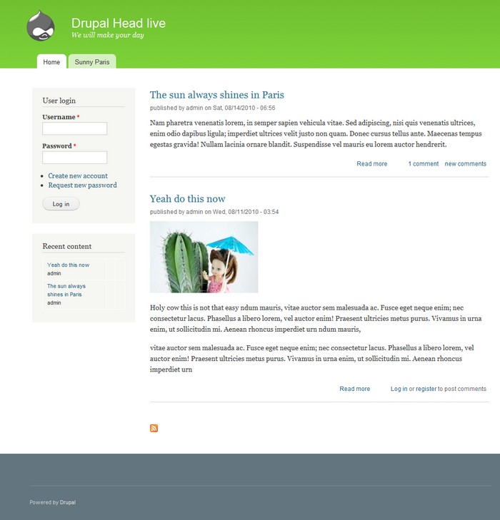
eigentor commentedThe style can be switched on as "Grass".
At the moment it is viewable at the demo site: http://auweia.org/test/drupal-head/
Comment #3
eigentor commentedRerolled patch
Comment #5
tim.plunketteigentor: One thing at a time, please. No one will bother reviewing a patch that makes arbitrary out-of-scope additions. Also, roll patches against HEAD or they won't pass the tests.
DISCLAIMER: This is a reroll so the tests will stop failing, not an endorsement of adding the patch.
Comment #6
tim.plunkettComment #7
Jeff Burnz commentedWell we have a red, blue, light and dark gray and, somewhat oddly a purple one, so a green one would seem to fit.
But yes, the contentheader addition is out of scope dude (too late for this, D8 material if ever), the color scheme itself is very nice and would be a nice addition / complement the existing set.
Comment #8
tim.plunkettOh wow, I totally forgot to attach the patch that just adds the green theme. Whoops! That's what I meant to do in #5/6.
Comment #9
eigentor commentedAh, my Drupal Head version is out of sync, sorry.
@Jeffburnz and timplunkett: Recoloring the content headers is out of scope? I thought we were working on the color schemes...
Comment #10
Jeff Burnz commentedYes, because its a strait out feature request - this would have to be done for all color schemes. Fixing the color schemes is either a bug or a task, but adding new things like a color setting is a feature (could even argue that a new scheme is a feature, but as long as it works with the currently available settings I think its viable).
Comment #11
eigentor commentedO.K. I see. So here we go: #883684: Make Bartik Content headers recolorable
Comment #12
thamasI like the green header (I tried to create a green scheme too), but the grey-blue(?) footer don't goes with it well IMHO.
Comment #13
eigentor commented@thamas: well, have a go ;) That's so nice with color schemes, you can try out live and quick by just fiddling with color module.
It was the best match I found, but there may be a better one. My inspiration was a Kuler swatch, named "Futuriffic". Kuler http://kuler.adobe.com may be a great inspiration anyway, trying to incorporate a set of matching colors instead of only one. Such nice swatches over there...
Comment #14
eigentor commentedChanged the header to better reflect the issue.
Comment #15
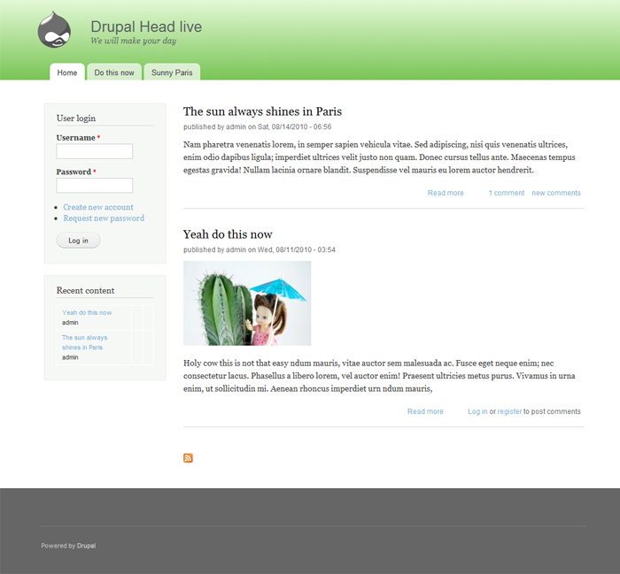
eigentor commentedTo create some Variation:
Comment #16
eigentor commentedForget the image, I recolored the content headers again. Here with current Possibilities and black content headers:
Comment #17
jensimmons commented1) Your footer does not meet accessibility guidelines.
2) This is out of scope for D7. We aren't going to add any more color schemes, or make big changes to any of the existing ones.
I have at least three others that I really like, and that I could argue should be part of the current set. We do not want to have too many, however, so I did not include all of the ones I made. There are thousands of possibilities. That's the really cool thing about the color module — people can make any combination they want, and have that on their website.
I see no need for us to try and include too many combinations in core. Including a few starter color schemes is a great way to show people who color module works. Including too many overwhelms people and makes them spend time trying to figure out our color schemes, instead of working on their own. Designers know this — too many choices is not better. http://en.wikipedia.org/wiki/The_Paradox_of_Choice:_Why_More_Is_Less
Comment #18
eigentor commentedWell if you do not want to include too many - we could move some out. Currently there are two black and white ones. do we need two non-color color schemes? The Plum one would at least need work as it has not been too popular until now.
I can see the point of not having too many. What is really a bit hard on me - I guess you noticed - is that even small changes (well what I personally find not too big) get marked "out of scope".
But I see I am getting into a bit of a Don Quixote role here and I cannot say this is fun.
Comment #19
tim.plunkettI think this is fair to say.