

Closed (fixed)
Project:
Drupal core
Version:
7.x-dev
Component:
Seven theme
Priority:
Normal
Category:
Bug report
Assigned:
Unassigned
Issue tags:
Reporter:
Created:
27 Sep 2010 at 13:04 UTC
Updated:
3 Jan 2014 at 02:04 UTC
Jump to comment: Most recent, Most recent file


Comments
Comment #1
dstolThis should do it. I swapped it out with admin-list, which is more appropriate.
Comment #2
dstolI can also see this patch working as well.
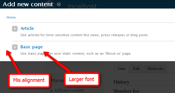
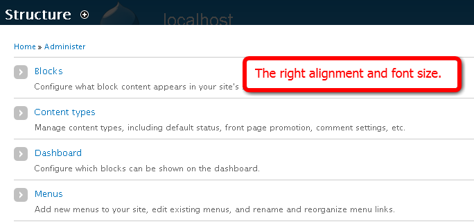
As for the font sizes, I'm not exactly sure the reason for the increase.
Comment #3
dstolComment #4
Jeff Burnz commentedSeems redundant to have two classes doing the same thing? Approach #1 seems more in order, as long as there are no other reasons why there are two classes.
We should change the font size (and weight?) to match.
Boyhan - anywhere else you see this problem with these lists?
Comment #5
Bojhan commentedNope this is the only place.
Comment #6
dstolIf #1 is indeed the way to go, it'd probably be worth while to remove the ul.node-type-list styles then.
Comment #7
Jeff Burnz commentedYep, sure we can.
Comment #8
Jeff Burnz commentedMissed some stuff in ie6.css
Comment #9
Bojhan commentedSeems like a bug fix. RTBC
Comment #10
dries commentedCommitted to CVS HEAD. Thanks.