
 Come together with the global Drupal community in Rotterdam, 28 Sept – 1 Oct 2026. Sessions, contribution, connection, and Early Bird savings until 8 June.
By chrismessina on
Well, I admit that I've been rather latent with providing any progress on the node creation mockup stuff, and I do apologize... it hasn't necessarily been for lack of effort.
I've drawn up (by hand) a number of node creation scenarios that I will be mocking up shortly, but they're not yet online.
In the meantime, I wanted to provide an intermediate mockup and get some more feedback.
Please note that I've revised this post with an additional mockup.
Take a look and leave a comment (or just reply to this thread):
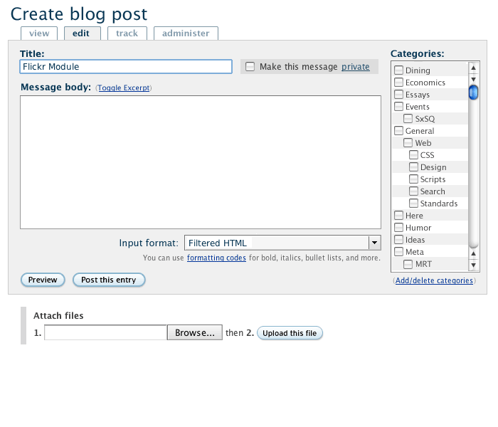
Some things to note:
- Make this message private is the same thing as saving the post as a
draft; if someone wants to give me more feedback on this, I’d
appreciate it - The categories look fairly nice now: they’re out of the way and more subtle
- There’s a more generous composition area
- If you toggle excerpt, a hidden field is revealed that allows you to create a custom snippet
- The link “formatting codes” is context dependent and changes based on whatever you’ve selected in the dropdown box.
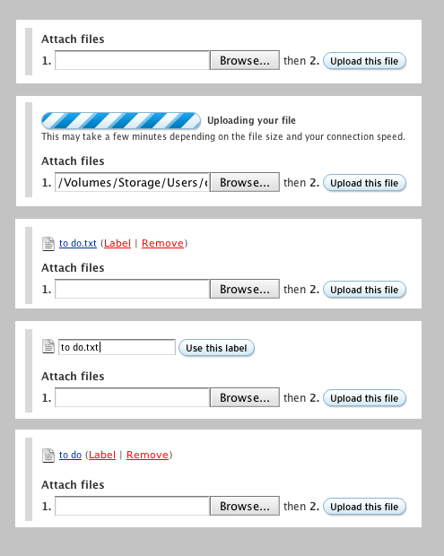
- Attach may become a separate tab, but Basecamp puts these below the compose area and it works out really nicely… It makes it easy to add multiple files or work with one file at a time. Check out the steps.
- Note that the submit button is now context sensitive: since we’re creating a blog entry, the button says “Post this entry” instead of the generic (and boring) “Submit”.
More changes to v2
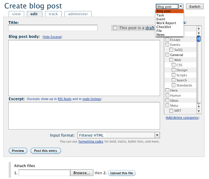
Notes on these changes:
There are some subtle but important changes in this version.
First, the excerpt field has been toggled "on". There was previously some confusion about excerpt vs. teaser and hopefully this will clear that up. I envision the excerpt being the short summary that gets sent out to RSS feeds being customizable... if you don't toggle/change the field, the first 200 words or whatever get used. This feature replaces the current need to use but has nothing to do with what others have called "teasers". As you can see from the inline explanatory text, it should be obvious to the composer how the excerpt is used.
Second, I've added a new content type switcher found in SilverOrange's intranet. In fact, this makes complete sense for Drupal and will eventually, I think, become indisposable. What this allows you to do is switch from one node type to another. This will supplement or replace the current "Create content" listing in the admin menu. It should only show up when there is more than one content type, of course.
I've also cleared up the wording on a number of items, especially the former "Make this post private" link. This now reads "This post is a draft" and will add the post to your drafts queue.
Hopefully this further clarifies some of my ideas for blog post creation.
Anyway, thoughts are welcome!
Chris

Comments
It really looks nice, but
It really looks nice, but where are other modules going to add extra fields?
Also, what will happen when I have more than one vocabulary?
--
If you have troubles with a particular contrib project, please consider filing a support request. Thanks. And, by the way, Drupal 4.5 does not work with PHP 5.
--
Drupal services
My Drupal services
Multiple vocabularies, extra fields
Can you send me a screenshot of the current multiple vocabularies layout? I have an idea of how I want to approach it, but don't have a reference to work from.
As for the additional settings, those mockups will be coming. For the most part, it will entail a smarter use of tabs... So the "Administer" tab will house a lot of extra features and I might add one more tab for other things.
It's a key point here that Drupal start to think about the nexus point of its forms. This means that we should focus on the core task and design around that... everything else gets hidden or pushed back until it's absolutely necessary to reveal it.
I understand that there is a balance to strike between showing modules' added functionality and keeping those features "pushed back"; my subsequent mockups will address those concerns.
I was working on redesigning the Module Creation/Editing form here on Drupal but perhaps that one is too big to start with... I think I'm going to come back to blog posting, forum topics, gallery image and standalone page to start with and then work on those larger, more extreme cases.
Chris
--
User Advocate for CivicSpace Labs
Here is a screenshot of a
Here is a screenshot of a "add event" form in German translation. Additionally to the event fields there are two vocabs to chose from ("Veranstaltungen" (single select) and "Zugangrechte" (multiple select) ) and the path alias field. The filter settings are still above the body fields as the this is from a pre 4.5 cvs version. The body field is not shown.
http://killes.drupaldevs.org/dateien/multiple-taxos.gif
I am ok with having an "administer" tab, but I wouldn't want to have "add event info" tabs.
--
If you have troubles with a particular contrib project, please consider filing a support request. Thanks. And, by the way, Drupal 4.5 does not work with PHP 5.
--
Drupal services
My Drupal services
A quick multiple vocabulary mockup
Here is one proposed solution:
Different proposal
Expand/Collapse Instead of Reverting to Dropdowns?
Is there a way to mix checkboxes with expandable/collapsible items allowing for multiple selection? This may accomodate long lists and offer a consistent method rather than reverting to dropdowns. I don't think this is possible, however, in JavaScript? It may be possible in DHTML?
Javascript collapsible fieldsets up the wazoo!
We really need to make some rules about how to apple these javascript collapsible fieldsets... I mean, I see everyone suggesting them for everything and we just can't do that.
I'll work on this some more and think up how we can accommodate the various cases of different vocabularies.
SilverOrange Intranet
I think SilverOrange offers an elegant solution where they present a list of vocabularies/categories in a folder form which are collapsible and expandable. They use simple css properties (display: none & display:block) and trigger them using javascript.
While there should be a default vocabulary tab displayed, additional vocabularies would be expanded as needed.
Link: http://www.silverorange.com/images/intranet/screenshot2.gif
Categories
What if one vocabulary is required (main classification), but additional vocabularies are not (additional or secondary classifications)? How would that affect your design?
Separate categories tab needed, especially for big vocabularies
Using checkboxes (rather than select menus) for the categories is a big improvement, but I would like to plead for them to be on a separate tab.
Two reasons:
maximising editing space
The mockup shows the categories beside the editing box. Very pretty, and handy for short posts, but for a longer node, the reduction in editing space would be a serious impediment to useability.
On my current Drupal site, the "Body" editing box already has its r/h edge near the right of my 1024X768 display, and allows a 75X20-character input area. That's already too small for longer documents, but putting the categories alongside it would make the editing area 20% narrower, and allowing for word-wrapping it would probably cause a 25% reduction in the amount of visible text.
Even that assumes relatively-short category names, as in the example … but some of my category names would be several times longer than those in the example. Unless category names wrapped, the edit-box would be shrunk even further … and wrapping the category names would exacerbate the category visibility problems below.
visibility of categories
Drupal has its origins in community-type sites, but it is developing into a valuable tool for documentation sites, and that sort of site may use several large and deep vocabularies. In that context, the classification is often the crucial piece of metadata about the document, and will usually be the primary means of finding the document (posting date may not be so relevant on that sort of site).
In that situation, scrolling up and down a 17-line window onto an underlying hundred-plus-line list of checkboxes is a design almost guaranteed to create errors.
I have managed a large documentation-intensive site for nearly a decade and now planning moving it across to Drupal. One of the things I want is to be able to see all the available categories, so that I can get an overview of the document's classifications. That is particularly important when reviewing the classification of an existing document, as taxonomies expand and develop: the initial author may have had a very clear idea of the classification intended, but the editor returning to the document possibly years later needs to be able to review the classification as a whole.
I can see that on some sites which don't rely so heavily on classifications, a separate tab may obscure the categorisation process. So maybe there could be a setting for how to display the categories, with a choice of a side-panel or a separate tab.
Nice but...
Very nice, but what happens if I have multiple vocabularies per node ??
Matteo
Looks like a good
Looks like a good improvement !
Some initial thoughts:
The idea of the flexinode is, that you provide a teaser or table flag: fields marked with “teaser” flag will show up in th teaser.
I am saying that, because IMO having an “exerpt-field-with-hide-feature” will make extending this option really hard. Fine modules such as “exerpt” or “teaser”, will break.
I suggest you simply define a “teaser” area in your mockup. That area will then contain any teaser related stuff. Rather then having this way too (IMO) limiting exeprt/teaser system.
div-ed form-group, copyright module uses it.
IMO a list with radios for these options makes a far better UI, since in one glance, one can see the options. Also, visual memory makes it easier to remember a location of an option when you see an actual list. (thus selects are considered to be not that good UI-elements). In fact, I assume you made the categories with these “rules” in mind, not?
All in all: a great, huge, humongous leap forward. And very, very nice work! Please do not get my comments wrong, they are only comments. It is always
much easier to tell other how they shouldve done it then do it myself. But that makes comments usefull often ;).
[Ber | Drupal Services webschuur.com]
"simply define a “teaser” area in your mockup"
I agree. Exerpt is an optional field which, IMHO, could be included in the administration options if it does become a standard feature since it is likely that many users will not take advantage of it or need to use it on a regular basis in node creation/editing.
Similarly, I would also relegate the switch option to the administration tab. Most users won't be (and indeed probably shouldn't be) switching node types.
As for "draft", I would include that at the bottom with "preview" and "post" as "save as draft" so that it is clear this is an alternative to "post." This would help to differentiate between the two, to make it clear that the post has not been posted.
support for draft ideas?
Going on a tangent here, has anyone setup to support writing of drafts for the authenticated user w/ no admin node permissions? One alternative we've considered is using node_privacy_byrole but if you have several roles that quickly makes your publish/unpublish checkbox into a cribbage-board of checkboxes which can quickly confuse the user. I suppose if everyone was an authenticated user, and then their other role/s, you could hide the checkboxes for the rest of the roles and control view/not view with just one checkbox for authenticated user, but that's pretty messy.
Any ideas on this front?
I cannot stress it enough: regions, not details!
This shows a mockup of the node form in a bottom-up method.
Drupal is modular, and thus the forms can -and will- look different afor every site. Because of this fact, it is undoable to design an interface for each situation. You already see all the comments flowing in about "But wht about ***?", "but how will *** fit into this?". That is because these mockup are far too detailed. An example: The mockups all show taxonomy, but I have some sites running that do not use taxonomy at all, not for blogs, nor for other pages.
its also what ce1414 proposes: get the bigger picture first!
Therefore I have suggested numerous times to start bottum-up:
First define regions, (that is this mockup)
Second define elements (a text-are is an element, but so is a taxonomy selector)
Third define where modules should place these elements. (tab >> region)
But please not that by no means, I mean to propose the exact regions like presented in the images. We must discuss these regions in a structural way and then agree upon a set of regions. These regions should then all bne placed in the nodeapi. But again: These regions are just brainstorm-ideas!
[Ber | Drupal Services webschuur.com]
instructional and submission guidelines
Here's a rework adding one additional region that takes into consideration FactoryJoe's design but still also allows a place for the
Explanation or submission guidelines for nodes to run across the top of the input interface:
(sorry for the bad hack of your image, Ber. I think I need you to give me a Photoshop tutorial : )
Guidelines, IMHO, need to run the breadth of the input form (so that users will be more likely to read them). But it make sense to me to follow FactoryJoe's layout to allow some options to appear beside the sidebar but above the title. Will make for a more pleasing design and a more efficient use of space.
Also, long term consequence of this is that the expert theme designers will experiment with the use of different display methods and the UI will evolve through their implementations as others adopt the best practices that result. In subsequent Drupal releases, then these best practices can be implemented back in as the default display, but they will always continue to improve outside of core development. So as much as possible, the designers need as much control over where--in what regions--and how--pull down list or scroll list of taxonomy categories--the elements appear in the input interface.
How ironic...!
Ber,
This is great. I think I needed to see what "bottom up" meant for me to grasp it. In fact, I started working along these lines last night before seeing your post! Granted, I was working from the outside in, I was actually working towards your very mockup! (and please note, my wiki page is far from complete!)
I do, however, have one major gripe with what you said:
This is just plain wrong and I'll fight you to the death over it! Ha!
Seriously, this is the fundamental problem with the Drupal approach to UIs. Hear me out: I completely understand and agree that we need good defaults that work well at auto-generating UIs. BUT, we also need to be able to give themers and nutso folks like me the ability to create the UI that I mocked up above.
I think that it will be a mix of having good defaults that don't need to be overwritten (or rethemed) as well as exposing more XHTML to the themer to bend to their will.
That said, I'm going to move in your direction and start working on what form regions we need in order to make sense of this from the more generalized theme perspective. And yes, I already have ideas on how to do this. ;)
Chris
--
User Advocate for CivicSpace Labs
trouble choosing good defaults
Chris,
Some Drupal sites are going to use UI implementations that would not work with a set of hard coded good defaults. In certain circumstances, it's going to be necessary to setup Drupal sites with what might be generally considered bad UI implementation, but good for the particular situation.
For example, a client may prefer a specific UI setup that breaks these defaults because
In part, this is because good UI practices are based on the functional digital literacies of users, their experience with using other applications and the Internet in general. And this varies between users groups. From a general perspective, bloggers may need one type of interface different from those more used to using phpBB. And in the long term, the UI practices associated with the funcational digital literacies are influenced by and change due to other applications. Case in point: MT is becoming more and more the defacto standard for blogging applications. Both UI and site layout design which differs from MT's even if better than MT's, may seem less usable to long time MT users. Some site administrators may find themselves wanting to implement changes to their installation to meet MT's changes as they happen to better serve their userbase, changes which can't be hard coded even if they are better overall.
Sorry if I've probably stated some of the obvious here. But it seems to me that there will be a lot of difficulty choosing any good defaults that don't ever need to be overwritten by someone. Let the theme designers and site administrators have the most flexibility to get feedback from clients and users for adjusting their UI for the particular needs of their userbase. Let the consultants do this job locally.
Charlie
Great stuff
Definately on the right track here!
I agree w/ the comments concerning module specific fields. The topic may open a can of worms regarding how to best administer field positioning on the submission/edit form. Some people may want the additional fields hidden on the administer tab some may want them on the main tab. Some people may want them on a user-created tab.
If I understand correctly, Drupal currently leaves it up to the modules to create the html output to pass to the drupal engine and display. Perhapse its time for the modules to return a list of fields/controls rather than the html output and let the drupal engine handle the html generation. That would make it easy to assign weights and tab locations for fields in one admin screen.
Other than that, I really like how its looking.
Mockup Comments
Hi, I’m new to Drupal. Being that I’m new I’ve thought a lot about what I like and don’t like, so when I saw you requesting feedback I thought I would take you up on that office.
This actually looks like some sort of instant messaging feature when I first looked at it. It wasn't until I read your post did I fully understand what you were trying to do with it.
I would recommend sticking to something basic like Published/Un-Published or maybe add a new type of submit button that saves the post to drafts folder or grouping. i.e. 'Save to Drafts' it could sit nicely between 'Preview' and 'Post this Entry'
In general, you might want consider using a consistent convention for labeling buttons. For example, you have 'Preview' but right next to it, you have 'Post this entry'. It might be beneficial if you were to say 'Preview this Entry' and 'Post this Entry'.
I really dig they way this looks, however I do have some suggestions as to how it might be improved.
It would be great if you could integrate into the layout the ability to show a preview of what was just uploaded (i.e. picture, movie) and show the URL so that way you can easily add it to the content area of your post. i.e. Placing an image into a post. Another idea I had was, what if you somehow created a picker that allowed you to place, at will, objects that you've uploaded in that post, in to the text area. i.e. Create a new post, and as I type in the text area I am able to just click on an object that inserts an tag with everything filled out for the image I previously uploaded.
Along those same lines, as a former MT user I miss the tool bar I used to get when creating posts. I was able to highlight text and create a hyperlink, bold, italics, underline, ect... It would really cool if a text formatting tool bar could be generated based on the input filter.
Its just my two sense, hope I can help.
Cheers,
someone
careful use of language
I agree with the above comment about make private/draft, publish/unpublish seems more natural.
Drupal is quite usable (thanks to a strong focus on this), however when we've come so far it's easy to forget how long the journey is.
One usability thing that stands out to me is the 'Drupal language' that is used everywhere. While some Drupal specific terminology might be needed for developers and site admins, website visitors and users should never (ever) see any weird-talk!
One of my annoyances is the use of the term 'node' everywhere.
OK, better stop before this becomes an unrelated rant!
I like "Draft"
I like "Save as Draft", simply because it's also an email term, and similar in functionality. Anyone who's on a computer uses email (I think), and email programs for the most part, have a draft folder.
I really want the draft feature. Drafts should not be the same as "published/unpublished" because this is an admin operation. Some sites want to look at the content before publishing it, but at the same time, a user may want to edit a post a few times before making it public.
--
Bradlis7.com | Churchofchristnet
Separate administration and editing?
I'm not sure I'm really qualified to comment on all the interesting comments concerning UI design and so on, but wanted to add my penny-worth for a concern which may be specific to me: providing the possibility to separate administration and editing content.
My site is holding an ever-increasing number of articles, in a large number of categories. We regularly need to remove from front page and publish to front page, and to modify the classification. All this requires "administrative" modification that does not change the actual content - yet at the moment I have no choice but to pull the content back to the client, then update it again, when in fact I only want to make very minor changes. Would it be possible to find a way round this?
On a more positive note, I really like the look of the classification part of the mock-up, which is so much cleaner than what we have today.
All in all, thanks again to all the bright folks who make Drupal work so good!
one implementation is not enough
In thinking through further this post, the previous mockup post, the comments in both, and the other UI concerns posted recently, there's a bigger picture which should be discussed here in order to properly affect a new design for the input interface.
The initial premise/principle is correct: the current node input interface is too cluttered, too full, especially for sites using many contributed modules. This will continue to be a problem as Drupal continues to grow and both more modules and more node config options are created.
The problem, and it's a good one, is that all of these options are a result of Drupal's ever-growing flexibility which enable site design/implementations for a variety of needs. What this problem means, though, is that
Thus, I think that this design can only be implemented correctly if a hook is created which allows module developers to create a config option in the administration menu which allows site administers to set either global defaults, allow node level local defaults on the main edit page or place them on the node administer page.The mockup design must reflect that potential implementation.
And this is not just a matter of preference, but a UI concern. On some sites, I might want a toggle for the author name available at the node level where users with the proper permissions can set it per node; in other sites, this is unnecessary, and I won't want that option because it will merely clutter the interface unnecessarily. Options that users, even admins, should never need should not be displayed. Options that my users need every time they create a node should be on the main edit page. Thus, the node options need the same sort of flexibility that the navigation menu now has.
Secondly, and of more minor note, "Administer" is probably not the best term to use for the additional options tab. "Options," "Extras, and "Advanced" are all better choices since "Administer" should be reserved for the administration menu. If I try to communicate to someone that a setting is in the node administration area, where will they look? It's also a little imprecise because some of the options available through the additional tab are not administer level options, but are granted to all users. And some are. The term administer is too tied to permissions.
Draft thing
Well..
I am not a very experienced drupal administrator and not at all a developer, but I am a drupal patriot and a philologist (3 sites for a philologist isn’t bad I think).
I find this "make this blog entry private" or something like this necessary, cause I have blogged quite a while now, and I like these "private entries".
Sometimes you just don't want that other people would see something, but you still would like to pour it out...
For example- modblog has also hidden posts.
This gives you an opportunity to record your emotions, thoughts that you just want to keep only to yourself.
And calling it a private entry is just the best.
Would you be so kind to rename it back?
Private vs Unpublished
If you look at the huge variety of Drupal sites out there, you'll notice that on the majority of them "unpublished" makes more sense than "private". "Private" really only suits personal sites, "unpublished" can suit blogs (private posts), forums (removed posts subject to moderator review), corporate sites with workflow (keep drafts unpublished until final), etc etc.
Privacy is more of an access control thing: making posts viewable only by registered users, by family, etc etc.
--
If you have a problem, please search before posting a question.
Draft?
Well, I have to admit that you could be right..
But in that case- I would rather use "Do not publish" rather than "Unpublish" or "This post is a draft" (latter is actually quite good, but rather as a sentence)
"Do not publish" is pshycologically and semantically better.
Avatud lähtekoodiga tarkvara... mmmm!
Correct. but we need one language.
We now use true and falses mixed.
Unpublished ( a negative) requires a check (positive). But "promote"(positive) requires a checkbox to be true.
We need to rethink this, and come up with one logic. Either all true, or all false. The terminology (draft, private whatever) is of secondary importance. But we have used "Published" for a long time, so changing it, will make a lot of users become confused.
[Ber | Drupal Services webschuur.com]
I'd go with: [Preview]
I'd go with: [Preview] [Publish] [Save Draft] : as buttons at the bottom of the form if it was up to me.
right, privacy is about access
I recently installed the taxonomy_access module on my personal weblog so that I could choose which posts to make public and which to keep private. Simply leaving posts unpublished did not make best use of Drupal. I want Drupal to manage those private posts and display them to me when logged in within the blog list displays, category displays, etc.
So for me, private is more than just a draft. It's a way of organizing content for me alone to use. However, a community site or"corporate site with workflow" could certainly do something similar, offering both private posts by user or private posts by role. In fact, I have a site I'm working on building now where we will do this, provide private access to particular discussions for certain user groups.
destinction between layout and content
The mockups look good but to me it's a theme rather than something drupal force on you.
I guess my question is where's the line between what drupal produces and what is generated by a themed template? Should drupal force you to use a "sideblock" or is that a decision for the themer?
IMO each part of the form needs it's own identifiable block which can then be styled into whatever position. At the moment each item has it's own div block but there's now way to tell them apart. Giving them unique id's would help enormously: Title, Vocabularies, message text, submit buttons
static layout
It looks very good to me.
A remark:
I hope you keep static layouts in mind.
I'm busy with a theme who is 750px width. Without the sidebar, the content part is about 515px.
This is just a normal width for a static layout. I just hope it will fit in it without changing the code myself.
Maybe this should be possible to change in a theme function?
updates?
Still working on this project? ;)
Will this make it into 4.7?
Will this make it into 4.7? It looks much more usable this way.
I think Factory Joe is busy with other stuff?
Correct me if I'm wrong, but I think that the originator of this thread has moved to other projects, so I wonder if there is anyone else working on this? Or if Factory Joe is still working this out?
It looks promising.
I had no idea, what a pity!
I had no idea, what a pity! His ideas are really great, so it would be really nice if they weren't abandoned.
Then please start work on
Then please start work on them.
-sp
---------
Test site, always start with a test site.
Drupal Best Practices Guide -|- Black Mountain
-Steven Peck
---------
Test site, always start with a test site.
Drupal Best Practices Guide
Usability dead forum post pruning
Thank you for your suggestion about improving the usability of Drupal! We look forward to more ideas, sketches and examples.
NB: Note this forum is deprecated. As tempting as it may be, please do not reply to this post.
I have added a link to this information into the Usability Group
http://groups.drupal.org/node/14428
If you are interested in finding ways to make contributions to Drupal usability, please join the Drupal Group:
http://groups.drupal.org/usability
Screenshots, sketches, research and examples of good practice are all welcome.
This forum has been deprecated, and is no longer supported. Please do not post in this forum, or reply to this post.
I am merely trying to trawl through and find good usability suggestions and add them to the issue queue where they can be tracked. Currently, there is no way for drupal.org maintainers to "lock" this forum. This is a stop-gap measure. Thanks for your patience!