Problem/Motivation
While previewing layouts at various screen and device dimension sizes is familiar to most front end developers and themers, the mechanics of this efforts may still be unknown or cumbersome to content creators and editors. For many of them, the goal of their efforts is to create great content. Anything that helps them quickly determine what this content might look like across the media that will deliver it to consumers is an improvement.
Summary of Pros and Cons raised during the debate of this issue
Pros
- Drupal 8 lacks a robust content previewing mechanism. The RP module gets us closer to that goal.
- Comments: #98, #87, #306, #355
- #87, Creating and previewing content is a core function of a CMS.
- #306, This feature is mostly for content-editors, core really lacks a sane content preview (what we have with Preview button - the old school style) So once core 8 focused on editor's experience out of box so it makes sense to include.
- #355, I think this provides a useful feature for content editors, even if it's going to be a pain to maintain.
- Shiny Drupal 8 features give us something to taut on release
- Comments: #107, #268, #298
- #268, Providing rich, user friendly, quick responsive(in speed) editorial interfaces is the way to ensure they get hooked to our Drupal platform.
- #298, The content creators or editors are invariably the decision makers when it comes to the tools they have to use.
- Many direct competitor CMSs have a similar feature. Drupal keeps parity with the RP module.
- Specific device names are easily recognized by non-techie content authors
Cons
- The device definitions that ship with Drupal 8 will be old in 6 months; using specific device names.
- Comments: #108, #109, #129, #130, #135, #158
- Remediation: #109, Use labels like Phone, Phablet and Tablet instead of specific device names.
- Remediation: Devices are configurable in the UI. New devices can be added. Devices can be deleted.
- Remediation: #155, We will add new device definitions with minor Drupal 8 core updates.
- It is has the potential of being deceptive i.e. that the previews will not match the rendering of the device indicated by the label
- Comments: #88
- It is true that the rendering engine used to produce the preview may not be the same as the one on the intended device.
- This feature is meant to give a content author a quick test of how a page might be presented on numerous devices.
- Remediation: #39, #40, The preview window is not simply sized to match the device's published pixel dimensions, it also takes resolution into account as well.
- We should not be introducing features to core at such a late stage in the development cycle.
- Comments: #85, #89
- Remediation: The RP module is a self-contained feature with no impact on other core modules.
- Remediation: Jesse Beach has volunteered to be the maintainer of the module.
- Remediation: A policy to allow late-stage feature commits is in place.
- Site builders and content creators need to stop thinking about how the site looks on a short list of specific devices because its folly
- Native browse tools exist and are getting better for responsive previewing
- Comments: #178, #282
- #282, Most major browsers ship with this facility built-in. Their solutions will not only evolve and improve much faster, they will also be much more accurate.
- Rebuttal: #286 Content authors will most likely not know about or be able to use the tools provided by browsers. These are advanced features.
- The only sure way to preview content on a specific device is to use that device.
- Comments: #285
- Rebuttal: Even the few devices represented by the RP module would cost a couple thousands dollars to purchase. Must all content authors purchase every device in order to preview their content?
CMS Competition
Many content management and creation tools are stepping up to aid content creators in this process.
Instant preview by Magnolia CMS: http://www.magnolia-cms.com/magnolia-cms/features/mobile-cms.html
Mobile optimization by Sitecore: http://www.sitecore.net/Products/Web-Content-Management/Mobile-Web/Mobil...
Adobe CQ5 optimization: http://www.adobe.com/it/special/eseminar-enterprise/pdf/CQ5_Mobile.pdf
CQ5 Mobile provides an easy-to-use, browser-based, in-context content authoring environment that eliminates the need for custom client software or separate sites for device types.
Drupal needs to assist in improving the content creation workflow from data model up to the point of end-user consumption.
Proposed resolution
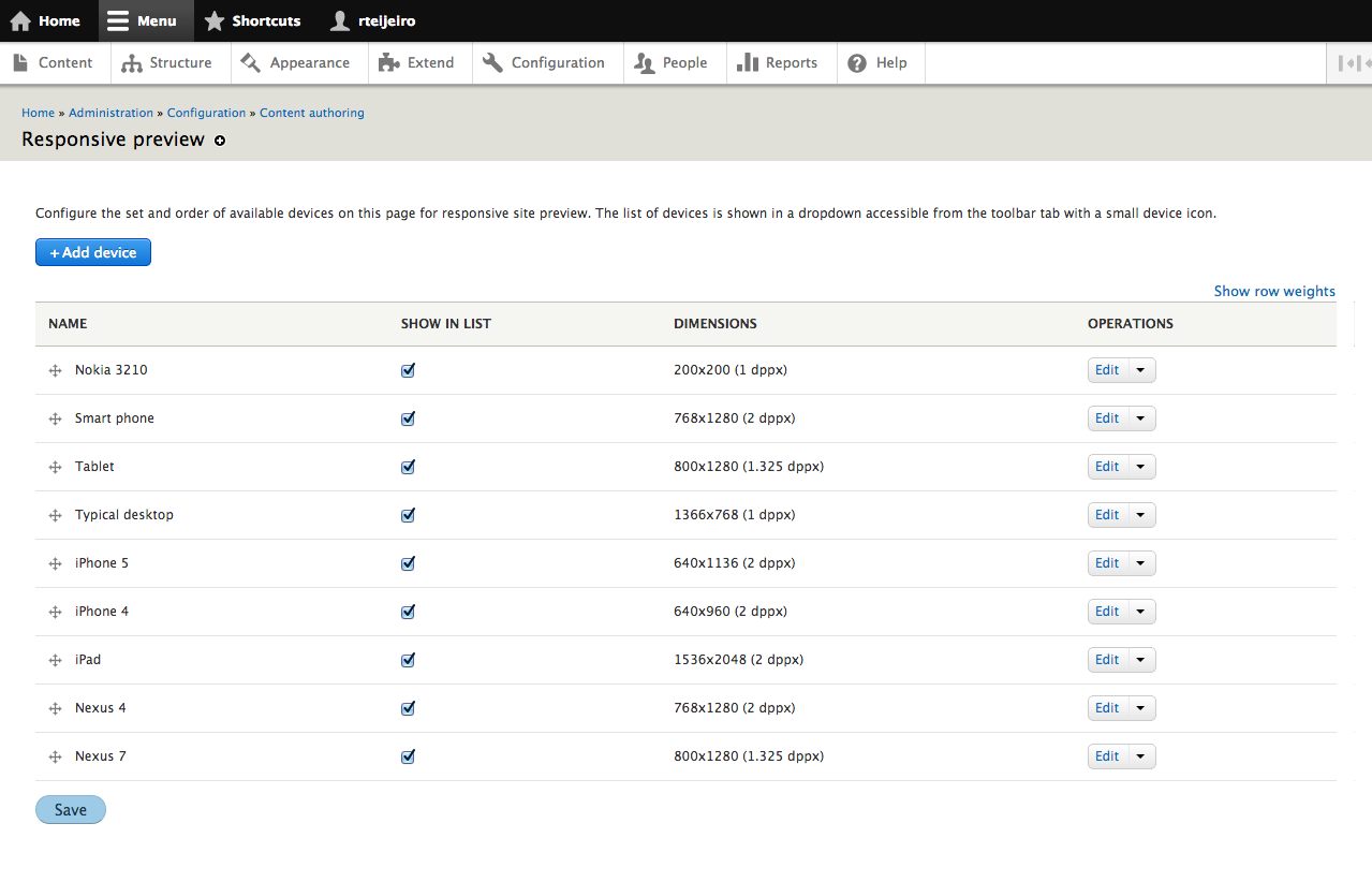
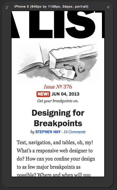
The responsive preview module proposed here is a light-weight tool for content creators to quickly determine how their pages will appear on smaller devices.
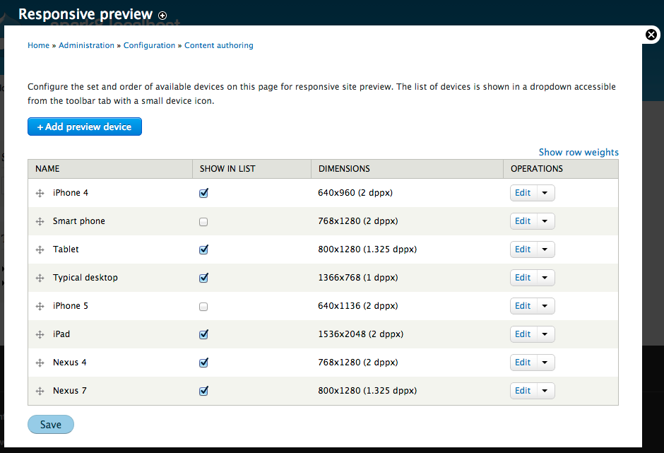
It provides preview options for several popular devices. This device list will be kept current through periodic minor releases of Drupal.
Remaining tasks
Follow up issues are tagged responsive preview. Once this is in, they'll be moved to the responsive_preview.module component.
Known bugs
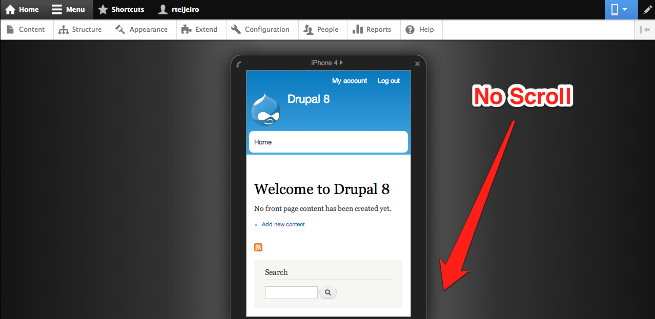
The responsive preview icon still shows up even on the iPhone sim which is obviously not wide enough to preview in anything. Clicking the icon causes it to disappear. (https://drupal.org/comment/8261301#comment-8261301)
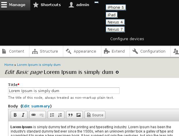
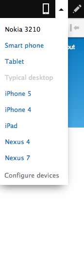
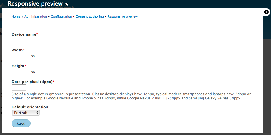
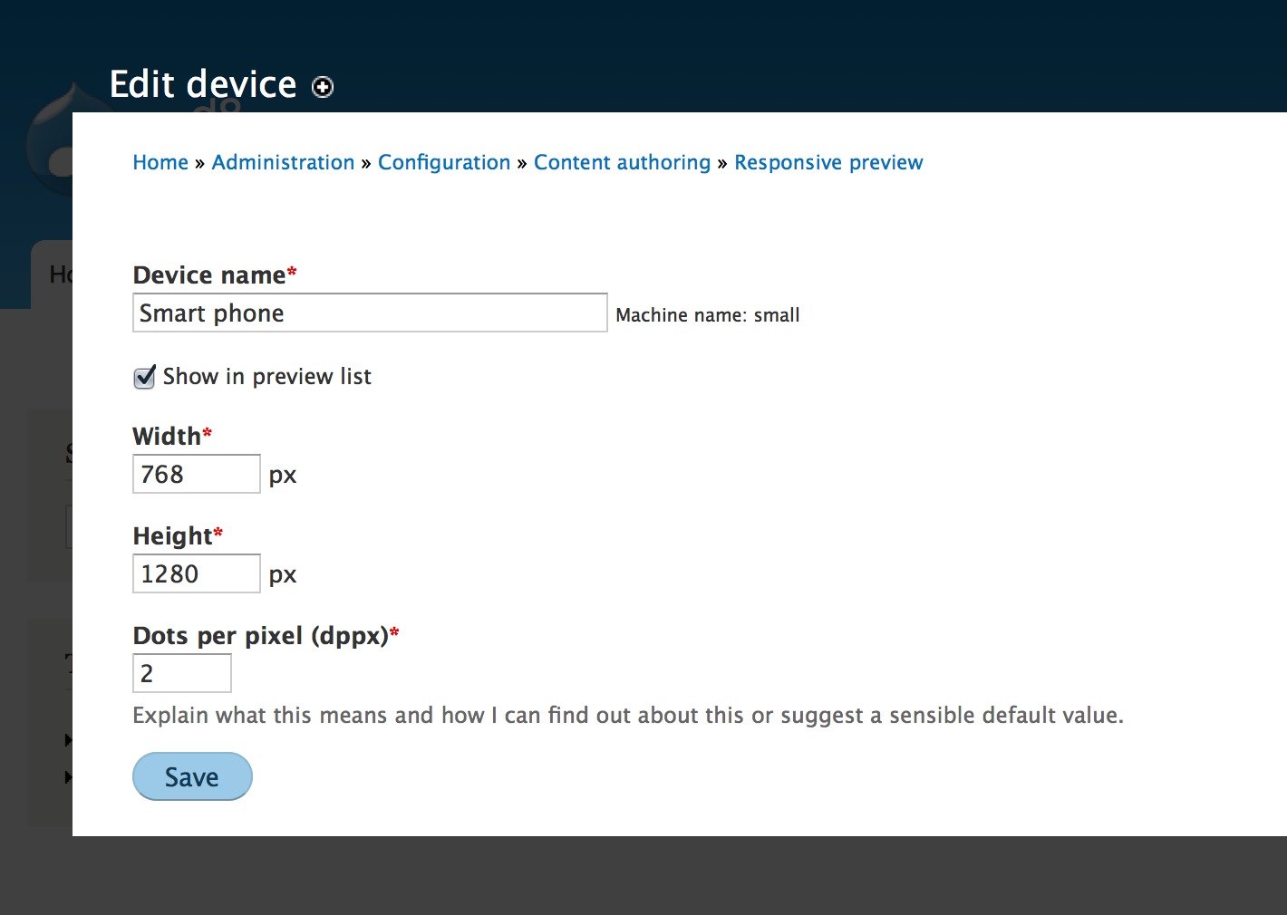
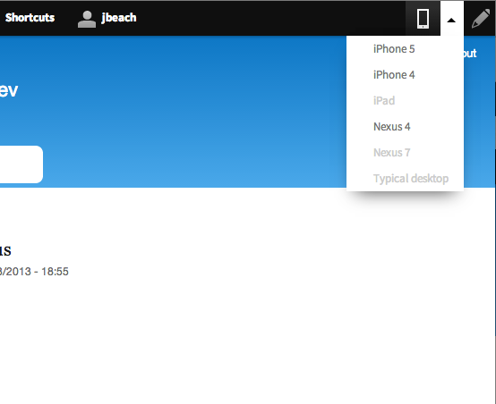
User interface changes
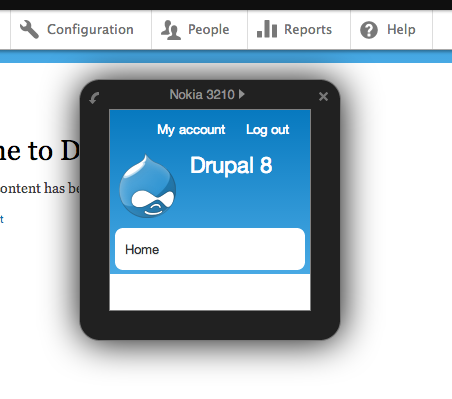
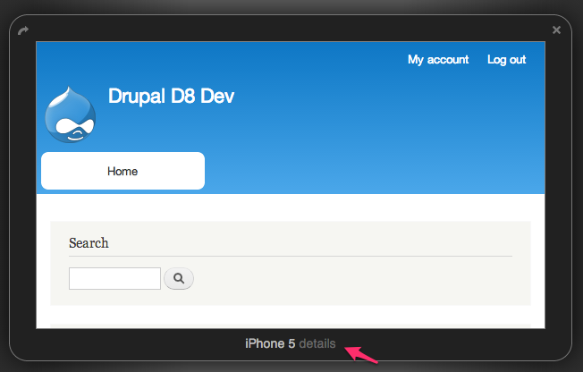
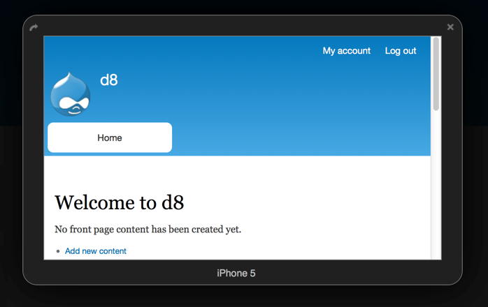
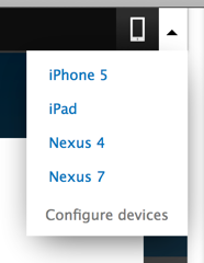
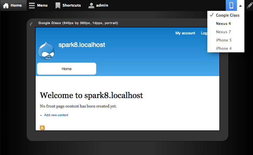
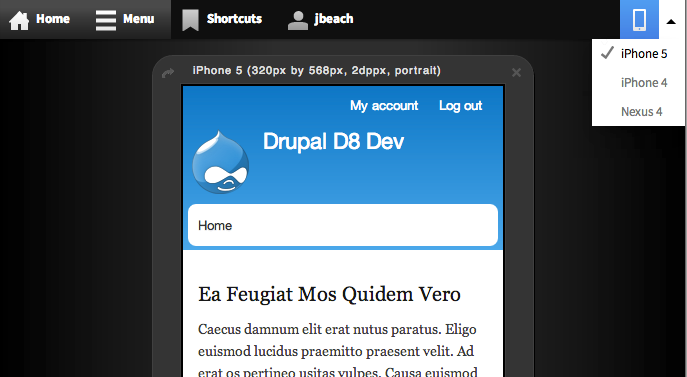
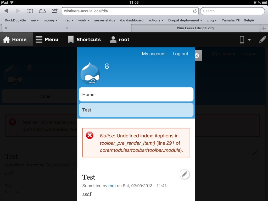
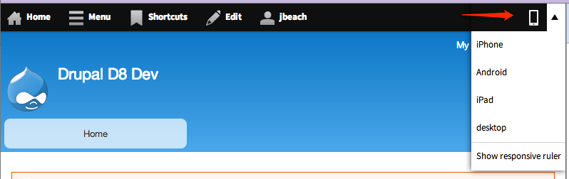
A toolbar icon is added. It shows a device drop-down selection menu (devices are configurable from an admin UI) that launches a preview of the current page in a pop-up on the selected device dimensions and default orientation. Users can switch orientation from a dedicated button on the preview UI or select a different device from the toolbar device drop-down.
API changes
None.


Comments
Comment #1
webchickTagging.
Comment #2
jessebeach commentedThis patch is not quite a Minimally Viable Product (MVP). But the basic interaction is present. I'll be iterating on it and posting progress patches.
Comment #3
jessebeach commentedThis update adds the ability to change the size of the preview through the input box at the top-center of the container. The input is limited to digits through a validation function.
The interdiff shows changes from #2 to #3.
Comment #4
jessebeach commentedWork is moved to #1880606: Introduce a configuration UI for theme-based breakpoints within the Breakpoint module queue.
Comment #5
jessebeach commentedOpening this back up.
I postponed #1880606: Introduce a configuration UI for theme-based breakpoints.
This issue will be an minimally viable product (MVP) implementation of the display portion of a theme-based breakpoint configuration tool.
Comment #6
Bojhan commented...
Comment #7
jessebeach commentedThis update styles the toolbar tab to look more like the designs. The tab is rendered as a dropbutton.
This feature can be demoed (after 15 minutes of posting this patch) by navigating to http://simplytest.me/project/spark/8.x-1.x and launching a new sandbox.
Comment #8
wim leersComment #9
Bojhan commentedJust wondering is this still a WIP? Because evaluating it even a little, I am confused:
The "Show responsive ruler" does nothing?
Desktop shows a smaller window, than my actual desktop
The ruler, does not have the affordance you can drag, that tiny <> part.
The purpose of the ruler, is not clear to me, do we want people to look at specific pixel values? I imagined the 80% case was just switching between breakpoints in your theme.
What if my theme has a black bg? Shouldn't we use some kind of background pattern?
Comment #10
jessebeach commentedThis is still a work in progress. I think Wim just got a little zealous.
I wish we had a tag for "needs progress review" and "needs final review".
Comment #11
jessebeach commentedThis update puts the mobile preview feature behind a checkbox that can be set on a per-theme basis, at the following path /admin/appearance/settings.
The wording of the option is really rough; I just threw it together.
On install of the layout module, the bartik theme is set to have the preview tab displayed -- the tab will not be displayed for Seven or Stark by default. The proper
hook_uninstallvariable cleanup is in place for the theme setting as well.Comment #12
jessebeach commentedThis patch is a major upgrade from #11. It brings the UI closer to the designs by tkoleary.
Those designs can be explored at https://projects.invisionapp.com/share/U4BPGASQ#/screens
I spent the day just getting the UI changes in place and cut some corners with code cleanliness. My next step is to go back and clean up and put in docs. I wanted to get to a point where folks can test the working UI even if it means the code underneath is a bit prototypy.
The latest changes can (always) be tested at simplytest.me with the 8.x-1.x branch.
Comment #13
wim leers#12 works great! :) Major step forward indeed!
I found only one bug: "Show developer ruler" didn't work right away. I had to close the mobile preview, open it up again, and then it worked. Note that *something* was happening, because things were shifting around a bit (I think shifting downwards), but nothing visibly appeared. Maybe it appeared underneath the black layer that sits on top of the content?
Afterwards, I looked at the JS console and saw this error five times:
Comment #14
jessebeach commentedIt turns out the controls don't exist until you've previewed a device. I need to take that case into account. Thanks for the report.
Comment #15
jessebeach commentedThis patch cleans up the CSS and JS. The entirety of the JS file has been commented up. I also fixed the JS error that Wim pointed out in #13.
Comment #16
jessebeach commentedThis patch moves the preview code out of the Layout module and into a new module called Responsive Preview.
I started a project for this module here: http://drupal.org/project/responsive_preview
This patch greatly reduces the functionality of the preview. The developer ruler and size input have been removed. It is now only possible to preview a page at the pre-defined device dimensions. The developer features may be reintroduced at a later time.
Next steps
Comment #17
wim leersChanges
Feedback
Testing revealed the following bugs (unfixed in this reroll):
jQuery('html').attr('dir').I think this one can be removed? After all, you're going to be looking at this from "a desktop" anyway. Because previewing this device on an iPad is never going to work anyway.
Do we even *want* this to appear on narrow screen widths?
36em seems to imply "smartphoneish" (because on an iPad, it still displays on the right).
Only on tablets and higher it makes sense to show this, IMO.
I removed this because AFAICT it was not useful at all. The offset was being set by the JS anyway.
Docblock for the behavior is missing — AFAIK it's an unwritten rule that each behavior must have some explanation attached to what it does.
This will actually happily attach multiple times AFAICT.
You should put the rest of the
attach()function's body in an anonymous callback passed in as the second parameter to.once().If I'm wrong, then you need to document this better :)
Why
window.topand not justwindow?Can you clarify this? I don't understand *why* this will "most likely" render outside the window.
Why is this call necessary?
loadDevicePreview()is already callingupdateDimensions()with the exact same parameters.Removing this line didn't make any difference and causes the number of calls to
updateDimensions()to drop from 3 to 2 upon initial drawing.Why is this
.trigger()necessary?loadDevicePreview()is already callingupdateDimensions()with the exact same parameters.Removing this line didn't make any difference and causes the number of calls to
updateDimensions()to drop further from 2 to 1 upon initial drawing.I don't think so, but I think as long as we do the same as overlay.module here, that we'd be good.
So: let's check whether overlay.module does the same.
I think it's generally weird to see
$someElement.drupalLayout('correctEdgeCollisions')and$someElement.drupalLayout('prunePreviewChoices')."drupalLayout" implies a certain degree of generalism, which can be considered true of "correctEdgeCollisions", but most definitely not of "prunePreviewChoices".
If you want to keep the structure the same, then
drupalLayoutshould be renamed todrupalResponsivePreview.Comment #18
jessebeach commentedReplaced with
.element-hiddenspans.Fixed by taking RTL/LTR into account when setting the edge distances for left or right.
The "standard desktop" is 1366px wide. On a large monitor, it's possible to preview this. If you're monitor isn't large enough, it won't appear as an option.
The only options you get are the ones your device is wide enough to preview. If the result is no devices, then the tab disappears.
oncereturns a jQuery set. You can either pass that set to a callback or store it in a variable.$body.lengthwill be 1 on the first attach and zero on all subsequent attaches. It just saves writing another function and indenting everything another 2 spaces.There are a couple
windowobjects in play here because of the iframe. The behaviors get attached to the page inside the iframe as well, so I'm just being really explicit about which window I want in all cases to avoid any silly mistakes.The CSS should prevent this from happening, so I changed the wording to "might". Whenever elements are absolute positioned like this, I worry that some part of the element will render off screen.
Totally right. Good catch. I removed it.
Good catch again. The control flow didn't always go through
loadDevicePreview. I removed a lot of code and these are some of the vestiges. Although something tells me they could have been redundant before too.I went though drupal.js and found
Drupal.encodePath. So now the code is:Good point about the name, I missed that one during the refactor. I would like to keep this structure because these functions act on jQuery objects and it's just so easy to chain them. But it's polluting the jQuery fn namespace just for convenience. Blech, I need to rewrite them as functions. They still iterate over a set of jQuery objects...just not as a jQuery plugin on the $.fn object.
Comment #19
jessebeach commentedThank you for the extensive review, Wim!
Comment #20
jessebeach commentedBlarg, it posted a file in #18 that I mark not to be listed.
This is the correct patch file: http://drupal.org/files/mobile-preview-1741498-18_0.patch
Comment #21
wim leersHrm, if that makes more sense, okay, but using
text-indent: -9999px;is fine too!You're right, I was making too many assumptions.
So the reason I described it the way I did is because anybody reading core JavaScript will be expecting it to look that way. So could you please add this tidbit of documentation to the code to clarify it? :)
Again, please add to the code docs.
The last two things were just a matter of "calling out code that looks unlike other JS of the Drupal code base and documenting it". This helps other people understand the code. Hence my request to document them.
Reviewed interdiff
Maybe "Typical" instead of "Standard"? Because there is no such thing as a "standard desktop resolution".
Both comments say "float left" :) You may want to fix the comments here.
"will might" :)
I get the need for speed, but having *everything* using jQuery except for this just looks silly?
Missing trailing semi-colon.
Too many spaces, unnecessary wrapping in parentheses
Remove the leading dash; it's against doc standards.
Comment #22
effulgentsia commentedPlease change hyphen to underscore (responsive_preview.devices.yml).
There's no responsive_preview_menu() in the patch, and this function isn't a page callback.
Needs a docblock.
Comment #23
jessebeach commentedThis patch addresses comments in #21 and #22.
Comment #24
dries commentedTested the patch. Some suggestions:
1. "Android" is an Operating System, not a device. Some Android devices to consider: "Kindle Fire", "Nook", "Surface", "Nexus 7".
2. When your browser window is smaller than the "Typical desktop" size, the preview is too small. That option only works reliably when you have a big enough screen and browser window.
3. I'd add "iPad Mini", to differentiate from a normal "iPad".
Suggestions for follow-up patches:
1. Visualize the height of these devices. Maybe we can render a line or something to denote the bottom of the screen.
2. Ability to flip between portrait and landscape mode.
Comment #25
Bojhan commentedI dont fully understand, why this is a core patch? It sounds like a great contrib module, but not very useful for core? I understand this isn't ready for review, but Dries reviewing gives the impression this is a serious consideration - and I haven't seen much of a larger product discussion, given that this will really be right in the face of any new user. I often fail to see, the larger idea - with patches like this, the end-goal was to make Drupal a better tool for mobile site building it seems like we worked on some of the fundamentals, and than stopped to end up at the far end - which is a preview mode. With no tools, to impact that preview mode - we seem to missing many of the tools that exist in that middle.
There is little people can do with this module - after all we cut all responsive parts from our blocks/responsive site builder concepts? We dont know if there is a demand for this? Its very prominent tool, even more so than common site building tasks - is the expectations people will do use this often? Wouldn't this fare better, as contrib and or optional core module? Is the strategy to define devices, I imagined that is a wrong strategy?
Comment #26
jessebeach commentedI filled out the device listing.
Only the options that will fit in your current browser window, the gutters taken into account, will be shown as options to preview. It's true, most folks won't see the typical desktop option. On a Cinema Display, it will probably be available.
We'll just need to discussion the design of the controls. The data to do this is all there.
The collision detection I had in the patch before just wasn't working with long lists, so I replaced it with
jQuery.ui.position, removed a bunch of custom code, and everything is working well now.Comment #27
dries commentedBojhan: The target user of this module is content creators, not site builders. It is an important feature available in many other CMSes (although usually much more advanced). That is why it slated for inclusion in core.
Comment #28
effulgentsia commentedTagging for mobile. Also raising to major, given #27. I agree that achieving the goal of D8 being mobile-friendly is not just about good responsive design, but also making it easy for content creators to preview their pages in common device widths.
Well, after previewing for a particular device and seeing that the page doesn't look good, the content creator could edit the text in the node to be less wordy, or replace images with smaller ones (or configure better image styles for the
<picture>element once we have that working), or if the content creator is a single blogger, perhaps browse the web for a theme that better suits their content, or if the content creator is part of a team, ask the site builder for help on how to improve the way the page looks on different devices.I agree that the original design with the ruler, integrated breakpoint configuration, and responsive layout builder, would have made this better, but sadly, it didn't make it. I still think what's here is useful though.
That wasn't the case with #23, but is fixed in #26: thanks.
#26 looks great to me, but it's 90% front-end code, so I'm not the right person to RTBC it. Hopefully a front-end developer can come along and do that :)
Comment #29
Bojhan commented@Dries Right, because we are cutting many of the useful sitebuilders parts from this patch - I am concerned we are leaving its usefulness to only a small target audience, after all site builders is still a real part of our audience too. I don't want this feature to turn into a sales gimmick, it should have a clear actual use amongst both content creators and site builders.
@effulgentsia Thanks for elaborating, it would be useful for us to sum up some of these use cases - because frankly, except for making it less wordy many of the usecases you summarised are site builder related. I don't really for see this being super useful for content creators, given that they have little influence on the layout, font and many of the other crucial aspects that make up a responsive site. Since we are trowing this in the toolbar, right in people's faces it should have an 80% purpose; which means that we are expecting that people use this tool all the time. If thats not the case, and its more likely its a sales gimmick and useful in 30/40% of the usecases - I think its better left as a optional core module (it is now, so I definitely recommend keeping it that way - I think this might flourish better in contrib, but thats my personal pov).
I know calling RTBC, make issues go faster. But this definitely should get more reviews and argumentation (there are 13 followers, and only Acquian reviewers + me - we need to be proactive in reaching out to others when this occurs) if we could have learned anything from the past Spark issues - is that moving too fast will kill more usefull reviews, and end up in dozens of significant followups. Given that this was introduced in feature completion phase it is only normal this needs proactive reach out to to others.
Having used this patch on simplytest.me, immediately a few things jump to mind:
1) Why are we introducing device specific options, the list is already quite long and I imagine will only get longer. I though the options should be like "mobile", "tablet", "desktop". For example, having a kindle fire option in the netherlands is utterly useless, because its not a common device at all - with the ever changing landscape, do we really want to commit to a 80% device list?
2) The lack of a background (pattern) is disturbing, and completely caters to white Bartik like themes. After all, when you have a dark theme, it will blend in with the background and seeing where responsive starts and ends will be very difficult.
3) The [x] seems awkwardly placed, and uses a style that is alien to Drupal. We should consider using a "mode" like trigger (pencil mode) instead of close button.
4) We are introducing a 4th kind of button on the top tray, from mode switching (pencil), tray (menu), link (home) to now mobile preview. Beginners will have no clue what will happen when they click a button. The > dropdown indicator does something, but its also a complete one-off. It's really sad that the toolbar design cannot accomodate more requirements with a single pattern. I feel like the whole tray concept is more and more neglected over one-off features. Why can't this for example, trigger a tray, or a mode - with a toolbox (that way going out of the mobile preview mode, will be the same as going out of pencil mode).
5) With the vertical toolbar button/mode close to it, it starts to feel more and more like that area is a blob of functionality. We should decrease the importance of the vertical toolbar icon or do something else, but as it looks now is a bit too many different buttons close to each other.
6) How does this look on mobile? Where do we draw the line, when this isn't displayed anymore?
7) This breaks when I am in admin - it trows me out of the overlay.
8) This breaks with the vertical menu (jesse, are you not using that mode :D?) You lose the vertical menu, once you click that button? If its a preview mode fine, but that means you cant quickly go to a specific admin option to fix something you see - which I imagine will be annoying. Being in the vertical menu mode should not be a disadvantage, because we have less space.
9) How do we handle things that are triggered upon detection of touch?
Comment #30
damien tournoud commentedSomething that hardcode a list of stuff is definitely not worthy for core inclusion in my opinion:
Also, all those device names are trademarked. So I assume we need a place to recognize the trademark somewhere.
This would be a great contrib module, thanks for all your hard work. But in core? Really, no.
Comment #31
wim leers#29: This patch — AFAIK — is about the Minimum Viable Product. It's still possible to introduce the more advanced stuff (the "Developer ruler") in a follow-up patch.
Exactly, it's optional, and AFAIK it would remain that way.
RE: 1. I think Jesse just added everything she could think of in response to Dries' remark about "Android" being a non-existing device. Now it's up to us to prune the list.
Points 2 & 3 are styling. Easily fixable.
This is a great point I think. Why not just list all the available devices to do preview of in the tray? It'd also mean less JS :) Would also address your 3rd point.
However, I think this would conflict with toolbar.module's automatic responsive behavior. I.e. on small device widths, it will automatically switch the tray to vertical mode. That vertical tray then doesn't leave enough width to be able to do the preview.
This also answers your 8th point.
RE: 5. You only see the vertical/horizontal tray toggle if you actually have the tray open. So I'm not sure it's really a problem. In any case, that's not something we should address in this issue; that's purely about toolbar.module.
Answered before, and you could've found this yourself: only if one or more of the device previews has a smaller resolution than the current browser width, it will be available. Hence, nothing will be available on smartphones, but smartphones *will* be available on tablets.
RE: 7. No, it doesn't break overlay, it displays the preview on top of the overlay. As soon as you close the mobile preview, it'll show you the overlay again. Also, if that's what you were getting at: it doesn't make sense to do a mobile preview of the overlay, because those are always admin pages.
I don't understand this.
I'm working on a reroll of this patch that addresses the biggest remaining gaps: messy device list, no height preview, etc.
Most of the points raised in #29 are somewhat moot, I believe.
Comment #32
dries commentedRe: #30: Trademark should not be an issue as, to the best of my knowledge, this falls under nominative fair use.
Comment #33
dries commentedRe: #29: "@Dries Right, because we are cutting many of the useful sitebuilders parts from this patch - I am concerned we are leaving its usefulness to only a small target audience, after all site builders is still a real part of our audience too. I don't want this feature to turn into a sales gimmick, it should have a clear actual use amongst both content creators and site builders."
Three quick links, but I can find more: http://www.magnolia-cms.com/magnolia-cms/features/mobile-cms.html and http://www.sitecore.net/Products/Web-Content-Management/Mobile-Web/Mobil... and http://www.adobe.com/it/special/eseminar-enterprise/pdf/CQ5_Mobile.pdf. Long story short, mobile preview functionality is common and expected. Open Source systems are lacking behind in this area.
I don't understand why we must target both content creators and site builders in one patch. It's perfectly fine to target content creators with this patch. They are our biggest audience (certainly not a "small target audience"), and the primary reason why Drupal struggles. I'm concerned you don't truly understand Drupal's competitive landscape, or our different target audiences. In any event, we have a vision for adding site builders feature to this.
The list of devices can be updates between minor releases of Drupal. People can submit patches for it. We can maintain it like anything else in Drupal.
Comment #34
damien tournoud commentedThe current patch confuses physical pixels and device-independent pixels, which seems to show a deep misunderstanding of how modern mobile devices actually work.
Let's give this time to mature in contrib, as it should. We have enough half-broken things in Drupal 8 already.
Comment #35
Bojhan commented@Dries I think its fine to add functionality for sitebuilders in later patches, but I do not see that vision posted as to what features that would contain and or any analysis as to why it should contain that. If there is a vision please share. The reason I think its a small audience, is because even out of the content creators that I am in contact with at small/large scale sites the majority currently doesn't seem to focus on optimising their content for mobile (they put that role with the sitebuilders), and in Drupal's case for those that do - we offer very limited tools to actually optimise it. I am gladly wrong on this count, but I just feel like we are offering a preview option with actually very few useful tools to positively influence that preview. The examples you linked all seem to have more functionality than just, preview which seems to validate my concern that the MVP is larger than just preview?
I don't think its fair to accuse, me or really anyone of not understanding Drupal's competitive landscape - that for a large part in the eye of the beholder. Acquia positions Drupal in a very different way, than it is positioned by the freelancers here in the Netherlands. I'm a little sad that you trow this accusation around, I feel like over the past years my role has often been to defend the content creator. Not understanding a particular need, is very different than not understanding the audience, competitive landscape, and with that Drupal's purpose(s) - if you do feel thats the case, I think me but more importantly the larger community could benefit from a lengthy blog post on this.
The guidance that has been provided to the core community, has been flaky and not been one of competitor analysis - that would bring out much more significant content creator flaws than a mobile preview toolbar, and it has definitely not been how we prioritised the to be developed features. Just pointing to features other CMS's have, and we don't is not a vision - we can really build on.
Comment #36
jessebeach commentedre: #34
Wim Leers bent his brain around this problem most of the day yesterday. I'd struggled with it to for some hours, but this clever lad figured out a way to incorporate pixel density into the sizing. Truly inspired code! He also culled the list of devices considerably from #26 so there isn't so much overlap in sizing and device.
The current trend of core JS is moving towards Backbone for managing model-like state and the views of those models, so I switched the code here from closured-class-like structure to one a Backbone structure. It ends up being much cleaner and easier to follow.
I added a black-and-white set of borders to distinguish the previewed site from the modal background to address Bojhan's critique of the lack of contrast for darker background colored sites in #29-2.
The mobile preview button now glows blue when the preview is active.
The preview is now constrained by the device height as well.
Comment #38
wim leers#36: mobile-preview-1741498-36.patch queued for re-testing.
Comment #39
damien tournoud commentedWoo. Thanks for your reactivity on this! Very impressive.
This is definitely getting somewhere, but there is still some way to go...
Browsing through the code, I do not think that getting into the pixel density business is a good idea. We are most likely not going to be able to emulate media-queries for
device-pixel-ratioso that they work properly in the simulator.If we want something that is useful for people while not pretending to be an exact simulation of a specific device, I think we should avoid naming devices all together. Really, only two things matter for the 80%:
Here is the list of devices I would like to see:
That maps relatively well with the Android screen size distribution, which defines the following four sizes:
(we probably don't want to pick exactly those values, but more the exact device independent size of the most typical device in the size... for example for "normal" it's the iPhone3/4 with 480dp x 320dp)
For all the non-desktop sizes, we also need to be able to preview portrait and lanscape orientation.
Comment #40
wim leers#39:
Emulating those media queries is indeed impossible. But that's not why this information is in there.
It's there because it makes it easier to deal with devices that have "odd" dppx values, such as the Nexus 7. That device's width is 800 pixels, but it reports 603 pixels, in other words, it has a dppx ratio of about 1.3 (that's what pieroxy indicated and the value that I used, but obviously it's wrong, because 800/603=1.3266998342 — turns out Wikipedia pegs it at 1.325, which yields 800/1.325=603.77535. I've updated it accordingly).
So, in order to not have to list the Nexus 7 as a 603x966 pixels device, which looks extremely weird, I figured it'd be better to have slightly more metadata, to keep it sane & clean.
When I look at this in a logical, puristic manner, I completely agree with you. However… reality is that most people would expect to see familiar names. "Small phone" doesn't ring any bells.
If you want to simplify it further — which I think is a good idea again from a logical POV — then I'd suggest to remove the Android devices and only retain the Apple devices. Pretty much everybody knows what the dimensions of an iPhone and iPad are. Their brand names have been around for years. There's so many different Android brand names, device names, resolutions, pixel densities and so on that even including the flagship (i.e. best known) devices is going to cause users of this functionality to wonder what these devices are.
(I've never seen a Nexus 4 or 7, for example. They're far from common in Belgium.)
For now, I've kept this the same, because I expect some bikeshedding here :P So, I propose that we defer from discussing the specific device list to use to a follow-up issue. That's a matter of choice, it's not a technical problem.
Agreed, but I was hoping that could be a follow-up as well.
#36:
TabStateModelremains largely unchanged, but I moved the unrelated attributes out of there, intoPreviewStateModel</a> and <code>EnvironmentModel(for the text direction and viewport width — I got rid of the parent window reference). This allows for much more clarity and better separation.EnvironmentModel'sviewportWidth). This allows for better decoupling and as dumb-as-possible Backbone Views: they should simply respond to model changes as much as possible, and do as little else as possible.Comment #41
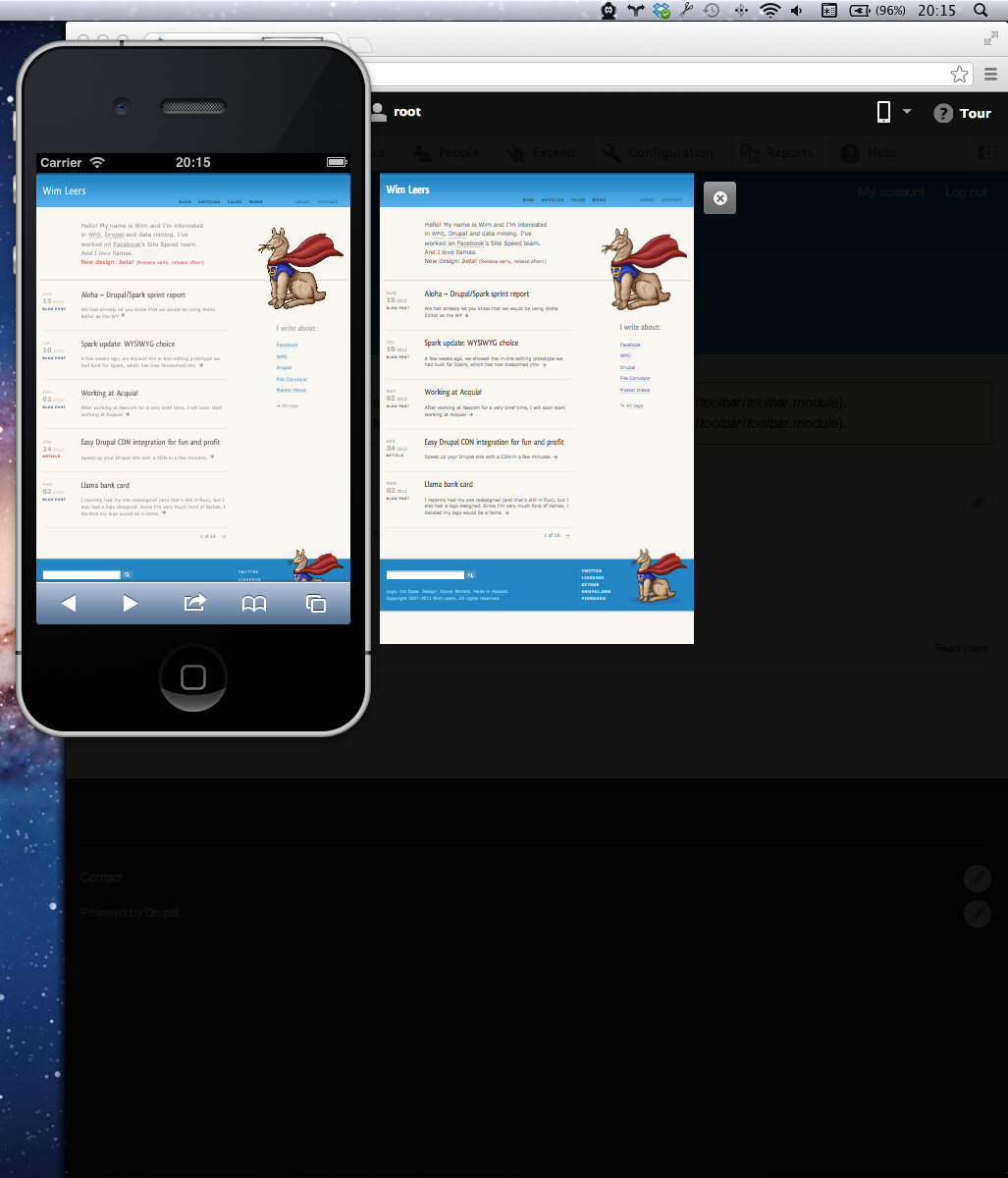
wim leersI forgot to attach screenshots. These are pre-#36 screenshots, from the work I passed on to Jesse and that she molded into #36. As of #36, things look prettier :)
(Screenshots of my site because it's not yet responsive, plus it has both large and small text, and a big image, that make the difference very clear.)
Comment #42
gábor hojtsyReviewed the PHP / module code. Only found one minor typo in the .info. Also a doc suggestion for extensibility.
"the a page"
If the suggested process to change devices or add more devices is that this single yml is changed, then it would be great to document. That is how the code currently "allows" device changes. I guess contrib can have a module to allow device list editing based on this yml key.
Comment #43
jessebeach commentedThis patch address the two issues raised by Gábor in #42
Damien, I've added a follow-up and assigned it to myself for the orientation change improvement you suggested in #39.
#1920454: Add an orientation toggle to the responsive preview feature so that a page may be previewed in portrait and landscape modes
Comment #43.0
jessebeach commentedupdated the issue summary.
Comment #43.1
effulgentsia commentedUpdated issue summary.
Comment #44
effulgentsia commentedI don't know why bot is so slow on #43, but clearly, nothing in the interdiff could have caused that or broken anything, and #40 is both green, and the review log shows that it took the normal amount of time.
Jesse and I updated the issue summary and filed all follow up issues that have been raised here (I think, though please add more if that's not the case).
Although I'm not a front-end developer, I looked over the code, and while I don't deeply understand every bit of it, it does look well structured and scoped, so I'm confident that whatever problems surface can be resolved.
I also manually tested this again, and did not find any problems other than what we already have follow ups for.
What does / doesn't belong in core is often contentious, but ultimately is for Dries to decide. Assuming Dries commits this, if someone still feels it should be removed from core, please open a follow up to make that case. Dries often listens to solid arguments, and has several times removed things from core that he originally wanted.
We'll need to determine what other tools are in scope in #1920564: Decide what else is in scope for responsive preview and ensure contrib can extend what isn't, but even if the answer is nothing, I still think a preview is useful. As I said in #28, for sites where the content creator is also the site builder, seeing the preview could lead the person to any number of decisions from configuring image styles and text formatters to selecting a different theme. For sites where the content creator isn't the site builder, even if all the preview accomplishes is letting the content creator discover that there's a problem, and then all the content creator can do is inform the site builder to fix it, that's still a useful outcome.
Given all this, RTBC.
Comment #45
dries commentedI'd like to commit this to 8.x. We can decide to remove it later if it is poorly received. We have a good track record of doing so.
Comment #46
Bojhan commentedI am definitely concerned this is a bit of a skewed review process, there have been two non-spark reviews that both identified serious issues that are largely bumped to followups. Although I appreciate the work that has gone into this, it has been very late and left little room for involvement of the larger community.
I am not sure if committing this now is a good idea, we have received little to no feedback of the people involved in mobile besides jesse, this had no a11y review, it adds a optional module that has no clear use cases as pointed out (@effulgentsia you didn't seem to cover use cases that content creators can influence?), and a lack of useful site builder functionality. It would be useful if we have a plan for this, but this proposal is just not mature - like other proposals of Spark have been.
Anyways,- you can commit it, but its exactly situations like this that people have been afraid of - because even though valid points have been raised they are not really discussed before commit. I'm fine if this is the process for Favorites-of-Dries, but its not one that encourages larger community involvement.
Comment #47
webchickI think Bojhan's correct when he says that concerns about mobile presentation is, currently at least, predominantly a site builder concern. He's also correct when he says that there aren't many tools we offer people to actually do something about it if their preview looks messed up.
OTOH, I think that this concern logically belongs on the content creator side, and after playing with it for a good 15-20 mins, wearing my "content creator/site builder combo" hat, I really want this on not only my own blog, and Drupal.org handbook pages and the like as well. Even though I have at least half of those devices laying around my house somewhere (something that's definitely not true for most content creators, especially of low-end/freelance type sites), It's so flipping easy to just run through each of the previews one-by-one that I'll probably just use this 98% of the time. And while mobile testing isn't part of my content creation workflow now, it certainly probably should be by 2014 when most serious Drupal 8 sites will start coming out. A simple and useful tool like this out of the box allows Drupal 8 to stand out from the crowd when it comes to mobile support.
With this being a separate, optional module, and with the device listing stored in the configuration system, I think the risk in committing it to core is low. If it ends up like Dashboard, poor and neglected and largely unused in favour of superior contrib alternatives, we can easily remove it in D9. If it ends up like Contextual/Seven/Toolbar, mostly ubiquitous on standard Drupal sites, and continuing to evolve over time, then great. In Drupal 9 maybe it can preview responsive turkeys. ;)
I agree with Damien that a "switch orientation" button of some kind is a pretty important component of this. OTOH, I think it's fine to handle as a follow-up, and the issue's already been created.
So, long story short, I concur with RTBC on this, and would love to see it in D8. :)
Comment #48
Bojhan commented@webchick I agree that's its a good idea, but I am just not sure about the current state - I know we are all before feature freeze and all but we did not have enough reviews to evaluate whether we are anywhere near MVP. Anyways just warning for Dashboard like situations, where we rush features in because Dries likes it - and then no one is interested to improve it, although Spark has committed to working in the cleanup phase - their list of things to solve has become incredibly long with quite some majors and lose-ends in both the edit-in-line, toolbar and now this module.
I imagine good improvements/followups would be:
1) Although content creators are advertised as the primary target audience, for them this will primarily be a "escalation" tool, to see that their article sucks in a certain device resolution. Perhaps for this purpose, we should add some "text" that is useful for the content creator to relay to the site builder (e.g. Iphone, Landscape mode).
2) We advertise that Drupal is thinking "mobile-first", but we currently in the UI offer little to no useful sitebulder tools around mobile. I think that means that we should try to bubble up some of those tools into this UI, like initially proposed with the theme break points, that is useful information for site builders. However clearly that cannot be shown to content creators, so we will need a way to disclose that more nicely.
3) I know the follow up to this will be to enable it by default. I would be against that until we figure out our toolbar strategy, we can't just keep pushing stuff to the top level. We will now have 3 icons on the right, all with different behaviors (dropdown, activate buttons all over, and tour). We are now near clean-up, we should not treat the toolbar like something we can endlessly stuff things in.
I guess I just like features to be more mature, when they get into core - in terms of review process, that hasn't happened here. I hope you understand, that will always be a concern of mine. Because in the end, if features are not actually useful (like Dashboard) to our larger audience, it is a negative bump in our UX for a full version (affecting in D7's case, at least 500.000 people) - even though the idea itself is really good (like this idea is really good). Its my role to avoid that from happening, a thorough review process is a significant way to do that. Up until 14 February, I did not take this serious - after all, we had many immature features rallying towards feature freeze. I imagine many other contributors felt like that.
Comment #49
effulgentsia commentedAt a minimum, there's the case of writing a node, saving it as unpublished, and wanting to preview on different sizes before deciding whether to publish. Then, maybe deciding to be less wordy (something I often struggle with, and nothing quite like seeing that someone will have to scroll 5 pages worth to see something to motivate getting to the point faster). Or else, deciding to escalate the problem to the site builder. Even though escalating a problem to the site builder is not something done via Drupal's UI, it is still something that content creators can "influence".
But I also think the content creator / site builder blended role (like a single blogger) is an important one to consider, and here again, being able to quickly preview while in content creator mode, and then upon seeing a problem, putting on the site builder hat and figuring out a solution is equally useful.
I think the "viable" part of "minimum viable product" means different things to different people. My standard of evaluation is whether the patch as-is is better or worse than not having the feature at all in core. To me, there's no question that it's better, but I understand that others could see it differently.
Comment #50
Bojhan commentedI think with this hat on you want more information, like the theme its break points. I understand why we initially removed that, after all core is no theme debugger. But it seems like the biggest site builder part? Can't we have like a tiny "information" area - where we display the selection in text, and its meta information (breakpoints)? Especially on the mobile display there would be the space for this, possibly we can hide it behind an icon or something a like.
I agree, largely core features are evaluated by "does it make it worse", I always evaluate by "is its current form desirable, if Drupal was released tomorrow". That comes from previous experience, of many things that didn't get improved after they got it - but perhaps my judgement is clouded by Drupal 7 period which was incredibly hard on contributors who had to fix all of the stuff we pushed in.
Comment #51
jessebeach commentedFollow-up issues if it gets committed: #1920698: [meta] Responsive Preview follow-ups.
Comment #52
jessebeach commented#50
Bojhan, yes, enriching the UI with more information is definitely possibe. This code existed in previous patches and Kevin has preliminary designs to that effect. It was removed to simplify this issue and bring this closer to a feature MVP, to be improved in subsequent patches. As you note, we'd want to hide that rich info behind a toggle or a button so the initial experience is just one of a quick preview with the possibility to experiment and manipulate right beneath the surface.
Here's the prototype link:
https://projects.invisionapp.com/share/JVBPENHP#/screens/4867869
Comment #53
webchickAssigning to Dries for the final call on this, and marking it as something that was RTBC at time of feature freeze.
Comment #54
lmdoom commentedHey, everyone!
Just want to be sure you know about the modules we have developed some time ago:
http://drupal.org/project/mobileadaptivetest
http://drupal.org/project/adaptive_layout_tester
It has similar idea and maybe it can be useful to you. We will be happy to help you anyway!
Comment #55
sunGiven that there are bookmarklets like http://lab.maltewassermann.com/viewport-resizer/ I wonder why this needs to be a module?
I wonder how many more different close icons we want to introduce in Drupal core?
A configuration object whose name contains "devices" does not need a "devices" key.
That's an awful lot of custom styling, for a toolbar widget type (a dropdown list) that should be supported natively by Toolbar.
These are not within the module namespace.
Why don't you use an item list instead of links, if you don't want to output links?
I don't understand why this condition exists.
Comment #56
aspilicious commentedWooow, this makes me a sad panda...
I didn't knew about this issue untill I read Dries his blogpost.
1) The patch is rushed in a couple of weeks
2) Like Sun said, there are tools for that in the browser that work a lot better.
3) It doesn't fix any bugs and it's a completly seperate module. It could be contrib.
4) It doesn't mean it's marked as spark that it should be in core.
5) It doesn't help content editors. It will give the impression those are the only screensizes. And seriously is someone going to check every state when adding content
6) It doesn't help the sitebuilder because yeah they use the more performant and flexible browser tools anyway.
Maybe some decent independent usability tests could tell us some more.
Please reconsider adding this to core... (at least give the impression that it's not yet decided)
This will frustrate some people (including me) if this get in without a good reason.
I still wonder why I ever would use this module?
Well in this case Dries his spark agenda always will say *add this to core*.
So I believe we must give others the opportunity to react to this issue and convince him that it's not a good idea after all.
(with good and valid arguments)
*spark profile material*
ps: I'm not sure how "hard" my post sound (for native english speakers). But it's not ment to be hard so please don't think I'm being an evil guy here.
Comment #57
lewisnymanFrom what I gather for the original proposal is that this is a feature that is aimed aimed at clients working within the content approval workflow. It's common, in my experience, for clients to request this kind of feature. When they do, all they are interested in is ticking 'mobile friendly' off the checklist, the same way they would preview the page in a desktop browser before signing this off.
This isn't a feature for developers, or site builders, or even themers. This is a feature to sell Drupal to clients, which I think it would do pretty well. Arguments of "I won't use this" aren't really relevant to the decision unless you spend a lot of time approving content.
Whether this should go into core or contrib, based on the context above:
If the answer is yes then I see that as a justified reason to add it to core. Being able to compete with other platforms is key to Drupal's growth, that obviously benefits all of us.
Comment #58
damien tournoud commented@LewisNyman: when is the last time you used Drupal core as a demo in your sales meeting? Being in core or not is totally irrelevant to the sales question.
On the other hand, putting something half-baked in core is a really good way to increase our technical debt. We have enough of that, we should focus on cleaning-up the existing debt, not add more.
Comment #59
lewisnymanYour point on adding technical debt to core for no benefit is completely true and no one is disagreeing with that. Whether it does have a benefit being in core is still a question not discussed in depth. I think it's naïve to think that one demo meeting makes for 100% of a potential client's contact with Drupal.
Comment #60
jessebeach commentedResponse to review
#55-1
I brought this up with Kevin and he's given me a new image.
#55-2
Good to know. Updated.
#55-3
A fair point. At the moment, there's only one example of this type of dropdown -- a dropdown that isn't quite a dropbutton because it doesn't have a primary action. It's more like a select box, but select box would take even more styling to undo the native form element appearance, so I just went with a button followed by a list. If we see more instances of this type of element, I agree it should be made a type of display element that the toolbar offers. At the moment, it's custom code here or custom code there and it seems keeping the changes isolated to this module is just as well for the moment.
#55-4
Right, holdovers from a module name refactor. Updated.
#55-5
Great suggestion. Updated.
#55-6
One of our assumptions is that this feature is useful for content editors, not site builders. There is therefore no need to offer a preview of an admin page.
Changes
Comment #61
jessebeach commentedtagging sprint
Comment #62
damien tournoud commentedCould we check if the following is true?
The official Android documentation and various internet resources still say that the default viewport size on Android is
800px. I haven't found any mention that it changed in Android 4.0.Comment #63
wim leers#62: My sources for that are limited, but this guy is really an expert in the mobile field, so I'd assumed it to be true.
I guess what this really implies is that this another aspect that should be incorporated into the .yml file so that we can accomodate whatever devices out there are using today or three years from now. We should make as few assumptions as possible. Easy enough to change of course :)
Thanks by the way, that's great feedback!
Comment #64
jessebeach commentedRemoved by mistake "RTBC Feb 18th"
Comment #65
damien tournoud commentedFound PPK's test page, and I can confirm the
980pxon my Galaxy Nexus running Android 4.2.2.Comment #66
mallezieI don't know what the normal process is about adding something like this to core. Personal i don't really have a strong opinion. but it feels like comments / serious concerns of sun / aspilicious / bojhan are being neglected here.
Could be i'm missing discussions in IRC, but it doesn't seem resolved from a 'i just read this issuu'-perspective.
Comment #67
jessebeach commentedThis patch adds a label to the preview frame that exposes the device's name, dimensions, pixel density and the orientation. The active device is also marked in the toolbar tab dropdown with a checkmark.
This patch also implements front-end tests through the testswarm module.
The icons in the sprite could use some cleaning up. I've asked tkoleary to look at them. I'm not nearly so effective with Photoshop.
Comment #69
jibraninfo file need conversion to info.yml
Comment #70
jibranconverted info file to info.yml
Comment #72
wim leers#70: mobile-preview-1741498-70.patch queued for re-testing.
Comment #74
wim leersThe module EnableDisableTest seemed like a non-legit fail, hence I retested it in #72, but it seems it's legitimate after all. It's probably related to the .info to YML conversion issue?
Comment #75
jibranI think it is because testswarm is not converted to info.yml.
Comment #76
attiks commentedI created an issue for testswarm, #1937240: Convert info file to yml
Comment #77
attiks commentedinfo file of testswarm is converted
Comment #78
attiks commented#70: mobile-preview-1741498-70.patch queued for re-testing.
Comment #79
damien tournoud commentedEw. No. No dependencies between core and contrib, please:
Comment #80
Bojhan commentedyay, more useful information!
Comment #81
aspilicious commentedOne more technical argument. This tool can lie to you as behaviors are specfic to the environment they are run in. For example some css/js behaves different in a scaled desktop than on an ipad. Thats why you always have to test with a "real" ipad when you're building mobile/responsive sites.
So with this tool, the management people you 'sold' this widget to can/will say: "Hey it looks great in my preview, why does it renders like that on my ipad". So if it's realy a sales tool you give management more tools to shoot at developers and themers.
I'm not a themer but I have seen problems with ipads and other mobile devices on every project I worked on caused by device specific issues (in combination with mobile specific browsers).
*Don't ignore this post like most of my previous post.*
Comment #82
gábor hojtsy@aspilicious: that would also be a great argument for those who said above that browser plugins and other 3rd party desktop tools should be used for this, I guess. Those would not reproduce the real-real environment of the mobile device either. Let alone the touch controls vs. the mouse based navigation if touch detection features are used, etc. That would lead us to never attempting to support this since its not possible to be perfect, and just say to people to buy a piece of each device.
Comment #83
wim leersPerfection is impossible, because we can't reproduce all exotic features and quirks of each possible device. That'd be insane :)
It's a best-effort thing, sure. But it does give people without the financial budget to test on each and every device to get a pretty good idea. And even if you have the budget, it's impossible to jump from previewing in one device to another with the same speed. All of the internet is best-effort. Those who strive for pixel perfection also have the budget to buy many test devices, and indeed won't be using this tool.
Also, did you see the screenshots in #41? There's hardly any difference… (the most notable difference lies in the font rendering, which is also true for Windows vs. OS X vs. Linux)
Comment #84
webchickYeah to me the big win on this isn't a sales gimmick (not sure why that assertion is being made?) but because it actually empowers people without $14,000 in hardware laying around to get a reasonable idea of what their site is going to look like on numerous mobile devices in about 30 seconds flat.
Is it a "perfect" preview? No, of course not. But I don't understand why someone would expect that either. The frame border is clearly generic, and all it's doing is window sizing (actually a little more than that). If we were shipping with device chrome like several other proprietary CMSes do, then possibly, but that's not even an option for a GPL project.
Seriously, just apply the patch and play with it. It's an extremely small and unobtrusive feature, but also really handy and practical. I'd love to have something like this on Drupal.org when developing some of the larger landing page types of things.
Comment #85
damien tournoud commented@webchick: Obviously, nobody is arguing about the usefulness of the feature. What's on the table is whether this belong to core at the eleventh hour, while there are *a lot* of other half-backed features to fix.
That's exactly where the "sales gimmick" comes to play: the only possible argument for having this into core is that it might help against the competition during a sales process. I have argued against this particular reasoning in #58.
Other then that, really, absolutely no good reason for this to be in core.
Comment #86
aspilicious commentedYes gabor if you want to do proper testing that is the case. If you need to support a new windows tablet you probably have to buy one to be sure it works. If you do want a preview for developer reasons than I would use browser tools in stead of these javascript tricks as they are "slow".
Tech people know those are just "previews", management does not. So thats why I say: Don't use it to sell Drupal, which is the primary reason if I read all the comments above. Because they remember those tools and want to use them.
Comment #87
webchickThis was discussed in IRC, so just to re-iterate my stance as it relates to various "sales gimmick" assertions:
Designing and creating content for desktop browsers only already doesn't make sense in 2013. It's going to be an edge case by 2014, by the time people actually use Drupal 8. I therefore don't remotely understand why people think this feature is a "nice to have," let alone a mere "sales gimmick." Yes, proprietary CMSes already figured this out long ago, and we need to catch up (which impacts people trying to sell Drupal). But to me, this is a critical component of the task of content creation for any CMS that wants to have longevity for the next 5+ years. What you see is NOT what you get when you're only accounting for your desktop browser, so baking that assumption into core makes zero sense to me.
I've heard concerns voiced about the device list going out of date. Yes. For core, I'm sure we'd update in point releases based on some list of "top used devices" or whatever. For your own site, it's a CMI file. Update it for the devices that make sense for your particular use case.
I've also heard concerns that we don't know what mobile devices will be in 2015 (Google Contacts™? ;)). Yes. We'll need to evolve this feature over time, same as we'll need to evolve Modernizr, same as we'll need to evolve all of our mobile-facing features because this is a fast-changing world. But we already evolve features in D7 today, so this is nothing new.
If your manager's not smart enough to know that s/he's not looking at a "true" preview, then simply don't enable the module on your site. It's optional, like all of the other Spark modules.
Comment #88
damien tournoud commented@webchick: Please be kind enough to read the points of the other parties, before trying to drown them under a wall of text.
Again, nobody is arguing against the usefulness of this feature. What's on the table is whether is belongs in core or not.
And because:
... I'm arguing that this belongs in the contrib / distributions land for now.
Comment #89
webchickI was responding to aspililicious's assertion, specifically, and documenting the follow-up conversation we had in IRC for transparency. Not trying to drown anyone. :)
I think your concerns can mostly be resolved now that http://buytaert.net/code-freeze-and-thresholds has been adopted. Basically, this patch can sit here and continue to get reviewed and improved as needed, and if we ever get below thresholds enough to commit new features, could be under consideration then, like various other features that didn't make the cut. We can commit features up all the way up until RC as long as we keep our technical debt down.
Comment #90
jessebeach commentedThis patch removes the testswarm dependency.
Thanks jibran for converting the info file to yml.
Comment #91
jibranPatch is awesome. Just played with it on simplytest.me. Great work.
Just one suggestion all the devices are declared in
responsive_preview.devices.yml. If devices can be defined using @Plugin annotation then contrib can add a lot more devices.Comment #93
jessebeach commentedI fixed a few issues in the JavaScript regarding the calculation of scaling transforms. I found these while backporting this module to Drupal 7 (http://drupal.org/node/1915852/git-instructions/7.x-1.x). The diff is small and changes are evident (I hope!).
Comment #94
jibranIt is something similar to how views handler are defined in D8. In D7 a
hook_responsive_preview_devices()which can be used to define new devices.I don't want to get of track here we can discuss it in the follow up if someone likes the idea.
Comment #95
attiks commented@jessebeach amazing work, this looks great!
Comment #96
wim leers#94: AFAIK the current viewpoint that Jesse and I hold is the one put forward by Dries, and it boils down to this: "no need to make this more complex than it needs to be". The list of devices is defined in a config file. If you want to modify the list of devices, then just modify the config file. That's what the config system exists for :) I don't think it makes sense to have a plugin type to define devices: 1) there's no logic involved, only metadata, hence it'd be massive overhead, 2) it doesn't really make sense for *modules* to provide new devices; each site owner decides for himself which devices he wants to support, and hence which ones he'd like to preview in. Therefor a configurable list of devices makes most sense.
I hope that adequately answers your questions :)
Comment #97
jibranThanks @Wim Leers for explaining.
This is fine by me.
Comment #98
effulgentsia commentedI just caught up on this thread after being away for the past few weeks. Just responding to the discussion of what the benefit of this being in core is. Particularly:
Which is often a very valid reason for something to be in contrib. However, one could also claim that being able to preview a node at all before saving it is a feature that from a code architecture standpoint, could live in contrib. And also suffers from being potentially deceptive, has UX problems, and many developers, including myself, never use. But the reason node previews are a core feature is because being able to preview content before saving it, for many people, is an essential part of the content management process.
Similarly, I would extend #87 with an assertion that given the complete paradigm shift of mobile devices being in wide use already and especially in the next couple years, that someone with just a Drupal core installation not being able to quickly and seamlessly preview content in a range of sizes before saving/publishing it will seem as ridiculous as if you couldn't preview at all. As ridiculous as not being able to add images to posts (which we finally fixed in D7) and not having a wysiwyg editor (which we finally fixed in D8).
I sympathize with the concerns of this not having had time to get refined in contrib, but I also think that applies to much of what the mobile initiative has had to deal with: it's a result of everything related to mobile web technology changing so fast.
Maybe for one reason or another this won't make it in, but for the reasons above, I'll be a bit embarrassed about D8 if that's what happens.
Comment #99
damien tournoud commented@effulgentsia: I already argued elsewhere that preview being also completely broken should be removed from core and mature in contrib. There is no reason to have a feature in core if it half-backed or half-broken, even if it can be considered by some a "core feature".
Comment #100
effulgentsia commented@Damien: Ah. Well, good to know you're being consistent in that regard :)
Comment #101
nod_Browsed throught the code, can we avoid the shortcut.admin.js-style jQuery chaining ?
Not readable.
Comment #102
jessebeach commentedWhile working on backporting this module to D7, I added a block that launches the previewer so that the module wouldn't need to depend on the Navbar. I forward-ported the block to D8. Both the block and the toolbar components share a Backbone model, so their state is identical independent of which component is interacted with.
We'll need to move the testswarm tests to the FAT module if this is committed to core. For now, I'm leaving them in this patch so they are more convenient.
Comment #104
jessebeach commented#102: mobile-preview-1741498-102.patch queued for re-testing.
Comment #105
webchickNote that we've backported this to D7 as the http://drupal.org/project/responsive_preview module. If you want to test out on your "real" Drupal 7 sites, have at it!
Comment #106
damien tournoud commented@Jesse, what needs to happen to get this to a committable state?
This is a cute feature in its current state, I think I was wrong to fight it that much.
Comment #107
chx commentedTo put it bluntly: the Drupal 8 gambit is that the frontend and mobile features will make it weather out the shitstorm developers will throw over the backend. Let's get this done.
Comment #108
Bojhan commentedI have no idea what @chx means, but I am guessing its something about the state of Drupal.
Anyways, reviewing again. I think the patch is bugged, I do not get what jesse shows in #67. Could we get a reroll? The toolbar overlaps with the information part, there is no way to return to ordinary view, the arrow jumps around (do we really need an arrow?), there is a gray block on top of some previews (iPhone 4), there is useage of a checkmark in front of the selected option - this is quite new to Drupal, could we use a background color too?
I still do not get why you are so keen on adding specific devices, I understand it is easier to comprehend, but its just so fragile. Because you will need updates, to make sure they are up-to-date, as sizes changes, new mobile phones get more popular, it is currently very skewed towards Apple (there is no android tablet), there will be large potential for this list to become convoluted as we constantly add new ones (do we have rules on removing old ones?), and users are going to wonder how to preview it on every other device. I have not yet seen how we deal with this. It's all in .config to me, is just blowing away concerns and not actually addressing it, because we end up with a list that due to its code simplicity will be misleading to users in the long run.
I am happy we didn't rush this in, and allowed for further refinements because the meta data provides very useful information content creators can relay to site builders. @effulgentsia I think the thing that you lay it out clearly; the reason this got so much backslash is because it was rushed, and that always upsets people - especially when concerns are met with a lot of resistance. I think a lot of features have gone in, with loads and loads of UX followups (toolbar, edit in line) - sadly, few of them are going to get resolved before release, I think thats why me and probably also others push back on rushing things. Because in the end we need to solve those issues, and many of them are not within the resource reach of the Spark team.
Once we get a reroll, I will do a visual review - I have a few ideas, that might make it look nicer.
Comment #109
damien tournoud commentedI still agree on this, as mentioned several times already. I think a simple Phone / Phablet / Tablet would be (1) more manageable, (2) more future proof, and (3) less deceptive (because we don't pretend to do a preview of how it's going to look on an actual iPhone).
Comment #110
jessebeach commentedI've addressed some bit-rot that set in since #102 was posted and we got
Drupal.displacecommitted. The preview window now positions its top edge using the latest Drupal Position-Rite Technology™.I also added an Esc key press handler so the preview can be closed with the keyboard in the case the Bojhan encountered where the close X button is unreachable.
Kevin gave me a cleaned up icon sprite, so I've incorporated that as well. I haven't made any changes to the icons themselves.
In many ways I'm just the developer on this issue and I can't make this call on my own, so I haven't touched this code. The good news is that making this change would just be editing a configuration file, so it won't be difficult to alter.
Comment #111
gábor hojtsyHand-updated to include type: module for #1292284: Require 'type' key in .info.yml files. Did not check if there are other changes needed though, just a direct update for that.
Comment #113
gábor hojtsyThe patch did not apply to the contextual JS either, because of minor code cleanups in events. I made that apply. All the rest if new code, so it did apply fine. Patch is smaller mainly because of lack of diffstats in my setup, the same files/changes are included.
Comment #114
gábor hojtsyI gave this patch a try with the latest core head today, and it still works as good as ever.
Comment #115
mgiffordSo to give this the final test before marking it RTBC, someone should:
1) install it on simplytest.me (or wherever).
2) test creating a new article on a mobile device. Check the preview.
3) check editing that article on a mobile device. Check the preview.
4) Repeat steps 2 & 3 with at least android & apple devices.
5) Mark RTBC with screen shots from something like Opera Mobile Emulator.
Comment #116
Bojhan commented@mgifford And the Spark team needs to coinside with the feedback that is opposing the use of device specific options, and I still get some bugs around the information?
Comment #117
kerasai commented#113: mobile-preview-1741498-113.patch queued for re-testing.
Comment #119
designfitsu commentedRerolling patch from http://drupal.org/node/1741498#comment-7394358
Comment #120
designfitsu commentedRerolling patch from http://drupal.org/node/1741498#comment-7394358
Comment #122
mradcliffe#120: mobile-preview-1741498-119.patch queued for re-testing.
Comment #124
kerasai commented#120: mobile-preview-1741498-119.patch queued for re-testing.
Comment #125
kerasai commentedRerunning tests.
Test ran on #122 errored on testUserBlock() method declaration in Drupal\user\Tests\UserCancelTests.
Comment #126
jessebeach commentedThanks everyone for the numerous rerolls and retests.
Changes in this patch
Everything is represented in the progressive diffs below.
Bonus points!
If anyone here is feeling really ambitious, I'd love to see a configuration form that would allow an end user to change the default configured devices and the metadata associated with them.
Comment #127
seosopt commentedmaybe you can add this patch or it will help you, the link is here https://drupal.org/files/mobile-preview-1741498-12.patch
Comment #128
effulgentsia commentedI heard at DrupalCon that many people were confused about whether new features like this can still make it into D8 or not. Per #89, they can in theory, but only if they don't require release-blocking follow ups, and only after we reduce our existing technical debt (major and critical bugs and tasks) to below thresholds. So two ways to help on this issue are a) help review/polish it to the point that it's ready to go in without release-blocking follow ups (which I think it's either already there or close to it), and b) help fix existing major and critical bugs and tasks in the queue.
Comment #129
Bojhan commented@effulgentsia As long as the discussion about having a list of devices vs. generic displays is ignored (having a config interface for this doesn't change it). I see no chance of this getting in.
Comment #130
yoroy commentedI was going to suggest to use S | M | L | XL for sizing, and lo: http://patternlab.bradfrostweb.com/ (look at the top right).
Comment #131
lewisnymanThe library used in Pattern Lab is ish.
It solves the device based issue we've been having by keeping it vague. Could be a nice direction.
Comment #132
dries commentedThe label-discussion is an important discussion to have and I see both sides of the argument. I don't want to see this feature derailed by the label-discussion so let's move the label-discussion to a follow-up issue so we can move forward with this issue once we are below threshold. In the mean time, let's leave the device names in this patch -- having talked to various users about this at numerous occasions, I feel pretty strong about using device names. But let's discuss that in the follow-up issue. Thanks!
Comment #133
Bojhan commented@Dries I understand negating this concern. But its also the only standing concern the community has. It would be nice if the Spark team could provide some argumentation.
Could you provide more background on how you presented the case, and what feedback you got. Did you present them the fact that the list might be outdated a few months after release, did this impact their decision? I like that you are performing user research, but its a little vague on the particulars - which is important for us to understand how users perceive this.
I can understand users prefer to see actual devices, but as expressed above that this is a little shortsighted since this list is going to change probably every 6-12 months after release, providing an editing interface is only a work around. Ideally people can just search a device and we would list the "top devices".
The approach used by Brad Frost is pretty stable and I think with our visual presentation enough to give people some indication on size. So I dont think its such a big departure/derailing from the current concept. Given that we are still quite far away from thresholds, it'd be nice to see some feedback on this.
Comment #134
effulgentsia commentedPer #132, I opened a spin-off issue: #2013166: Evaluate pros and cons of using specific device names vs. generic size names as labels for Responsive Preview. I pasted some of the information from the last few comments in there, but left a todo for summarizing other considerations that have been discussed on this issue. If anyone's inspired to fill in that todo, that would be awesome.
Comment #135
David_Rothstein commentedI hadn't seen this issue before, but the device labels give me the impression that Drupal core is being used as a platform to advertise Apple products. (I realize that's not the intention, but it makes me uncomfortable nonetheless.)
If the device labels are causing the controversy then shouldn't they actually be removed from this patch and discussed in the other issue (rather than the other way around)?
I have some other feedback after trying this out. I'm not sure if it belongs here or in the other issue.
Comment #136
effulgentsia commentedIf it's not related to device labels, then here.
Comment #137
David_Rothstein commentedDecided to leave it here, since it's only tangentially about the device labels:
Comment #138
David_Rothstein commentedSo I was just brainstorming in my last point above, but then d.o. went down for a bit while I was trying to post it. In the meantime, I decided to have some fun and code up a quick prototype for what a slider might look like.
The result is in the attached patch. The code is prototype quality (or possibly below that), so don't review the code. And the styling is very rough also. But I recommend trying it out on simplytest.me or otherwise and seeing what you think of the basic concept. (Basically, just install Drupal, click the "preview at different widths" button in the toolbar, wait for it to load, and move the slider and watch what happens.)
I still don't know if this entire feature is useful for core at all, but if so I think a slider approach has more potential. And I also like how jQuery UI does most of the work for us - as you can see the code is pretty simple (although non-prototype code would of course be more involved).
Comment #139
mallezieI really like the 'slider preview'. I think it has lots of potential, and could be the best future-proof concept. Who knows the resolution of the 'apple-watch' or the new 'sony bravia extreme ultra HD TV'. This slider makes this easier to maintain in core, since we shouldn't have to touch it again for the 8.x-cycle. And it even makes it some more a 'show-off' feature, although that shouldn't be a really valid reason.
Some possible needs for further use-cases.
-Make it possible to extend to a bigger size than your current screen size (resize an ultra HD-tv on an tablet, with scrollbars, probably best under some 'hidden advanced setting'.
-Perhaps some minimum width should be more user friendly.
-If we could allow contrib to alter it again to some button's that could make it easier for site-builders, to list devices based on what they wan't to support. And use device names based on the devices your sites caters most. (For example android is smaller in USA then in Europe / Asia, you could chose to have an seperate mobile site voor < 600px, but have 'some sort' of responsive site for tablets and desktops. Contrib could thackle this use cases, with a 'configurable preview button module'.
Comment #140
gábor hojtsy@David: Karen McGrane had a great point in her DrupalCon keynote that multi-device previews may be a very good tool to make people aware that their content will appear differently in different environments. I believe that this tool helps demonstrate that, although it is admittedly not perfect. That Wordpress does not yet have this is not really a reason that its a bad idea :)
@David/@mallezie: the mobile preview patch proposed does take height into account as well; only taking width sounds like assuming certain kinds of websites; whether the site has a floating menu showing up on the bottom/top or even wants to look like a mobile app with artifacts dependent on height, assuming websites will only be different per width sounds like limiting to me
Comment #141
johnalbinLooking through previous comments, I see that the label issue has been brought up several times, even before feature freeze.
Damien said it well:
The preview cannot be a realistic preview of a real device. Pixel density, JavaScript engine, touch capabilities, etc. means we cannot show a realistic preview of most devices and that we are only capable of showing previews of different viewport sizes. Claiming its a preview of any specific device IS A LIE.
Also, from a front-end development best practice standpoint, site builders and content creators need to stop thinking about how the site looks on a short list of specific devices because its folly. There is simply too much churn in new devices to use any specific set of devices as build-phase ruler. If you build a site against the iPhone 5 today, it may look like crap on the iPhone 6 just after your launch. If you, instead, think about your site as fluid range of sizes from ~250 pixels on up, your site will be future friendly. Putting a specific list of devices in the preview list reinforces the wrong development mental model.
Additionally, I am concerned that when users reach Drupal 8’s plateau of productivity (18 months after release? 2 years from today?), that the current list of devices will be embarrassingly out-of-date. Common devices from 18 months ago in the US were: iPhone 3GS, iPhone 4, iPad 2 (non-retina), Samsung Droid X2, Galaxy S2. Would anyone be fine using the list in the previous sentence instead of the one in the patch?
Furthermore, the list of devices in the current patch is highly biased towards above-average-income Americans and does not reflect the unique mix of devices in other localities around the world. The specific device list WILL BE A LIE for most websites where Drupal is used. Where's the Galaxy Note, the most popular phone in Asia?
While running out of words from the thesaurus that are the equivalent to “also”, I worry about Bojhan's usability point. Is this a true MVP? We are providing content editors and site builders with a tool to preview their content at different sizes without the ability to affect the layout changes necessary to fix any problems they see in the preview.
Finally, applying the patch produces this warning:
warning: 1 line adds whitespace errors.This (and the label) point are my only issues with the work in the patch itself. :-)Comment #142
David_Rothstein commentedUploading a screenshot of the "slider preview" conceptual protoype from #138 (for anyone who wants to see it without actually waiting for Drupal 8 to install so you can use it).
Gábor, it would definitely be possible to add height changes to this one too (either setting it automatically or via a separate vertical slider). I think the use case is limited though; since if something like what you described looks wrong at different heights that's even more of a "site builder problem" than something looking wrong at different widths (which could at least in theory be related to the content).
Comment #143
mallezieI think a vertical slider would be great, perhaps ow the use case is limited to portrait mode of all devices, but what if apple for example decides to invent an i'rules of 2cm height, and thirty long. i think more different aspect-ratio's will more and more come up.
I also saw the Karen McGrane keynote, and didn't she state we should design for our site to look good on toast, instead of known devices. With the sliders, we could even preview it on toast sizes. (sounds real fun contrib module, to make it really look as if it's on toast on top of this module).
Perhaps we should get this more in to the direction of a different size preview, not a (mobile) device preview, since actually it only renders pixel-based, which could again be overruled by viewports. It's onlu a matter of approach, and is probably more future proof. Contrib then can then maintain different (geographic different) device previews. (See JohnAlbin's post of geographic differences for which device, I also think it's quite North-America-centric).
Comment #144
jessebeach commentedCriticism of using specific device names
-- #108 Bojhan
-- #109 Damien Tournoud
-- #129 Bojhan
-- #130 yoroy
-- #135 David_Rothsten
Device name compromise
I personally would like to go with yoroy specific suggestion to use S/M/L/XL labels for the devices and present them as generic. But, I still want to support the case of interested site builder providing device-specific options. To that end, I can introduce a configuration screen with fields for: label, width, height and dppx. The generic devices could be removed and the more specific ones added on a site basis or perhaps by a distro.
Resizing vs. pre-configured devices
David, this feature has been described to me as one that content authors will use to get a quick impression of what their entities look like at major. device-associated breaks i.e. a mobiley thing or a tablety thing. It's not meant for site builders who might benefit from a slider approach.
That being said, I could make the preview object API more robust in the sense that passing it dimensions object would cause the preview to resize. Contrib could then tie into the module and associate it with a slider.
Comment #145
klonos...comment moved to #2013166-1: Evaluate pros and cons of using specific device names vs. generic size names as labels for Responsive Preview
Comment #146
David_Rothstein commentedThe slider provides the mobile/tablet information via dynamic text that appears on the screen at various widths (which would also be configurable).
I would think simply using a slider and watching how the content responds would be a much quicker experience for content creators (compared to clicking individually on several different options)? And also more useful since there will always be devices with widths that aren't covered otherwise. So I'm not sure why the slider would specifically benefit site builders compared to content creators.
Comment #147
gábor hojtsy@David: I'm not sure how an automated association system between widths and device types could work. My Google Nexus 4 phone has the exact number of pixels in width and more number of pixels in height than an iPad 2 tablet. According to your code, my phone in portrait is a tablet and in landscape a desktop.
Comment #148
gábor hojtsyDefinitely did not want to remove tags.
Comment #149
lewisnymanIf you ask someone if they would like specific device testing, built into their CMS, they would say yes 100% of the time. Even I would say yes! What a time saver that would be.
The problem is that all we would be doing is telling people it's a preview of a specific device, when actually it's a million miles away from a realistic test, we'd be lying to the users. If we run this tool in Internet Explorer then what are the chances of the preview looking anything like it does on the target device? That's before even considering other important factors like touch, cpu speed, and network connection. The iOS emulator for OSX allows you to test with all these factors applied for a reason.
I think being able to test at different screen sizes is a good feature, but let's not lie to our users about what we are actually testing.
Comment #150
johnalbinThat is also the suggestion I prefer. :-)
I <3 Jesse Beach.
Comment #151
David_Rothstein commentedDon't put any stock in the specific labels and widths I used in that prototype - that was just to demo the concept :)
And there would definitely need to be the ability to have more than one "device label" appear on the screen at the same time (to cover the case of overlapping width ranges). But that's very easy to do.
Comment #152
jessebeach commentedI'm totally in favor of making this possible, but not actual in this patch. With a couple nice events to hook into and nicely encapsulated behaviors, contrib can layer these types of enhancements in. I'm glad to make those possible with a few changes to the code here.
Comment #153
damien tournoud commentedOk, can we move forward with S / M / L / XL in here and handle other possible API enhancements as non-critical follow-ups?
Comment #154
dries commentedBefore we change to "S / M / L / XL", we should do some user testing and compare both approaches. I think "S / M / L / XL" is less usable. Maybe the usability team can do this?
Comment #155
dries commented"The problem is that all we would be doing is telling people it's a preview of a specific device, when actually it's a million miles away from a realistic test, we'd be lying to the users."
Aggregations like this are not productive. It's not "a millions miles away". Personally, I've no idea what "medium" means -- is my Android small or medium? In other words, I think "S / M / L / XL" is very difficult to understand. I'd much rather have device names that are not pixel perfect as I can relate to them. We unnecessarily get worked up about 'lying to our users". We're looking at this problem as developers or designers, not as end-users. This feature is not meant for developers or designers.
"Additionally, I am concerned that when users reach Drupal 8’s plateau of productivity, that the current list of devices will be embarrassingly out-of-date."
We can update the list between point releases. It's very easy to do. We can track the most popular devices.
"To that end, I can introduce a configuration screen with fields for: label, width, height and dppx."
Even with a configuration UI, we still have to agree on whether to list device names. While a configuration screen is handy, it doesn't solve the problem.
Comment #156
yoroy commentedI think the point *is* that it's not clear what S, M, L, XL mean *exactly*. I don't agree that these are hard to understand. They're pretty much self-explanatory in relation to each other. It's the whole spectrum of screen sizes this feature gives you an impression of.
Maybe people are passionate here because as an open source project our understanding of mobile/responsive is broader than the standard iphone/ipad/imac line-up and thus we're hesitant to model our UI after only those examples.
Comment #157
dries commentedWe should list a good selection of the most popular devices, not just Apple devices. In fact, the proposed list includes various Android devices.
We should do user testing and discuss the results in #2013166: Evaluate pros and cons of using specific device names vs. generic size names as labels for Responsive Preview. Again, let's stick with device names in this issue and move this to #2013166.
Comment #158
damien tournoud commentedNo, we should not list devices at all. Listing devices would trigger the expectation that this feature is an reasonably accurate preview of how the page will render in a particular device. As already mentioned several times, it is not.
@Dries: It is millions miles away. This is not an aggregation, it's the truth.
Let's list some ways it is millions miles away:
Let's remove this list of devices from this patch. And also, please stop putting our heads in the sand: this is a cute feature, but it is *not* a realistic preview.
Comment #159
lewisnymanI think this is the key point:
If a user loads the Galaxy S3 view and it looks fine, is the interface is telling the user “It will look fine on a Galaxy SIII”? This feature is not qualified to make that statement.
What happens when the user hits publish and later on they view the same page on their phone and it does not look fine? I think this is an likely situation.
Comment #160
effulgentsia commentedPer #1825090: Remove theme_html_tag() from the theme system, these now need to be changed to
'#type' => 'html_tag'.Comment #161
jessebeach commentedI fixed the #type issue mentioned by effulgentsia in #160.
I also added a rudimentary device info management form at the path
/admin/config/content/responsive_previewas well as a way to add new device info atadmin/config/content/responsive_preview/add.The forms now need tests. I wasn't able to get to those today.
Comment #162
dries commentedThanks for all the feedback. At the end of the day, both approaches are flawed for different reasons. On the one hand, we can't always accurately model devices. On the other hand, S/M/L/XL isn't very helpful (i.e I'll ask again; is an iPhone medium or large?).
The preview doesn't have to be perfect to be useful. Pixel density may be an issue but it is totally fine not to emulate touch events or not to simulate plugin availability.
It's my role as the project lead to make a decision; you're not going to like all decisions I make. To move this forward and to get to a decision, it would be helpful to see some actual screenshots of situations where we are off "a million miles". A constructive path forward would be to present some screenshots of devices that (a) we would consider to include (b) where the previews aren't helpful. That would better help me understand the severity.
Comment #163
damien tournoud commentedThere is an easy way out. Take what I suggested all the way back in #39 and name those:
There is no way to do this "constructively". Of course, the preview should be relatively accurate on a modern browser, when running a stock Drupal website with the Bartik theme. This is a controlled environment.
Where the preview is going to start being grossly inaccurate is on real projects with complex layouts; a complex, custom theme; a pile of contributed modules and links to several external services (an ad server, several social links, videos, etc.).
Comment #164
gábor hojtsyMark review for the testbot at least.
I was about to go do a config-entity based solution to configure the devices. I think Drupal 8's pattern to have distinct items like this is config entities, and we don't need to make up our own. The UX of the config entity listing / add page approach may be a bit more complex, however this patch for example does not seem to have a way to remove configured devices?
Also I'm not clear on how device additions on updates would work. If we store all devices in one file, would we write update functions to add in new devices? If we'd have separate files for each device (~config entities), new devices added would be merged on updates or would need more custom code then? Someone more versed in the config system would be great to help clear this up so we know the extent of our possibilities in later Drupal 8 releases with each change. I'll ask a few people to chime in here :)
Comment #165
wim leersTo provide the examples Dries asked for in #162, do this:
Setup
To load a website other than the Drupal 8 site
Repeat for every unique website you want to test:
<meta name="viewport" />tag.jQuery('meta[name=viewport]').remove()jQuery('#responsive-preview-frame').attr('src', 'http://alistapart.com');. Replace with desired URL. You should now see something like the attached screenshot.Comment #166
wim leersI also wanted to reply to a few points in #158 that paint an inaccurate picture:
If you mean that we don't simulate
device-pixel-ratiomedia queries, then you're right. But we can't simulate that. Furthermore, these media queries typically only affect images: high quality images would be loaded. But, on a device with lower pixel density, you wouldn't be able to see the extra detail in higher quality images anyway, so the layout that's being previewed should still be accurate, just with less pixels. Finally, for the same reasons, if you're previewing on a device with higher pixel density, then those higher quality images would still be loaded.But the layout is going to be almost exactly the same. Browsers are converging in terms of how things are rendered, thanks to ever increasing standards adherence.
Everybody is moving away from Flash. This has become an edge case problem.
But… how does this affect layout? Responsive preview is not about simulating mobile interaction. It's about a best-effort preview of what it will *look* like.
Comment #167
jessebeach commentedThat's correct, no way to remove yet. What I posted was a first-attempt to get a configuration screen into the patch. So we can discuss what that experience will be like.
Awesome, that would be most helpful.
Comment #168
gábor hojtsyI had this interesting discussion with Greg today. Essentially he suggests we use config entities and either way (current approach or config entities), we'll need to write code in update functions to update list of devices, no special magic. I'll work on config entity-fying tomorrow.
Comment #169
effulgentsia commentedIf the devices are based on actual devices (e.g., "iPhone 5" or "Nexus 4"), then their specs are unlikely to change in minor releases of Drupal. We'll just need to provide new entities for the new popular devices that emerge. If we end up going the route of generic size names, then updating might become an issue, but that's a solvable problem we can tackle if and when we go that way.
A question here will become how to filter and order the list. I suggest providing "weight" and "status" keys in each YML file. I.e., someone who decides an "iPhone 4" is irrelevant for their site can disable it without needing to delete it. Among ones of the same weight, perhaps we should order from narrowest to widest (adjusted for pixel density).
Comment #170
wim leers#169: there's currently *one* YML file that lists all devices, not one per device. Hence the complexity.
Comment #171
effulgentsia commentedRight. The suggestion in #168 is to do one yml file per device, which I agree with.
Comment #172
gábor hojtsyHere comes the config entity-fication, modeled after best practices melded from user roles and contact categories:
1. Added a DeviceInterface that can be used to typehint this type of config entity.
2. Added a Device class that holds the properties for a device.
3. Broken up the single config file to device config entity files. This allows modules and distros to ship a set of devices themselves without any API needed to support it :) I mean the config entity API already supports this.
4. Added a standard config entity listing screen. I tried to make the responsive table classes appear properly on things. I could add them to the headers, but not the data cells for some reason. So I backed out of that. So the listing is not responsive yet. Which sounds ridiculous for a responsive preview config screen.
5. Added an edit/add screen. Not sure about the form layout exactly. We may or may not get better results if we line up the height x width in one line as two input fields inline.
6. Added features to weight the devices and be able to not show them in the final list on the frontend.
7. Added the ability to delete devices.
For some reason that I could not yet figure out the edit and delete forms don't get the properly loaded config entity in the URL upcasting. Interestingly they result in different errors from it. But adding devices and ordering them works.
Also note that not all devices you add and want to display may show in the responsive preview list. Devices bigger than your current viewport are hidden. So eg. although I added a Smart TV device in my setup (with a huge pixel size), I could not make it to show up in the list, but that is expected due to my small screen size.
Screenshots of my adventures with this UI:
1. Added a device called Google Glass (not that a website would look like this on a Google Glass, we know Google Glass does not even have a web browser yet at this point). Also reordered the items (note the list does not contain all devices as noted above):
2. Device configuration shows up under admin/config/content:
3. Device list after I played around, added some and reordered them:
4. Form to add a device (edit would look the same but as said above does not work proper yet):
This will need web test coverage for backend features as well as config schema for the entity.
Comment #173
jessebeach commentedRather than hiding devices that don't fit, I've reworked the JS a little disable the buttons associated with the device if it doesn't fit in the viewport. So the full list remains visible.
Comment #174
larowlanThis fixes the edit forms/tab, also updates the form controller keys to use add/edit in line with our move to do away with 'default'
Comment #175
larowlanand screenshot

Comment #176
gábor hojtsy@larowlan: edit works nicely indeed. Thanks also for the default => add|edit change, I was not sure what is the most up to date :) Have you been able to look into why delete does not get the upcasted object?
Also, I've been thinking we should provide some kind of affordance to lead people to the config form if they have permission to edit the list from the device list? Or would that be too distracting?
Comment #177
larowlanSee #2010290: Editing a config entity from a listing page results in a 'page not found' which will fix the edit operation, no need for the duplicate route. Will look into the delete, suspect it needs same change to buildForm arguments as edit form did.
Comment #178
robloachI've been using many native tools to web browsers that provide this kind of functionality. It might be good to look at some alternatives to understand why and how they're great to have:
Understanding the why and how is an important part of every feature. Something we should definitely keep in mind in order to make this an outstanding tool for content authors. Some features we could definitely bring over (I really enjoy having the ruler). In most cases, if the design is done right, content authors shouldn't even have to worry about this.
Comment #179
larowlanSo this should fix the delete upcasting. The _form defaults entry in routing.yml files goes via HtmlFormController which uses Reflection to hand objects from the route to the constructor. If your buildForm method's arguments are not named identically to the placeholder name in the route, it won't get passed in. So in short, your argument in the buildForm method needs to be named $responsive_preview_device to match that of the parameter in the routing.yml file. For the details on how/why see HtmlFormController.
Note this removes the duplicate route for the /edit tab - that will be fixed by #2010290: Editing a config entity from a listing page results in a 'page not found', if you want to see the 'edit' functionality in place, just click the edit link then drop the '/edit' bit from the URL. This is an existing bug with the config entity list controller.
This also updates the urls from responsive_preview to responsive-preview, reasons being - thats our established pattern, SEO reasons and a11y/simplicity/laziness/whatever (you can type a hyphen with one finger, you need to use two for an underscore).
Comment #180
robloachChrome also supports changing device metrics directly from the browser. Hit F12, and then click on the gear settings at the bottom right, and swith to the Overrides tab. This screenshot was taken under 25.0.1364.160 Ubuntu 13.04.
Not trying to de-rail the discussion. Just making aware some of the other handy tools out there.
[EDIT] Tried out the patch and it looks great! Definitely enjoying how far this has come.
Comment #181
jessebeach commentedAwesome, thanks @larowlan! It's very helpful to go through the diff and learn about the routing behaviors.
Comment #183
gábor hojtsy@RobLoach: see discussion above on those tools.
Comment #184
gábor hojtsy#179: mobile-preview-1741498.179.patch queued for re-testing.
Comment #185
gábor hojtsyAdding configuration schema for the config entity. I found a config schema issue while writing this, no support for floating point number types. This applies regardless of whether we go with config entities or the original one file method. That is required to ship with a correct schema for this module. See #2023357: Missing floating point number type support in config schema. No other change.
Comment #186
gábor hojtsy#2023357: Missing floating point number type support in config schema landed! So we can remove that todo and use a float.
Comment #187
catchI'm not really sure what this adds past browser plugins for doing the same (or as Rob Loach points out, just native browser features). Support for those is only going to get better over the next 1-4 years whereas there's going to be limits to how far we can keep this updated in core.
Comment #187.0
catchUpdated issue summary.
Comment #188
mallezieAdded #2013166: Evaluate pros and cons of using specific device names vs. generic size names as labels for Responsive Preview to OP as as spin-off / follow-up issue.
Comment #189
jessebeach commentedIn this update:
DeviceAccessControllerclass. The operations for the devices were not accessible because they lacked a controller. This was caused by a change to core.Deleting a device no longer works. Thus I'm setting this to needs work. I'm not sure what changed to cause this operation to fail. Investigation is required.
Comment #190
klonosI'd like to propose the following things for consideration:
1. The name of the module "Responsive Preview" is kinda misleading. How about "Device Preview" instead?
2. After enabling the module, I expected its configuration under either the "Development" section or the "User Interface". Having it under "Content Authoring" makes no sense to me at all. What's the rationale here?
3. The device icon is not shown on admin pages (only on those that pop up in the overlay) while using the same theme for both the frond end as well as the administration UI is a perfectly valid use case and people might still want to know how their theme behaves in admin pages on various devices.
Why? Here are the steps I took in order to test this feature and my thoughts along the way:
- Enabled the module. Ok, where's the device icon on the toolbar? Perhaps I need to configure something first...
- Menu -> Configuration -> ??? Not in the UI section!? Perhaps because it is theme-related I should look in the Dev section. Nope, not here either. Lets scan the options sequentially... Here it is! Wait!? why under Content Authoring? Well drupal newbies won't have a problem locating it at least (they always scan the page sequentially) but still placing it under a content-related section does not make sense. Oh well...
- Clicked on the "Responsive preview" link. Ok this is the device config page. Good to know there's a set of default devices out of the box and that I can add my own. Still don't get the bloody device icon though?! The help text doesn't tell me what I need to do either.
...after a few seconds I thought why not check the front page? ...Ah, MAGIC!! Could use some hints though.
Comment #190.0
klonosAdded follow-up / spin-off issue
Comment #191
johnalbinYes, it does make sense. This is content previewing feature. It is not a device previewing feature. That's why there are so many strong feelings in this issue and why we've spun off #2013166: Evaluate pros and cons of using specific device names vs. generic size names as labels for Responsive Preview.
Again, this is not a device previewing feature. We're not going to provide a laundry list of devices. We want to show the user how the content will look at a variety of screen sizes. "Responsive Preview" is fine with me. "Content preview" would be another option.
Comment #192
klonosI would vote for "Content preview" over "Responsive preview" since we cannot guaranty that what users will get will definitely be a responsive preview. The responsiveness is totally up to the design itself. What we show them is whether/how responsive their design is - not a responsive version of their design as "Responsive preview" might imply and thus possibly get wrongly interpreted.
Comment #193
jessebeach commentedI like Content Preview as well.
Comment #194
gábor hojtsyAll right, here is a bugfix for the delete operation. I also decided to add full integration testing to the module, since we may hit other routing issues later on as well. This also tests the exposure checkbox. Tests nicely pass for me. Did not work on renaming the module at all.
Comment #195
gábor hojtsyAnd here is the interdiff for the prior patch. The direct problem for the delete not working was that the proposed controller was not implementing the confirm form interface anymore properly (in terms of the public/private methods). However, an entity confirm form base has also been added, that we can use, so I moved our code there. That allowed to remove some stuff as well. Then I needed to wire that up via the config entity annotation and integrate in the routing .yml. Those are all the changes.
The remainder of the interdiff are the tests.
Comment #196
aspilicious commentedI still don't think it belongs to core but after testing this I must admit it works smoothly and it's visually very refined. There aren't many features in core that look as clean as this one.
Great job!
Comment #198
jessebeach commentedI investigated the test fail in #194. It exists in 8.x HEAD, so nothing to do with this patch.
The commit of #1847314: Reduce the dependency on JavaScript for the toolbar to display properly introduced CSS changes to the Toolbar that required some adjustment to the responsive preview CSS. I also decided to deal with the height overflow of the preview window. When the height of the preview device is higher than the screen, the bottom of the window would be unreachable. Now the bottom of the window will readjust it's placement so that the preview container is always on screen.
I made a little video. Pardon the flickering. My computer was having trouble doing the screen recording.
https://www.facebook.com/photo.php?v=10100104421620036
Comment #199
gábor hojtsy@jessebeach: good updates! Although I don't think we have permission to view that Facebook post, at least I don't.
@all: Also what else is left here? I think the proposal to rename the module from responsive preview given that the thing previewed may or may not be responsive is not bad :) Although AFAIS there is no strong agreement as to the rename. I for one would fine "Content preview" confusing, because "Content", eg. the major menu item in your toolbar is about specific nodes. This feature will preview a full page for you, so maybe "Page preview". I think the "Responsive preview" may look like it indicates your pages will be magically responsive, but in reality it is a nod to how it related to different sizes of display. "Display size preview" anyone? :)
Comment #200
webchickThere's typically only one person per Drupal site that's going to ever see the name of this module to turn it on/off, and chances are that person will be relatively technologically savvy enough to understand that magical rainbow-farting responsive-izing unicorns do not exist. :P If the name alone isn't descriptive enough, clear it up in the module description. Offering a "Responsive preview" is exactly what the module does, and renaming it to anything else is just going to make it more confusing, IMO.
Comment #201
yoroy commentedThe real naming problem is the fact that we have multiple ways to preview content (of which the primary one is still very very bad). Responsive preview is probably best and webchick is right that the name is not user facing so that's fine.
## Actual preview:
- The 'configure devices' link is visually more prominent than the device links, this seems backwards. Alignment not great either.
- Accessibility: the "Smart phone, 1280px by 768px, 2ppx, landscape" text in the frame of the actual preview is too small. I'd just remove the specific sizing of that text.
- From a "content first" perspective, that same text should be shown below the preview, not above it. It's meta data, make it follow instead of lead
- The 'change orientation' icon seems all labeled up correctly for accessibility, but it doesn't visually show a tool tip
## Configure devices overview:
- The one primary task of adding or removing a device is literally the very last option on each device's edit screen. I'd expect to be able to enable/disable from the overview list instead, maybe similar to how it's done in Field UI. Or can we make enable/disable options in the drop button? It's a pretty major ui issue that you have to dig so deep to make something available as a preview device.
- Related: 'Show in list' is more important but shown as the last data column.
- I think we need to explain somewhere what 'dppx' means or not mention it at all.
- Default orientation column seems unnecessary to me, it's really not that important and clutters the ui. I'd remove it.
- 'Save order' for the submit, why not simply 'Save'?
## Configure individual device screen:
- Description for the 'Name' label is unnecessary, there are enough devices already in the list to get the idea of what the name should be. Lets remove it.
- If we can't move the 'show in preview list' option to the overview screen, at least make this checkbox come directly after the name field.
- The field set around dimensions and then a single separate 'default orientation' select list makes for a noisy bit of ui there.
- The 'default orientation' select reeks of featuritis to me. It's confusing actually. I can set a default orientation just by deciding which values to use for width and height no? If I want a default landscape orientation, I use the larger value for width. If I want a default landscape orientation, I use the larger value to set the height. I think we can remove it.
These points apply to the 'add new device' as well.
Overall this is a nice feature, works great. We should make this the default preview experience. Is there a post-api freeze way to make this the behavior when I click the 'preview' button on a node/add screen?
Comment #202
gábor hojtsyThe toolbar got broken due to toolbar class names changed. I'll defer to @Jesse on that.
I'll work tomorrow on implementing the listing checkbox solution and simplifying the edit/add page.
Comment #203
jessebeach commentedThanks for the review yoroy! I've addressed a few of the items your brought up. The ones I haven't addressed are listed at the end of this comment.
Tightened up both of these.
I moved the label and increased the font size from 11px to 12px at a standard 16px base size. I moved the labeled to the bottom of the preview frame, but it makes the UI look a little unbalanced. What do you think?
Good catch, tooltips added.
dppx (dots per pixel) is a crucial concept to how a device interprets pixels. The label explains the acronym on the individual device edit form. We can't leave it out because it explains how a device that claims to have 1280px width will only consume the equivalent of 640px of actual space (2x pixel density). dppx is a technical term.
Not addressed from #201 (yoroy)
Comment #204
gábor hojtsyHere is an update that resolves most if not all of @yoroy's outstanding concerns.
- removed orientation from overview table
- added checkbox for show in list in overview table, made it appear before dimensions (it cannot go all the way to the left because that is the ordering section, we usually avoid putting the weight drag-drop and a status checkbox right by the side of each other)
- I kept the dppx in the dimensions in the overview because it is an essential part of how it is displayed see above explained by Jesse
- removed the status checkbox from the edit form
- removed the form group wrapper from the edit form
- added explanation for dppx (although I'm not sure you are happy with the long-winded nature of it, shortening welcome :); I did not find a "repository" of dppx values, examples are taken from our own config files and http://bjango.com/articles/min-device-pixel-ratio/
- updated tests for device changes in #203 and the new placement of the status checkbox (all passes for me locally)
Any other concerns or should this go in finally? :)
Look of list now (after tinkering with device orders and enabled checkboxes, this is NOT the default state):

Look of edit/add form:

Comment #205
gábor hojtsy#204: mobile-preview-1741498-204.patch queued for re-testing.
Comment #206
gábor hojtsyI think this needs to be updated for https://drupal.org/node/2007444 (local actions as plugins) as well as https://drupal.org/node/2044515 (local tasks as plugins) - actually for the later, the delete tab should be removed, see #1834002-7: Configuration delete operations are all over the place, so we don't need a menu entry for it, the routing entry already takes care of it, unless we want it to show in breadcrumbs. I will hopefully get to this later today.
Any other concerns from reviewers? Ready to get in? :)
Comment #207
jessebeach commentedI converted the local action (add) to a plugin. Converting a local tasks (edit & delete) to plugins fails because the route contains a dynamic parameter, and these aren't supported yet by local tasks: #2045267: LocalTaskBase and LocalTaskInterface has to work with routes containing parameters.
I did remove the Delete task tab by setting the context of the router item to inline:
I removed the testswarm tests and moved them into the FAT module: http://drupalcode.org/project/fat.git/shortlog/refs/heads/responsive_pre...
I jshinted the JavaScript as well and resolved some style notices.
Comment #209
gábor hojtsy#207: mobile-preview-1741498-207.patch queued for re-testing.
Comment #210
gábor hojtsy@jessebeach: the docs at https://drupal.org/node/2044515 suggest we should use 'type' => MENU_VISIBLE_IN_BREADCRUMB instead of keeping it a tab and making it inline, so it is not visible as a tab. I think either way this is a temporary state because breadcrumbs will likely become plugin/service based somehow I guess and the whole hook_menu() will go away. That should not block this from committed, the committed menu stuff will just join other pieces for cleanup. Plenty of that in core already and the API is not stable to code against still. So I think its fine as-is anyway.
Any other concerns from people? Ready to get in?
Comment #211
jessebeach commentedGábor discovered a issue with the detach function while integrating this patch with the rest of the Spark modules. I've refactored detach so that it now executes within a proper context on the unload trigger. Multiple executions of detach are idempotent.
Comment #212
jessebeach commentedyoroy, do the changes represented in #211 address your concerns from #201?
Comment #213
yoroy commentedI had another look:
1. I made some minor tweaks to the device list in the toolbar: blue text color for the devices, removed border, made the configure link grey instead of black and some padding at the top and bottom
2. The animated transition between device names there, not sure it really adds something. I don't think a checkmark + indentation is the best indicator for the active item. It's an almost-nice touch but then
3. The device label at the bottom is an improvement I think. I wonder if we need all the resolution and orientation info though, especially when it adds (additional values) for the resolution. I assume that happens when my monitor is not large enough. With all those high density screens that's bound to happen a lot. All those specifics might work against us then. Maybe just the device name is enough?
4. I'm glad the default orientation is gone from the overview, but I meant to say that that whole setting on the individual device is unnecessary. If I set a witdh of 400 and a height of 800, then the default orientation is already set. Adding a separate option to switch those around for the presentation triggers unnecessary confusion. At least it did for me. Don't make me think! :)
I tried to create a patch but that didn't work out. I made changes in 1 css file only, attaching that instead.
Comment #214
hass commented.device
.icon
.option and other classes should not used
#2029187: [meta] Make sure CSS classes are prefixed properly
Comment #215
jessebeach commentedThank you for the CSS yoroy, I've incorporated it into this patch.
We scale the screen in the preview container so that a high density screen is simulated. Meaning that a HD iPhone that is physically 450px across but that contains 1024px (or so), will only consume 450px of space on the user's screen. That's where the dppx value comes in. We render the screen at 1024px, then zoom out until it consumes 450px of physical space. If the device you are previewing is physically larger than your computer's monitor and the pixel density is higher, then the preview will shrink to fit in those bounds. The size numbers in parenthesis is the physical size of the preview container, given the constraints of your window's current size. Ya, lots to think about there :) Fundamentally, the preview window should be as flexible and forgiving as possible.
In this updated patch, I've hidden the details behind a click on a details link.
The default orientation is set, with a select box, to portrait. A user never needs to touch that box. And if they set up a device with 800px by 400px dimensions and leave it as portrait, everything still works. But, the distinction is valid for devices like monitors, which are landscape by default. I would like to keep useful data points on the model of the device and orientation is one of these. The necessary permission to add or edit a device is administer site configuration. This will probably be someone who can grok the difference between landscape and portrait orientations.
hass, I've prefixed the classes you pointed out.
Built on: cd62f0bc02cc26b887c211e757e6268784f9db08
Comment #216
hass commentedI'm sorry for spoiling the party... But #1686178: CSS compressor destroys valid css "content" attribute values is not yet fixed and these css files contain spaces in content attibutes. These will be removed in css compression mode and may cause unwanted results. Maybe we can motivate someone to work on #1686178: CSS compressor destroys valid css "content" attribute values as it really requires a lot of workarounds here, too?
Comment #217
webchickHm, no. That doesn't seem related to this at all. Seems like a good idea to fix, though. But we can't block every patch that adds CSS on one bug.
Comment #218
jessebeach commentedhass brings up a valid issue with the way I added a 'more' trigger to the preview frame label. I agree we can't hold up work here on fixing the compressor issues. So I'm going to refactor around the error that hass identified. Kudos to him, too, because this wouldn't have been obvious at all until someone turned on code compression and things went hinky.
Comment #219
mikeytown2 commentedI did a little test on d7 with drupal_load_stylesheet_content and it will keep a single space inside of the quotes.
CssOptimizer::processCss is essentially the same as drupal_load_stylesheet_content. Webchick is correct, the bug linked in #216 doesn't affect this. It's pretty close though so we should try to fix this sooner rather than later.
Or is this bit of Unicode a workaround for the bug?
Comment #220
jessebeach commentedI've removed the CSS content styling. Compression is no longer a blocker or an issue for this patch.
And while I was in the code, I wanted to make the invocation and dismissal of the preview a little less sudden, so I added CSS transitions for opacity on both sides of the interaction. Now the preview fades out when dismissed instead of just suddenly disappearing.
I also cleaned up the removal of the previewView just a bit so that we don't have a view stuck around after
detachBehaviorsis called. It was a minor improvement.I made a little video of the current behavior: http://www.youtube.com/watch?v=nNSdChPrl2w&feature=youtube_gdata_player
Comment #221
klonosWhat is the logic behind adding "responsiveness" to the preview? I mean:
a) the preview starts with dimensions that present a square device instead of an iPhone.
b) at around 0:20 of the video when you resize the window horizontally, the preview is resized as well but only it's width while the height is left intact. This leaves you with a device that looks like a stick and does not resemble an iPhone at all.
I don't think that it should behave that way. It's supposed to show how a specific device would look like but instead the width/height ratio is lost. We're not talking about the same device anymore. What we should do is:
a) fit the device on screen: either let the height expand out of view (below the viewport, even if that means horizontal scrollbars for the main window) or fit the height on screen while adjusting the width proportionally in order to maintain the actual respective width/height ratio of the device in question.
b) when resizing the main window, if we decide to shrink the width, then the height should be reduced/increased proportionally.
Comment #222
jessebeach commentedThose are good points klonos. Here's how I came to the current behavior:
When the screen does not have enough width to display a device, then that device can't be activated (it's link is disabled).
If a device is previewed and then the screen is shrunk, the width adjusts down so that none of the preview is lost outside the viewport window. Otherwise, you might not be able to access the close button on the preview frame.
Prior to the patch in #198, when a device preview was too high for the window that you're viewing it in, the preview frame would overflow the window. I could not find a way to allow the page to scroll down to get to the overflowed sections of the preview frame. So that portion of the preview was lost to the end user. I decided to extend the squishiness that the width has to the height as well. In this way, the preview frame will never overflow the window.
I put the dimensions of the device in the details of the frame and, when the device preview frame is shrunk under those dimensions, the actually display size because of resizing in parentheses. It's a hack, but at least it conveys the truth of the circumstances.
I agree, the squishiness is not true-to-life. It's a compromise due to the realities of trying to preview an approximation of a device on a screen whose dimensions might change or a screen that lacks sufficient height.
So, those are the edge cases I ran into and how I solved them within the limits of my abilities. I'm happy to look at alternative solutions!
Comment #223
hass commentedWas't aware that content with just a space should work... strange compressor...
Cnw because you seems to change a translatable string to lowercase. This caused translation issues. Don't uncapitalize strings with css, please. See #1496418: Views: Don't change capitalization of translatable strings with CSS and #1913958: Bartik theme: Don't change capitalization of translatable strings with CSS
Comment #224
jessebeach commentedhass, I don't understand. Should the strings be uncapitalized in the JavaScript? I thought we would want consistency with how we register words, so that we don't get "Close" and "close" as distinct translatables. What's the best solution in this case?
Comment #225
hass commentedDon't alter strings in t() with css or js at all, please. Translators otherwise lose control of capitalisation. Write it propperly and leave the string as is. Don't use text transformation at all... At least lowercase - "never".
Comment #226
hass commented"Close" is fine. You are not doing something like #2052973: Improve translatability of strings in toolbar.js?
Comment #227
jessebeach commentedOk, thank you for explaining hass.
I've changed "Details" to "details" and removed the CSS text-transform.
Comment #228
klonos@jessebeach, #222:
I completely disagree with that logic.
This logic seems to conflict with the previous idea that if a device's dimensions don't fit it should not have a preview available.
If we use scrollbars, people will still be able to scroll and access the close button. Anyways, if that is not possible, still I think that resizing one dimension should resize the other proportionally and maintain ratio. Otherwise the overall feeling of a certain device is lost (it causes "square" or "stick" device previews that do not reflect any actual device I know of). It's just weird.
Let's try maintaining ratio at all times and adjusting the zoom level of the preview. Does that make sense?
Comment #229
jessebeach commentedSure, that makes sense. I'd like to see how that behavior feels as well. I look forward to the patch that introduces it.
Comment #230
klonosA really clever way to say that one does not intent to work on a thing ;)
Comment #231
Bojhan commented@klonos You can work on such a thing :) Jesse has put in a major effort to keep this going, I don't think it's fair to ask/criticize her to work on all the features.
Comment #232
jessebeach commentedI like to think that we're here, investing our time and thought and effort, because we like to build cool things. Sometimes, that process of building involves debate; sometimes it involves coding; sometimes design and sometimes critique. We build better things when more people participate actively. Most importantly, I think that participation must involve production at some level. I produce code (for the most part). Someone like Bojhan produces designs. Others produce management of resources. All types of input push us in the direction of progress. So when you have ideas for improvement, I encourage you to take action with those ideas. In this case, I happen to think the current behavior of the preview frame is sufficient, felicitous and stable. You think otherwise. So a little code will go a long way to convincing me :) I've tried several of the behaviors you've described (scrolling the window when the preview frame is larger than the available viewport size) and I found it impossible to achieve given the fixed placement of the frame and other content on the page. I always like to be proven wrong when I think something is impossible. That's at least how I've learned some really clever techniques. So yes, you're right. That was a clever and hopefully polite invitation to you to take a shot at coding up your ideas. I'm not going to outright deny solutions that have potential. We'd never get better doing that.
Comment #233
hass commentedI'm sorry for beeing nitpicking... but
Single word. Why this this uncapitalized? It should be ucfirst.
This must be a ucfirst string, isn't it? Looks like a single action word to me.
 is a space? Why is this not a padding/margin?Comment #234
jessebeach commentedI don't understand hass, you asked me to make it lowercase in #225:
The string is presented as a lowercase word in the UI.
Since I shouldn't change the casing with CSS, this means that I need to register the word as lowercase in the
t()function, no?I also don't know what "ucfirst" means. Can you define it for me?
The
#responsive-preview-frame-labelelement contains a set of<span>tags, all defaulted to display inline. In order to allow for proper ellipsis of the text node inside#responsive-preview-frame-label, I don't want to add padding or margin to any of the span elements that might cause them to wrap or shift against each other when they should maintain a single line of text that ellipses when the width is insufficient to display the entire line.Comment #235
webchickI think what hass means is we should fix this like we did in toolbar. So instead of t('details'), do t('@preset details', array('@preset' => $thingy->foo)); (or whatever). This gives translators proper context to know what kind of details we're talking about.
Comment #236
hass commentedThanks for the screenshot, this makes things very clear as I have not seen it yet.
This is a context sensitive bug.
t('@preset details', array('@preset' => $thingy->foo));is the proper way to go. Thanks webchick. :-)Comment #237
Bojhan commentedHow does the design work when there are loads of mobile phones? Don't we need a way to group? I can imagine quickly after release, people will want to add loads on their client websites?
Comment #238
jessebeach commentedOk, I understand now. Unfortunately, this can't be a single string because I need spans to grab onto. So, I gave it a good think and took a different angle on the problem. I've removed the 'details' string and replaced it with a little triangle, defined in CSS in an :after pseudo element. Nothing more toe translate. The details text is only visually hidden, so a non-visual user won't need to click on the label.
Details hidden:
Details shown:
Comment #239
nod_Looks like a use-case for the
<detail>element to me, no?Comment #240
Bojhan commented@jesse Just wondering why do we need to hide it? I might have missed something. But we can place it below the title for example, centered.
Comment #241
jessebeach commentedA valid concern, but we can deal with that happy problem of zealous usage when it arrives. We could introduce wrappers to the list of devices in the UI without much disruption in a subsequent release to D8.
Comment #242
jessebeach commentedyoroy suggested hiding the details around #213. I agree that it looks cleaner without the details ever-present.
Sure, maybe? Probably semantically better, but we're not going for SEO here. And the details element has default browser styling and behavior to unwind. A span should be fine. This isn't a mission-critical piece of the UI.
Comment #243
webchickI agree with hiding the details by default. Some of those technical details might be super long, depending on the preset, so it'd be nice to not see the clutter unless you ask for it.
Comment #244
seanrWow. Just played with this on simplytest.me - this is fantastic.
Comment #245
Bojhan commented@webchick, jesse Ok, ok :) makes sense. In regards to the grouping, don't you need to have api support up front to allow nesting, or can that all be added later?
Comment #246
klonos@Bojhan, @jessebeach: did you guys notice the ;) at the end of my comment in #230? I would never criticize and add a smilie in my comment at the same time. So, please lighten up ;)
Jesse, my comment was more of a complement on your verbal skills :)
...and though admittedly I might expect* you to do things (since you're the "JS ninja" here), it doesn't mean I demand from you to do things - there's a difference.
Anyways, I want you to know that I greatly respect everyone's time and I'm honestly sorry if I offended any of you guys - it wasn't my intention.
*: to be clear: in the sense of for example a dog waiting and whiggling its tail while its master is about to feed it.
Comment #247
webchickWe reviewed this with Dries again today. The one outstanding thing is that something that starts as an iPhone size can become not an iPhone size anymore when squishing the window down. Since scrolling within the preview window looks to be impossible (or at least Jesse hasn't been able to crack it; other folks helping is welcome!) we came up with a few suggestions:
- Just close the preview window if the browser width shrinks down enough that it would no longer be viable to preview it. (needs to be based on width, not height, because otherwise the window would randomly close when you turned iPad to vertical view)
- Have some message that appears when this happens that warns you what's going on, so it doesn't just look like the feature is buggy.
- Some sort of visual affordance on the window to indicate that it's getting cut off.
Kevin to spitball this when he gets back from vacation on Monday. Other thoughts welcome, too. Then, I think it might be RTBC time.
Comment #248
gábor hojtsy#238: mobile-preview-1741498-235.patch queued for re-testing.
Comment #249
gábor hojtsySome fun thing changed again in core, so this will not work anymore. I'm getting:
Comment #250
amateescu commentedThat would be #1847002: Move entity type classes from Drupal\$provider\Plugin\Core\Entity to Drupal\$provider\Entity.
Comment #251
gábor hojtsyAll right, fixing that.
Comment #253
gábor hojtsyThat was an easy fix. (Although I killed a couple hours fixing all kinds of bugs in this because I somehow picked an older version and did not notice. Oh, well :/).
Comment #254
gábor hojtsyThe contextual toolbar changes were missing. Duh.
Comment #255
jessebeach commentedRemoved the
Needs teststag. We have CRUD tests for the device entity in this patch.Removed the
Needs config schematag. The schema is provided inresponsive_preview.schema.ymlUpon reviewing with Dries, he noted that the preview frame's vertical shrinking behavior distorts the dimensions of a simulated device in most instances. The responsive preview feature will not offer a device for preview if there isn't enough horizontal space; we can't do that for vertical since almost no device would be available to preview with that restraint. I had originally made the preview frame shrink and always fit in the window. Dries asked me to explore having the preview frame retain its height and scroll instead.
I've done that in this patch. Here's a short video illustrating the new behavior: http://www.youtube.com/watch?v=5dI1T81A1PI&feature=youtube_gdata_player
Because the bottom half of the preview frame chrome can fall off the screen now, I moved the label back to the top of the chrome, so that it isn't lost below the fold.
Comment #256
jessebeach commentedI forgot a comment on a theme function in #255. Same patch, with the comment added.
Comment #257
jessebeach commentednod_ mentions that the following code needs to be refactored because of #1691394: Drupal settings gets broken by AJAX requests.
Comment #258
jessebeach commentedMore comments from nod_
Comment #259
jessebeach commentedI reviewed the current design the tkolearly. He had a few small (very small) styling changes to the font color and size of the frame label.
I addressed these two comments from nod_:
For the looper function comment:
We're iterating over an object here and on top of that, underscore isn't a dependency of this module, so we don't have those helper functions; so I inlined my own. No changes from this comment in the updated patch.
Comment #260
gábor hojtsyI think this would be (yet another) great time to see if anybody has concerns with this patch or should it go ahead and land in core? :) We can keep refining it there as needed.
Comment #261
David_Rothstein commentedI think based on the discussion above and in #2013166: Evaluate pros and cons of using specific device names vs. generic size names as labels for Responsive Preview, the device names should be removed from this patch.
Personally (if I ever find the time), I'm planning to clean up the "slider" code I wrote above and turn it into a contrib module. Different people seem to prefer different user interfaces for this functionality, and having all of them in contrib makes the most sense to me. (Especially given where we are in the Drupal 8 release cycle...)
Comment #262
nod_Still need to get rid of the currentPath workaround.
From the other issue, the translatable strings needs to be removed from the configuration object.
in the .extend, no need for
drupalSettings.responsivePreview || {}, ifdrupalSettings.responsivePreviewis undef, it'll work.Just a question, I see a lot of code I used to see in overlay. Since the use case is different, how feasible is to use jquery ui dialog (or our new Dialog API) with an iframe inside?
Comment #263
jessebeach commentedDerp, I missed that. Will address it in the next patch.
My initial reaction is that we'll end up fighting the dialog more than using it. The placement and sizing algorithms of the preview window are highly specific to this use case.
The HTML needed to enable the vertical scrolling would also be a bear to wedge into the jQuery Dialog.
All of the CSS would need to be overridden as well. I don't see the positives of being on the standard out-weighing the negatives in this particular instance.
Comment #264
webchickre: #261:
Dries made it pretty clear in #157 that he wants this going in with the device names. He asked for some actual examples of places where the preview was significantly off in #162 so that we could address it, and I don't see that those have been provided. #2013166: Evaluate pros and cons of using specific device names vs. generic size names as labels for Responsive Preview looks like the conversation died out, rather than reached consensus, to me.
Comment #265
Bojhan commented@webchick I don't think there are any that are currently - significantly off. So I don't think that we will be able to produce that. I think that the there is no consensus and that is pretty clear. A significant number of contributors think that having devices listed will not be a long-term solution. Dries, you and a few others think that devices is the way to go, because of clarity. The end result is, no consensus on either direction. Given that Dries, put his foot down - I think most people have given up on the discussion, and just helped make the actual feature happen. So I don't think it's fair, to say "provide more evidence or argumentation" since there has been plenty of that, we just have a different opinion on this part - and that can happen.
Comment #266
webchickI didn't ask for "more evidence or argumentation," I was merely writing down the current status of things.
Comment #267
Bojhan commentedOk, my mistake, sorry :)
Comment #268
shyamala commentedWe are maintaining a couple of newspaper sites in Drupal 7 and the editors are our first users. Providing rich, user friendly, quick responsive(in speed) editorial interfaces is the way to ensure they get hooked to our Drupal platform. Our editors loved panels, page panels & panelizer like interfaces we created for them to enable custom pages on the fly. The flexibility provided to the editor needs to be superior to their earlier java based applications or other competing tools that provide the same.
Now with us building them responsive websites, they want to have layout builders for their responsive sites. They want to be able to configure and visualize their responsive pages. In this context, can not share how happy they would be if we had a beta release of spark or a preview toolbar. Keenly following the Drupal 7 versions of these features.
Comment #269
gábor hojtsy#259: responsive-preview-1741498-259.patch queued for re-testing.
Comment #271
gábor hojtsyHere is a roll of the patch against 8.0 alpha3. The contextual toolbar JS got moved, otherwise #259 still applied.
Comment #273
catchMy opinion hasn't changed since #187.
Comment #274
gábor hojtsyFix for VERSION becoming Drupal::VERSION. That was post alpha3. So above still fine for alpha3.
Comment #275
robloachQuick side note for doing this in your native browser...
Chrome: Settings -> Overrides -> Device metrics
Firefox: Tools -> Web Developer -> Responsive Design View
Comment #276
jessebeach commentedFrom #262:
I've removed the currentPath workaround.
Strings are now declared as they are in #2058843: Be consistent with respect to which strings within JS code should be overriddable via drupalSettings.
I removed the conditional expression from the .extend when defining the options variable.
Assigning to nod_ for further review.
Comment #277
jessebeach commentednod_ points out that JSHinting the responsive-preview.js results in several warnings. He would like core to be free of any JSHint warnings.
The problem is two functions that are located outside the scope of the views that rely on them. In order to keep the code DRY, I bound these functions are handlers to the context of each view object, using
thisto refer to the view in the handler.We can get around using
thisby passing the view to the handler as an argument, but that means currying the handler function to bind it to the object, like this:By referencing the view as an argument, JSHint does not produce possible strict violation warnings.
nod_ mentioned in chat that this was his last blocking contention with the JavaScript in this patch.
Comment #278
webchickLooks like this has JS maintainer sign-off, so un-assigning.
This seems to work great in Chrome, however, in Firefox I get:
Uh oh. :)
Comment #279
webchickIncidentally, in playing around with this one of the things I'm MOST excited about is that this would make it sooo much frigging easier to audit D8 core's UI and how it works on smaller screens. Uploading a screenshot from an actual iPhone is an exercise in foaming rage.
Comment #280
jessebeach commentedOy, Firefox. Why do you burn me? This was working fine in FF for weeks. So, after poking about, it seems that Firefox suddenly does not like the
srcattribute. It simply won't load the path value (qualified or not) assigned to it. Theloadevent associated with the element never fires.We need to be more direct. By assigning the path value directly to the
locationproperty of theiframe.contentWindowobject, the iframe loads the resource at the path. I've tested in Firefox, Chrome, Safari and IE. All are functioning as expected.Comment #281
webchickRegarding #279, here is a total accidental case in point: #2027181-76: Use a CKEditor Widget to create a stellar UX for captioning and aligning images. I would never have found that bug without this patch.
I tested this thoroughly in multiple browsers, and can no longer find any complaints. This has been through numerous code reviews, JS reviews, functionality reviews. All feedback that I can see has been incorporated, apart from the device names which Dries overruled in #157.
Therefore, marking RTBC, and assigning to Dries.
Comment #282
sunI agree with @RobLoach & Co. Most major browsers ship with this facility built-in. Their solutions will not only evolve and improve much faster, they will also be much more accurate.
This feature does not belong into Drupal core, as it would only present yet another Drupalism. On top, the administrative UI to manage devices is nice, but not a 80% use-case. Lastly, there is no proof that this is actually desired functionality/behavior. The proposed change represents a repetition of the Overlay mistake.
Comment #283
nod_For what it's worth, I'm with catch, rob, sun and others who think this should not be in core but delegated to contrib or better yet browser's own tools.
Comment #284
catchYes I don't think the actual need for this has been justified at all - regardless of how nice the implementation is that doesn't matter if it's providing redundant functionality that's better handled elsewhere. I'm not changing status but I have no plan to spend any time on this feature should it go in.
Comment #285
andypost-1 to the issue. when you gonna test you layout you need actual device and actual content - no other way!
Suppose clients would check a site on retina and there's no ability to check this properly on windows.
Comment #286
jessebeach commentedIt's true that major browsers now ship with a feature to override viewport settings.
I've made a video in Chrome of me trying to emulate an iPhone 5 with the settings in Chrome.
http://www.youtube.com/watch?v=6svpSQJdonI&feature=youtube_gdata_player
Make sure you switch to 720p when you watch the video to see the details
For a developer, this tool would probably be ok. Although I'm not quite sure if font-scaling translates well to emulating pixel density.
For a content author -- someone tasked with producing content that displays well on small screens for instance -- this Chrome tool will not be known or usable. It's too techy and raw. For the folks here, commenting in this thread, I agree that the built-in browser tools will ultimately be more valuable. But for a non-developer, they're not a good option.
The purpose of this feature is to give content creators a quick preview mechanism to spot-check their pages on different sized devices. It's not meant to be a tool for validating a responsive layout. That's been my understanding of it.
Comment #287
dave reidI think the biggest question is still, since there seems to be some overlap with browser tools, why must this feature live in core and not contrib, the latter where it could prove itself if it was used for a high majority of D8 sites once we get statistics about them?
Comment #288
alexpott#2074037: Add drupalPostUrl() — drupalPost()/drupalPostAjax() are for forms only, D8 JS performs non-form HTTP requests has changed drupalPost to drupalPostForm
Comment #289
gábor hojtsys/drupalPost/drupalPostForm/g
Comment #291
gábor hojtsy#289: responsive-preview-1741498-289.patch queued for re-testing.
Comment #292
effulgentsia commentedBack to RTBC as it was prior to the need for a reroll in #288.
#286 answers why the browser tools currently available are unusable for content authors. As to why a tool (that is usable by content authors) for previewing content on different device sizes is important to have in core vs. contrib, that's a strategy question for the project lead, to whom this issue is assigned.
Comment #293
webchickI also tried to address the "why core?" question in #87. One of the key new things in Drupal 8 is first-class mobile support. Designing content solely for desktop browsers makes zero sense now, let alone in 2014-2019. Since managing content is sort of the whole point of a CMS, our tools need to evolve for the reality that we're designing content for, now and the next 5 years.
Comment #294
sunWould it make sense and be a better use of everyone's time to improve the browser tools upstream instead?
It appears that one year of relatively steady development was necessary to make the current solution work. It also appears that the final solution recently had to be adjusted for browser changes.
Are we sure that we have the necessary amount of skilled developers in order to maintain this custom solution for the next 6+ years?
Given that there are built-in solutions in browsers already, are we sure that the resources available to us shouldn't better spend their time on solutions that are unique to Drupal as a web CMS product?
Comment #295
David_Rothstein commentedThe primary concern isn't the accuracy of the device previews; it's putting something in Drupal core which promotes bad practices (see for example this comment).
I mean, having the device labels in there isn't quite equivalent to a "this site best viewed in Netscape Navigator 2.0" tag at the bottom of your webpage or whatever, but it's along the same lines, and really not appropriate for Drupal core.
Comment #296
webchickI can only re-state that by definition, if you are in this issue, this feature is not for you. :) It is for people who would never in a million years be able to figure out browser developer tools, no matter how awesome we make them, and who cannot conceptualize abstract concepts like a "desktop" vs. "phablet." None of them seem to be represented in this issue (which is not shocking since it's a developer forum on a highy technical website), but they are a huge audience of people.
Comment #297
catchThat's correct, but we also are the people that maintain Drupal core as a whole, which often includes having to deal with the impact of refactoring on optional modules that get added.
There's no MAINTAINERS.txt hunk in this patch, so who's offering to maintain it? By contrast most newly added modules to core this release (not all though but most of those are the very small field modules) have a specified maintainer in MAINTAINERS.txt, for example REST and Entity Reference.
There are plenty of features in core that are not 'developer features' but which developers use all the time - the node and comment forms, or site building stuff like menus/blocks UI. Because most developers also create content as site visitors/bloggers and do site building. This is not one of those - site visitors will never see it, developers will not use it.
Comment #298
shyamala commented+1 to What Jesse says in #286.
2 big reasons why I thing this should be in core:
To me any editor tool available in the competing CMS like Adobe CQ5, would be a great selling point to our Newspaper clients. It's easier to sell feature richness to being cost effective.
Comment #299
catchedited for tone
I absolutely can't agree with commercial arguments for adding features to core. We have a very serious core contributor burn out rate, partly due to continuing to support features that made sense in 200* or 201* but not 2-3 or 5-6 years later. Drupal does not have a problem with adoption rate- approximately 200,000 new installs reporting back to Drupal.org since last year, we do have a problem with getting releases out and the amount of time it takes to get changes in (which includes refactoring optional core modules such as this one).
Several features have been removed during 8.x, but it always takes considerably more discussion (and wall time, although not actual work on patches usually) to decide a feature can be removed than it does to add one.
Obviously some features such as CMI are likely to make Drupal more attractive to potential clients when compared to other systems and Drupal 7. But that's not the prime motivation for CMI - it's because config is a genuine annoyance that affects tens of thousands of existing Drupal developers and sites now.
Comment #300
seanrI'm with Shyamala, webchick, etc. on this. It may not be as accurate as a true browser-based development tool, but I can't imagine the vast majority of people knowing how to do that or even notice much difference - the developers who build a given site will have already done the real testing on large sites and it'd only be content creators that would have a use for this (and they may end up demanding it). When a lot of our competitors (even Sitecore, as crappy as it is, has mobile preview!), I think we'd be remiss not to include it. If you're concerned about it not being a pixel-perfect representation, maybe include a notice to that effect in the module's help.
Comment #301
jessebeach commentedI added this line based on #300 by seanr:
"'The preview does not purport to emulate the page rendering capabilities of an indicated device. It provides an approximate page preview rendered by your current browser, based on reported device sizes and their screen resolutions.'"
I've added myself as the maintainer of this module. I've written most of the code and have been with it since the early development cycles. This is not a feature with grand potential to grow in scale. It's a narrow-focus feature that is most likely as rich as it's going to get. It should not require more than sporadic maintenance.
No code was changed in this patch. Just strings.
Comment #302
shyamala commentedActually if you look at "Drupal 8 being responsive & providing mobile friendly support" as a feature then what functionality the responsive bar provides only completes this and is not an entirely different feature by itself.
That being the case, not sure if we can equate and compare responsive preview toolbar with CMI.
Agreed with the increased maintenance overhead, but I think this can not be the only reason for us to not include a particular enhancement feature.
Comment #304
wim leers#301: responsive-preview-1741498-301.patch queued for re-testing.
Comment #306
andypostThis feature is mostly for content-editors, core really lacks a sane content preview (what we have with Preview button - the old school style) So once core 8 focused on editor's experience out of box so it makes sense to include, OTOH the maintenance cost of JS is really big because JS issues lives in queue much longer without review.
Technically there's no a lot of php code, but this needs clean-up to follow current core standards. Mostly all of this easily fixable.
But the amount of JS code seems really hard to maintain in core so I suggest to leave this for contrib, maybe spark team.
needs checkCreateAccess()
$form['_title'] supposed
needs to be $this->t()
Should be done over #2074875: Reload entities in DraggableListController::submitForm()
$this->t() and re-use of DraggableListController
see examples in vocabulary Controllers
weight also needed
Could be done with yml
Is not needed
Comment #307
sunThe argumentation appears to be based on the idea that this feature would magically improve, whereas native browser features will be stuck in their current form and will not improve. That is a weird world perspective. It assumes that Drupal would be moving faster than web browsers, whereas the reality clearly is the exact opposite: Web browsers are moving 6x faster than Drupal.
Second, on the usability argument: I'm just pressing
CTRL+SHIFT+Mon this very page here, and I immediately see a mobile/phablet representation of this page. I can even navigate through it. Did drupal.org have to implement specific support for that? (No.) How much easier can it get?Third, the mass adoption argument: Please correct me where I'm wrong, but that is the exact point where the development effort of coming up with a custom solution for Drupal appears to be misdirected in the first place. If you want to make access to these tools easier and foster their adoption, why didn't you contribute to the browser implementations instead? They already exist, and most of them accept open-source contributions. Contributing there would improve the experience for everyone, not just Drupal 8 users.
Fourth, on the product argument: @catch's points (note: he massively edited) about maintenance are not only absolutely valid, they further lead to the question of how Drupal core can, will, will not, or cannot maintain and support code that only exists to allow enterprises to increase their sales. It does not appear to be healthy to add stuff like this to core, without having a concrete and clear plan for how exactly things will be maintained later on.
Fifth, on decision making. This entire issue appears to be dominated and pushed forward by people from a single organization. It happens to be that the same group also has decision-making powers in Drupal core. That appears to be a clear conflict of interest. At the same time, one of the dedicated D8 core maintainers clearly objected. It might be best if the ultimate fate of this issue was decided by a different party.
Comment #308
sunThat said, I do have to wonder what the point of becoming or being a Drupal core maintainer is, if your evaluation of the situation does not matter at all.
Strictly speaking, @catch's objection is sufficient to mark this issue won't fix.
If that is not the case, then, friends, we're in deep troubles.
Comment #309
dave reidFor me it comes down to the simple fact that if the decision is to have actual device names, it means that the list of devices is going to change frequently. Do we have a plan for supporting this? Because naturally when something needs to adapt quickly, my immediate thought is "it will be much easier on everyone if this lives in contrib".
Comment #310
shyamala commentedThis thread clearly demonstrates dissatisfaction in the approach to defining the product road map. Do we have a specific process with different stakeholder involvement to define the product road map? I remember we had drupal governance policy project that got discussed earlier this year.
Though I would love to see this feature in code,
The voices of different members and infact one a maintainer can not be disregarded. May need to have a call for discussion of the interested and involved parties, where further clarification is provided.
Comment #311
klonosDisclaimer: I don't like saying "never", so I'm going to go ahead and say that I simply do not see myself using this feature. That doesn't mean though that I find it not-core-worthy (so long as it stays off by default in the standard profile) - it simply means that I see no use for it with my current client target group. So I couldn't care less if this was moved to contrib or stayed in as a core feature - I'm merely following this issue out of interest to how D8 will evolve. Ok, having cleared this up and the fact that I do not actually "need" this feature...
@sun, #307:
Nope, the argumentation from what I can tell so far is that the native browser tools are more targeted towards site builders/admins and are more code-oriented. The features they offer are simply overwhelming to the content editor audience - they are "too much". Even accessing these tools seems to not be a task for the not-so-tech-savvy (fiddle through menus + figure out the terminology used along the way or even need to install separate addons/plugins).
The way I see it, what this issue here is trying to accomplish is offer a simple UI that:
- blends nicely with the site design.
- looks and works the same no matter what browser a user might be hopping to.
- does a simple single task: offer a preview of how the site would most likely look in various screen sizes.
- find a way to use this feature in conjunction with the "preview" feature we currently have in place when creating content.
You must have really tech-savvy clients to assume that content editors are not intimidated when asked to a) remember and use keyboard shortcuts i-n g-e-n-e-r-a-l in order to access something and b) see different behavior/UI when doing that in various devices/OSes/browsers. I don't know about the rest of you, but my customers like to point and click.
I'm 100% with you on this one ...but frankly I still fail to see how that would even remotely help with some of the things I mention above.
@Dave Reid: I was under the impression that this thing would be easily configurable as to which presets it would display to the end users and that settings (and thus device names too) would be a) easily configurable and b) importable/exportable. So, I guess that we'd have something in contrib (not necessarily a module - see #1154000: Create "Other" project type for projects that are not modules, themes, installation profiles, etc. / #322626: META: Package and version non-modules for download) to help keep up and be updated with what's latest.
Comment #312
klonos[I intentionally left this comment for a separate post]
Oh, this matter has hurt me so much so many times - I need to make no further comments :/
Comment #313
gábor hojtsyWorked on fixing @andypost's reviews from #306. I think this is useful regardless if this module is going to end up in core or contrib.
1. Resolved: implemented checkCreateAccess() and made use of methods on $account now instead of user_access(). So even better. Also removed some duplication :)
2. Resolved: made it use $form['title']
3. Resolved: $this->t() in form controller.
4-5. Not resolved: I did not find adequate docs on how to use DraggableListController. The change notice at https://drupal.org/node/2089283 did not really help for an advanced use case like this where we need a checkbox in the form as well. We need our own submission handler either way. We can delegate saving the weights but then need to resave again for the status. Not sure saving twice will be nicer, even though it would save us some duplicate code, yeah.
4 (again). Not understood (this part). I don't see how #2074875: Reload entities in DraggableListController::submitForm() would be related to buildHeader() and what would need to be rebuilt for that?
5 (again). Resolved. $this->t() in the list controller.
6. Not Resolved. Same as 4-5 (draggable controller).
7. Resolved. Although this is only needed for the draggable controller :)
8. Resolved. Added local action YML in place of plugin class.
9. Debated. Both are used in the code, the load function is used as an existence check for the machine name field, the access function is used to hide/show the button in the toolbar. The later may be misleadingly named, since it does not trump the access check, it just looks at whether this path should have the button in the toolbar or not. IMHO it makes sense to have this as a utility function.
+1. Also noticed routes have been renamed to have a dot after the module name, applied that here.
Comment #315
damienmckennaDisclaimer: this is a brilliant module that'll be really useful to MANY people, kudos for the amazing work!
+1 for moving this to contrib because a) Drupal 8 is expected to remain in production use for many years (guestimate: 5 years), b) the range of devices and device resolutions could change significantly over that same time period.
Comment #316
msonnabaum commentedI agree that this should be in contrib.
Comment #317
jl.images commentedThough this is a great piece of work from a technical POV, I think this should be in contrib; I just don't see how it can be justified in core. In my opinion, RWD is not about catering to specific devices (quite the opposite), and this feature (as core functionality) may seem outdated and odd in a couple of years.
Comment #318
moshe weitzman commentedAs has been mentioned in this issue before, Drupal can add/remove/edit devices during a release cycle. The argument that the device list can go stale holds no water, IMO. SItes can easily edit their own device list too, for that matter.
There are of course other reasons to object to this. My objection is that we are months past feature freeze and this could add some criticals to our backlog once it gets battle tested.
Comment #319
eaton commentedThis issue (more accurately, the responsive preview feature) is a mixed bag. On the one hand, in a multi-device world the ability to preview how things look in other contexts is important. However, a couple of acquaintances asked me to weigh in on any concerns since I've been speaking about and working on multi-device and multi-channel issues recently.
The most obvious (but also least pressing) issue is the hard-coding of specific devices instead of specific sizes in the preview itself. #2013166: Evaluate pros and cons of using specific device names vs. generic size names as labels for Responsive Preview covers it in more depth, and since it can be remedied with pure configuration updates I won't rehash the issue here.
The one that's more troubling to me is the assumption that varying screen size is the heart of the previewing problem. Increasingly, responsive web design is called on to adjust itself in subtle ways to a variety of cues: screen size, window size, device orientation, input type, device signature, and audience targeting are all important considerations on sites whose designs are complex enough to demand a multi-format preview.
Tackling this issue in a way that serves users beyond kick-the-tires demos is hard -- very hard. The Typo Neue team is an example of the kind of fundamental rethinking that well-executed preview requires, and they aren't entering into it lightly.
I understand that an important consideration for many D8 features is the perceived need to win head-to-head demo shootouts with prorietary CMSs like CQ5 and SiteCore. Having talked with integration specialists and customers using both of those systems, what I hear is that neither of those systems does this in a way that serves customers well, either. While it's important to remain competitive by serving the needs of Drupal's users, we should not rush to spend scarce development and maintenance resources on a feature-war checkbox fight -- especially when the competing systems aren't doing a great job of it themselves.
I don't have a strong opinion on the core-or-contrib-for-8 issue, but as someone who'll be working with and advising clients about D8 for years to come -- long after the demos are finished -- I believe this purely window-sized approach to previewing runs the risk of quickly becoming as dated as puffy, candy-colored icons in the admin section. In situations where preview fidelity *matters,* I believe it will be disabled and replaced by more capable implementations -- either ones from contrib, or one custom-coded to meet the needs of complex projects.
Screen sizes can be updated over the D8 cycle, but the approach used by the feature will not, unless I've misunderstood, be flexible enough to deal with the reality of responsive design over the next 3-4 years. Whether its near-term curb appeal it is worth the work is a question for the developers whose time has and will go into creating, testing, and supporting it over the D8 lifecycle.
Comment #320
Snugug commentedDouble Post
Comment #321
Snugug commentedDeath to Bullshit
I find it astounding, although I really shouldn't at this point, that suggestions from non-backend experts are all but ignored. Have we learned nothing from Luke W's keynote at Denver? What about Karen's in Portland? What about our own front-end stance of "mobile first"? To paraphrase Karen, this is another one of those features that seems "ginned up by some marketing department". It is utter bullshit. Let me explain.
First, let's talk device names. As discussed in a thread specifically created to discuss naming, the overwhelming consensus is that device names are absolutely pointless but, worse than that, totally and absolutely misleading. There are so many factors that go into a design from progressive enhancement of display from available features to orientation to any number of other things that arbitrarily deciding that some given width (and not height) is somehow a device is pure crap. It is almost the definition of an anti-pattern.
To that extent, second is the fact that the display they're getting is categorically not what they'd see for any given device. Has the back end world forgotten about the different rendering engines in existence? Claiming that a resized IE preview is what their site will look like on mobile Safari for iOS7, or for that matter IE Mobile, is just blatantly not true. Are you really suggesting that a know wrong model provides a good user experience? Bullshit.
Even if you were to rename them from device sizes to relative sizes and have those relative sizes be ranges and not set sizes, you're still missing the largest issue with this feature: it's Desktop Web centric. Let's start with Desktop. Even if we're only discussing publishing for the web, this feature inherently assumes someone is sitting at a Desktop publishing content making this feature worthless for any content creation happening on anything but that type of environment.
Now what about web? The same issue exists with this that does with the inline editing; it puts users into the terrible mental model that the web is the canonical view of their content. THIS IS NOT TRUE. The Services initiative makes widely distributing content to platforms other than the web something inherent to Core, and constantly pushing this mental model for Core is absolutely infuriating. Drupal 8 is going to be around for a long time. Next year when smart watches are everywhere, not only will this feature be worthless, but the idea that your content only exists on the web, if it weren't dead already, will be gone and forgotten. This feature respects neither the content creator, the front end developer, the designer, nor the reality of the multi-channel, multi-device world we live in.
If this module must exist, it doesn't belong anywhere near Core. While attempting to turn Drupal into CQ5 may be good for those trying to sell Drupal from a marketing/investment perspective, that doesn't mean it's a good thing.
Also, as an aside, I find it totally fucking disingenuous to suggest that just because those participating in this conversation aren't the core user for this module means our opinions don't matter. We are your damn experts on the matter and if we suggest a car when you want a faster horse, take heed as to why we're suggesting that and don't blow it the fuck off. It shows a total lack of respect.
Comment #322
rteijeiro commentedPatch updated according to https://drupal.org/node/2089727 Changelog.
EDIT: It seems I have created the interdiff.txt in the oposite direction :'(
Comment #323
webchickThere is really no need to throw out words "bullshit," Snugug. You can still make your points (and honestly, they'd be much better received) without resorting to attacking people. http://drupal.org/dcoc <-- read it.
I don't feel like this huge pile of comments is really helping. We have a BDFL, and sometimes his job is to D. If you want to affect his decision-making process, though, the best thing to do is get the concerns raised in recent comments put in the issue summary in neutral language like a pro/con list.
Comment #324
catch@webchick, your post in #296 would also have been better received, and might have been responded to with a more neutral tone, had it not included an ad-hominem.
I look forward to someone pushing for this feature updating the issue summary to reflect the current status of the discussion.
Comment #326
tkoleary commented@snugug
Tossing aside the profanity because I know that's just you being you :), I want to challenge you to propose an alternative approach that addresses this very real and often-heard user story:
"As a site administrator managing a large site that an excellent development team has already themed to be fully responsive, I want a relatively painless way to get an approximate preview of my new content (Is Miley's head big enough to see her expression?, Does the headline break in the middle of the punch line?). Pixels and Ems mean nothing to me, but I know for a fact from my statistics department, that two thirds of my users view my site on a Nexus 7 and that's what I want to see."
Comment #327
catch@tkoleary, it's not up to snugnug to provide an alternative, it's up to this issue to justify solving that very specific user story, in this way, in core. Browsers and contrib modules have plenty of opportunity to provide alternatives during the full length of 8.x's lifecycle.
I'd be more interested in a measured response to eaton and snugnug's posts that actually deals with the points they made, rather than just trying to turn the conversation around.
Comment #328
amateescu commentedDoes "Buy a Nexus 7" qualify as relatively painless? :/
Comment #329
effulgentsia commentedHere's my take on it.
First, responding to snugug's points (#321):
Karen specifically mentioned in her talk the need for CMSes to provide the functionality of previewing multiple presentation modes, to get content authors to make the mental transition from a world of Microsoft Word style editing, where what you write always appears in that one way from screen to paper, to a world of content appearing in a multitude of ways. She also mentioned that this is a very difficult thing to accomplish, since invariably, you end up providing for preview some presentation options and leaving out others. The feature in this issue is a step in that direction. One could argue that it's an insufficient step, since the presentation options we're offering (sizes) and the ones we're leaving out (everything else mentioned in #319) fails to help content authors realize there are other variable at play than just size. But I think there's no way the web community is going to help content authors make this mental leap in one shot. It's going to be an iterative process, and I think starting with the one axis, as this issue is doing, and then figuring out UIs for all the other axes, is a reasonable way to approach things. As for Luke, I'm not clear what in his talk is relevant to this, except perhaps this next point.
Huh? AFAICT, this feature works equally well on a tablet or any other device. Its only limitation is you can only preview in a size smaller than the one you're on. So, on a tabletish device, you can preview a phonish size. Maybe it makes sense to also allow previewing larger sizes than the one you're on, despite the corresponding need for horizontal and vertical scrolling?
Are you suggesting we therefore get rid of all Preview functionality everywhere, since the Preview button of the node edit form also only shows you a web representation of your content?
And, to eaton's (#319):
I agree that all those other axes are important. But does that make screen size unimportant? As an analogy, consider our comment module. For over a decade, it's been limited to only commenting on nodes (and still is, though hopefully we'll get that fixed for D8). Of course there are use cases to also comment on user profiles, products, orders, files, etc. Does that mean we should have removed comment module from D7 (or any prior version), and only allowed it into core once it's been generalized to all entity types? Or was it ok for it to exist in core despite its limitation of nodes only? My opinion is the latter, and similarly, I think the majority of Drupal 8 sites out there will be well served to have content authors quickly previewing different sizes, even if they're not also quickly previewing every other conceivable axis.
That's fine. Likewise, in places where a full-fledged editorial workflow matters, people can replace core's simple "Save as Draft" vs. "Publish" button with something more sophisticated. And people can turn off all of Drupal's core UIs and replace the entire CMS experience with a native app. I don't see what's wrong with core offering something that fits the needs of the current mainstream, even if leading edge use cases, or what will be mainstream in 5 years, eventually make the current solution obsolete. I think perhaps there's debate on whether this feature solves the needs of the current content authoring mainstream (or will continue to do so for sufficiently long after D8's release). I don't know the answer to that, but would be very curious about how to determine that. While I do not at all want to dismiss the opinions of front-end experts, I share webchick's concerns that these experts are so far on the leading edge that they're undervaluing something that might be "good enough" as an interim improvement to "nothing".
And by "good enough", I don't mean anything disparaging at all. I think content authors being able to easily preview content in different sizes is totally awesome and core worthy. If someone proposed a working, well coded, well tested, patch that also allowed previewing other important metrics, like different view modes or different Views or whatever else, I would also consider that appropriate for core inclusion.
Comment #330
Snugug commented@Effulgentsia:
Let me start by thanking you for actually responding to the issues brought up and let me respond:
While my contributions inside the Drupal community aren't as vast as others, I wind up contributing a great deal to open source projects outside of Drupal, many of which intersect with the same types of problems that Drupal is trying to solve, in this case being able to provide a preview of your site at multiple screen widths. You know what I've found after years of working on responsive things, discussing with other experts in the field, creating my own tools, and using and working with tools other experts have created? Toolbars that resize your screen width, and nothing more, are fantastic for demos when sitting in front of computers, but are pretty terrible everywhere else. They are made 1000% worse when screen widths (and only widths) claim to be devices. You know what I've found works much better? What Luke W advocates for, and we've all seemed to miss? Opening up my site on various devices. That works like a damn charm, every single time.
Take a look at the following tool by Brad Frost, one of the leading thinkers in the Future Friendly/Responsive Web Design "movement", his Pattern Library. Hey look! At the top! A responsive preview toolbar! This one, though, was designed for people who know what they're doing, doesn't use devices, has em and px measurements, and the S/M/L are random sizes in a general range. It even has disco mode. I love Disco Mode. Now go open that up on a mobile device, those have gone away because having large previews are messy on mobile (and honestly not particularly helpful because you're going to need to zoom all over the place). That being said, this is a responsive preview tool, again built by a leading thinker in the field, and ya know what? After the Disco presentation, that toolbar becomes totally useless to me. It's not something that's helping me on a physical mobile device, and what it's doing on Desktop can easily, and with absolutely 0 effort on our part, be replicated by simply resizing my browser window. It helps if I want to see a smaller width on a larger handheld device where I cannot resize my browser window, but that's it.
But that kind of gets to Eaton's point, suggesting that width alone is "good enough" is not, in and of itself, good enough. Let us ignore all other variables that go into good design and let's just laser focus on width. If we're making the assumption (and putting out users into the mental model of) width corresponds to device size, then we're leaving out one of the most critical parts of the devices we're talking about: they're handheld! Meaning they have different viewing distances! Meaning, again, that sitting in front of a computer (or a tablet) and idly resizing the display isn't even good enough to tell us what our content is actually going to look like at those widths across devices! What happens when we add in just screen resolution into the mix? If the point of the exercise is to see if our content looks good, there hasn't been a 1x resolution iPhone in 3 years, and the new Galaxy Note has a DPR of 3. We're doing a terrible disservice suggesting that width is the only factor a user should care about; it's not good enough, it's demoable enough.
What I find so silly about this all is we're talking about live sites. You know the absolute best way to demo what content is going to look like on a live site across multiple devices? Well, amateescu said it best:
Here's the thing that those not working on the front end every day, with content strategy every day, I find tend to miss about Responsive Web Design: It's not about current devices and known unknowns, it's about future devices and unknown unknowns. Yes, previewing multiple presentation modes is important, but IMO "small web" and "large web" aren't different presentation modes, they are different sizes of the same presentation mode: web. When Karen says presentation modes, I do believe she means different presentation modes. RSS Feed, JSON Object, Mobile App, Smart Watch app, Electronic Signage. The point of different presentation modes is to show that your content doesn't just live on the Web, and the Web's presentation isn't the only one you need to care about. Having different sizes of the Web are simply different sized Word documents. Having a system where these different sizes are hardcoded to a single size each time, or worse than than named after devices, means that you're giving people let's call it 5 different sized Word documents to look at. That's not particularly helpful; no one is actually going to change their content for that. That way of displaying a size, at a half a handful's screen sizes instead of a fluid continuum (which they can get from resizing their browser) is called adaptive design, and is something that hasn't been a best practice, none the less a good practice, since before this issue went up a year ago.
Responsive Web Design is designing for the cracks. If all we're doing is providing a button to resize someone's viewable area from one fixed size to another fixed size instead of having them change their browser window's size by hand, what we've done is turn cracks into gorges. Sure it may be demoable enough, but that's not good enough.
Comment #331
Snugug commentedNow for the straw men brought up (I do love burning straw men, especially now that it's getting cool).
The Preview Button
Yes. I do believe that for any non-trivial website or publishing workflow beyond a single-user blog that the Preview functionality in its current state is useless, especially if you've got an admin theme. Hell, I'll go one step further and say that for any site where content is built in chunks instead of blobs the current Preview functionality is useless. It's fantastic for WYSIWYG blobs (ya know, assuming you don't do much in the way of theming your front end), but terrible for Web displays that make use of Drupal's fantastic chunking capabilities and mixes field display with block content display. It's also kind of terrible when wanting to work with faceted related content. Or any of the other million things it's bad at. What it's really good at is providing an out-of-context preview of the body field and the title field. You know what the first thing that gets asked of me by the editors I work with? Why doesn't the Preview button actually show me a preview of what I've created, to the point we've disabled it in favor of publishing to Draft and then allowing a user to change the publish state. Is a preview of what they're getting in their Web presentation as good as true cross-presentation-mode previews? Absolutely not. Is it better than an in-line preview of the body field? Without question.
The Comment Module
This one is fun because this one starts with a false analogy. Before we burn this straw man, let's have him dance a little. If, when Comment module was being created, every browser ever made had a native, cross-browser way to leave a comment on a specific page of a website, have that comment persist across different users accessing that website, in short did literally everything the Comment module sets out to do, and all an end user had to do to show those comments was press a button, let's say next to the back/forward/refresh buttons in each browser's native UI, would Comment module have been made? Would Comment module have made it in to Core? If the entirety of the functionality of Comment module was handled natively by browsers, would we even be having this conversation? Would we even be discussing creating our own, if other commenting systems had been built by experts in the field, doing the same things we're proposing to do, and their experiences ultimately didn't improve enough upon the native experience to be worth the hassle? I think the answer is probably not.
Now, to burn said Straw Man. Pre Drupal 7 and entities, there was no real good way to attach a piece of functionality to any "entity" on the site (hell, there was no concept of entities, just nodes) so it made sense for Comment module to focus exclusively on nodes. Yes, products and profiles and orders all those other things could have comments attached to them, but before entities, the only way to really create these was through Nodes. When Drupal 7 shipped, Comment module still only supported Nodes. Should it have been pulled out? No, it provided an, and here's the key difference, existing working solution to the problem of commenting. Should it have shipped with full Entity support though? Without question. Why didn't it? There were much larger fish to fry for D7's release, and as the existence of a million modules prove (some of which still haven't been upgraded to entities), the entity system in Drupal 7 was only half baked when it launched (no disrespect to those working on it) so I'm honestly not entirely surprised it didn't. Should JavaScript aggregation have been pulled out even though it wasn't upgraded to entities like CSS aggregation was? No, for the same reason. The Comment module (and JS aggregation, and others) are oversights in existing working solutions to problems with no native browser solution. What's being proposed here is a new, controversial, and untested solution to a problem with a native browser solution.
Comment #332
lewisnymanI would be a lot less against this feature if it was being honest about the only variable it is modifying. Pretending to be a device implies a lot of other variables are under control of the preview. As it happens the naming convention in Pattern Lab was suggested about 200 comments ago.
I think the faster horses analogy by Snugug is pretty accurate. Responsive design is not about a handful of devices. In my experience the organisations that think that are the ones that are too large to shift their way of thinking and approach to the web in just a few years. If we look at the organisations that have a bleeding edge approach to responsive web design, you'll see that they have addressed the fact that their site is being accessed by many devices of different shapes and flavours. Here's a good example from the BBC called cutting the mustard.
Comment #333
dries commentedI'll provide a longer, more on-topic reply later but I wanted to point out that the discussion is getting too emotional. Hence, I feel inclined to leave a "meta thought".
As we get bigger, consensus-driven decision making gets more difficult. I believe this "Mobile preview" issue is a good example. One group of people believe this is a good idea, another group of people believe it is a bad idea, and yet other people think something differently. Long story short, we don't seem to arrive to a consensus. When that happens, we can't fall back on shouting louder and louder, nor should we bring emotional arguments to the table. Instead, when the consensus-driven decision making "fails", a tie-breaker comes in and makes a decision. I did that months ago.
Having said that, I'm happy to continue the conversation and have changed my mind on many occasions. However, this particular issue aside, I see a lot of people that hold a grudge when something is decided that they don't like -- even when that happens rarely and in areas that don't truly affect their own work. More and more, I observe that failure to accept decisions causes bitterness and a negative attitude well beyond the issue they disagreed with.
I'm happy to make more tough decision and hope to make many more (we have to!) but we can only succeed in an environment where (i) we all do a good job listening (including myself) *and* (ii) decisions are accepted without holding a grudge. We have to create a culture where people can accept decisions they don't like. Not easy given how much passion we have in the community but fundamental to the way we operate. It takes two to tango.
Thank you!
Comment #334
catch@effulgentsia:
If someone was proposing adding comment module to core now, and the patch only worked with nodes, then it would not get committed until it worked with entities. People have spend hundreds of hours of their own time trying to bring it up to date with the entity API (and caching best practices) this release, which hopefully gets committed very soon. As Snugnug pointed out, the entity API went into 7.x too late to get it anywhere close to complete or bring things up to date, but that's mostly been fixed this time around (obviously with lots of work to go, part of why we have around 80 critical tasks open - to ensure core gets up to date with its own APIs). There are no contrib alternatives to comment module (except for one proprietary alternative), and it's in use on lots and lots of sites as a visitor facing feature. So from both a technical and feature standpoint, I don't think the analogy holds.
On the other hand would tracker or forum module be added to 8.x if they were proposed from scratch? Certainly not without being brought a lot further up to date than they have been, and possibly not at all in anything resembling their current form. The feature set they provide is very specific and things are moving on around them both technically and in terms of how the web gets used. Removing those, while it's been proposed, is a bit harder than some other modules, not least because they're used on Drupal.org and other sites.
@Dries while ideally these discussions wouldn't get heated , I personally get very frustrated when decisions are made with no justification given. For example from this year, or 2007 or 2008. In both those cases the issues eventually got committed, but only because various stubborn people (including me), continued to argue on the issues long after the decision was made, in one case for almost seven years.
Maintaining something years after it's obsolete or turned out to be not such a good idea is not enjoyable. Especially when that happens as part of a project to which you donate hundred if not thousands of hours per year. Despite trying to avoid ever looking at Poll module, I have ten commits against it as a result of trying to get other things done. So decisions on feature addition or retention do have an impact which lasts well after the initial decision gets made, and I don't think it's fair to characterise this as 'holding a grudge'.
I'm also not sure that this issue really counts as a 'hard decision' as such. The consequences of adding the feature would be that a feature gets added to core that several people have objected to. The consequence of not adding the feature would be that it gets provided as a contrib module, and Drupal won't have a feature out of the box which some other CMSes apparently do (albeit not executed well anyway).
So it is fundamentally a different choice than deep technical (or developer experience, or usability, or accessibility) issues, where a choice has to be made to unblock other patches or the release as a whole, but there are two or more sides deadlocked over the approach. Even in those cases it's OK for people to continue to argue against the decision long after it's been made - the likely change from PSR-0 to PSR-4 is an example of people doing that very constructively.
Comment #335
sdboyer commentedspeaking as an (opinionated) spectator on this issue, i find this statement troublesome. it strikes me as having the following implications:
tbh, i think there is a valid reading of @eaton and @Snugug's comments that IS them "accepting a decision." i'm not saying they think they accept it, nor am i expecting or encouraging them to. but the act of stating one's objections in the public space, clearly and openly, is an essential part of consensus (esp. the "Degrees of Conflict" section). letting concerns be voiced can undermine a specific process, but keeping concerns from being voiced damages group integrity, undermining ALL processes.
if the decision's been made, then ignore the concerns. we don't actually operate by consensus, so the stated concerns can stand and be on the record, which is where they belong. acknowledge them and continue forward as dictated.
all this said, from my perspective, this seems like a particularly odd case to be so hard-line on the "a decision has been made" front, for the exact reasons @catch gives:
bravo. we're not between a rock and a hard place for an existing system. we're choosing whether or not to introduce a new core component. no consensus? put it in contrib. unless i've missed something?
Comment #336
eaton commentedIndeed. I tried to make clear in my post that I don't have strong feelings on this going into core, or not going into core. I'd been asked to weigh in on the issue and provide some perspective on whether or not it was a good approach. I agree with effulgentsia's post: the perfect can't be the enemy of the good. It's just important for us to keep in mind that this feature is a solution to a near-term problem, and does not address the much more challenging explosion of responsive and RESS variations that forward-looking designs will increasingly rely on. (Someone, please tell that to the marketing people before D8 ships!) As long as we keep our heads on straight and don't oversell it, the feature does bring valuable functionality to users, many of whom aren't even thinking about mobile issues yet.
A larger issue, and one that's more interesting, is the change that has occurred over time in selecting functionality for inclusion in core. Increasingly, major features are decided on by Dries, and the equivalent of a ticket is opened by an Acquia employee here in the issue queue. The ticket outlines what is required, what must be done, and why it must be done. In many cases, the "Why" boils down to feature-parity with another enterprise-class CMS like SiteCore or Adobe CQ, and the need to win the hearts of CxO level stakeholders in head-to-head demos.
There's nothing wrong with using those pressures to allocate resources, and webchick is absolutely correct that the BDFL position gives Dries unequivocal right to make those decisions. I think it's just a major transition for the community, who for nearly a decade regarded core as a sort of "communally owned resource," where any party's ideas required buy-in from a critical mass of other participants. During those days, Dries' influence was largely a matter of encouraging people to work on key issues in his Drupalcon keynote, and "blocking" features he felt were a bad match for core. Dries taking a more active role in the direction of core is a good thing, as it will give users and developers more confidence about the direction of Drupal's future. The downside is that some people will not like that direction, and will either protest or leave for other projects. That's preferable to endless drifting.
Several years ago, I tried to hammer out a set of proposed heuristics for deciding whether functionality should be added to core or not. In an earlier discussion in #drupla-contribute,, webchick expressed disappointment that I had let that drop off. I think it's worth pointing out that high-level decisions about Drupal functionality are no longer inherently consensus-based community decisions. Rather, some decisions are left to the community. What individuals can and should do is decide for themselves what issues and projects they are passionate about, and work on them. I think there's a lot of anger and frustration that stems from confusion around this transition, and it often bubbles up in issues where the distinction is unclear.
Comment #337
gábor hojtsyRerolled the patch so it passes on head again. I think this is useful regardless of whether this goes to core or not. People can still try it out then and provide feedback based on that understanding.
Issues identified:
- delete controller now needs a cancel route provided not a cancel path
- the tab .yml file had plain wrong syntax
- the form title should use #title and not _title the later is for the .yml (confusing, yeah)
This passes and works manually fine for me.
Comment #338
rteijeiro commentedPatch applies well. Thanks Gábor!!
Everything seems to work like a charm but I have found a weird thing and I am not sure if it's a bug or not. All devices can be scrolled down, I mean the window browser scroll, not the device scroll. But with iPhone 4 it seems not working.
Added new device and tested that works well too.
I have attached some screenshots to show that it working well except this little issue:
Menu is working well

New device created

New device working well

iPhone4 scroll issue

Marked the issue as "needs work" to fix the small bug. If I'm wrong just tell me :)
Comment #339
jessebeach commentedI think you're probably right @rteijeiro. I'm going to guess that the edge collision detection isn't taking the border height sufficiently into consideration here such that scrolling would be triggered. I'll just need to adjust the line of code that does that calculation. Great catch!
Comment #340
rteijeiro commentedI would like to fix it but I'm afraid it's really hard to me :'(
Comment #341
jessebeach commentedrteijeiro, you can definitely get this. Here's the code that's doing the scroll calculation in responsive_preview.js around line 733.
I think the solution lies in how
paneHeightis being calculated. Maybe there's another UI element that needs its height taken into account so that the available area is less and thus triggers scrolling sooner, so we don't get pieces of the preview frame outside the viewport without a scrollbar.Comment #342
seanrAre we accounting for a fully expanded toolbar? Also, if someone is using Panels In-Place Editor, it'd be ideal to take that into account too, if possible. Those are the main UI elements I can see eating up a lot of space.
Comment #343
rteijeiro commentedJust fixed adding the toolbar submenu (toolbar-lining) height that was the problematic element :)
Not sure if my code is pretty enough but it works.
Comment #344
jessebeach commentedah! that's what was causing the problem. We should be able to get that value from
Drupal.displacerather than making the Responsive Preview module know about the Toolbar module so intimately. If we're already taking the top displacement value into account and the horizontal toolbar isn't part of that value, then this is a problem withDrupal.displace.You can see the displacement values at any time by running
Drupal.displace()in the browser Console.Comment #345
rteijeiro commentedGreat! Thanks @jessebeach. Didn't know about Drupal.displace() :)
I guess now it is better.
Comment #346
nod_if you're just getting the value don't call the function displace only use it as an object.
Comment #347
rteijeiro commented@nod_: Just tried with
Drupal.displace.topand it doesn't work. I have found the same useDrupal.displace().topincore/modules/comment/js/comment-new-indicator.jsfile so that's because I used that. Is it correct?Comment #348
nod_Drupal.displace.offsets.topshould work.Comment #349
rteijeiro commentedThanks @nod_!!
Maybe we should fix that also in
core/modules/comment/js/comment-new-indicator.jsfile ;)Attached an interdiff with #343
Comment #350
wim leers#349: yes, please! But do that in a separate issue — I'll RTBC it :)
Comment #351
rteijeiro commented@Wim Leers: Issue #2113087: Incorrect use of Drupal.displace in comment module created ;)
Comment #352
Blooniverse commentedHm ... simplytest.me doesn't show the responsive-preview icon after applying responsive-preview-1741498-349.patch (#349). No matter whether I choose Drupal 8.x-dev, Drupal 8.0-alpha4 or Drupal 8.0-alpha3.
Comment #353
rteijeiro commented@the_phi: Did you tried to enable the responsive_preview module first?
Comment #354
Blooniverse commentedNo, I didn't. Sorry, wrong alert/alarm, @rteijeiro! In Spark the module is enabled by default -- I must have gotten used to that. With Drupal 8.x-dev it works just fine (superficially judging, obviously)!
Comment #355
rainbowarrayThere's been a lot of discussion on this, so I'm reluctant to add anything. It's clear that Dries has decided that A) this feature should go in, and B) this feature should have device names rather than size labels, despite all the advice to the contrary.
Dries has the right to do that, of course. And I can understand that perspective.
For a content editor who wants to preview content before it is published, and who likely is not familiar with all the concepts that go into responsive design, an option to preview how the content would look on an iPhone is probably easy to grasp.
I think that's better than a "Preview" button that just shows how the content looks on whatever device the content editor is currently using. Even if device names don't paint the full picture, at least it's one opportunity to get content editors to understand their content is going to look different depending on where it appears.
This preview option is not a replacement for more full-featured tools that help themers and front-end developers to change the layout of a site and adjust breakpoints. I still hope we can get the Responsive Layout Builder functioning, as that's going to make a big impact on making it easier to develop responsive sites in Drupal.
I think the best that you can hope for with this preview option is that the content editor can spot some broad issues that could pop up at small or large screen sizes. Maybe a content editor puts a table on a page and realizes that it doesn't work very well at a small screen size. Or maybe that image that looks great on a phone looks really small on a desktop, and the content editor realizes that the wrong option was picked when inserting the image, then goes back and picks the format that flexes with screen size (even if the content editor doesn't know the details of what is happening with the picture module).
I saw this picture today, of a device testing lab: https://twitter.com/kylebarrow/status/392970944957788160/photo/1
That's a lot of devices. 900 or so in fact. On the site I manage, we had 350 different mobile devices access our last month. There were about 200 or so different screen resolutions.
So I get nervous about putting three or four device names into core.
Yes, those can be updated with point releases of Drupal, and if we're lucky, site owners will make those updates and see the new device names. And yes, a proactive site developer can manually update device names and specs to give a content editor new options.
Maintaining that list of device names that gets updated in point releases is one more thing that has to be monitored over the next few years. And each time an update gets made, that's another opportunity to bikeshed whether there are too many iPhone options listed, or not enough Samsung options, or Windows Phone, or whatever. I'd expect we'll get to have a lot more 300+ comment threads over the next few years with plenty more fun debates on devices.
Whatever we do, though, it's really important to keep in mind that this tool is not the same thing as a content editor dropping by a device testing lab with a wide range of devices each and every time a page is posted. And frankly, that would seem like a crazy thing to do. You use a device lab when you're creating a site, not when you're maintaining the content on that site.
What we want is for content editors to consider that their content will appear on different devices, and maybe catch some major issues that might not be apparent otherwise.
Putting in device names might make it easier for content editors to "get it" faster. Device names also might make those content editors focus on just the default devices and not realize that there are a lot of other devices out there with in-between screen sizes.
Device names are also going to be a much bigger maintenance hassle.
There are a few generic labels that might work: Phone, tablet, laptop, desktop. But the definitions of what means in terms of screen size could also change over time. Is a phone 4 inches? A tablet 7 or 10 inches? Is a laptop 11 inches, 13 inches, 15 inches? Desktop 20 inches or 27 inches? How do those physical sizes translate to pixels?
The same is true with labels like small, medium, large, extra large. What does that mean in terms of pixel? Is what we think of as small today going to be the same thing that we think of as small in a few years?
I'm not really sure. I love Brad Frost's Pattern Lab, and his Ish tool is great. Showing content editors Disco mode would probably freak them out but get the point across.
As I think about this more, I don't know that we can pick any one set of labels that is going to mean the same thing in terms of pixels over the next five years. So if device names are easier for content editors to grasp conceptually out of the box, maybe that will work.
But I agree with what others have said that it's important to keep in mind that by putting this into core, we are committing to maintain that list of device names over time and to deal with changes in browsers that could foul this up (as the Firefox glitch demonstrated).
The fact that many of the people most interested in front-end development and mobile disagree with the device name approach is concerning, because if there isn't buy-in, then we're likely going to continue to have this debate every time a device name update is suggested over the next half-decade of Drupal 8's maintenance life, and beyond if this stays in Drupal 9.
I've yammered on far too long. Short version: probably best if we fix the last outstanding issues and get this committed, device names and all. I think this provides a useful feature for content editors, even if it's going to be a pain to maintain.
Comment #356
Blooniverse commentedAccording to your existing entry, the iPad (4/5-Air) has a resolution of 1536×2048 pixel in combination with 2 dppx.
Now, how does this correspond to its publicly propagated pixel density of 264 ppi?
Why am I asking this superficial question (I am, admittedly, completely new to dppx!). The reason is quoted just below and stems from http://www.w3.org/TR/css3-values/#resolution:
Well:
I also checked http://dpi.lv from Lea Verou. In her list I seem to be able to discover lots of inconsistencies/discrepancies. Could someone briefly explain this to me, please?
Comment #357
damienmckenna@the_phi: Also, what about the new iPad Mini with Retina Display? It has the same resolution as the larger ones only a physically smaller display.
Comment #358
Blooniverse commented@DamienMcKenna: This results, very clearly, in an increase of the pixel density, expressed in ppi. Some mistakenly use dpi instead.
However, I don't seem to fully understand the relation between ppi and dppx (dots per 'px' unit)! In addition to this, I just cannot see any dots on any of my screens. For me, dots are something printed on paper.
Comment #359
pieterdcI haven't read all comments. But I have the impression no-one, saying the device- or screensize-specific preview functionality isn't sufficient, already has started an issue proposing a better alternative.
I hereby invite you to #2123085: Add preview options
Comment #359.0
pieterdc...fixed minor typo and added more detailed description of UI changes while at it.
Comment #360
jessebeach commentedTesting comments.
Comment #361
jessebeach commentedThe scrolling issue in #338 ended up being a miscalculation of the preview frame positioning. In this case, the top position of the frame was not taken into account. This had nothing to do with Drupal.displace.
I've also ported a few fixes from the Responsive Preview project 7.x branch. I found these issues while backporting the 8.x code and working with the non-responsive themes in 7.
All of the changes are represented in the attached interdiff.
There are no known outstanding issues as of this patch.
Comment #363
jessebeach commented361: responsive-preview-1741498-361.patch queued for re-testing.
Comment #365
jessebeach commentedComment #366
webchickI can confirm those errors about MENU_CONTEXT_INLINE on localhost. There are no matching change notices, but #2084463: Convert contextual links to a plugin system similar to local tasks/actions is the most likely culprit.
Comment #367
jessebeach commentedComment #368
dawehnerIt is a little bit astonishing that noone spotted the usage of the old local tasks API yet, but well 3 months seems not to be that much time given the age of this patch.
Here is a patch which adds contextual_links, local_tasks as well as some minor changes here and there.
Comment #370
jessebeach commentedAwesome, thanks dawehner!
One small thing. You deleted
I'm putting this function back as I don't see an alternative to callback pattern to load an entity without a wrapper function (unless we do something fun like Closure::bind()!).
There was also some dead code in DeviceFormController.php
The tests that failed are passing locally now, so here we go!
Comment #371
jessebeach commentedComment #373
jessebeach commented370: responsive-preview-1741498-370.patch queued for re-testing.
Comment #374
jessebeach commentedAnd testbot is happy now.
Comment #375
jessebeach commentedAnd testbot is happy now.
Comment #376
laura s commentedIt's sad to read this thread. It's more sad to see this feature treated like it's some kind of gift to users (ostensibly because someone said they'd like it). I agree with the arguments against this kind of feature -- and especially against the naming of presets according to device names. I see a lot of voices of people who work with clients every day raising valid objections, and maybe it's just me, but I'm not seeing a lot of arguments why this is such a killer feature. In the end, I see this feature as something that sounds nice on paper, but ends up being a club for clients to use on their developers. "Why doesn't the site on my Nexus 5 look like it does in my preview?"
Also, btw, it's especially misleading to use pixel width on anything labeled "HDTV" (which I saw in one of the screenshots). Everything is different there.
The rest of my thoughts are in the meta thread.
Comment #377
sun@mdrummond makes a very good point in #355 (lengthy but worth a read):
By exposing device names, you presume that I'd know what these names stand for.
(In fact, even I have no idea, 'cos I'm a software geek, not a hardware geek.)
Since the preview won't be accurate anyway, it might make more sense to select by technology (desktop → laptop → mobile → tablet → ...) and applicable variations (dimensions → widescreen/portrait → retina → HD[TV] → ...), which might be easier to understand by users.
Comment #378
Jeff Burnz commented370: responsive-preview-1741498-370.patch queued for re-testing.
Comment #380
Jeff Burnz commentedStandard browser bg is white, this makes its #212121, I suggest setting #fff on
.responsive-preview-frame-container iframe {}.Also I tend to think the .responsive-preview-frame-container would look sharper with less border radius, perhaps just 8px? Right now the 20px looks really rugged on my monitors, reducing this softens it quite a bit.
Comment #381
webchickNo longer applies due to this hunk, since Overlay was removed:
So here's a re-roll for that; however, it seems odd that Contextual module's JS has code in it for either Overlay or Edit or Responsive Preview. Contrib definitely can't get away with that. So it seems these events should be added through some sort of "alter" equivalent within their respective modules. Might be a separate issue to add such a capability to contextual module (or I might also not understand how JS works :P~).
Didn't address Jeff's comments, since I was just going for getting this patch to apply to HEAD again.
Comment #382
webchickAnd, honestly? If we're going to do this, it should really be enabled by default in the Standard profile. The big benefit of this feature is informing content authors of the fact that previewing on whatever device they're authoring on is not remotely sufficient, and giving them a well-integrated CMS tool with which to attempt this without spending $10,000 in hardware. But if the tool is not on OOTB, then we are not really achieving this.
So here's a re-roll again that just adds the module in standard.info.yml. (Sorry, I don't know how you fancy kids nowadays do interdiffs. Get off my lawn. :P)
Comment #383
tstoecklerEnabling the module in Standard profile is a huge change, and I think it is not really fair to make this change in comment #382 of an issue. This detail was not at all discussed so far, as far as I'm aware.
It might be that everyone just assumed that it would be enabled by default, but that's neither here nor there if no one found it important enough to discuss. I for one regularly looked at the patches to make sure that that was in fact not the case.
This issue is incredibly loaded with a huge arsenal of opinions already so I think it would be best to leave yet another debate out of this issue and discuss that in a follow-up.
Comment #384
Bojhan commentedWell we all knew that was part of the agenda anyway :). I agree that its more fair to the community, if we don't push it to standard at #382. The only reason I didn't spend more time on this issue, is because I knew it wouldn't be on by default.
I still find this issue strange, that despite the significant amount of valid concerns against the current implementation of device names the Spark team does not concede to implement the community its wishes. An RTBC here, would from my point of view not be that of the community, but a small subset that is (most of whom) are directly involved with the development.
Sorry for the bluntness, but I see so many valid constructive comments against it, and such few constructive comments for it. We are not at a stalemate, which is what Dries makes it sound like in #333 - we are at a clear point where loads of people disagree with the decision to put devices names in, and a small subset is for it. I think its OK, for this feature to go in - but I'd like it to go in without the major flaw in its design.
I hope to still see the long on topic reply from Dries to explain his position. Because right now, I have no idea why we can't just postpone the discussion about putting specific devices in the list is a followup.
I was not following this for a good 150 comments, but really hoping this gets resolved by constructive leadership.
Comment #385
webchickSure, #381 is fine, too. I was playing with the feature some more yesterday and it seemed like it made more sense given the goals, but I'm happy to push that to a follow-up, assuming this makes it into core.
The Spark team is coding Dries's wishes, because Dries is the Drupal project lead, and he specifically asked for it to be done this way. When he once again has time to review this (it's not a priority atm with all the actual beta-blocking stuff going on), the issue summary's been updated with the arguments pro/con for him to take a look at.
Comment #386
rteijeiro commentedMaybe we need some testbot feedback?
Comment #387
Jeff Burnz commentedThe way I see this there is a #7th con not included in the issue summary - that device names impede usability, not increase it as is contended in the summary. I can see others have argued something similar, but that has generally taken the line of users being misinformed, or mislead regarding the accuracy.
I'd like to examine that more closely because it doesn't really sound like something we can presume.
Practically everyone knows about device groups, either explicitly or implicitly. Explicit knowledge means they understand device groups exactly, without any doubt. Implicit means they know about them, or have heard of them, or just have a general idea of what Tablets and Smartphones are.
Expecting users to learn actual device names is a more demanding task than leveraging this pre-existing, near universal implicit knowledge of Smartphone, Tablet and Desktop. The issue summary appears to take it at face value that everyone has explicit knowledge of what the devices listed are - I strongly suspect it's not that simple.
Included are two Google Nexus devices. These are marginal, low sales devices in many countries, including my own. The point being that most users lack even tacit knowledge about the vast majority of mobile devices. A default list of devices will always be wrong on some level.
Including multiple device named options such as iPhone 5 and Nexus 4 may well increase the time it takes to complete the task (task performance load), simply because you have more options than is functionally necessary to complete the task, i.e. "a quick preview". Users should not be particularly interested in the difference between iPhone 5 and Nexus 4. All they need to care about is that it looks OK in a Smartphone.
It's a plausible argument that as soon as you go beyond groups you're into specialist territory. I mean if you really need iPad Air, because you're on a corporate network and everyone is issued with that particular device, then you have the option to add that device by name.
If front end developers can build entire sites and themes with device group previews (they can), then surely it stands to reason that including device names to facilitate basic content previewing is clearly unnecessary - device groups are easier to understand than actual device names. You don't need to know if this preview is for iPhone 4/5/6/7, all you need to know is that you're previewing for Smartphone.
The maintenance issue has been raised as pertaining to cores ability to keep up - but that is only half the equation. What you also ask is that all content authors also keep up with the latest and greatest devices. Smartphone, Tablet etc are not likely to change in the next five years IMO, although we may get new classes/groups of devices (glasses, watches etc), it's possible of course that a new groups could become broadly popular. Watches I think might be a space to watch :)
My conclusion is that using real device names (brand and model names) actually make the preview harder to use, not easier. Maybe not very much harder, but I do believe it's a misnomer to put that in the "pro" column. Afaict very little has been presented to support that assertion, it appears to be presumed.
I have been using device groups for more than two years in contrib, the relevant version has 40 000+ users and I am yet to have an issue about this. Granted it's not for a preview, however the user base is very diverse from low skilled non-technical people right up to very experienced web developers. It clear to me that right across the board people understand the concept of device groups.
I know there are holes in my argument, there will be in every stance on this issue and you may not agree with me, I can only express my professional experiences with this issue. At the end of the day I am not that personally invested in this to be frank, however I do think this is a pretty big mistake to ship with device names, and that device names have not been well argued for.
If you want to rebut then go right ahead, I will probably not reply, these days my ability to be involved with core is very much curtailed. I will try but lets face it, a lot has been said and even I am not entirely sure I have said that much that is new, I think some of this is embedded in comments already, at least to an extent.
Personally I like the preview feature. I think it's important even, and from what I can tell there is considerable buy in on this feature, save for this one very important and divisive issue, and in that I very much agree with #384.
Comment #388
seanrI agree with #387. Maybe we should use small phone, medium phone, large phone, small tablet, medium tablet, large tablet and leave it at that? As stated, users can add specific resolutions and name them as desired if the need arrises.
Comment #389
rteijeiro commentedTested #382 patch and seems to work fine.
Regarding #387 and #388 discussion:
- Did you tried the module?
- Did you noticed that you can delete those device names and create new ones?
- IMHO, I think those elements are only sample names and they are only for demonstration purposes not for branding or something similar. I don't see the problem in having these or different device names as soon as you can delete them and create your own devices with your custom names and sizes.
We should focus on test the module and make it RTBC as soon as possible ;)
Comment #390
webchickOne other small bug that came up in the demo today was the responsive preview icon still shows up even on the iPhone sim which is obviously not wide enough to preview in anything. Clicking the icon causes it to disappear.
Comment #391
Jeff Burnz commented#389 I have been using and evaluating the patches on and off for some months. Perhaps tl:dr or maybe the usability argument I am making is not clear enough?
In the issue summary using device brand names is under "pros", but without any solid evidence or argument to support that presumption.
I say that using device brand names is not easier to use, in fact it's highly likely they're harder to use, for all the reasons I already stated in #387.
I've called into question the maintenance argument, because that's not been fully debated, again, well outlined in #387.
I am testing the module - I am raising a UX issue, and while there is an issue open for that already, I see very few reasons why this issue cannot be postponed/blocked by the naming convention issue, given the majority here disagree with the current approach, and it's clearly a divisive issue.
That does not preclude you continuing to test and perfect the module while that goes on.
Comment #392
rteijeiro commentedTotally agree @Jeff but I think this discussion should be addressed in #1920554: "Finalize" the device list shipped with Drupal core's responsive preview module that IMHO is the correct issue for that. This issue has almost 400 comments that makes hard to follow the conversation.
Updated summary with error reported by @webchick in #390.
Comment #393
jessebeach commentedRerolled, changes to MAINTAINERS.txt no longer applied.
I also made a small change to
responsive-preview.js. I discovered a race condition issue in theDrupal.behaviors.responsivePreview.attachmethod that would cause the Toolbar tab to not fully initialize if thecontextwas not correct on the first pass. The changes are shown in the interdiff.Comment #394
jessebeach commentedAnnnnd the interdiff for #393.
Comment #395
Blooniverse commented#393 works, for me! Changing status to RTBC.
Comment #396
webchickSorry, that one was rolled from #382, which adds this module standard profile. We need to remove that hunk and discuss it separately.
Comment #397
Blooniverse commentedOh, I've lost the overview! Which patch should get tested, actually?
Comment #398
webchickNo, that's the right patch, just it needs a re-roll to remove that hunk. :)
Comment #399
rteijeiro commentedResponsive Preview removed from Standard Profile :)
Comment #400
Blooniverse commentedUi, 0 bytes!
Comment #401
Blooniverse commentedFixed 0-byte-#399!
Comment #403
Blooniverse commentedSomething with the editor, sorry.
Comment #404
Blooniverse commentedWhy did it not do the testing? Again!
Comment #405
webchickOh, you need to set the issue status back to "needs review" when you upload a new patch. Testbot ignores "needs work" issues.
Comment #406
chx commentedBack to RTBC.
Comment #407
xjm404: responsive-preview-1741498-404.patch queued for re-testing.
Comment #409
mcrittenden commented404: responsive-preview-1741498-404.patch queued for re-testing.
Comment #411
Blooniverse commentedAgain: same patch, new number!
Comment #413
Blooniverse commentedNULL comment, current system patch!
Comment #415
Blooniverse commented#403 was a pass, #404 not. Same patch! WTF?
Comment #417
Blooniverse commented415: responsive-preview-1741498-415.patch queued for re-testing.
Comment #419
jessebeach commentedThe patch in #415 is corrupted and doesn't apply. I'm rerolling it now.
Comment #420
jessebeach commentedI made this patch from #393 and removed responsive preview from the standard profile.
There was a conflict in
contextual.toolbar.js.I also had to make changes because of #1800022: Update Backbone and Underscore. In Backbone 1.0+, options are no longer included on the instance when the
initializeis invoked. Options are passed as an argument to initialize.Comment #422
webchickTestbot, please stop being lazy. :\
Comment #423
jessebeach commentedTestbot is not to blame this time :) There were legit test failures.
entityInfochanged from an array to an object, so we needed to changeentityInfo['label']toentityInfo->getLabel().Also, the API for tabledrag options seems to have changed as well.
I also changed all the
Backbone.Event.on/offinvocations toBackbone.Event.listenTo/stopListeninginvocations. I neglected to do this in #420.Tests are passing locally. Let's see what the bot thinks.
Comment #424
shyamala commentedWorks perfectly on Home page & Article pages.
Breaks on Admin pages...
Comment #425
jessebeach commentedhmmm, it shouldn't be rendering on admin pages at all. Something has changed in the Matrix.
Comment #426
rainbowarrayJust remembered I hadn't seen any activity on this in a while. Would still really like to see this get in.
Comment #427
klonos...keeping only latest patch visible might help ;)
Comment #430
dries commentedI personally feel very passionate about this feature and the importance of it to help grow Drupal. Many hundreds of hours of work have gone into this patch. However, since Drupal 8 currently is in beta and we have a policy outlining what changes can be allowed during this phase (#2350615: [policy, no patch] What changes can be accepted during the Drupal 8 beta phase?), we should focus on non-features during this phase, and postpone this issue to 8.1.x or a later minor release. I personally would like to see us add this feature in 8.1.x, so let's revisit this together after we release 8.0.0. I want to thank everyone for their extensive feedback on this issue and for the effort that has gone into this patch.
Comment #431
joelpittet@Dries, I'd like to share this article that gives a bit of a fresh(ish) perspective on responsive design and how we should be designing and communicating responsive design with our clients as well as other great thoughts around our culture of tools:)
http://bradfrost.com/blog/post/i-have-no-idea-what-the-hell-i-am-doing/
It was shared with us on Vancouver Drupal User Group Slack channel. Very well received.
Sorry to add to an already huge issue, just triaging my queue, hope it finds you well;)
Comment #434
chr.fritschWhat about this issue? I would really like to see this in core. Or should it be created in contrib? We are are the beginning of 8.3.x. So it's a good time to decide how we wanna go.
Comment #435
jessebeach commentedThis should be in contrib. I vote to close the issue.
Comment #436
tkoleary commentedI agree. This is a great feature for a site builder to install if they need it but here is little chance of this ever making it in to core. Closing
Comment #437
chr.fritschI started working on a drupal 8 version at https://github.com/BurdaMagazinOrg/responsive_preview
So any help is welcome. My frontend skills are limited :P
Comment #438
pieterdc@jessebeach and @tkoleary, can you explain why this should be in contrib? Why there is little chance of this ever making in to core?
Comment #439
jessebeach commented@PieterDC, this feature had always been a controversial addition to core (see comments from about 3 years back). Over time, this functionality has become commoditized. Chrome now includes this feature in its dev tools and because it's baked into the browser, it will necessarily have higher fidelity than anything we might have approximated in the DOM, augmented with JS.
Comment #440
pieterdcThanks for your clarification, @jessebeach. I was thinking the same ;-)
Not only Chrome, but also other browsers, have this functionality easily available nowadays.
But the difference would be that "responsive preview" is more of a tool for content editors, not (just frontend) developers.
Just like with this related ticket #2123085: Add preview options, I still feel there would be gain in giving insight / visualize for content editors how their structurally inputted data will be presented in different places: Google search result, Facebook share, Twitter card, smartphone, tablet, desktop, ...
Comment #441
gábor hojtsyYeah the back and forth was always that these should be browser controls vs. content editors not using their browsers to that level with developer support, so better put it into the Drupal system. I don't think we ever succeeded in getting out of that discussion as evidenced by recent comments :)
The new way to discuss this on the highest levels of the idea itself before people destroy themselves over implementing it is to submit an Idea issue at https://drupal.org/project/ideas and get it discussed on that level first. (Product/framework managers review that queue). Then if it has no chance anyway, it will be suggested to go to contrib at that earliest stage when all you need is a rough idea.