
The Responsive Preview module provides content and theme administrators with a quick way to preview how their site's pages will appear at narrow and wide width dimensions. It provides a pre-configured list of devices and their associated dimensions. Selecting a device from the drop down list launches a preview overlay. The current page is display in the overlay at the dimensions of the device. Although not a perfect reproduction of a device's page rendering, it can provide a fast approximation of how a page's layout will respond to various screen sizes.
Usage
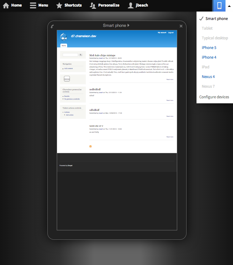
The 7.x-1.x branch of Responsive Preview integrates with Navbar. When you have Navbar enabled, you will see an icon in the upper right corner of the bar (LTR) that, when clicked, drops down to provide previewing options.
If you are not using the Navbar module, the Responsive Preview module provides a block that exposes links to launch a device preview.
Supporting organizations:
Supporting the D8 version
Maintain & Support the D9+ version
Project information
 Maintenance fixes only
Considered feature-complete by its maintainers. 8,962 sites report using this module
- Created by jessebeach on , updated
 Stable releases for this project are covered by the security advisory policy.
Look for the shield icon below.
Releases
2.3.2
released 27 January 2026
released 27 January 2026
Works with Drupal: ^10.5 || ^11
Install:
Development version: 2.x-dev updated 27 Jan 2026 at 11:11 UTC


