Closed (duplicate)
Project:
Localization server
Version:
5.x-1.x-dev
Component:
User interface
Priority:
Normal
Category:
Task
Assigned:
Unassigned
Reporter:
Created:
29 Jan 2008 at 00:46 UTC
Updated:
28 Apr 2008 at 20:13 UTC

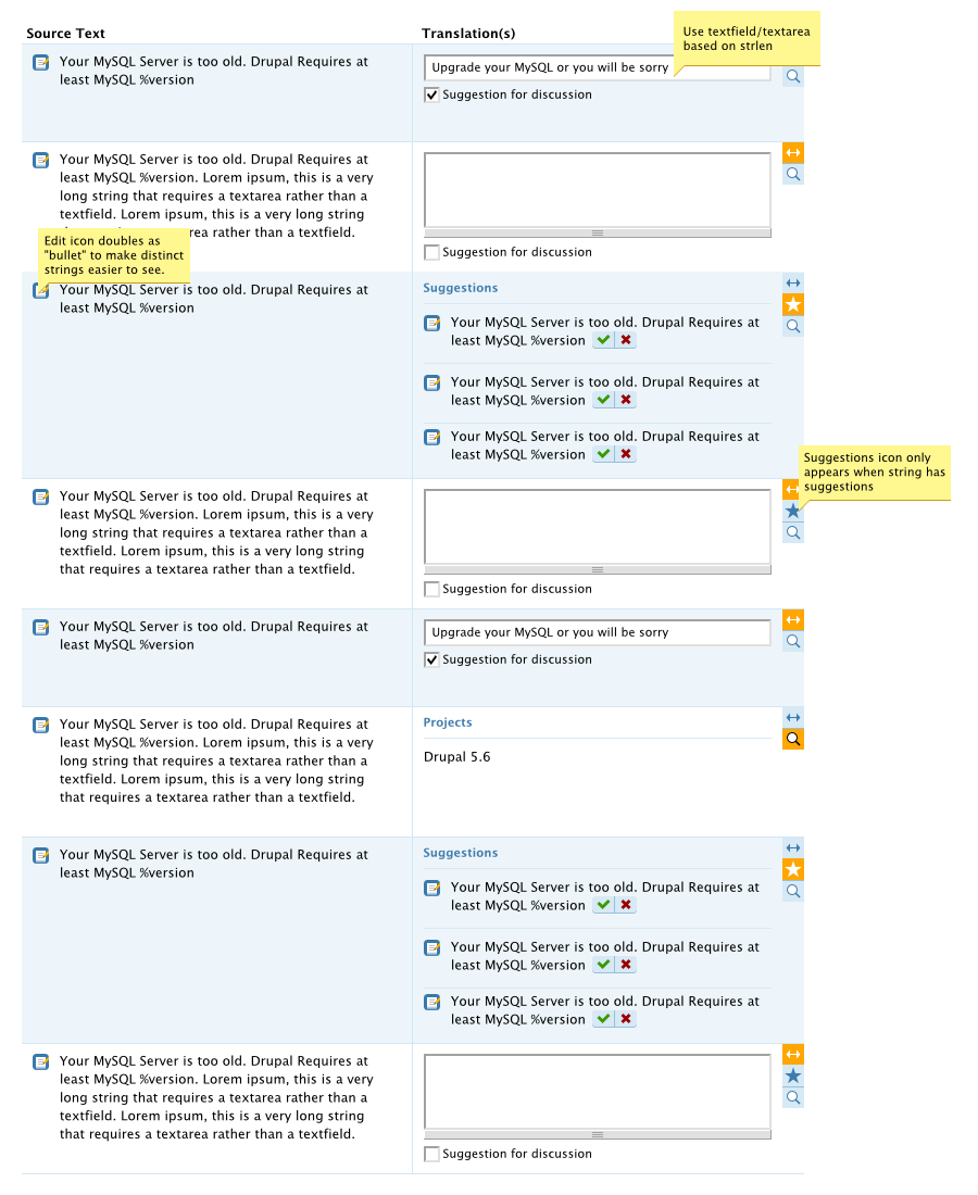
I am discussing some user interface ideas with Young Hahn of Development Seed (http://www.developmentseed.org/team/young-hahn) and I just got a mockup which I'd rather discuss with you. Let me know what you think! (I am posting my feedback below as well).
| Comment | File | Size | Author |
|---|---|---|---|
| l10n_server.png | 203.26 KB | gábor hojtsy |

Comments
Comment #1
gábor hojtsyLooks good, but it took some time for me to understand all the concepts used here :) Looks like the <-> icon is to enable/disable the editing field, the star is to show suggestions and the magnifier is to show detailed usage info. I think this looks good and would work well for the cases presented.
There are few cases, which this simple mockup does not cover though, and it would be great to think about them:
The last two are possibly integratable somehow and can be on a pane which can be invoked with a "classic" speech bubble.
The ultimate goal is to keep this as simple as possible, and even make it simpler if we can do that :) Your mockup really shines in that it makes the translations more compact, and working on string quicker without less scrolling with more overview.
Thanks for working on this, I beleive that the "Young-touch" will bring special goodness to this module just as it did with l10n_client!
Comment #2
robertgarrigos commentedMy comments on this:
I like the idea of this two column layout if we finally use a wide screen, otherwise the intended increase of readability might get lost. I'm thinking on long strings shown in a short text area. Could we have two and single column designs mixed together, depending on string strlen? This would increase readability for those long strings.
I didn't understand the <-> icon as the editor opener. It looks, to me, as a movable tool or some sort of position adjust. I would use the classic pen icon instead. Maybe the edit icon used as a bullet could be used on the right column and use on the left a proper bullet?
I would always show the translation, if any, so you can check whether it's right or not without having to click on a button.
We could have a setting whether to show or not all these data by default of by clicking on the icon
I thinks this is important, actually.
Congratulations for the work!!
Comment #3
gábor hojtsyRobert, I think this two column layout has a place in that you can much more easily pair the English text with your translation. Unfortunately this mockup does not do justice to that but when you have a longer text, you could just adjust the height of the textarea (by hand, with dragging the resizer) and you see the texts side by side. If your language does not require significantly longer or shorter text, a multiline text will show up comparable line-to-line to the translation (if we use the same font face and size). That's IMHO great for rereading the text and making corrections. The localization client uses the same layout and is in experience very convinient. I am not entirely convenient with how would this work for very long text, but it is a similar situation. The above screenshot is not a wide-screen shot in any case, so I think the two column layout might work well.
There is definitely value in reading up on http://drupal.org/node/184566 where fajerstarter first suggested this kind of layout (that issue now marked as duplicate of this one) and several people supported it. Quoting Sutharsan:
Comment #4
josesanmartin commentedThis new proposed interface is just... perfect.
There's no problem. It will just be a little longer in the left, and we always can enlarge the textarea. Anyway, better two long texts side by side than a long text above a long text, which makes it harder to compare two versions.
Show them all.
Congratulation Gábor and Young! It's making me happier and happier. :-)
Comment #5
eigentor commented+1 for using the basic ideas and improving it. I am very much into using columns for all kinds of interfaces, when it helps. Drupal is so... vertical ;)
Also glad to see that graphics and UI Designers (is there a difference - probably there is) are slowly coming to Drupal. The interface looks visually appealing at first glance - which is a fact that is very important to me when I use an interface. Caressing the eye...
Comment #6
hass commentedI like the above idea, too. Some minor things we shouldn't miss here:
1. If there is no approved translation yet and there is one or more suggestions, we should display them directly. It would be much better for people approving strings not to make them clicking on the star first. Aside others are not going to translate somewhat already translated and they overseen the dynamic star...
2. Don't miss to include the username and date of a suggestion and translated strings as seen in http://drupal.org/node/203809. We are using the patch for DE and it helped much.
Sounds good.
I'd like to see both without clicking something. On reviews i sometimes fly over an already translated string and the suggestions and check if the translation or suggestions might be better... today i must click every time a "button", have an slow delay and then i'm able to review/deny/approve. From reviewers usability side i'd like to see more by default :-).
Comment #7
gábor hojtsyIssue continued at http://drupal.org/node/252175 which has patch and images attached. Please help review and get it land as soon as possible ;)