
 Come together with the global Drupal community in Rotterdam, 28 Sept – 1 Oct 2026. Sessions, contribution, connection, and Early Bird savings until 8 June.
The project usage table for a project should be visualized using a graph instead of a table.
| Comment | File | Size | Author |
|---|---|---|---|
| #31 | project_326094.patch | 6.41 KB | drewish |
| #27 | usage_graph.png | 9.34 KB | aclight |
| #25 | project_326094.patch | 5.51 KB | drewish |
| #24 | Picture 6.png | 67.71 KB | drewish |
| #24 | audio_usage.txt | 16.13 KB | drewish |

Comments
Comment #1
aclight commentedDoes Drupal have the built in ability to create graphs? If not, this would make the project module depend on additional modules. It would be nice, but I think it's far from trivial to implement.
Comment #2
drewish commentedsubscribing. personally i'd thought this would be a great use for javascript. let the visitor burn some cycles to turn the table into a graph rather than having d.o do it.
Comment #3
pasqualleIf the usage statistics is done by views, then a graph can be created easily with the Charts module. Oh, but it is for Drupal 6 only.
Comment #4
drewish commentedPasqualle, the statistics aren't done via views (and from a performance standpoint i'm not convinced it would be the best way to do so) and there's also the server side load to consider. That was the rationale behind my suggestion of using JavaScript.
Comment #5
beginner commentedsubscribe
Comment #6
dave reidI think it'd be easiest to implement charts using the Google Chart API much like testing.drupal.org currently does.
Comment #7
drewish commentedDave Reid, the charting api looks really cool. the only think that migh be an issue is the usage. if we'd be generating more than 250,000 requests a day we'd need to let google know that it's not a denial of service attack.
Comment #8
pasqualleI guess saving the generated image on d.o would not be a hard thing to do..
Comment #9
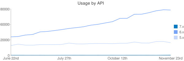
drewish commentedBeen playing around with some sample code to theme the project's API usage info:
I've attached an output image from this URL: http://chart.apis.google.com/chart?chtt=Usage%20by%20API&chs=600x200&cht...|31931,32525,35078,36030,40481,41225,42770,44481,46423,47875,49345,52099,53564,55939,58193,63702,63885,70886,71003,73628,76875,78657,78271|16954,19345,17681,17524,18616,18679,18628,18916,21122,19754,19696,20241,20452,20442,20128,20778,20891,23049,21357,21179,23836,23967,21910&chds=0,80000,0,80000,0,80000&chdl=7.x|6.x|5.x&chxt=x,y&chxl=0:|June%2022nd|July%2027th|October%2012th|November%2023rd|1:|0|20000|60000|80000
Comment #10
pasquallenice chart :)
Comment #11
drewish commentedTotally untested but should make nice charts for the API versions... it's pretty inefficient because for simplicities sake I did the chart in the theme function. I'd like to test it out on p.d.o and go from there.
Comment #12
drewish commentedHere's a screen shot of some other bits i've been working on. It's a small chart for each release to make it easier to see the trend that the numbers have taken. I'll hold off on posting this code until the last patch is tested.
Comment #13
beginner commentedre #12:
Very nice work.
The trend seems inverted, though, unless you read the chart from right to left, i.e. in the same direction as the table. It's a bit unusual, though, and gives the impression the trend is falling when it's rising and vice-versa.
Otherwise, it's pretty cool. :)
Comment #14
dave reidVery nice work with the API drewish! In response to #12, I thought all the charts looked really funny and realized they read backwards from what I was expecting (time passing from left to right). Maybe the data columns should also be arranged from oldest -> newest so they can match the "direction" of the charts?
Comment #15
drewish commentedrealized the patch wasn't looking in the right part of the table for the data.
it might make sense to change the direction of both the table and the graph. my original rational for the putting the latest numbers by the release name was so you could easily scan the table and see the current usage by release.
Comment #16
drewish commentedhunmonk put the patch on p.d.o for me and there's something wrong with my code to pull data from the table. i'm adding a bit of debugging output here to see how the actual tables differ from my expectations.
Comment #17
drewish commentedokay hunmonk applied the last patch and i got a dump of the table (which i'm including here for future reference). did some tweaking to the code that parses the table and came up with the following patch. hopefully hunmonk will have a little more time to apply it too.
Comment #18
drewish commentedactually since i've saved the table output here's one that drops the output for that.
Comment #19
drewish commentedi'd replaced strtr() with str_replace() but didn't re-order the parameters correctly. this should do the trick.
Comment #20
drewish commentedturns out i had a few other bugs in there that i was able to work out using the var_exported data. this should actually generate a chart.
Comment #21
drewish commentedhunmonk was gracious enough to apply that last patch and i was able to get the attached screenshot for p.d.o note that there's some missing data in the table that's reflected in the graph. hopefully i'll be able to get some code reviews now and have dww tear it apart on monday ;)
screen shot is from http://project.drupal.org/project/usage/drupal?sort=asc&order=Oct+12 note that some of the usage pages might be cached from pre-charting, in that case you can usually sort the table to get an uncached configuration.
Comment #22
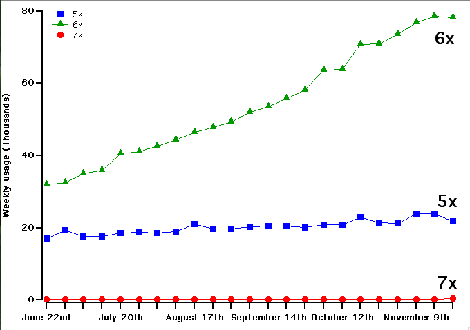
aclight commentedI don't know if the Google Charts API supports this, but I think it would be better if the actual data points were drawn with a marker (say, a solid square), and the lines connected the markers. For example, like the green, red, and blue traces in the graph on the left hand side at http://www.wavemetrics.com/products/igorpro/gallery/user_Sigman.htm
Comment #23
drewish commentedthis moves the chart building into its own theme function and adds a (totally untested) call to it from the release pages so those get a chart as well.
it also adds a bit of code so i can grab some sample data for the release table
Comment #24
drewish commentedso the last patch seems to be working well enough but i've noticed that i'm not always putting enough values into the $value_axis array as evidenced by the attached screen shot of the release usage page.
i've been able to gather some sample data for the overview page that i can now play with to build some spark lines. they're attached here for future reference. the order might be strange because i had to change the sort order to get uncached data.
Comment #25
drewish commentedthe attached fixes the missing value problem and removes the var_export() calls.
Comment #26
Bojhan commentedSubscribing
#21 First initial feedback, I would use either more differentiating colouring (avoid red for obvious reasons). Could you show one, that is intensive and one that isn't? It is hard to determine if the length to aspect ratio is good enough to avoid lumpy or spikes in the chart. You might consider removing the line, when there is no data - otherwise, it will be harder to scan for the information you want - do to the large differences from when there is no data. When I work on stuff like this, I always ask the question "Do the prominent visual effects, convey relevant information" - sometimes making something less prominent will be good enough.
Comment #27
aclight commentedI've attached an example of a graph that (IMO) improves on what you've done so far. I created this using a program for scientific data analysis and graphing, and it may be able to do things that the Google chart API can't do.
A few key differences in this example:
1. The actual data points are indicated with a marker. This makes is clear what the granularity of the data is.
2. I've drawn the left and bottom axes in black. Combined with the use of markers, I think this makes the 7x data distinct from the axis itself, even though the values are very close to 0.
3. When it's practical to do so, I think it's best to use a text label to identify each line instead of a legend. The problem with using text labels for automatically generated graphs is that it's difficult to automatically position them in a good location that doesn't overlap with another trace or label. Therefore I've also added a legend. We'd probably want the text in the legend to be larger than I've used.
4. I wonder if, for the bottom axis (time), we should just label with the month, eg. June, July, Oct, Nov, Dec. The tick for each month would be on the 1st of the month. I know we don't necessairly have data for the 1st of the month, since we're only collecting weekly data. In a real graphing program this wouldn't be too difficult, but using Google Charts this is probably not possible.
Comment #28
dave reidThere are a lot more chart types and chart options that the Google API is capable of doing.
Comment #29
drewish commentedaclight, i'll try using markers when there are multiple data series. i don't think that the other changes would be practical with the google charts api.
Comment #30
dwwMostly looks great. Applied #25 on p.d.o and cleared all the caches. A few relatively minor problems:
A) On the usage page for a single release (e.g. http://project.drupal.org/project/usage/324832), the chart's title still says "Usage by API" which is confusing. In fact, it seems like it'd be nice if the chart title was more self-documenting, so that in the inevitable cases where people paste these images into other things, the chart title accurately identifies the data. E.g. "Usage for [project_name] by API" on the project usage pages, and just "Usage for [release_name]" on the release usage pages.
B) For this code:
it'd be nice to have a code comment that says these cryptic array keys are what chart.apis.google.com expects. That comes later in the PHPDoc on the helper functions, but it'd be nice when the data is defined in the first place.
C) Typo in comment: "wit no".
D)
$subset[] = $labels[$count * ($i / $n)];that always gets cast to an int since it's used as an array offset?E) I haven't thought about it much, but on quick glance, it's not entirely clear how this logic is working:
What's wrong with http://us2.php.net/manual/en/function.round.php ? As in:
I guess that doesn't always round up, it can round down, too :( *Sigh* maybe what you have is best. Now that I've started at it more closely, what it's doing makes sense.
F) Wouldn't it be proper to give these chart images somewhat meaningful alt attributes? Seems like it'd be easy to pass in
$args['chtt']for the alt attribute (and maybe title, too?) for theme('image').G) This could use a code comment, since I don't know why we need to do it:
H) Typo: "migth" in here:
// FIXME: HACK TO REMOVE COMMAS FROM number_format(). It migth be better
Yeah, and what about that hack? ;) Doesn't seem easy to add that number_format() call to the tables after we generate them -- I guess we could array_map('number_format'). Not sure that's worth it. Anyway, we can punt this to later.
I)
function theme_project_usage_chart_by_release($project_header, $project_rows)That function is shared for both project and release usage charts, so those argument names (and PHPDoc comments) are misleading.
J) I wonder if this should all be controlled with a killswitch setting of some kind? Also, since both project_usage_chart_label_subset() and project_usage_chart_axis_labels() are directly manipulating the $args array with google-specific keys, seems like those should both be theme functions in case someone's trying to change all this to use a different charting service.
K) Probably totally out of scope, but... consider http://project.drupal.org/project/usage/324832 -- The only data points are 52,599, 50,452, and 46,300. However, the Y axis goes from 0 to 60,000. That makes this look basically like a flat line, even though it's not. Seems like it'd be nice to limit the range on the Y axis so that you get a better sense of the data, no? In this case, even if the Y axis was from 60,000 to 40,000, you'd be able to better understand the data from the visualization. Better yet would be 55K to 45K or something, but that might be too tricky to implement.
Comment #31
drewish commenteddww, thanks for the close review.
a) Fixed, I've make that a parameter.
b) Fixed, documented the source.
c) Fixed.
d) Good call, it could go in as a float which would probably be cast correctly but better to be certain.
e) I've documented the reason for building the max number as a string. basically large floats round when you pass them through number_format() so 90,000 becomes 89,999.99.
f) Now that the title is a parameter I'm using it as the alt tag as well. I might be check_plain()ing the value too many times here but better that way than the alternative.
g) Done.
h) Cleaned up that comment to make it clear what's happening. I'm fine with punting on that.
i) Renamed those.
j) I'd like to hold off on changing that now until we see how it's actually used. I want to add some other charts in and I think that'll be a good driver for rounding out the API.
k) I can see both sides of this. I'd be willing to give it some thought but I'd rather not block the patch on it.
Comment #32
dwwThere were a small handful of remaining bugs in here that I just fixed myself, committed to HEAD + DRUPAL-5, and deployed on d.o. In particular,
t('Weekly usage of @release-title', $release->title)isn't how t() works. ;) But, it's all resolved and live, for example:http://drupal.org/project/usage/drupal
The charts are a little funny due to the off-by-1 error over at #344344: Weekly usage stats not processed if we have a full week of data but we processed less than 1 week ago, but that's coming next. Calling this fixed. Other kinds of charts or requests for the charts should go in new issues at this point.