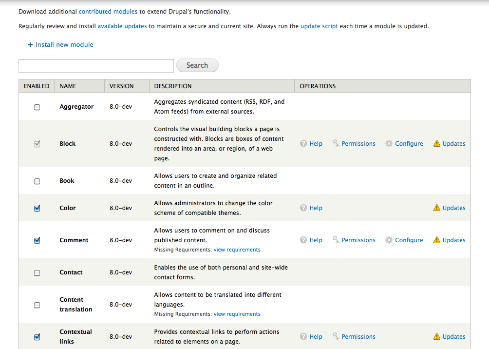
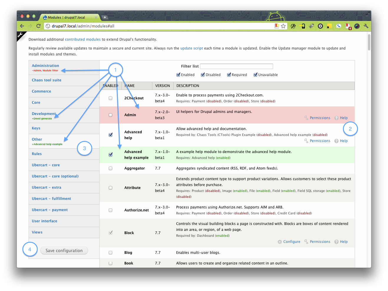
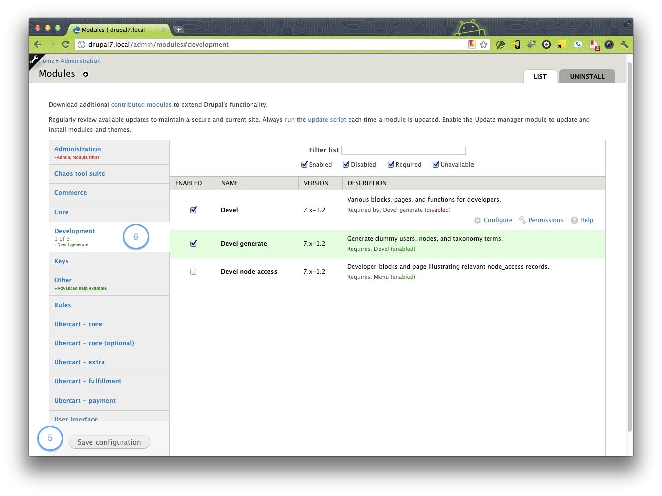
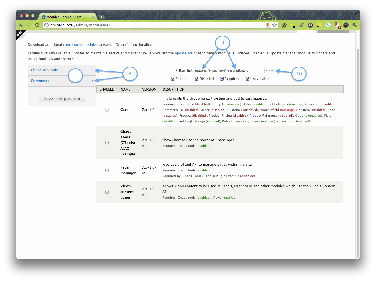
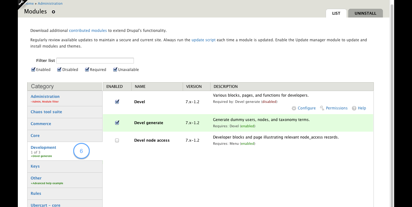
The Problem
Over the years we have done numerous usability tests on the module page, and they all discoverd various problems that need to be solved in a redesign. The problems we found are :
- The module page is overwhelming, thereby failing to inform users about Drupals extendability.
- It is hard to find a module after you uploaded/downloaded it.
- Additional information such as dependancies and links draw too much attention.
Process for finding a resolution
- Prepare prioritized task list for the modules page, list of requirements for presentation and functionality.
- Verify our assumptions with some interviews
- Use those lists to find the best ideas for the most important tasks/requirements in all the mockups that have been posted.
With the information from this, we can continue our design iterations and finnally decide going down a certain path.
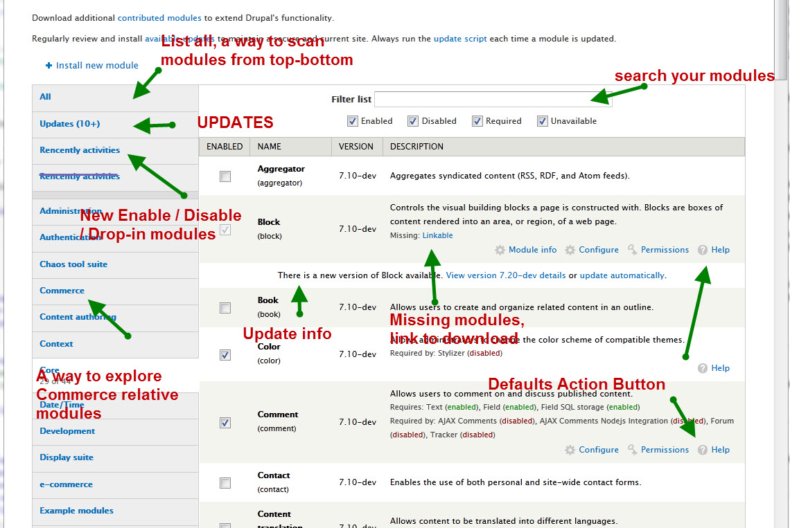
The list of things you want to do on this page, prioritized by importance:
- Find a module
- Enable / Disable / Uninstall module
- View module description to orientate what the module is about
- Change the permissions / configurations of a module
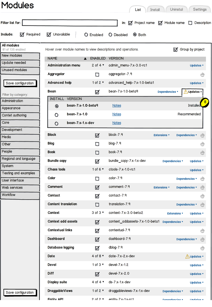
- View available updates / update module
- View current module versions
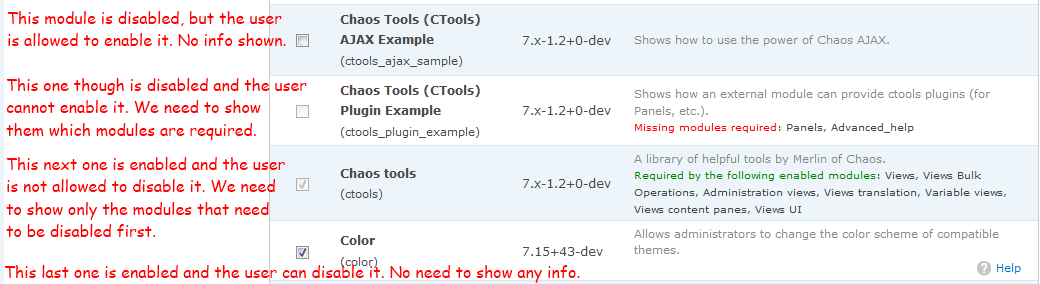
- View which modules are required to be able to enable, disable or uninstall a module
Current ideas for solution
It is quite messy to follow this topic around issue #88 the discussion for Drupal 8 started. In the past months we have consensus on a number of ideas but still have discussion about their specific design and implementation.
Agreed upon ideas
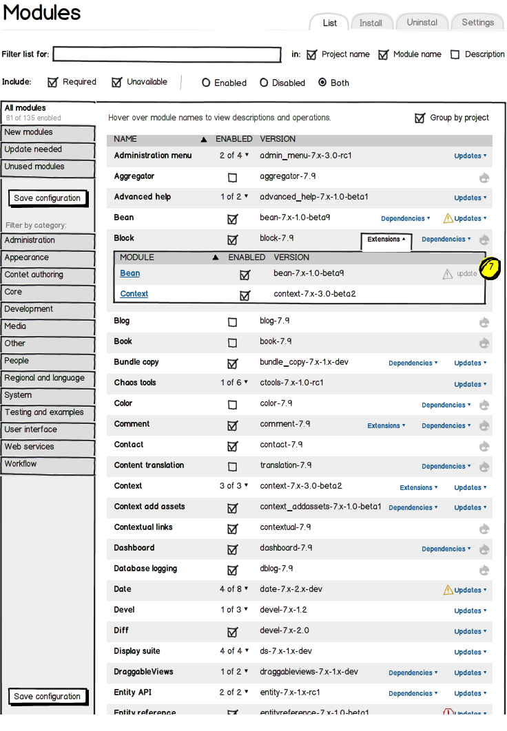
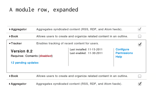
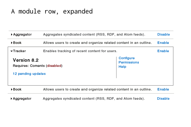
- Using a accordion like interaction to encapsulate information such as dependancies.
- Allow users to filter the list using search.
- Have a signal for showing which modules are "new".
- Have a signal for modules that require update(s).
Topics still under discussion
- How to group modules; using packages, categories, tags, nothing?
- How to filter modules (disabled, enabled etc.), what meta data is important?
- How to handle dependancies, disabling and enabling modules that require other modules is currently too hard.
Research
As noted in the process for finding a resolution, we have concluded that we need to do interviews. The current progress of this is :
- Test script has been written
- 17 interviews have been conducted
Sub-Issues
#396478: Searchable modules page
#468208: Allow uninstalling modules with dependents by offering to recursively uninstall their dependents as well.
#492834: Hover operations for flooded state screens
#1296876: Make dependency list hidden on modules page until requested
#1348692: Vertical Tabs for the Modules page
#1353888: D8UX: Improve the position of the 'Save' button on Modules page.
#1355292: Come up with better alternatives for groupings on the modules page
#1355358: Allow searching for modules on Drupal.org from the modules page
#1355442: Add "Update available" indicator to the modules list
#1355526: Add a way to determine the date a module was added so the modules page can use it for sort
#1371524: Remove packages from modules list and .info files


Comments
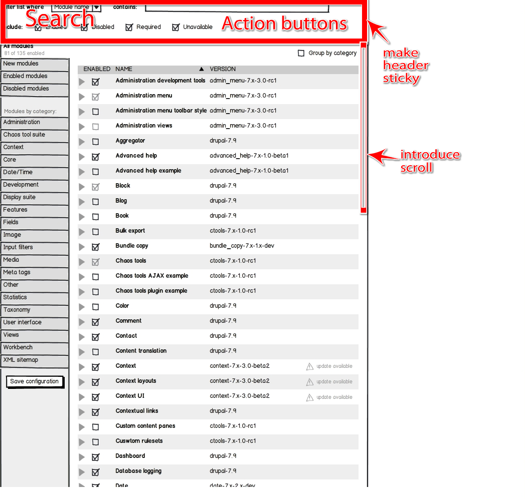
Comment #1
eigentor commentedLarger Image
Comment #2
xanoHere's Marks latest mockup. If you want to help out with this issue, please come to #drupal-usability for some fierce discussions.
Comment #3
yoroy commentedBefore we start to throw out more mockups, let's summarize the known issues with this page first,
then look at what could help solve these problems,
then wireframe,
then spin off seperate tasks that will have actual code patches posted to them.
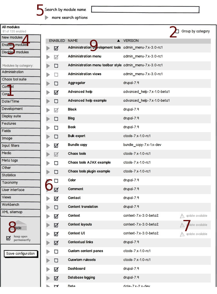
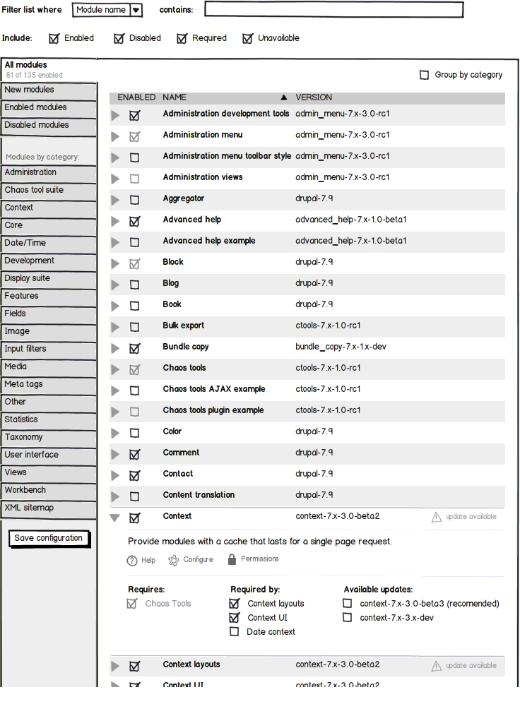
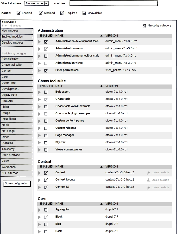
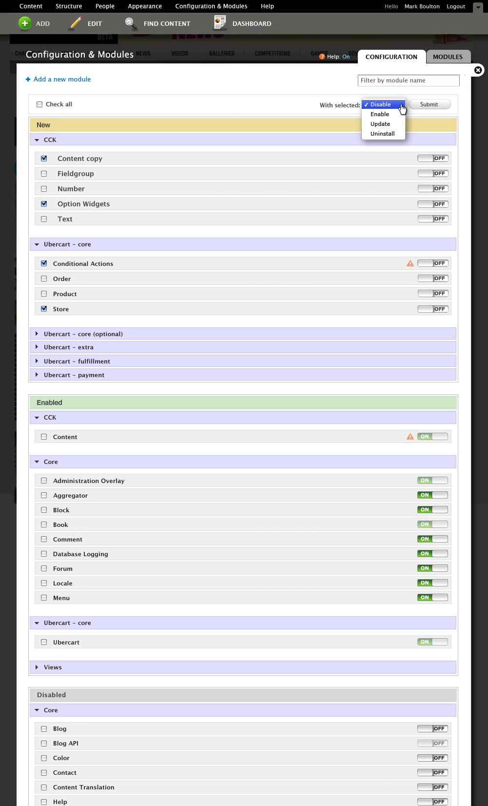
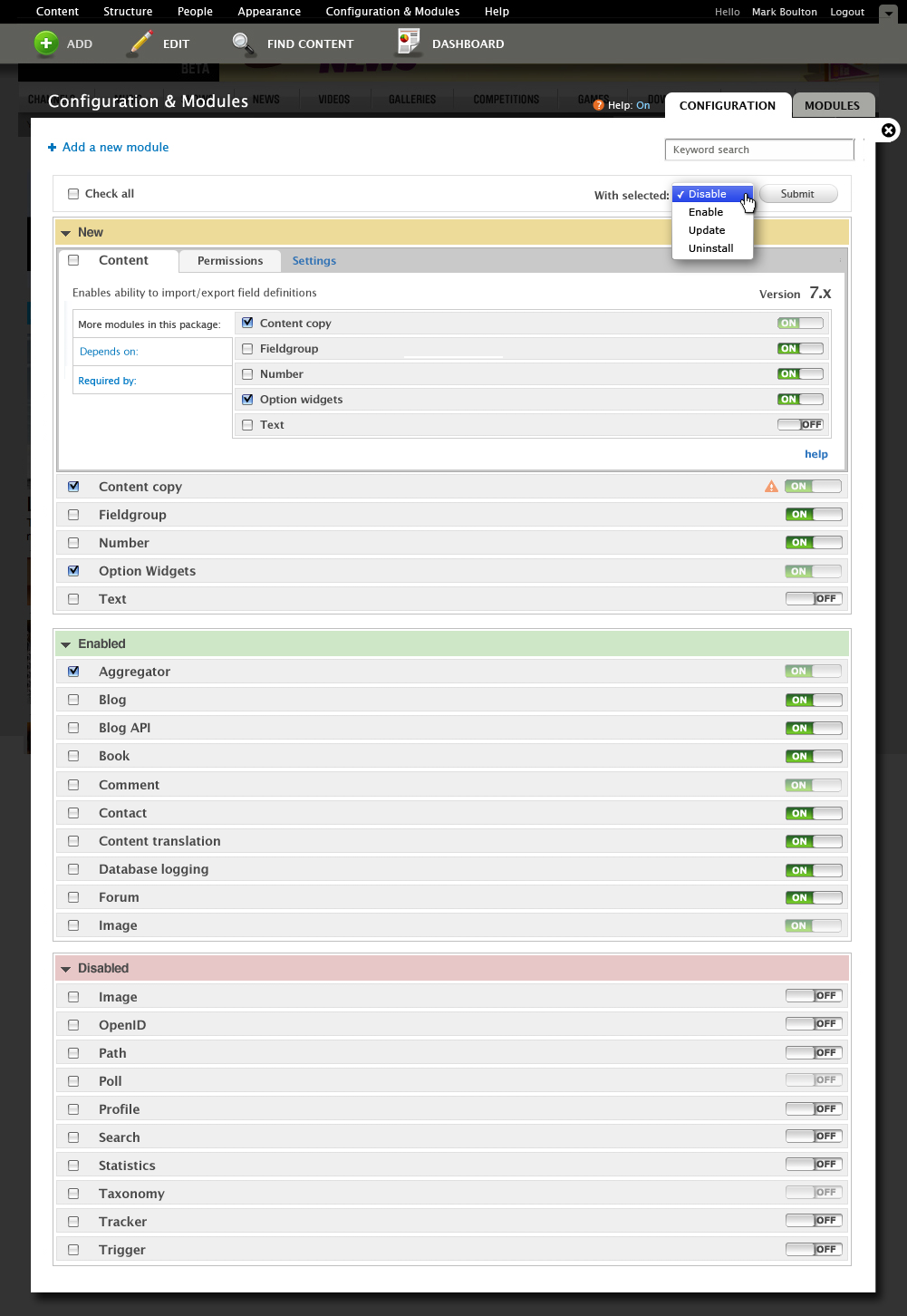
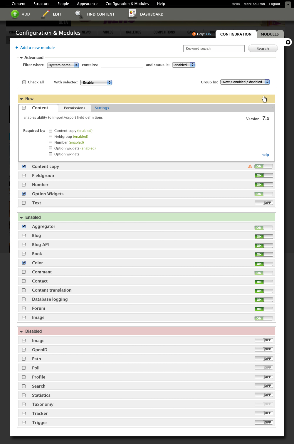
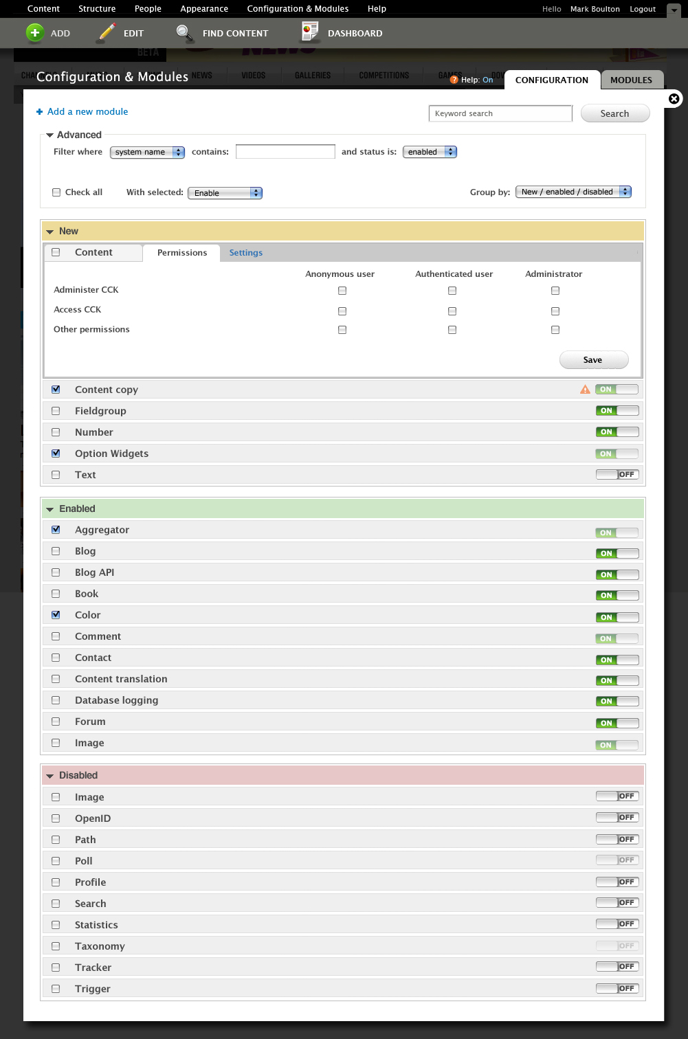
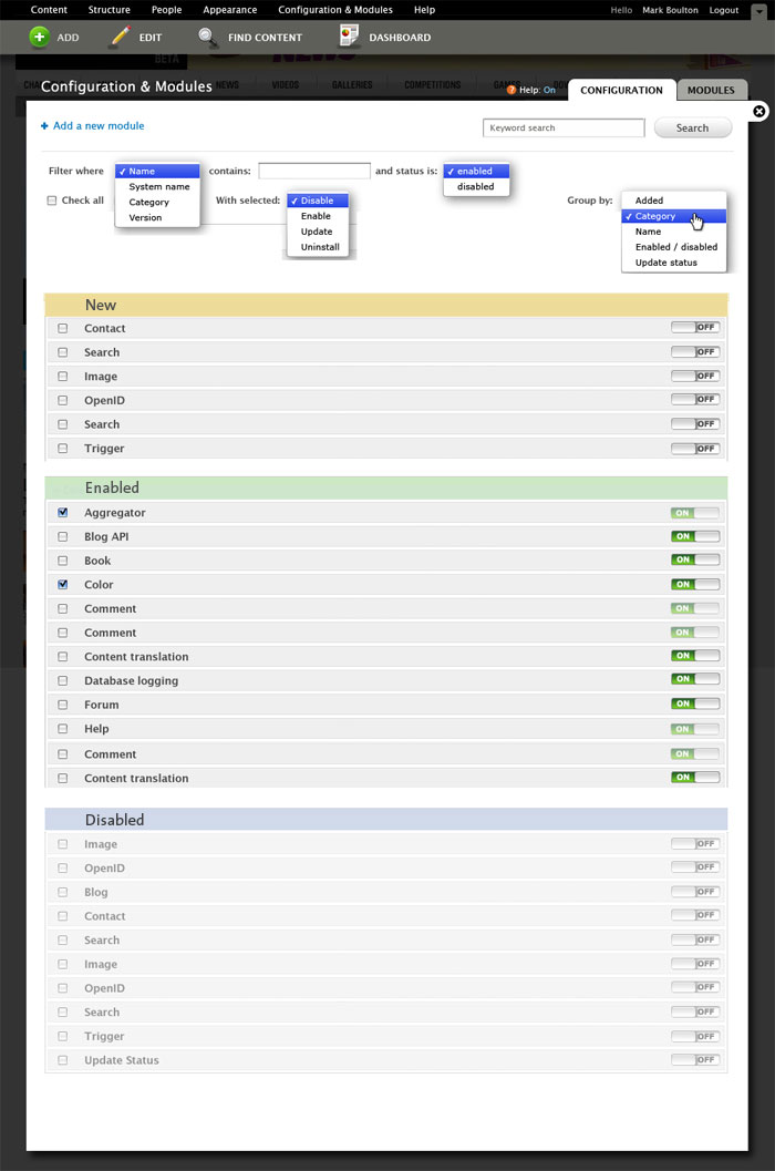
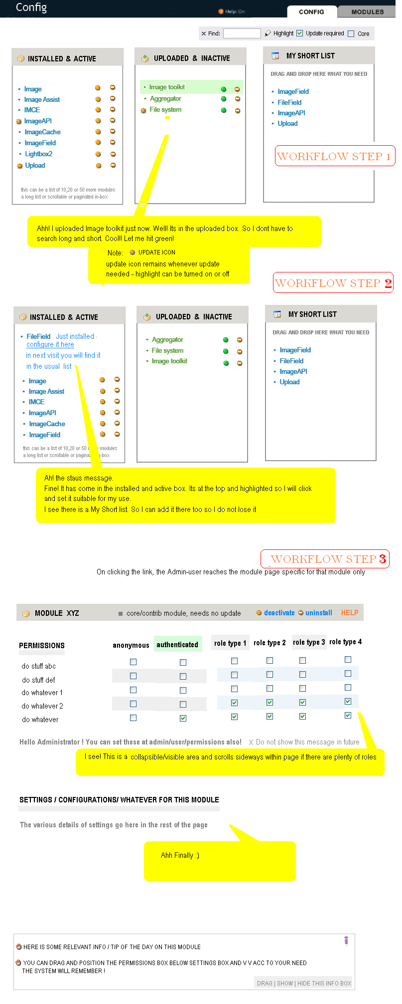
What follows is a summary of our module page thinking during june ux sprint. One of the main ideas is to make 3 main buckets on this page: new, enabled and disabled. Please read:
__
Modules page is a typical example of a long list that gets hard to manage pretty quick. The categorization is not always ideal, with big modules providing their own category and a quickly growing 'misc' section.
Usability tests have shown that after installation, modules do not provide clear starting points to where you can find their configuration pages. Same goes for the new permissions a module might expose. No clear indication that there are new permissions and no clear pointers to where to find them.
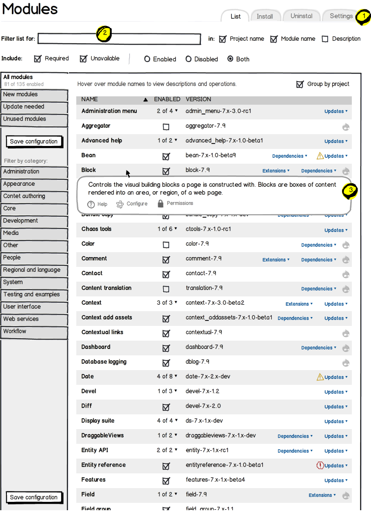
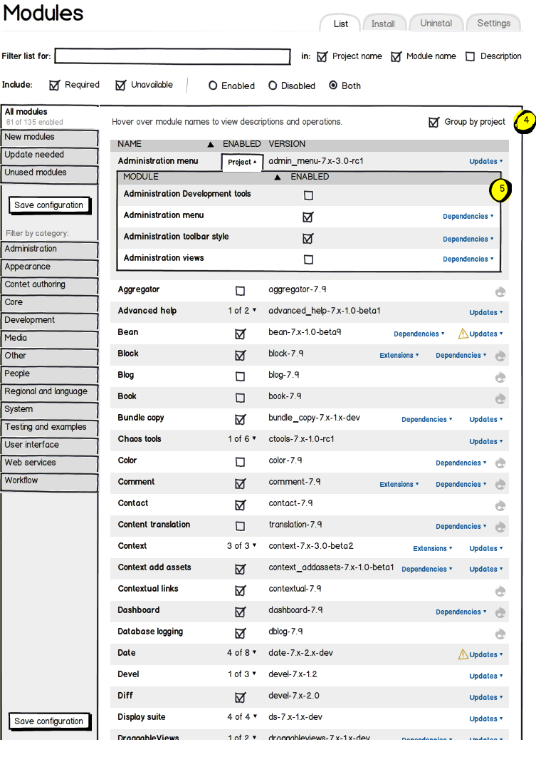
http://sprint.drupalusability.org/content/design-module-page gives us a good summary of the main issues with this page:
1. Finding functionality once a module is installed
2. Finding functionallty a while after the module is installed
3. Finding functionality (with no knowledge of modules whatsoever)
In general, this gives us two areas of attention:
- Managing the big list of modules as a whole
- Finding related tasks per individual module
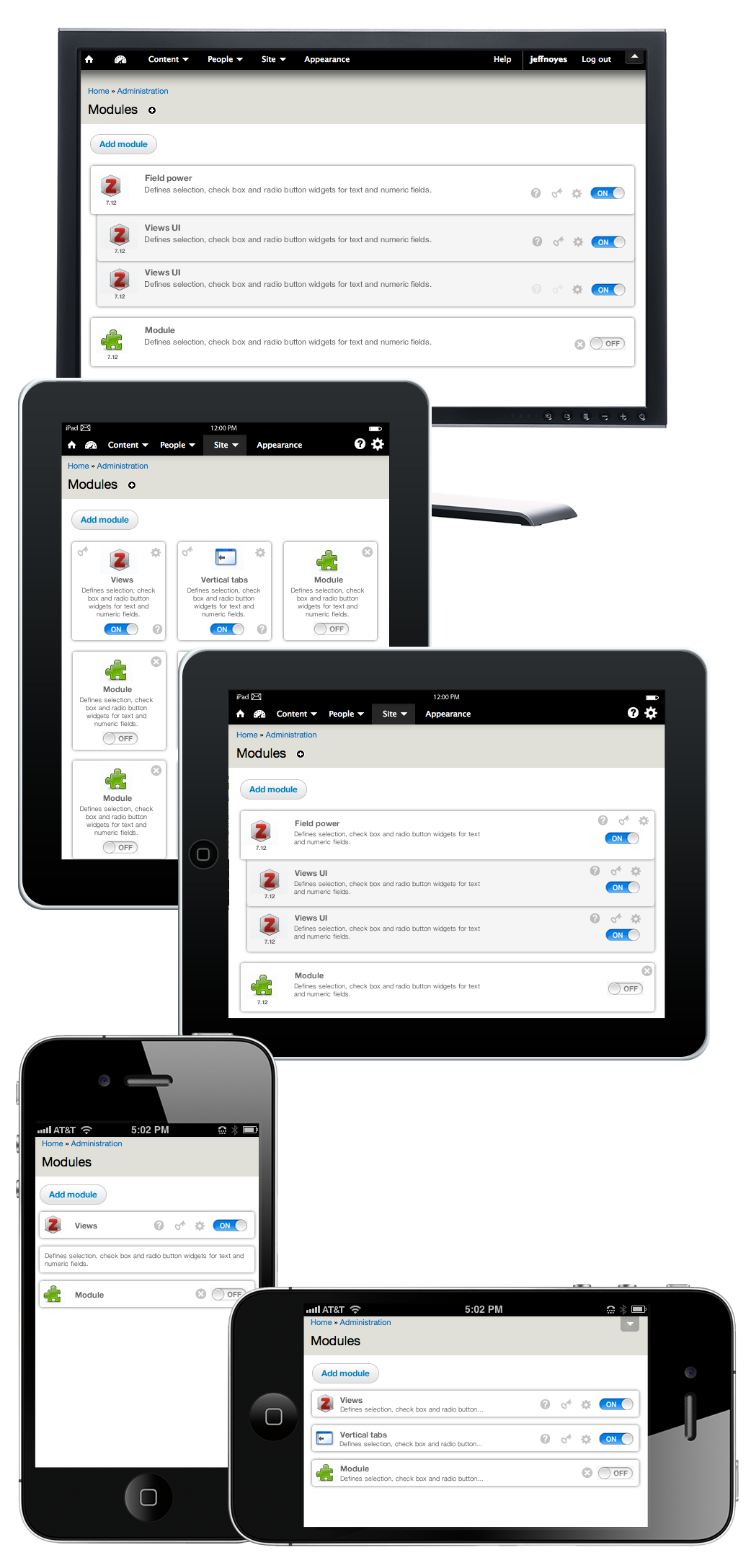
We need to show more info per module without cluttering the interface. Finding related tasks per module is something the accordion (yes, accordions, I mixed up my musical instruments there) concept could help improve by showing links to configuration and permission pages in context of the module itself.
During the UX sprint we discussed ways to make it managing the big list itself easier. The main idea is to provide 3 top level boxes for modules to live in:
- New
- Enabled
- Disabled
Let's take a look at how this would help solve some of the problems:
Box 1: New
This would make it pretty easy to find the module you just installed on the page. You'd find both enabled and disabled modules living in this box. Of course, we'd still have to provide messages on other admin pages (and maybe even in the admin header) so that you know you have to visit the modules page at all.
Box 2: Enabled
It seems sensible that below the list of 'New' modules is the list with 'Enabled' ones, no? These are the ones that provide the parts you built your site with.
Box 3: Disabled
For the modules that are installed and fully configured but are (kept) disabled, well, you probably don't want to have them clutter the top part of your screen.
Yes, but…
-- What about the categories?
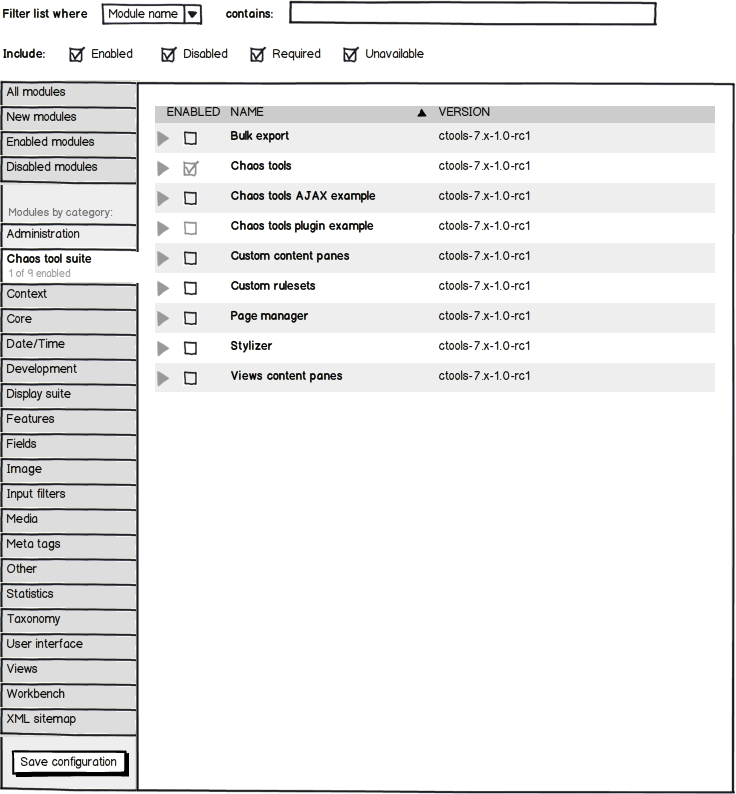
It would still be handy to be able to filter on everything 'media' or 'ubercart' yes. Propose to make the categories a filter as a select list on top of the page.
-- What about modules that consist of multiple modules, like panels, views, ubercart? What if I enable some of them, some not?
Yes, the New/Enabled/Disabled segmentation would seperate these 'sub-modules' from each other. Currently these modules are grouped into their own category. I don't expect the seperation to be a real problem. On first usage (after installation) the module family would be shown in full in the 'New' box. After configuration, the category filter would allow you to see all panels, views, ubercart related modules together again.
-- This would mix up core and contrib modules!
From the users perspective, does that really matter? Again, the Category filter would come to the rescue in providing a filter to show 'Core modules' only. In itself it is not a very relevant disctinction to make.
-- How would the modules within each box be sorted?
Looking at an average use case with say, 30 installed contrib modules, there doesn't seem to be a need to make the sorting within each box 'smart' in some way. Sorting alphabetically, although about as helpful as 'random' in most cases, seems to be the most logical option here.
Any other edge cases I missed? Any other problems that might arise from this new grouping? Point them out please and talk us through it. If the concept still holds after discussing them, then just this new grouping of modules in New / Enabled / Disabled boxes would be a worthwhile improvement for the modules page.
Comment #4
xanoI was thinking of a textfield that allows users to filter modules by name. In combination with AHAH this makes searching for specific modules in large lists a lot faster.
Comment #5
webchickFixing tags. Also, ninja subscribe. ;)
Comment #6
leisareichelt commentedgreat summary yoroy - really look forward to getting this one nailed, it has been a challenge!
Comment #7
webchickAlso tagging with this. I think that it would be a shame for D7 to ship without this page having been re-worked, since it's one of our biggest usability WTFs currently.
Comment #8
eigentor commentedGreat writeup. I guess you really thought of about everything.
Ah, no, there is an edge case: Drupal has just freakin' too many modules. What poor soul is gonna herd them?
I mean, this is a hard task.
Maybe we could create some typical module setups and find solutions for these examples. What is the average amount of modules?
In Designing for the 80% (that we mostly target) Things are much, much easier: I guess, a drupal newbie won't install 50+ modules.
Things like Ubercart are special, this monster in itself installed about 25-30+ modules last time I checked and clutters everything. So this and maybe there are some more should be an edge case: personally I would always keep together Ubercart modules, since they in themselves are often cryptical and confusing.
So for these "monster" modules sets a special plan might be good.... (haha fourth group at the very bottom: "Monsters". Allegory: go down and burn in Hell)
Comment #9
yoroy commentedI'd presume ubercart would add itself as a category to filter the list on.
Comment #10
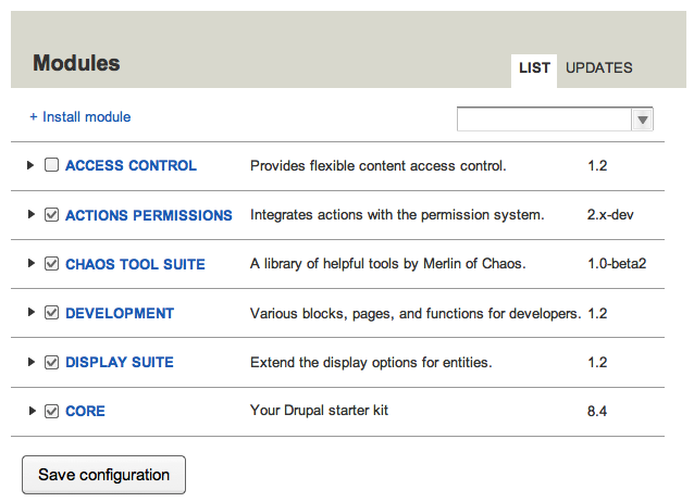
kaakuu commentedAs hinted by Yoroy in the other related issue, posting a mock-up diagram here which in my idea streamlines things more.
Please see the attachment here - the first diagram.
The second diagram is a rough diagram approximating an ideal workflow for modules
Comment #11
kaakuu commentedIn conjunction with MODULES.gif above
a very, very rough skecth to show how this mockup handles when there are more than 50 modules or 500
The lists can have more sharpness in display with slightly more increasing the line-heights.
Can post a better diagram when have more time and if there is any enthusiasm here :)
Comment #12
derjochenmeyer commentedWithout having read in depth about this issue (which is probably an advantage), i like the mockup #2 posted by xano >> Its intuitive it looks drupal like >> i feel at home.
I dont like #10
Just my thoughts about this starting from #2
Comment #13
gábor hojtsySubscribe.
Comment #14
yoroy commentedSo, I'd like to create a first spin-off issue for grouping the module list into 3 boxes "new, enabled, disabled", since that seems like a usefull thing to have regardless of any extra filters for sorting and regardless of any extra links offered per module.
Do we want to discuss the requirements for that here or in the seperate issue?
Comment #15
gábor hojtsyNow that the "Configuration and modules" page is in, I've submitted a patch which moves the Modules page to the right place in the IA as a first step. I think it is best to get that in fast and then work on the inside of the page. See #545952: D7UX IA: move modules to config/modules.
Comment #16
skilip commentedSubscribing
Comment #17
webchickJust a note that Gábor's issue in #15 was committed last week sometime, so we are no longer held up on that.
Comment #18
skilip commentedMost of you know I've spent dozens of hours in rethinking the module page earlier. I've been involved with many discussions, made many mockups and even made a contrib module which was intended to make it to core. A few months ago webchick advised me to stop further development until the D7UX team picked up this issue, to prevent me from doing a lot of work which wouldn't make it into core anyway. So I'm really committed to this issue.
As yoroy mentioned there are a few main targets here on which we must focus. The order of importance:
As for scannability I am a bit disappointed by Mark's work. I don't agree it improves scannability, mostly due to the grouping. The hierarchy is to deep IMO. You have three parent groups (new, enabled, disabled), the categories as subgroups (which can appear in each parent groups as well), and a module can also be a group. We could easily tackle this by removing the uppermost categorization (new, disabled, enabled) and add a 'sort-by' select list to the filter system. From there you could sort by date added, enabled, disabled, and more. I also dislike the amount of whitespace between the modules and groups. I always have thought of the module page as a tabular data like list. That way you don't have to scroll down too much if you've got a huge amount of modules. iTunes! That could even avoid the pager (which worsens the workflow).
The tools made available in Mark's proposal really improve the workflow exponentially. The filters, bulk actions, floaded harmonica's, search field, on/off switches, and so on are all great features which improve the workflow. Still, the lack of scannability breaks the workflow.
Yoroy, Bojhan and me already have made a lot of mockups. The last mockup was really good, so why not work from there instead of taking again a new approach and restart bikeshedding?
Comment #19
eigentor commentedGreat to have you on board, Philip!
I second skilip on the scannability issue. This should get more focus.
Still I do believe parting it into three groups can improve scannability, but it has to be three clearly separated groups. Wordpress here again does a great job by seperating enabled and disabled plugins very clearly: http://screencast.com/t/tNb6FG5MkV
If you have several groups you can scan each group seperately and you get less overwhelmed by an endless list.
So how to progress on this? Time gets shorter and shorter.
Yoroy asked in #3 to stop adding more wireframes before we got the specs right.
Still this is a huge one and we have not really progressed since then.
Personally I'd opt for any kind of working prototype and iterate on that. I don't know if this module is still any good as a prototype, as it is for D6? http://drupal.org/project/module_table
We could also do interactive prototypes in Omnigraffle or Axure RP, as this is quite dynamic and is not helped by static mockups. But we need to act soon as this is no easy one.
I heard Merlin saying he was passionate about that page so we might win him to support the coding part. Gabor does such a great job but he cannot be the only one helping out on this.
+1 for building upon mockups you have already done, for my part: show them here!
Comment #20
yoroy commentedGuys, of course show mockups. Just make sure to be really explicit about what you are proposing. #3 had to be written up, that was all.
1. Finding functionality once a module is installed
2. Finding functionallty a while after the module is installed
3. Finding functionality (with no knowledge of modules whatsoever)
Skilip: It's hardly time yet to nitpick white space issues. Better to support your argument with showing the mockups and explain how it helps (better) solve the 3 issues outlined above.
I hereby lift the ban on mockups in this thread!
Comment #21
skilip commentedOkay, here's a new mockup. I've merged Mark's proposal with our last mockup. It's not complete, but a good starting point IMO.
Comment #22
yoroy commentedthe mockup in #21,:
Comment #23
webchickIt took me way too long to find this. Adding D7UX to the title to make it easier.
Comment #24
eigentor commentedThis looks quite clean at a first look.
What I especially like is the solution for the flooded state. This keeps it clean.
Now let's try to do the grouping into "new" "installed" "not installed" which would adress yoroys 1.
I guess yoroys 2. is largely up to various sets of filters. but 1 is proposed to be the default filter, I guess.
3. Needs self-explanatory module names and - maybe - descriptions.
Since we cannot control the names and the general wording of the descriptions, we have to concentrate on Scannability and that module names can be read very easily. IMHO this would ask for more space between the module names and maybe not making them bold. While Marks last layout may not be the way to go, I like his approach to rather reduce than add - would mean not by itself make module names bold.
Descriptions: if we have any (probably in flooded state) they must be trimmed to say a one-liner. So we motivate module maintainers to be precise and say everything in one short sentence... :P
What about the dependencies? Do we want to do that? For if so, they must get into mockups.
Comment #25
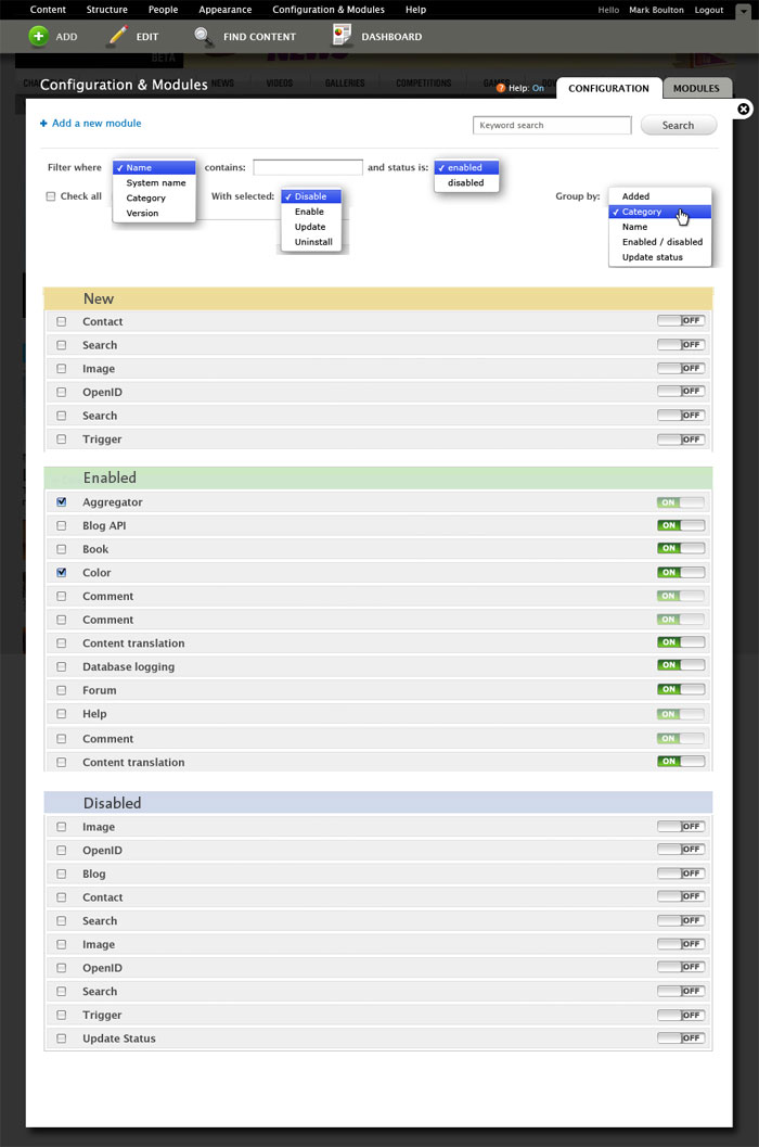
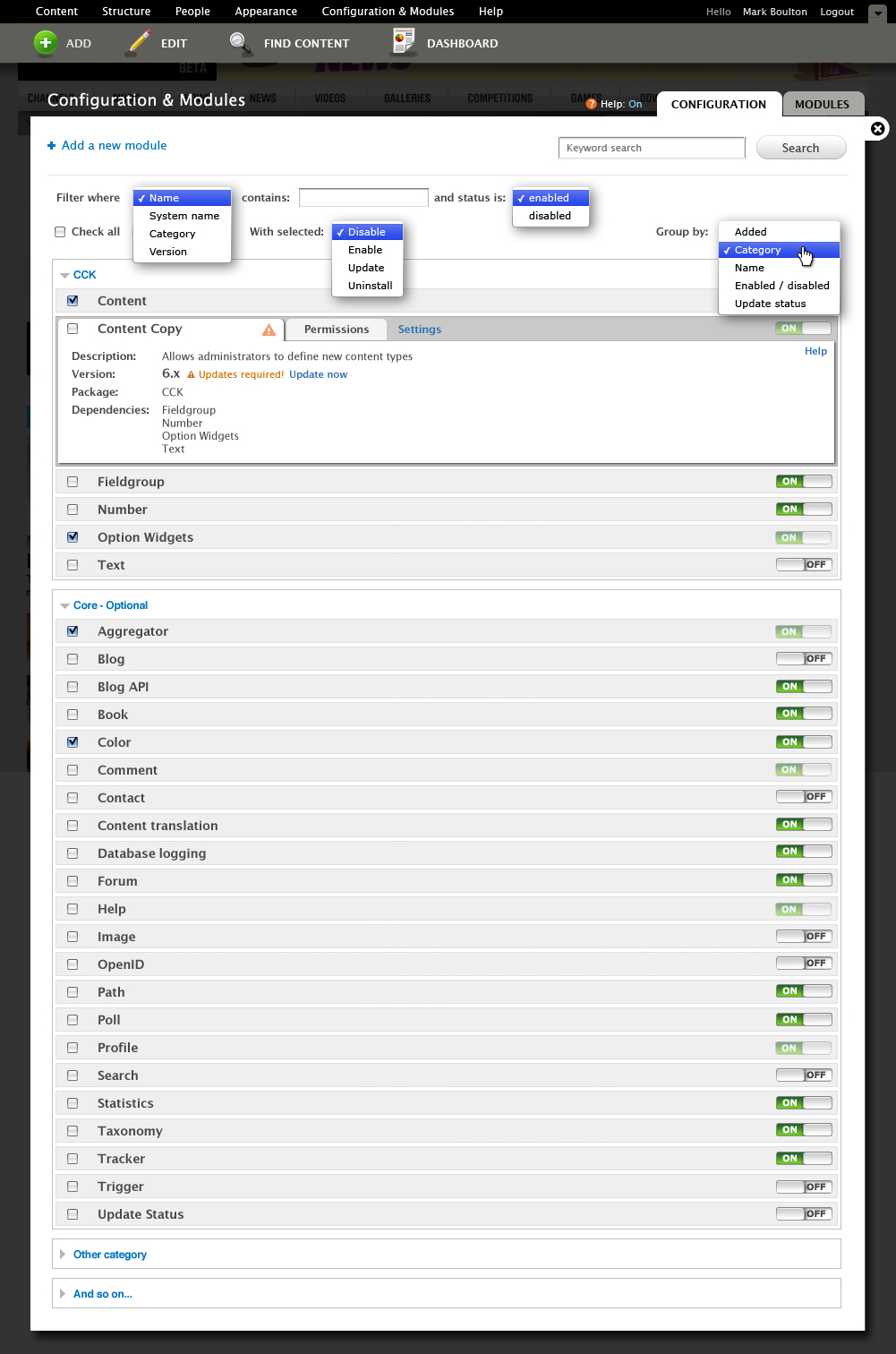
skilip commentedNew mockup. Still not finished but more detailed than the first one. What are we going to do with the dependencies?
Comment #26
skilip commentedUploaded the wrong image
Comment #27
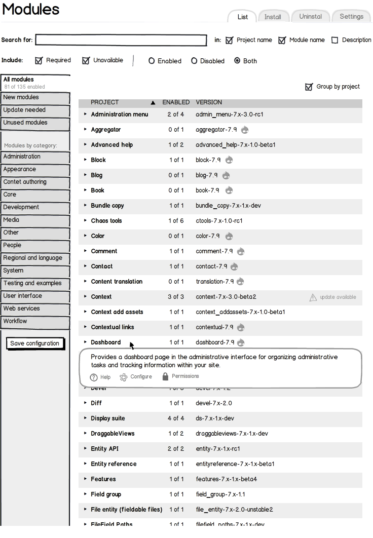
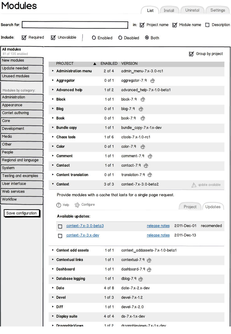
xano- The per-module package information is redundant, because modules are displayed grouped by package anyway.
- Dependencies sounds too much like techbabble to me. What about Requires or Depends on?
- Group by is a display setting. It should therefore not be put on the same line as Check all and With selected, because those are actions.
Comment #28
skilip commentedHere's a part of a conversation I had with Roy and Bojhan in irc about this issue.
[22:27] yoroy: skilip: I miss the three boxes for new, enabled, disabled
[22:28] yoroy: skilip: the tab-like design of the permissions and settings links suggest an inline form, not a link to another page
[22:28] skilip: yoroy: Yeah, I do not agree on prefixed grouping. I totally see the use of having the newly added modules on top, but that's obviously a usercase
[22:29] skilip: yoroy: for the permissions: since we now have an overlay, we have loads of more space available the the Garland mockups
[22:31] yoroy: skilip: So you see the use but don't like it?
[22:31] skilip: yoroy: Can we skype for that? It's a lot of typing
[22:33] skilip: Well, I'll start typing anyway.
[22:34] skilip: First reason I don't like the grouping in Mark's proposal is that you'll end up with groups within groups.
[22:34] • skilip hopes he doesn't have to explain that
[22:35] skilip: Secondly you could end up with modules which belong to one category but are divided between 'Recently added', 'Enabled' and 'Disabled'
[22:35] skilip: And lastly, the flexibility.
[22:37] skilip: For newcomers I assume Mark's proposal suits them well, but for advanced users, like Drupal developers (which is 80% of the users who visit the module page), this surely isn't preferable
[22:38] skilip: For developers, the most important thing is to find the right module(s) an do the administrative tasks required.
[22:38] skilip: And that's not only enabling a module during a site setup!!
[22:39] skilip: So we should ask ourselves: what's the 80% in this case
[22:39] skilip: ?
[22:40] yoroy: I don't see how this would make it harder for devs to find a module?
[22:40] skilip: So they newly installed isn't very helpfull when you're half way your development process
[22:41] skilip: The separation of the categorization
[22:42] yoroy: skilip: ok, I think it'd be good if you past these concerns into the issue
[22:42] skilip: yoroy: you need to be honest, Groups within groups which are divided over several places over the page, does not improve scannability
[22:43] skilip: I'll do that
[22:45] yoroy: skilip: I'm asking what your concerns are right? Implying I'm not being honest isn't really nice
[22:45] • yoroy thinks he prefers findability over scannability
[22:45] skilip: yoroy: I didn't imply that
[22:46] skilip: yoroy: what's the difference?
[22:48] skilip: yoroy: ??
[22:50] Bojhan: skilip: So basicly, what is the diffrence here is - that you imply that you prefer seeing everything over drilling down - visually.
[22:50] yoroy: skilip: scanning suggests eyes dashing all over the screen everytime. findability suggests putting stuff in place that lets you skip stuff, know where to go
[22:50] • skilip is thinking about that
[22:52] skilip: yoroy: So that's why the 'Recently added', 'Enabled' and 'Disabled' groups are born?
[22:53] skilip: So that you find the right modules in the place where you expect them?
[22:53] yoroy: skilip: yep
[22:53] skilip: yoroy: Ah
[22:53] yoroy: you drill down a part of the list, not the whole list all the time
[22:53] skilip: still
[22:54] yoroy: because you very likely do know if it's either on or off
[22:54] • skilip feels sorry for being a pain in the ass
[22:54] skilip: As a developer in a company, I often do not know where I could a module expect to be
[22:55] skilip: And when you visit the module page a week later than adding all required modules, you probably don't either
[22:56] skilip: If you're working in a team, anyone could have added modules
[22:56] skilip: So again, what's the 80%?
[22:56] skilip: Developers, or end users?
[22:57] Bojhan: skilip: We dont diffrentiate between the two
[22:57] Bojhan: skilip: its totally not about that either
[22:57] Bojhan: its about finding a good middleground,
Comment #29
kaakuu commentedIn the above mock-up the two most important parts missing, imho, is that the user (admin or whoever in the team) is not being allowed to make a favorite list, so that he or they can have a quick look at what they wanted when they come back in future or what they need actually to. And the link to module plugin browser.
Not exactly eye-candy, and the typography, spacing, icons, alignment etc need re-dos but in principle this is what I suggested. Please have a relook at http://drupal.org/files/issues/admin-modules-50.gif
( the figure assumes in each box the modules are default sorted alphabetically, that way I do not have to learn or guess 'categories')
This is also the standard way standard admin panels (where lots of or minimal modules are there) are handling things.
Comment #30
kaakuu commentedSlight correction done in the diagram
Comment #31
eigentor commentedO.K. A tweak of skilips version that introduces grouping into New, Enabled and disabled. I like the fact that the "on" switch gives further color coding without being obtrusive. A bit of a problem imho is the large unused space between Name and switch, but the flooded stat tabs that skilip shows give a reason for that. A question to be solved is: how long is a module new? I guess it has to do if it gets enabled, so I believe new modules mostly will be disabled (mirrored in mockup). Should thing about if if makes sense to also take into consiereation if permissions have been set or they have been configured.
Depencencies not yet taken into account.
Comment #32
eigentor commentedJust a different picture for the above post
Comment #33
webchickHot damn, #31 looks really, really nice. I'm assuming that these will all be alphabetized. :P I'm further assuming that modules that come as part of the same download (such as Ubercart, Views, etc.) will expand out and have checkboxes for the sub-modules contained therein. If this is the case, it needs to be visually represented that some of these sections are expandable. I would also love to see what a mock of an expanded section looks like.
I am not sure I understand skilip's argument. I'm a developer with 4 years of Drupal experience and I never know where to find a frigging module once I add it, unless it's one I enable constantly like Views or CCK. And even then, I normally have to resort to cmd+F, because "Views" might be at the bottom, or second from bottom, or 4th from bottom, etc. depending on what other modules are installed. The current interface is a complete nightmare.
This new interface makes it easy. Is it enabled, disabled, or did I just turn it on? Once I ask myself that question, I can find it in no time flat.
Comment #34
skilip commented@kaakuu: Your idea of tagging modules as favorite should definitely be taken into consideration. However it requires even more work, while we're currently stripping as much as we can to get the concept into core before code freeze. (think of how the modules should be tagged. This needs AJAX behaviors, database alterationsm, etc.).
Beside that, your mockup brings up a total new concept. The mockup we're currently discussing has already been widely discussed with Bojhan and yoroy, months before this issue has been opened.
@eigentor: I really like the coloring of the different groups. Only remark / concerns on that would be how to handle a situation where the modules are grouped by category. This will display an undefined number of groups. Should we predefine, say 50 colors?
Making the tiles of disabled modules lighter, is an extra indicator which is IMHO unneeded.
I guess a week is enough for marking a module new. Maybe even shorter.
@webchick: My main concern is having the 'new', 'enabled', 'disabled' grouping, without the possibility of grouping in a different way. It assumes you know which modules are new, or enabled. When working in a team, you're not the only one who can add, disable or enable modules.
Another drawback of this grouping is that we'll need subgrouping. The 'new' group can contain modules categorized under 'views', but so can 'enabled' and 'disabled'.
After thinking about the discussion I had with Roy and Bojhan, I now understand why the groups 'new', 'enabled', 'disabled' narrow down module searching. You only need to look where you'd expect the module to be. Since this primarily targets novice users and developers who are working alone, I think this type of grouping should be default. Beside that I'm thinking of putting both the filter and grouping select list under a collapsed fieldset, named 'Advanced'.
Working on a new mockup......
Comment #35
kaakuu commented@skilip
Cannot we delay the code freeze so that
# there is a solid API or whatever that makes modules that will be old still work in future just like old Paint still works in win XP, new modules will work better but we don't have to discard the olds after 7
# remove half baked things once and for all like http://drupal.org/node/543914#comment-1903512
# it is a developer's game so far and perhaps commercial D's gain but let us have some new or needed features for those who actually use our sites http://drupal.org/node/544474
Was that out of topic? Perhaps. But this module redesign is being just cosmetic and lagging behind in useful "user" ergonomics, other admin panels like cpanel have moved much forwards.
Much thanks for the feedback.
Comment #36
mcrittenden commentedSubscribe.
Comment #37
webchickErm. If Drupal ever starts using CPanel as an example of what to strive for in a user interface, I officially resign. :) I cannot possibly think of a more overbearing and convoluted interface where it is quite literally impossible to do *anything* without cmd+F.
One other thing I notice about #31, which I think is just a mockup glitch, is that the checkboxes for disabled modules are themselves disabled. This would mean you could never enable disabled modules, so let's make sure we don't do that. ;)
@skilip, that's a good point about people enabling modules while working in teams. I still think this is preferable because it gives a maximum of 3 places to search for the module, but there will indeed be times where things are unexpectedly in the wrong places if 2-3 people are monkeying with this page at once. However, I think I'm willing to consider that an edge case at this point, since hopefully you and your team-mates are communicating well enough to understand what each other are doing.
Comment #38
kaakuu commented:) @webchick - I too :) But I meant pick up the good things. The newest cpanel packs the most recent tasks or modules visited in a handy block automatically thus making frequent tasks available easily. It also groups modules in easily scannable and identifiable blocks that can be dragged and reordered. It 'remembers' those without needing to click save. Were you speaking about this new cpanel?
The new Drupal is/was meant to make things easier, isn't it ? Even with these mockups it will still be cmd+F to find out if I suddenly need my module X from a list of 70 modules. A long rigid list to scan plus vast wide horizontal space.
Anyway, I resign from this thread now. Will contribute something useful elsewhere. Thanks.
Comment #39
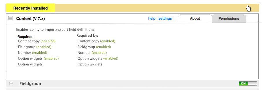
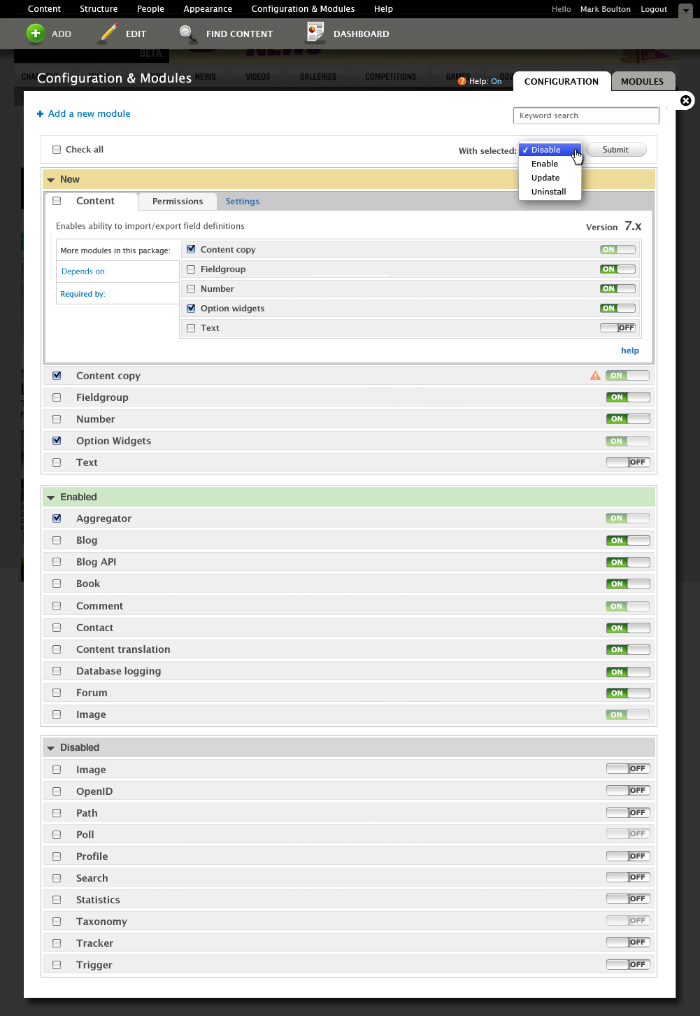
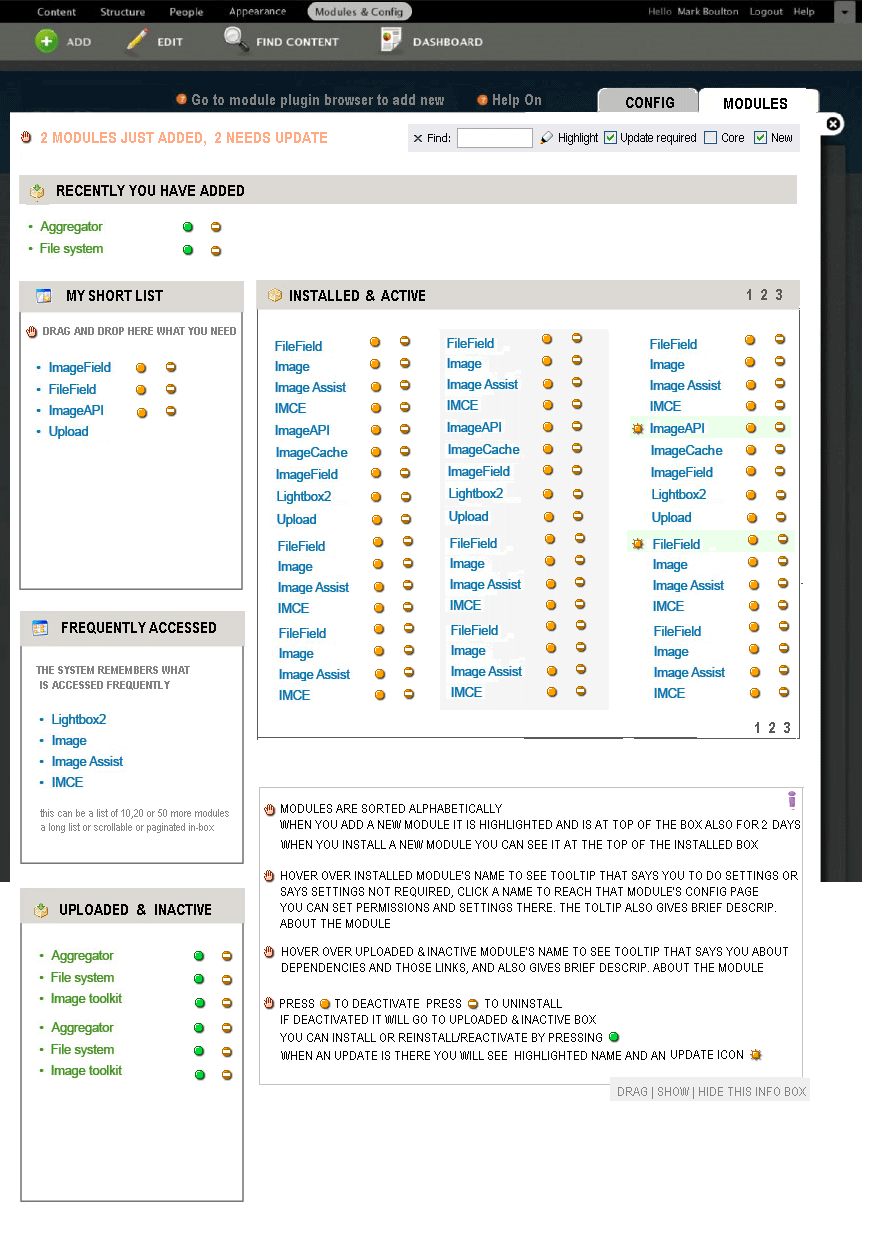
skilip commentedNew mockups. This includes the expanded states of modules, module info and permissions.

Comment #40
skilip commentedI'm also considering dropping the whole filter form. Just having a 'search when you type' would be useful enough.
Comment #41
amc commentedBut if the lists are sorted alphabetically, it'll b.e obvious where it is even in a long list.
Comment #42
skilip commentedOk, here's a new one. Quite near to finished I guess.
Comment #43
skilip commentedComment #44
mcrittenden commentedI love it! One question: is the Keyword search going to be used solely to filter modules on this page, or does it search the rest of the admin section as well? If the former, then we need to fill it with "Filter modules" or something like that instead of Keyword search, and if the latter, then that's just no fun at all :).
Comment #45
jix_ commentedLooks pretty good skilip!
My comments:
Comment #46
xanoI'm not sure about the background colour for disabled modules. It kind of suggests something went wrong there.
Comment #47
jix_ commentedHmm now that you mention it, I agree gray (for example) would be more suitable.
Comment #48
mcrittenden commentedXano: good point, maybe just a light gray?
Comment #49
jrdixey commentedI'm a fairly new Drupalist, so take my comments with a large grain of salt.
This is all very encouraging in terms of where the UI for D7 is headed.
Two thoughts:
1. The Permissions and Settings tabs idea is brilliant! Finding where to set permissions for a new module is always a challenge, and this would even give module developers a place for a small explanation of what the options actually do, in context. Total win.
2. To my eye, a "New" box is not necessary. I don't usually download more than one or two modules at a time. Two boxes, Enabled and Disabled, with a "New" visual flag of some kind on those modules that are new, seems sufficient to me.
Hope this helps.
Comment #50
mcrittenden commented@jrdixey: Glad to see you joining in the discussion...it's important to get the opinions of people who haven't already stared at the Drupal UI everyday for the last 5 years ;)
Re: the New box, I personally think it's a great idea, not only because you automatically want to enable all newly downloaded modules, but also because I tend to download 10-20 modules at the beginning of a site's development, so it'd be really helpful if they were all together. But I might be the exception and not the norm.
That being said, I would be OK with a "Check all new" checkbox right next to the "Check all" checkbox to accomplish the same task. But that would be a step backwards from the mockups IMHO.
Comment #51
mcrittenden commentedUpdated skilip's mockup with gray instead of red.
Comment #52
xanoI like jrdixey's idea. Something like the "new" flag used for nodes, but then for modules? It saves a lot of space (and it's consistent).
Comment #53
skilip commentedHey guys, Thanks for commenting.
Comment #54
yoroy commentedSo I'm seeing at least 3 spin-off issues here that could get actual code written for it:
- create the 3 boxes new, enabled and disabled
- bring permissions and config inline
- make the filters work
If there's no more architectural feedback here (discussing colors isn't) we could go ahead and start work on the implementation.
Skilip: excellent work so far.
Comment #55
eigentor commentedWill join the mockuping party in the weekend.
Some more filtering would not hurt and is easy to implement: by package, by whatever?
I have been using the collapsing feature of Admin Menu for a long time now, and it is a great help. Just when you search for something specific you are lost.
What we should also work on is the dependency thing. Though I like the idea of skilip, it feels a bit redundant.
Ack, the gray for disabled modules has been proposed already... ;)
Another thing we need to check is the settings tab. While I really love the idea: how to handle multi-page settings pages? At the moment module settings pages have real subpages like /admin/build/views/export/ that are used directly for funktionality and have to keep their integrity.
Should work on some real-life mockups that implement modules settings pages into the admin page, It may come out that it is wiser to just keep a link to the settings page here, and put links on the settings pages back to the modules page.
Comment #56
eigentor commentedThat's how my module page has been looking for quite some time. As said, only thing I missed was searchability...
Comment #57
leisareichelt commentedI've just had a look at the module in 'open' state and have put together a little mockup (attached) that I think tidies up the tabs area a little more.
I feel like I need to better understand the use case for the 'Required by' functionality? What are the most likely scenarios of use for this?
Also, would it not be more helpful to have a listing of the modules that the select modules requires? (And the ability to install/enable those required modules?)
I'm going to take a look at some ideas for 'grouped' modules next and interested in your feedback on this.
Comment #58
yoroy commentedLeisa's above:
Comment #59
mcrittenden commentedThe major problem I see from #57 mockup is that it removes the individual checkboxes from the modules within that package, meaning each of those modules has to be broken out as they currently are in 6.x which gets really messy really fast.
That said, I can see a potential problem when grouping all the modules in one package together: in the #42 mockup, there's a master checkbox on the top left of the package, which I assume just enables the Content module, but since it's over the whole package, it sort of seems like that checkbox enables every module in that package. Anybody else?
Leisa: the Required By is useful (for me at least) for determining which modules are preventing me from disabling a certain module. For example, if I want to disable the Comment module, but the checkbox is disabled, you can look at the Required By section to see that this module is required by the Tracker module, which is also enabled, so I need to disable Tracker before I disable Comment.
Comment #60
mcrittenden commentedComment #61
wretched sinner - saved by grace commentedMy view, coming from Mac OS X, is that if I see the switches, I want to be able to enable or disable a module with the switch. If I have switches telling me that they are enabled, but I can't use them to toggle the status, then it seems pointless having them, especially if we already group modules as to whether they are enabled or disabled.
My photoshop skills are non-existant, but I've tried to to piece together my ideas from the bits used above...
Basically, the idea is to replace the checkboxes with space that can indicate new modules. All modules are then in a single, scannable list, and the enabled/disabled status is reflected in the switches. Also, by bringing the switches into the requires/required box, it allows for enabling pre-requisites while looking at a single module.
Obviously to enable the modules via switches, we probably need to use AJAX to process each individual enable/disable in real time, but it would have the advantage of the support queries of a WSOD when PHP times out because someone has enabled all 50 modules they have just uploaded to start creating the site.
Comment #62
skilip commentedI've had a long discussion with Bojhan (in the Thalys on our way to Paris) about the grouping of modules per category. Here's a mockup which shows the idea.

Comment #63
skilip commentedCreated an issue for the slider behavior: #565312: Textfield to slider behavior
Comment #64
skilip commentedComment #65
peterjmag commentedI've been working with Drupal for less than a year, but I'm extremely interested usability in general, so here's my input:
Slider toggles
I agree with #61 in that if sliders are to be displayed at all, they should be fully functional. A couple other things to think about:
--I think that the slider as an additional element (as in #62 and a couple of previous mockups) could be very confusing. I understand that the checkboxes now serve a different function (sort of a bulk operations thing, as opposed to the D6 enabled/disabled state), and while I think that could be a good thing, we need to think about how the user will interpret both of those elements. For example, will the user expect an enabled module to have its checkbox checked (as I do because of D6's behavior)? And what does the user expect to happen when he/she toggles the slider? Should he/she have to click "submit" to save their slider changes, as they do with a checkbox?
--If the slider does indeed become a functional toggle element, should the user drag the slider (a la the iPhone) or simply click on the entire "image" to switch states?
--Would the modules page be the only page to use sliders like this? Would other areas of the Drupal admin interface benefit from that kind of UI element as well?
Grouping
This may be a slightly more contentious issue, but I'm not a fan the New / Enabled / Disabled grouping as a default. It feels like many users would have just as much trouble finding a particular module as they do with the D6 layout; as skilip mentioned in #34, it "assumes you know which modules are new, or enabled," which is not always the case. I think that the user should be given a couple different grouping options, including enabled/disabled status.
I'm not sure if this idea has been proposed/suggested/shot down already, but how about using row background colors to indicate each module's status in a (more or less) ungrouped list, sort of like the status report and available updates pages? I realize that there are obstacles to that (e.g. how many different colors/states should there be? should that include colors indicative not only of enabled/disabled, but for up-to-date/in need of security update/etc as well?), but I think it'd be much easier for the user to see what's happening when he/she glances at the list. Any thoughts, or is this just a bad idea all around?
Expandable fieldsets for each module
I'm on the fence about this. On one hand, I love how much potential it has for cleaning up the list, especially with a large number of modules installed. However, I'm also really turned off by the prospect of being required to expand a fieldset before enabling a submodule. It feels like adding unnecessary clicks to me. Another issue: If a user checks the "Check all" box, how will it be indicated that all checkboxes in collapsed fieldsets have been checked as well? Should all collapsed fieldsets automatically expand to show that?
Including permissions
Awesome! I'd love to see this executed, but does that mean we'll lose the standalone permissions page? Or would it be just another method for sorting existing permissions?
Filter by module name
Also awesome, and very important in my mind. I agree that this should be a "search-as-you-type" field.
Add new module
Someone already asked this question in their mockup notes, but what would this link do? Maybe give the user a quick overview of how the module installation process works? I do think it's a good link to have on the page though, especially for new users that may be confused by the process or may expect to have to make Drupal "aware" of a module being added to the modules folder before installing it (I know I did at first).
Sorry for the somewhat disjointed feedback; just trying to be constructive. I hope it helps!
Comment #66
sutharsan commentedAfter scanning the thread, I evaluated the last design for my 'daily' use as site builder.
* The "Check all" checkbox for all modules on the page has little or no use in combination with "Enable" or "Disable" action. How often do I disable all modules on a site (at upgrade) or enable all modules (never). However a 'Check all' per section (New, Enabled, Disabled) is very usefull and has a clear purpose.
* The section section title "New" confused me. I guess this is meant to be "Recently added (disabled)".
* The upgrade notification triangle could be repeated/placed on the grouping header when the group is collapsed.
For the rest the design is a big improvement compared to existing.
Comment #67
eigentor commentedTo move this issue ahead, I had a talk with skilip and I promised to do clickable prototypes, becaues flat ones won't be enough for this complex and very important page.
But after Drupalcon :P
Just my 2 cents about package grouping inside the "new" "enabled" and "disabled" category.
I plain don't like it.
Reasoning: We want to improve scannability. The three groups is one semantic model, the package grouping is another. If you mix the two, the user is probably confused more than it helps.
Let's keep the grouping seperate and switchable: one grouping by the three big groups, inside them alphabetical, the other one by package and without the three big groups.
As filtering is really not expensive in programming (I guess) why not having a third one that is plain alphabetical without even the three big groups. Especially power users that know exactly what module name they are looking for will like it.
The default clearly will be the enabled, disabled and new.
We should do user testing on the interactive prototypes - for this needs feedback. If anybody wants to join in - will use axure rp for this so we could share files.
Comment #68
amc commentedRegarding #62 I"m not sure how I feel. It seems like the page is getting too busy and scannability is suffering while workflow is not necesarily improving (see #18). I fear the page is becoming more like the mess in #56...
The only upside is that it identifies the core modules. Since upgrading Drupal requires all contrib modules to be disabled, we need some way on the page to identify those. Even better would be a link or button that unchecks the boxes (like http://drupal.org/project/contrib_toggle does). We couldn't really have it recheck boxes after the upgrade unless Drupal somehow saved the state before deactivation.
Comment #69
eigentor commentedHave been working on a prototype for this a bit today. I realized that to do all that we layed out, this would be huge.
Knowing that even smaller changes need quite some discussion and polishing, I'd say Realistically, hardly a chance to get this in as a big chunk since no dev power is left for this issue.
So I propose to break out the most important parts of this into smaller issues that will have a chance to get in, and maybe add up to the bigger one in the end.
Leave it as a proposal for now to get some comments before creating a lot of of issue creep.
I see the following changes as the most important bits, that should be broken out into smaller issues:
1. Search field for full text search
2. Link to module's settings page
3. Description and Depenencies only when clicking the module (flooded state harmonica behaviour). Only show module name and enabled/disabled status by default. Also 2. is not shown.
4. Get the "collapse groups" settings from admin menu into core. This should be right at the top of the modules page
5. Format Dependencies and Description in a more readable way (Lists for dependencies like shown in the mockups)
6. Get the on/off slider in, to make it easier scannable if a module is enabled or disabled
Have I forgotten anything?
I see the list as hierachical, the further down, the less important. The first two alone would mean a huge improvement and man - this should be doable.
Comment #70
mark trappThis might be hashed out elsewhere, but one thing to think about with the sliders is the confusion over whether it's enabled or disabled. In implementing sliders in the past, I've had users ask if it says "on", does that mean it's on, or does that mean if you slide it to the word on, it'll be "on"?
Apple in Mac OS X solved this confusion by putting the labels outside of the slider, so when you push the slider to the word "on", there's no question that the slider is set to the "on" position.
Comment #71
sunCan someone please post a technical summary of this issue (and maintain that summary by subsequently posting revised summaries)?
That summary should NOT contain questions. If any point is unclear, list all possible ways that have been mentioned in this issue to solve the point, but no questions, nor personal opinions. For examples on how to do this, see http://drupal.org/node/8#comment-287088, http://drupal.org/node/8#comment-628434, http://drupal.org/node/8#comment-1178898, and http://drupal.org/node/8#comment-1184066
I'm referring to summaries of that issue, because this one has the potential to be equally challenging.
Comment #72
sunAdditionally, I'd really like to see a flexibility that allows modules like http://drupal.org/project/module_supports to do their job properly. That said - ideally, we put 90% of that module into core (only informational strings, no hard-wired logic), because I've stopped counting the issues requesting to put some "related" info on a project page or the project's handbooks.
Comment #73
eigentor commented@sun: here is my stab at a summary:
Three main goals are targeted by this issue for the modules page:
1. Finding functionality once a module is installed
2. Finding functionallty a while after the module is installed
3. Finding functionality (with no knowledge of modules whatsoever)
4. Finding related tasks for each module (permissions, settings, help)
In the present state of the modules page, there are several issues that prevent these tasks from being easily performed. In the following the measures to be taken are collected behind each issue.
It is not yet decided if the grouping by status and package will be switchable or combined (like shown in http://drupal.org/node/538904#comment-1884088) It is also not decided if there will be more filters.
Comment #74
chx commentedBoth scannability and searchability would be best done by an incremental filter. Ie #396478: Searchable modules page ...
Comment #75
Bojhan commented@chx Agreed, searching this table is a required interaction. It would immediately increase the find ability of any module better. See #229193: Incremental filter for permissions page for how this was done on permissions page.
Comment #76
skilip commented@eigentor: Thanks for the summary! Here's the status for what I know:
Everything marked emphasized is still not sure.
A search as you type box is widely accepted. I've built this behavior and know someone else did as well (forgot his name), so this shouldn't be hard to get into core. Something like a javascript behavior 'tableFilter'.
Comment #77
skilip commented@tha_sun: could you please explain why module_support could improve the current module page?
@chx: I really hope you're not referring to the vertical tabs. This has been proposed before and has been rejected for several reasons.
Comment #78
dries commentedGiven that this was not a Drupal 7 code slush exception, I'm tempted to move this to Drupal 8. I'm happy to revisit that decision if there is Slush time left after we tackled more of the other exceptions. Until then, this is a low priority issue for me. Of course, it doesn't hurt to keep working on this in parallel, but I wanted to manage people's expectations.
Comment #79
silverhosting commenteddarn it, I was looking forward to this in Drupal 7.
Comment #80
luco commentedone thing I really hate in Drupal is the excessive use of collapsible fieldsets. what's so wrong with vertical tabs that doesn't get even worse with them?
the modules page is still hard to scan and more often than not you have to select a series of submodules to achieve what you're supposed to with your design. that's a lot of clicks. and it doesn't get any better with these sliders. their purpose is still unclear to me, except for enhancing carpal tunnel syndrome.
OK, I'm not here only for stone throwing, so... my proposal is:
1) a simple "flying" menu with all the module group titles in it (CCK, Views, Media, User Interface, Other etc). this flying menu would work like the excellent Table of Contents, but with the table headers javascript (that's part of drupal core) to stay with the admin while he/she scrolls down.
2) also a sort of a "check all" feature for module groups. with it, you don't have to check CCK, link, text, filefield, imagefield, node reference etc etc etc. one by one.
what do you think?
Comment #81
eigentor commentedSince the big revamp for this page is not going to happen for D7, let's break out the most important parts.
The search field
#598738: Modules page: add Search box for filtering by module name
and the link to the module's settings page
#598758: Modules page: add link to its settings page for each module
have their own issues now. It would be great if we got those in.
They should not be too hard from a technical aspect.
Comment #82
catchMoving.
Comment #83
Bojhan commentedSorry, not just yet.
Comment #84
int commentedNow?
Comment #85
catchDowngrading all D8 criticals to major per http://drupal.org/node/45111
Comment #86
kiphaas7 commentedsub
Comment #87
yoroy commented#937814: [meta] Smarter UI/API separation for modules says hello.
Comment #88
robloachSlider Toggles...
Comment #89
francis55 commentedI like the idea of favorites.
We could use favorites in other contexts: favorite views, favorite nodes, etc.
As a newbie user of packages like Drupal commons, I know I get submerged by the amount of stuff already in the application, and the items I add on get completely lost in the mass. If there could be a "my favorites" page where I could find links to my modules, nodes, views, blocks, etc, that would be a start to reducing the feeling of being lost in the wilderness.
Comment #90
pillarsdotnet commentedAt the risk of bikeshedding... Would it be possible for the various tabs to be pluggable? For instance, I'd like to write an add-on that allows you to adjust module weights by filtering on a particular hook and drag-and-dropping the list of modules that implement it. It would be nice if I could add that as a tab on the modules page and maybe even re-use some of the search functionality.
Also, per-module configurations could be added as inline per-module tabs in addition to their administrative menu locations.
Comment #91
webchickpillarsdotnet: That's just hook_menu(), no? You can add tabs wherever you'd like.
Comment #92
webchickAlso, this is D8UX at this point. :P
Comment #93
webkenny commentedI have to agree with #88 - Unless we plan on the modules screen only ever showing up on devices which have touch, we should ditch the sliders. No bike-shed here, just pointing out a big +1. (Also, subscribing)
I don't see any fundamental problems with checkboxes as long as there are "normal" interactions for them like you'd find in just about any web application.
Some requirements I can think off of hand:
I see the 2nd covered but we should have ways to deal with ranges.
Comment #94
eigentor commentedI guess the sliders are not the primary part of the layout, but somehow a part that was discussed a lot.
Maybe we get to some fancy Ajax saving that follows the new interaction pattern I know from my Android Device: click an option and it is changed. No need to save.
Still this might be trouble with modules, since this installs database tables.
I guess what philip was after with this was a clear indication if a module is on or off.
In wordpress I think they color the entire row green if it is on. We can sure find a way for that like in other parts of drupal:
How about coloring it green when you check the select, and still having to save. When saved, some part stays green. Does not need to be the entire row, might be too much.
Comment #95
webchickDo we have any evidence that people find it difficult to tell if a module is turned on or off with the checkboxes? I know I certainly have never seen that.
Comment #96
eigentor commentedYou might have a point :)
Finding the module at all and understanding all the crazy submodules and dependencies are a much bigger issue for sure.
So maybe the wretched switch should be put in a solid last place in the queue of problems.
Comment #97
webkenny commentedThe problem with color indicators is you have to also have some "as clear" alternative for those who don't perceive colors that well. For months, I wondered why a colleague of mine couldn't tell when a comment was "private" then I finally asked. He didn't see light colors well (the colors that make up most web apps indicators) - So maybe a larger checkbox is in order. But only slightly. The page is long enough. ;)
Comment #98
luco commented@webchick do I ever miss a comment like yours in discussions like this. it's not over till it's tested! ;D
however, UI-wise, both the checkbox and the ON|OFF switch serve the same purpose: to turn things on and off! so there could, I don't know, be a module for changing checkboxes into switches? :P
@eigentor I've once suggested vertical tabs on the modules page, or at least a menu with anchors. I didn't cause much of a commotion, though.
@webkenny totally. the colour blind are people too.
Comment #99
catchThe main advantage of the switch would be allowing modules to be enabled/disable in-line, we might be able to do that with a checkbox if the interaction is clear though.
Having the interactions inline would allow for one at a time (or one + dependencies) at a time enabling / disabling to be enforced, which would avoid situations like trying to enable all modules at once and getting a big wsod when you hit submit (oh the memories).
Comment #100
luco commentedyes, catch, but when you install a module it creates tables. that would bloat the DB while a user is fidgeting with the modules they want, or even if you happen to switch something on by accident. so you switch it on and off and the tables get created then dropped?
anyhow using both is overkill. I still haven't seen a use case for that.
personally, I think people are waaay too much into their capacitive touch interfaces [tm].
also. it'd be nice if you could check some module and its dependencies get checked automagically. now that would be cool.
Comment #101
arcaneadam commentedI think the use of sliders is really a moot point and something that is really more of a theme level issue anyways. If we can decide on whether or not to enable/disable module on the toggling of a checkbox, then some enterprising JS guru can create a mod/theme that implements toggle slider/buttons that swap out the checkbox. Who know's maybe that functionality could even be built into stark if people like it enough. But the system.module should only implement the ajax and checkboxes and let a theme or contrib module provide that extra cherry on top (IMHO).
I'd also agree with Rob Loach that this should really be broken out into multiple actionable issues.
Comment #102
jstollerSorry to come late to this party, but here are some thoughts, in no particular order...
1) Somewhere in the details provided about each module, we need to list the file name of the module. Or better yet, the file path. At some point during every site's development I go to delete the files for modules which I experimented with, but ultimately didn't use. Unfortunately, in many cases it is not very obvious which files go with which modules. Especially when you have several similar modules that you are testing.
2) I like the idea of color-coded row backgrounds. Namely making the rows for enabled modules green and disabled modules gray. The one thing I'd add to that is a different color for modules that were once installed, but then disabled and not yet uninstalled. These colors should of course be checked by someone who's colorblind, to make sure they're differentiated enough. And I wouldn't rely on color coding alone. Each row should also have some text and/or icons that indicate its status.
3) I agree that the sliders may be unnecessarily problematic and, in combination with the checkboxes, could cause confusion. I've been around for awhile and when I first started looking at the mockups on this issue, I was confused about the disconnect between which modules were checked and which modules had their sliders set to "on". Given this and many other slider issues which have been raised here, my vote is no sliders. Other elements (see 2) could be used to indicate status.
I recognize that removing the sliders and returning to the checkbox as the mechanism for enabling/disabling modules does make the idea of bulk actions difficult to implement. Obviously you can't have one checkbox both signify which modules are enabled and allow you to select modules for bulk actions. I have two possible solutions to this. First, the checkbox could be used solely for selecting modules to be the subject of bulk actions. As long as the current status of those modules is clearly indicted with color-coding/text/icons, it should work just fine. This brings the benefit of bulk actions and is similar to other parts of Drupal, but only one type of action can be done at a time. Another option would be to keep the enable/disable checkboxes similar to how they are now, but add an "Actions" tab when you open a module's details. This would contain additional checkboxes for Update, Uninstall and anything else which might be appropriate. This could be a nice productivity boost—allowing users to string together a whole host of actions in one form submission—but it also could bring problems of its own.
4) Disabling the checkboxes for modules with dependency issues is just annoying. This has been a long standing frustration of mine. I don't want to load a page five times just to disable all the modules I need to disable. If you really want to disable those checkboxes, then there should be a Java Script that enables them dynamically based on the other modules a user selects or unselects in the interface. Of course that seems really complicated to me. A better solution might be keep all checkboxes enabled, but put little warning icons next to them if the module either requires modules that are not yet enabled or is required by modules that have not been disabled. Then, when the form is submitted, Drupal can ask the user if they wish to automatically enable/disable these other modules, assuming they haven't already accounted for that in their other module selections.
5) The new/enabled/disabled organization scheme is great, but to be honest I don't think I'd use it as often as category organization, or even just an alphabetical list. There should be an easy way to switch between these displays and the selection should be remembered between visits to the modules page. At least for the length of the session, if not saved as a user preference.
6) If I've been following this correctly, we're not talking about a "text search box", but rather an as-you-type "title filter field". Much like what the Module Filter module now offers. This seems like an important distinction to me and I want to make sure it stays clear. Also, it's not absolutely necessary, but auto-complete might be nice in this filter field.
7) Right now I appreciate the vertical tabs I get from the Module Filter module which let me quickly isolate one category in the module list. I understand people don't want to use vertical tabs here, which is fine, but there should be a quick and easy way to filter down to one category. A drop-down select list seems the likely candidate. This should work in conjunction with the title filter and should be available in all display modes.
8) As has been pointed out by others, there seems to be a lot of unused space in each row of the table. Why not bring back a little bit more information. Sure, descriptions would be too long, but at the very least we should be able to include the version of each module. You could probably fit the file name as well, with room to spare. Something like:
This would definitely help scannability. Often I just want to check what version of something I have installed.
9) A reinstall option in the bulk actions drop-down might be nice.
10) The "Permissions" tab in the detail view of each module is a very nice touch, but you should be prepared to deal with sites that have a lot of roles, as well as modules with lots of permissions. I don't think either of those are really edge cases.
11) Looking at the module detail view, as shown in #43, it would be nice if each vertical tab indicated how many items it contained.
12) If we're providing an "Update" action for modules, then there should be a section in the detail view (maybe another vertical tab) which shows all the applicable versions of the module and gives users the option of choosing which one would be installed. Perhaps they want to upgrade to a beta or dev version.
Comment #103
xanoWe could use PHP to disable a module's dependents, just as we enable a module's dependencies.
Comment #104
luco commented@jstoller I agree with pretty much everything, especially the dropdown in (7).
users select which module group they want to enable modules in, and the group shows up. the rest doesn't matter, so it's taken out of the way. as an added bonus, that gargantuan scroll is minced.
that's pure UI gold. :]
Comment #105
quicksketchI'm moving this to a feature request, since our new policy adopted in http://drupal.org/node/1201874 puts a cap on all major/critical bugs/tasks. There are many other features just as worthy as this one; we shouldn't prevent them from moving forward just because this is categorized as a task instead of a feature.
Comment #106
yoroy commentedConsidering the awful performance of this page in usability testing and it's relative importance to using Drupal succesfully this issue is more of a bug than a task even. Downgrading this to a feature request comes across as ignoring that problem imo.
Comment #107
catchYeah I'm moving this back to a task for now, there is plenty of bad code around the modules page, #820054: Add support for recommends[] and fix install profile dependency special casing and #943772: field_delete_field() and others fail for inactive fields for example - so this is something that needs refactoring both at the API and UX level, and they will need to be done in concert to at least some extent (the field critical adds a new concept to the Modules UI that it's not really built for, for example).
Comment #108
quicksketchUgh, well I look forward to this being fixed in the next 6 months so I can get in my first feature patch in 2012. :P
Comment #109
robloachHaving the Batch API on there would be super duper helpful.
Comment #110
robloachIn case you missed it, How to fix the modules page, by Earl Miles. He makes a few points:
Comment #111
eigentor commentedWe had one thing during the last iteration that could help especially Drupal Newbies a lot: Sort newly uploaded Modules to the top (or assign a category to them when they have just been uploaded). Maybe they shold be color-coded as well. "Just uploaded" or whatever the category can be named.
This way somebody who uploads a new module and wants to enable it, never has to scroll through the big table of desaster, but easily finds them at the top. Might be a bit tricky technically, but solve the biggest problem.
As more people get used to Drupal, the more they will be willing to search on modules page. But especially the brandnew ones need help not to be apalled and confused. So for them this would help a lot.
Comment #112
klonosI personally don't agree with all of Earl Miles suggestions (or for some I simply fail to see how much they'd improve things - if at all), but I surely like to see these implemented:
1. Filtering and sorting (currently I use Module filter to achieve this).
2. Modules' update status indication right there on the modules' page.
Since this is about redesigning the modules' page, I am also cross posting my suggestion in #857090: D8 Modules' page: Add links to module help, project page + merge operations links to one cell.:
3. Move the operations links to a single table cell. Please see how table widths are messed up and inconsistent in narrow themes (like the core bartik) and how much more clean it looks when the extra links are rendered in a single cell.
Comment #113
klonos..oh I forgot to mention:
4. Enabling/disabling without page refresh (à la Views 3).
Comment #114
droplet commentedmodule page missing some important info / features:
1. When a module is missing, it display shortname (machine/code name). It hard to find out the module if that is a sub module
2. Missing a way to Delete modules from harddisk
3. Missing an automatically way to download missing modules
sub +1
Comment #115
klonosReading this issue from start one sees a lot of mockups (probably outdated/obsolete now) and there's no way to actually know where we stand right now since this stared back in August 2009 as a D7 issue. We need an up to date summary with currently decided/chosen battle plan or perhaps just ditch this one and start afresh.
Comment #116
klonos...breaking it down to smaller issues would help too.
Cross-referencing #913712: Improve modules page table poor layout.
Comment #117
bfroehle commented~
Comment #118
eigentor commentedI guess just starting afresh with new Mockups with some Explanation would be just fine.
Having worked some with Balsamiq recently I'd say the balsamiq level of detail is enough for these mockups, which saves time.
http://www.thewebmadeeasy.com/AtomsNetwork/Files/238/basalmiq2.png
Comment #119
droplet commentedsomeone able to update Issue Summary ? Thanks.
Comment #120
klonosI'd be willing to spend some time to do that, if only I knew what was finally decided. I mean, from reading the whole issue, I can see various mockups and ideas thrown here and there (most of them badly outdated too), but no fix on a specific target.
As for updated mockups, I guess at least for the search/filtering feature that seems to be widely requested/desired, you can try the combination of Module filter and Instant filter as I've already suggested back in #112 for a live, working demo ;)
I personally prefer the forked project Module filter NG instead of the original Module filter because:
- it implements #1023252: UI should utilize Drupal 7 core more - new 7.x-2.x branch?
- it is actively maintained/updated in tandem with Instant filter (same maintainer).
- it implements my suggestion to merge operations in a single cell for a cleaner table layout.
Comment #121
Bojhan commented@klonos Nothing has been decided yet from a UX perspective, other than it being neccairy to have a search function. I'd say thats one of the first things we need to get in and is currently lacking activity over at #396478: Searchable modules page
Comment #122
bleen commentedsubscribing
Comment #123
robloachRelated: #1291592: D8UX: Batch API for the Modules page
Comment #124
xjm#119: Most contributors can't edit the summary because of the input format used. If someone could swap the input format now that anyone can post images, then we can add a summary. :)
Edit: the issue summary is now Filtered HTML.
Comment #125
mannos commentedSeconding yoroy's comments about sorting. Enabled vs. not, at the very least. After installing a new module it can be a pain to find it, though Mark Boulton's 7.x Seven theme has made it much less stressful on the eyes. A toggle for sorting by install date would be useful for enabled modules (and if applied across the board as opposed to filtering on enabled modules, would inherently implement enabled vs. not... to some degree).
Comment #126
eigentor commentedHow about using module_filter as a solid starting point.
We have started to use it on every site we create and never want to go back to default
http://drupal.org/project/module_filter
It has a lot of good ideas, even stole the +1 idea from Wordpress to indicate where a new module is installed. It is basically lacking only some things:
Maybe the module author greenSkin wants to join in here?
Comment #127
greenskin commentedLet me begin by first explaining a little of Module Filter's evolution.
Back in '08 I became overly annoyed with trying to find the module I was looking for and thus spawned Module Filter. At that time Module Filter only offered the ability to filter, no tabs or other UX tweaks. Eventually I dug deeper into improving the modules page (at least improvement in my own eyes) by implementing tabs instead of fieldsets (the tabs look was inspired by Views 2) and the addition of an "All" tab. This required Module Filter to override the theming of the page, partly to get rid of the fieldsets and partly to alphabetize the projects (modules). The "All" tab allowed the end user to filter over everything and to present everything in alphabetical order rather than alphabetical only within the package. Switching to a tab acts like a filter in of itself, filtering modules based on a package. I eventually added things like the +1/-1 count and their associated row colorings, the additional filtering checkboxes (a feature request), the count shown just below the title of the active tab of the number of enabled modules out of the total available modules for that tab, and the ability to keep the save configuration button accessible when scrolling.
Several have asked that Module Filter's tabs would utilize the work done by Vertical Tabs. I recall when I was first implementing the tabs view that Vertical Tabs was being developed. At a point I had pondered requiring Vertical Tabs for the tabs implementation but decided against it for Drupal 6 as I didn't want the module to be dependent on another. As for Drupal 7 I have not been convinced to switch probably solely on the lack of being able to display an "All" listing in alphabetical order without some major JavaScript magic.
Now comes the Drupal 7 2.x branch. Thanks to some spurring from both @klonos and @Kiphaas7 I begun an almost rewrite of the module, cleaning the code, making the tabs look a little more like Drupal 7's integrated vertical tabs, and improved performance. The improvements, though, have not stopped there, and is partly the reason 2.x is still only available as a dev release. The following, and what is more in context to this issue thread, are further additions made to the 2.x branch of Module Filter.
Not shown in any of the screenshots is the use of URL query strings. Basically URL query strings can be used to default the filter input and checkboxes. Currently the implementation is only half-baked, the URL queries can be entered by hand but not yet programmatically. This spawned from the desire to remember what filter criteria was set (including what tab was selected) when the form was submitted and to re-apply them. By using URL query strings the modules page becomes much more friendly via links. For example, module's help text (hook_help or perhaps advanced_help module) could link to the modules page and pre-define relevant criteria.
I hope this helps to prove at least that the core modules page does in fact leave a lot to be desired. I am glad to see it is a priority to Drupal 8. And thank you @eigentor for bringing me in to this thread.
Comment #128
yoroy commentedAwesome write-up, thanks! One question that immediately came to mind was regarding your point 3: how to select no tab after you did select one? I'll have to play around with the module a bit.
This also shows that Ubercart is a very bad boy :)
Comment #129
greenskin commentedAhh, yes, excuse my forgetfulness. Selecting the active tab would deselect it. I've edited the post to include this point.
Comment #130
klonosWow James! Thanx for taking the time to explain all the progress made in the 2.x branch. Perhaps you need to edit those img tags and reduce the screenshots' width so they fit nicely in smaller screens though ;)
I kinda stopped following the progress of Module Filter around September 15th (that is the last 7.x-2.x-dev I have downloaded) because I switched to using Kiphaas7's fork instead: Module filter NG (NG stands for "New Generation"). The main two differences of this fork to your original module that made me decide the switch were that:
a) it takes advantage of Instant filter (that I think should be in core btw). Instant filter implements a generic filter API (re)usable by other pages than just the modules pages like the users, content, admin/config and reports/updates pages. There are feature requests filed in order to also implement it in the permissions & reports/dblog pages - perhaps other pages could benefit too:
#793478: Add instantfilter to permissions configuration form
#1342072: Add Instant filter to the "Recent log messages" (admin/reports/dblog) page
b) it implements #1023252: UI should utilize Drupal 7 core more - new 7.x-2.x branch? and uses core as much as possible (core vertical tabs for example).
c) it implemented feature 2 shown in the 1st screenshot at post #127 (your module -the 1.x branch- didn't do that back then). #857090: D8 Modules' page: Add links to module help, project page + merge operations links to one cell. is the related issue filed against core.
Can you please update on whether you decided to or have already implemented any of a or b above in the 2.x branch??
Comment #131
yoroy commentedMind you, right now I think this discussion is better served with a clear definition of the different *problems* we want to solve on the module page. It's tempting to start discussing this in terms of which parts of which existing contrib module should be moved to core. There's value in that, but we need to be able to discuss this based on user goals first.
This is not to discourage the discussion here, just pointing out what needs to be done to be able to move this forward. At 130 comments in we need to step back, regroup and outline the high-level objectives and create some better-scoped follow-up issues.
Comment #73 has a good start for the summary we need. Anyone up to editing the original post on top and add an updated version of #73 there?
Again, thanks for all the input & do continue :)
Comment #132
aspilicious commentedHmm I always disliked the table inside a vertical tab idea. I think it's better to move tables and stuff outside the vertical tabs.
Here is a screenshot to show what I mean. I just cut pasted a few things around.
And now we should do what yoroy says in 131 ;)
After defining our goals I would brake up the patch in several sub tasks.
The filter for example can be added afterwards. (if we choose to use a filter)
Comment #133
xjmPersonally I would hate the vertical tabs, because they'd prevent me from searching/scanning on the page for the module I wanted to enable, and I'd have to effing click around looking for it.
Edit: Alright, aspilicious tells me that if you click a tab a second time, it disables it and shows the full list. (?) Doesn't seem intuitive to me, but I guess maybe the mockups don't convey everything.
Comment #134
bleen commentedxjm: in addition to aspilicious' clarification, note that when you first get to the page all the modules are listed by default and you can scan all you want. IMO this makes the less-than-intuitive nature of clicking a tab a second time, much less important since that is the default view a user sees
Comment #135
jstollerClick-to-deselect, while a welcome new feature, still seems unnecessarily unintuitive to me. I prefer to see the "All modules" tab come back.
Comment #136
klonos@aspilicious, #132: having the table header as shown in your screenshot/mockup (on top of/outside the tabs) is kinda WTF for me UI-wise (and plain ugly if we count personal opinions here). It seems as if the categories tabs are actually some badly aligned cells or messed up rows. Most users (at least Windows apps/UI accustomed people) would expect different behavior from such a UI design. Tabs are there to group together a set of things. They don't need a header (IMO) and that goes for all vertical tabs used across all Drupal UI too - not only those that contain tables. It's simply a matter of consistency.
I could live with the table headings being on top of the vertical tabs set, but we should definitely not add a "Category" heading for the tabs. On the other hand... if we don't, then why bother moving the table headings outside the tab?
@xjm, #133:
When you say "searching/scanning" here, do you mean "looking"/"scrolling" at the whole of the page and "manually" looking for the desired module? I'm asking simply because the actual "searching" (as in "filtering" - not "looking") I believe is well taken care of by the filter thing: simply start typing a few keystrokes! I'm sure you'll agree that this is way more effective then one trying to "manually" locate things.
Comment #136.0
klonosUpdated issue summary.
Comment #136.1
eigentor commentedUpdated Issue Summary
Comment #137
eigentor commentedI had another stab at the issue summary, which thanks to the Project module improvements is now in the start post.
Feel free to improve on it.
Maybe we should listen to Yoroy and try to sort out the problems that have to be solved and take a step back from implementation details.
This issue is so big that probably it needs sub-issues later anyway.
I'd say this one can only serve as a meta issue, and in that, let's go meta :)
Comment #138
klonosYes, we shouldn't get too exited and kill any kittens at all on our way trying to solve this one. Thomas did a great job updating the issue summary (thanx), lets now define the problems and break this down to smaller issues. Shall we?...
I was thinking to perhaps start by trying to solve the searching/filtering thing, since this would be a major UX improvement. As I previously said back in #130, I strongly believe that we should focus on using some sort of a generic API for form filtering so that we can re-use it in other forms all around the UI as well. The Instant filter contrib project is already doing a great job in doing that. I think that besides the standard filter field it also provides the ability to use sets of checkboxes in order to filter things by certain pre-defined properties.
Then we can move to solving the grouping thing. It is generally agreed that the modules' page tents to get bulkier as more and more modules are added to any installation. The way we have it now is a major UX put-off for any site admin going through that page. This makes common tasks a really tedious job. We seem to agree that taking advantage of the core vertical tabs is the most preferred way to solve this.
These are IMO the two major things that should be broken to two separate issues. Once we get these in (or in parallel - but definitely in separate issues), we can add in all the smart ideas like...
- the easily accessible & always-in-view, sticky "Save configuration button",
- the merging of the actions links, so they don't take that much space for no obvious reason
- all the nice visual "goodies" like the indicator numbers & module names on the tabs etc
- ...
Comment #140
klonos...so? Do we agree on:
a) making this a meta-issue (it kinda already is)
b) filing a new issue about having a generic, reusable form searching/filtering API in core
c) filing a new issue for implementing the searching/filtering API in the /admin/modules page (for other admin pages we create separate issues)
d) filing a new issue for implementing (better) grouping in the /admin/modules page by using core vertical tabs
e) filing separate issues for implementing each smart UI improvement we already came up or might come up with in the future
Comment #141
greenskin commentedI do think the addition of Instant Filter, or some variant, into core should be a high priority as it would ease use of several pages and who knows how many contrib modules. That being said, I do think that the filtering should take a back seat. I think we need to settle on where we need to go first. Let a separate issue of adding a core "instant filter" take care of the filtering, possibly then later coming back here to include specific filter rules and such. Especially for graceful JavaScript degradation.
Considering graceful JavaScript degradation, I think we need to use a construct of form inputs for filtering the list. Though when JavaScript is available I think we should lend the filtering to core's instant filter.
I like the idea of three groups (new, enabled, and disabled) but I wonder if it could be problematic at the same time. For example, say I'm looking for the Entity Tokens module and I'm not sure if it is new, enabled, or disabled. To make matters worse I have JavaScript disabled so I have to either use the browsers find feature (which we all know is a nuisance) or I have to look through each of the three groups. I think it would be simpler to just keep everything together, alphabetically, and let the filter do the work. Or perhaps even better, provide a toggle where the modules are all in one group or split into three.
If elected to go with using the three groups, I think tabs should definitely be dropped and rely on the filter for reducing the list(s) to modules in selected categories.
I'm a little wary about the batch processing, but other than that I'm liking where this is going.
Comment #142
eigentor commentedWhile looking into no-Javascript fallbacks I think it is a secure street to assume that 98%+ of users have it enabled. Javascript in itself becomes more important as Drupal has a strong emphasis of accessibility. But I do not think we need to think first of the possibility of disabled Javascript.
Think of it, provide a decent fallback, but start with and concentrate on the 98% I'd say ;)
Yes, grouping is no easy one. Maybe it is a good idea to think of probable and common use cases building on the personas? Who would be looking for the entity module and how could they find it.
If there is an "All modules" view, I'd think this should be alphabetical. The current grouping by packages does help the more experienced users at best.
You will always provide a default grouping whatever options you provide, and the default better be the one that suits everyone best :)
But the discussion can get stuck easily on that. Maybe that would be best a spin-off issue "Grouping options for improved modules page"?
Comment #143
yoroy commentedThanks for the summary eigentor!
Sun outlines some todo's in http://drupal.org/node/396478#comment-5093082, including this yet to be opened issue:
#396478: Searchable modules page and
#229193: Incremental filter for permissions page, too.
Also, less words, more sketches in here :) There's older issues here and discussions on g.d.o/usability with other ideas. Research and collect these ideas and images will also be full of win.
Comment #144
jstollerHere are some visuals, as requested.
First, I moved the filtering out of the vertical tabs. These filters will apply no matter which tab the user is on and should persist as the user navigates from tab to tab.
I created two clusters of vertical tabs, to allow for different modes of searching and increase "findability" of modules. The first cluster includes the default "All modules" tab, as well as easy access to viewing just newly installed modules, enabled modules, or disabled modules. Below that are the familiar category tabs.
In order to improve "scannability" I drastically reduced the information provided in each row. I propose that when scanning over the table, the important information is:
Descriptions and required modules are important, but they contain too much text and inhibit scannability, so I've moved them lower in the hierarchy. Clicking on the module name or disclosure triangle will reveal details about that module (see "Context" in the image below). This includes the module description, any available actions and lists of other required/dependent modules. It also includes a list of available updates to this module. From here, the user can enable/disable any dependent modules, or pick an update to instal.
By default these lists will be in alphabetical order by module name. However, I envision that click-sorting can be used to sort them by project name as well. Also, all the tabs in the top tab cluster have a "Group by category" checkbox. Checking this will still list all the modules, but will group them by category (see image below). I thought about permitting the categories to be collapsed, as they are now, but decided that the category tabs negated that need.
The category tabs work as you would expect. And of course, these tabs don't require the "Group by category" checkbox.
Thoughts?
Comment #145
bleen commentedre #145:
Comment #146
eigentor commentedJstoller:
This is an awesome start!
Can we have a public decision somehow to use only tools like Balsamiq for Sketches in that first stages? That rocks in being quick and getting away from eye-candy in the early stages...
What I like especially is: The Order of the tabs from top to down.
Someone that is completely new to Drupal probably won't care at all about the lower tabs. He will only care for "New modules". The first time he really actively uses this page, he will have installed his first module. So he clicks "New modules", which is very near to the top.
One might emphasize this more by color: making the "beginners tabs" more high-contrast.
In the bottom, we could provide basically a myriad of filtering/grouping options. Only limit would be to not let the list get to long.
The trick is: Only more advanced people would use them at all. Only limit would be to let the list not get too long and intimidating.
It might even make sense to make the bottom part swappable by package/by module. I think tha actual module filter module uses by module, while you have used current drupal's by package grouping. Maybe this makes sense for some people, so there could be a switch for the bottom part to have the tabs by module or by package.Forget this part. Better decide for one :)
Would you mind sharing your balsamiq files? I startet to re-build your mockups again, but isn't that a waste of time...
Comment #147
jstollerI've attached my Balsamiq file, for those who are interested. It distracted me from getting any "real work" done today, so I'm glad to know it's useful. :-)
@bleen18:
@eigentor:
I wouldn't get too caught up in thinking of any of the tabs as for beginners or advanced users. I would have appreciated the category tabs, even as a beginner, and I'd appreciate the "New modules" tab now, even being strong in the ways of the Drupal.
Color coding is something I considered and still think would be an excellent idea. I just thought the drawing would be more effective in black & white at this point. I don't think it would be appropriate for tabs though. I'm more interested in using color to code the rows of the list. For instance, we could do something like...
All these details can be worked out later though. For now let's stick to big ideas.
Comment #148
greenskin commented+1 for #144 – Good job jstoller!
I'm a little curious how the "requires" and "required by" checkboxes will be processed. Duplicate checkboxes can be a nuisance to deal with. I know it can be done but perhaps there's an easy solution I'm not familiar with. Or perhaps instead of these being checkboxes, a checkmark image is shown for the ones enabled or being enabled. Maybe the name of the "required by" or "requires" module links to it's module listing somehow. Similar thing for the dependent updates.
Comment #149
greenskin commentedTo the question bleen18 raised in #145 concerning how do we know what a "new" module is. I'd gander Drupal should glean a timestamp from the .info file for each module of when it was added/updated as jstoller describes in #147 and add this to the {systems} table so other modules can use it if ever there is another need for it. One of the many sub-issues to be created of course. :)
Comment #150
bleen commentedSo I did some VERY informal, VERY unscientific usability testing with my VERY non-technical wife and she scored really well with this design! My questions included:
Q. How would you turn on a module?
A. Click the "all modules" tab and then click the checkbox
Q. How would you turn off a module?
A. Click the "all modules" tab and then click the checkbox
Q. What do you think happens if I click the "statistics" tab on the left
A. It shows me a page of modules that show statistics.
Q. How would you find info on the "foobar" module?
A. She asked if there was a "foobar" tab on the left, and I said no, so she said she would type in the search box at the top of the table (note: she did not notice the arrow on the left - I had to show it to her)
Q. (showing the design with module detail) What do each of these options do?
A. The "help, Config, perms" links were obvious. The requires & required by lists were clear, but the meaning of the checkbox wasnt. Available updates made sense too. She assumes if you click the checkbox it will update the module.
Based on this unscientific study I would say that the proposed design is extremely successful. I suspect that even the areas that were not totally clear (like the arrow on the left) would be much more clear once the design is fleshed out.
Cant wait to start working on this ... :)
Comment #151
yoroy commentedThanks for the report, good job getting some unexperienced eyes on this.
How would dependencies be handled in this design?
Comment #152
klonosPerfect!!! Thank you for all your hard work and time spent on this excellent write-up Jeremy. If we all agree that these mockups put together all the fundamental ideas discussed here (and elsewhere), lets then break this down to smaller issues and start implementing one feature at a time. Shall we?? Yes, details (such as coloring and filter list drop-down contents) can be worked on later on with successive issues. Two questions though...
Do we re-invent the wheel with filtering, or simply work to get Instant filter in core as a reusable API and then use that?
Are core vertical tabs able to do all we want? If not, do we file issues against vtabs in core or we do custom-coding?
I'm asking because I think we'll have more chances to get things accepted if we depend on core features. If we don't, then I think that at some point we'll be eventually shown the contrib door (i.e. Module Filter/Module filter NG) ...which btw is fine with me - I already use Admin menu instead of the core toolbar like most people I guess.
Comment #153
klonos...btw, while I was at sf, I noticed this nice feature when filtering bugs. Just posting a screenie here so it doesn't get lost.
Comment #154
yoroy commented@klonos: #143 has links to already existing issues for live filtering on admin pages
Comment #155
bleen commentedre: #152
I think we would be much beter off working to get Instant filter in core
I *think* they should be fine ... if we find that we need to tweak, I would say we worry about that when we get there in the "Ok we decided on a direction, lets build the v-tabs for module admin page" issue
That all said, it seems to me that we have 2 issues to open here:
Comment #156
eigentor commentedWell, it is not for certain that vertical tabs are the way to go.
While they work well in module filter, there may be other concepts for filters that have not yet been explored.
That is what focussing on the problem instead of jumping to solutionls means. Of course, someone would have to post mockups with possible solutions.
Personally I like the tabs as they may be a goable solution.
But I know also I hated them first in module filter and always switched them off for the interface feels more cluttered with so many vertical tabs. In Core's UI Guide I think we have a rule that if you have to many items inside vertical tabs, you should not use them as scannability gets lost.
I find it a bit disctracting to have a second long list besides the already long module list.
So what options could we have to offer filtering?
- do horizontal tabs
- hide parts of the vertical tabs behind a "more filters" option to only show on demand
- offer more options for the search field and center everything around the search field
Again, it might help to research what the general main problems are with the module page for beginners and advanced users - which will be different.
Offering a lot of filtering options is good. But if the options are overwhelming and people do not dare to click somewhere but leave the page in panic you win nothing.
This will be less the case for advanced users. But users not so used to the available-option-overkill in general Drupal will probably be.
Yet it has been decided I think (has it?) to concentrate the UX Efforts for D8 more on the Side Admin kind of Persona instead of the content creator.
What has not been decided if these Administrators shall be Administrators rather new to Drupal or if it shall be more the power users.
Comment #157
xanoThis is something I have seen on a very big Dutch tech site. All filters are checkboxes on the left, even packages/categories. This would allow users to view modules from different packages at once, but it would make the 'single package view' require two clicks instead of just one.

Comment #158
Bojhan commentedActually, I find that a very interesting approach. However I really question the use of enabling one to several categories?
Comment #159
klonos@eigentor, #156: While I understand (some of) your concerns Thomas, -when it comes to vtabs- you do need to keep in mind the following:
- the use of vtabs was "decided" mainly because they are in core and because that's what we used when we needed to address the same issue (group/organize a very long list of things that grows as people install more modules) for the content edit form in D7. In other words the main reasons were keeping UI consistency and reusing existing code that does what we're after (as opposed to figuring out a solution that required custom-coding something from scratch).
- the "decision" might seem as if it was a bit rushed (without any actual UX studies etc), but if you consider the success vtabs had with providing sanity in content edit forms, one foresees how they could help with the modules page too.
- one can actually see all that in action if they install either Module Filter or Module filter NG.
- we might have not actually gone through any extensive UX study specifically for this before implementing it, but we did have a wide acceptance of its use (a lot of contrib modules use them in their UI - views for one) and great feedback regarding its usefulness on content edit forms.
@Xano, #157: very intuitive design indeed Bart. I think this implements some kind of solr search type of filtering, but if you give it some more thought, it's not that different from the instant_filter approach:
- instead of having to click on specific tabs, you now have to click on specific checkboxes
- instead of having to click on a "All modules" tab, you would now have a "select/deselect all" checkbox
- they'd both take about the same vertical and horizontal space
- they'd both show the number of current tab/category results (solr search does that)
...most importantly:
- I *think* that solr search type of filtering can also be reused in other admin forms. So we'll benefit in other ways in the future - same if we used instant_filter.
The only advantage I see when using the solr search filtering is that one will be able to filter/select multiple categories at the same time. Don't know how useful that might prove to be, but it is an extra bonus to the features indeed.
Can we implement selected vs total of results in solr? If not, then count that to the cons. Also on the cons: solr searching requires special setup on the server side, while instant_filter not.
Personally, I don't mind which way we go and where we place the widgets as long as we are able to implement all (or at least the most important of) the features we have talked about in this issue. I'm prepared to get accustomed to whichever design, so long as it makes my life easier and every day drupal administration a less tedious task.
Comment #160
webchickFocusing on the problems we're trying to solve, I think a lot of it boils down to use cases like:
- As a site builder, I recently downloaded a new module, and want to enable its functionality.
- As a site builder, I am trying to troubleshoot a specific module.
- As a site builder, I would like to get an overview of what modules are installed on a new site that I recently inherited.
Under none of those circumstances is the category helpful (in fact, it's damaging to the third use case if I can't see all modules at once without clicking 50 times), so its prominence as a primary navigation tool is a bit puzzling. I would actually love to see us get rid of categories altogether, and have sub modules automatically grouped together and the ability for modules such as Address Field to register themselves as submodules of other projects. Not sure if that's on-topic here or not.
But +1 for a "New modules" or similar. That's almost exclusively what I land on this page to interact with.
Comment #161
xanoPersonally I like* categories, because it allows to me to see all modules that can be used with Drupal Commerce at one glance. I *don't* like the rigidity with which it works as it is now. Webchick's solution about registering modules as 'children' of other modules (even though they're in different projects) makes sense to me. This doesn't have to do anything with this page directly, but it does influence how this page can be redesigned and AFAIK the package information isn't used elsewhere.
Regarding package vtabs versus checkboxes: the difference is that vtabs present modules in different fixed subgroups whereas checkboxes communicate that there is big list of modules that can be narrowed down with a lot of flexibility. If we continue with displaying/filtering by package, we have to find out if vtabs aren't too rigid and if checkboxes aren't overly flexible and time-consuming.
The advantage* of checkboxes is that we can put all filters in one column/bar, which puts all tools to edit the modules list in one place, whereas vtabs would split these tools in two (the tabs and the remaining textfield/checkboxes).
To address the issue of "new modules": it would be great if we could somehow link to a list that displays new modules only. Do vtabs provide this option? Checkboxes can be prepopulated via the URL.
Another advantage of using a single column with filtering options is that even if JS is disabled for some reason, we can make the filter column position: fixed; so it will still be easily accessible if the list is horribly long. This will backfire if there are too many categories, unless we make the filters scrollable, but we'd end up with Facebook-like sidebar issues.
*) disclaimer: never have I participated in any UX-related study about this horror of a page
Comment #162
klonos@webchick, #160: I personally find categories very useful Angie, both as a filter for the installed modules page in each drupal installation and here in d.o in the module search page as well. It is the only way AFAIK that we *currently* have to help with somehow grouping modules (and thus reducing the length/havoc of the modules page). It is what makes life-saver contrib modules like Module Filter work.
I do find very interesting the feature you propose of being able to define a project as being a submodule of another project or a core module (is there any issue filed for that btw??), but as a complement to the current categories system - not as a replacement. If introducing this ability proves to make categories fully redundant in the future, then yes lets remove categories - but only then. We can for example group various views complementing projects under views and the same for field-providing modules under CCK/Fields or Commerce/Ubercart as Bart mentioned, but where would you group admin_menu under for example?
A similar idea I had was to add the ability to define custom categories and allow admins to group modules to their liking based on these (using the same drag 'n' drop mechanism we have for the blocks page). The continuously growing size of a site's "Other" generic category lead me to this "breakthrough". If we implemented the feature you propose as well, then combining the two one could also drag modules under other modules besides under custom categories (a-la menus' parents/children)
As long as there is a "All modules" tab or a "check all" checkbox available, it'd only be a single click ;)
@Xano:
Yep, count that to the pros, but please provide a use case where that feature would be useful because I fail to see how it could be used in the modules page. Do we refer to the modules page from certain other admin sections? If we do, it would be great to be able to link and at the same time limit displayed modules down to the intended ones.
I don't know about if tabs can do this. Do they work with #??
As for having all controls in a single place, yes I like that too. In the mockup in #157 I don't see you include the filter filed though. That would still need to be on top someplace. Right?
Comment #163
xanoI think it will be helpful after installation or for use in documentation to be able to link to certain selection of modules.
Yes, the filters on the left of #157 don't show the keyword textfield, which would need to be added. My apologies if this wasn't clear. This was a very quick sketch I did this morning right before I had to leave home.
Comment #164
cosmicdreams commentedThese are the user stories that have frustrated me over the years:
* As a site builder, I want to quickly find a module by name. Current status (in D7): Completely broken
If I hit Control+F and search for the module by name I get all of the modules that depend on it for search results.
Module Filter provides a great way to handle this. Similarly, I like http://api.jquery.com/ 's solution.
* As a site builder, I want to disable all the modules I'm not really using. Current status in D7: Workable, based on experience.
An experienced site builder / developer can know what modules are actually being used by having viewing all of the nodes, views, and other content and know what's being used on that page. It would be nice for a program to do this.
* As a site builder, I want to disable an entire family of modules without submitting the page multiple times. Current status: use drush
I've worked around this issue by standardizing on drush, but it would be nice to provide a UX that
1. informs the user of the consequences of their choice to disable a module that other modules depend on.
2. informs the user that those dependent modules will also be disabled.
3. provide the user a simple way to change their mind before the disabling happens.
Comment #165
Bojhan commented@cosmicdreams Would be a great contrib project, I can see this being possible already but its tricky until proven to be possible.
I really like webchicks focus, I want to avoid turning this into a like or don't like categories discussion though :) They have their use, but are quite limited in terms of find ability.
How would we do, having "new modules" do we time their appearance in the sites/default/module folder?
Comment #166
webchickYeah, I picture basing that off of their file create time on the file system. I have no idea if that's possible in a cross-OS compatible way. :P But that's how I'd do it.
Comment #167
webchickHm. We could also add something like a timestamp column to the system table and have the function which finds new projects populate it upon inserting new records to that table.
Comment #168
greenskin commentedConcerning how to determine what modules are new, my thought is up at #149.
I do think, until a better alternative becomes apparent, we should stick with the current implementation of categorizing modules.
Comment #169
jstollerSome of my typical use cases are...
The "All modules" list is important to have and should be the default view, but it is huge and difficult to deal with. Often I may not know the name of a module, or even exactly what I'm looking for, but I know it has something to do with Fields. Having those category tabs lets me very quickly cut the list to a small number of relevant modules, which I can then easily scan to find what I need. From my perspective, the category tabs provide a huge boost to findability and scannability, by letting me quickly flip between focused chunks of data. I'd much rather click between three different category tabs than scroll down the entire list of modules.
Re #157: I'm not as interested in the checkbox approach. That just seems cumbersome. It negates the best aspects of tabs and doesn't seem to provide much in return.
As I said in #144, I think the filters in the form above the list should persist as the user clicks from tab to tab. Taking that a step further, I think that when the user applies filters, any tabs that don't contain relevant data should be visibly disabled. When I apply a filter, I may still have a sizable list of modules, but if I see that those modules fall into only three different categories, one of which is relevant to what I'm looking for, then I just shortened my search time.
Comment #170
shyamala commented+1 for #144
Would be great if we made the Header sticky and let the module section scrollable. The Header could in addition to the search section introduce the bulk operation buttons, or the save configuration button.
Comment #171
eigentor commentedA lot of what is useful and what not comes from Experience with using the module filter module. I would stongly encourage everybody to give that a solid try. :) (which means trying it on a site you regulary go to the modules page, so you have some kind of long-term test). This would give us more metrics of what is already good and could be used 1:1, and what areas are still difficult. The difficulty to find a way to go back to all modules appears to be already identified. But it appears to be already adressed in the latest version of module_filter, where there is an "All" tab wich is also default http://screencast.com/t/Yce91fnJ
In my personal usage, as said, I always switched off tabs and categories first.
But then I saw someone else use them and gave it a try. It is actually quite convenient to be able to filter down the entire list to categories, and mostly using it I find what I search for quite quickly. And it is kind of the "fuzzy search" that some mention. You are not completely sure where to find your module - click here and there. More systematic people might use the search box with different search terms.
Entering text in the search box - I mostly am too lazy, if I coult get to my goal without probably some klicks on the tabs would go first.
What is still a drag is the unholy "other" category which basically means a module author either was to lazy to implement a proper package name for his module, or had problems to find a suiting one.
Actually it would be interesting if beginners would tend to use categories. I would guess rather not, because all they will have on their site is core and a very small selection of extra modules. So this may also take away from the argument that the categories list is confusing, because more exerienced Drupal site builders will not be confused by it, because the may know what it is, and beginners will only have very few categories and thus tabs.
One could maybe also safely say, the more beginner a user is, the more the "where is my new module I just installed" panic needs to be adressed.
Keeping the use cases separate may save quite some discussion.
Comment #172
xanoWith more and more distributions being developed, more and more beginners will have a modules page that shows more than just core packages.
Comment #173
webchickThe reason I feel categories are useless is that—apart from the "sub-module" use case, which is clearly valuable—they are one module maintainer's arbitrary decision as to what noun or set of nouns loosely describes the space their module sits in. And there is no consistency between these arbitrary nouns across modules. It's fairly common on a site with more than a handful of modules for your categories to include things like: "Administration", "User interface", "UI", "Admin improvements", "UI tweaks", and so on. So now I need to click 5 possible places to find that module (and in the end, it's probably in "Other" anyway), instead of just scrolling down one single alphabetical list where I could quickly locate something like "Quicktabs" between "Panels" and "Rules." :(
"Entering text in the search box - I mostly am too lazy, if I coult get to my goal without probably some klicks on the tabs would go first."
I don't understand why if you were looking for Quicktabs, you wouldn't just type "Qu" into a search box, which dymaically filters the list and finds it at once, as opposed to scanning down the list of categories (which might number 30 or more), trying to mentally filter those down to a "short list" of ones which most closesly match the thing you're trying to find, clicking the first one, guessing wrong, clicking the next one, reapeat, until you finally just give up and fall back to using the search box. :P
Unless you are very experienced with building Drupal sites, and you happen to intuitively know the package of the most common modules, this is your current path. Putting them into vertical tabs or checkboxes doesn't change it.
Comment #174
xanoIn the past an "integrates with" property for modules/themes was suggested. The UI could show these relationships similarly to dependencies. Would this be an improvement over arbitrary predefined packages?
Comment #175
eigentor commentedHere is an idea for how to make the categories optional to reduce clutter. I also put all options for the search box into a "more options" Fieldset. Changed "Filter" to "search". This may not be the correct term, but maybe it is more common to people to search instead of filter. Might be a bad idea, though. :)
Comment #176
Bojhan commentedI had a short discussion with webchick, its an interesting idea to consider alphabetical order for this list without the categories exposed by default.
I think we need to look at this without the "installing something new" usecase, which could be handled by a simple "new" switch". I wonder, if we cant have something like searching on a package?
@Xano You touch an interesting point, for distributions this is also a "showing off" what you got point. Having limited to no unrelated modules here (such as core modules), would be beneficial. However I personally think this is better served by something like a marketplace/project browser.
I really like the recent discussions, loads of good ideas!
Comment #177
klonos...I don't mind "hiding" most of the controls (filter checkboxes, categories tabs) as shown in the mockup in #175, but as long as the last hidden/shown state is remembered for successive visits to the modules page. I understand trying to present a less overwhelming UI to newcomers, but as a non-beginner I hate having to click an extra time for each set of controls/widgets I need to use.
A couple of minor notes:
The existence of both the "Enabled modules" & "Disabled modules" tabs along with the "Enabled" & "Disabled" checkboxes might seem redundant to a new user. Perhaps the tabs should be named "All enabled modules" & "All disabled modules".
The "Enabled" & "Disabled" checkboxes should not be presented when one is viewing the "(All) Enabled modules" & "(All) Disabled modules" tabs. It simply makes no sense.
Comment #178
xanoI am really curious how we're going to make this degrade gracefully. With tabs, we'll have multiple occurrences (new, disabled and the module's category, for instance) of most modules on the same page. Without Javascript, how will we know which occurrence's checkbox takes precedence?
Comment #179
klonosI took the liberty to update the issue summary of #430180: Move module_filter (or its functionality) in core for D8 in Module Filter's issue queue since we seem to agree that it is the most suitable candidate in contrib. Despite the issue's title it doesn't necessarily mean that we'll move it in core as is. We can instead "borrow" code/ideas so we don't reinvent the wheel (I've clarified that there as well). Please check it and update as you see fit. Let's make that issue the first of the ones we intended to break this one here into.
I think that -if everyone agrees- I'll open another issue to move Instant filter in core (as a reusable API so it can be used in other places all over the UI) and a third issue to implement it in the modules page.
Comment #180
jstoller@Webchick:
I understand your point about the lack of consistency when it comes to package names and I totally agree. However, I still find the category tabs (as currently offered by the Module filter module) incredibly useful. Your example presumes that I know I'm looking for Quicktabs, but more often than not, I don't. So, lets say there were five potentially relevant tabs for me to look in. That still cuts out at least 70-80% of the modules which now I don't need to concern myself with at all. Most of the tabs will only have a handful of modules in them, which I can quickly scan and the time it takes to click between tabs is easily less then the time I would spend scrolling through the whole list. Even when I do end up in the dreaded "Other" list, it just feels so much more manageable when that's all I'm presented with, rather than it floating in a giant list of hundreds of modules. And the categories, inconsistent as they are, still give me a bit of insight into the nature of the modules I'm looking at, which I find helpful.
Perhaps I'm being overly optimistic, but I also think the consistency of package naming could be improved. There's nothing preventing us from coming up with some basic standards for this and adding it to the documentation for contrib developers. It still won't be perfect, but I'm betting we can get a lot closer. We could come up with a few general categories that most modules would fit in and allow the larger modules that have an ecosystem around them to break out into their own categories. That's really where the category tabs shine. I regularly want to see which Views modules I have, or which field modules I have, or which Core modules are enabled. That's not something I can do with a title search field and it's incredibly frustrating to do when presented with the full modules list, even if it is grouped by category.
I think it is important to keep in mind that different users will have different preferred methods to approach this page. Even the same user will find different approaches more or less useful depending on the task at hand. Therefore, I think it behooves us to support as many different modalities as we can, to the extent that we can do so without completely confusing the user.
With that in mind, the question is not so much would you find the category tabs useful, but rather, does the presence of the category tabs prevent you from using this page in a way that does work for you? If having them is not detrimental to your user experience, then we should seriously consider implementing them, since for at least tens of thousands of people, it will greatly improve their user experience.
My goal in #144 was to visually segregate the category tabs into their own cluster, so they wouldn't interfere with other browsing/searching modes, while still providing an intuitive and easily accessible function to those who want it. @eigentor, my preference would be to keep the categories visible at all times, unless UX testing shows that they are causing a problem. And if we do hide them like you show in #175, then as klonos suggests, the expanded state needs to persist across page visits for the same user. Same with hiding advanced filter fields.
@klonos: I think you may be right about not having enabled/disabled as both a filter and a tab. In my mind, the filter seems the more appropriate. Tabs are better for chunking small amounts of information and both of those lists would be way too long. I also can't really think of a time I would use a tab like that. Instead, I suggest adding an "Unused modules" tab, listing contrib modules where no module in the associated project is enabled and therefore the files can be safely deleted. That is something I would use all the time.
Here's a slightly modified version of my original mockup, showing changes to the filters and the upper tab group.
Comment #181
klonosI like where this is going more and more! I think Jeremy nailed it -yet once more- with the enabled/disabled/both radio button set. This way, the "Enabled modules" & "Disabled modules" tabs are simply the "All modules" tab with the respective filter applied. Simple and brilliant.
As for the collapsed or expanded categories dilemma, well... yes when in the "All modules" tab and without any filters applied, it doesn't seem that bad (nor will it seem when in the "Other" category tab that tents to be equally long or more). When one is in a category/tab with only a handful of modules in it, I admit that it does seem ugly to have such a long list to the left that also causes the window to be scrollable & long. Personally, I would easily "compromise" with such a minor ugliness compared to what we currently have.
PS: (kinda off topic rant): If I seem a bit too "eager" in all my posts related to this initiative here as well as HTML5, Libraries API in core and getting core updated to jQuery 1.7 (or whatever is latest), it is only because I secretly hope and wish that if we implement these four features we'd then perhaps give in and release D8 sooner with only these changes ;)
/coreand all) & easier upgradability.Comment #182
yoroy commented@klonos: good energy :) I see you found the filter-related issues, it seems like the best place to start if you want to get some code without limiting the design discussion. Go for it!
Comment #183
cosmicdreams commentedAwesome, one quick question, because after reading/skimming through all of these comments I'm still not sure:
Why do we need the "Filter list by module name" drop down?
Seems to me that we can simply encode the search bar to be intelligent enough to search the listed modules by module name, category, dependencies, status all through javascript-empowered client-side code.
like this, but better: http://api.jquery.com/
Comment #184
eigentor commentedFollowup to optional categories switch:
Keeping the categories open for people who want this is an easy one:
(not beautiful, but gives the idea)
Comment #185
klonos...no reason to have the checkbox that permanently keeps open things (categories or the "more search options"). If we implement a "remember state of controls" from last visit, then that feature would take care of it ;)
Comment #186
robloachThere is way to much going on here. Let's think of the kittens and get some scope in here by splitting this into a number of different issues. From the design eigentor proposed at #184, it looks like this could technically be split into the following topics:
In the attached image, I've numbered each topic according to its design. We should create an issue for each of the previously mentioned.
Comment #187
xanoHiding categories would hardly remove clutter, since all it does it make an existing item smaller rather than removing unnecessary items from the interface. I'm not sure about hiding filter options either, since they're one row of elements and they're replace with one row of collapsible fieldset.
Instead of using checkboxes for filtering by package, we can also use radios. With some custom JavaScript, they would give us exactly the same behavior as tabs. They degrade much gracefuller though. We would also have some extra space height-wise, since all filters would be located in the left column.
However, before we continue it may be a good idea to decide whether we want to continue using packages or use a more suitable way of categorizing modules. Webchick and I both suggested an alternative. I don't necessarily think we should change this, but if we do want to change it after all, it's not really efficient to be stuck with a new design that was made to use our old-fashioned packages.
Comment #188
Bojhan commented@Rob Loach you are thinking too much about the actual implementation, we are just exploring the design here.
Comment #188.0
Bojhan commentedUpdated Issue Summary once more. Added Link to Comment #88
Comment #188.1
eigentor commentedUpdated Issue Summary by entering Sub-Issues
Comment #189
eigentor commentedRob has a point. Maybe not all eight issues need starting right now.
Created #1348692: Vertical Tabs for the Modules page which is about the Tabs and an issue in itself for sure, as we spent most of the recent discussion on it. Not sure about the experience with splitting up issues too much or too little, so the audience decides if that part of the discussion should move over there.
Comment #190
yoroy commentedI thought a bit about what the simplest useful version of this page could look like for small screens.
Comment #191
klonos@Rob Loach, #186:
It all seems a good starting point to me. Lets elaborate a bit further and break these down to separate issues so we can work on them. The issue you point to for #5 is already ~220 posts long and was initially started back in 2009. I'll go through it and try and get its summary updated. What's everyone's opinion on polishing Instant filter and getting it in D8 core instead?
@Xano, #187:
Good point Bart!
@Bojhan, #188: ...keep exploring the design and pretty soon we'll be renaming the issue to "D9UX: Redesign Modules Page" :/
@eigentor, #189: Thank you Thomas! Heading there...
Comment #192
jstollerI think its good to continue with a more holistic discussion of this issue for now, rather than fragment it too much. It doesn't feel like we've reached enough of a consensus on the approach to start breaking this into tasks yet. Exceptions being that everyone seems to want some sort of instant filtering capability (details TBD) and there's broad support for tracking newly installed modules.
@cosmicdreams: I included the dropdown because I thought there was benefit to letting users explicitly choose between searching on module name, package name, description, or all of the above. I think it would be great if we also implemented filter operators—like greenSkin mentioned in #127—but that's really an advanced user function. The dropdown seems more approachable for beginners.
@Xano: I totally agree that hiding stuff doesn't seem necessary. Trading one row of filter settings for a collapsible fieldset doesn't seem worth it. The filter settings aren't providing so much visual clutter that they need to be hidden and doing so would hurt functionality. Again, if UX testing shows that the presence of these few checkboxes and radio buttons is preventing users from understanding the module filtering, then we can hide them. Otherwise, lets leave them out in the open.
I'm against replacing the category tabs with radios. If the radios act like radios, requiring a separate submit button push, then that completely defeats the utility of the tabs. And if they act like tabs, then they should look like tabs.
I also don't think we should try to stick the filter form in the tab sidebar. For me it works better having it above the tabs. Again, I'm trying to visually segregate functionality to make the page more approachable. The tabs are all about chunking data into smaller collections. The filter form is about further reducing the data within those chunks and it works across all tabs. I'm still standing by the mockup in #180.
As for graceful degradation, it seems to me that the most graceful way to do it is simply to remove much of the JavaScript dependent functionality if JavaScript isn't present. Maybe all the tabs just go away, leaving an alphabetical listing of modules and a simple filter form at the top. Correct me if I'm wrong, but I expect the user base for doing administrative site-building tasks, without JavaScript enabled, must be infinitesimal.
Comment #193
webchickOh plus the heck 1 for #190 and designing for mobile first. That should help a great deal with the rest of the discussion. And I think/hope that makes it clear that adding another 50+ navigation items there per category/package is not going to be a workable solution and will only completely clutter-ify the page for no real gain.
But in critiquing #190, the basic problem with that is CTools.
While there is a module called CTools, CTools is an entire package (in the true sense of the word) of modules: Bulk Export, Page Manager, Stylizer, and so on. When I downloaded the module from Drupal.org, I downloaded "CTools". I am not going to know where the heck "Bulk Export" came from in my list, and I certainly won't know it's part of the CTools package unless there is visual grouping somewhere.
We could solve this by adding > arrow things next to expandable elements, and make that on/off slider default to enabling all sub-modules for a package. But typically you don't really do that. You don't really enable EVERY module that comes with Ubercart, you pick and choose the ones you want. In fact some packages, like FileField in D6, iirc, come with some sort of "edge case" modules for meta-data gathering that require external libraries and the like. You don't want to not be able to install one module in the package because you can't install all modules in the package.
Make sense?
Then in terms of dependencies, I've made a case that dependency information should be obliterated from this page over at #1296876: Make dependency list hidden on modules page until requested, because they're only relevant at enable and disable time, and at no other time do you actually care about this info. So -1 to including dependency info in the search, unless there's a valid use case for it.
Comment #194
klonos@webchick: 190? Really?? Did you perhaps mean 180?
I can only think the case where one wants to disable a certain module required by a lot others. They then need to first locate all these and disable them before they are actually allowed to finally disable that initial one. If we figure a way to batch-disable modules and their dependencies (first informing the user like we do when enabling modules with dependencies), then yes there is no other use for it - not AFAICT.
Comment #195
webchickNo, #190. Because it filters down the problem to only the real, actual uses of that page.
And yeah, I would love to fix the inability to disable modules at once. http://drupal.org/project/qamodules used to do it in D6. Moving that into core would be lovely.
Comment #196
yoroy commentedMy .graffle file
Comment #197
xano@jstoller in #192:
In a degraded version (no JS) they would act like classic radio buttons with a submit button. With JS. they would update instantly, just like vertical tabs would. From a technical point, this would make more sense than using vertical tabs where modules need to occur more than once. From a UX perspective I have no evidence what will work best.
Comment #198
yoroy commentedWebchick, bojhan & yoroy discussed the packaging and filter behavior a bit more.
Wouldn't it be nice to offer a search through d.o. projects when searching locally yields no results we thought:
Talked about the packaging thing some more. Some modules are hit singles, some modules are whole albums. Should we just show package contents directly in the list or put those on a seperate, deeper page:
Within the main list:
On its own page:
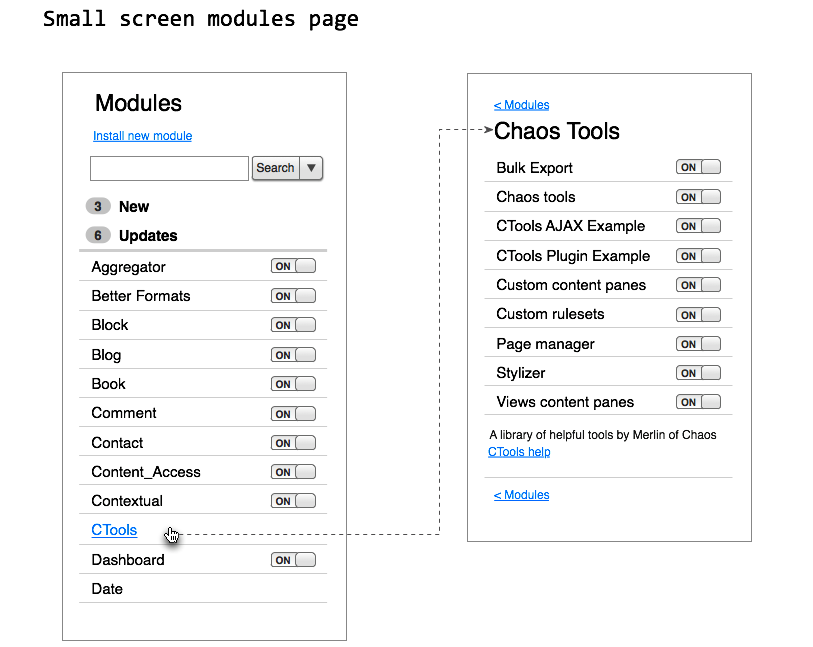
graffle file is a mess, start at the last pages.
Comment #199
greenskin commented#198: I'd rather see the page load with everything, no sub-pages, aka the expanded list. The user would toggle these open, but during filtering they should all open so the user can see what the results of the filter are.
What if we stick with the current implementation of "packages" but throw out "Other". Modules that would normally fall under the "Other" package would only be viewable from the "All" tab. Or in the case of yoroy's wireframes for a mobile view, "Other" modules would mix in with the packages (click to show sub-list) in the main list.Scratch that thought, it would make it that much harder to browse over modules not categorized.Comment #200
cosmicdreams commented@yoroy Awesome work dude!
I also like the one-page results with fancy in-page filtering via the search box.
How about we provide descriptions onclick of the module title?
Comment #201
webchickLove, love, love the stuff at #198. Simple and clear. It's missing the module descriptions and help/perm/settings links, but maybe those sort of "swoosh" down when you click on one of the items in the list (dependency stuff could show up there too I guess, if we really wanted it).
Comment #202
cosmicdreams commented@webchick @yoroy:
I imagine that we'd have jQuery Mobile at our disposal here. So here are some analogs to what we've been talking about:
Search filtered list with inline categories: http://jquerymobile.com/demos/1.0/docs/lists/lists-search-with-dividers....
Accordion style sets that start collapsed and expand: http://jquerymobile.com/demos/1.0/docs/content/content-collapsible-set.html
These accordions that they demo unfortunately don't have much "swoosh".
Comment #203
webchickDarn. Do they at least have cowbell? :)
Comment #204
cosmicdreams commented@webchick, ha. I suppose a question for a future part of this discussion is: Should we adopt jQuery Mobile into core or implement these ideas some other way? Maybe that's a question for John Albin's Mobile initiative?
Comment #205
klonosAre we talking about implementing something like #190/#198 only when administering an installation from mobile/small-screen devices here, or about implementing it as a global admin UI?
Comment #206
xano@yoroy in #198:
- The second "no results" mockup makes more sense to me. It visually links the search result to the search input.
- Your idea about nesting modules and using subpages is interesting. Do you suggest we nest modules based on their package or based on the project they belong to? Project information is not shipped with modules. AFAIK the only way Drupal knows about such things is if Update.module contacts drupal.org and retrieves the list of projects.
- Using Update.module's information, if a search keyword matches a module name, can we link to its project on Drupal.org directly? This would add an extra link to the search results, but it would take users directly to the project page of the module they searched for.
Comment #206.0
xanoSub Issues in hopefully correct format
Comment #207
eigentor commentedThe nesting needs to be done by Javascript (collapsing) I guess that is rather sure to keep easy searchability through all modules and submodules and not open new cans of worms with subpages.
The most important task to fulfil in nesting would be to me:
How to make it unmistakably clear to the user this is nested, that if he clicks on it a greater selection opens up?
We have failed in the past with collapsible fieldsets Drupal 6 and earlier and it is still not roses in core and contrib.
Maybe we should have a close look at modern UI ideas like cosmicdreams listed in #202. Am pretty sure some of the clever UX guys out there have found almost foolproof solutions for that.
Have added #1296876: Make dependency list hidden on modules page until requested to the issue summary. This issue list may get very long, but if it is for the good, be it :)
Comment #208
yoroy commentedI'll have to try some mockups for how the expanded view of for a single module in the list might work.
I sense some disbelief around this simplefied approach to this UI though. Don't be put off by proposals that go counter to what was discussed before. The best way towards a *good* idea is to have *many* ideas. The modules page *will* get a serious overhaul for D8, I'm confident it will. We just need to take our time designing the best possible solution before starting implementation.
Comment #209
xanoI agree with yoroy. Mobile first doesn't only work well to get things to work on, well, mobile devices, but it also forces you to focus on the key aspects rather than fancy extras (which may be useful, but just not as useful as the key aspects).
Comment #210
MickL commentedThis looks pretty great!
I added the group-title that was lost on the "All modules" page. Also i removed "new modules" and added "updates". I think this point is very important to have there.
In addition to that, it could be possible to display the number of items beside to the link.
Comment #211
bleen commented#210: Why remove the "new modules" tab? Arguably this is the most useful feature we could add to this page.
Comment #212
MickL commentedadded "New" notifications to modules tabs.
Comment #213
klonos@yoroy, #208 & @Xano, #209: I cannot argue that implementing a UI for mobile first will keep one "restricted" to placing there only the basics and thus will keep the UI to a minimal look & feel. Honestly though, how many of us do routine site administration over their smartphone? Specifically, I cannot imagine real-life use cases where site admins would need (or dare) to manage their sites' modules on their smartphone on a regular basis.
@benchi, #212: that design does solve the need to be able to spot newly installed modules, but by removing the dedicated tab we had in previous designs for that purpose forces admins to click through multiple tabs in order to enable freshly added modules. With the "New modules" tab we had, one would simply navigate there and perhaps with a "select-all" checkbox would only require a couple of clicks instead.
Comment #214
cosmicdreams commented@klonos the need to do site administration via a web enabled device is very real. As someone who has been on call to support deployed websites, often times the call comes when you are least prepared. It would be great to have a UX that helps, instead of of harms, a mobile site admin from fixing the errant module upgrade or resource over utilization, or ...
Later, when the crisis is over we can then apply the "proper" fix.
That and in the future a small screen device may be the target UI for the majority of websites might as well prepare for that now. What's the harm in optimizing for mobile?
For example, I'm still on my thanksgiving vacation and for once I didn't lug my laptop across the county. Typing these comments in has been frustrating because these text areas are annoyingly uncooperative with my mobile device.
Comment #215
cosmicdreams commentedPersonally, The most annoying thing about the modules page is the save button. After I've enabled the module I want turned on, I don't care where I am on the page. I just want a freak'n save button to be on the page, plainly visible. I don't want to scroll. I don't want to press Ctrl+End. I likely had to use the mouse to click the checkbox so I don't want to have to switch devices so I can initiate the action I've queued up.
Please provide the following:
1. Allow the save button to be at the very top and the bottom of the left hand side bar.
2. Make the bottom save button be "smart" so that as the user goes down the page, the save button always stays ont the screen. Like a sticky header.
3. Remove the save button at the bottom of the page that is inline with the names of modules. This will enforce the expectation that the button will be in the side bar.
For mobile devices, provide a save button at the top and bottom of the list of modules. This will allow a module that is near the top of the list to be turned on without needing to scroll way down to the bottom in order to execute the action.
Comment #216
xanoRe #212: let's not confuse available updates with newly uploaded modules.
Comment #217
jstollerI'm all for designing mobile first, as long as that doesn't mean mobile only. The ability to use a small screen in a pinch is fine, but when it comes to the site building tasks I might do on the modules page, "in a pinch" is the only time I can see myself turning to my smart phone. 99.9% of the time I'm going to want a nice big monitor, and I'd like to take advantage of the added interface enhancements that such screen real estate can provide.
In any case, I started rethinking this a bit and it took me back to the info files. It seems to me that we are confusing the idea of "categories" with the idea of "packages" and it's making neither work particularly well. So, I'm proposing we add a few things to the info file to rectify this.
Lets say we have a project called "example", with two modules: example.module and example_ui.module. I'm considering example.module to be the "base module" for this project, because its name matches the name space of the project itself, and I'd suggest making this a requirement for all projects.
Within the base module's info file, I'm adding some new variables. In addition to project, I'm adding project_name and project_description. This allows the project overall to have a different human-readable name and description than any one of the modules it contains. If either of these variables are missing, the base module's name and/or description variables would be used in its place. In the end, the info file might look something like this:
Additional modules in the same project would simply include the project variable to properly associate them, like so:
Modules that are intended to extend an existing project—like modules that add new fields, or views displays—would use the package variable. However, package now must refer to the machine name of a project and not an arbitrary string. For instance:
You'll notice that I've also added a "categories" array to these info files. While categories would accept arbitrary strings, I propose that we develop a list of generally acceptable categories for developers to use, covering most of the situations one might come across. For inspiration I'd look to the menu structure. Off the top of my head, I'd see something like:
Note that we should never have anything like "Views", since that is a package, not a category. If you want to see a list of projects providing views displays, then you should look at the listing for Views. If you want to see a general list of modules that deal with site structure, you can look at the "Structure" category.
I debated whether to allow multiple categories per module or not. I also debated whether categories should be associated with modules, or projects. I'm still not completely sure about either of these choices.
So, what would this look like? I went back to my mockups and tried to re-work them, focusing more on projects than individual modules. It's still a little rough, but I ended up with this:
Each project indicates how many of its modules are enabled, as well as the total number of modules it contains. Hovering over any of the rows in this table would bring up a pop-up (see Dashboard above) containing the project's description and links to any admin pages. This way we can keep the descriptions hidden, improving scannability of the page, while still making them immediately available when needed.
Clicking on any row in the table will expand a collapsed section with more information about the project, like so:
The default view in this section shows the project description and all the modules contained in this project, allowing the user to enable and disable them. It also provides links to any projects marked as being in the same package as this project. Dependency information is hidden, but can be exposed for individual modules:
A tab in the project detail then lets you view all possible updates to the project and pick one to install:
And just for fun, here's a quick mockup of what this all might look like on a mobile device. I've maintained all search options and tabbed views, though accessing them will require an extra tap to open a drop-down. At the bottom I show a project detail page and a module detail page.
I've attached a zip with the BMML file, for those who want it.
Comment #218
klonosI'm about to become a dad in 30days or so!!! The Mrs just freaked out this morning (the baby wasn't kicking) and so we went to the clinic for a quick precautionary checkup before going to the market (we started buying baby things this week!! - I'm afraid I'll become the world's silliest dad!). While she & the baby were having a cardiogram, my brother and I were just hanging out in the waiting room (he just came along for the market part, since he is already a dad of two and we needed him for some experience-based shopping advice). After discussing many topics, we came to an agreement that most people seem to confuse "important" with "urgent". One of the topics we discussed was how my girl freaked the nurses out by making them believe she was actually having the baby then. It was amazing how our doctor's advice to "Just go and have a cardiogram just in case ...if it's not any trouble." magically became "Our doctor said it's urgent!!" for the mom! My brother also gave another example of such a case: he gives his personal cell-phone number to valued customers and tells them to call in cases of emergency. After some time of doing that he now has to explain to them that "emergency" means cases such as if a huge asteroid is heading Earth's way. He finishes his hilarious example by saying "Most of the times I also need to further explain: ...even then, don't call me unless I can actually do something about it."...
...what I'm trying to say with this rant of mine here is that I'm still not convinced that site admins will actually absolutely *need* to do routine administrative tasks via their handheld/small-screen device. If it's that urgent, I'm sure they'll find a "proper" device. Building Drupal with these cases in mind is far-fetched IMHO, since we can always have some custom minimal handheld-device-targeted admin theme.
Comment #219
eigentor commentedCreated #1353888: D8UX: Improve the position of the 'Save' button on Modules page. inspired by cosmicdreams #215
Think this is a pretty good spin-off-issue.
Even if we keep discussion to this issue mainly for now, guess it does not harm to create the sub-issues already. Thanks to the editable issue summary, they can always be updatetd.
Comment #219.0
eigentor commentedAdded #1296876: Make dependency list hidden on modules page until requested to issue summary.
Comment #219.1
eigentor commentedAdded new sub-issue 1353888
Comment #219.2
eigentor commentedRe-added Sub-Issue
Comment #219.3
eigentor commentedEdit sub-issue
Comment #220
cosmicdreams commentedThoughts on #217
I think I've finally pinpointed what I think is wrong about the searching mechanism that has been presented on many of these UX designs. It's not really a search, it's a filter. So if we present text next to the "searchbar" it should be something like: "Find", "Find a module", "filter for", "filter modules for", or something better I think that will both not impede on the site search's namespace and make it more clear to the user what will happen when they start typing in that textbox.
BTW, I love that the search bar is first and the specifications of the search is immediately second. Most of the time people will use the top of the site's form fields to describe the thing they are looking for. If they cant get that done with one or two terms then they might have the patience to check a box to more clearly state their intent. I think user testing will prove that.
I like the idea of grouping modules by project, but I don't like the idea of having to click on group to get to the checkbox of a module. Would like to have a checkbox next to each group that when checked marks all the members of the group.
For mobile and large screen designs, any time we view a set of checkboxes from a group we should provide a "select all" action. That allows the site builder to do the likely intended action with fewer clicks. If we're talking grouping by project, it will become more likely that the admin will want to turn on everything from that project.
I kind of like the idea of having a kind of favicon for projects. But if we have them it would be better to keep them organized by presenting them in the same vertical line. Float them to the right or something.
The "Dependencies" link shouldn't take you to another page. A lot of interfaces are designed in such a way that if you go to another page, you end up having to redo every setting you made on the previous form. That will just cause frustration in user testing. Instead have those links open a modal or something.
Comment #221
jstoller@klonos:
Congratulations! And I agree.
@ cosmicdreams:
I couldn't agree more and my initial mockups said as much, but several people seemed to prefer calling it search, so I tried it that way. I think perhaps we should start by using the accurate terminology and if that doesn't work in UX testing, we can switch back to search.
I thought about this, but it is problematic. If there is a checkbox next to the project name then most people—or at least most newbies—will likely just check the box and enable all the modules. This is a bad thing. For the majority of projects that include multiple modules, I don't enable all of them. In fact, sometimes doing so would be ill advised. We could include a checkbox just for single-module projects, but that could be clunky.
I thought about including the module list in the pop-up when you mouse over a project, but that seemed like too much. As an alternative, what if mousing over the module name popped up the project description, as shown, but mousing over the number of enabled modules popped up a list of included modules with checkboxes? That might make things a little faster for experienced users, without confusing newbies too much.
For the reasons listed above, I'm not so sure this is a good idea. In most cases, I don't think enabling all modules is the "likely intended action".
My intention was not to provide favicons for all projects. In fact, I think that would hurt the page more than it helps. I was just trying to call a little more attention to core modules. I'm not completely sold on this approach, but I thought it was worth consideration.
Agreed. On my big-screen mockup, the link just opens a hidden container. On the small screen, it may look like you've opened a different page, but that doesn't necessarily need to be how its working behind the scenes. Of course, I'd be happy to table the mobile talk for now, for many of the same reasons klonos brought up.
Comment #222
bleen commentedQuestion: There has been a lot of great discussion and some good points brought up... given that we will never have 100% consensus, at what point to we start taking these ideas and start building? What criteria needs to be met?
Comment #223
klonos@jstoller: Thanx ;)
...I believe that the "Select all" checkbox's use is so "controversial" because people immediately associate it with enabling all items. While I agree that selecting *ALL* modules is not that common/advised, still people might find another common use of it. Consider this example:
One might want to first select ...say all 10 and then deselect the 2 they want to leave out instead of selecting the 8 they want (3 clicks instead of 8). What I'm trying to say is that the "Select all" checkbox is there to help those that require it, as long as it doesn't bother the ones that don't ;)
Comment #224
lewisnymanAdding mobile tags.
Comment #225
klonosI honestly think that we should leave mobile out and move it to its own meta-issue. It only holds back this for D8 and as I've already said back in #191 you'll be changing that tag to "d9mux" before you know it. Developing websites & theming them on small-screen is simply crazy. Supporting small-screen as visitor devices is a completely different thing and can be solved by using a dedicated theme for that purpose along with Mobile tools/Browscap/Wurfl and Switchtheme.
Comment #226
lewisnymanOne of the benefits of thinking from a "Mobile First" mindset is it narrows the focus of the page. Instead of adding more and more UI elements we should start from the ground up and work out what the single main purpose of this page is. Drupal has always been guilty of trying to serve too many purposes at once and many pages in the UI reflect that.
As for mobile being unimportant or irrelevant, that's just misinformation. It's not hard to find supporting data these days.
Comment #227
MickL commentedwhat about #222 ?
Comment #228
klonosNobody minds working out the "main" purpose (enabling & disabling modules) - it is the "single" being suggested that bothers most. What is proposed here by most of those that brought up the mobile UI issue is not to simply redesign with the main purpose of the Modules page in mind - it instead feels as if you are proposing for it to become the *only* purpose of the page. At this point let me stress that "minimal" doesn't necessarily mean "mobile". It is simply that the later has no other option but to be minimal. Don't confuse the two or suggest that they either are or should be the same.
We all understand that having so many things happening in this page is a complete mess as is right now. That's why we started this issue here in the first place - we aim to improve it. Along the way, some people instead of helping to tidy the page seem to have started proposing we should be "ditching" features instead and start "going mobile". The addition of "more and more UI elements" was not done for the fun of it - they are added as needed in order to help users achieve certain tasks. Removing them doesn't help the users in that end - it only ignores their problem in favor of "minimal". I personally don't mind keeping the "minimal" in mind as we go, but fixating on it absolutely bothers me to a point that I start seeing mobile UI suggestions in this issue as hijacking & I urge people to file a separate issue for that.
From what I've read so far in the two articles linked in #226:
1. "We have dug ourselves a hole": ...there seems to be concern that we are "left so far behind" in providing a mobile admin UI. Left behind compared to what? Do Joomla or WordPress for example currently provide that support? Any other of the competing CMSs out there perhaps? Even if there is one that does (I seriously doubt it, but please do point me to a screenshot/mockup to prove me wrong), still a "nice to have" feature is far from "necessary" or "the way to go".
2. "We can't afford to ignore mobile": ...There seems to be concern that users are starting to use mobile devices more and there is a considerable amount of them that start using mobile *only*. That does not in any way prove that this audience is designing and/or administering websites. There is this quote:
...used to make a point. Fine! Try saying that to a graphics designer and make them work on iPhone. Oranges & apples I say.
I won't start a flame war over the 80/20 rule of using the admin UI in handheld/small-screen or "normal" devices without first having any *actual* usage stats. Here's a suggestion though: ...why not start a minimal, mobile-intended, admin-focused contrib theme coupled with a nice, also mobile-focused toolbar, give them enough time (we do have a long way till D8) and at some point see how these compare to module_filter's usage stats?? That would be a nice way to get some feedback on people's preference: a slick/basic admin UI or a full-fledged one. Don't you agree? Starting a separate issue for redesigning the Modules page for mobile devices and checking how many followers are there compared to this one here would also serve the same purpose fine.
Comment #229
webchickThe reason I like approaching this from a mobile POV isn't really related to how many people do or do not browse their Drupal admin pages with a mobile device, but more the fact that the reason this page needs redesigning is because right now it's totally crazy and does way too much. Narrowing our focus to "Well, what would a mobile interface look like?" is a really useful exercise, since it forces us to think through "What is the bare minimum you actually need on this page for it to be useful?" I love the idea of starting from there, and then figuring out what extra doo-dads we could put on the "big screen" version to streamline things for folks on desktops.
Comment #230
yoroy commentedMobile versions are *not* seperate issues. What I'm seeing is that many of the proposals so far have been *adding* options and sections and ui patterns to the page in order to capture all the current complexity going on on this page. But adding stuff should never be the first option for solving a design problem. First you start looking for ways to remove, reorder or rephrase parts of the UI to see if that can solve things: "No matter how cool your interface, it would be better if there were less of it."
If we cater for the current situation, the madness will only increase because we will have provided more wiggle room for contrib to pile on even more categories, packages and whatnot. We will have fixed symptoms only.
Instead of argueing about mobile or not, it would be much more constructive to critique the minimal proposals and point out which (primary or secondary) functionality is *missing* that it won't let you enable, disable or configure modules.
@bleen18 You ask the best question :) The way I see it we should aim to first strip away some of the apparent noise from the ui. We can then evaluate if we can simplefy further or need to bring back some info or tool to help people find their way around this page. Which is not a definitive answer I know, we'll have to discuss that a bit more. It would definately help to get agreement on the main scenarios, maybe write up some user stories that we want to verify design changes against.
Comment #231
xanoThe core issue remains: how do we display the long list of modules? For that we need to know the exact data to display.
(feel free to suggest changes for this list)
That's all there is on the current modules page, except for the packages. I think everybody agrees packages are what we'd been discussing about the most here. Yet, we still don't know whether we want to keep them or want to throw them away, and possibly replace them with another way of showing relationships between modules. Since they make up a fair amount of the visible page, I think it's fair to say this is one of the most important things to figure out.
Comment #232
droplet commentedImportant for everyone:
Important for everyone first time use that modules package:
also Important for newbie:
I think it also need the "Recently Added / Enabled / Disabled (recently activities)" filter
Comment #232.0
jenlamptonUpdate sub-issue
Comment #233
jenlamptonI'm not sure anyone actually views which modules are required to enable, disable or uninstall a specific module. I think the workflow pattern is: 1) try, 2) fail, 3) find out why. I think if we moved the information off the page, no one would miss it as long as it were to appear on step 3. (more at #1296876: Make dependency list hidden on modules page until requested)
I have never seen someone land on the module page without knowing the name or description of the functionality they want to enable. Does this use case exist?
Core modules are usually what people are looking for least often, having them at the top of the list sometimes feels intrusive.
From my experience, most "site builders" know either the module name, or the d.o project name, and currently do a search in the text to find their module. If possible, we should provide a page that can support this existing workflow (so we have at least one view where a command-f will find any module). I also think it would be useful to add the d.o project name, somehow, to this page as well (even if it's just a search criteria).
Most new Drupal users read the names and descriptions to locate a module (after failing to find usefulness from the groupings, but see more on groupings at #1355292: Come up with better alternatives for groupings on the modules page). If someone doesn't know exactly what they are looking for, we should have a view make sure descriptions can still be found.
Comment #234
cosmicdreams commentedI mostly agree with #233 and #231 and I completely agree with #232.
If all the module page had was an intelligent filter and the ability to call out the machine names a module has packaged up I'd be eternally grateful for D8.
Listing the dependencies really screws up the modules page. I can't even use a Ctrl+F to find the module by name at that point. I'd be glad to be rid of them.
#1296876: Make dependency list hidden on modules page until requested will rock
Also, I agree that while we may not of 100% consensus on all of the issues here. I think we have enough consensus on the tasks listed in this issue's description (minus the whole packaging issue) to get started with productive work. May we be allowed to move this meta issue forward?
Comment #235
webchickSpun off #1355358: Allow searching for modules on Drupal.org from the modules page as a separate issue.
Comment #235.0
webchickAdd a new sub-issue
Comment #236
cafuego commentedI've done a quick hack on my D8 to allow the modules to be ordered by modification time and grouped by interval. Screenshot attached. The change required to common.inc is minimal, but I've implemented the new list as a separate menu tab (in this patch).
Intervals are 'today', 'yesterday', 'this week', 'more than a week ago'.
Comment #237
greenskin commentedI disagree with removing the list of dependencies. I'm fine with hiding them except to show missing dependents. I know it is definitely a use case to be able to see what modules a module depends on. The only other way to determine this would be to open the module's info file.
Comment #238
webchickHm. What is the use case exactly, for viewing the dependency list of a module at any time?
When I enable a module with dependencies, I get an interstitial screen that tells me "The following modules are required; foo, bar, baz" and the opportunity to turn them on at the same time. I click "OK" and I'm done. Never need to care about those dependencies again.
When I try and disable a module, that doesn't currently happen because we disable checkboxes of modules with enabled dependencies. But it totally could. And if that happened, the same thing would occur if I tried to disable a module.
Other than those two instances—enabling and disabling a module—when else do I care about dependencies?
Comment #239
greenskin commented@webchick: Other than the two instances—enabling and disabling a module—when else do I care to visit the modules page. :)
Comment #240
webchickWell, for starters:
1) You inherit a site and want to view what it's running. You visit the modules page to do some basic investigation.
2) You just enabled a bunch of mondules and want to configure them. The modules page has a handy "Configure" and "Permissions" links for you.
3) The site's having a problem, you view the modules page to see what's running to try and deduce where it's coming from.
4) You want to configure module X and can't remember where it lives in the IA. The modules page has a handy "Configure" and "Permissions" links for you.
But even when you go to the page to enable/disable a module, you are looking for a specific module(s) in the list. All of the dependency info from every other module you do not care about is just adding visual noise/clutter to your current task before you.
Comment #241
designerbrent commentedIf I inherit a site and go to the modules page, I want to know why each module is there. I have had times where it is not clear why a module is there. If the dependency list is gone, there would be no telling why a certain module is installed.
I would say the list should stay!
Comment #242
eigentor commented1 more:
5) You don't know the first thing about Drupal. You stumble upon the modules page and are amazed of the wonders of extensibility.
Let's not forget this one.
Comment #242.0
eigentor commentedAdding link to #1355358
Comment #243
jstollerIs there anybody who is suggesting that the dependency list actually go away completely? It is my understanding that we're just talking about hiding the dependency list, to improve overall page scannability, while providing some way for users to call up that list for any given module as needed. Does anyone disagree with this approach? If not, then in order to avoid further confusion, perhaps we should stop talking about removing the dependency list and instead talk about hiding the dependency list.
If I'm understanding this correctly, then I'm 100% behind it. I am often annoyed by the dependency lists. Yes, there are plenty of times when I want to see dependencies when looking at the modules page—often to determine why a module is there and whether or not I can get rid of it—but I've never had the desire to see all dependencies at a glance. As long as there is some mechanism whereby I can click once or twice and see the dependencies for the module in question, I'm a happy site builder. Stipulating, of course, that these clicks don't require a page load that would loose the current state of the form, as I may have already enabled/disabled some modules, but not yet be ready to submit.
@jenlampton:
I do that all the time. For one, there are many modules with names that don't describe what they do, or at least not in a way that makes sense to everyone (I mean, what's a "View", or a "Bean"). And it doesn't help that my memory is like that cheese with all the holes in it, so I often can't remember exactly which modules I installed in the more experimental phases of my site development. I go to the modules page just so I can get a sense of what's happening with a site. Maybe I inherited a site and I'm trying to figure it out, or maybe its my own site and I'm checking to see what state it's in.
I've grown to love the Module Filter module more for its tabs than for its search function (though I use that as well). The way it chunks information improves the quality of my life. Often I just want to see all the Views-related modules I have installed, or all the field modules, and I'm not looking for a specific name. And yes, there are plenty of times I want to look at all the Core modules. Usually so I can make sure there's nothing enabled that I don't really need. And if I want to find the Book module, clicking the Core tab and finding it in the list is faster than typing "book" in a search field and WAY faster than looking through an unfiltered list.
Comment #244
jstollerHere are some of the user stories I think this page needs to address:
And here are some of the functional requirements these stories imply:
Comment #245
jenlamptonBut in that case you won't be *searching* the page for a specific module, in the use-case described you will actually want a list of all the modules. I was asking about if you come to the modules page for the purpose of turning a mondue on or off... Don't you always know *either* what it's called *or* what it does (what might be in it's description).
I'm pretty sure that if someone is going to enable (or disable) a module they will know either what it's called, or what it does. If they don't, then they probably want the whole list anyway :)
Comment #246
jstollerThe list of all modules scares me. It's too overwhelming to look at. I like my module list in smaller, bite-sized chunks—alla the Module Filter tabs—and I'd like to see that sort of functionality improved. Chunking the data for easier digestion.
Many times I'm coming there to see what modules I can turn off, and I don't have something specific in mind. I just want to look at the Core modules and see if there's anything I don't really need enabled anymore. Or I want to look at the Field modules to see if there were some that I had enabled earlier in development, but ultimately didn't need. I think that qualifies.
Comment #247
jenlampton@jstoller, #244 is *super* helpful :) I'd like to address some of the functional requirements these stories imply, to track our progress on each issue.
This could potentially be solved by listing the modules by project, as #1355292: Come up with better alternatives for groupings on the modules page
Working on that one in #396478: Searchable modules page
This may be solved in the way we handle dependanices (as mentioned in #1355292: Come up with better alternatives for groupings on the modules page)
This is what *some* maintainers were trying to turn "packages" into. I'm not sure we have a good way of defining or allowing modules to define these "categories" but if this turns out to be necessary, perhaps the issue can also be solved using dependancies.
Being worked on in #1296876: Make dependency list hidden on modules page until requested
I'm not sure about this one. I think maybe they can still be shown by default, at least for web users. I'd agree to hiding them for mobile devices, but I think the descriptions are important for first-time drupal users. They don't even know what "modules" are yet, let's give them some help with "beans" :)
+1 for this, I had not been thinking about it, but it is really frustrating. It looks like there is also an issue for this, #468208: Allow uninstalling modules with dependents by offering to recursively uninstall their dependents as well.
Agree completely. There's some interesting work going on over here on a new UI pattern we can maybe use: #492834: Hover operations for flooded state screens
We've been talking about this in this issue, and I think it's a great idea. I just created a sub-issue for it over here: #1355526: Add a way to determine the date a module was added so the modules page can use it for sort
Comment #247.0
jenlamptonadded another sub-issue
Comment #248
lewisnymanSo when I was prototyping the mobile navigation I came to the conclusion that there should be common action links that operate on every list we have with in Drupal. Modal forms could pop up and filter or sort a list like modules similar to what we have on the content page. I've already come up with a prototype for how action links could display on mobile, we simply move the action links into the toolbar.
The sort function can cover some of the use cases outlined in #244. For example; only make the package headings appear if someone chooses to sort by package. The default sort could be how recently it was added! Brilliant!
I also think we should have module sub-pages that display all the information you could possibly want from a module like the machine name and dependencies. We only need to show enough for the user to identify the correct module they want to take action on.
Luckily I already have a rough mobile prototype of this kind of page: http://nav.d8mux.org/modules.d8mux.html
Comment #249
timmillwoodI have not been following this through from the start but just had a quick scan and thought I would add my 2¢. Please feel free to ignore.
I think the vertical tabs will make it harder to find things not easier. No one will know, realise or remember which module is under which tab. A lot of people will click through each tab until they find the module they want.
I like the idea of having filters and search, I also like the idea of organising the modules by new, enabled and disabled.
Comment #250
yoroy commentedBleen18 asked an important question in #222:
We discussed this a bit during UX open hours yesterday. Here's what we (dcmistry, bojhan, yoroy, jenlampton) came up with:
1. A first stab at a prioritized task list for the modules page
2. We will verify those assumptions with some interviews
3. We can use this list to find the best ideas for the most important tasks in all the mockups that have been posted.
### A prioritized list of tasks to complete on the modules page
1. Find a module.
2. Enable / Disable module
3. Use description to orientate what the module is about
4. Change the permissions / configurations of a module
5. View available updates
6. View current module versions
7. View which modules are required to be able to enable, disable or uninstall a module
### The interviews
Dharmesh agreed to write up interview questions. Dharmesh and bojhan will conduct some interviews. The more the merrier, leave a comment here if you want to help us getting a clearer picture of how people think of things to do on the module page.
### Use the task list + interview insights to find the best ideas in the mockups
The prioritized tasks will help us get a clearer picture on which ideas supports which task the best. From there we should be able to cherry-pick our way towards a design we implement and then test. This will take several iterations.
#244 does something similar, lets compare notes :)
I want to thank everybody involved in this discussion so far. The thread is becoming huge but I don't see too much of a problem with that, we're spinning off actionable issues (links in the issue summary above) and it makes sense to keep all brainstorming ideas happening here.
Comment #250.0
yoroy commentedAdded more sub-issues
Comment #251
tvn commentedI've updated issue summary to incorporate latest comments and results of UX open hours discussion.
Comment #252
sutharsan commented@yoroy I can do interviews. Can this it be done by phone? I can do interviews with people with a wide range of Drupal experience.
Comment #253
klonos@timmillwood, #249:
Funny thing... more than 14,000 users (including myself) of module_filter that adds vertical tabs think otherwise. Did you actually give it a try? ;)
...not no one. I agree that not for every single module, but for most of them I at least do. When unclear, the "Other" category/tab is usually a nice shot ;)
For starters, that's why we've been talking about having a "All modules" tab. That will satisfy these users that like the old way of having the whole list of modules out there in bulk. This tab will be the default when one visits the Modules page & the "Clear/Reset all filters" link/button is there to simply take users back to this "All modules" tab. (Of course all this can be optional or remembered across sessions).
Comment #254
dcmistry commentedHi @Sutharsan,
That is awesome. Yes, this can be done on the phone/skype/etc. I am going to send out a draft of the questions for the interview for everyone to review here soon. We will make sure we keep you in the loop.
This is neat stuff. Thank you for doing this!
Comment #255
webchickklonos: For me, Module Filter is great for the search box aspect of it, but not the vertical tabs. Don't assume all 14K of those users like everything Module Filter has to offer. :) The "click through each tab until they find what they want" behaviour is something we've observed countless times in multiple usability tests in multiple locations. It's a real problem for new users.
And expert users know the module name they're looking for anyway, so they just type it, and don't use the categories. When was the last time you browsed for modules via going to http://drupal.org/download, then Modules, then filtered by category, then read down the list until you find what you're looking for? No, you'll either just go to http://drupal.org/project/[name], or search Google for "site:drupal.org [use case] module."
So +100 for the keyword search that Module Filter offers, since that closely matches the problem-solving pattern of both new and expert users. But -1 to mis-using a UI pattern to emphasize something known to be confusing and useless for most people.
Comment #256
jstoller@yoroy, re: #250:
Your list of module page tasks seems overly focused on finding A module and enabling/disabling A module. These are highly directed tasks, but I can't emphasize enough how valuable this page is when undertaking a less directed exploration of the current state of a Drupal installation. This exploration may then lead to enabling/disabling modules, but the task of gaining an overview of how the site is constructed should place as #3 in your task list. I would reorder your list like so...
Comment #257
jstollerIf you know what you're looking for, then of course the full list of modules with a search box is the way to go. However, if you don't know exactly what you're looking for, then the grouping provided by category tabs can be incredibly valuable. And we shouldn't talk about clicking through multiple tabs like it's always a bad thing.
To me, it's all in the implementation. The current implementation of "packages" leaves much to be desired, but could be improved. I think there should be a visual/spacial separation of the category navigation from other more direct search methods, so I wouldn't want a direct implementation of what's in Module Filter. There are solid use cases where this sort of capability is highly desirable. Ultimately, if well implemented, I think it would make for a greatly improved user experience.
Comment #258
klonos@webchick, #255: why not use instantfilter instead that does the filtering part only? (that one counts less then 100 installations). But then again, I'm sure you'll argue that not all 14k users of module_filter knew that instantfilter even exists (take you for example) and then how am I supposed to argue over that one :p
edit: here's how: #1356426: Clarify in the project's page that people not fond of the vertical tabs should use instantfilter instead.
Comment #259
webchickklonos: Of course I know instantfilter exists. :) It came directly out of work on D7 to solve this very problem. But it's D7-only, doesn't have a stable release yet, and the maintainer isn't quite as active, so I imagine that's why more people use module_filter instead. Anyway, this is getting totally off-topic.
jstoller: So you're after a means of "exploring" modules on a site you're unfamiliar with, and also a means of visually breaking up a huge list with 100+ things in it. That makes sense.
I still am not sure though that arbitrary and mis-matched categories that were chosen by module developers in the ether, rather than hand-selected by the people who built a particular Drupal site to explain to fellow future site builders how those modules fit into the context of their specific implementation, helps with that. It's not purely about the fact that you have to click, read, nope, click, read, nope, click... It's more the fact that the categories to choose from are completely inconsistent across Drupal sites and purely depend on what modules you have downloaded, and they're also completely inconsistent across modules themselves, with some admin-related modules choosing "Administration" as their package, others "Views", and others "Other". This doesn't help with exploration, beyond exploring the vast and varied opinions of Drupal developers everywhere about module taxonomy. :)
To me, I would handle the exploring bit with tighter integration with Drupal.org. Take a look at the demo for http://drupal.org/project/project_browser. Now imagine that browser had the capability to tell you that such and such a module you found was already installed on your site, and had links to jump directly to its configuration page? This would mean you have one "flow" for doing exploring for a module to solve a use case, and either it's already there, in which case you configure it, or it's not and you download/install it. And at either point, you're back to dealing with module names again.
Comment #260
droplet commentedYeah, modules filter is simple enough for most actions. Comment #217 wireframe needed more CLICKS to do a simple action.
here my thoughts base on modules filters:
(Requires / Required by will be removed)
Comment #261
klonosFine! (actually not - but anyways...)
Whether a project on d.o has a "stable" release is purely a matter of maintainer policy (marketing trick if you ask me). To support that: instantfilter has 0 bugs and only 5 feature requests or tasks and still its maintainer chose to call its stable "beta2", while module_filter has 14 open bugs (and a total of 33 issues) and still has a "stable" release. So how stable(er) module_filter is or not when compared to instantfilter is not such an easy thing to conclude to. As is not a maintainer's activity - especially when their project has 0 bugs/criticals to be solved.
The only thing that I'm trying to prove by insisting in vtabs is that I for one find it useful. I even like the fact that we have a working & popular solution in contrib right now to start with. So, I cannot leave some people's negative comments simply go by like that. You cannot simply say "I don't like it.", "It's not useful.", "It's the wrong way to use vtabs like so" without any actual data to support these claims (the 2nd & 3rd I mean - not the dislike part). On top of that when I try to support my claim & present some decent/legitimate proof, you persistently dispute it. So I research a bit more and think that you might be right about it. I say "Fair enough. Lets test it..." and instead of a "Fair enough. Let's see..." I get a "You're off topic!".
Well, since I'm off-topic here let me say that I was under the impression that we were discussing vtabs - I wasn't aware that we've decided to not implement them. I know what! Lets discuss mobile!! ...since that makes more sense.
Let me also take the opportunity to say that his whole thing reminds me how the "idea" of the Overlay got in core (because *most* users liked it and found it useful) and then strangely how I systematically find myself disabling it in every single installation - same with the Toolbar instead of admin_menu. I honestly cannot recall a single screencast or DrupalCon video where I saw Toolbar and Overlay left enabled. All cases of useless things not done the proper way in contrib - so we re-invented things for core instead.
I know I'm a newbie and I cannot put code where my mouth is, but trying to convince the "core Gods" to at the very least try and find a way to actually get some sort of feedback before they implement what they "think" the users like is as hard as trying to make them understand and try to keep in mind that I too am one of these users.
PS: ...and judging by how easily I "got off-topic" because of insisting in speaking my mind, I should next expect to also be told off now because I'm adding "noise" :/
Comment #262
webchickWell, er, in an issue talking about redesigning the modules page, talking instead about my perceived knowledge or lack thereof of available contributed modules, or about the usefulness toolbar and overlay..? I'm not sure what else to call it than off-topic. :)
But back on-topic, my comments/observations come from various usability studies done on Drupal, several years' experience teaching Drupal to new site builders and developers, feedback from readers on a Drupal book I wrote aimed at newcomers, training clients new to Drupal on how to use their sites, and just general intuition gleaned from reading books recommended by and working closely with the usability team during the D7 release. That's not to toot my own horn or anything, just explaining where I'm coming from. Others in this thread, such as dcmistry, yoroy, and Bojhan, have much deeper direct usability expertise, and folks such as jenlampton also teach new Drupal users way more often than I do, but all have a lot of additional "in the field" experience in terms of their reactions to various designs.
But I'm all about dcmistry's efforts to get a script together so we can "crowd source" usability testing and start seeing some actual data in these threads rather than opinions. But to do that, we need to keep the discussion constructive. So let's get back to discussing mockups, hm? :)
Comment #263
droplet commentedmore about #260, vtabs pattern is a bit close to Windows Vista / 7 start menu, also the Windows 8
It has a default list, when perform search, it filtered out some apps & cats.
I think order with Tags / Terms is useless and make things harder. You only care about what under Commerce modules when you use it. It doesn't like Modules Search in drupal.org, we don't want to see E-commerce modules in our filtering.
Comment #264
jenlampton@klonos: Have you considered that maybe 14,000 people might actually hate the vertical tabs added by module_filter, but use it anyway because of it's search box? *ahem*speaking for herself*ahem* Plus, we do have an issue now for debating the use of vertical tabs: #1348692: Vertical Tabs for the Modules page so maybe all the vertical tabs talk should be moved over there ;)
I'm also super excited about interviews and testing. I'd be glad to volunteer all the chapter three developers (sorry guys) as a pool of seasoned Drupal users, and maybe I can also get a classroom of students to help out as a pool of Drupal newcomers. This will be fun :)
As for discussing mockups, I'd like to take it back a few steps. I think all the checkboxes, vertical tabs, bells, and whistles, may be overcomplicating the task at hand. I added a few of the things from our sub-issues into D8, and look how much better it looks already! :)
I'm in favor of removing (or hiding) more things than we add, since the page is already overwhelming. Too many options in search/filters will make the ones we do provide less effective. Do we really need checkboxes for things like "unavailable" ? Less is more :) .02
Comment #265
webchickWow! LOVE. IT. <3 This indeed feels like it's headed in the right direction.
Comment #266
xano@#264: It feels way better, though it definitely needs to be tested with ungodly long lists. I imagine such lists will still slap you in the face when you see them.
This takes @jenlampton's approach and takes it a little bit further:

- descriptions are now spread out across multiple columns and are just like form descriptions: slightly smaller and grey.
- Dependencies and dependents are now located under "more information", which simple is not there if there is no extra information to show.
This is just based on personal feelings, but I wanted to share it so it can either be shot down or be used in future, more serious mockups.
Comment #267
timmillwoodI think the idea of having a new flag would be great, some way of showing the modules that have never been enabled before, because more often than not, these are the modules you want to enable.
Comment #268
bleen commented#267: I definitely dont agree that "new" should be defined as "never enabled before." By this definition, the "book" module would be "new" forever on most sites (sorry book module). To use an example from contrib, that means that "stylizer" would be "new" for every site that just downloaded ctools because they want to use views.
"New" needs to be temporal ...
While we're talking about "new" ... I'm going to tread lightly here because of everyone's feelings about vertical tabs, but one of the most exciting things (to me) introduced all the way back in #175 (and later refined) was the idea of tabs for "All Modules", "New Modules", "Installed Modules" & "Updates needed". #264 & #266 are without a doubt, cleaner & betterer than what we currently have, but this page could be so much more useful with these non-name-based filters.
Comment #268.0
bleen commentedSummary update to reflect current plans and discussed lists of tasks and requirements
Comment #268.1
Bojhan commentedUpdated issue summary.
Comment #268.2
Bojhan commentedfirst cleanup of summary
Comment #268.3
Bojhan commentedUpdated issue summary.
Comment #268.4
Bojhan commentedsecond cleanup
Comment #268.5
Bojhan commentedthird cleanup
Comment #268.6
Bojhan commentedUpdated issue summary.
Comment #268.7
Bojhan commentedmore cleanups
Comment #268.8
Bojhan commentedok text is now sexy clean
Comment #269
Bojhan commentedI have updated the summary to be more clean, and focus on what we agree upon and what we still have discussion over.
Comment #270
jenlampton@timmillwood and @bleen18
I created a new issue for "new" at #1355526: Add a way to determine the date a module was added so the modules page can use it for sort and agree we need it. I just didn't know how to represent it in the UI yet so I didn't build it into my example. :)
@xano
I love the new description location + style. I wonder about more / less information though. I'd like to use that text to tell people what kind of information is inside the accordian rather than leaving it so generic. How about "See dependancies" or "View requirements". I also think an indication of weather the modules are disabled (dim red) or missing (bright red) without having to expand the accordion is important and I wouldn't want to loose that.
Suggestions for language and use of current colors?
Comment #271
jenlampton@Taxoman brought up a good point in #1296876: Make dependency list hidden on modules page until requested that we mentioned here earlier, but I wanted to bring it back up for discussion.
Should we build different pages for different user types rather than focusing on trying to improve this one display to make it work for everyone? We obviously need to improve the page we already have (and we are), but what about adding other pages? Is this something we should consider doing in core, or should we leave it to contrib to alter this page, or add other pages?
Comment #271.0
jenlamptonok, stronger now
Comment #272
Taxoman commentedFYI: Related feature request: #1357662: Collaborative module categorisation and search relevance improvements
Comment #273
jstoller@webchick:
I completely agree that the current implementation of "packages" is totally arbitrary and not nearly as useful as it should be. I just disagree that the solution is to abandon any attempt to classify modules. I think that this can be handled much more effectively by: 1) separating what project your module extends from what conceptual categories it belongs to; 2) actually documenting a standard list of categories for module developers to use; and 3) allowing one module to be listed under multiple categories and extend multiple other modules. Lets not throw out a potentially useful tool because the current implementation is sub par. More on my thinking in this regard at #1355292: Come up with better alternatives for groupings on the modules page.
And I looked at Project Browser—which is awesome—but I see that as a useful tool for exploring new modules. I don't think it would help me in exploring the state of the site I'm working on.
@Bojhan:
I still strongly feel that something along the lines of "Explore overall site construction" should be listed in your prioritized task list. See #256. I still peg it at #3 in the list.
@jenlampton:
I vote no for the additional pages. I think they'll just confuse things even more. I'd rather concentrate on finding ways that this page can successfully support multiple modalities. And of course, laying the ground work so contrib has what it needs to modify things further for those who wish it.
Comment #274
Taxoman commented#273: when we talk about "pages", are some people thinking "urls" and some others different sections on the same url, "hidden" by for example vertical tabs or the like? Are some people arguing from a technical standpoint and others from a visual one?
For example, while I am in favor or moving the details into its own "page", I dont really care if it is a tab on the same page or on its own new url entirely. "Page" to me in this context, is just "different list that fills the screen when you click somewhere". Performancewise, if it is a point to avoid loading more data than necessary on the initial load of the modules page, perhaps that means a separate page with its own url, I am not sure if that is strictly necessary, technically speaking.
But it would be practical to know if some people are actualy agreeing on hiding from view, even if they seem to disagree about moving it to a tab or a new url.
And, this is also a question of what exactly it is suitable for core to provide. I would be surprised if it turns out that we dont think Drupal itself should inform about its modules in detail.
Comment #275
Taxoman commentedFurther on my last comment:
I agree very much with the comment #256: "I can't emphasize enough how valuable this page is when undertaking a less directed exploration of the current state of a Drupal installation."
( https://drupal.org/node/538904#comment-5305312 )
Item #3 in that list, "Explore overall site construction", is in my view related to having the information available about the dependencies, and a less directed exploration for someone without existing knowledge about Drupal, would be practical to do at a place where you can get the "full overview", not just part by part, therefore my emphasis on a full page or full view, or full modality or full tab or whatever full might mean in this context.
Moreover, I think that a person who gets to explore a vanilla Drupal core site, before knowing how to (or even the need for) install extra modules, should expect to find one place to look at it all, to get a firm impression about what is "here", out of the box.
Comment #276
jstoller@Taxoman:
I for one assumed that "pages" meant the high-level horizontal tabs at the top of the page, which require a page load and change the URL, so can be thought of as different pages. This as opposed to vertical tabs within the content of a page, which just show/hide/filter content.
I still think that having more than one of these pages devoted to listing modules is a mistake. Instead we should find a clean way to organize information in that list, with enough filter/control mechanisms that we can support most use cases. I have also yet to hear any use cases requiring the display of all information for all modules all at once, but I suppose we can keep discussing that at #1296876: Make dependency list hidden on modules page until requested.
Comment #277
Bojhan commented@jstoller I understand your argument, however I think this is not a beginner/intermediate task. I removed it because I felt it had too much importance, it is a task often exercised by expert users and practically I am not sure beyond packages, how we really serve this usecase currently.
Comment #278
jstoller@Bojhan: I see this very much as a beginner task. As soon as I understood the concept of a module, I went to the modules page to take in the view, so to speak. I wanted to see what was enabled, what wasn't and try to figure out why. I've always gone to the modules page many times during the development of a site to poke around and see where things stand. The only reason this isn't more of a beginner's task is the disastrous state of the current modules page, but I'm aiming to fix that. If the page were better organized, it would be a great place for newbie site builders to go and explore when they're trying to figure out how Drupal works. And there are a number of points during development, for users of all levels, when looking over the modules page can be extremely helpful.
Comment #279
Bojhan commentedJust a thought, how do we visualize all the data in a accordion? I haven't really found great examples of other systems that do visualize this nicely, if others know of any - that would be awesome for inspiration.
Credits go to yoroy for the wireframe.
Comment #280
bleen commentedAre the enable/disable links in #279 intended to be links (as opposed to checkboxes)? Would we then be removing the ability to enable/disable more than one module at a time? Eeek ... I would not be in favor of a change like that.
Comment #281
webchickI think the idea is it'd happen via an AJAX callback on the backend so clicking that link would toggle a module's enabled/disabled status, so modules can be enabled as you click on them, without having to scroll to the bottom and find a button.
Also? LOVE #279!
Comment #282
xanoI like that, but I remember an issue from a while back that argued against this. I think because of the extra load this would put on the system (cache clear etc for every AJAX callback).
Comment #283
Bojhan commented@bleen18 No, we where just not focusing on designing a on/off switch.
So how, do we design this area?
Comment #284
theborg commentedI like the accordion (#279)!, and we can have the ability to enable/disable more than one at a time. Also love the idea of having information on installation dates as jenlampton suggested (#270), modified yoroy/Bojhan wireframe:
Comment #285
yched commentedI'd say the module version number needs be part of the one-line summary for each module.
Comment #286
Bojhan commented@yched I wonder why though - its easy, to not change what we have, there surely are many reasons to keep. I removed it to see how it looks, and it is a lot cleaner when you don't have the enormous diversity of version numbers there.
Comment #287
Taxoman commentedI agree with @yched in #285, the version number should be part of the one-line summary.
Comment #288
xanoAs a developer, I totally agree with the version number being visible at all times. As a total wannabe UX guy I'm rather skeptical towards that and I'd like to know how much that really matters.
RE @theborg in #284: Last install and enabled date are great for developers (I love them), but how do regular users view this? How many people know the difference between installing and enabling modules?
Comment #289
bleen commentedWe could display the version number without the 7.x ... er without the 8.x (except for Drupal core itself which is listed on this page so people know about updates). For example: Views 3.4 or Views 3.x-beta1
Just a thought.
Comment #290
webchickNo, let's not do that. That would be confusing that the project page + issue queue says one thing and the modules interface says another.
I also don't quite know what relevance the version number has when looking at an overview of modules to turn on/off. It has relevance when "exploring" modules, though. But maybe "Expand all" could take care of that? Not sure.
Comment #291
theborg commented@Xano version number and dates could be hidden for users that not have certain permissions.
Comment #292
yoroy commentedAlso, on the overall plan:
- bojhan and dcmistry are working on the research questions, hoping to finalize in the coming week
- Week after: doing the interviews and reporting the results
- Week after that: analysis and recommendations, reporting
Ideally, that is :)
We're looking to interview 15-20 people to get a good, broad picture of how modules page performs for people.
We can continue work on detailed solutions for specific tasks. The research results will then help us put the different tools on this page in their relative prominence.
Comment #293
jenlamptonI agree with #285, I'd like to see the version number as part of what's initially visible. But maybe that's my developer-brain talking. We can also get that version number from the available updates page without all the clicking, so maybe we developers just need to reprogram our brains to go there instead of the modules page if we want a list of versions. ;)
@theborg Re #284 I think we should have the installed (but maybe not enabled) date in the database - but I don't think we should actually print them out on the page like this. I was thinking that we could use them to create list of a "new" modules at the top of the page, more like #62.
I'm also conflicted about the link vs checkbox. I think I still prefer the checkbox, even with all the scrolling. There will be far less scrolling with accordions, after all. I actually think I still prefer the whole layout from #266 but maybe that's just because change is hard :)
Comment #294
theborg commentedWhat about having a button to change between a simple list and a detailed view?, it's a proven interface that almost every os is using... or maybe is "too much of a good thing".
Comment #295
jenlampton@theborg, can you give is an example of that in action? screenshot, or link?
Comment #296
Taxoman commentedhow about a JS-link at the top: "show version numbers", and have it "off" by default?
When clicked, the list stays in "minimal view mode" but the version numbers are added to the view.
Comment #297
theborg commented@jenlampton, I mean something like osx finder, with 3 buttons to switch between:
a) list (like in #264) with an option to show/hide columns
b) detailed view (like in #279) , with more developer data
c) hierarchical, by module category
I think that everybody is used to that kind of switches... but maybe it would put too much clutter on the screen.
Comment #298
danillonunes commentedTaxoman, maybe is better for the JS-link at the top to be a "Expand/collapse all".
Comment #299
dcmistry commentedComment #300
Bojhan commentedWe have been working on an interview script, which can be found at http://groups.drupal.org/node/194833 . We intend to start running interviews later this week, but we will need additional volunteers who interview friends/colleges with Drupal experience.
Please let us know if you want to be involved! We hope to run 20 or so interviews, and do analysis next week.
Comment #301
bleen commentedBojhan: DrupalCamp NYC is this Saturday (12/10) ... I'm sure I could round up some volunteers there, but what exactly should I tell them? Or should i just collect email addresses?
Comment #302
webchickOooh, great idea. A big DrupalCamp would be a nice mix between both experienced and new Drupal users.
Comment #303
neclimdulJust in case this is a vote... here's my feelings on the recently discussed issues. ;)
+1 to link or "button" instead of checkbox. I know everyone does the "select tons of checkboxes to enable a lot of modules" dance but I think one click installs makes the install code simpler, and will actually be faster and easier even for power users like us. Also, the checkbox theoretically empowers pro site builders but if it does, it does so at a cost to site maintainers and smaller site builders which I think is unfortunate.
+= .5 to version number, or at least major version number for contrib modules. I don't feel really stong about this but I like the idea of knowing the 3.x release of views is installed not the 2.x release. That combined with update coloring will provide a lot of information about the modules status without the details of what minor versions, dependencies or any other details we bake in. While the current wires are slim and beautiful it doesn't seem like the version would take up enough room to be distracting but I'll leave final call to the designers. I'll also admit its a slippery slope though because then you can go "well it'd also be nice to know its a -dev version instead of a full release" and you've basically slipped to full version numbers...
Really excited about the interview results. Think I might have someone I can interview if I can schedule it in.
Comment #304
andypostI think
update coloringshould be mixed with- icons
.disabled
.enabled
.enabled .new
.enabled .needs-update
.enabled .updated
- also good to indicate a not a major version but stability state: recommended, rc, beta, alpha, dev, unknown, custom (with some short description)
- expanded info should contain version number, instaled & updated date, pending updates and detailed Description of Pending updates!
Comment #305
jstollerI've been playing with my wireframes and I thought I'd post the latest versions for consideration.
First let me note that, given the contentious nature of the discussion to date, I think its safe to say that different users have different needs. So I'd like to call your attention to the "Settings" tab (1) at the top of the page. Let's assume, for the sake of argument, that within that tab users will be given the option to set defaults for all form fields on this page, as well as enable/disable specific features. So, if you don't like a particular feature, then please consider whether it should go away all together, or if it could simply be made optional. Then later we can get into what the initial defaults might be.
You also may have noticed the "Install" tab, which I foresee working somewhat like Project Browser, allowing users to browse D.O and pick modules to install directly from within their site.
There seems to be general agreement that the primary task for this page is finding a module, so I've included a number of list filtering options (2) at the top of the page. The specifics are negotiable, but I think it's important that the text search field is placed first, giving it the most prominence, so it will be easily noticed. These filter settings will impact the list no matter which vertical tab is selected (more on tabs later).
To help in finding modules, one of our stated goals is to improve the page's scannability. To this end, I tried to determine what the absolute critical information is when searching for a module. To me, this comes down to the module name and the project/file name. Everything else is just adding noise when I scan down the list. I would even suggest the table be click-sortable on these two names.
Secondary to module names, there are things that won't necessarily help me find a specific module, but that I'll none the less want to see at a glance as I scan down the list. At a basic level I'll want to know if the module is enabled. Then, I'll want to see any important notifications about a module, like if it needs to be updated, if it has dependencies, or if there are other modules that extend its functionality.
There's been some debate about version numbers. Personally, I think there is great value to keeping version numbers visible at a glance. Especially when you consider the use of dev and beta modules. It's best to keep that sort of thing out in the open, whether the user is a newbie or a seasoned developer. Also, if we show the file name—and I really think we need to show the file name—then tacking on the version doesn't take up too much more space or add too much noise to the page.
Now we come to descriptions. I've gone back and forth about this one. I postulate that displaying descriptions—especially those long enough to be meaningful—provides no benefit towards finding a module on the page and will in fact have a detrimental effect on the page's scannability. The description really comes into play once you've found a module and you're not quite sure exactly what it does. That being said, I also realize that when this occurs, you want to have that information right at your finger tips, which is why descriptions are normally displayed by default. So I'm suggesting a compromise. Lets hide the descriptions by default, but display them by simply mousing over a module's listing (3). No clicking required, so you can easily run your mouse down the list to browse the module descriptions, but they won't interfere with you finding what your looking for when you know what you're after. This may also encourage developers to write more useful descriptions, since they won't be constrained by a tiny table cell.
I'm also including operations links in the description pop-up, like Help, Configure and Permissions. These also seem like things that you want easy access to, but that you don't need when just scanning the list. They are the kind of thing you need once you've found a module and want to learn about it, or do something with it.
I still think grouping modules by project can be quite valuable, but I know there are other opinions, so I've kept it as a user-selectable option (4). Un-check the box and every module gets listed individually.
The biggest issue with grouping by project is indicating which individual modules are enabled. When an individual module is listed then I display the standard checkbox, but when it's a multi-module project, I list how many modules are enabled out of the total number of modules in the project (i.e. "1 of 6"). Clicking on that expands the project (5), revealing the member modules and allowing you to enable/disable them individually. Users could also see the modules' dependencies, descriptions and operations within this list.
Now we get at the more targeted information about modules: Dependencies, Extensions and Updates. These all represent information who's existence you may want to be aware of when scanning the modules list, but the details of which really only become interesting after a specific module has been located.
For instance, I may want to know that a module has dependencies when I'm scanning the list, but what they are isn't important until I've settled on a single module that I'd like to investigate. At that point I can click the "Dependencies" link (6), revealing the lists of required and dependent modules. Modules can be enabled/disabled directly from here, but more importantly, each listed module's name links to that module's listing on the page. So with a click, I can be exploring the details of one of the dependent modules.
Clicking the "Extensions" link (7) reveals a list of other modules that extend, replace, or somehow augment the module in question. For modules that have an ecosystem around them—like Views, Field, or Context—this would provide an easy way to see all related modules in one place. So clicking on the Views extensions, for instance, would show me a list of all modules that add views displays. Look here for more information about how I see extensions being implemented. As with Dependencies, Extensions can be enabled directly from this list. Also, each module's name is a link to that module's own listing in the larger module list.
The "Updates" link is displayed for a module even if the only available update is a development version. However, if there is a recommended, or security update available, then that will be indicated by a warning icon next to the link. As expected, clicking the "Updates" link (8) reveals a list of all available updates for that module. Selecting the radio button next to a version other than the one currently installed will cause it to be downloaded.
As you can see, I've maintained the vertical tabs in this version. The tabs are broken into two clusters. The top tabs are state-based. "All modules" will be the default. It lists everything in alphabetical order. "New modules" will list just the modules that have been installed since you last visited this page. "Update needed" will list all modules that have a recommended update. "Unused modules" will list contrib modules that are not being used and can safely be uninstalled/deleted from the system.
The bottom tabs are category filters. Look here for more information about how I see these categories being implemented. Based on recent discussions, I assume this will be an optional feature configured on the Settings page.
The "Save configuration" button is intended to stay fixed at the bottom of the window in the sidebar, as the page scrolls. I've included a second button between the two vertical tab clusters, just in case the length of the categories list pushes the bottom button off the page. It also helps create more of a spacial differentiation between the tab clusters.
Comment #306
jstollerI wanted to make a small point about the testing that's being planned. First and foremost, I think it's a great idea and I'm going to do my best to participate. That said, let's please remember that user experience testing can only test things that users have actually experienced. As the late Steve Jobs said:
So this sort of testing may show us what isn't working now in its current implementation, but that doesn't mean a different implementation of a similar thing wouldn't work. And people will try to tell us how they use the page, or even how they think they'd like to use the page, but that doesn't mean they wouldn't be even happier using it in a completely different way that they just didn't think of or fully understand. So I guess I'm saying we should be careful about drawing too many conclusions from data that is less than conclusive.
Comment #307
jenlamptonSone feedback based on your beautiful pictures :)
1) Settings: I still hold that we should do *less* in core. Providing a settings page and letting people change the way the module page behaves seems like something that should live in contrib. Module filter module is a great example, and I'd like to see more things be *proven* in contrib, rathter than assumed useful and put directly into core.
2) Search: I love it. But I'd like to see less clutter in the UI. Why ask people if they want to search on module name, project name or description. What's the harm in searching all three? If we search them all, whatever they want will match. I still don't see any value in checkboxes for "required" vs "unavailable" either. When was the last time you searched specifically for an "unavailable" module?
3) Descriptions: I like the idea of description on hover, but I wonder how that might feel if we also have all these accordions too. I think I prefer the idea of displaying a (short) description on one line below (or above) all the other options. But intuitively I like this.
4) Group By: I think the "group by X" checkbox is a good compromise. I'm not sure weather we'll agree on project, leave package, or come up with something else. But whichever way I think this checkbox will keep all the neigh-sayers quiet. Maybe. ;)
5) Collapsed Projects: I'm not sure how I feel about this. I like having the modules grouped by project, but I don't think I like the idea of having *some* modules hidden while others are visible. I think all the modules should be treated with the same importance, or we're going to end up with the same (but opposite) problem we have now with projects.
6) Dependancies: We just need to keep in mind that these lists will get very long. The two column layout here may not work.
7) Extensions: I don't like this idea. First, we have no way currently of telling if a module is an "Extension" of another so we'd need to re-invent something like "package" so contributors could define them. That will result in all the same problems we have with package. Second (less importantly) I don't think we should call them extensions. :)
8) Updates: In theory, I love this idea. I want it for myself, but in the real world I've already opened an issue about protecting beginner users from themselves (see #1072176: Module Installation UI should not allow installation of -dev versions.). I think allowing inexperienced drupal users to install -dev versions of modules this easily is going to cause a lot more harm than good. That's the fastest way to an unrecoverable WSOD, and a frustrated user leaving our community. -dev versions of modules should *only* be installable by developers, and that means we there should be absolutely nothing that allows them to be installed via the UI.
Overall though, there are a lot of really solid ideas in these drawings :)
Comment #308
neclimdul-1 to checkboxes still.
Comment #309
jstoller@jenlampton, re #307:
1) Settings: I agree in principal, but still think we should be open to a settings page if we find it's useful to get past an irreconcilable difference of opinion. It's like the Overlay. Some users love it, some want it to die painfully. So we put it in Core, but allow it to be disabled. We may find we're in a similar situation with, say, category tabs on the modules page.
2) Search: I definitely agree the filtering options need to be cleaned up some. To be honest, I have never searched based on "required" or "unavailable". In fact, I'd probably never use the enabled/disabled/both selector either. These were pulled from options presented in previous mockups in this issue and I've kept them in for discussion purposes. I do think there is some value to disabling filtering on module descriptions though. Some module names are just really generic words which can pop up in the descriptions of completely unrelated modules. (Field, Features, Views, Block, Context, etc...)
3) Descriptions: We won't really know until we have a working example to play with, but instinct tells me that it shouldn't be a problem. I think there would be enough of a stylistic difference between the description pop-ups on hover and the accordions that users won't have a problem navigating their way around the page and finding what they're after. I'd like to keep this idea in the running.
4 & 5) Group By & Collapsed Projects: Perhaps "group by" was a poor choice of wording here, considering what we have now. I would never want to group the list by "package", as we do today. If I'm looking for a known module, then an alphabetical list is way easier to scan through. As I've said before, I'm actually a huge fan of browsing modules by category, but finding a category group in the full list of modules is ridiculous, which is why I like the vertical tabs paradigm. Click and you're there.
I see collapsing projects as a different issue. I think we have some problems here, since we simultaneously use "module" to describe two completely different things. I download a "module" on D.O., which contains three different "modules." Huh? I think treating a project as a single entity on this page may help people wrap their brains around what's going on. I recognize that this approach brings problems of its own, but I think it's worth some serious exploration.
And just to be clear, I absolutely do not want Projects to become the new Packages. So a collapsed project group would never hide modules that weren't actually downloaded as part of that project.
6) Dependencies: The lists may end up being long in some cases, but at least they'll be readable. I think this is a small price to pay. Especially since they only display when you want them to and can be hidden again with a click of the mouse. The current dependency lists are way too difficult to scan.
7) Extensions: I'm completely open to suggestions for the name, but I think the idea of extensions is extremely important. Packages are too amorphous a thing and tried to solve too many problems with one variable. I want to replace Packages with three completely separate, better defined and better documented designations for "project" (a collection of modules that are downloaded in one package), "extends" (a list of projects who's functionality this module augments or replaces) and "categories" (a list of conceptual categories that a module falls under). Please refer to this comment for more information on that approach.
8) Updates: In theory I agree with you, but in practice it just isn't practical to make that restriction. Dev versions aren't always dev versions. Sometimes they're stable releases (and visa-versa). Sometimes you have to install a dev version, because the module maintainer hasn't posted a stable release in over a year, even thought there are numerous bugs which have already been fixed in dev. In any case, if I read posts in the forums telling me I should install the dev version of something, but that didn't appear in my list of available updates, I think I would be extremely frustrated. I say include appropriate warnings, but don't add restrictions. Perhaps this is one for that settings page...
Available update lists:
(•) Only show recommend releases
( ) Include "other releases"
( ) Include development releases
( ) Include all releases
Comment #310
jstoller@neclimdul:
I'd be fine with the idea of AJAX enabling/disabling of modules on two conditions:
1) The process must be very fast.
2) I need the ability to enable/disable a number of modules in quick succession, without waiting for one module to process before clicking the next link. And I need to know that this is possible without breaking anything.
On this second point, I'm reminded of the Features module. I might have a number of content types, say, that I want to add to a feature, but I constantly find myself waiting for the ajax calls to complete between each selection, which is always frustrating.
Comment #311
bleen commentedI have the same frustration all the time ... agree whole-heartedly with your comment in #310
Comment #312
greenskin commented@jenlampton & @jstoller, re #307 & #309:
1) Settings: I'd lean towards not having a settings page within core for the modules page. I like the idea of having an action bar for toggling the format of the page like OS X's Finder with it's toolbar for selecting the view type. Something along the lines of "cozy", "comfortable", "advanced". Naming obviously open for refinement. I'd recommend that we would start by designing the advanced view first then eliminating parts within the other views as needed. If designed right, this could be a simple JavaScript show/hide based on cozy/comfortable/advanced classes.
2) Search: I think for simplicity the filter should be by module name, maybe include the module's machine name. I do not think it should look within the description unless the user explicitly asks it to via a filter operator (see #127 at item #9 within that post) or a checkbox toggle.
3) Descriptions: I'm in favor of a one-liner description with a "read more" link.
4) Group By: I like the "group by" feature. What I'd like to see, with how things currently are working (with packages), is for the tabs to list the categories as defined from drupal.org then this "group by" checkbox to group modules within the package the developer specified. I think this might be the necessary first step to get away from packages as we now know them.
5) Collapsed Projects: The collapsed projects idea I think stems from the mobile side, listing modules but hiding submodules behind a general entry in an effort to ease readability. I think we need this even in a desktop view. It helps to show that the Views module and the Views UI module are in fact the same download. So version would be exactly the same, update status is the same.
6) Dependancies: I think a comma separated list sorted alphabetically for each "requires" and "required by" is more than adequate. Each module name can be color coded based on if it's enabled, disabled, or missing. I might propose the module link when clicked would alter the filter to show only that module.
7) Extensions: I agree with @jstoller. We need to distinctively allow for finding a module by project, by association (extension/package, however you want to label it), and by categories. I'd like to see categories handled as vertical tabs, and the "group by" toggle handle grouping by association.
8) Updates: Dev versions would need to also be available but given perhaps a JavaScript prompt that reminds the user the potential consequences of updating to a dev version and whether to continue or not. Alpha and Beta as well, anything that is not an official release. I think a prompt is adequate so a setting would not be needed.
9) Versions: We can safely leave off the Drupal version number from the module's version that gets displayed unless the installed module is for a different version of Drupal, then the Drupal version should be included. I don't need to be seeing 7.x everywhere I look. The version of Drupal isn't relavent unless the listed module is not for that version of Drupal.
Comment #313
bleen commentedPlease see #289 - #296
Comment #314
xanoI just came across this little quote from chx in http://drupal.org/node/937814#comment-3556636:
Would it be useful/an improvement to hide API modules that are of no use on their own anyway?
Comment #315
greenskin commented+1 for hiding API modules.
Comment #316
xanoI had a short but rather fruitful discussion with yoroy about hiding API modules. If they're not visible, we have to keep them enabled OR disable them automatically when all their dependants are disabled. However, this raises the question how API modules should be uninstalled from within Drupal, because they probably won't show up on the "uninstall" tab. Even if they do, we end up with automagic, which may spawn numerous DrupalWTFs.
Comment #317
jstollerI think hiding API modules is EXTREMELY dangerous. Hiding them is likely to cause way more confusion than displaying them does. And there are numerous logistical issues when you start hiding things like that. In addition to those already mentioned, what happens when a module doesn't depend on the API module, but can be enhanced by it? Drupal would have no way of knowing that it might want to enable that API. And I don't like the idea of having an incomplete picture of my site.
Comment #318
jenlamptonI'm also against hiding APIs. There may be a better way we can represent them than in the same way as all the others, but hiding them entirely is just going to lead to more confusion, more magic, and fewer people understanding what Drupal actually does. I'd love to see some ideas though for other ways to show them.
Comment #318.0
jenlamptonUpdated issue summary.
Comment #319
danielb commentedBloody long issue, but has anyone mentioned linking the module category system on Drupal.org to this?
What I'm referring to is: when you are a module maintainer you nominate categories for your module and they show up on the project page, and if you look in Drupal.org's 'download and extend' section, you can browse modules by category.
But inside your Drupal installation this is found nowhere and has no meaning.
Now I know a lot of modules are misclassified on Drupal.org, but this would be the kick in the pants to get it straight.
Comment #320
danielb commentedre #318: Simply add a class in the output to specify it as an API module and leave it up to themers to figure the rest out :P Oh god, unless you are a themer, then I'm sorry...
Comment #321
jstoller@danielb: The module category system on D.O, as it currently stands, is a bit of a mess IMHO. I would hate to see this same system brought to the module page in Drupal Core. My biggest issue is that it is combining two completely different organizational schemes: categories (i.e. Administration, Content display, File management, etc...) and module ecosystems (i.e. CCK, Rules, Views, etc...). I think both of these are important and each should be given its own treatment. I also thing the categories chosen for D.O need some rethinking. My suggestion is to find something that works really well for the Drupal modules page, then update the D.O page to match, if appropriate.
I've proposed we add two variable arrays to module info files: extends and categories. The extends array would list projects that the given module somehow enhances, augments, or replaces (i.e. Views slideshow extends Views, and Context extends Block). The categories array would allow developers to associate each module with one or more conceptual categories. However, unlike the current package variable, the categories would be well documented, promoting greater consistency between modules. And there wouldn't be any module categories, like "Views", since that would be handled by the extends variable.
Comment #322
neclimdulI actually have discussed this in the past and support exposing the category system on d.o rather than a new arbitrary system because we are only starting down the same failed path as packages. The d.o system, even if you think its flawed, already contains information on all our modules and has some basic oversight in place, and apparently would be very easy to expose using the Drupal update system if we chose to expose it that way.
Comment #323
jenlamptonI think the question is if the d.o category list would provide any value on the modules page of your site? What if each of your modules was in a separate d.o category - does that really help you do what you came to do on your modules page? I'm not sure. We do need to figure something out though, let's continue this discussion over in #1355292: Come up with better alternatives for groupings on the modules page
Comment #324
xjmLooks like there's a rich summary here now.
Comment #325
Bojhan commentedWe have now done 17 interviews, and are expecting to add 5 more in the next week. After this we will do analysis, and results will go up in January.
Comment #325.0
Bojhan commentedadded another sub-issue
Comment #326
klonos...and January has passed ;)
Comment #327
Bojhan commentedWe have done all the interviews, and are doing analysis its close to done.
Comment #328
klonosGreat news Bojhan! ...my comment was just my way of asking for an update and to bump the issue ;)
Comment #329
ro-no-lo commentedFor everyone in D7 who needs a quick solution until D8 comes out. Click here: http://drupal.org/node/1427750
I did not knew that there is this discussion here which is like 2 years old. I was just frustrated enough to have a quick solution on the module page.
Comment #330
bojanz commentedNote that there's building consensus in #1199946: Disabled modules are broken beyond repair so the "disable" functionality needs to be removed for changing the way disabling / uninstalling works.
Basically, modules would be installed or uninstalled, with uninstall in the main tab then.
There also a way to "disable" a module, which means stopping its non-essential hooks from running (so no menu entries, form alters, etc). We'd want that either on the same page (as an action link for each row?) or on a separate page (in which case you duplicate the module listing...)
Comment #331
yoroy commentedBojhan just posted our analysis from the 22 interviews, go check it out!
Comment #332
cosmicdreams commentedEpic win! Looks like this is all we need to move forward with hiding the required / dependency information for the initial view of the module page. It prevents folks from being able to effectively search the page using browser search.
Comment #333
klonosYeah, we should render missing requirements separately from the ones that are met and only display those to the UI. People rarely want to see the requirements of their enabled modules, but they surely need to know what's keeping them from being able to enable their locked/disabled modules on first scan of the page.
Comment #334
jstollerThe survey results seem to reinforce much of what we already assumed about users' current feelings. I don't see much in the survey to help decide the sticking points in this discussion, but I can't say I expected to either. The survey only tests what is there already and we've been looking at some major changes.
@cosmicdreams: I absolutely agree that dependency information should be hidden, but I see no reason to worry about making browser search work on the page. If what we do improves browser search as a happy accident, then that's great, but it shouldn't be a goal. People turn to browser search now because that's their only option for searching. We should concentrate on improving the built-in searching/filtering options rather than pushing people to an external tool.
@klonos: I agree we need to let people know that there is a missing dependency preventing them from being able to enable a module, but even then I think the list of these dependencies should be hidden. A simple warning icon would be enough. There are a number of modules in my sites that have missing dependencies, but that doesn't matter since I have no interest in those modules. I don't care that cTools Plugin Example is missing the Panels module, or that Date Migration is missing the Migrate module. What dependency I'm missing is only important if I am actually looking to enable a specific module. In which case, I can afford the extra click it would take to reveal this information.
Comment #335
yoroy commentedLinking to #1475204: [META] Provide a generic search/filter UI interface pattern for listing pages
Comment #336
yoroy commentedMockup of default state with some contrib installed
Mockup with CTools project shown expanded
Mockup with CTools project shown expanded, with annotations
A single line seperates individual projects, instead of a border around each project.
When expanding a multi-module project, the individual modules are listed: checkbox, name, description. Configure/Permissions/Help links are shown below the module name. Requirement info is shown below the description.
This approach requires the module maintainer to specify which modules to enable by default when switching on the project. In the CTools example, the example modules would initially stay disabled.
The search/filter box would ideally be some kind of Chosen-like widget that allows for filtering based on text input. It would double as a select list with options to show only Enabled, Disabled, and "Has updates' projects (and an 'All' to reset)
Comment #337
jenlamptonI love seeing "core" at the very bottom of the list. After initial set-up, this area isn't revisited very much and having it at the top like in D7 creates a lot of unnecessary scrolling.
I also love having the checkbox on the left. When it was on the right I forgot what I was turning on by the time I scanned all the way over there.
I don't like seeing the projects collapsed by default. If I have to click-to-expand every time I come to the modules page, and multiple times per visit, I'm going to be very frustrated by all the extra clicking.
Having all these projects collapsed means I can't scan the page anymore. Where is views content panes? Is it under views? Is it under panels? No, its under ctools, but how would I know that? How many clicks are added for people who guess wrong as to where their modules are located? I don't think we should be adding any additional emphasis on projects until the project problem has been resolved, but see #1355292: Come up with better alternatives for groupings on the modules page for more on that.
Yes, I do see that there are checkboxes per project, but I also think this is a terrible idea. First of all, I will never trust the module maintainer to decide what I need to be enabled when the project is "turned on" so I'll always be opening these fieldsets to see what's inside, and turn on modules myself. That's a lot more clicking for the Drupal-savvy - and we are going to complain the loudest :)
Sometimes maintainers will get it right - but I won't know what they've selected for me until I've tried it, and I won't ever know if some of the modules they've turned on for my site are actually needed for my site. "Am I wasting resources, or will turning this one off break my site?"
And immagine the poor new people who will have even less of an idea of what a "module" actually is. They won't understand what each one actually does, we're adding more magic, and increasing the learning curve.
Additionally, this does not address the problem of showing way too much information about dependancies. (see #1296876: Make dependency list hidden on modules page until requested) As soon as you expand a project, you get the way-too-much problem again. Try a control-F now for views and you get only one result, but it's the "views" package, and I want "views content panes" which is NOT in the views package. Open the views package and try a control-F, and you *still* get all the required-by and depends-on information, but no views content panes. I think we should address the overwhelming amount of less-useful information, before we start hiding the most-useful information.
Comment #338
merlinofchaos commentedThere is a search widget which is better for finding a module whose location you do not already know than scanning anyway.
Comment #339
klonosQuoting most of Jennifer's comments in #337...
Same here. Unless of course:
#1036780: Drupal.org should collect stats on enabled sub-modules and core modules
#1274766: Collect stats on enabled sub-modules, not just projects
#1439316: Provide means for module maintainers to collect heuristics on certain settings of their modules.
Yep, they might either *happen* to get it right (some testing and followup "nagging" by users might take place before that) or they might simply take the easy/safe path of only enabling the "core" module in which case, what's the point of this whole feature anyways? Is the sole intention here to sacrifice freedom of choice simply in order to hide "scary" things from newbies?
#1164760: [meta] New users universally did NOT understand that you can extend Drupal
#1167458: New users do not know to click on 'Modules' to extend their site
#1464964: Rename "module" to a more generic term so people new to Drupal understand what it means
Combine that comment (and the whole idea behind it) + the above linked issues and you'll see that if it was to group (sub)modules by something other than the current way of using categories then it definitely would/should not be by project. Perhaps an abstract list of "features" (unfortunately a namespace already taken by contrib) that people can turn on/off would be more streamlined. For example, if one wanted to enable their site to support multiple languages, they'd most likely go on and enable contrib modules like i18n, language_icons, entity_translation, i18n_entity_translation and so on. To that end, the way we have it grouped now (using packages) seems closer to that idea. Add to this the cases of projects where their submodules are placed in different categories/packages and it actually does make much more sense to have it like so IYAM.
Comment #340
neclimdulThis maybe something I overlooked or forgot but I thought we where pretty anti package but this mock-up seems to stick with the concept. So we have an idea that we're not wading back into a concept that's been troublesome, what defines the grouping and how do I know this as a user(and developer)?
Comment #341
ro-no-lo commentedModule, Mod, Package, Extension, Plugin, Pack, Mixins, Add-Ons, Add-Ins, Bundle.
I like module.
Comment #342
merlinofchaos commentedMy belief is that this is project based, not package based.
Comment #343
Noyz commentedSorry, I couldn't read this entire thread. I know some of the ideas here are mentioned above, so for those that have stayed with this entire thread, take what you can from these designs.
To come up with these designs I looked into various tools like Chrome extensions, Firefox add-ons, InvisionApps enabled/disabled states, Apples time machine, etc. These are tools looking to extend functionality - which is exactly what Drupal's modules are doing. We should reuse these patterns as they've become accepted.
Unlike other designs posted here, I started working mobile first, which potentially points out flaws in earlier concepts. For example, as much as I like the idea of incorporating permissions and config, it's not going to work well in mobile. I think the main thing we need to do is:
Comment #344
jstollerLet's please try to remember the context of this page within the system we are building. Mobile first is a great concept, especially for site visitors and even content editors. However, this page will not be seen by either of those audiences. The audiences for the modules page are site builders and site administrators, in that order.
I can certainly foresee a scenario where a site admin needs to access the modules page from their smart phone to turn off a troublesome module while they're on the road. However, this will be an edge case. One we should support, but still an edge case. By far, the vast majority of site building activity requiring the modules page will be done on more traditional computing platforms. Even an iPad has an effective dimension of 1024px x 768px, but I would estimate that 90% of the work done on this page will be on screens of 1280px or more. Even after mobile takes over the world. In fact, I'd guess that you'll have far more people accessing this page on 27-30" monitors than on phones and small tablets.
Do we really want to tell all the site builders, designers, developers and site admins out there that they need to endure a degraded experience on the modules page, just so the tiny minority of people who access this page from a phone don't feel bad? That hardly seems like good UX design, or a good use of responsive design principles. We need to stop pretending that enhanced features on larger displays is always a bad thing and pay attention to how this page will actually be used.
When the page is accessed from a phone, it will likely be by someone who just needs to quickly activate/deactivate something—probably in a troubleshooting scenario—and they probably know what that something is. A basic listing of modules with some simple search capabilities would be perfectly adequate here. I would argue that since most of the time this page will be accessed from larger devices, that is where we could have the greatest UX impact and that is what we should be concentrating our efforts on. We just need to be mindful of the requirement that whatever we do can gracefully degrade to the simple phone experience, but I don't see that as a problem.
For my part, I still stand by the mockups I submitted in #305—more or less. The design of course needs some cleanup, but I think it is closer to where we need to be on any device as big or bigger than an iPad.
Comment #345
droplet commented#336 mock up is not bad. I don't think we need to make this page more complex than #336.
This is not a WebOS. Just a module page of Drupal which site builders will work on.
Comment #346
larowlanComment #347
cafuego commentedFor the record, as per #1355526: Add a way to determine the date a module was added so the modules page can use it for sort there is now an
mtimeproperty on each module object on the modules list page, so they can be sorted by installed (or updated) time.Comment #348
mgifford@Noyz - very pretty!
Can this be spun off into a new thread. It's just really unmanagable as we reach #350 posts.
Comment #348.0
mgiffordUpdated issue summary.
Comment #348.1
eigentor commentedAdded new Sub-Issue
Comment #349
eigentor commentedMaybe we can revive this issue.
At the moment, I see the status as follows:
So I very much doubt we will have a big redesign of the modules page for D8.
So how about scaling down the effort and trying to get in the stuff that appears to exist a consensus on?
1) Making the page searchable / filterable in some way
2) Decluttering the page by removing information for each module
There is even some more consensus, and there is now even is statistic data in the interviews the UX team has performed http://groups.drupal.org/node/211233.
What I read from the interviews is that the main tasks done on the module page are enabling / disabling modules, and for that, first trying to find anything.
So the more detailed consensus I see is for point
1) Searchability: Searching by the name appears to be the most used feature
2) Decluttering: Quite a broad consensus is there to get rid of the dependency information. Next in line may be hiding the version information also. The description is last and kept in almost every mockup.
So how about:
1) Working on #396478: Searchable modules page and find the smallest common denominator there: do searching for module name with a solution that is acceptable performance-wise for the Javascript-Specialists. The search only searches the module name column, not in description.
2) hiding Dependency information, and maybe also version information. Find a way to show this information on demand, which would be a follow-up, though.
The decluttering would solve several problems at once:
- Making the action links more findable since there is less clutter
- make the page mobile-friendly, since there may be less columns and the description column has less content the entire thing is manageable on a mobile device (=narrow width of table).
Comment #350
klonos#1510532: [META] Implement the new create content page design was also reaching 300 comments and was getting out of control. To remedy that it is now being split to smaller issues to be tackled in baby steps. I think we should do the same here or this won't move.
Comment #351
kika commentedCreated #1757368: Reduce visual clutter in Modules page. Any other split issues? When not, I think this issue should be put on rest.
Comment #352
klonosIn #396478-246: Searchable modules page I proposed that we set it back to active. So, that would make it:
#31535: Allow table row groups in table.html.twig and template_preprocess_table()
#1757618: Add Instant filter functionality in D8 core.
#1757368: Reduce visual clutter in Modules page
#396478: Searchable modules page
How about we set this one here to be a meta-issue?
Comment #353
kika commentedYes, it would be nice to have one single meta issue but this issue is way past its due date, comment paging makes it totally unusable. I say create fresh clean metaissue "[meta] Modules page improvements" and link all issues (both active and old monsters) there.
Comment #354
klonos...in the above list of issues I replaced #1475204: [META] Provide a generic search/filter UI interface pattern for listing pages with #1757618: Add Instant filter functionality in D8 core. that is actually something actionable. Lets do that instead and improve things later. We need to see the bigger picture here.
I agree on ditching this huge issue here and moving to a new, more manageable one. People that have made important comments here that feel should be in the other issue too can simply copy-paste them if still valid.
Comment #355
jstollerYou can add #1355292: Come up with better alternatives for groupings on the modules page to your list of sub-issues.
It's a shame that technical annoyances are causing us to abandon all this great discussion.
Comment #356
lpalgarvio commentedgreat ideas going on here.
i love the concept of fieldset/accordion for dependencies. this has been discussed so many times, really needs a fix (especially when it comes to features)
looking forward for a resolution =)
Comment #357
CydeWeys commentedI think it's very important to be able to see, at a glance, the internal names of modules. Not only is this hugely useful for developers, but it's even useful for everyone else as well, because everyone has had that experience where they've downloaded a module, put it in the modules directory, and then been unable to find it in the Modules List page because the display name is different from the internal name. The only want to find the display name is to look in the module's .info file, which is a hugely unnecessary step. The internal name, however, is going to be the file names and directory name of what they just downloaded, so they always know that.
Here are two different attempts at exposing the internal names:
https://drupal.org/node/1760892
https://drupal.org/sandbox/CydeWeys/1760604
Comment #358
CydeWeys commentedThe attachments in my last post didn't display inline. Here's take #2. These are two different approaches at solving the same issue.
Comment #359
kika commented@bohjan prefers to keep the conversation in this thread, so I am copying my stuff over from #1757368: Reduce visual clutter in Modules page:
Here's two approaches to de-cluttering:
Approach 1: Remove version and dependency information, add a global toggle to show / hide extra information. This is somewhat similar to "Show descriptions / Hide descriptions" UX in Configuration page: novice users do not see unnecessary information, advanced users will see it. Single click will toggle between the modes.
1A: Default state:
1B: "Show more info" is clicked:
Approach 2: Remove version and dependency information, make each module expandable separately.
2A: Default state:
2B: Comment module pane is expanded.
Questions / notes:
- How to handle showing compatibility errors on modules?
- It would be nice to follow some styling choices from Status report table (error row icons, vertical-align: top etc.). It should be done on seprarate issue though.
- Action buttons should likely be converted to #1480854: Convert operation links to '#type' => 'operations'
Also note that the design solution should be compatible to upcoming responsive admin tables initiative what removes certain table columns when viewport is smaller. Below are two modules page mockups for smaller screens:
Comment #360
klonos@CydeWeys, #357 & #358: Hey Ben! Might wanna check Module Filter. It already does what you suggest and more! For example it doesn't only list the module machine/file names, it also filters them by that too!! In the screenshot below I filtered using the term "i18n". See it filter all modules that include that string in their name and/or filename:
@kika. Hey Kristjan! While I agree that we should do something about uncluttering the UI from all the excess information, I don't think that hiding/removing ALL the information is the proper solution. Specifically, I think that unmet dependencies should be shown and so should "Required by" information (but only for those modules that cannot be disabled). Please take a look at the mockup from #1351140: Hide dependencies that are met from the modules page. where I suggest to show unmet dependencies and requirements when the user cannot act on a module (enable/disable it).
Comment #361
klonos...the first mockup in the linked issue suggests that we replace the information with links that will show/hide things + they don't use real-life example modules. So, here's an actual situation:
...compare it to this one (with added notes):
Comment #362
lpalgarvio commentedrelated issues:
#396478: Searchable modules page
#107038: Javascript to select module dependencies
#468208: Allow uninstalling modules with dependents by offering to recursively uninstall their dependents as well.
#1473760: Use data-* to check modules dependencies before submit
created a similar issue, dealing with permissions page
#1765576: Redesign Permissions Page
Comment #363
klonosFor the operations column/links, I believe #1608878: Add CTools dropbutton to core will be of great help.
Comment #364
Bojhan commentedI am going to open a new issue, with a final direction. Although we could continue discussing here, I dont feel we are really on the road to consensus. The UX-team has been working on a solution we feel good about, but due to time havn't been able to put it out
Comment #365
Bojhan commentedI would like to thank everyone, for there inmmense contributions. This has been a long discussion on a though topic, but I feel although we didn't reach concencus we atleast got a whole load of good ideas that the UX-team was able to incorperate into one proposal.
#1790280: Module page redesign 2.0
I am marking this issue postponed there is no, followup status :'), so we can continue the discussion elsewhere.
Comment #366
moshe weitzman commentedDon't think we plan to reopen this. If I'm wrong, please give new status and Summary.
Comment #366.0
moshe weitzman commentedRemoved it again since the sub-issue was already there :P