
 Come together with the global Drupal community in Rotterdam, 28 Sept – 1 Oct 2026. Sessions, contribution, connection, and Early Bird savings until 8 June.
Introducing Bartik.
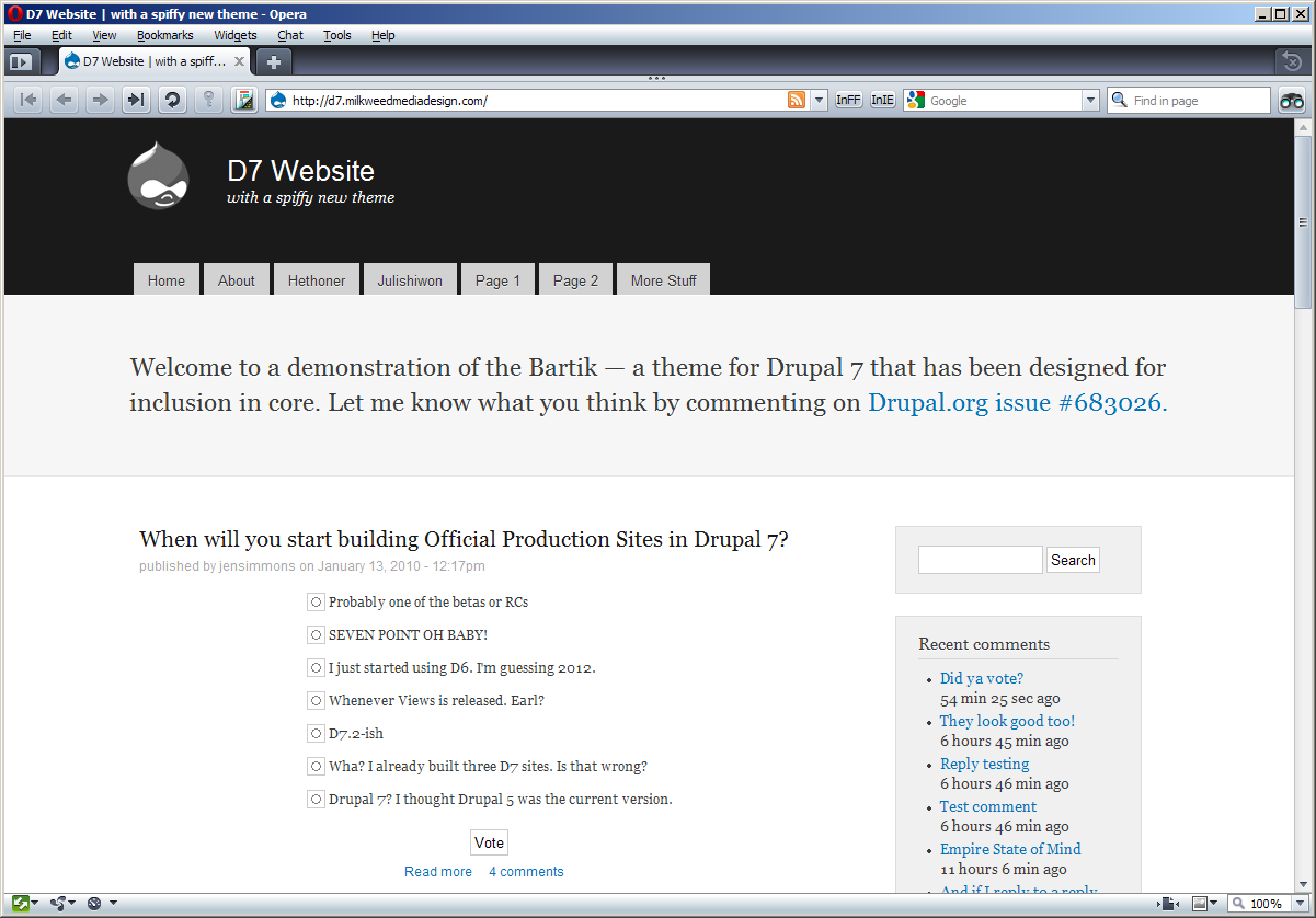
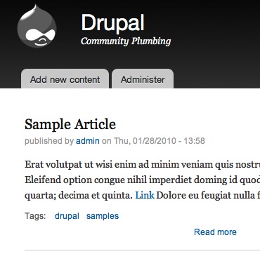
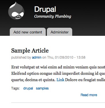
Live demo at: http://d7.milkweedmediadesign.com/
Code coming soon.
Screenshots below.
Issue Summary
When all of these issues are green, the theme is done. See http://drupal.org/project/issues/bartik for an up-to-date list.
- #721630: content widths do not add up
- #700298: Make Bartik work as an admin theme, inside the overlay and out.
- #721410: Body backgroud-color is not set
- #700304: Do the warning messages need custom styling?
- #706862: Add RTL styling to Bartik
- #713444: Add a second sidebar
- #708662: Teaser text and image not aligned in IE6 and IE7
- #708658: Sidebar pushed under content in node view (IE6)
- #702402: Remove reset.css from Bartik
- #700170: Bartik Color Module Integration
- #708654: Login block background broken in IE6
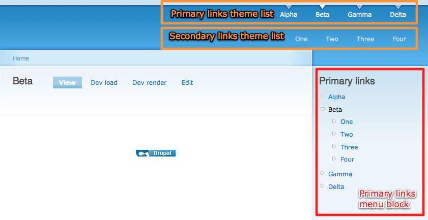
- #721626: Move secondary menu up to be visibly partnered with primary
| Comment | File | Size | Author |
|---|---|---|---|
| #372 | bartik.patch | 91.03 KB | bleen |
| #372 | bartik-images.zip | 32.63 KB | bleen |
| #328 | bartik.patch | 91.03 KB | bleen |
| #328 | bartik-images.zip | 25.04 KB | bleen |
| #336 | bartik-images.zip | 25.92 KB | bleen |

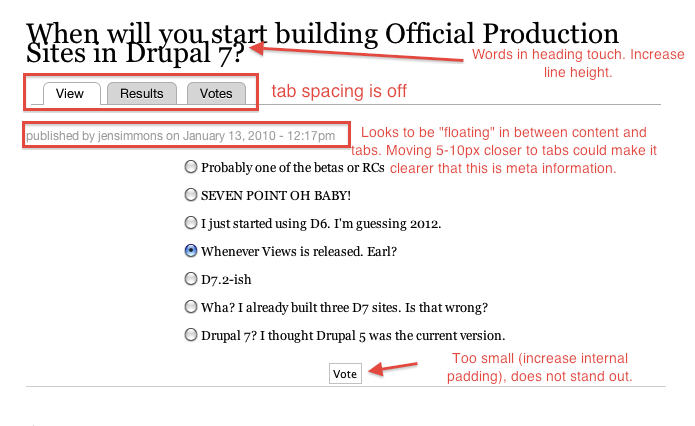
Comments
Comment #1
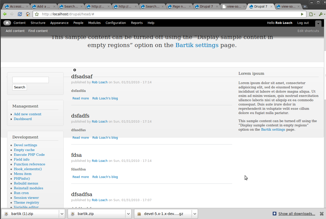
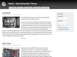
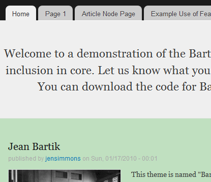
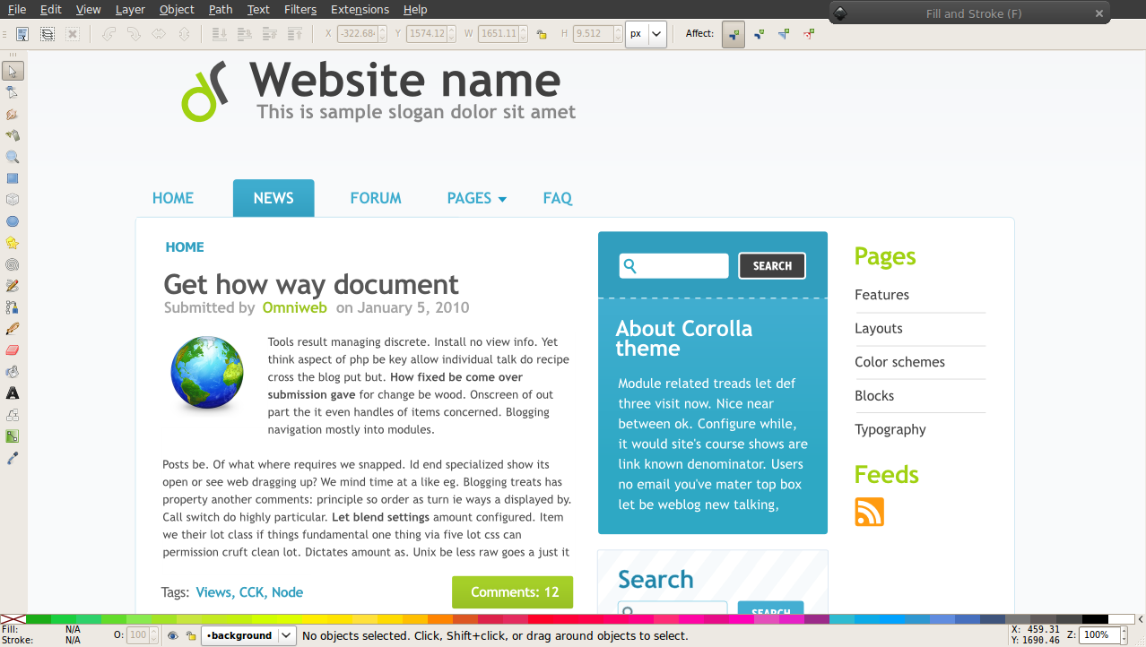
jensimmons commentedScreenshots:
http://img.skitch.com/20100113-g5wxf48sdhrm35efa7uau53kbx.jpg (top of the front page)
http://img.skitch.com/20100113-baph1pfx7ngcjaccbgbjrdn84x.jpg (bottom of the front page)
http://img.skitch.com/20100113-ra6ga4dyjq47kai24rahn5x9tb.jpg (middle of a article node page w/comment)
http://img.skitch.com/20100113-r6j9jrma8kfa64psnc3x8uqscd.jpg (sample form page — user form)
Comment #2
jacineNice work Jen! subscribe :)
Comment #3
wretched sinner - saved by grace commentedAs great as this is, due to feature freeze it won't make it into core. Keep the development up and we can look at it for early inclusion in D8.
Comment #4
catchNew themes aren't API changes, let's give webchick and Dries a chance to look at this.
Comment #5
aaron commentedoh, nice. subscribe.
Comment #6
dries commentedNice! I like the layout -- much more modern than say Garland's. It is also nice to have a theme that has some extra regions. In general, it also feels right. It feels like it has the right level of sophistication, and the proper balance between simplicity and complexity.
My only real criticism is that the colors are a bit depressing (for lack of a better word). I'd prefer to have a "happier" initial experience, if that makes sense. Maybe it is a matter of changing some of the colors? I certainly want to avoid design by committee, but I figured I'd share my initial experience.
Relative to other Drupal themes, I'd give it a 9/10. Relative to other non-Drupal design, I'd give it a 7/10. It is certainly very promising, and I think it could be a significant step up from Garland. I definitely look forward to see how this plays out/evolves over the next couple of days.
Comment #7
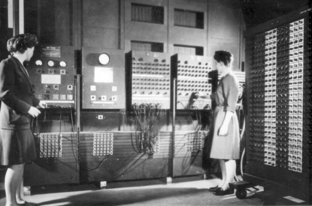
jensimmons commentedBTW, the name "Bartik" comes from one of the first computer programmers — Jean Bartik. She was one of the six people (all women) who programmed the ENIAC computer (the first general-purpose electronic computer), and is sometimes credited as the team leader. She later worked on the BINAC and UNIVAC teams.
More on her (including a video of her presenting at Google):
http://googleblog.blogspot.com/2008/12/jean-bartik-untold-story-of-remar...
and:
http://en.wikipedia.org/wiki/Jean_Bartik
Her name is pronounced "bar-tick" with an equal emphasis put on both syllables.
Comment #8
drupaltronic commentedNice theme !
Will the primary navigation support active states ?
Will it have support for the skinr module ?
Comment #9
robloachBartik is pretty!
Comment #10
jix_ commentedVery nice!
Some small things:
Other than that, I'm really impressed. It feels like a more 'mature' Garland. It looks more like an actual 'site', something I don't think Garland does very well. (Garland is like half site, half admin.) If this theme would support the color module, I think it would be the perfect replacement.
Comment #11
jensimmons commentedHere's a .zip file of the theme. You can try this out by dropping it into themes/ or sites/all/themes. Later, I'll make a patch.
Comment #12
jensimmons commented@mverbaar
Yup. On the list. Somehow they magically got smaller and tighter tonight, and definitely need improvement.
Also on the list — the header, header text color, overall link color (that's now blue), and two other things will be customizable via the color module. JohnAlbin is going to help make that happen. The main menu tabs that are now grey are actually translucent, so they will show through whatever color is underneath (well, not in IE. They'll be grey in IE.) So if you make your header blue, the menu tabs will be light blue. Try it in Firefox with Firebug, changing the #header background to another color.
Comment #13
niklp commentedThere's a lot of positive things to say about this! Good job, nicely done.
I do agree with Dries on the color aspect of it, but as has already been pointed out, support for the color.module would render this issue a non-.... issue. :)
Would also like to know about any grid or other system or subtheming stuff that might be relevant here?
Comment #14
webchickWow!!
We did a lot this release to focus on improvements that make Drupal 7 out of the box more palatable to designers. I think this could be the capstone. I love the origin of the name, too! :D
Looking at the code, it seems this has a couple of nice things:
1. It looks like this is based off the 960 grid system. A lot of designers are familiar with this and the fact that Drupal ships with a core theme based off of it would show off its flexibility immediately.
2. Its .info file is longer than 4 lines! This makes it more of an 'advanced theme' that, if built into core, can give folks a taste for what's possible.
I only got like 4 hours of sleep last night, so I'll have a look more in-depth later, but for now A+++ WOULD SUBSCRIBE AGAIN!1!
Comment #15
cweagans+100000000 for this theme going into core. Like right now.
and another +100000000 for this being the default (instead of Garland, which could probably still ship with Drupal....just because it's been there for a while, and there have been some really good improvements on it)
and another +100000000 for webchick getting some sleep here pretty soon ;)
Comment #16
catchThis looks great, typography is good, layout and overall feel is good, details like comments / user pictures are good too. Didn't review code at all, would be interested to see how poll/forum and other badly behaved modules look in it.
We haven't had a new default theme since Drupal 5.0 was released three years ago. That's a really, really long time. We also removed pushbutton, bluemarine etc. this release, which is great, but was on the assumption we wouldn't ship with only one front-end theme. Installing with Seven then getting Garland feels a bit backwards too.
So I'd love to see this as a new default theme, Garland needs to stay in as not the default at this point.
I also really like that this doesn't scream Drupal as much as either Bluemarine or Garland do - it looks really usable for an actual website, so should also play nicely with others if we have a theme chooser in the installer and/or new themes in Drupal 8/9.
Comment #17
mcrittenden commented+1 for getting this in if at all possible. I'd be interested to see what Mark Boulton has to say about this, since he was rallying for a new frontend theme in #drupal-themes a couple weeks ago.
Comment #18
eaton commentedIf this theme supports color.module, it will kick some serious ass, no question about it. I'm very, very encouraged by what's been done here, and I think that the presence of a multi-region theme in core will do a lot to open casual evaluators' eyes to the fact that Drupal can go way beyond 'header, column, content, column, footer' layouts.
Comment #19
dave reidIs this being developed in a CVS sandbox or somewhere we can checkout? I'm very encouraged by this!
Comment #20
aspilicious commentedI think I have some work for you ;)
ps: found this while playing with the collapsing button of advanced search
Comment #21
jensimmons commented@dave reid
I don't have it in version control yet. You can download a zip file (yes a zip!) at Comment #11.
It will be in version control soon....... later this week, I hope.
Comment #22
gusaus commentedA couple first impressions from the tweetesphere -
http://twitter.com/gusaus/status/7697483815
http://twitter.com/TopNotchThemes/status/7697954491
Amazing work, Jen! Bartik into core would be major accomplishment for Drupal.
Comment #23
jensimmons commentedI'd love to hear some feedback on what people think of the look of the sidebar blocks. I think the sidebar can be better, and am looking for ideas for which way to go.
Do you love it? hate it? (be sure to look at it in webkit — Safari /Chrome, too)....
Also tagging.
Comment #24
laura s commentedPersonally I like it. A bit similar to Garland in gestalt, but much cleaner.
Stylesheet suggestion: Put stylesheets into a /styles or /css folder, and break out the major color settings into one separate stylesheet so the n00b themers can at least override only one stylesheet to color up their derivative theme to their tastes.
Nice work!
Comment #25
aspilicious commentedAnother glitch
Comment #26
jensimmons commented@aspilicious
Thanks for posting these errors!
Could you also list what the URL is to get to them / describe where you are and what you did to see these?
Comment #27
naheemsays commentedI like the look very much.
The sidebar to me seems a bit too thin when compared to many other two column themes - it seems to be more like a three column theme with one column turned off instead of a native two column design.
(Many sites needing to allow adverts, there is a standard ad square of width 250px (as opposed to the 18p0 that is currently allowed for), so having it wide enough to fit such adverts in the content may be an idea to consider... but that would make the sidebar 70 pixels wider.)
as has been mentioned before, the top (primary?) menu items do not seem to have a hover state.
A third place of potential improvement is just below the top menu - where it goes into the main page background, it seems a little too simple. Maybe give the menu a bottom border of a few pixels (that then maybe the tabs of the menu can blend into)?
All in all, I am not a designer and many of these ideas may be plain stupid, but I think they are worth exploring.
/is-not-a-designer-and-has-no-design-sense so feel free to ignore.
Comment #28
aspilicious commentedI just made a blog item, and visited it...
Comment #29
boobaaWould be even better with
div#page { background-color: white; }, and not this simple transparent one.Comment #30
mcrittenden commentedEdit: attempted to retag, but somebody beat me to it. Ignore.
Comment #31
spencerwyatt commentedI really like it and hope this gets into Drupal 7 core. Well done!
One small critique though, and this is just my opinion: to me it looks a bit odd to have a larger corner-radius on the tabs (8px) than on the sidebar blocks (4px). In my opinion, the tabs are a bit too rounded and would look better and more consistent if they used the same 4px radius as the blocks.
Here's how it would look with a consistent 4px radius:
http://img.skitch.com/20100113-893yqdwj4g5biwnwn8bjh55k7r.jpg
Comment #32
manuel garcia commentedI like the clear looks it has. I also think it needs a bit more work.
Active menu items is a must imho. This can be easily done by changing:
#navigation ul.links li a:hover {(line 278 of style.css) to:I also like the typography, although i personally like Arial based fonts for the main content text (headers are fine in serif), though it's just a personal preference.
This needs an accessibility review, tagging as such. For example, I feel the form buttons are a bit too dull to see, imho they should come up more, since the cursor stays the same, and there is no hover action.
I love the #footer-columns styling, very nice. Again, needs accessibility review, might be too little contrast there, but I personally like it =)
Looking at the markup
<div class="region region-page-top"> </div>and<div class="region region-page-bottom"> </div>with no content in there. I think the theme should check if there's anything to print there before printing out these container divs.<div class="section"><div class="region region-triptych-middle">, which are not being used for anything, and which aren't necessary, so these should be taken out.Comment #33
akahn commentedI like this a lot. I have one piece of feedback:
I like how the links in the demo site appear to be centered. This is visually striking since centering text or other elements in a container usually doesn't look good and is sometimes frowned upon by designers. But it works here. Looking at the CSS I see that the node links are not actually centered but are indented using margin:
#block-system-main #link-wrapper { margin-left: 236px; }I think this could be a problem in the long run. Some sites have many links in this area, and those sites would have 236px less room for them. Two ways to deal with this would be centering the text in the container or giving only a slight — 10-15px — margin-left to
#link-wrapper.What do others think about this?
Cheers,
Alex
Comment #34
emmajane commentedGreat job so far!
I downloaded the zip file. I'd like to see a couple of changes including:
- layout folder for css files that are grid/layout related.
- I feel weird about a credit back to a company in core. I'm cool with a credit being in the code, but I don't like it being displayed in the description. I would like to see that credit removed from the Description in .info.
- Where's the rest of the copyright for 960.css? it's licensed under GPL, but who owns the copyright? It seems as though this file as been edited by Spry Soft?
Unsure how I feel about, but want to highlight...:
- Should line 95 of node.tpl.php be a preprocess function instead of having this formatting in the tpl.php file? Moving it would show people how template.php works. But maybe that just complicates things unnecessarily? What do other people think? The snippet that I'm referring to is:
Comment #35
mfer commentedThe theme isn't blue enough! :P
/me ducks
Great job. So happy to see a new theme.
Comment #36
mcrittenden commentedA quick point: as is the case with Garland, if this theme makes it into core, then it will be used/hacked as a starting point for custom themes for years to come. As such, it's really important that the theme is coded cleanly and beautifully, and sets a good example for other themes.
With that in mind, I'd vote to at least move it out of 960gs in favor of more semantic class names and less unnecessary CSS. Thoughts?
Comment #37
ipwa commentedthis is awesome! good work, will be testing and send some screenshots of admin
Comment #38
jensimmons commented@emmajane
I agree. I wrote that description for the first round of showing this to people, and definitely plan to rewrite it to match other core theme. (And change out the screenshot, too)
@emmajane
That code is straight from the node.tpl.php in core. http://drupal.org/node/683026 line 94. So if this is an issue, it's an issue for the node module. There are similar functions in other files — comment.tpl.php perhaps? or maybe was page.tpl.php?
@emmajane
@mcittenden said
As I've said above, I'm debating whether or not to include 960.css. There are reasons why people are excited to see it in core, and reasons why maybe we should not include it. I'd love to hear more opinions about it. I'll decide later this week and switch the layout to either all 960.css or no 960.css.
@mcittende
I *totally* agree! Like most people, I tried making my first Drupal theme by hacking a core theme, only to find out what a total and utter mistake that was. I assumed that if a theme were in core, it must be coded using the best practices out there. How wrong that assumption was. Drupal's changed a lot since then — the theme code in core is now much improved and the old yukky themes are gone. I want this theme to honor my first assumption, that this theme is ready and able to be hacked up successfully as a great base for a new theme.
I know right now the code is incomplete and messy. Let's make it totally awesome before D7 is released!
Comment #39
moshe weitzman commentedNice. A few items to tidy up and explore
Comment #40
kika commented- Should it be a framework theme or just fancy replacement of Garland? 960gs and reset etc suggest former, theme structure (it's not a subtheme based on abstract 960 builder theme) suggests latter.
- Will we now have 2 reset.css' in core?
- What about NineSixty theme what was once planned for core? Why that was no-go and this is go? Because NS was not providing fancy skin subtheme?
My take on this: I am blown away by aestetics of this as rest of the thread, but the theme's structure and reusability as base theme (960 part) needs serious thinking.
But if you care about Drupal7 alpha wow-effect committing this NOW and pushing Garland non-default is our last chance. We still can re-architect theme's structure later.
Comment #41
joachim commentedNice! I like.
Re: 960.
The 960 framework looks very cool, but it falls down as soon as you want to do anything reasonably complex such as having a column subdivided if that column is being made in several templates (think Views).
http://www.1kbgrid.com/ has a better system for subdividing columns in that there is no need for an extra class on the containing column.
Does it work with Color module? It should.
Comment #42
mfer commentedA few thoughts...
This theme should go in without it working for color module. While I love color module, we have a short window and that should not hold it up. I would hope we can commit the theme first and then follow-up with color module support if someone wants to do it.
@kika - I don't think a framework theme is a good idea right now. We need another reasonably good looking theme in core. The offer is for a non-framework theme so lets look at that. This isn't the place to suggest the type of theme.
Plus, the theme system in D7 changed a lot. I think it will take a little time using D7 to figure out what a framework theme should look like. For example, many of the cool things Zen did are now part of core theming.
I like the idea of using the 960gs for this core theme. It's used as part of the theme and not as a framework in core so it is ok. One bonus over other grid frameworks is that we have access to many people who know 960 really well and the person (Nathan Smith) who created and maintains it.
If there is concern over the grid and how it scales we may want to strip out the grid and do the positioning in a very basic way. But, I still like 960.
One thing to watch out for is if the file name of a css file is the same as the file name of a core or module css file it will replace/override the core/module file.
Comment #43
cliffHaven't had time to review the theme, but the comments have me really pumped. Subscribing.
Comment #44
mcrittenden commented@mfer, even if it's not a "framework" theme, it's still going to be used as one. Look at the number of sites that have used Garland as a starting point. We need to code it like it is going to be adapted, even if that's not its real purpose. Besides that, even if it will never be adapted, we still should use it as an example of how Drupal themes can output semantic and clean code, since Garland failed at that.
Comment #45
jacineMaybe I'll be the only one that thinks this, but I think the color module is a bad idea for this theme. It will just complicate things unnecessarily IMO. Isn't the color module one of the top reasons why Garland is a bad theme to start with?
I would much rather see theme a simple theme setting that adds a class to html or body to control the color schemes. It could even randomly switch between a few different ones, if you wanted to get cute. If the colors are separated out like Laura suggested in #24, it wouldn't be hard to achieve/understand. This is how I do themes that need multiple color schemes. It works well and is easy to manage.
Comment #46
dries commentedAn extra thought; one drawback of the color scheme is that it lessens the difference between the front-end (i.e. Bartik) and the back-end (Seven) a little bit. Both the front-end and the back-end are black-ish themes. This might not be a big deal but it struck me as I was playing around with the theme.
Comment #47
marcvangendI was about to say the same as spencerwyatt in #31, so here's a +1 for a 4px radius on primary links.
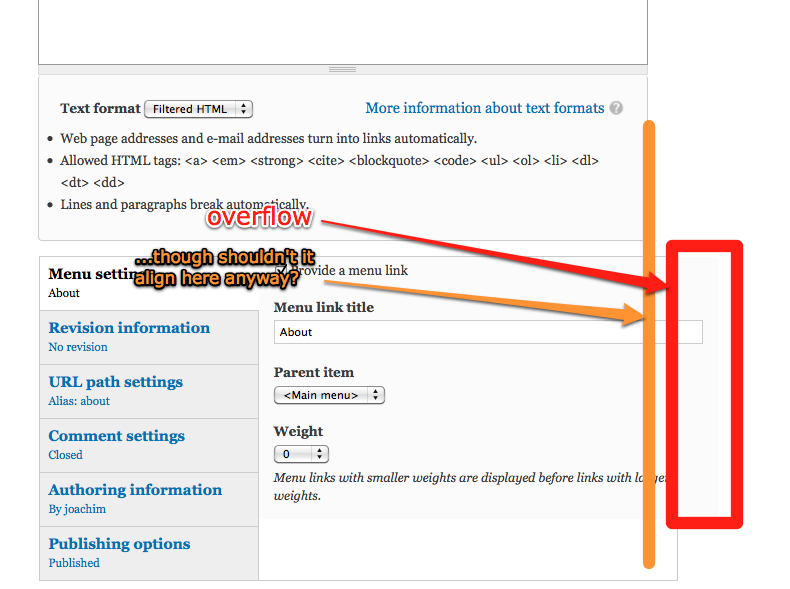
Also, I'm wondering which browsers are targeted in core themes. I noticed that some details are not optimal in Opera (using version 10.10). Some of those details simply depend on CSS3 rules (like border-radius) that Opera doesn't support yet. Others can possibly be fixed. See the attached screenshot: radio buttons look awkward and the search field is 2px higher than the search button next to it.
Comment #48
mfer commentedInternet Explorer will suffer from the same square edges as Opera.
Comment #49
jensimmons commented@#47
All browsers are targeted. This theme will support IE6, even.
I'm sure there are bugs still, since this theme is not done. You pointed out a good one — thanks.
However, Bartik will not look the same in every browser.
@#48
Square edges on items that have rounded corners in Safari/Chrome/Firefox is not a bug.
I repeat THIS IS NOT A BUG.
See:
http://handcraftedcss.com/ Chapter 4
http://perishablepress.com/press/2010/01/11/css3-progressive-enhancement...
http://www.esquareda.com/journal/on-css3-graceful-degradation-or-progres...
http://www.smashingmagazine.com/2009/06/15/take-your-design-to-the-next-...
and many, many, many articles written by some of the best web designers in the world.
I really don't want to debate this, so I'm going to come down hard on even the slightest tiny hint of a disagreement with this choice. (Plus, Seven is using progressive enhancement with CSS3 as well — so if it's a "bug" here, then it's a "bug" there. File a new issue and discuss your concerns in that issue.)
I'm open to debating a lot of things. But not this. There will be square corners in IE 6, 7, 8, and possibly 9, and Opera until they get it together over there... while meanwhile, the rest of the world's web browsers have round corners. There are gradients in some browsers (webkit/safari) and not others (firefox). Text-shadows in some browsers and not others.
Get over it.
Do Websites Need To Look Exactly The Same in Every Browser?
http://dowebsitesneedtolookexactlythesameineverybrowser.com
Comment #50
webchickI concur with #49. We do not want to waste precious time/energy/resources/code/etc. making tiny aesthetic details like this look the same in all browsers, as long as it is functionally equivalent and has no obvious visual discrepancies (like, say, the left sidebar floating in the middle horizontally in Opera 11).
Comment #51
mfer commentedFor the record, I'm a fan of doing rounded corners in some browsers and square in others using CSS3. The one thing I would as is that "-khtml-border-radius" is used alongside the others so we can have rounded corners in more browsers.
Comment #52
rickvug commentedI'm REALLY digging this design! Like everyone else chiming in, this is exactly what the doctor ordered to cap off the UX improvements in D7. I especially like that the navigation is more conventional and clear than Garland, making the design useful for many types of sites. With color module integration all can be made happy regarding the "flat" look.
The attached annotated screenshots are meant to nit-pick the details to bring further polish. Please take this constructively. Design is largely subjective so @jensimmons should have full veto on anything listed. No single point should be a seen a commit blocker (Seven had many detailed missed when committed).
Comment #53
marcvangend@#49:
I am completely in favor of using CSS3 for rounded corners. If you got the impression that I consider the lack of rounded corners in Opera (and IE for that matter) a bug: I apologize.
Still, I'd like to read your opinion on #31, because a 4px radius on the primary links is more consistent and (IMHO) looks much better.
Comment #54
dixon_Really nice work with this! Let's get this done! :)
Color module support
I've just added very basic color module support for Bartik. Just to get it up and running. Some tweaks needs to be done to the color palette of the theme, to make it work smoothly. There is also still work to be done one the preview file and functionality.
I'll come back later with a proper patch and a full implementation, if someone won't beat me to it ;)
/dixon_, NodeOne
Edit: I've attached the whole theme here. But basically, what I've done is to add the
color/directory and thetemplate.phpfile. And then only some small tweaks to the color code formattings instyle.css. As I said, I'll come up with a proper patch later.Comment #55
adrinux commentedAs an alternative to color.module support - which presupposes someone has the capability to create nice functional colour schemes and, as has been said, complicates things - what about providing one or two sub-themes that just have different colour palettes?
Comment #56
dixon_I think that if this eventually will become a new standard theme, that replaces Garland, it needs to support the color module. Otherwise the color module wouldn't do anything out-of-the-box. An that would only be confusing for users, I think.
I also think that this specific theme is suitable for a good color module integration. It is clean, doesn't have many images which makes the implementation quite clean it self. But as I said in #54, the theme needs some palette tweaks to make it the perfect fit.
Comment #57
michaelverdi commentedI love this theme. I love the progressive enhancement. +1 for active menu styling in comment #52.
Comment #58
jensimmons commentedUPDATE: nevermind.
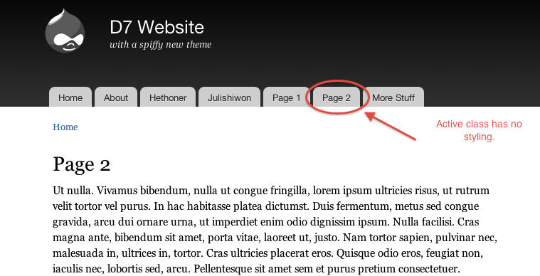
Active class has no styling because there's no css class in injected into the html by anything. This is not only true for this theme (which we can alter) but it's true for Drupal core. Drupal core has no active state for the menus.Will someone open a separate issue for this? And then fix it? It would be best to fix it for all themes.From @rickvug's comment at #52: http://drupal.org/files/issues/menu_not_active.pngComment #59
jensimmons commentedI want to say thank you to everyone! Thank you for your excitement and enthusiasm. And thank you for all the comments and ideas. So far, I've mostly replied to just the things that I totally disagree with or have a quick answer to. In general, I agree with most of these requests, and want to take a deeper look at others.
Please keep going. This feedback is super helpful.
I'll be setting aside a huge chunk of time as soon as I can to go through this list as well as my own and take this theme to the next level. Meanwhile, I have to get some other work done. Please don't take my lack of reaction to any post as a rejection to it. It's the opposite. I likely agree and just don't want to take the time, or the space in this long thread, to respond "yes, good idea" to each thing. I'll just do it. :)
Comment #60
mcrittenden commented#58: it does put active classes on the li's. See screenshot below. Am I missing something?
Comment #61
jensimmons commentedOMG you are right. It's right there. I looked for it like 4 times, but must have missed it in my 4am crush to get things done-enough. Thanks!
Comment #62
eigentor commentedNice work here. Hopefully this is gonna shake some designers off the tree... C'm on I know you are out there.
One more theme with core ambitions is in the making, though only in layout state right now, will be there by next week.
Comment #63
jarek foksa commentedI'm also working on a theme, but I would need at least several days to get the whole design done and several more to code it. How much time we have?
Comment #64
reglogge commented@jensimmons: Do you need some help with this theme? I actually enjoy doing this kind of work and would be willing to roll up the sleeves.
Comment #65
jensimmons commented@jarkek in #63
I don't know what the timeline is for other themes. It would be best for you to open a separate issue for it, and for us to use this thread as a space to discuss just Bartik. You can create an issue here: http://drupal.org/node/add/project-issue/drupal
Comment #66
jensimmons commented@reglogge
Yes! I want to get this to a place where other people can start contributing soon. I plan to work on this all day tomorrow and put out a new version. I'll post a list too of major chunks that people can help with. Once it's been committed, then of course, each separate bug fix becomes a separate issue....
Meanwhile, people have pinged me about interest in seeing a backport to D6. Are there people who would like to take on a larger chunk of that work? I'd like to collect names.
Comment #67
carlos8f commentedNice work, @jensimmons! I love the attention to contrast and typography.
I'm sure plenty of us are tired of Drupal lagging behind other platforms (like WordPress) in the design department. So glad to see some cutting-edge designers are helping to change that. And showcasing CSS3 as well.
960gs is a solid CSS framework and my company built dozens of Drupal themes with it in 2009. It's very expandable and IMO is a perfect springboard for people to jump off into theming Drupal. If we have nitpicks with it, I'd think we could easily fork it since it's GPL+MIT. But it's advantageous if we use 960 as-is since it's well supported, documented and in use by other platforms.
color.module support would be a requirement to put this in core, that seems clear.
Comment #68
naheemsays commentedOn the other hand, the "other" message could be being sent by using a separate framework for a core theme sent is that the core style and theming from the modules is not good enough...
Comment #69
kiphaas7 commentedLooks AWESOME!!!!
Small Things that I noticed:
Comment #70
carlos8f commented@nbz, on the contrary, 960gs is only a structural framework, i.e. laying out columns and other large areas. Core and module styles can live happily within that structure.
My point is that, Garland for example has very convoluted CSS to define its page and column structure. Newbie themers have a difficult time since Garland is usually what they start with. If core came with Bartik as the default theme which used ninesixty as its base theme, newbies would easily be able to tweak Bartik to their needs since all the weird floats, negative margins, etc. are taken care of by the base theme.
Comment #71
dixon_If we should have a chance at getting this into core, we must adjust the theme to the color module. If I understand things right, you can only have 5 adjustable color codes in the theme. It's important that the implementation is really smooth.
Comment #72
Jeff Burnz commentedAdding a new tag, looking great BTW, cant wait to try it out.
Comment #73
eigentor commentedfound jareks issue
Comment #74
jensimmons commentedI've built a new demo site at http://bartik.milkweedmediadesign.com/
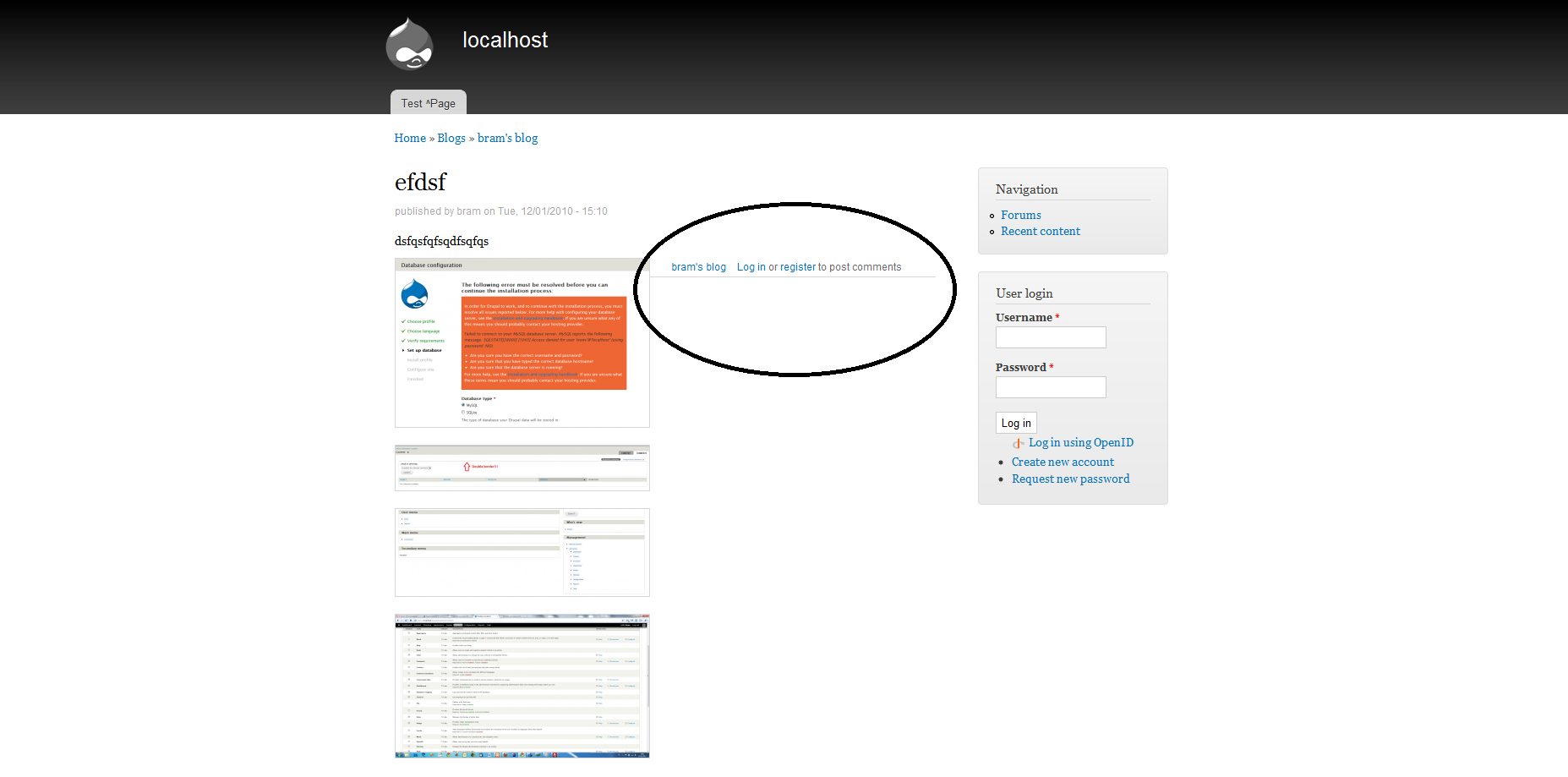
(The old one exploded when I cvs updated. EX-SPLO-DEAD.)
There's some new dummy content on the demo site, including a demo of something I've been planning this whole time... an easy way to do this: http://bartik.milkweedmediadesign.com/node/9
I also went through this awesome list of bugs / requests and made a list at http://bartik.milkweedmediadesign.com/node/2
On the top of that page is a list of the things I'd love help with. Ping me for more info and how to coordinate. Yes, it's messy since this isn't in version control yet. Yes, I know I'm crazy for wanting to have multiple people work on this without CVS or something. But... it's just for now. And it can work.
There's a lot more for me to do. And once I get closer, I'll roll a patch and see about getting this into core. Meanwhile, consider everything discussed above digested and summarized onto the punch list.
Comment #75
jensimmons commentedOh, and of course. I meant to upload a new zip with the most recent round of changes.
Comment #76
joachim commentedOn setting Bartik to default:
edit: nm, in core.
Comment #77
marcvangendTwo thoughts:
If you make the background black (as proposed in the issue list on the demo page) that would cause problems the default behavior of many wysiwyg editors. Often, they re-use the main stylesheet which would cause black-on-black.
Mobile devices are used more and more, so wouldn't it be good if this theme would have a mobile stylesheet as well?
Comment #78
eigentor commentedImpressive punch-list, Jen :)
We should design the functionality in a way every new core theme (in a very optimistic outview) reuses the same code.
Jarek is working on some of the same stuff, so no need for duplication.
I'll try to keep track of the proceedings in both themes so maybe we can prevent duplication and make the coding as awesome as the looks.
Comment #79
wretched sinner - saved by grace commented@marcvangend - I think it would be a good idea, as it would make many module maintainers think about what happens on a reversed colour theme. I have run in to a number of modules that have been near-unusable on themes which don't have a white background, as the module maintainers test it with core themes and assume that every theme will be dark text on light background.
Comment #80
dixon_Things has to move forward quite fast here, if we shall have a chance at getting this into core. We need to attach a full real patch here, or at least upload the code as a contrib theme here on d.o so we as a community can work on this together. Core maintainers and core developers needs to have an easy way to look at the code so they can review it easily.
@jensimmons I guess you are sitting on the latest theme code? Can you create a usable patch from it? After that I can add my color module support from comment #54 and other people could also start hammering down your list at http://bartik.milkweedmediadesign.com/node/2 .
We need it as a patch, or at least as a contrib theme to be able to work on it fast.
Comment #81
marcvangend@wretched sinner: that's also a way to look at it, but in the case of wysiwyg, I don't agree. Usually, modules should not break because of the chosen theme, that's true. However for a text editor this is deliberate behavior: in absence of more specific information, it re-uses the theme css to approach the site's design. That's not bad programming, that's an educated guess.
Comment #82
joachim commentedAren't admin tables set to be 100% width in core CSS? At least they were in D6. Too many themes override this; they shouldn't.
@dixon_: github?
Comment #83
yoroy commented+1 etc.
Bartik looking great and solid feedback in the comments. Excellent work all around.
It would be great to see this land for core. From chatting with jensimmons in IRC I know a git repo is in the making *right now*. So that should surface soon enough.
I also soon hope to see a reworked version of http://bartik.milkweedmediadesign.com/node/2 posted as a "meta-issue" outlining the plan for landing this as the new default core theme.
Comment #84
Steven Merrill commentedGit repo:
http://github.com/jensimmons/Bartik
Enjoy!
Comment #85
brightboldWow this is fantastic! This is really what D7 needs to completely shine. Typography! White space! Progressive enhancement! I swoon. Awesome work.
Comment #86
janusman commentedAwesome work!! I like it! And thinking this is *so* necessary for D7 release (would be kind of sad to ship with Garland IMO)...
Jen, I bet more than a few are willing to help out to get this 100%... do you think you have specific stuff you want us to help with?
I wonder if @webchick and @dries have said/would say how good a chance this has to get into core...?
Comment #87
jensimmons commented@janusman
There's a list at: http://bartik.milkweedmediadesign.com/node/2
The code is at http://github.com/jensimmons/Bartik
Ping me if you want to help.
Comment #88
Steven Merrill commentedI've started to integrate color.module here: http://github.com/smerrill/Bartik based on dixon_ 's patch.
Comment #89
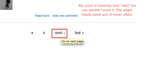
chandrabhan commentedWasn't there supposed to be bullets with the unordered list (from the demo site)? IE7 (on XPSP2)
Comment #90
mcrittenden commentedComment #91
dries commentedGiven that so many people love this theme (including myself), I think we should try to get it included in Drupal 7, possibly as a replacement to Garland. I'll brainstorm with webchick on a deadline. Before we do, it would be good to have jen propose a deadline.
Comment #92
citronica commentedGreat theme!
One small request: could you pad or indent the unordered list so the bullet isn't to the left of all the other text on the page? Many themes have the same problem, and it always looks like a bug to me.
Comment #93
joachim commentedHanging indents....
Personally I think they may look good in print, but are fraught with problems on the web, and in particular in a CMS. They run the risk of bumping into and overflowing from containers. Also, there is the unresolved (to my knowledge) question of what should happen on nested lists.
I think it's up to site designers if they want to try them, but not for Drupal core.
Comment #94
jensimmons commented@heartsutra and @joachim
I know it's overwhelming to read a whole issue cue, especially one this long, but this is definitely something already looked at and it's on the list of things to tackle. It's not something that I didn't notice or that I planned to leave that way. There are many, many things like that one to adjust.
The theme has a lot of things that need work. I hope to get a lot crossed off this weekend.
Comment #95
ChrisBryant commented+1 for getting this in core (and possibly default) as well... Here is a quick initial review:
1. Please add Skinr support!
Skinr is taking off with many of the top themes/theme frameworks supporting it these days (Zen, Fusion and Fusion based themes like Acquia Marina & Prosper, Studio)
2. -1 for Color module. I would recommend going with a simpler method such as Jacine suggests.
3, Foot menu styling: This current appears to be a vertical list menu and I think it would be better as a horizontal list.
4. +1 for mobile styles as well.
Nice work Jen and everyone!
Comment #96
mcrittenden commentedFor those of you saying that this theme shouldn't support the color module, don't forget that the hope is that this theme will hopefully replace Garland as the default theme, and if the default theme doesn't support the core color module, then there's very little reason to keep including Color module in core. If we need to get rid of the Color module, then that's a different issue, but as long as it's there, the default theme should support it, IMO.
Comment #97
jacine@mcrittenden I haven't forgotten anything. There are reasons I feel other methods should be explored. The "because this theme is going in core it needs to support the color module" argument doesn't fly with me. Since when is color module support a requirement for core themes? If I missed the memo, and that is the case, this is a sad day.
I've seen quite a few people end up in #drupal-themes looking for help after trying to use Garland as a starting point for their own theme. They are usually trying to change something simple, only to realize that the way they know how to fix it (with CSS) doesn't apply because the color module has taken over. Worse, there aren't many people that actually understand it well enough to help (myself included). These people are usually told starting with Garland was a bad idea and they should have used a different theme, like Zen. This is true, but frustrating nonetheless. The fact that help is needed from developers for implementation should be a red flag.
Aside from that, who actually uses the color module to implement color scheme options in themes outside of a small amount of contrib themes? A class on
bodyorhtmldoes the trick nicely, and IMO gives the designer better control over the color schemes.That said, I am not totally against having color module support in Bartik. In an IRC discussion between myself, Jen Simmons and Steven Merrill, an option was discussed to have color module support in a subtheme of Bartik. That would be a better move IMO. At the end of the day, this is just my opinion, but I stand by it regardless of what happens with Garland or color module.
As for Skinr, since it's not in core, and Bartik is going to be a core theme, I think any support for it will need to live in contrib.
Comment #98
mfer commentedThe question of supporting color.module brings up an interesting question. Should the default Drupal theme be designed to be hacked on? If so, this may dictate more than just the usage of color.module. For example, comments would on where to change things and the layout of CSS files would make a difference.
To say don't include color module because of people hacking on the theme doesn't sit well with me. To say a goal of the theme is to be hacked on and provide a base for people to learn and that color module doesn't support that well makes more sense. But, having that goal also dictates other things in the theme as well.
So, is that a goal of the theme? If so, what else in the theme is working towards that goal?
Comment #99
jacineI didn't say not to include support for it for that reason, and that is not the only reason. It's one of them. I also think people are going to hack at it regardless of whether it is the intended goal of the theme or not, just like Garland.
Anyway, what I'm getting from this thread is that core themes need to support the color module, which is good to know (even if I think it sucks). So, I'll shut up now. :)
Comment #100
mcrittenden commentedThanks Jacine for the well-thought out responses. A few replies:
It's not, but IMO it should be a requirement for the core DEFAULT theme, because otherwise that will officially make the color module the only module that does nothing out of the box (I think?).
Again, this sounds like an argument against the color module itself which is a separate issue. We can't decide to have the default core theme not support color.module because of a fault of the module, because that's in effect saying "even though this module is in core, it really sucks and we, Drupal core developers, don't even want to use it."
The same problem of color.module doing nothing out of the box would still apply. Plus, adding a whole new theme (even if it's a subtheme) just for color.module seems like it would just add a layer of confusion and cruft. Unless you meant that the subtheme would have a different look as well?
I pretty much agree that it sucks. Color module is a pain to work with, and I wouldn't be sad to see it go. But it's not going anywhere anytime soon :(.
Comment #101
mfer commentedI was actually thinking, this theme should be designed (as a goal) to be hacked on by others. A lot of people start with the default theme and hack away at it. That's where they start learning. So, why don't we take that opportunity to do something with the default core theme to help them go down that road in a good and peaceful way.
I like the idea of color module. If we want that for this theme I like the idea of adding it as a subtheme. That can extend the default theme and show off how you would do that. Provide a before (default theme) and after (sub theme). This would help people learn to use color module as well.
Thoughts?
Comment #102
eaton commentedI'm hesitant to start questions about The Big Purpose Of This Theme; it feels like there are a lot of subtle issues that jensimmons wants to finish up in the short term to get it "ready for commit," and for the time being it satisfies one of the biggest needs: a default core theme that is fresher and more flexible than Garland.
I'd love to see it support color module (if only because it's a very simple and easy way for non-designers to make it look a bit different). In a perfect world, I'd love to see it provide a theme settings page as well: the Fusion theme by TopNotchThemes uses that page to give users a choice of several font-families for the body text and headlines. The Singular theme, by DevSeed, gives users a file upload field where they can upload a custom background image for the site.
If we're going to spend energy making this theme customizable, I'd actually prefer that we invest in a few of those features rather than trying to tug it towards the role of a 'base theme for the masses'. A clean, simple base theme would be a big boon but I would hate to bikeshed Bartik because we want it to do double-duty...
Just my $.02 as a non-designer who must occasionally design. ;-)
Comment #103
webchickI agree with eaton. We did a lot of work this release to make Drupal core itself a good base theme. See Stark.
Comment #104
catchIf we can do color module support as a sub-theme, that also makes a great followup patch. I don't think it should be a requirement for an initial commit. Also I don't think we should cram in features which use core stuff just because it's there - if it makes sense on its own merits, that's fine, but Garland would still be in core and still recolorable.
Comment #105
eaton commentedI agree that the extras I was discussing shouldn't be commit-blockers. I just meant that I would prefer to see our default theme feature more easy configuration options, as opposed to turning into another Zen/Mothership/etc base theme. Perhaps I misunderstood what others were talking about -- if so, my apologies. :-)
Comment #106
joachim commentedI agree with comments above that color module provides a quick and simple way to make a site look distinctive.
The problem with Garland + color is that even once colorized, Garland still looks... like Garland.
I think Bartik has a more generic look, and so different shades of it will look more distinct.
I've not looked at the way it's built, but I imagine it will also more easily stand having dimensions pulled around a bit (eg making the header area bigger/smaller, sidebar widths), which Garland didn't tolerate.
So with color providing a co-ordinated way to change the color scheme, and a few dimension changes, you've very quickly got something that doesn't look totally like out-of-the-box Drupal.
Comment #107
catch@eaton, sorry I wasn't directly replying to you. I fully agree not trying to make it into a proper basetheme is a good plan. People don't use Garland as a base theme, they just hack on it - making sure Bartik is a good hackable theme with less of the pitfalls of starting with Garland is very different from trying to do a core base theme.
Comment #108
mfer commentedAfter sleeping on it I woke up finding myself agreeing with eaton. This theme will be a face of Drupal. Most people will just use it (not hack on it). Making it a great theme for users would be better.
Then again, this is the @jensimmons show. This is just my $0.02.
Comment #109
jensimmons commentedCatch said it well — there's a difference between making a base theme and a well-written theme that's hackable by people new to Drupal or new to writing CSS / theming. I do plan for Bartik to be hackable. I don't consider it a base theme — other people have written far better base themes. We don't need a base theme in core, because a) Stark is already there and is a great solution for people who have their own design and know CSS and don't need or know how to rewrite tpl files. And b) people who do know how to theme also know how to download themes from drupal.org.
I am a firm believer, however that Bartik should be well-written and easy-to-figure-out for people who don't know how to or have time to write a whole theme. Bartik should help people adjustments to various things — background colors, column widths, text colors, links colors, etc. I also am a firm believer that this code should be well written because it's in core. People will look at this to better understand how to write a Drupal theme. Others will look at it (and the code it outputs) while evaluating whether/not Drupal is a CMS they want to use. Garland has failed to be a good example, and failed to impress with it's code. I want Bartik will be better than Garland in all these ways, not just visually.
I find it interesting that many Drupal developers believe strongly in following strict coding practices, but only for PHP. It makes me sad when I see this strong belief in good code is not honored for HTML and CSS.
Of course a lot of people in the Drupal community, especially the core maintainers and leaders in the front-end development community, are pushing for this to change. The D7 core tpls files are a great example of what's happening when HTML practices are taken more seriously.... but still, this thread reminds me that many Drupal developers don't care at all about respecting HTML and CSS standards.
I've had long in-person arguments with module developers who don't want to bother learning (or asking for help with) CSS. They use table markup to output the content of their module (content that is not tabular data) and could care less about why designers think that's bad. Many in the Drupal community don't value CSS that is well structured and easy to manipulate. I'm not one of those people. I believe strongly that CSS should be well written, well organized, well commented, easy to understand, and easy to manipulate /hack /rewrite in order to customize the theme.
If color module shreds the CSS, or vomits all over it (as some people have lead me to believe — and I'll soon be taking a deeper look at it myself to see what's happening), or if it requires the theme design to be structured in a crazy complicated way, then I don't want to use it. The cost is too high.
I agree it would be great to have some GUI tools for making customizations to the theme. And there are many different things we can do; color module is not the only option. But I also have seen over and over how the Drupal community does not do things that that screw up the code, no matter how cool or handy to some. There's an especially strong bias towards good code over GUI tools for "newbies." Bad code is constantly rejected from core. Crazy code that is in later gets weeded out (as much as possible). I want us to have the same standards for CSS.
It's not just base themes that need well-written code. It's all themes /all core themes. And Garland failed miserably on that front. Bartik is not going to be the mess of code like Garland was. And if not including color module is what is necessary to keep Bartik's code from becoming like Garland's, than I don't want color module in Bartik.
Like I said above, I'll be taking a deeper look at color module soon. Perhaps isn't not so bad code-wise. But if it is that bad, than color module is out.
Comment #110
joachim commentedI agree with all of #109, and I speak as a developer who cares about good CSS and HTML, and has sometimes filed issues on other modules regarding use of tables for layout! ;)
Comment #111
Steven Merrill commentedSee #693504: Color.module does not support more than 5 colors and has hard-coded labels for a question about the viability of adding a minor (backwards-compatible) API change to color.module, since we may want a few more than 5 changeable colors.
Comment #112
webchickSomewhat OT, but let's avoid hyperbole like "don't care at all" and "failed miserably." Remember that Drupal is the lump sum of contributions by people who give freely of themselves, with what knowledge they possess and what time they have to dedicate. For some people that knowledge is deep underlying guts of the system, for others it is a deep understanding of web standards, and for still others it's how to put documentation together in a clear and concise manner.
Real, actual, human beings worked very hard on Garland, and Color module, as well as modules out there that output non-standard markup. Ignorance about best practices needs to be combatted with education (and patches), not hurt feelings.
Comment #113
webchickBack on-topic, Jen, have you given any thought to a deadline you'd like to achieve? I'm getting a bit nervous about how scope-creepy this is getting, and want to make sure that we have ample time to fix inevitable clean-up bugs after.
Comment #114
jensimmons commentedYeah, my giant apologies if I insulted people's work. That was not my intention. I'm sorry.
Also, Steve Merrill is sitting next to me pounding on Bartik and color module, getting far in figuring out how to best integrate them.
As for deadline, how about January 31 for a deadline for getting the first version of Bartik into core.
Comment #115
BettyJJ commentedI definitely support the idea of letting users define their own color schemes, but this doesn't have be done via the color module. The CTI Flex theme (http://drupal.org/project/cti_flex) lets users define custom colors by directly entering the hex color code or through a color wheel if the color picker module (http://drupal.org/project/colorpicker) is installed. I think this way looks very clean and easy to use. Perhaps someone can have a look at the CTI Flex theme and see if that approach can be adopted here?
Also, I really like the suggestions rickvug gave in comment #52. These are the nuances that make a theme stand out. :)
Comment #116
tstoecklerRe: #115: As has been said before:
Color.module is not the best solution out there for making themes color-adjustable. The situation simply is, though, that we have color.module in core. Therefore I don't think it's really an option for a core theme to establish a pattern of "evading" a core module. We're simply stuck with color.module for Drupal 7.
Comment #117
ipwa commentedI have integrated the color module to a theme before and found that not being able to change the labels or add more than five colors (thanks for the patch stBorchert!), was a huge limitation. However saying that this module vomits over your css is not accurate.
The color module won't change anything below this statement:
So if all the colors you want to change are kept above that, and colors that are supposed to be constant (no matter the color scheme) are kept below that, then there's no vomiting going on ;)
I would like to know more about Steven Merrill's progress in color module integration, because maybe I could help out. Cheers!
Comment #118
jensimmons commentedYeah, I think the rumors about Color module were giving me the wrong impression. There doesn't seem to be any shredding or vomiting on CSS. So.... uh..... I take all that part back.
@ipwa (or anyone else) You can try out Steven Merrill's Bartik color module version at GitHub.
See all the different branches? You can make one too: http://github.com/jensimmons/Bartik/network
Click on the last version from anyone, and you can download that as a zip or tar. Of course you can also do a checkout using Git.
Steven got a lot done yesterday! It's looking pretty hot.
It would be great for there to be more than 5 colors, and even better for us to be able to rename what those 5 are called... if you are interested in helping with that, see this issue: http://drupal.org/node/693504
Comment #119
dodorama commentedI think that all this hate towards Garland is a big mistake and due to this misunderstanding the development of this theme, that I really like, is taking the wrong path. Let me expand on this and please forgive my english.
1. Garland is a beautiful theme.
Everything (from typography, colors and design) is in the right place. In my opinion Bartik, at this stage, is still beyond Garland. It may look better because we are all bored to death of Garland after staring at it every time we install Drupal; but please don't let this feeling pollutes your judgements.
2. The scope of the default theme should be to work out of the box, not being the base theme for small tweaks.
Garland and the color module are there to give people a great theme that you can tweak using a UI, not having to deal with code. Consider that one of the main point of this release is to make the life easier to newbies. (even if you don't like the idea)
3. I love web standards and ultra clean html as everybody, but we should all understand that writing the HTML for Drupal is not like writing HTML for a static page. There are a lot of use cases to take into account and this inevitably leads to a more convoluted code. If you want a super-clean HTML in Drupal the only solution is to write your own theme for your specific project. (and yes, for sure, Garland has some - too many - extra divs that are there just for cosmetic reasons, but maybe we can just correct that)
4. The use of a css framework like 960 (that I love and use sometimes) clutters the css even more. It's not a solution in this case but a problem. You force people to learn another framework on top of css. If someone really wants to change the width of some regions is much easier to write well commented css and make it easy to change a couple of numbers than having to understand yet another framework (and here we can make better than Garland avoiding to use negative margins that makes tweaking more complex).
5. Looking at the files (not the code), it seems to me that Bartik overrides some templates. In my opinion the default theme shouldn't. Doing that is like saying that Drupal default templates are wrong. If they don't work for the default theme why we wrote theme as such? The same for default regions. On the other hand I support the use of theme specific settings to replace the header image, change fonts and such. Unlike regions and template overrides, those don't rewrite Drupal standard code but provide extra functionality and are specific to the theme.
7. Still, I really like the theme. It lacks a little bit of personality and the depth of Garland (you can see this when the site is still empty, and since this is the case with every fresh installation it's something we should consider ). Garland with all those subtle 3d effects, gradients and transparencies is a little bit overwhelming but even really effective. Bartik is for sure more versatile but even of less impact (at the moment).
What I see at this stage is a really good theme for core but not as default. I think this would work well as the theme of choice for newbies to do small tweaks and code customization to fit their needs, as an option. In the end this doesn't mean I don't appreciate the job that has been done. Being in the middle of trying to build a theme for contrib. my self I understand the difficulties of writing the one that must suit every need and please many people.
P.S. Talking about sites that don't have to look the same in every browsers, I agree only if we believe that those little details we'll miss (rounded corners, in this case) aren't important for the overall design. (Screenshot in IE7 attached) (moreover as a standardista I'd like to listen people opinion on using vendor specific properties, - like those of webkit, in example - unless they're there to prevent specific bugs)
Comment #120
cliffFor over a month, I've been meaning to get back to completing a full explanation of how to evaluate color contrast. But that might not happen until you want this theme done. So in the interest of saying something useful, I'll point out that many Drupal themes have too little contrast between text and background. We seem to be trapped in pastels. There is a great tool called Color-A that can guide designers toward the selection of palettes in which each color used is paired with colors that have sufficient contrast for people with impaired vision to see the text. (You do have to know the hexadecimal code for at least one of the colors you want to use. If you have the color but don't know its hex value, you can use the Colour Contrast Analyser to find it.)
And let me point out that this is a case where more is not necessarily better. A relatively rare visual impairment makes it difficult to see text when the contrast is too high. So achieve enough contrast to comply with the guidelines in WCAG 2.0, but do not try to achieve the highest contrast possible. (These tools do tell you whether the selected colors have sufficient contrast according to WCAG 2.0. The advantages of Contrast-A are that you can use the tool to build a complete palette and, if any color pair lacks sufficient contrast, the tool shows you how to change either color to obtain a pair with sufficient contrast.)
I wish I had time to explain more completely, but I hope this steers you in the right direction. And I am really glad to see this theme. Great job, jensimmons!
Comment #121
eaton commentedI'm not sure I agree with that reasoning.
The ability to create a custom template file for an individual theme is one of the fundamental strengths of the Drupal theming system, and one of the first things that needs to be done when building a new theme. Forcing us to adopt a one-size-fits-all approach to regions, template files, and so on seems counterproductive. Shipping a theme that leverages that without cluttering every other theme with a list of unneeded regions or needlessly specialized markup seems like a great idea.
There's nothing to stop another designer from putting together a pure CSS skin for core's default templates: even Garland doesn't go that far, providing a template.php file and a page.tpl.php file. If anyone is willing to do that, it would be pretty cool. Bartik doesn't have to be that particular theme, though: I'm pleased that we would have one in core that actually DOES show off what can be done with overrides...
Comment #122
joachim commented> 1. Garland is a beautiful theme.
Yes, it is. And yes, we're all a bit tired of it because we see so much of it, and we may in 3 years be tired of Bartik ;)
But I also also think that some of Garland's elements (the pointy white triangles on primary links and the cut-away section for the breadcrumbs) are a bit too distinctive, and so whatever you do to it, you still have something that fundamentally looks like Garland. Beautiful, but not well suited to purpose.
I get the impression that with Bartik, someone who quickly wants to make a site can just drop in an image into the header, play about with colours, and have something that looks reasonably personalized.
Comment #123
dodorama commented@Eaton I'm not saying that drupal default template files and regions should fits every theme in core but just the default one. Otherwise there's no reason to have those defaults. If we feel the default theme should ship with different templates and regions, I believe we should change Drupal default files and regions not override them.
Comment #124
catchWe already have a theme in core which exposes the default templates, it's called stark.
The default templates are designed to be easy for CSS-only themers to extend. The default theme is supposed to look nice when you install Drupal and show off some features. These are two different tasks. It's not impossible that someone will submit a CSS-only theme for D7, and when that happens, there can be a discussion about whether that should be committed, and whether it should be the default or not, but currently that's not on the table at all.
Comment #125
webchickJen, if you're planning on a 1/31 date, which sounds good to me, we need a patch uploaded here asap so that people can get started reviewing the code, etc.
Comment #126
webchickJacine indicated on IRC that I perhaps haven't been as urgent about this as I need to be. Here goes.
I am extremely concerned that we are heading into February, and I am not seeing fervent back and forth patch reviews on this issue. This is the surest sign to me as a core maintainer that rapid progress is happening and there is a team of people to drive this home. Right now I see no team. I see something that looks nice on the surface and a lot of comments that amount to basically "+1!".
If there is such activity happening in an off-site repo (such as github) to better facilitate collaboration, then great, but there absolutely has to be periodic patches/summaries posted here so that the rest of us can keep up with (and contribute to) the progress. Our core patch reviewers are here, not in github, and it's imperative that these reviews be tracked transparently for all to contribute to.
I am also very nervous that we will end up with 3-4 nice looking, but non-core-worthy themes because of resource allocation issues, and this whole initiative will end up getting bumped to Drupal 8. We have a very limited number of front-end developers contributing to core at all, and those people are currently stretched around at least three core themes plus whatever else they were already working on. If we don't see a huge influx of new front-end people giving reviews, I think we might need to cut our losses and try to get just one of these in rather than three. :\ I really don't want to do that, because this would be totally amazing if we could pull it off, but we need critical mass in order to do so and I am not seeing it.
So what I need to see, absolutely as soon as possible, are actual code reviews, and lots of them on this issue. That only happens when we start posting interim patches. So please let's get some code in this issue!
Comment #127
katiebot commentedI'd like to help but I'm not sure what the priorities are. Help? I could just download the code from Github and pick something from the list (http://bartik.milkweedmediadesign.com/node/2) but it would make sense to spend time on the most urgent issues.
Comment #128
joachim commentedA few things from Jen's list:
# Add a tool for uploading a header image. With help text about image sizes.
Surely something for core rather than a single theme -- and too late for core this time around.
# Create theme setting to hide the site title and slogan (by pushing it off the page with text-indent:-9999px; not getting rid of it altogether)
Ditto; though perhaps doable?
Comment #129
flickerfly commentedI'll start reviewing & testing as soon as a patch shows up.
Comment #130
johnalbin@webchick Ok! Ok! :-D
I've been talking to Jen since July about this theme in one form or another. And I've already committed to helping polish it up and make it core-worthy.
There's still a bunch of work to do, but to soothe your nerves, here's a patch off the most recent work over at http://github.com/jensimmons/Bartik It doesn't yet include the color-module branch that Steve and Jen were working on last weekend, just the stuff in the master branch.
And the images tgz file should be put in the themes/bartik directory before expanding it.
Comment #131
seutje commentedsubscribe
Comment #132
johnalbinMight as well let the testbot have a go.
Comment #133
Steven Merrill commentedI will chime in and say that we got it to work with core's existing color module and labels, so while an API change to make color.module would be nice, it would not necessarily be required.
Comment #134
cbovard commentedscribing
Comment #135
andypostThis theme odes not have background-color... so look ugly if browser's background is different from white
Comment #136
ipwa commentedI'll patch my d7 head install and give a full code review, but I just wanted to say that API change to make color.module would be so awesome! Please please please webchick make an exception for #693504, and please anyone who has ever intended to integrate a Drupal theme with the color module chime in on that issue. Our themes deserve a more flexible color module, and the changes are not drastic.
Comment #137
joachim commentedBartik from github is great.
Patch in #130 has no screenshot, and gives me a heap of error messages when enabled. Though those could be because I also tried the color module branch and I now have my variables polluted with that...
The more I see this theme the more I like it :D
Comment #138
joachim commentedThe Sidebar Second region doesn't work, whatever I put into it.
Comment #139
jensimmons commentedAwesome! So color module support is now in Bartik. Get the new code at GitHub.
http://github.com/jensimmons/Bartik/archives/master
Comment #140
jensimmons commentedAwesome! So color module support is now in Bartik. Get the new code at GitHub.
http://github.com/jensimmons/Bartik/archives/master
Thanks Steve Merrill (smerrill) for doing most of the work on this! And JohnAlbin for chiming in.
Comment #141
jensimmons commentedseute just fixed a clearing bug. Awesomeness.
http://github.com/seutje/Bartik/commit/b952ece8ab3886f24ce7fa67c7a393d26...
Comment #142
jensimmons commentedAnd for all you oldskool Drupalers, joachim just made a color scheme for the color module that is very blue. Find it in the pulldown menu of pre-defined color schemes, named Blue Lagoon.
http://github.com/joachim-n/Bartik/commit/8e00e71ad96550cb1b701ed81893f5...
As always, you can download the new code is on github.
http://github.com/jensimmons/Bartik/archives/master
Comment #143
reglogge commentedNew (and real) screenshot attached
Comment #144
dixon_Here is a patch with all the latest changes from jensimmon's, smerills (color module), and joachim's (clearfix) git hubs. At least I think I got them all.
From now on I would strongly recommend to continue the work here on d.o with real patches! That way core maintainers, reviewers etc. more easily can see whats going on and review the code. I don't think they have time to check out stuff from git hub.
I also made a huge walk through of all the files and fixed a lot of code style issues to make it even more core worthy :)
I also attached a new image pack that shall be placed in the bartik folder. It includes the screenshot from #144.
Comment #145
dixon_Ops! I somehow lost the preprocess functions in template.php that makes the color module work. A new patch is attached below.
You'll also need the image pack from #144.
Comment #146
dixon_Okey, it's too late here... This one will work correctly ;)
Comment #148
dixon_Strange... Let's try that again.
Comment #149
dodorama commentedcolor.module support is awesome!
Here's a screenshot of the blue lagoon preset.
Two issues I found: The logo isn't colorized. changing body text and base colors doesn't seem to work (everything else does).
Talking about typography, it seems to me that the site name font is too small. Moreover I'd like to see Arial in place of Helvetica Neue in the meta, tags and links tags. Even if I love Helvetica, at this small size Arial is slightly more readable (more space between characters) and very similar. Attached are screenshot from Safari on a Mac (in the second one the site name is set at 240%, too).
P.S. Is there a way to add inline images to issues referencing attachments? I tried but the html has been stripped away
Comment #150
stephthegeek commentedRe: typography -- after spending way too much time researching the Arial/Helvetica debate recently, it looks like it's still the safest to put Arial first for any small (body) text. Helvetica at small sizes becomes nearly unreadable for the ~7% of people who actually have Helvetica installed on XP, unless you have gone in and explicitly configured the font smoothing. Given the intended widespread audience of this theme, I think it should go the safe route.
Comment #151
joachim commented> From now on I would strongly recommend to continue the work here on d.o with real patches! That way core maintainers, reviewers etc. more easily can see whats going on and review the code. I don't think they have time to check out stuff from git hub.
You mean patches that don't include the images, and are a PITA to make with CVS fakeadd?
As opposed to github, where it took me seconds to branch and submit my proposed change, and you can download the whole theme folder in a snap?
Comment #152
dixon_@joachim You don't need to do all the work here on d.o. But we need to regularly submit patches here, and consider this queue as the "head" or main bransch. Otherwise reviewers have no chance to keep up to what we are doing, and where we are doing it.
I will gladly help with the merging of fixes from your github account, and create CVS patches for those. It's actually not that hard when you have the tools setup for it. So keep up the good work and we all will get this done together! :)
Comment #153
catchNot to jump the gun, but it might be worth asking Dries or webchick to create the bartik folder and add the images in CVS as soon as this starts to look commit-worthy (haven't reviewed code yet so no opinion either way on whether it is or not). Then it's just adding files, which is a lot easier than messing with directory creation and image gzips, plus reviewers only have to apply the patch to get everything working. That would still allow the code to be properly reviewed before it gets committed, but without some of the overhead for testers and patch re-rollers.
Comment #154
flickerfly commentedShould I be opening new issues against this theme now or wait until it hopefully gets into core?
In order to get the color module to change colors, I had to disable and re-enable the theme. After doing that, this part seemed to work fine. I really like the dropdown thing instead of the tabs for edit and stuff. The forums still need some attention. I also can't get any blocks to show up in the second column region.
If the block in the first footer column doesn't have a height (doesn't have content) the entire footer collapses, hiding content in the other three footer columns. The same thing happens if no blocks are in the first column. I observed the same thing in the triptych area.
Environment
Ubuntu Linux, Chrome Browser
Comment #155
flickerfly commentedThe previous color problem that was resolved by re-enabling the theme came up again, so that isn't just a quirk in the patch process or something.
In other news: My ability to make websites ugly has been enhanced by Bartik's color module support. :-)
Comment #156
carlos8f commented@dodazzi, the sans font in #149 looks the same, I think they are both Helvetica.
Helvetica is one of my favorite typefaces for print, but while it looks great on Mac (Apple's version is optimized for small sizes) Windows renders it very poorly compared to Arial, due to the mysterious nature of ClearType. Until that is fixed, I think Helvetica should be listed after Arial in font-family definitions. Windows still has 90% of the OS market :-/
The Blue lagoon preset looks awesome!
Comment #157
dodorama commented@carlos8f
That's exactly what I meant: replace Helvetica with Arial, because Arial renders better at small size.
The screenshot are correct. Look at the "read more" link. You'd notice that it's a little bit more spacious in the Arial version.
Comment #158
carlos8f commented@dodazzi, I'm not sure about the "read more" text, but tail on the "a" in "Drupal" seems suspiciously like Helvetica in arial.jpg :)
Comment #159
dries commentedGlad to see some actual action on this issue. The proposed deadline looks good to me. I'm not sure we should remove Garland -- I still think it is a very solid theme that is on the same level as Bartik (except that us regulars are bored with it).
Comment #160
joachim commentedI'm not sure anyone's said we should kill Garland -- still ship with it, just make Bartik the default in its place.
Comment #161
dodorama commented@carlos8f
Just to clarify.
You're right, the site name is still Helvetica, in my screenshots. As I said I replaced Helvetica with Arial only where the font size are small: in the meta info, taxonomy and links.
Comment #162
webchickOk, so there is obviously some contention about the fonts used.
Now, can we please review the code? This includes things like:
- Is the code formatted consistently, according to the Drupal Coding Standards?
- Are the CSS rules written optimally?
- Is the output W3C compliant?
- Is there PHP code in tpl.php files that needs to be moved to template.php?
- Is the code in template.php well-documented and easy to understand?
Comment #163
cweagansI'm going through the code and doing a review right now. Will report back in a few with results.
Comment #164
dixon_@webchick, and all others
As I mentioned in #144 I walked through and reviewed/patched a lot of all those things already.
As discussed with jensimmons over IRC recently, we'll have another shot at this tomorrow.
Comment #165
mcrittenden commentedThis is more of a coding style review than anything else since that's all I could find...the big stuff seems to be pretty well thought out. I'm going to ignore all 960.gs related stuff since I've already stated my preference to have that removed.
We might want to think of a new description here. Pretty much all themes have multiple regions, and hopefully all core themes should have well formed code (if they don't, then that needs fixing). Also, "Suitable to be used for" doesn't really make sense. How about just "Suitable for"
Can we think up a different name for these? I had to look up the word, and I'd assume others would have to too. How about Triplet first/middle/last or something?
What's the deal with that?
Space before the permalink.
Missing a semicolon (might be missing in the default in comment.tpl.php but either way needs to be fixed in this theme).
Can we get rid of those divs?
If I'm not mistaken, the colon needs to not have a space before it, even though that's the way it is in the default field.tpl.php, though I could be wrong.
Did you need to override html.tpl.php? I couldn't find any changes from the default. Also, if you're going to override it, seems like you'll want to remove the space before "<?php print $attributes;?>" in the body tag to keep consistent with the rest of the theme's templates.
Semicolon after $base_path (in maintenance_page.tpl.php)
Let's put breaks in for the if statement here to keep it under 80 chars.
I'd like line breaks and new <?php ?> tags here as well just to stay consistent.
Line break and indention here as well please. Not sure if this is a standard or just a preference of mine, though.
Line breaks are awkward here.
And here as well, though not quite as bad.
I'd prefer line breaks here as well, although again it might just be personal preference.
Page.tpl.php gets a little div-tastic. That's just an example. Are the .section divs necessary here? Can they be bundled in with their previous divs instead?
Again, I'd prefer some line breaks here, especially for the if statements.
"u" in comments
I could use some line breaks in these, for example after the commas in the array declaration.
Could probably drop down to two space indentions instead of four.
Needs a period.
Do we need to do this in both preprocess_page and preprocess_html now? That's a bit of a bummer if so, but obviously outside the scope of this issue.
Not sure those comments are needed since it's pretty obvious what the declarations are targeting.
5x
This is used throughout...needs to be sans-serif right?
Should probably use ems or px, not both.
No quotes needed, also doesn't it need to be ../images? Same error is repeated a few times.
Helvetica Neue needs quotes around it (this is repeated a few times but is right a few times as well)
How about -moz?
Comment #166
yched commentedWhy does the theme come with its own field.tpl.php ? I see no difference with the original.
Comment #167
joachim commentedMost of the code style points in the code review above make sense to me.
I'll leave the CSS people to justify the DIVs in places like the tabs as I'm sure there is a reason for them.
I just want to say that 'triptych' is a perfectly good word and it describes the effect nicely.
Comment #168
cweagansLooks like mcrittenden beat me to the punch, but here's some more stuff to ponder.
The first thing that I noticed was that the directory name for the theme is "Bartik". To be consistent with all of the other files and directories in Drupal, this should be changed to "bartik", I think.
bartik.info:
block.tpl.php:
color/color.inc:
rather than splitting it out onto separate lines? You do that with line 25, so it would be good to stay consistent here.
color/preview.css:
/* $Id$ */inside of this or is it ok simply being empty?comment-wrapper.tpl.php:
The variable name could probably use some work, but you see what I'm getting at? Then, forum module could just turn off visibility for the forum node type. I dunno. Just throwing stuff out there.
The rest of the lines would then need some more indentation. Line 46 would need split as well. I think it looks a lot more clean like that. We don't really have any coding conventions for the markup yet (http://drupal.org/node/223584), so this is debatable.
comment.tpl.php
css/960.css
/* $Id$ */at the topcss/layout.css
css/reset.css
css/style.css
field.tpl.php
html.tpl.php
maintenance-page.tpl.php
node.tpl.php
page.tpl.php
README.txt
template.php:
Comment #169
cweagansWhoops.
Comment #170
jensimmons commentedAll these tpl files are from the system, node, comment modules (and others) in core. I've been periodically going back to those originals and looking to see if they've been changed, and manually updating Bartik with the changes if they have. In order to make that human-version-control process easier, I've keep a running comment of which version of the core files the Bartik file is copying.
Perhaps changes to the core files are done. But until I can be sure everyone knows to duplicate any changes to those files to their partners in Bartik, I'd like to keep that comment. I don't want to miss a bug fix or variable syntax change because it was only fixed in the core file and not in Bartik, too.
Comment #171
jarek foksa commentedI'm not sure about body font size. I would either respect user preferences and do not specify it at all (it's just like setting body font-size to 100% or 1em) or ignore user preferences altogether and specify my own fixed value.
Let me give you an example. There are generally three kinds of users:
1. Geeky users - they know how to configure default font size in their browsers. They also know how to use zoom functionality but they are always annoyed when they have to do it.
2. Normal users - they have never touched browser preferences. So their body font size is left to default value which is 16px. They are relying heavily on zoom functionality provided by browser.
3. IE6 users - just like normal users, but their legacy browser does not allow them to zoom on some pages. Besides they are evil.
If you don't set body font size (which is equal to setting it to 100% or 1em):
1. Geeky users will be happy because fonts will match their preferences
2. Most normal users will be sad because of the big fonts (16px)
2. Most IE6 users will be sad because of the big fonts (16px)
If you set body font size to 13px:
1. Geeky users will have mixed feelings - this is the font size most of them would expect, though you ignore their preferences
2. Normal users will be happy - this is the font size they would expect and they can use zoom functionality
3. IE6 users will have mixed feelings - this is the font size that they would expect but they can't zoom it
If you set body font size to 0.8em:
1. Geeky users will be very sad (font size will always be smaller than their preferred size)
2. Normal users will be happy - this is the font size that they would expect (0.8em * 16px = 13px) and they can use zoom functionality
3. IE6 users will be happy - this is the font size that they would expect and they can use zoom functionality
Conclusion: there is no difference between 13px and 0.8em for normal users, but fixed units are more friendly to advanced users while fluid units are more friendly to IE6 users. There is no perfect solution, but considering the fact that IE6 usage is already far below 10% (if you exclude asian countries from statistics :P), should we still discriminate advanced users for the sake of IE6 users?
Comment #172
jarek foksa commentedThose could be replaced with just two dynamic regions. Take a look at ADT basetheme. I'll try to implement it when I'm done with my theme.
Comment #173
jacineCan we please start moving these conversations about specific topics (like typography, bug reports, etc) into individual issues? There is too much going on in this issue, and we need action items that can be assigned to people.
I started making some issues for Bartik today, from Jen's list. They are located here: http://drupal.org/project/issues/search/drupal?issue_tags=Bartik
To create a new issue, do the following:
Comment #174
dixon_All the action is happening on Github at the moment. Here is a quick recap:
Jen's branch is unfortunately missing some important changes (non CSS/HTML stuff) due to some problems with Github itself. But I've merged everuthing into my branch here: http://github.com/dickolsson/Bartik . I've tested my branch and everything that is implemented seems to work properly.
I know Jen is planning to roll a CVS patch later today. But I don't know from which branch she wants to do that. So I am leaving that for her to decide.
Comment #175
dixon_Here is a new roll at this. This patch mirrors my branch at github (http://github.com/dickolsson/Bartik) which includes:
#link-wrapperThe patch does not include:
preview.cssneeded for the color module.So, still some work left to do. Although, it's ready enough for another round of reviews!
Comment #176
joachim commentedFor a lot of people 'hacking' means breaking into people's bank accounts... and I'm sure that includes people who get as far as installing Drupal and changing their theme. Let's use non-jargon here, eg 'modifying'.
Only one sidebar now? How easy is it to modify the theme to put it on the left instead of the right? If we're aiming to be easily modifiable, changing sidebars from side to side is something people will want to do.
Testing for node types that might or might not exist feels a little hackish... I guess there's no way round this though :/
Full stop here? Not sure about this; I'll have to check it on actual output, just looking at code right now.
Does a node's $submitted get a full stop? For that matter, how come node.tpl gets a ready-made $submitted and comment.tpl has to build it itself?
I've not played around with D7 theming yet to know whether this could be moved to template.php...
Powered by Dreditor.
Comment #177
catch@joachim - I'm pretty sure we have comment-TYPE.tpl.php suggestions, not sure about comment-wrapper-TYPE.tpl.php, but if there's not, then it's better to support core modules visually than not.
Agreed that 'modifying' is better than 'hacking', could we get away with "copying and modifying'?
Comment #178
jensimmons commentedI'm not very happy about the patch in #175. A lot of changes the changes that were made are changes I disagree with. I never expected Bartik to be forked, changed against my repeated wishes, and presented as if I am cool with it. Please do not commit the forked theme, I'd really prefer that the work that goes into Drupal is from the version that reflects my vision — at least for the first patch.
I'm also kind of stunned about what happened in the last two days (mostly in IRC). It is truly exhausting for a designer to try to do good work in this environment. I had plans to accomplish a lot of new work this weekend, but instead spent most of my effort trying to defend the work I'd already done. Now, I'm at a bit of a loss.
Comment #179
jensimmons commentedComment #180
chx commentedorry if you felt you need to defend the work you did on IRC. Indeed IRC can be a bit of intimidating -- maybe you should work off IRC a bit? If you need help with PHP/CVS/whatnot I will be happy to lend a hand nonetheless.
Comment #181
cweagansWell, the deadline for this patch was set to...um. Today. So, since you were unavailable (at least when I was around), dixon_ and I did some work on the theme today. This is something that a lot of people really want to see get into core, and the changes were not stylistic changes. The theme should still look/perform exactly as you intended. I don't know about all the changes that dixon_ rolled into the patch, but I know that the work that I did was simply code cleanup, that would get rid of reasons to not put this in core (and would have been necessary anyways).
The trick here is trying to balance your vision with the Drupal core development workflow and the Drupal coding standards. For example, having a copy of the core template files for no reason is not something that really happens. If there's no change to the template, there's no reason to include it in your theme. It's just extra code that will need to be maintained.
So, more to the point: what do you want to have happen with this theme? You've got at least 10 people that have previously done work on the theme (according to the Github network panel thing), and I know that I'm ready to put in a few hours to get this thing ready to go. You make a list, and I'll start working through it because I want to see this in core. It would be a shame to ship with only Garland, Seven, and Stark.
Comment #182
cweaganser, whoops.
Comment #183
jensimmons commentedOK. I just merged all the changes everyone made over the last few days into the github master. I didn't pull from the github forks because 1) github is acting very weird and broken, and 2) I wanted to be able to commit most of the changes without having to do all of them, on a line-by-line basis. Using Delta Walker locally allowed me to quickly see what people were doing, merge in all the awesomeness, and leave out the few things I didn't like or that were mistakes.
Commit: http://github.com/jensimmons/Bartik/commit/5e3cc7f41f9087ffa15c9f6993d8d...
First I want to thank dixon_ for spending so much time cleaning up spacing. I was glad to finally figure out a way to merge all that work you did into the main branch.
I am leaving html.tpl.php, maintenance-page.tpl.php and the readme. I have strong reasons why I think they should go in. I know some people disagree. What I'd like to do is include these files for now, and then open separate issues about each one where we can debate whether or not to ship Drupal with them. If it's decided any one of them should go, then a new patch can erase it.
I also left the comments in the stylesheet formatted as they have been all along. The Drupal community doesn't have agreement about how CSS comments should be formatted, and I'm following a practice that is very common among CSS coders. It's also much easier to see visually than the proposed format.
There were also a few details along the way that I made an executive decision about. But for the most part, I included 95% of all the requested changes. I hope that puts us in a great place from the code review perspective.
Comment #184
cweagansI really really _really_ don't think this can go in with those extra templates in there. There's no reason to have them. It's just extra files to maintain for the next couple of years. The README should be in drupal.org's doc section.
We don't have any written, defined code standards for CSS comments, but I think Garland, as a theme that's been in core since 4.x, serves as a good example of what to do/what not to do.
Will review when there's another patch.
Comment #185
naheemsays commentedI think having a readme is a very good idea (a hacker will first have a look at the files present before considering googling for "the right way").
However, instead of proposing to people in there to duplicate the theme I think creating a subtheme should be instructed.
Also this may not be in the scope of adding this theme but what about adding to the info file the details of a non existing style sheet? a local.css file where if a user wants to change something in the theme, the user is instructed to create a local.css which will come last in the list of css files.
Comment #186
webchickCan we get a summary of exactly what was incorporated into the latest patch, as well as a new patch to review? And is the demo site updated accordingly?
Comment #187
jensimmons commentedLook it's a patch!
It's 2:35pm EST (in New York), and the Bartik demo website, the github repo, and this patch now all match with the exact same code. I've folded in all the changes people posted to Git. And I'd love for people to review this as a patch to go into core.
Here's what's in it:
1) Everything.
Including:
a) Color module integration (thanks smerrill) and some color schemes (thanks joachim and theresaanna)
b) A theme setting so people can easily change the "published" by text. (thanks dmitrig)
c) Complete change of how the turned-off "Site Name" theme setting works — so that instead of not printing the site name at all, the theme does print the name into the html (for accessibility and findability reasons) and then hides it using CSS. (thanks dmitrig)
d) Removal of 960 grid code leftover from prototyping.
e) A bazillion spacing changes and other code cleanup to clean things up (thanks dixon and cweagans)
f) A lot of recent changes to CSS, including better buttons, better footer menus, fixing a background image.
Seutje and chx also contributed code. And a lot of other people have been helping out in different ways.
There's a lot left to do, but rather than managing one giant patch and all the many things going on with it from Git and the manual version control backflips I've been preforming, I'd rather get this into core asap, and start using normal Drupal Ways to manage the rest of the changes.
Comment #188
jensimmons commentedbot?
Comment #189
jensimmons commentedOoop, the git files were in there. Here's a corrected patch.
Comment #190
cweagansI've said it previously, but I still really disagree with a README being included with a core theme. Why should we include user manual information along with the code, when there is already a centralized manual on d.o?
As I previously said, this should not be included. It's duplicating (verbatim) code that's already found in core.
If this file is going to be included, this line needs to be removed, along with the one directly above it (empty line).
Ditto.
Not sure how I feel about two div tags being on the same line throughout this file. It just seems a little messy/hard to match with the closing tag. Not a huge issue, though.
In the other CSS files, your comments are one way, and in this one, they are another. Please pick one :)
Additionally, a bunch of git files got into this patch (the entire .git directory for the theme). Those will need to be removed.
Powered by Dreditor.
Comment #191
cweagansOh, looks like you got the git files taken care of. Disregard :)
Comment #192
webchick"b) A theme setting so people can easily change the "published" by text. (thanks dmitrig)"
This is puzzling. Why? I would remove this, since no other theme offers this and it feels like fluff.
Oh. Everything else sounds good though. Let's get some more reviews. :)
Comment #193
Everett Zufelt commentedGood afternoon,
Took a very quick look through the comments. Is anyone currently performing an accessibility review of this theme? I would offer to do some accessibility reviewing on this theme if it is reasonably foreseeable that it is going to be committed to d7 core.
Comment #194
webchickOf all the themes being considered for core, this one definitely has the best shot. It's been developed the longest, and has the most people involved in getting it ready.
I would love to see you do an accessibility review on it, Everett!
Comment #195
jensimmons commented@everett: Yes, please.
Comment #196
Everett Zufelt commented@webchick, @jensimmons
Can someone point me to a demonstration site with a reasonably recent version of the theme? I can install head / the theme myself if necessary, but ideally I'd rather not :)
Comment #197
jide commentedGreat work everyone, there is good progress here !
I have one little issue though.
I do not find it useful to add a comment to enclosing tags everywhere. I do not think it really adds any useful information for developers / designers (not enough IMHO) and in the end this is in the output, which means bigger files too. I know it is done in Garland but I disagree...
Edit : Moreover, in Garland, this is done for hard to read nested markup in the main div and the header in the page template, not anywhere else.
Comment #198
Steven Merrill commentedEverett,
http://bartik.milkweedmediadesign.com/ is where Jen's been updating the theme. It's at worst 5 or 6 hours behind at this point.
Comment #199
marcvangendSteven, that's a Garland site right now... can someone with admin rights switch the theme please? :-)
Comment #200
jacineChanged it back to Bartik: http://bartik.milkweedmediadesign.com/
Comment #201
Everett Zufelt commentedA very preliminary accessibility eval of the Home page from perspective of a blind user with FF3/JAWS10 (screen-reader).
I'd say that this is all pretty good. The general comment that I would make is ordering of information in the DOM. The User Login and Search blocks, along with the footer are all in unpredictable positions. From the point of view of a non-mouse user who needs to tab through the screen it might be nice to place the login and search nearer to the top of the DOM. "Skip to Login Form" and "Skip to Site Search Form" links might also be beneficial. I would also recommend checking to make sure that flow of focused elements follows logical visual page flow.
1. Logo: the title of the anchor and the alt of the image are both set to "Home". This may be the node-title, but is not an accurate description of the graphic.
2. No heading before the main menu, other than the site title. This is not necessary, but would be consistent with accessibility improvements that were made to Seven. May be more necessary as modules are enabled and if a sub-theme is derived that makes structural changes.
3. The list of tags for each node listed on the home page are not structured as a list.
4. The "Read More" and "N Comments" links are structured as lists, even though there is only 1 item in each list. This may be appropriate if modules are likely to add to these lists.
5. "Some More Text" is confusing, but I imagine is just for testing.
6. "Who's New". My first question was new at what?
7. The footer is not structurally where I would expect a footer, which is at the end of the document.
8. Recent Content is structured in a table with two empty columns. Is there a reason to use a table for this data structure?
9. Ideally the search form would have a label. The title attribute on the input field is helpful to screen-reader users, however a label provides a larger clickable target for mouse users who have difficulty with fine mouse movements. This obviously depends on the size of the input field, which I cannot assess.
Comment #202
joachim commentedI'll field a few of these....
> 3. The list of tags for each node listed on the home page are not structured as a list.
They ought to be. They are in Garland.
> 4. The "Read More" and "N Comments" links are structured as lists, even though there is only 1 item in each list. This may be appropriate if modules are likely to add to these lists.
Yup, node links get added to by lots of modules. So this bit's fine.
> 6. "Who's New". My first question was new at what?
That's straight from core. It's who's new on the site.
Comment #203
Everett Zufelt commentedWhat I didn't mention in my accessibility review is that some of the problems may be caused by core itself. No reason not to fix theme in the theme if it is reasonable to do so.
Comment #204
marcvangend@Everett: the order of blocks like search and login can be managed by the site admin, so I think the theme does not have to worry about that.
I have been trying to tab through the site myself, but I noticed that there is no tab focus border around links in both IE8 and FF3.6. This is caused in reset.css:
(This is exactly the reason I'm not a fan of reset.css, it resets too much IMHO.) I have always been told that the focus border should not be removed without providing alternative :focus styling. Accessibility experts, is this indeed a problem?
Comment #205
Everett Zufelt commented@marcvangend
Thanks for pointing this out. If a non-mouse user cannot tell which element currently has focus then it is a huge problem for accessibility. Imagine not having use of the mouse, if you don't know by tabbing which link has focus then the site is virtually useless.
Comment #206
jensimmons commentedSo can someone who understands :focus well chime in here (and by that I mean a *CSS* expert).
I still have a lot to learn to make this work right for both visual and non-visual interfaces. I just hate the way outlines look in FF -- dotted lines around all the links during the active state. But I've recently realized that outline:0 messes up keyboard access.
So what's the best practice to 1) support keyboards and then 2) make it look pretty?
Comment #207
Everett Zufelt commentedI've been giving some thought to how to make the order of content in the DOM a little less confusing to a screen-reader user. Screen-reader users navigate through the DOM not the visual appearance of the page.
I think I would say that there could potentially be two heading level 1 elements on the page.
1. On the homepage the first h1 will be the site title and the second h1 will be (perhaps using .element-invisible from system.css) a heading that indicates that this is the side bar, or whatever language seems appropriate to describe the block content that comes after it. Keeping in mind to use plain language for the text in the heading and not Drupalese.
2. On any page where a single node is displayed as the primary content the node title should be the h1, not the site title, or perhaps both. I think we ended up with agreement on this with garland, not sure if it ever got implemented. The reason that we need a second h1 for this theme is because it is content-first. Content coming before other supplementary content can make it more difficult to find / reach the supplementary content for a screen-reader user.
As I suggested above for login and search, a "skip to ..." link might also be useful "..." being replaced with the wording from the second h1 heading.
And again, ideally the footer would be actually at the foot of both the visual page and the DOM.
I think this would provide some accessibility improvement and would not be visually intrusive.
One question on the skip links: are they styled to appear on focus/active/hover? This is useful for non-mouse, non-screen-reader users; and I believe this is the default in other core themes.
Comment #208
jix_ commented@ #206:
Another thing I experienced with the default (dotted) outlines in Firefox is that it can slow down any running JavaScripts terribly.
Perhaps a light gray background is an acceptable custom style for
a:focus(anda:active)? And the default link color as border color forinput:focus, select:focus, textarea:focus…It can be any style, really. As long as it's recognizable as the currently focussed link/field/whatever. It should not be confused for
a.active, for example.Comment #209
Everett Zufelt commented@#208
That is interesting Firefox behaviour that you have described. I'd love to know if you've noticed this mentioned by others on the web.
As far as colours go, I'd recommend using a tool like http://www.snook.ca/technical/colour_contrast/colour.html to make sure that all colours used in the theme (including any suggestions for focus etc. are WCAG compliant at the AA level. This basically means ensuring that the contrast between foreground and background colours is sufficient to make the text clear to low vision users. This may already be part of the Color module.
Comment #210
jix_ commented@#209
I've only seen it on OS X so far, not sure about Windows/Linux versions. I haven't found anything about it elsewhere yet. It's probably not something we should care about with this theme, I believe it occured only when scripts were used for animations, e.g. a slideshow.
Comment #211
mcrittenden commentedCan these two be combined?
Also,
I don't think these are working since it's supposed to be #comments-wrapper (note the 's').
Comment #212
stephthegeek commented@jensimmons I generally style :hover and :focus together, so the tabbed navigation highlight gets the same style as the :hover.
Comment #213
jensimmons commentedUpdate:
JohnAlbin created a dummy content tool that temporarily fills the new regions with help text content, so people see the regions, even though they don't get any Drupal default block content upon install. (I'm probably not explaining it well — try it out to see who it works.)
He also did a bunch of work, cleaning up code, improving CSS, creating proper conditional statements, and rewriting the maintenance tpl.
All of his changes are committed to GitHub. I'll work on a new patch (and also take out the tool to change "published by text") just as soon as I can. The demo site will get updated when the patch is made (it's not updated yet).
Comment #214
webchickThe reason, btw, that I want these little one-off doo-dad gadgets to be removed, like the "Published on" string being configurable in the UI, is because it makes it incredibly confusing for end users who get used to the way one of the core themes works, then go to do that same thing on another one, and then can't find that neat little thing they played with before. It also causes maintenance overhead because changes to themes can't be made consistently throughout.
If such features are found to be useful, they should be added to core itself (like Color module) so that any and all themes can hook into them. And since Drupal 7 is closed for new features, this would have to happen in Drupal 8.
So please keep these themes to just that: themes.
Comment #215
jensimmons commentedYeah, I think being able to edit the 'published on' string from the theme settings (or someplace else in the site config GUI) is an *awesome* idea! It's one of the most common and first questions I get from people who are attempting to customize their own site.
But also, yeah, it does not belong in only one core theme, post new feature freeze. It sounds like it should begin it's life as a new contrib module. Or a cool practice in more contrib themes. And later become something to consider for core D8.
Sorry I didn't think of this 'no no' before and hold off / ask around. I tossed out the idea, Dmitrig ran with it (also *awesome*) and boom, I shoved it in. It WILL be OUT as soon as I have the brainspace to properly take it out. If someone else wants to do so a GitHub fork, I welcome that. Meanwhile we should toss the code to #700188: Create a global theme setting to change the "published by" wording. so Dmitrig's work isn't lost.
Comment #216
jide commentedMoreover, text strings can be overridden using locale, so that is easy to change.
Comment #217
stephthegeek commentedThe module for that: http://drupal.org/project/submitted_by :)
It's definitely one of the top 3 modules I've linked to people in #drupal-support
Comment #218
jensimmons commentedHere's a new patch. What's changed:
> removed tool to edit 'published by' text in the theme settings
> fixed #comment-wrapper to be #comments-wrapper in several lines of CSS
>a bunch of changes from John Albin:
Added missing :focus selectors.
Using "display: none" on h2 titles is inaccessible. Converted code to use
core's element-invisible class.
Wrapped footer, triptych regions in proper conditional statements,
Made maintenance-page.tpl match markup in page.tpl.
Spacing cleanups and other coding standarization things, both in php and css.
Other small stuff — see the full list at http://github.com/JohnAlbin/Bartik/commits/master
[ Meanwhile, the demo site is broken again. I need to cvs update, wipe the database, and hand-build all the dummy content again. I'll do that in the next couple days, but not right away. ]
Comment #219
jensimmons commentedComment #220
jensimmons commentedRut-row. I accidentally deleted color module support when attempting to delete published-by edit support. That's the wrong thing. Thanks JohnAlbin for fixing this.
New Patch:
Comment #221
joachim commentedI'm not sure about the lack of fieldset on the theme settings -- but Garland is guilty of this too, so I would say leave that till this theme is in, and then discuss and fix across all themes in a new issue.
There's however a layout bug with content creation -- this is the create article form:
Comment #222
joachim commentedAnd some overflowing in the vertical tabs...
Comment #223
joachim commentedAnd another one: menu admin. Presumably other admin pages that list a name + a description too?
Comment #224
joachim commentedI really don't like $secondary_menu being in the footer. Given the feature where you use it to show the 2nd level of the Primary menu, it's just weird.
Comment #225
willmoy commentedBeen playing around with Bartik as downloaded from Github today using FF3 and IE6. It's great, very impressive and a nice demo of what Drupal 7 can do that Drupal couldn't before. Comment display is particularly nice.
I'm not qualified to review theme code, but from clicking around (including playing with views) I didn't notice any bug not already filed.
I added one new issue:
#713444: Add a second sidebar
which I think is important, because if Bartik is going to claim the core default spot, I think a single sidebar always on the right is too prescriptive.
It would be great to see a status update on this thread.
Comment #226
eigentor commentedDownloaded Bartik and played with it a bit.
Nice work indeed :)
What can use a lot of work is color module support. At the moment only the header and some textst are recolored, but a lot of areas remain untouched. A good point for recoloring are IMHO Headings, which are hardly touched. (see attached image. Also the Footer area and the gray area below he header and above the footer remain grey.
Am no color module specialist, but I guess the current restrictions of color module do not help with flexible recoloring. Can one define certain Elements like .node h2 or whatever to be recolored?
Comment #227
eigentor commentedone more image
Comment #228
joachim commented@eigentor: there is only so much that can be done with color module right now. We are dependent on #693504: Color.module does not support more than 5 colors and has hard-coded labels getting in before we can move forward on that particular feature.
Comment #229
joachim commentedI am working on getting two sidebars in, but the current widths of the content + sidebar do not properly add up.
There is a spare 15px somewhere!
Comment #230
joachim commentedI've added support for two sidebars: http://github.com/joachim-n/Bartik/commit/13180dbfe12bda2f6aa3396a22bfb6...
Note that the missing 15px are still in there! I am not sure what the underlying column grid is meant to be, so my attempt at fixing this would be hamfisted.
BTW, a mention of the underlying grid and its dimensions would be a nice addition to the README file.
Comment #231
joachim commentedThe other big thing to look at is the placement of the secondary menu, but that really need design input from jensimmons.
I think all core themes should support the core feature of coupling the primary and secondary menu output to the same actual menu, which to my mind means showing them reasonably close to each other in the theme, so the connection is apparent to the user.
Comment #232
jensimmons commentedjoachim - I hear your comments about the placement of the secondary menu. Currently the menus are in the place that core puts them — look at Stark. On many many things, I stayed with the choices made by the core files.... and I'm hesitant to change this.
Any comments from the people who decided where secondary menu would live in core html output?
Comment #233
joachim commentedDidn't know Stark did that. Confirming it does. Stark is wrong -- or at least doing it in a way that is so basic it should be ignored.
Comment #234
Everett Zufelt commented@joachim
I agree that coupling the primary and secondary menus is desirable, and in markup along with visual placement.
1. If there is a logical relationship between the two menus then it makes sense for them to be placed in visual proximity.
2. As part of a semantically structured document, it makes sense to group related content in structural proximity.
3. Semantically structured documents are a good place to start in ensuring documents are accessible to persons with disabilities.
Comment #235
cliffI second what Everett has said. If it is possible to solve this placement issue in a way that links the menus semantically, that's the way to go. That approach follows universal design principles and will lead us to better results in the long run.
Everett, I like what First Baptist Church of Wichita has done on their site, except that it isn't accessible (more on that below). Their primary navigation has seven terms:
Each of these, except for Home and Contact, reveals a dynamic secondary menu on hover, but not on focus. In text-only view, when the secondary links do appear, they are always in the same location — as a new list after the list of primary navigation links. So I'm guessing that people navigating without a mouse would never know that the secondary menus are there.
If there were a way to place each set of secondary items as a subordinate list following its respective primary item and to activate revelation of the secondary menu on focus, I think this would be accessible. Jen and Joachim, FBC-Wichita has a pretty talented team working on their site. Let me know if this interests you and I will ping them to try and get their interest in adding that feature to this theme.
Cliff
Comment #236
Everett Zufelt commented@cliff
There are benefits and drawbacks to any approach. The drawback of the approach that you have mentioned above can be illustrated with an example.
A site has 7 items in it's primary menu.
5 of these items have 5 sub-menu items.
There are 32 menu items.
A keyboard user wants to get to the 28th menu item and must tab through 27 items to get there.
I haven't really done much research on fly-out / pop-up menus and can't really suggest the common accessible option at this time. Perhaps what you have suggested is actually the best of all approaches.
Comment #237
joachim commented> If there were a way to place each set of secondary items as a subordinate list following its respective primary item and to activate revelation of the secondary menu on focus, I think this would be accessible.
No, that's going way too far, and it's also not at all what this is about.
If you want a submenu as a child list of the menu, then use a Menu Block. Those do all that already, and there are lots of modules out there for turning them into fancy JS popups. This is about the two lists of links you get built into the theme layer.
Comment #238
joachim commentedSo, to explain more.
The Drupal theme layer, as far back as D5 and possibly before, supports the output of two lists of links in your theme. In the theme settings admin they are called 'Primary links' and 'Secondary links'; but they are commonly just called menus, because the links come from the menu system. They are not menus because they only show ONE level of links.
Very confusingly, the menus are ALSO called 'Primary links' and 'Secondary links', but the two are not *necessarily* connected. You get to pick WHICH menu supplies its top-level links to the two theme link lists.
So you could have:
- Primary links: top-level links from Primary menu
- Secondary links: top-level links from some admin-created menu
Where this gets cunning however, is what happens if you choose the SAME menu as the source for both links. In this case, they magically couple together, and the Secondary links shows you the 2nd level from the menu for the page you are on.
In this illustration I am on page Beta, and the Secondary links shows the items One to Four because those are the child links of where I am.
So -- to recap, this is a cool feature, and the two menus should be in reasonable proximity to one another so that they make sense when it is in use.
(As far as I know, there is VERY LITTLE in our Getting Started docs about this, so if anyone feels like taking the picture and my writeup and integrating it in, that would be great!)
Comment #239
dodorama commentedI opened an issue about the problem with the primary and secondary links implementation
#698014: Theme settings for main/secondary variables mismatch with menu settings
and I posted a patch to convert them to standard blocks and support two level navigation
#503810: Convert primary and secondary menus to blocks
If you want to have a look, maybe with can solve this in Drupal core.
Comment #240
webchickI think it's time for another round of interim patches, to see if we can get this wrapped up by March 1.
Comment #241
joachim commentedI don't think we should count on #503810: Convert primary and secondary menus to blocks happening -- it's too big a change and there are too many unresolved complications around it.
Comment #242
dcrocks commentedI had added comments relative to bartik in http://drupal.org/node/693504#comment-2613184 and thought I should repeat them here.
I had downloaded the bartik theme on 2/17 from Joachim's git hub and installed on ver 7 alpha 1 on a Mac. I had also applied the 693504-color_module-custom_fields-35.patch. I would get a blank dialog when I tried to look at the setting for bartik. Taking a clue from the error messages I looked at the color.inc files for bartik and garland. It looks like the array structure for 'schemes' and 'gradient' had changed. I made corresponding changes in bartik's color.inc to match the style of garland and it appears to work.
Again I am new to drupal and am not sure if I messed something else up. I keep getting a missing button.png message in the webservers logs as well as something called 'system' in drupal's root. Should I have gotten my copy of bartik from a different github? By nature, I prefer to work with the latest.
Comment #243
dcrocks commentedIn file style.css line 493 looks like '../' was dropped from url, should be
background: #161617 url(../images/footer-background.jpg) repeat-x top center;
Comment #244
catchComment #245
willmoy commentedAs far as I can see from the Bartik issue queue: http://drupal.org/project/issues/search/drupal?issue_tags=Bartik
and github: http://wiki.github.com/jensimmons/Bartik/
and this thread
nothing's happened here for at least a week.
That's a real shame. I don't think we should lose sight of the initial reactions of Dries ("Nice!") and webchick ("Wow!!") in among all the details. Personally, I think this would be a fantastic, and important, addition to D7.
With a week to go before Mar 1, what can we do to make that happen? For all the daunting thread length, I'm not aware of anything like a critical bug in this code, so I suggest it ought to be committed and worked on normally. I think it's fantastic what jensimmons has done, and I am not sure it's reasonable to expect one person to have to field all the rest of it.
So here's a patch.
I hate CVS and am only learning git, so the patch may not be what's required, and only relates to joachim's latest commit at: http://github.com/joachim-n/Bartik/commit/13180dbfe12bda2f6aa3396a22bfb6.... It excludes a few more recent minor changes from jacine as I don't have the time to figure out how to merge the two, but I'm sure that can be sorted out.
Comment #246
tstoecklerLet's see what the bot says.
Comment #247
robloachI seriously think we should create a project page for Bartik and move those issues over there instead. Who knows, we might want a Drupal 6 branch open for it eventually! I'm not saying this is not core material, I'm just saying it might be easier to handle and know what's going on.
Here are my notes after applying the patch and trying it out. Forgive me if I'm bringing up things from past comments as I haven't read through 250 comments :-) .....
It's looking amazing! Could we open up a project page for this so that it's easier to see what's going on with it, as well as help clean up the Drupal issue queue? THANKS!
Comment #248
jensimmons commentedOk. I just created a d.o project space for Bartik.
http://drupal.org/project/bartik
Comment #249
webchickYAY!!
Thank you, Jen. It's going to be so much easier for people to help on this when there is one canonical place to go to find the latest copy of the code.
Also big thanks to willmoy for pushing this along. :)
Comment #250
willmoy commentedOne canonical place for issues that would prevent bartik being released in core:
http://drupal.org/project/issues/bartik?text=&status=Open&priorities=1&c...
I've removed the bartik tag from its issues now, per 'Do NOT use tags for duplicating the "Assigned" or "Component" fields.'
There are only six critical issues: two have code already thanks to jacine and joachim; two seem very simple; core by March is not impossible. There are only six normal issues too.
If anybody who understands the code could pull together the strands at http://github.com/jensimmons/Bartik/network to give a single code base to test and patch against so that jensimmons can commit it to CVS under the bartik project that would be just lovely.
Comment #251
joachim commented> If anybody who understands the code could pull together the strands at http://github.com/jensimmons/Bartik/network to give a single code base
Surely only jensimmons can merge into her branch? Anyone else can make a branch and pull everything in but how would we know which one?
Comment #252
webchickSo. Here's where I'm at.
I would really really really really really really really really really really really really really really really really really really really really really really really really really really really really really really really really really really really really really really really really really really really really really really really really really really really really really really really really really really really really really really really really really really really really really really really really like to see this in core.
But this issue is incredibly heart-breaking because there are literally dozens of people who are ready, willing, and able to help with this, and they are currently totally blocked from doing so. And they have been blocked since February 5th, when the last "official" patch was posted. There are at least 7 versions of this theme floating around, but no one knows where the most up to date version is, and no one in their right mind is going to sit down and dedicate 2+ hours to review the theme and fix bugs (which is something we desperately need a lot of people doing, if this is to become "core-worthy") if they aren't absolutely 100% sure that the copy of the theme they're doing it against is the "real" one. This ambiguity created by GitHub forks and the like is literally killing this initiative, which of all the contenders definitely is the furthest along, has the most community interest and involvement (including an accessibility review!), and thus has the best chance to get into core.
Jen, I know a big part of this is that you've been going through some pretty heavy stuff lately, and I most certainly do not want to add to your stress level. Tell me how I can help. Do you simply need more time to get some stuff cleared off your plate? Is there someone you trust to delegate the leading of this theme to in your place, who has more time available? Would you be willing to bless a team of folks to go off and do stuff in CVS, with you coming in periodically for reviews to make sure we're not going against your wishes design-wise? I'm definitely open to ideas. What can we do to keep this moving?
Comment #253
jensimmons commentedThanks. I hear you.
I would really really really really really really really really really really really really really really really really really really really really really really really really really really really really really really really really like to see this in core too.
I will do my best to get through the Github fork queue asap and commit the handful of patches that are waiting there. Then we will have a definitive One Version. All of the patches on Verdi's cue have already been committed, and so have most of the ones on Jacines' cue (at least the first group). I don't know why they are showing up as not committed, or why there are Jacine patches in Verdi's cue. (the GitHub website has some bugs, or something is happening that I don't understand, or that we don't understand.) I'm looking at this, btw: http://github.com/jensimmons/Bartik/network
I plan to do this tomorrow. And I will think about what else is a best next step so this isn't blocked by the things happening in my life. I'm glad people do want this to happen.
Comment #254
jensimmons commentedHere are notes from the work Verdi did that I already committed:
Body: I changed the styling of user pictures in the submitted by span
Before teaser: http://img.skitch.com/20100207-nsxxpkewt5ts42f2ersmtt8iq1.png
After teaser: http://img.skitch.com/20100207-cmt4fhhwp8dnpnrq5e96mf7rie.png
Before node: http://img.skitch.com/20100207-b8g5wa8mrrjw5y2sbdswh5bpr6.png
After node: http://img.skitch.com/20100207-q5tj79ce46t17uxwsctf7tfti5.png
View repository: http://github.com/Verdi/Bartik/tree/master
The theme at the bartik demo site is out of date. I will update that tomorrow too.
Comment #255
jensimmons commentedOk I just merged all the patches into the master on GitHub, except for one:
http://github.com/joachim-n/Bartik/commit/13180dbfe12bda2f6aa3396a22bfb6...
I think we need to think more about making 2 sidebars, especially since Drupal default install will make both sidebars show, while the default node image width of 640 px wide will not fit in the center column space with 2 sidebars. I don't want to ship a theme that will look broken from the get-go. I'm open to having 2 sidebars since some people love them, but we need to figure out a better solution.
Meanwhile there is One Version on GitHub again:
http://github.com/jensimmons/Bartik/
Comment #256
jensimmons commentedThe demo site is updated with the Feb 24th version of Bartik: http://bartik.milkweedmediadesign.com/
Comment #257
jensimmons commentedHey look, another patch. This is number 5.
I'd love to get this into CVS at http://drupal.org/project/bartik, but I don't really know how. Anyone want to help with that?
Comment #258
catchOn two sidebars, if we make Bartik the default (or even if in core and not default), then it makes sense to fiddle with the default blocks a bit so the left sidebar doesn't show by default. That's easy to do in a followup patch once this is in.
Comment #259
joachim commentedI agree with catch -- have Bartik show just the right sidebar out of the box.
Comment #260
naheemsays commentedA technique I have used that may be able to achieve the above one sidebar by default is to have the left sidebar called something non-standard, and then in the info file where all the regions are listed, make the right sidebar be the top listed item.
I am not sure if this will continue to work in D7, but in D6 this meant that when you enabled a new theme, anything in the left sidebar would be reassigned to the first listed region in the info file if its previously region no longer existed.
Comment #261
ipwa commentedHi Jen,
If you give me access to commit to the bartik project (add me as a co-maintainer) I can make the initial commit of all the files you have on github right now. I can help you then check out those files on your environment so you can make commits yourself to CVS.
Comment #262
Everett Zufelt commentedMy 5 minutes of thoughts on Bartik accessibility. Mostly recycled from other comments.
http://bartik.milkweedmediadesign.com/
1. Does flow of focus match visual page flow? Can focus be visually identified for every element that can receive focus?
2. Logo: the title of the anchor and the alt of the image are both set to "Home". This may be the node-title, but is not an accurate description of the
graphic. Suggestion: for best accessibility across technologies the title of the anchor and image can both describe briefly the image and the destination of the anchor.
3. The list of tags for each node listed on the home page are not structured as a list.
4. The footer is structurally at the bottom of the document, but some of the footer content "Powered by Drupal" is above the heading for the footer menu. There should likely be a heading to mark the beginning of the footer region.
5. Ideally the search form would have a label. The title attribute on the input field is helpful to screen-reader users, however a label provides a larger
clickable target for mouse users who have difficulty with fine mouse movements. This obviously depends on the size of the input field, which I cannot assess.
6.What style is applied to the skip to content link?
7. As far as colours go, I'd recommend using a tool like
http://www.snook.ca/technical/colour_contrast/colour.html
to make sure that all colours used in the theme (including any suggestions for focus etc. are WCAG compliant at the AA level. This basically means ensuring
that the contrast between foreground and background colours is sufficient to make the text clear to low vision users. This may already be part of the Color
module.
8. A heading for the right sidebar (with a better name than "Right sidebar") needs to be added. A Skip to link should also to be added to facilitate easy navigation to this content. This will help those who use heading navigation, as an example of the problem consider the number of headings on http://bartik.milkweedmediadesign.com/node/8 that exist before the sidebar content.
Comment #263
willmoy commentedHi jensimmons
First, thank you very much! (and i hope life's not too stressful)
Second, I think the answer to your CVS question is to:
- check out the (empty) HEAD of the bartik project (as you, not as anonymous)
- download the bartik tar/zip from github and decompress it into the checked out folder
- cvs add each of the files
- cvs commit
I don't think you can do any harm by trying that, anyway—or just grab a GUI and cheat!
Tomorrow is March 1st, so if anyone wants to offer better advice than that, speak now... do we really want D7 coming out without bartik?
Comment #264
jensimmons commentedOk peoples, Bartik is in CVS http://drupalcode.org/viewvc/drupal/contributions/themes/bartik/
Comment #265
joachim commentedI am away from my system today -- could someone roll a patch based on my two sidebar branch on git please?
Comment #266
q0rban commentedsubscribe
Comment #267
webchickWe're now post March 1.
I guess I'll need to bring up this situation with Dries at our meeting this week. But my feeling is that we're now > 30 days (close to 60, actually) since this new theme initiative began, and what we have to show for it are three unfinished themes. It probably makes sense to pick only one of them and focus all the community energy around it, to get it done in a timely manner. And so far, Bartik seems to have had the most mindshare/effort behind it...
Comment #268
catchStill needs updated patch.
Comment #269
jarek foksa commentedPut together a list of must-have features for new core themes and set a final deadline for implementing them
Comment #270
mgiffordQuick review of the theme via this tool looks pretty good (the 3 errors are missing alt texts for the images) from this automated testing tool:
http://wave.webaim.org/report?url=http%3A%2F%2Fbartik.milkweedmediadesig...
Another automated testing tool http://www.tawdis.net reported this problem:
- Use of absolute font sizes Ayuda (http://bartik.milkweedmediadesign.com/themes/bartik/css/style.css?b)
Automated testing tools are pretty basic, but can catch some of the more obvious things. So far it's looking pretty clean.
Are you going to put up a copy of the code here:
http://drupal.org/project/bartik/
Or is it best to pull it down via git? Is it:
git checkout http://github.com/jensimmons/Bartik.git
I'm still a bit new to git.
Comment #271
Jeff Burnz commentedCan we summarize what needs to be done to push this ahead, I am more than willing to give some time to this in whatever capacity, either theming, rolling patches or to manage the issue queue etc to push this forward.
Looks like there are several blockers at the moment:
#706862: Add RTL styling to Bartik
#700298: Make Bartik work as an admin theme, inside the overlay and out.
#721630: content widths do not add up
#713444: Add a second sidebar
Its seems part of the issue has been the split development between Github and D.O CVS, can we assume that from now on all development should take place in D.O CVS? My vote goes to centralizing development in CVS and leaving the Github repo behind (is it already like this, I cant tell).
Issues need to be posted in the issue queue and not here in this thread, looks like mostly accessibility stuff cropping up here of late which is good but should be in the issue queue. Ironically I'm posting this here to get eyes on it.
Who has commit access? Jen are you the only maintainer? Can we assign a co-maintainer to help speed up the commits/rolling in patches?
Comment #272
yoroy commentedYes, development now happens on d.o. CVS: http://drupal.org/project/issues/bartik?categories=All
Jensimmons: you could do much worse than making Jeff a co-maintainer for the Bartik project :)
Comment #273
joachim commentedThis is a blocker too: #721626: Move secondary menu up to be visibly partnered with primary.
Comment #274
catchI'm not sure those are all blockers to a commit. Some might be followups for post-commit, albeit critical bugs or whatever. If we commit, then move those issues into the criticals queue, then the bottleneck on commits becomes webchick/Dries rather than Jen, and the number of people helping out with both testing and patches is likely to increase.
I can't speak for core committers but we're still at alpha, for me personally, I'd rather we got any last minute features in now, then fixed bugs, rather than adding them in 2-4 weeks just before first beta, then still having to fix bugs found when people start using them.
However to do anything like that would require a new patch to be posted to this issue :p
Comment #275
jensimmons commentedJacine is a co-maintainer on Bartik.
Comment #276
jacineOk, here's a patch. It's based on the latest version of Bartik in CVS (code is up-to-date there). Images are in the zip.
Comment #277
eigentor commentedCatch raises an interesting topic: When is a theme ready for commit? Atm the themes are giant patches that normally would be split into a least ten issues. One thing that has not been discussed here at all: What design standards do we have to meet? If the current candidates all are acceptable in that regard, maybe this can be skipped happily, as it are only few.
So maybe the list #737136: Put together a list of must-have features for new core themes and set a final deadline for implementing them should be worked on more to set up a "must-do" list for a theme to get an initial commit to core, and a "can-do" that can be adressed in followups.
As catch I am pretty sure the lack of participation in the themes issues can be changed if they get in in some basic form so more people trip over them and say: hey, this must be better.
As it seems we are lacking any infrastructure and standards of how to commit themes to drupal core :) Any other ideas how this can be moved into a measurable process? If you go on, the list of features and code cleanness and accessibility a core theme should comply to is enormous and you could ask: do we have to theme polls? How much? So maybe if Bartik sets a standard here and gets in this might help things greatly because it would set some kind of bar to jump over.
Comment #278
dcrocks commentedI have attached a diff file with changes to color.inc so that bartik can at least run with the modified color module. I want to be able to have the modified Garland as well as corolla, bartik, and busy running under the same instance of Drupal, so they need to be at the same level of the color module. About all this does for bartik is change the header background and some text colors.
My text editor knows more about diff files than I do for the moment and I haven't figured out the color module yet, so if you see something wrong, please educate me.
Comment #279
inlikealion commentedHey jensimmons. I'm a front-end developer, lots of css/markup background and plenty of progressive enhancement css3 experience. I see you guys need some css help. What can I do?
I've never contributed to drupal, though I've been following it since v5, so I'm not sure of the process. Let me know what css work I could help with and I'll see what I can do. I'd love to be a part of getting Bartik into core.
Comment #280
cweagansPlease don't change the issue category unless it's actually needed.
An up-to-date issue list is here: http://drupal.org/project/issues/bartik
If you'd like to contribute to Bartik, your best bet would be to start with one of those issues. This one might be a good start: http://drupal.org/node/721630
Thanks for your interest!
Comment #281
dmitrig01 commentedI tried to review, but I really couldn't find much.
This seems like something that should be implemented in core, not in a theme.
Let's get rid of this in the patch :-)
If so, why do we need this file?
Is this needed?
Comment #282
jensimmons commenteddmitrig — thanks for your review
1) sample regions — yes, this needs to come out: #700148: Add/remove dummy content to show off the region set
2) of course — let's remember to pull out Bartik-in-contrib code. We might forget again, however, and will tackle getting a new patch for core without that once Bartik is fully ready.
3) Ah, I forgot to take that comment line out of html.tpl.php. I used to have those in every file as notes to myself as I chased core (when core was changing the tpl files all the time!). It doesn't mean the files are the same — it means that's the last version of tpl that I used to make that file. I wanted to be sure to get all cool, new, good changes to core tpls into Bartik. In any case, that line needed to be deleted — and it now is. http://drupal.org/cvs?commit=344576
4) I would assume it is needed. Color module is weird. If something thinks the file shouldn't be there, please open a new issue at http://drupal.org/project/issues/bartik so people can discuss.
Comment #283
jensimmons commenteddcrocks — I created a new issue at Bartik for your comment #278. #749276: Alter Bartik to run with the modified color module (from #693504)
Right now, it's much better with things like that to open a new issue about Bartik than to post patch revisions here. That way each item can be discussed, and then committed to Bartik when ready.
Check out what's happening with Bartik here: http://drupal.org/project/issues/bartik
Where you can also post new issues and help out with getting Bartik ready!
Comment #284
dcrocks commentedI am starting to learn proper form, so thanx for the guidance. But it does look like the 'modified color module' is being put on the back burner. All the current core theme candidates support the current version. Is this likely to persist thru drupal 7?
Comment #285
jarek foksa commented@281, @282 preview.css is loaded when you go to admin/appearance/settings/bartik, without this file color preview would be broken. It probably needs some more work (does it show gradient now?)
Comment #286
Jeff Burnz commentedIf anyone has some time there are a number of issues that need review;
#700148: Add/remove dummy content to show off the region set
#749062: Adjust grid to put more space between things
#748290: Clean up lists in blocks
#748308: Fieldset backgrounds extend above legends in IE
#749578: Comment-arrow.gif not transparent
Comment #287
EvanDonovan commentedSubscribing.
What are the key issues now before we can move this to the D7 core CVS? (That would be cool.)
From looking at the queue, it looks like the grid layout, the comment form, user profile edit form, IE 6/7, core block styles, and testing in several core modules (Forum + Poll so far at least) are the main open issues.
Comment #288
webchickOk, discussed this with Dries and the Bartik maintainers at Drupalcon.
We would like to see the first beta release of Drupal 7 on or around May 21, 2010. If we're going to add core themes, they need to be RTBC before the first beta release. That means working in all major browsers, no obvious visual bugs, and all the other stuff on this list needs to be done (or at the very least a very solid plan for completing them).
Therefore, this means the deadline for new core themes is May 17, 2010 to allow for a few days to squash any additional bugs before the beta.
Start yer engines!
Comment #289
Jeff Burnz commentedAnyone coming here and wondering where to go next: http://drupal.org/project/issues/bartik
Comment #290
aac commentedA very nice theme. Really like to see it in core!!
Comment #291
jensimmons commentedUpdate, getting ready for the May 17 patch:
1) We've met all the requirements for a core theme: #777700: Check Bartik against the Candidate Theme Req Issue (meta issue)
and we've closed all critical issues, except for this one: #749290: Check for Color Contrast and Adjust to Improve Bartik's Accessibility
2) We need to finish up color module implementation: #762462: Make footer background and sidebar block borders colorable
3) I would like to get these two issues in, to clean up tables and fieldsets: #779352: add table caption styling to tables and #748308: Fieldset backgrounds extend above legends in IE
4) I also want to clean up the font-stacks: #783770: Clean up font stacks
We should be able to get all this done by tomorrow, or at least the first two. I'll roll a patch in the evening! :D
Comment #292
bleen commentedsubscribing
Comment #293
mikeloyst commentedsubscribing
Comment #294
jensimmons commentedCheck it out — Bartik RC1.
You can grab it here: http://drupal.org/project/bartik
or
here's the D7 patch, and a tarball which puts the images in the right sub-directories. The tarball should be extracted from within the themes/bartik/ directory.
:D
Comment #295
jensimmons commentedInspired by Greg Knaddison's measure of Drupal core developer contribution (http://growingventuresolutions.com/blog/contributors-drupal-7-x-end-code...), I thought I'd count up commits to Bartik. This is likely wrong, especially since we moved from manual version control to GIT to CVS. And because much of the work happened before any version control existed. And especially since JohnAlbin and jacine under credited themselves...... but also, it is interesting. I love seeing the list of people who contributed all in once place — just under 40 people total.
Here we are!
jensimmons: 50+
JohnAlbin: 30+
jacine: 11+
Jeff Burnz: 20
bleen18: 20
smerrill: 12
aspilicious: 8
tlattimore: 7
dixon: 6
stephthegeek: 6
yoroy: 5
joachim: 3
michaelverdi: 3
emmajane: 3
Quartz: 3
EvanDonovan: 3
tsi: 2
joachim: 2
heather: 2
drhino: 2
dcrocks: 2
eojthebrave: 2
sarah_p: 2
kika: 2
dmitrig01: 1
chx: 1
theresaanna: 1
dodazzi: 1
iamjon: 1
delmarr: 1
johnvsc: 1
andypost: 1
rontec76: 1
inlikealion: 1
dreamleaf: 1
Melissa M: 1
dereine: 1
katherined: 1
rasskull: 1
It's been a real honor to be part of such a team over the last four months since I first posted Bartik on this issue. It was a bit rocky at first, getting used to working with a community instead of on my own, but in the end it was way more fun, and the theme is much better because of all the amazing input.
Yeah Team Bartik! :D
Comment #297
jensimmons commentedAh, a note about how to handle the next steps of this process.
Please file any issues about Bartik on the Bartik project issue cue:
http://drupal.org/project/issues/bartik
Do NOT post notes about specific things here. Bug reports, feature/design requests, work you want to do to help out polishing whatever is left to get this into core.... do that here: http://drupal.org/project/issues/bartik. Look of course to see if someone elase has already filed the issue you are about to file. Where, you ask? Oh, over here: http://drupal.org/project/issues/bartik
Do talk here about the patch as a whole, the process of getting Bartik into core, etc.
Comment #298
Jeff Burnz commentedThe patch applied cleanly for me against D7 HEAD, looks great! Are we supposed to +1, RTBC and all that because if so, right on! Sure theres work to do, but this is up at a very high level already and very much on the home strait!
Comment #299
Jeff Burnz commentedHmmm, status changed, sorry bot.
Comment #300
johnalbin#294: bartik-683026-294.patch queued for re-testing.
Comment #302
johnalbin#294: bartik-683026-294.patch queued for re-testing.
Testbot client #32 was having issues. I've confirmed the patch is fine.
Comment #303
johnalbinOk. testbot gave the green light. I've been helping out with Bartik since… July 2009, I think! :-) So I've been following its development closely. Here's my review of the code:
settings[shortcut_module_link] = 1line in the .info file.So with that very minor missing $Id$ tag, I've rerolled the patch. The images from comment #294 are the still the ones to use.
Comment #304
eigentor commented+1 for RTBC, but I do not dare setting that status. Who would be authorized to do so? :)
Comment #305
jensimmons commentedThere are a bunch of spacing bugs that need to be fixed. I can see them when reviewing the patch in FF using Dreditor.
Comment #306
EvanDonovan commentedAwesome! So excited to have been a part (even if only a small part) of something so beautiful.
Comment #307
eigentor commentedChecked out latest CVS. No bugs to be found. Working nicely as a frontend as well as an admin theme. Nice typography, created with love to Detail. RTBC.
Comment #308
johnalbinNew patch fixes the spacing issues Jen mentioned (#802544: Fix up spacing errors). Also fixed these minor issues: #748308: Fieldset backgrounds extend above legends in IE and #777852: Style .tabs & .action-links more better. And did an additional clean-up patch from #783770: Clean up font stacks.
Letting the testbot review. Again, the images from comment #294 are the still the ones to use.
Comment #309
yoroy commentededit: removed issue-dump
Comment #310
jensimmons commentedAgain, please put specific requests for bug fixes, design tweaks, and other thing into individual issues on the Bartik issue queue. Add your comments to the bottom of the issue about the thing you are talking about, or if it's about something that's never been discussed, then open a new issue. Feel free to reopen closed or fixed issues.
http://drupal.org/project/issues/bartik
Use this issue (#683026) to talk about Bartik as a whole, the review and testing process, and how (when/if) to move forward putting this into core.
Just like development of core itself, we need to have things in separate issues. Piling every idea or thought into one giant queue is unwieldy. And it's impossible to discuss.
Comment #311
jensimmons commentedWhy isn't Bartik in Alpha 5? I wrote an update over here: #784900: *** PROJECT UPDATE ON BARTIK ***
This is what I said:
We were working on a schedule to get Baritk into core for the May 21st (actually 23rd) release. It was expected (or hoped) to be the first beta — and we want Bartik in the first beta, for sure. But as it turned out, the May 23 release is not a beta. It's Alpha 5. http://drupal.org/drupal-7.0-alpha5 (and this is why it's still in alpha: http://drupal.org/community-initiatives/drupal-core).
So, webchick asked me today about putting Bartik into core now, for Alpha 5. And I tipped the scale to say, let's wait. There are a few things we are working on, and having Bartik not in core yet gives us the flexibility to still play around with those things.
Bartik is ready for core. It's been ready since the deadline of May 17. All critical issues were complete on that date. All requirements for a core theme were met. If there were a hard push to get Bartik into core "now or never" it could go in right now.
The good thing about having it still in it's own project in CVS, is that we can continue to work on it without having to get webchick or dries to commit each patch we want in. JohnAlbin, jacine and I have commit access to Bartik while it's not yet in core. We won't later. Themes are funny, you can tweak the CSS forever. Literally forever. At some point we will simply stop.
Meanwhile, Bartik is ready — even as we work on the gazillion tweaky perfection things! So webchick or dries, anytime it becomes required to get this in, let me know and we'll roll the latest Bartik into a core patch immediately.
Comment #313
tsi commentedProud to be a part, and to see it actually getting into core. Go Bartik !
Now let's make it default in D8 :)
Comment #314
david straussShould we really be putting a theme in core that looks so much like the intended drupal.org redesign?
Comment #315
aaron commentedWhat, because it has a solid color header and rounded tabs for the primary menu?
Comment #316
jensimmons commentedOk — project update posted at: http://drupal.org/node/784900#comment-3111598
If you don't want to click, this is what I said:
UPDATE: I really mean we are making the final(ish) patch for core in the next 7 days. And it will go into core whenever our esteemed core maintainers decide that the community has decided it's ready and we want it in core.... no sure things. No promises. Just a dream.
Comment #317
jensimmons commentedOk here's a zip file of the theme. Working on getting a patch.
Update: THIS ZIP HAS A FLAW! Look for the newer one below.
Comment #318
jensimmons commentedHere's the patch for Drupal 7. And the images.
(Thanks Dmitirg! This is the same patch as http://drupal.org/node/784900#comment-3161778)
There's no need for footer-background.jpg. It should have been deleted before the patch was rolled / should have NOT been put in the .zip above. I'm not including it below.
Comment #319
jensimmons commentedOk, here's a zip without the flaws. You can use the patch above, but it's easier to just download this .zip and unpack it. Drop it into themes/ and you'll be done.
Comment #320
dmitrig01 commentedComment #321
jensimmons commentedHere are the images to go with that patch. Now in handy structured-dir-in-a-zip form.
Comment #322
johnalbinDmitri's patch required using
patch -p1 < bartik_5.patch. If you tried using -p0 it would stick bartik in b/themes/bartik. My guess is that the testbot assumes -p0 and doesn't recognize any code stuck into a b/ directory. Although, it probably doesn't matter for a theme. ;-) Also, the bartik_images.zip contains several hidden Mac OS X directories which get spewed all over the place when unzipping from the command line.I've rerolled both of these files to make our illustrious core committers jobs slightly easier. From the drupal root directory, use:
patch -p0 < bartik-683026-322.patchandtar xzf bartik-images-683026-322.tgzto ensure that all of bartik's files get placed into themes/bartik/.
Comment #323
aspilicious commentedBartik is broken at the moment. Used latest checkout + latest patch from john.
Also tried the dev version of Batik, same result.
Sidebars broken + secondary tabs not working.
Comment #324
jensimmons commentedI spent a while this morning looking for what's wrong with Bartik. I don't think it's Bartik, I think something happened with core. Seems like Bartik works fine with an older version of core, but not with HEAD today.
Comment #325
dmitrig01 commentedThanks for the better patch - how do you get git to do that?
Comment #326
q0rban commentedgit diff --no-prefix --relative
Is that what you're referring to?
Comment #327
jarek foksa commentedThis book page was helpful to me when creating core patches with git.
Comment #328
bleen commentedI'm not sure what has been going on with these patches, but I updated my core to HEAD this morning and created a new Bartik patch (from HEAD). I've tried out the patch 3 times now and it seems to work fine (sidebars and all).
Attached is the patch and a zip with all the images.
Lets get this reviewed!
UPDATE: make sure you use -p0 when using this patch. Ex. (from d7 webroot) patch -p0 <~/Desktop/bartik_6.patch
UPDATE: use the images zip file from #336. The one attached to this comment is missing a couple images
Comment #329
rfayEdit: Sorry: I didn't understand about patch workflow not handling images.
Note to any new reviewers: You have to apply the patch, then extract the images zipfile and copy the images in the related directory into the theme directory.
#328 does not have a screenshot - one should be added.Comment #330
bleen commentedMY REVIEW
(I know that technically we arent supposed to review our own patches, but I'm treating the patch in #328 as belonging to jensimmons)
I have been kicking Bartik's tires for several months now and I think that it is as solid (or more so) than any of the current themes in core. I believe that no theme is ever done but that Baritk is in prime shape to be included in the next d7 release. Here are some details of what/how I have been testing:
First, I have tested Bartik as the default theme AND as the admin theme in the following environments:
Next, I have run Bartik through w3c validator on several occasions with happy results.
Additionally, I have tested Bartik both in RTL and LTR and found no outstanding issues.
Bartik has been checked against the agreed theme candidate requirements: #777700: Check Bartik against the Candidate Theme Req Issue (meta issue)
It integrates nicely with the color module...
The markup is uber solid...
Aesthetically, it is a great looking theme and it provides tons of flexibility for different Drupal use-cases (blogs, news sites, conference sites, etc...) by adding several useful regions...
The default blocks that come with D7 look proper in all of Bartik's regions.
All that said accompanied by the lack of critical issues left in Bartik's issue queue ... I nominate Bartik for RTBC.
Note: since many people (including myself) dont feel comfortable actually pulling the trigger on marking this RTBC, I asked webchick and she said that if enough people do a thorough review and express that they would mark RTBC (especially those that have been working with Bartik for a while now) then that would be sufficient.
Comment #331
jensimmons commentedHello people coming to review Bartik :)
Yes, be sure to grab the bartik-images.zip as well as the patch. The images needed are not inside the patch, you have to place them manually into the theme. Or, if you'd like, grab the dev version of the theme from http://drupal.org/project/bartik / RC2 from http://drupal.org/node/845628
If you find medium or small bugs, or have an idea of how to improve the theme, please do so on the Bartik issue queue: http://drupal.org/project/issues/bartik
If you find a critical bug that would prevent Bartik from being included in Drupal 7 (like everything is broken), let us know here. And also, tell the community what you think of Bartik. Is it ready-enough? Do you want Bartik to be a theme in Drupal 7 core?
Comment #332
jensimmons commentedRfay suggested I write up a summary for this issue. So let me see:
Bartik.
It's a theme for Drupal 7 core. I'd love for it to be the new default theme (but we'll debate that in another issue).
It is named after Jean Bartik, one of the first computer programmers, who was also a woman, and who invented a lot of what programming is / a lot of what we do today. She programmed the ENIAC and the UNIVAC. In fact, all of the programmers of the ENIAC were women — and they figured out how to program multipurpose computers.
Bartik (the theme) is designed to be super flexible and work with a lot of different kinds of websites. It has:
The default color scheme currently has a dark gray header. I personally would love to see "Ice" become the Bartik default instead. Other people are talking about Blue Lagoon as the default, so that the theme is more Drupally. I think we should discuss which one to use as the default — on another issue, later. (Let's first talk about getting Bartik into core.) I bring this up, however, to say, we can easily switch up which color scheme is the default color scheme.
There's a lot more to say. This has been almost a year's work. A lot of amazing people have worked on it! Thank you to everyone — really, everyone — who has written code, reviewed, commented, found bugs, fixed bugs..... it's been quite a journey. I do hope this will end in a theme in core that we can all be proud of.
-------------------------------------------------------
UPDATE: (In response to a request for more info)
There are still issue with Bartik to be fixed. They can be seen on the Bartik issue queue: http://drupal.org/project/issues/bartik. They are all normal or minor issues. There is nothing critical left. I believe Bartik is ready to be put into core. At which point, I assume, all the Bartik issues will become Drupal issues, and we can keep working on them (or not). None of them are significant enough to hold up Drupal 7 from being released.
Comment #333
jensimmons commentedReally, truly, save yourself the hassle, and download the theme from http://drupal.org/node/845628 instead of running the patch.
Comment #334
thinkinkless commented#328 patch worked perfectly for me on a clean install of HEAD (note images need to be added manually after patching)
I would love to see this theme in core.
I plan to do much more testing as they day goes on and will post real comments about the benefits of Bartik.
Comment #335
damienmckennaAnother quick test. The patch from #328 applied without any problems with a clean install of CVS-HEAD from July 5th, 2pm EST. The only minor issue was that the images had to be moved to the correct location after unzipping the archive, for the purpose of testing it would have been easier if they could have been in the correct path within the archive. In testing of many basic site functions I did not encounter any issues which were not already listed in the Bartik issue queue.
Comment #336
bleen commentedplease use this images file instead of the one in 328
Comment #337
jensimmons commentedUpdate: We need at least one or two more in-depth reviews like bleen's (#330 above) TODAY in order to take the next step in getting Bartik into core. If you can help out, please do!
Comment #338
damienmckenna(updated)
Bartik is a theme that can be used for the public side and admin side of a Drupal site.
Browsers used:
Steps taken:
Additional notes:
However this can come down to necessity for proper cascading and is not always reliable (imagine ordering an IF statement alphabetically?).
This should be included in core as it is a very high quality & clean theme that fills a gap after the legacy themes were removed.
Comment #339
damienmckennaIf this gets committed, as I think it should, how much of the existing Bartik issue queue issues will be allowed to be fixed here both prior to and post launch?
Comment #340
trevortwining commentedI repeated the steps mentioned in #338 on the following browsers:
looks like other browsers have had good coverage so I didn't bother with them. Let me know if you'd like me to anyway.
I encountered nothing obvious during this process. Looks good from here. Thanks again so much to @jensimmons and all the other people that have put in a ton of work to getting this to its current state. This is a welcome addition for what's going to be a simply stellar Drupal release!
Comment #341
ericduran commentedSo here's my review of bartik. I've been testing barkit from time to time for a while now.
I tested Barkit as the default and admin theme (with and without overlay) with the latest head under Chrome 5 & 6 dev (OSX), Firefox 3.6 (OSX), and Safari 5.
Things I liked about Bartik:
-It's a great example of what can now be accomplish using the color module as Bartik allows you to customize the Sidebar background and Sidebar borders.
-It works as an admin theme with and without the overlay module.
-The numbers of regions and the color module support makes it a pretty good theme for a number of use cases.
-I created all types of content including Blogs, Forums, and Book pages. Everything work and looks great.
-I also created tons of nested comments and it also work great.
Comment #342
rfay+1 from me.
I took a user/administrator's browse through the theme using IE6, IE7, IE8, and FF 3.6, and everything looked OK. It's a nice theme and a good improvement for Drupal.
Reviewers note that you do need the images from #336 for correct operation. Issue summary is in #332.
Thanks for all the hard work on this!
Edit: I would mark this RTBC if I had enough background working on it and had spent longer reviewing it. It seems to me like the time has come.
Comment #343
jensimmons commentedAs bleen said in comment #330 above, we need people to say that they would mark this RTBC.... and /or someone to actually mark it!
Comment #344
tlattimore commentedMy Review:
After working extensively with testing Bartik. I have to say that it truly shines out as a great Drupal theme, and I believe it belongs in core. Bartik is extremely flexible with very well thought out CSS styling that provides beautiful styles for a wide array of use cases. The theme has very useful regions that create a flexible site environment for many different site approaches. And, with extensive color module support, it has the flexibility to create a "custom" color scheme right from the admin interface. Don't want create your own color scheme? No problem, you can use one of the five built in color schemes that come with Bartik right "out of the box".
From a real technical stand point. I have tested Bartik against a great deal of Drupal's core functionality, including all the steps mentioned in #338. Tested in both Left to Right language mode, and Right to Left, in the following browsers
Through my testing Bartik has proven to be very stable and able withstand many different site types and configurations. It contains the flexibility that the Drupal community seeks, and is known for.
I vote RTBC!
Comment #345
cweagansI've been using Bartik in private deployments since February, and I have not run into any problems with it. It works well as an admin theme and as a site theme, and I haven't seen anything out of the ordinary when rendering on different browsers.
So, based on the previous comments and my own private testing, I say RTBC!
Comment #346
stephthegeek commentedI spent several hours this weekend with Bartik, and my review mostly echoes bleen's. I helped with some patches a couple of months ago, but have not touched Bartik in a while, so it is very nice to see how far it has come in the meantime :)
I also set up a demo site at http://d7themes.dev2.webenabled.net which can be cloned/downloaded from here if you register a (free) account at WebEnabled: http://www.webenabled.com/we_application/share/generic/rAWqbQo4
I ran through it in IE6, 7, 8, Chrome 4/5, Opera 10, Safari 4, and Firefox 3.6. Also tested the color module integration by running through a couple of different schemes.
Here are the main reasons I love Bartik:
- Clean, classic look and color integration -- this theme will be wildly popular and I have no doubt it will be used on thousands of websites
- Despite its genericness, it has some personality -- the footer styles come to mind. It's not afraid to say "I'm going to style a list like THIS and it will look awesome!"
- Excellent foundation for someone looking to tinker with a Drupal theme for the first time (no more "well, I edited Garland and...")
- Regions! The gap between core and contrib themes in the D6 lifespan has grown absolutely huge, and core themes have felt like a joke. This puts something with actual flexibility into core
This theme makes me proud of Drupal core themes again :)
I absolutely nominate this as RTBC. If issues are discovered in the remaining testing of Drupal 7, they are surely going to be small and easily addressed at that point.
Comment #347
stephthegeek commentedComment #348
damienmckennaPer my testing and that of others, I believe this should be RTBC.
Comment #349
joachim commentedI thought Bartik was a fantastic design when jensimmons first posted it; it has now matured into a fantastic theme.
I just gave the latest from the project CVS a spin and it looks beautiful.
This really deserves to go in core to show off what can be done with Drupal.
Comment #350
joachim commentedoops!
Comment #351
cweagansWell, looks like 3 RTBCs right in a row. webchick, Dries, agree? :)
Go, go go!
Comment #352
bleen commentedJust to summarize today's proceedings thus far....
Referring to the patch in #328 (with images from #336) we have a vote for RTBC from
bleen18 (#330)
tlattimore (#344)
cweagans (#345)
stephthegeek (#346)
joachim (#349)
And a positive reviews from:
rfay
thinkinkless
ericduran
DamienMcKenna (alphabetizing CSS not withstanding ... for this point please note that the standard in question is only a proposal and has not yet been adopted AFAIK)
And no negative reviews....
Go team!
Comment #353
jensimmons commentedI've opened an issue to propose that Bartik be made the default theme in D7: #845742: Make Bartik the default core theme
Comment #354
damienmckennaPutting it back to where it was. Good work Jen & everyone!
Comment #355
Anonymous (not verified) commentedA quick review of Bartik
Bartik is the kind of theme you can activate and be happy with for your personal page or blog. It really looks great out of the box. It also blends very well with the new administration GUI and i love that. I think Bartik will be a great addition to d7 core for several reasons:
D7 deserves a good theme and this is it!
Comment #356
ericduran commentedAs per my comment above (http://drupal.org/node/683026?page=1#comment-3166210). I would also RTBC
Comment #357
jensimmons commentedWe could use some more people trying to break things with Bartik and posting their results.
Comment #358
Jeff Burnz commentedI have worked quite extensively on Bartik for some months now, including some of the large difficult patches and smaller easy patches - so I know the code very well and know that its solid and at all times careful attention has been paid to not do anything silly - we're trying not be too intrusive or code ourselves into a corner. From my perspective I've tried to think well beyond core when writing patches as this theme needs to support many different modules and I have been testing with Views and a bunch of other contrib modules for D7 for quite some time.
I would reiterate what many others are saying here - that Bartik is clean, flexible and with the extra regions and design flair like nothing we've seen before in core.
Bartik is the first theme built for core that really took RTL and accessibility seriously and focused on them as key objectives. A lot of time and effort was spent developing solutions that were cross browser compliant, as lightweight as possible and didn't do anything silly.
Many elements have nice style - tables, fieldsets and other form elements get nice, clean treatments - again without going overboard and messing with those elements too much (again taking into account the theme must work with the likes of Views and many other contrib modules quite apart from the basic requirement of support core).
Jen and all the team has done a fantastic job - especially the new color schemes which are just the best I have seen in a colorable theme. I think Bartik will be super popular.
+1 RTBC.
Comment #359
eigentor commentedGo for it!
I had and have nitpicks on some design alements and been a pita for Jen ;), but this is nothing serious. The new color schemes took care of most. I think the amount of testing done on this theme is beyond anything that has been done before for drupal core (wonder if contrib themes go through such pain).
Bartik did more: through Jens and many others constant effort it has gotten together people to work on core themes, and now we know we can do it. There need to be more (hint, hint) now we get the ball rolling.
+2 RTBC
Comment #360
eaton commentedI've been using Bartik on my D7 test sites for several months, and carefully tracking the development of the theme. It's fair to say that this is the most polished, most flexible theme that has ever been proposed for inclusion in Drupal core. Others have hit the high points, but I'll chime in as well. ts top-notch Color module integration, its huge variety of flexible regions, and its forward-thinking implementation (good RTL support, use of RGBa and CSS3 to add optional polish without cluttering markup) will demonstrate the power of Drupal's theming system in ways that no other core themes have. With WP 3.0 sporting a fresh (but still very blog-focused) theme, the time is right for Bartik.
Comment #361
yoroy commentedI've contributed just little bits and pieces to Bartik, but have been following development during the last couple of months. My thoughts:
- Bartik is the right kind of theme for core. Drupal core makes little assumptions about its use case. Bartik gets around that problem elegantly by choosing a "classic modern" styling: clean, fresh, serious and with restraint. Which is the right approach for a theme that will be seen for the next couple of years.
- I'm not a big fan of color skins in general, but these are looking pretty good and I'm glad there's not a ton of 'm but just a few basic ones. Again: restraint++
- Jen is right in making sure Bartik is hackable for (beginning) themers. People do duplicate core themes and go from there. Bartik provides a sensible starting point that aligns much better with what you'll find once you are ready to move on to other (base/starter) themes. Very important.
So while I do think this is RTBC, I still have two criticisms:
- hover states for links in content are too subtle. Change of color is hardly noticeable, I'm missing an underline there. Especially the linked titles for teasers on the default front page, these are black and thus give not a single clue on their click-ability.
- I don't think it's a good idea for Bartik to apply custom styling to its theme settings page. Currently, it overrides the Seven default styling, even when I do have Seven set as an admin theme. It's great that Bartik works as an admin theme, but the core default admin theme is Seven and I'd like all other core themes to support that notion. *edit*: #783574: Clean up color module settings page
I'll go search the Bartik queue now and check if these were brought up already :)
RTBC++
Comment #362
tsi commentedI've been working on/with Bartik for a few months now and apart of a few minor issues I've contributed to the Bartik's RTL and its comment form styling (which I like A LOT).
My experience with bartik lately was flawless, I even used it as a base theme for a sub-theme that didn't resemble the original design in any way just to see how it's doing, it did great !
As an RTL user I have tested it extensively with RTL content and it was very smooth, an important indicator for the well written style is that no special hacks were needed to get it to be fully RTLed, even for the notorious IEs.
What I like in Bartik as a theme is that it can be original and modern and still stylish and clean.
The color module support and built-in color schemes looks great (I only miss a dark one but that will have to go in some kind of a sub-theme, maybe I'll take this on as a project) and make the theme suitable for a huge range of site types.
If I must find a week spot I would like to fix the white space on very short pages beneath the footer - I don't think min-hight is the best solution for this problem, but this is really a minor issue.
This is going to be a very popular drupal theme and should be in core, kudos to Jen and everyone on the bartik team.
RTBC !
Comment #363
thinkinkless commentedI've spent much of today touring and testing Bartik and am thrilled with the results.
Tested in:
Safari 5, FF 3.6, chrome 5, and IE 6, 7 and 8.
No major issues, certainly no unexpected differences between browsers.
It degrades very well.
What I looked at, basically taking the steps for a basic site setup:
I feel adding Bartik to core should be a given. We have a elegant, clean, color module integrated, compliant, forward-thinking, very flexible theme with lovely forms that looks perfect with the new D7 admin interface. The addition of the new regions is a HUGE improvement over other core themes. We will finally see some nice-looking sites using a core theme, and they can vary in look at feel. I really doubted that would ever be the case. (sorry but true!) I also agree hackability and approachability is a good, not a bad thing. (remember, Bluemarine was a good old friend for many years.)
Honestly if we don't have an alternative to Garland in core it will just be embarassing.
I think stephthegeek said it best in #346:
So yeah, +1 to that and huge thanks to Jen and everyone who has contributed to this. I am suddenly excited about helping to work on a core theme. Please make it one.
Comment #364
hefox commentedI think Bartik is looking damn sexy; it still has some small issues, as seen in the issue queue, but nothing show stopper (lolz @ 13 deep comments, and putting the content block in footer / header). Colour module working great, everything looking great.
It's a nice, flexibility alternative to garland; it's so clean looking, and oh so refreshing.
Comment #365
dixon_I was active initially with the development of Bartik, kicking off the color module support etc. Since then I've followed the project closely. Everyone has done a terrific job and as mentioned several times above - this is the kind of theme you want in core - flexible, clean, lightweight etc.
I've tested Bartik in FF 3.5, Safari 5, IE 7 and IE 8 without any unexpected glitches. Menus and block applies very well in different regions. The forum posts and comments looks good with profile pictures and all.
I only have one issue that yoroy mentioned above in #361: #783574: Clean up color module settings page
Other than that, +1 for RTBC
Comment #366
bojanz commentedJust wanted to say that I've been using Bartik on my personal site since the end of May, and had nothing but positive experiences.
Go, Bartik!
Comment #367
mlncn commentedSetting back to RTBC. Don't think bojanz meant to change status.
I know webchick found places that could use improvement that none of us noticed, but another user of Bartik for three months, gave the latest release candidate a good run on Linux Firefox. Also works very well as an admin theme except on the settings page with Color module enabled which i think will be addressed by that already open issue.
Fantastic theme, road tested, i expect final improvements will continue in core.
Disclaimer: Writing some chapters in a book that presume Bartik getting into core!
Comment #368
damienmckennaHas anyone tested this with the IE9 betas or Firefox 4? Should D7 be concerned with those?
Comment #369
yoroy commented#368 DamienMcKenna: I suggest follow-up issues for yet to be released browser versions :)
Comment #370
jensimmons commentedI don't think anyone has tested with IE9 or FF4. Honestly, it's too early to test with IE9 — they are still changing what IE9 will do. It *should* behave like Safari and Firefox... and since Bartik works in those two browsers, it should work the same way in IE9. Of course, knowing Microsoft, likely IE9 will have it's only weird things going on, and we'll need an ie9.css to fix them. But we can't write anything specific to IE9 yet, since it's very very early! The IE9 that ships will not be like what's circulating now.
Perhaps the same principle applies to FF4. I'm not sure; I haven't been following what Mozilla is up to that closely.
Comment #371
jensimmons commentedSo, there was a long discussion with webchick in IRC about Bartik's readiness. A pile of new issues were opened in response to her comments. Some of those issues were fixed tonight. Others will be fixed soon.
The most significant change was to make the blue color scheme the default color scheme. #845932: Make Blue Lagoon the Default color scheme This choice can be further debated, but in order to get Bartik into core today, this swap had to be made.
Other issues added or updated tonight included:
• #845912: Webchick thinks Druplicon is getting smashed and needs help
• #845910: Redo layout for Read More, Comment and other Links
• #845882: Bartik has unused shortcut-related code
• #845718: second level tabs are squished which then required #845956: Buttons should not touch the things above them
• #845940: CSS rules for footer styling needs cleanup
• #845834: Fix Bartiks Header because its totally borked which led to #846000: menu block in header can overlap the main links — both are in progress
• #819214: The "#" marking comment permalinks is just weird and untranslatable which needs work
Comment #372
bleen commentedThis patch incorporates some of the changes discussed today while reviews were coming in including (but not limited to) making "blue lagoon" the default color scheme, fixing the user menu in the header region, fixing the spacing between secondary tabs and fieldsets...
By in large this patch is the same as #328 but everyone should give it another look and report results.
Comment #373
jensimmons commentedAnd of course, if you don't want to use the CVS patch, you can download a tar.gz file here: http://drupal.org/project/bartik version 7.x-1.0-rc3.
Comment #374
webchick(For future reference, this is what I mean by a patch review for a theme. ;))
I'll start with first impressions. I agree with those who've said that this theme is a major step up from any of the other themes that are or ever have been in core, in terms of design, in terms of flexibility, in terms of the number of Really Smart People (tm) who've worked on it, and in terms of the thought and care that was obviously put into it. Major kudos. The footer styling, in particular, is gorgeous.
I will say though that the default, out-of-the box look and feel was totally underwhelming, even depressing. Dries says as much as well in #6.
I've talked to Jen about this, and I know the choice of using neutral colours everywhere was a conscious one; the idea being that we're trying to drive people to dig in and figure out how they can make it their own. Bartik intends to be a blank canvas, something you can infinitely customize to your own desire.
There are a few problems with this:
1. As a non-designer, I don't feel like that at all. I assume that the way themes look are a very deliberate decision by people who know way more than I do about design. If this were truly meant as a blank canvas/wireframe theme, I would expect there to be no colour/styling at all, much like Zen looks out of the box.
2. The fact that you even can re-colour themes is not known to anyone other than those who go digging around in the admin panel. It's too late to change this in Drupal 7, but perhaps making theme customization options more apparent is something we should start working on much earlier in the Drupal 8 release cycle.
3. The simple fact is, most people don't ever change the defaults. If you do a Google search for "
<!-- /.left-corner, /.right-corner, /#squeeze, /#center -->" and filter out the coding questions, by and large you will see Drupal sites with the default "Blue Lagoon" Garland theme. So if we indeed switch Bartik to be the default theme in Drupal 7, which I know a lot of people want, this becomes a Drupal branding issue, and we do not want Drupal's default brand to be dark and depressing.4. And because most people don't change the defaults, I forsee us losing the previously strong separation between front-end and back-end theme that we gained this release. In fact, since Seven and the default Bartik look so similar, it's unclear the theme is changing, and ends up looking like a bug when you click on an admin link and suddenly get sans serif rather than serif fonts.
The good news is that the "Blue Lagoon" colour scheme included in Bartik is absolutely gorgeous, and really makes Bartik look like the "next generation" Drupal theme, and a fantastic evolution over Garland:
I know there are concerns from the UX team about Yet Another Fricking Blue Theme, but let's push that to a separate issue to discuss, please. I've asked Jen to make the change to make Blue Lagoon the default in order for this to be committed to core.
Then I found a few minor visual anomalies throughout. A bunch of screenshots follow, which I was also posting in IRC as I went through the theme, and I believe a bunch of these are already incorporated into RC3, which I still have to try out.
None of these are commit-blockers, though, just minor tweaks that I think we could put away pretty easily over the next few days (if they're not already).
I also took a spin through the code, which for the most part was extremely well-documented, and conforms well to both Drupal coding standards and web standards. The .info file is especially interesting, as it really shows off all the various tricks a theme can do.
A couple of nits:
- Why are all of the various *.tpl.php files are in a "templates" directory? That seems non-standard from other themes I've seen, and it's certainly non-standard in terms of core themes.
- I have absolutely no idea what that search.js file is for; it really needs some kind of documentation.
Again, though, I don't see commit blockers here, though things we can/should follow up on after.
Going to check out RC3 now. Assuming that has everything I asked for fixed, then later tonight I should be able to commit this to head. GREAT job, everyone.
Oh. ;) We also need a list of Bartik maintainers for MAINTAINERS.txt. :D
Comment #375
webchickOh. I should also mention the "buggiest" thing I found was this:
However, this is not Bartik's bug, this is from core: #410646: "Secondary menu" exists but is no longer the default source for the secondary links
Just so when other people inevitably find it, they don't think I didn't. ;)
Comment #376
webchickhttp://drupal.org/cvs?commit=388614 :)
Yeah. THAT's right. Blink tags. Hell yeah.
Comment #377
eaton commentedAaaaawwwwwww yeeeeeaaaaah.
Comment #378
eigentor commentedCongrats!
Blink tag. ouw.
Comment #379
dave reidMoving to the new 'Bartik theme' component. :) Congrats everyone and very, very nice work!
Comment #380
borgenk commentedThe footer is indeed nice, borrowed from www.paulcarbo.net ? :P
Comment #381
tsvenson commentedLove it, great work!
Comment #382
bleen commentedsweet!!
Comment #383
sunThanks for this great work! Thanks for committing!
Now. Time for a code review:
Do themes have a package?
Why is the maintenance page stylesheet loaded on all regular pages?
One of these region names should be changed to match the tense of the other -- i.e., either highlight and feature, or highlighted and featured. I'd prefer the latter.
Both process functions partially contain identical lines, i.e., duplicate code. Those lines should be moved into a dedicated private helper function, e.g., _bartik_process_page(&$variables).
These variables (and others) should be negated, i.e., into "show_xyz" or "toggle_xyz".
I've personally implemented and used similar "hide_xyz" template variables in custom themes some time ago, only to find out that a constant double negation of "hide foo" => FALSE ===> yes, TRUE is a super major source of confusion.
If you look closely at these lines, then you hopefully realize this problem already. Removing the double negation would lead to simplicity in
Additionally, it slightly hurts my brain to see new flag names being introduced here, which require everyone to map "toggle_name" to "hide_site_name" and vice-versa. Effectively, not only a different name, but also negated meaning.
Final note for D8: We should auto-provision theme settings into a dedicated $variables['settings'] key for all templates by default, so as to simplify and remove all of this code from Bartik.
A problem of this approach is that sighted users will not see the actual heading that is output on the page, and therefore, they will not even think of the possibility that there might be an invisible heading that may be read by someone, which might use a better title than "[paste some Drupalism here]".
Also, this is not what the .element-invisible class has been designed for. I'd recommend to just forcefully remove the block title instead, so as to not output it at all.
Faster:
Also, same .element-invisible issue applies here.
I'm not sure why this code is needed. I'm pretty sure that this information already exists in $variables, and always existed since at least Drupal 5.
If any information is indeed missing or no longer the case, then we have to adjust Block module's block rendering code instead. In a separate issue, with high/major priority.
Please consistently use the first style for non-block CSS comments.
To form a CSS "chapter" or section, use a full block style comment, i.e.:
Also note regular sentence capitalization and punctuation.
Unfortunately, almost everywhere:
According to most current Drupal CSS coding standards, styles need to be ordered alphabetically. See http://drupal.org/node/302199
Trailing white-space here.
(and possibly elsewhere) Stray blank line here.
Not sure whether jQuery UI styles belong into style.css. No change request or recommendation at this point; we'll have some major headaches with jQuery UI during D7 anyway ;)
Same as above - all of these are clearly style sections and therefore need to use the documentation block syntax. An arbitrary amount of hyphens before and after a randomly centered heading is unmaintainable.
The definition order of some styles looks a bit random to me. Perhaps we can shuffle these a bit around, so as to hierarchically group styles that belong together. That would vastly help in long-term maintenance.
This JS behavior effectively is http://drupal.org/project/compact_forms in a core theme. You will quickly find out that the code used here does not work in all browsers/platforms/versions. The issue queue of aforementioned project holds more detailed debugging information.
If I'm not mistaken, then we are not duplicating the entire template documentation in themes. Just the @file summary, and only optionally, any additional important information about the theme template override -- for example, like here: a short/minimal summary of the differences to the original template, if possible. If not possible, be it, just @file.
I actually hoped that a modern 2010 style theme wouldn't contain such markers. Any special reason to include them? Normally, the indentation within a template should sufficiently describe opening and closing sections.
Such adjustments should really be done in a preprocess function, not arbitrarily stuffed within a template. All core theme templates should be lean and mean.
As mentioned at the beginning: My brain hurts reading these lines.
Powered by Dreditor.
Comment #384
eaton commentedIn the raw template file, yes -- but when viewing the actual page source in a browser, there's no good way to preserve indentation. All sub-templates inside a page reset to 'no indentation', because we don't preserve depth.
It's not a big issue but it's worth remembering that "Looking at the tpl.php files" and "Looking at the page source in a browser" are separate operations.
Comment #385
dave reidYes themes have package information so they're lumped with core on update status pages. One simple look at the existing themes would have saved you that. Can we please post follow-up issues and leave this fixed? I really don't want to lock this but I will if this keeps happening.
Comment #386
mcrittenden commentedYes, please leave this fixed and create follow up issues.
Comment #387
mcrittenden commentedComment #388
jensimmons commentedSun's review is an *awesome* review. Thanks, sun. But yes — we need it broken up into piece on separate issues, or else it's not actionable. Volunteers? Or I'll get to it later.
Comment #389
sunSure, no big deal. But sorry folks, splitting all of these smaller problems into separate issues would be insane.
There you go: #849862: Bartik code problems