
 Come together with the global Drupal community in Rotterdam, 28 Sept – 1 Oct 2026. Sessions, contribution, connection, and Early Bird savings until 8 June.
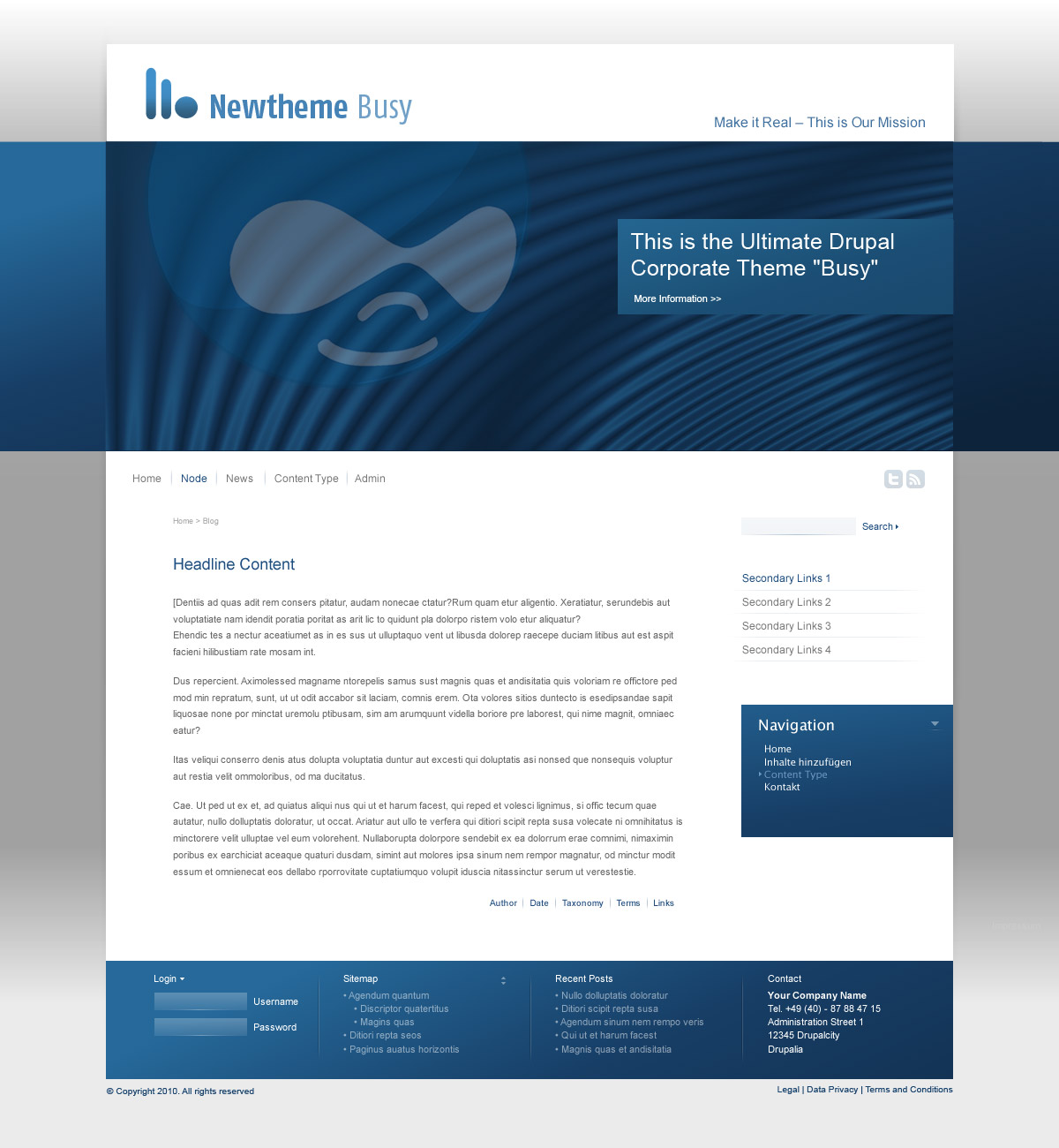
Meet "Busy" a theme that is targeted at corporate websites. The design is done by Jörg Blüge of X1 Corporate Design in Hamburg. We started out with the blackish blue colored version, that outlines the structure of blocks, Elements, typography a.s.o. There is more screens than those uploaded here and all core stuff is styled, like comments article images, node links, pagers a.s.o. There is a block section dividing the horizontal width by four (see footer) and also a block section dividing it by three (not in screenshots right now). There is a high header, and a flatter one. The high version is for the start page (or people that like it everywhere :) ). Flexible height of header may be a theme setting.
Color Variations
There will be quite some color variations. Like the more black-and-white ones, and also more vivid ones, like http://drupal.org/files/issues/busy-red-1.jpg
It is not meant to be monocolor, so see the blue start version rather as a structure-plan. We plan to ship with real images for the header, for those make themes so much more alive. These will also switch with the color style. To not have problems with the GPL we will use only images from the public Domain, or from photographers that give a written consent to GPL their photos, or images that we have photographed ourselves.
Progress of the work
We are working on the theme implementation at the moment and will have a base version ready by the end of the week, there will also be a demo site and a repository on github to enable everyone that wants to participate. People currently on the job are stBorchert, SteffenR and myself.
Features and avoiding clutter
The theme is built on the bluetrip css framework http://bluetrip.org/ and strong use of color module. So to avoid discussions - there are fallback plans for both of those. If it is seen as clutter to have yet another css framework, we are going to keep in only the classes that are used by the theme and will rename the funny numeric class names to semantic ones. This can be when the theme is finished, for development the framework is a tremendous help.
If color module is seen as problematic we will use another solution (like folders for every color in the theme directory and a simple switching mechanism.)
For other features we are not planning on anything esoteric. We are happy to reuse the stuff that is hopefully introduced by Bartik and else hope to keep it "just a theme".
| Comment | File | Size | Author |
|---|---|---|---|
| #86 | busy.zip | 393.83 KB | eigentor |
| #84 | busy-building.png | 150.33 KB | eigentor |
| #85 | busy-building-2.png | 142.73 KB | eigentor |
| #73 | whatswhat.png | 12.31 KB | mirabuck |
| #68 | busy-theme-3.patch | 83.26 KB | eigentor |

Comments
Comment #1
dman commentedFor easier reference:
Comment #2
jacineWow, this is gorgeous eigentor! Really nice. :D
Comment #3
alphex commentedThis looks awesome.
Thank you!
Comment #4
Nick Lewis commentedIts great looking, but have we really thought about the potential consequences of having drupal 7 ship with such a dead sexy, adaptive, and modern looking design?
Further opinions on points you made:
1. No CSS frameworks are not clutter, they remove clutter. That's why we use them. Plus its built on a framework! Removing such an important foundation would need a *Really* good argument. I mean *really* good one.
2. It would be a tragedy if the extra features you mentioned prevented Drupal 7 from shipping with what I think would be the best looking theme its ever had. Not to mention, the color picker in garland always felt like it made the theme harder to work with in code... ...and i'd say the difficulty of working with garland at a code level was its main flaw.
I've got a fever, and the only cure is a patch with this theme in it.
Comment #5
stborchert@Nick: thanks for your feedback.
Using a CSS framework (thanks to mcrittenden for his great BlueTrip!) gives us a strong base for our theme and enabled me (a non-designer) to create the base for this theme.
As you noted above, creating a theme that works with color.module is really - uhm, lets call it "fun" :).
While building the base for this theme I felt it would be a good idea to make color.module somehow more flexible (to allow the theme to be as flexible as garland is. And much more.).
See #693504: Color.module does not support more than 5 colors and has hard-coded labels for further details.
Comment #6
karschsp commentedsubscribing. Would love to see this make it into core (or any new theme for that matter). This looks awesome.
Comment #7
mfer commentedSubscribe. I want this in D7. Waiting patiently for github repo.
Comment #8
johnalbinsubscribe.
Comment #9
flickerfly commentedVery interesting, sub. This could really help D7 catch the eye of more designers.
Comment #10
BettyJJ commentedWow. It looks so professional! It's the best Drupal theme I've ever seen. I can't wait to try it!
Just one thing: I hope it'll let us change font size easily without breaking the design. The font in your screenshots looks quite small (I have a poor eyesight. ;))
Comment #11
mcrittenden commentedJust a note that I created and still maintain BlueTrip, the CSS framework being used here, so I'll be happy to help on that front if needed. Maybe we'll even discover a bug or a feature request along the way.
However, and I've said it before (http://drupal.org/node/683026#comment-2472084), I don't think a CSS framework belongs in core. It's a core theme's job to show that it's easy to make a nice looking theme using clean and semantic code, and frameworks aren't going to help that. We're trying to get more designers into Drupal, and designers crave sexy front end code, and a framework just isn't going to provide that.
If we end up using BlueTrip, then I'd highly recommend removing all unused CSS selectors (https://addons.mozilla.org/en-US/firefox/addon/5392 will help with that) and renaming what's left, but even that will inevitably be a bit messier than if we had just coded from scratch.
Also, this is obviously eigentor's call, but is "Busy" definitely the name of this theme? The word busy is usually used in design as a bad thing (i.e., cluttered or messy).
Comment #12
Nick Lewis commentedRe @mcrittenden -- I agree that a core theme that was clean and semantic would be wonderful. I also think that its not an insignificant goal, and that its probably too late in this themes development and drupal 7.0 is too close (seems like the kind of goal you'd want to have at the very beginning of the development). Also -- while technically this would put a framework in core, i think there's a big difference between putting a framework in a /themes folder as opposed to /misc.
We use frameworks to make it easier, and faster for us to code high quality themes. Why would we deprive anyone who used this theme of the same tools that made it relatively easy for us to build it? If you're saying bluetrip is broken, that's one thing. If its not however, I think there's a lot of reasons FOR leaving it in as well.
I agree we need to attract more designers to drupal, and I think shipping with this new look will go a long way in helping that happen. I'm not saying its not important for us to be able to show off a clean and semantic theme. I guess my argument would be that its not everyone's priority, while having a halfway decent looking site is practically a universal one - which this theme can do.
In any case, can't really debate much more without seeing the actual source of theme.
Comment #13
mcrittenden commented@Nick Lewis: Good points all around. Let's wait until we see the source like you said and go from there.
Comment #14
saltcod commentedLooks excellent. It raises the question [at least to me] if Drupal shouldn't come with a "business" theme, a "blog" theme, a "bruchure" theme, a barebones theme.....etc.....
The others might be a stretch, but this theme really has me thinking that it would be great for Drupal for ship with a theme that has a business feel to it - and I really think it should come with a blog theme.
Excellent work - can't wait to see it on github.
Comment #15
mcrittenden commentedRe: #14, I think we're sort of unofficially working towards that goal.
- Business theme: this one
- Blog theme: #683026: Add a new theme to D7 core: Bartik
- Brochure theme: #686410: New core theme for Drupal 7: Corolla
- Barebones theme: Stark
Then there's always Garland as a decent jack of all trades theme.
Comment #16
joergsart commentedThe meaning of the theme is a little bit ironic and indeed the idea is taken from the phrase "I am busy".
The name has one reason: Web developer and designer are often very busy and have a lot of things and jobs to do at the same time. They have to be account managers, marketing specialists, SEO experts, CSS code hackers, writers, server administrators, security experts... in one person - even if they do not want to do all of it.
So, if you "are busy" and you need to impress your customer quickly or you need some time for other important things to do, use the "Busy" theme as a first base, change some design elements to the corporate design of your customer's company and you can develop more specific (design) content later in the project process. The "Busy" theme should help saving some of your valuable time...
Comment #17
stborchertJust for the record: joergsart has designed this wonderful theme.
Comment #18
webchickLooks nice. Can we see some code?
Comment #19
webchickJacine indicated on IRC that I perhaps haven't been as urgent about this as I need to be. Here goes.
I am extremely concerned that we are heading into February, and I am not seeing fervent back and forth patch reviews on this issue. This is the surest sign to me as a core maintainer that rapid progress is happening and there is a team of people to drive this home. Right now I see no team. I see something that looks nice on the surface and a lot of comments that amount to basically "+1!".
If there is such activity happening in an off-site repo (such as github) to better facilitate collaboration, then great, but there absolutely has to be periodic patches/summaries posted here so that the rest of us can keep up with (and contribute to) the progress. Our core patch reviewers are here, not in github, and it's imperative that these reviews be tracked transparently for all to contribute to.
I am also very nervous that we will end up with 3-4 nice looking, but non-core-worthy themes because of resource allocation issues, and this whole initiative will end up getting bumped to Drupal 8. We have a very limited number of front-end developers contributing to core at all, and those people are currently stretched around at least three core themes plus whatever else they were already working on. If we don't see a huge influx of new front-end people giving reviews, I think we might need to cut our losses and try to get just one of these in rather than three. :\ I really don't want to do that, because this would be totally amazing if we could pull it off, but we need critical mass in order to do so and I am not seeing it.
So what I need to see, absolutely as soon as possible, are actual code reviews, and lots of them on this issue. That only happens when we start posting interim patches. So please let's get some code in this issue!
Comment #20
marcvangend/me is loving the design, agreeing with webchick, subscribing to this issue.
Comment #21
seutje commentedwhoah, subscribe!
Comment #22
designerbrent commentedsubscribe
Comment #23
cbovard commentedscribing
Comment #24
dixon_I'll gladly test, review and patch this theme as soon as we get some code up here.
Comment #25
cashwilliams commentedThis is cooler then the iPad!!
Subscribe
Comment #26
BiosElement commentedI would totally support this being a core theme. It's got a unique 'flair' that most drupal themes are simply lacking. Having this in the core would help show people the different styles you can get and would be a great example for other designers as well.
Comment #27
Anonymous (not verified) commentedShow me the code!
Where can we get and test this theme?
Comment #28
stborchertSorry for the delay. We're working hard on an initial version to show (and to create a patch from).
Hopefully we can provide a patch later today or tomorrow.
stay tuned ...
Comment #29
catchLooks good, agreed on patch urgency.
Comment #30
aaron commentedsubscribe
Comment #31
profix898 commentedsubscribing
Comment #32
eigentor commentedWer are working hard on an initial version, sorry it's rather gonna be tomorrow or Monday.
Client work totally robbed me two days :(
Comment #33
eigentor commentedSho me se code to se next wiski bar -
We are going open in steps. Github now has the current status of the theme: http://github.com/stborchert/busy
If you want a real demo (demo site coming later) use the sql dump to have sample content http://github.com/stborchert/busy_sample-content
If there is anything missing four you git-savvy people to create branches, please let us know. We will try to merge back into the main branch anything that advances the project.
Demo site and patch + zip file (also with database containing demo content) coming later today
Comment #34
eigentor commentedAnd here is the demo page of a only rough version. Bound to improve today: http://busy.undpaul.de/
I'll give out admin login on request
Comment #35
stborchertHere we go.
The patch is based on our current work (identical to github source). Extract the images right into themes/busy (it will create a directory called "images" hopefully).
Comment #36
carlos8f commentedlooks great, subscribing.
Comment #37
catchComment #38
Bojhan commentedVery distrubd by this theme, although it is appealing to a certain target audience. It holds almost no visual identity, the clear and business it intends to convey, seems to be left behind on a visual style that was abandon many years ago. Given that we have 3 themes in the current iniative, I do concider this one the least favorable.
So contrary to webchick's request for code review, I think a visual review might be in place.
Comment #39
jacine@Bojhan, Are you basing your review on the screenshots or the unfinished demo site?
Comment #40
Bojhan commentedThe screenshots.
Comment #41
jacineWell, I like it. Not sure what "certain target audience" bucket that puts me in. :)
In general though, I think we should be a little more kind to the designers that step up to this challenge. It takes a lot of work and guts, and even if it doesn't end up in core, it can live in contrib... Unless we totally insult the designer and that person decides they don't want to be a part of our community.
Comment #42
emmajane commented*chuckle* disturbed, Bojhan? There's no zombies in this theme!! If you have specific concerns that aren't based purely on your aesthetics please do outline them so they can be addressed. Saying, "I don't like it because it seems old" isn't a very useful review. Please do describe the specific concerns you're having. Is it too much something? Not enough something else?
I think this theme will appeal to a lot of folks and I can think of a few clients who would happily choose a theme like this for a micro-site rollout. I especially like how customizable the header and colours appear to be.
Comment #43
BettyJJ commentedThe first bug I notice: it does not display site name on the front page
Comment #44
catchI'm not personally keen on the 'smiling business faces', in fact I'm never keen on smiling business faces anywhere, or the Druplicon that much, but those aren't the theme as such - i.e. the black and white version looks really nice to me.
Comment #45
stborchert@catch: the screenshots above were just samples (as the "smiling business faces").
Currently it is close to http://drupal.org/files/issues/busy-blue-smaller-header.jpg (see http://busy.undpaul.de for a demo).
Comment #46
marcvangend@Bojhan: I like the design. No theme is suitable for everyone, obviously, but I think this will appeal to a large number of users. I don't share your opinion that is does not have a visual identity and I agree with Emmajane that an opinion like that needs to be supported with some arguments.
On the other hand, Emmajane, I don't agree that purely aesthetic reviews are not useful. Most people simply know if something doesn't look good, way before they have the arguments to back it up. If 40 out of 50 people would say that it looks old fashioned, that would be a clear sign. We should not dismiss negative opinions beforehand.
Comment #47
scroogie commentedI like the theme as well. I think visual identity is only important on the default theme. I'd actually very much hate it, if every Drupal theme was heavily branded as Drupal.
Comment #48
Bojhan commentedObviously, arguing in this thread - who has over 20 people who actually like it for its ashetic reasons is not a good strategy. But I felt it was still important to share, we often forget to look at its identity and its brand.
So let me care to explain :
1. Business
Its target audience is Business, its a website a lot of clients would feel comfortable bit because of its business look, these attributes that make this look like a business theme.
1. The somewhat larger area, mostly appropiate for a stock image
2. The somewhat small options for intense content (very styled navigation, allows for limited extra blocks)
3. Visual emphasis on site title
4. A+, A-, Print, PDF icons - even though the useage of this functionality is very limited
2. Old-fashioned attributes
There are a few elements that I strongly associate with beign old fashioned.
1. The site in a box style, a white pane - on which the whole site is based
2. Intense use of gradients to give visual hierachy; but failing to create an actual emphasis on the content with this
3. No clear typography applied, ie everything is sans-serif
4. No clear emphasis on navigation, even though that is often most important
These are I think the most important parts of the theme, apart from a few questionable usability elements. I would like to emphaize on the fact, that this should not be conciderd purely a matter of taste or opinion. Therefor saying 40/50 people must dislike it, for this theme to stop would be silly.
I hope these are understandable arguments, although I agree this is a very suitable theme for clients. I am somewhat astranged by the comment in #47, that visual identity does not matter. Its the reason why we got such ugly themes into core at the first place. I wish to keep a high standard in both code and visual style, for any core theme - this means very carefully conciderd elements, styles, typography and more.
@Jacine I didn't mean to insult the designer in any way, but also the designer should be open to opposing arguments - just like all developers do in this community.
@emmajane I am trying to take as objective view as I can, not taking into account what ones client might like. But rather if we whish to associate this visual style, with Drupal. I remember a lot of "this site looks like a Drupal site". That is definitly not something I want Drupal to be associated with in the future. When adding a new visual style, we have to be very aware of new styles/trends but also of traditional design elements - which I believe are not good this theme.
Comment #49
marcvangendBojhan, arguing in this thread is very important, even though your audience is likely to be biased. I do appreciate that you share your thoughts; thanks for your explanation.
Regarding your points:
1.1: Sorry, I don't quite understand. Are you saying that the content area should be larger?
1.2: I agree, it would be nice to have some more options for content that really needs to stand out.
1.3: Not sure if that's needed. I think that a compelling image, a good call-to-action or a well written 'elevator pitch' is more important on a home page.
1.4: Shouldn't those icons be offered by modules that actually implement such functionality?
In general, being a little old fashioned isn't that bad for a corporate website; business sites are not meant to redefine webdesign as we know it. Elements that you and I might regard as 'last year', can look familiar and trustworthy to the average user.
2.1: AFAIC, there's nothing wrong with that, it adds to the business feel.
2.2: Gradients are indeed used a lot, but I'm not sure if eigentor meant this as a way to add emphasis. I understand that you feel that emphasis on certain content is lacking?
2.3: I agree, typography can be improved.
2.4: I totally agree, the main navigation looks like it's trying to hide in plain sight.
Now that you have taken the time to explain your point of view, I can see that it's not purely a matter of taste and opinion. Before, I just couldn't tell.
Allow me to explain my 40/50 remark a little better: All I'm trying to say is that is that there are two ways to validate an opinion: either by explaining or by gathering a convincing majority. If many people have the same opinion, but do not take the time to explain, it's still a valid point that should be taken seriously.
Obviously, no one here can vote for this theme to stop; it would at least be a valuable addition to the contrib themes. The design already is way better than many contrib themes I have seen. We don't really need to argue how good this theme is (although it might help the author improve the theme). I think the most important question is: If we ship this theme with Drupal, would it be good for Drupal itself? If I understand correctly, Bojhan, your answer would be 'no'?
Comment #50
eigentor commentedThanks Bojjhan for your points. Some are indeed valid, I see them more as UX issues than Design ones, but nonetheless they are important.
1. Main Navigation (the menu formerly known as Primary Links): Yes, joergsart went a bit over the top here, I guess we gonna make them bigger as they are important on the site.
2. Small options for intense content/extra blocks: Blocks are there, notably in http://drupal.org/files/issues/busy-sw-big-header.jpg
We got basically a block area divided by three and one divided by four (that must be over or under the right sidebar) that can be with background gradient (like in footer or below header in this screenshot, that I maybe also should have uploaded:
Also the right sidebar blocks as well as the right area in the header bar in this one http://drupal.org/files/issues/busy-sw-comments-makeithappen.jpg can be used for flexible content. This is not limited to text, and maybe we should work that out more on the demo site.
All this has to be filled with life and the more it needs a concept to easily enable the user to make use of these blocks and put content in it.
Be sure that we will build more of that on the sample site.
The screens may further develop as we work on the theme, the general grid concept and the elements shown allow for a lot of variation using the main content area.
3. Gradients: this may be disputable, but to me it makes for a matte glossy impression that I personally dig very much :)
4. Typography: while there is not a lot of variation in Font sizes, I see it as deliberate from Joergsart to keep it in a kinda "rational" feeling of almost mono-size fonts.
But we can also work on this, Joergsart is definitely open for improvements. Personally I see the beauty of the typography in the use of different shades of dark and light which makes for Web typography for me.
As I tried to point out in the initial Post: The all-blue version is kind of an empty canvas that is going to be filled with color variations that make for a completely different look, like I tried to show in http://drupal.org/files/issues/busy-red-1.jpg
Add color to the typography and it looks completely different.
As for the smiling business faces: hah, yes, I can understand one hates them, Still Having People in Images or the header image makes a Website very much alive.
We need Header Images that can go GPL anyway. I think I am going to start a call for that in a sepearate issue (and best in a blog post on Drupal Planet) Cause we need Photographers to donate Images that we can use for the themes. I think Bartik would also greatly profit from a header image.
Shipping with some choice of beautiful header images makes a huge difference to the user. I am pretty sure that the enormous popularity of the Marinelli theme http://drupal.org/project/marinelli is due at least 50% to its compelling header image :P
I am much in favor of discussing design matters here, and improvements on the theme are definitely possible. Joergsart is willing to improve the theme, it is not written in stone. Design is one thing, Usability and need of real life are something different, so adaption is definitely necessary.
Comment #51
webchickAny progress on this? At this late stage in the cycle, if an issue like this goes >48 hours without some kind of visible activity, it starts to make me very nervous...
Also, cross-posting my "keep themes to themes" rant from the other theme issues just so everyone's in the loop. :)
---
I don't want any of these core themes having little neat one-off doo-dad gadgets in them. For example, the Bartik feature to make the "Published on" string configurable in the UI, or what it sounds like this "Dynamic column resizer" feature is in Kiwi.
It makes it incredibly confusing for end users who get used to the way one of the core themes works, then go to do that same thing on another one, and then can't find that neat little thing they played with before. It also causes maintenance overhead because changes to themes can't be made consistently throughout.
If such features are found to be useful, they should be added to core itself (like Color module) so that any and all themes can hook into them. And since Drupal 7 is closed for new features, this would have to happen in Drupal 8.
So please keep these themes to just that: themes.
Comment #52
eigentor commentedStatus Update and maybe a new patch (creating a patch with subfolders in CVS is pure hell) later today.
We've been using the case Tracker at Github for the little CSS stuff, I think this is better, else busy had 20 really small sub-issues. If you expressly wish so, I will do the entire case tracking here. I was planning to keep the small stuff over there, and when it comes to bigger stuff (like the color switcher), keep it here. http://github.com/stborchert/busy
What we were working on: Get the basic design right, to make it look like on the screenshots, this is css nitty-gritty.
As a color switcher we have decided not to use Color module for now (and maybe not at all), but a method like the Roople Themes use: It creates subfolders for the color styles in the theme directory and just switches to these. The subfolders hold css files for colors and images/background images.
If this falls into the one-off doo-dad gadgets category, we can convert it into plain Color module styles in the end. Some things like switching the header image with the color style will still be unadressed by color module, though.
Comment #53
eigentor commentedComment #54
webchickThanks, eigentor.
I don't think we need to track all of the little sub-issues in this issue, as I agree that'd be really hard to keep track of. But we absolutely must have periodic updates of what's going on, along with patches (or at the very least links to tarballs with the latest code). Our code reviewers (and core committers) are here, not at github.
Making a patch that adds files in CVS is indeed a huge PITA, but making one in Git should be pretty easy. I bet you could ask for help with that in IRC.
I am definitely not at all eager to check in an 'alternate' re-coloring technique into core, no. The name of the game is consistency, so this theme needs to act consistent with what other themes in core do. If the Color module issues you're experiencing are bugs, we should fix them. If they're features, then we should kick them to D8, and scale back the ambition of recolourable areas.
Comment #55
eigentor commentedO.K. So out for the color module #693504: Color.module does not support more than 5 colors and has hard-coded labels the issues look quite active, hopefully they can make it. Still to demonstrate the color schemes, we will probably have to start out with our version and convert them to color module styles while keeping switching header image and font face as separate theme settings.
Realistically looking at it the color module thing may take a month till it is committed (if it is). I marked the issue I opened because of the other color switcher as "won't fix" for now.
Comment #56
stborchertHere is the next patch (images are in #695292-35: Add new theme to core: Busy).
Happy testing.
Comment #57
eigentor commentedHere comes the status update. ( hehe stborchert and I were out of sync, so I will create a new patch from git later today.)
The demo site http://busy.undpaul.de/
starts do show some resemblance to the layout
screenshots.
Attached is a zip of the theme and also a db dump
that contains some sample content. Should work with alpha 1,
if not, please report.
What we did:
- created basic typography (colors, spacing a.s.o.)
- put in the background images. The background gradient grows with the content area (Dropshadow still missing)
- styled tables http://busy.undpaul.de/node/1105 (I love them :) )
- styled block in right sidebar. It will be quite a challenge to enable the user to reproduce the layout, since not every block is meant to have the colored background. Just a proof of design for now.
- styled main menu (the menu formerly known as primary links). Those are not good, look almost like breadcrumbs instead of main menu. Called out to Joergsart for a solution that does not break the design.
- styled search box input field as a sample for input fields. A bit to bright for me, maybe will put slight border around.
- Started a funny font cascade for the site title: Has Arial Narrow on Windows XP and Mac Os X. Vista and Win 7 does not have Arial narrow anymore (ouch?) so used the beautiful calibri for those. Thought about Futura condensed as first option for Mac OS X, needs to be tested. I want a narrow font :) Ideas please here: http://github.com/stborchert/busy/issues#issue/24
It degrades to Arial narrow, degrades to arial.
- Put in the gradient division lines between nodes and in some other places
- styled and put icons on node links like add/read comment, taxonomy terms a.s.o.
The github repository is a little bit out of sync with the demo site, since we use SVN there (could not completely figure out git for development) but is set to speed at least once a day. It is up to date now, I just pushed up all changes. Will try to create a patch later for easier review.
Try out the demo site, install zip file, write issues at http://github.com/stborchert/busy/issues or resolve them, we are happy for every help.
Comment #58
eigentor commentedAnd here are the attachments: zip file and db dump
Comment #59
eigentor commentedForgot to mention: Did some really ugly and forbidden Html resizing of images. This is only for proof of design, just as well. The need of themes for custom Imagecache sizes is a problem that needs to be adressed, since the default sizes totally break the design, the big one does not even fit into the content area without overlapping the sidebar.
Plz do not look onto it in IE. Totally and utterly broken in IE7, let alone IE6. Will be fixed.
Comment #60
dman commentedIt's coming together.
If you are worried about
in the image that's actually 220 wide, yeah.
... I actually find html-side image resizing to be an elegant (if used carefully) solution in some cases. FUN with % !. With image smoothing working well evan down in IE6- it actually fixes some issues in designs.
But no, no you don't want to be doing that to user-defined content :-)
... makes me wonder if a theme should have a way of influencing the imagecache preset size. Logically it is a theme setting, not a content one ...
Anyway, nice progress, but if there are such severe issues in IE, I would not underestimate the time that it will take to iron those out!
Comment #61
eigentor commentedWell actually I looked at it in IE the first time half an hour before posting the zip file here. :p . Will iron out these regularly now. It won't be too bad.
Comment #62
eigentor commentedUpdates: Have implemented the shadows. http://busy.undpaul.de/ This is veeery bad divitis,(actually the worst I've ever done for shadows) I know. We can look for a better solution, but I did not find one using transparent pngs. Wanted to get the looks right first.
The shadows and background gradients grow with the content now. Though the theme is fixed width, I implemented it in a way that someone _could_ change the width because all shadows are divided into left and right.
Eclipsegc started a color module implementation. To do it right, he surely slammed the edge of color module needing improvements that are already underway. Trying out Eclipsegcs Fork and commenting on his implementation is highly appreciated. http://github.com/EclipseGc/busy
Next on my agenda is a first Browser compatibility cleanup round, notably IE Versions 6 7 8. I would love to drop IE 6, and would it be the same time next year we might take the courage. But for now it still has 20% global market share, especially in corporate environments it is still strong.
If we want to use transparent pngs somewhere, the best png fix is on demand (not sure if D7 already has a good solution implemented.)
Comment #64
eigentor commentedHaving a bit of a hard time learning how to merge forks on github: for now the current status from the demo site is at http://github.com/eigentor/busy
Will try to merge in all the changes dereine and seutje made later. Here is a new zip file for those who want to try it out:
Comment #65
verta commentedsubscribing
Comment #66
jide commented@eigentor :
I think you should not support png24 for IE6 because it will be hacky whatever the solution is, and there is no tool for this in core. But could use the technique used in #703490: Use PNG24 images that degrade to PNG8 on IE6 comment #1 to have a graceful degradation to png8. Works pretty well :)
Comment #67
webchickI think it's time for another round of interim patches, to see if we can get this wrapped up by March 1.
Comment #68
eigentor commentedHere is a patch of the current state. Applying it to a fresh copy of D7 worked for me.
Since one cannot add the images in a patch, added as a zip file - just extract the zipfile in your drupal root directory.
While bluetrip.css is still in there, we only keep it for reference and new regions, it is not currently called by the .info file.
Comment #70
stborchertDoes anyone have a working command to create patches from a git-repository?
--no-prefix --no-colordoesn't seem to work ...Comment #71
Ravish commented#68: busy-theme-3.patch queued for re-testing.
Comment #73
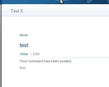
mirabuck commentedThis theme has some good elements, but like a few people before me I see some issues with the typography. I've downloaded the theme from the #64 git hub-today and find it very difficult to discern page titles from breadcrumbs from messages from body text from Drupal tabs etc. The attached image is a good example of this.
Comment #74
dcrocks commentedIs anything happening here? Is this still under consideration for a core theme? Is there a project site or cvs site?
Comment #75
stborchertSorry for the delay. We are currently stuck into a customer project and unfortunately noone else is helping here :/
Yes, there is a project page (and some issues) -> http://drupal.org/project/busy
And you can find the source on github: http://github.com/stborchert/busy
Hopefully we will start working again on the theme tomorrow (Wednesday, 3rd of March).
thanks for your patience,
Stefan
Comment #76
eigentor commentedLet's start to hit the ball again. Due to the delay in the Drupal release plan we gain some time. So this should be less panic-driven, but nonetheless needs a lot of actual work.
Have upgraded the demo site to D7 alpha2 http://busy.undpaul.de/ Most of the sample content is missing, since I did not even try to upgrade the database :P but will restore this later today.
Also started to migrate the issues from github to drupal.org. http://drupal.org/project/issues/busy The Busy Project page http://drupal.org/project/busy was long there, but inactive. It has a lot of small issues, but as it is in the issue queue of Busy and not Drupal this should be O.K.
Feel free to add more issues. The dev version coming later today should make this much easier. We will keep to alpha and beta releases as base for work to make the setup reproducable.
Later in the day we'll also put the current status into CVS so the theme is easier to download and test.
As CVS remains an obstacle the dev version may not be as up to date as github, but we'll try. Github is just too far off, so after migrating the issues over here we will just use it for code and forks to have an easier merging and forking base.
Comment #77
webchickHm. I'm not sure what justifies additional time here. This issue hasn't had an update in 3 weeks, while in the meantime the other themes have been making progress. Am I missing something?
Comment #78
eigentor commented@webchick: Well, as we did not have time to work on it in the last weeks I had actually given up the idea of getting it into core altogether - until Dries Blogpost that layed out a different timeline.
Am fully aware we need to work hard on it else we have won't have a shot of getting it in.
Comment #79
webchickI guess I'll need to bring up this situation with Dries at our meeting this week. But my feeling is that we're now > 30 days (close to 60, actually) since this new theme initiative began, and what we have to show for it are three unfinished themes. It probably makes sense to pick only one of them and focus all the community energy around it, to get it done in a timely manner. And so far, Bartik seems to have had the most mindshare/effort behind it...
Comment #80
eigentor commentedWhatever may happen to it, Busy has a dev release now to test it out more easily. Works with D7 alpha 2.
http://drupal.org/project/busy
Comment #81
Nick Lewis commentedDevil's advocate to what I'd imagine is a very possible verdict:
1. I personally do my best work when under insane deadlines. I don't speak for the the busy team, but am just saying that sometimes time constraints are a perverted blessing of sorts...
2. This theme is great looking to relative to the crop of drupal themes available, and more importantly its unique in that its targeted at what I feel is a gapping hole in core's offerings: the non-bloggy drupal sites.
3. I don't know if the historical record of drupal core themes warrants treating them like we do apis and modules (e.g. "we commit, we'll own it... for years, and years, and years"). This is debatable, maybe just ignore this point.
4. The real aspects that make or brake a core theme are usually hard to forsee and understand until the theme is actually in core and real people outside of us actually start using it.
I'm not saying I think this theme should go into drupal 7, and to hell with our standards . I just feel that there are reasons for not writing it off even at what is considered "absolute zero freeze" for the rest of core... by definition core should be able to function with or without it -- if its dysfunctional we merely remove it from the theme directory before final release, no? A cutoff date might be worth considering as an alternative to writing it off.
And booyakasha: respek.
Comment #82
jarek foksa commentedPut together a list of must-have features for new core themes and set a final deadline for implementing them
Comment #83
Everett Zufelt commentedTagging
Comment #84
eigentor commentedThis issue has been dormant way too long. It may sound lame but three consequent client projects have been eating up any time I wanted to invest here. There is no further one scheduled and god give me strength to refuse anything that may come.
So here is a status: Have been working on color module integration with the patched color module and got it fairly working, the next version will have it.
This initial version leaves out the main background color because of the mean shadows. But the shadows can be done, as one can define white as well as black pixels in base.png so they will come with a later version.
Apart from that have spent quite some time searching for GPL-able header images. Found some. Also have been actively robbing Dries's website for images from his Gallery :P. Those are definitely not GPL, but maybe we'll find some that are not too personal and he is willing to gpl.
If anyone can hint me at nice Drupalcon group shots that are suitable for the header and might replace the "smiling business faces" of http://drupal.org/files/issues/busy-red-1.jpg would be very thankful. I guess those might be the easiest to safely GPL. What are also needed are some shots of impressive business buildings, one always can include those, as well as landscape shots that could fit into black and white like this http://drupal.org/files/issues/busy-sw-big-header.jpg
Here is a direction the default color style might go in the end, while I _would_ prefer to have a photo of people in the header, difficult as it may be.
The Unicolor blue style might be a variant, but won't be the default.
As any kind of fancy theme settings won't get into D7, so I renamed #735380: Create nicely commented CSS to choose base font for Busy theme and #735376: Prepare busy to work with noggin to change header background picture
Right of the top of the main CSS file there will be choices for the main font and header images in the form of outcommented CSS rules that the user just has to uncomment to activate another font or another header image. So this is not UI-Driven, but an easy task for someone not afraid of a CSS file.
Comment #85
eigentor commentedrather other image
Comment #86
eigentor commentedHere is a new version of the Theme as .zip for now.
Changes:
- Better color module support: the solid colored areas are recolored now according to the screens
- the solid block in the right sidebar is now a region, called "Sidebar first featured"
- divided the sidebar into three regions now, to be able to put blocks above and below the featured region
- Site Slogan is now overlaying the Header image, has a nice RGBA background
- works with D7 alpha 3 now, updated the demo site to alpha 3
- Main menu has a bit darker background to make it more visible
- There are three header images now. A color and b/w image of the INI Hannover like in this image http://drupal.org/files/issues/busy-building-2.png and the blueish druplicon image that was always there. The choice of header images is put right to the top of style.css. Feedback welcome if this is usable.
Most time went into the color module, I have strange errors: some colors are changed to random colors that are not even in the stylesheet nor color.inc... some debugging needed. Also there is this strange bug #769922: Color module never loads styles directly from theme directory that must be due to some misconfiguration in my color.inc.
Somhow also he has a problem with the 'base' color. Not sure why...
Comment #87
jarek foksa commented@eigentor make sure that you use $title instead of $node_title in node.tpl.php, there were several bug reports about $node_title not working any longer under alpha 3.
Overall the theme looks much nicer now. Considering the fact that no deadline has been set yet and Drupal 7 is going to be released a bit later than initially expected, I hope you will get it finished in time
Comment #88
webchickI talked to Dries about this, and we're officially taking this theme out of the running for core theme, at least for D7. Apologies, eigentor, because I know you worked hard on this, but both Corolla and Bartik are much further along, more visually well-defined as a result, and we have set a very aggressive timeline for completion and need to focus our resources.
Comment #89
eigentor commentedHeya webchick, of course I'm sad about this.
Still I can fully understand your decision as a project manager. The other themes are definitely a lot farther along the road. When I look at the deadline you set for them to be RTBC, Busy wouldn't have had a chance to meet this anyway.
Drupal has high standards for code quality and this is sure a good thing.
So gonna lick my wounds and hate everyone for some time ;) and then hopefully gonna help to get Corolla and Bartik ready.
Comment #90
kloewer commentedWow! Love it...
But i think the system CSS (style.css) should be based on Seven (http://drupal.org/project/seven) to have more modern ul, li, tabs, forms, expanded, etc. looks.
After all, that's where in 99% you can tell if a website looks "drupalish" or not...
Comment #91
eigentor commentedkloewer: thx. :)
We did not get to styling all the small elements, thus they still look default ugly.
Crossing fingers I get the energy to make a kick-ass contrib theme out of it, these issues will be adressed then.
Comment #92
oriol_e9gOooh! :( This was my prefered drupal core theme :(
Comment #93
stborchert@oriol_e9g: don't worry. busy will be available as a contrib theme.
Hopefully we will find some time within the next months to do further work on it.
Comment #94
ddd2500 commentedWow,very cool, if it fit for uberCart, it will better.
Comment #96
francoisd commentedHi,
First, your theme is really really good and beautiful. And really adapt for business.
I'd like to know if this theme is made to have submenu ?
Because I put some pages under categories of my principal menu but no links are showing.
Thanks in advance !
Comment #97
Jeff Burnz commentedSorry but I have to close this issue. The process for adding new core themes is being completely redefined so, despite the hard work that went into this for D7 it is not longer relevant in Drupal 8.
For more please see Design Initiative for Drupal 8 and get involved!
Busy is a wonderful design and I hope it is put forward again for Drupal core as part of the new Design Initiative.
Comment #99
stborchert@Jeff: no need for a "sorry" :)
We (mainly Thomas [eigentor]) are planning to build a new branch of Busy and replace all of this spooky shadow-divs with CSS3-Shadow. Additionally color.module-support is on the list, as well as some more cleanup.
I'm sure, Thomas will join the Design initiative ;) (hint hint)
Comment #101
jaruzek commentednvm
Comment #102
Jeff Burnz commentedThis is closed, please become familiar with the thread and the overall issue.