
 Come together with the global Drupal community in Rotterdam, 28 Sept – 1 Oct 2026. Sessions, contribution, connection, and Early Bird savings until 8 June.
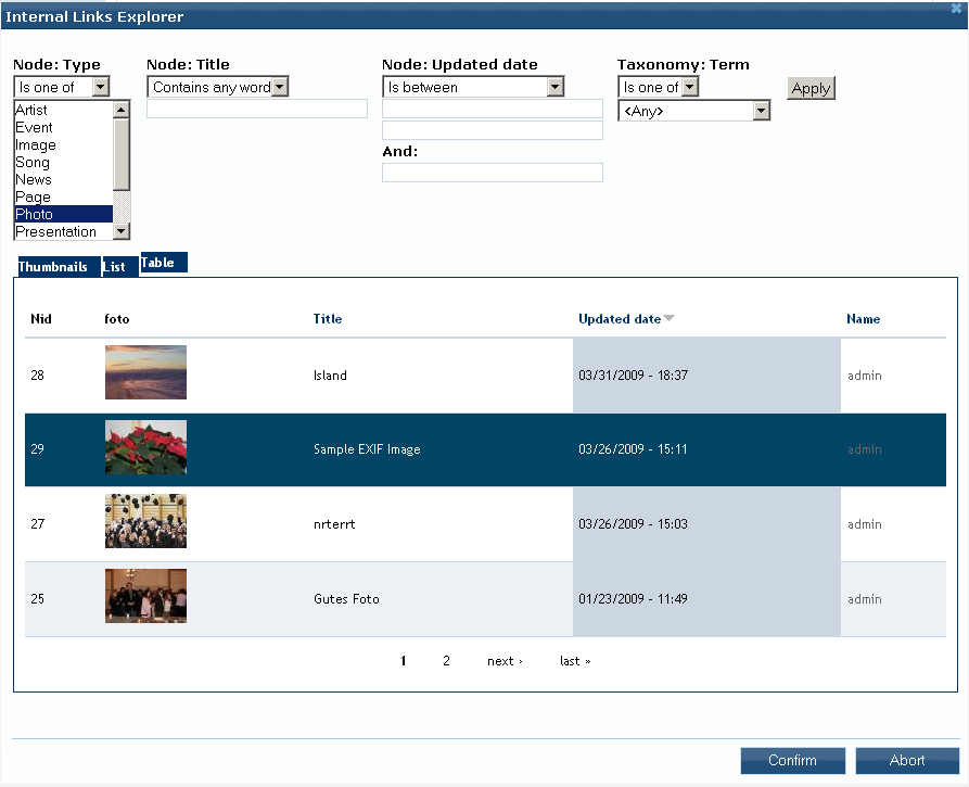
This project is not covered by Drupal’s security advisory policy.
The Nodereference Explorer (NRE) is a selection dialog for creating references between nodes. Editors can link arbitrary content type instances, e. g. pages, stories, news, images etc., with each other. Typical use-cases are for instance:
- Reuse of assets, such as images, audio and video clips for display on other pages
- Providing a list of internal links
The motivation arouses from the usage scalabiltiy limitations of in-built nodereferences widgets, i. e. autocomplete, select list and option boxes, when dealing with a large number of nodes. Therefore the NRE enhances the autocomplete widget by an explorer-like selection dialog. It contains several view displays and optionally exposed filters where list items can be selected via mouse click.
If you found this module useful, please help me to keep maintaining by donating and/or contact me for professional paid support.
This module is developed in scope of the OSCE 3.0 website and CMS relaunch.
Recommendations
It is recommended that you use the Modalframe dialog API together with the OnBeforeUnload module, as "built-in" is deprecated since version 1.1. If you want to use jQuery UI 1.6 you have to use modalframe version 1.6 or lower.
Features
The Nodereference Explorer is a rich widget improving strongly CCK's content editing/referencing usabilty and is highly configurable at the same time. The most important features are:
- Themable jQuery dialog with list of nodes for selection as nodereferences
- Node list is a customizable view with various displays, like grid, table, list and unformatted containing selectable view items
- Exposed view filter forms for content search/exploration
- Simple mouse point and click selection
- "Create & Reference" functionality adding new nodes on the fly
- Edit and delete a referenced node
- Field preview (as an additional view display)
- Plugin architecture for support of other CCK fields, e. g. Link and Nodereference Quantifier
- Different Dialog APIs:
- Built-in
- Modal Frame (recommended)
- Integrated third party modules:
- Leveraging indirectly the power of views:
- Multilinguality
- Image, Imagefield, Imagecache compatiblity
- Lightbox or thickbox support
- ... and much more
TO-DOs
- Multiple selection
- Implement successor Explorer module
Supporting organizations:
Development and maintenance
Project information
- Project categories: Content editing experience, Developer tools
 40 sites report using this module
- Created by gnindl on , updated
 This project is not covered by the security advisory policy.
Use at your own risk! It may have publicly disclosed vulnerabilities.

