
This project is not covered by Drupal’s security advisory policy.
An easy to use simple helper module for making your images responsive.
Features:
- Loads the correct image size depending on the set image breakpoints, this means that you have to set image styles for these breakpoints.
- Only loads when it shows on the browser window
- Responsive images do not directly depend on the window's width but on the image container which can have % width of the window.
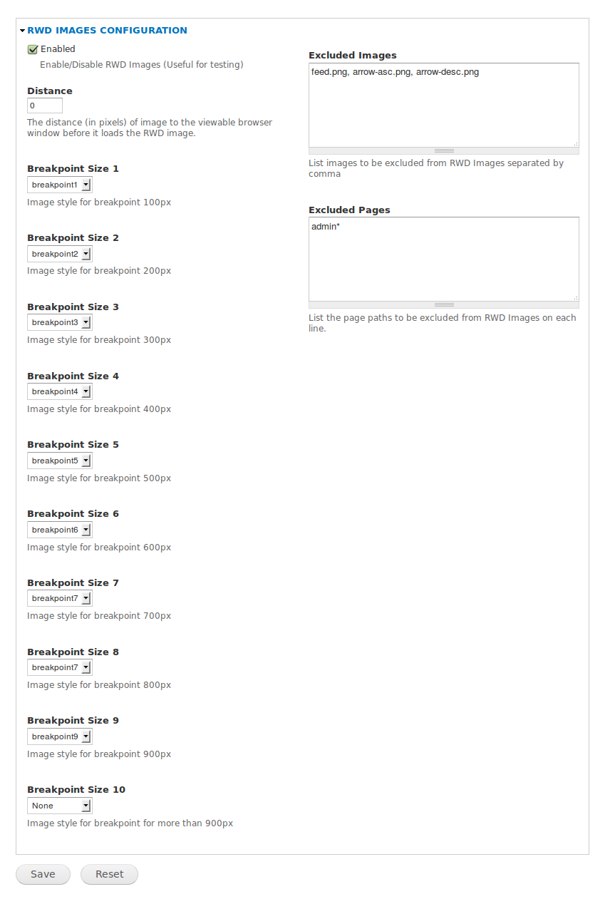
Available Settings:
- Enable/Disable
- Distance - image distance from the viewable browser window before the correct image loads
- Breakpoint 1 - image style if image is equal to or less than 100px
- Breakpoint 2 - image style if image is equal to or less than 200px
- Breakpoint 3 - image style if image is equal to or less than 300px
- Breakpoint 4 - image style if image is equal to or less than 400px
- Breakpoint 5 - image style if image is equal to or less than 500px
- Breakpoint 6 - image style if image is equal to or less than 600px
- Breakpoint 7 - image style if image is equal to or less than 700px
- Breakpoint 8 - image style if image is equal to or less than 800px
- Breakpoint 9 - image style if image is equal to or less than 900px
- Breakpoint 10 - image style if image is equal to or more than 901px
- Excluded Images - images to be excluded from RWDImages
- Excluded Pages - page paths to be excluded from RWDImages
Notes:
1) All images for RWDImages must have a container block, such as div or a/span defined as a block because images will have 100% width which will follow the container's size.
2) This will only work after clearing the cache.
3) You have to set the image style breakpoints, Ex. Breakpoint 1 (100px) will use thumbnail
Similar Projects
- Responsive Images
- Responsive Images and Styles
- Adaptive Image
- Adaptive Image Styles
- Client-side Adaptive Image
- Borealis
So, what makes Responsive Web Design Images different?
- No need to download additional jquery plugin
- RWDImages jquery plugin will measure the size of the image container and loads appropriate image size through image style settings.
- Images won't load until it's visible on the browser window, saves you time if you have multiple images.
- You can configure up to 10 image styles to match your multiple image sizes.
Sponsors
Promet Source, an Acquia Drupal partner company
Daniel Honrade, author
Project information
- Project categories: Content display, Developer tools
- Created by danielhonrade on , updated
 This project is not covered by the security advisory policy.
Use at your own risk! It may have publicly disclosed vulnerabilities.
