
On this page
- Appearance
- Accent color
- Focus color
- Increase contrast (EXPERIMENTAL)
- Dark mode
- Light mode
- Navigation
- Sidebar, Vertical Toolbar
- Horizontal, Modern Toolbar
- Legacy, Classic Drupal Toolbar
- Show Secondary Toolbar in Frontend
- Layout density
- Enable form description toggle
- A field with a description that's toggled
- Users can override Gin settings
Specific settings within Gin
Gin comes with a suite of exciting UI features that can be tailored to improve the user experience for a site admin, it can also be tailored to match a company’s branding.
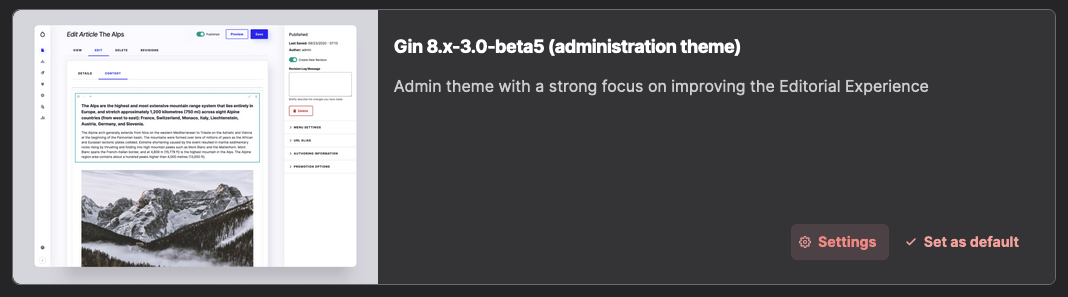
You can access these features by going to the settings section within the theme; use the ‘Settings’ button found within the Installed themes section of the page to take you there.
Appearance
We can change the appearance of the admin interface to suit the requirements of the end user. For example, some people might prefer dark backgrounds over light backgrounds to help with visibility and ease eye strain.
There are three modes to choose from:
- Light
- Dark
- Auto
‘Light’ mode will ensure that light background colors are used in conjunction with dark foreground text, and ‘Dark’ mode ensures that dark background colors are used in conjunction with light foreground text.
Also, Gin can be configured to automatically adapt to a color scheme based on a preference mode defined at the operating system level. To do this, select ‘Auto’.

Accent color
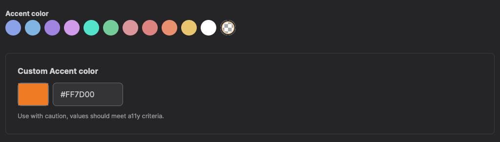
We can choose from a selection of predefined accent colors that will influence the color of HTML elements such as form buttons, input items, labels, select lists etc. Accent colors can be used in either Light or Dark mode.
If a color from the predefined list is not suitable then a custom color can be set by choosing the ‘transparent’ item at the end of the list and entering a HEX color reference.
Please consider your color choice carefully as it should meet a11y criteria and contrast appropriately. This tool is available to help meet your desired standard level.
Focus color
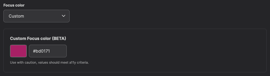
There is the ability to change the focus color, in this section, there are several options to choose from and should be self-explanatory.
They are:
- Gin Focus color (Default)
- Green
- Claro Green
- Orange
- Neutral
- Same as Accent color
- Custom
If you have already set an accent color you can opt to use the same color for focusing by choosing the option ‘Same as Accent color’ from the select list. If the accent color is custom, it will also match it.

A custom color can be set by choosing the ‘Custom’ option from the select list and then entering a HEX color reference. As noted with selecting an accent color, please consider a11y criteria so that it contrasts appropriately.
Increase contrast (EXPERIMENTAL)
There is an experimental feature to toggle high contrast mode. When enabled, this adds borders to sections of the admin area to help improve visibility. Areas that have borders applied to them are field sets, vertical toolbar menus, forms, tables, and some divisions. This feature works in both Light and Dark mode.
Dark mode

Light mode

Navigation
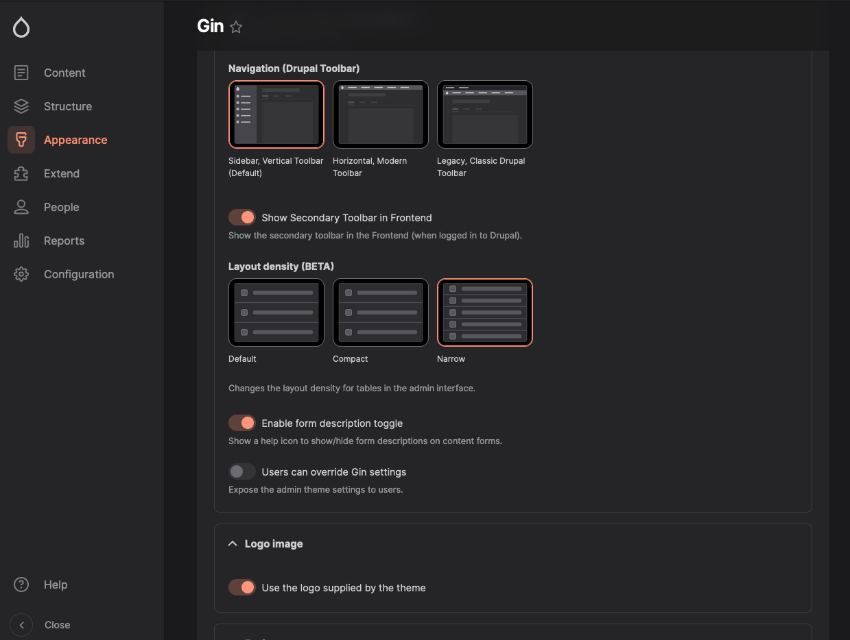
There are three options which will change the position of the admin navigation toolbar.
- Sidebar, Vertical Toolbar (Default)
- Horizontal, Modern Toolbar
- Legacy, Classic Drupal Toolbar
Sidebar, Vertical Toolbar
‘Sidebar, Vertical Toolbar’ will position the toolbar to the left-hand side of the screen. Located at the very bottom is a button that expands the menu revealing the names of the navigation items. Toggling it again will collapse the menu to just show the icons.
Horizontal, Modern Toolbar
‘Horizontal, Modern Toolbar’ positions the toolbar to the top of the screen which is fixed and always in view when the page is scrolled.
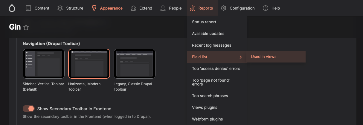
Legacy, Classic Drupal Toolbar
‘Legacy, Classic Drupal Toolbar’ uses the old-school style toolbar that is a part of Core.

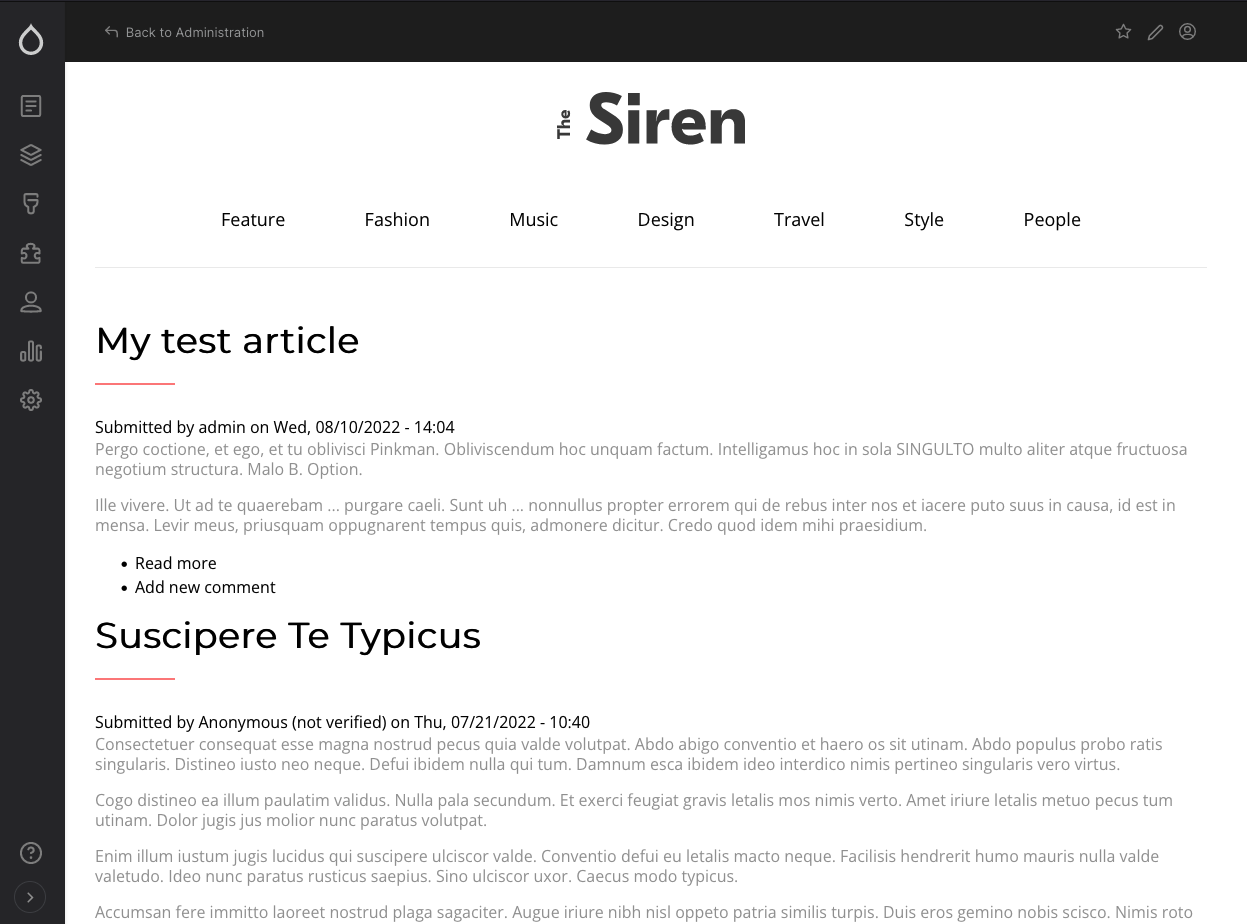
Show Secondary Toolbar in Frontend
To use this option, ensure that you have downloaded the Gin toolbar helper module. If your website is managed via Composer install it by running the following command in your terminal, then enable it:
composer require 'drupal/gin_toolbar'Toggling ‘Show Secondary Toolbar in Frontend’ places an additional horizontal toolbar on the front end of your site and is positioned at the top of the page that is fixed. As the page is scrolled it remains in view.
Layout density
Layout density is an experimental feature that will change the height of table rows in the admin area.
There are three modes:
- Default
- Compact
- Narrow
The size changes are subtle but effective; selecting Default will set the row height to 62px, selecting Compact will set the row size to 52px, and Narrow will set the row height to 47px.
You can see this in effect by going to:
-
Content -> Overview
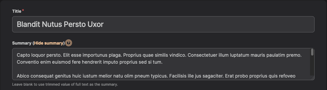
Enable form description toggle
When enabled, this feature allows a site admin to toggle the help text that can be defined in a description field for a content type. To toggle the help text simply edit a piece of content and click the question mark button.

A field with a description that's toggled
Users can override Gin settings
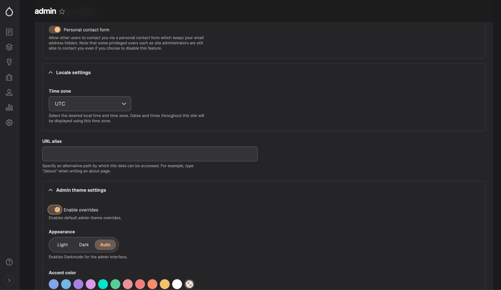
This option exposes the Gin admin theme settings to a particular user for customisation.
To configure this, first make sure the setting is enabled then go to:
-
People -> Overview
Edit the user and toggle ‘Enable overrides’ in the ‘Admin theme settings’ section. This will expose a portion of the settings for further configuration.
Help improve this page
You can:
- Log in, click Edit, and edit this page
- Log in, click Discuss, update the Page status value, and suggest an improvement
- Log in and create a Documentation issue with your suggestion
