
On this page
- The goals of this style guide are:
- Basic principles
- How should we express these principles?
- Summary: the Seven Graphic Style
- On Contrib
- Color Palette
- Iconography
- Patterns
- Content Header
- Typography
- Text fields
- Basic Form Controls
- Buttons
- Dropbuttons
- Small Controls #
- Progress
- File Field
- Fieldset
- Summary and Details
- Navigation Tabs
- Mobile nav tabs
- Vertical Tabs
- Table
- Pagination
- Nav List
- Messages
- Modal Dialog #
- Source File
Seven theme style guide
The goals of this style guide are:
- Outline Drupal core values that guide the look & feel for the Seven theme.
- Describe the unifying the visual language in Seven that supports the core values.
- List the visual and UI patterns used by Drupal that form a shared language we can build on.
- Provide guidelines for others (e.g., contrib) to build on as new interactions emerge.
As the principal Admin theme of Drupal, Seven theme must:
- Be completely accessible (WCAG compliant)
- Be responsive and mobile friendly
- Provide consistency across all Drupal 8 modules
- Stand the test of time.
Basic principles
The development of the Drupal brand has come a long way in the past few years. With the introduction of an admin theme and toolbar, we now have important places where people interact with Drupal visually. For a lot of people who use Drupal but don’t visit Drupal.org, the administrative interface is their only interaction with our brand.
We looked into words that describe Drupal’s brand:
powerful, adaptable, empathetic, direct, democratic, accessible, clear, concise, natural.
Part is this brand is also the community values we express:
welcoming/respectful, open, informal, collaborative, transparent, responsive, credible.
Much of this is captured in Mark Boulton and Leisa Reichelt’s earlier work describing the brand at https://www.drupal.org/drupalorg/style-guide/brand.
How should we express these principles?
Having a set of adjectives to describe Drupal, we tried to give those terms visual expression using basic design elements and principles. First, we mapped each adjective to a set of possible visual characteristics:
- powerful: confident, precise shapes and strong contrast, especially for user-controllable elements.
- empathetic, responsive: choose to calm colors and rounded forms; give emphasis to what matters;
- clear, direct, concise: use crisp lines and simple, decisive shapes; avoid patterns, texture, and ornamentation; each element should serve a clear purpose; make measured use of whitespace: room to breathe, but avoid sterility and emptiness; use rules/boxes sparingly.
- accessible, transparent: appeal to the greatest possible number of people; choose a legible typeface; set text for optimal readability; emphasize what matters; use consistent visual cues for affordances.
- natural: desaturated tones: avoid neon/artificial colors; organic rather than geometric forms; choose a typeface that retains a trace of the human hand.
- friendly, collaborative, democratic, respectful: choose cheerful colours; avoid high contrast at large scales (too bold/aggressive); prefer well-known design patterns, iconography, and affordances; avoid visual indulgence, ensure visual style is extensible and flexible.
Some of these design elements would be in conflict with one another: powerful shapes and too much contrast might make the UI unfriendly or even disrespectful. In these cases, a careful balance is needed. In other cases, there is a clear common thread.
Summary: the Seven Graphic Style
- A primarily light tone that feels bright and open.
- A neutral desaturated color palette, both friendly and calming.
- Legible, readable typography.
- Crisp lines and sufficient, but not jarring, contrast.
- Bold shapes reserved for headings and action elements.
- Some rounded forms to humanize the interface.
- Little or no ornamentation: no patterns, textures, gradients or shadow/emboss effects – except to communicate affordances.
- Borders and background tone as grouping devices only: to clarify relationships and emphasize important elements.
- Generous and consistent use of whitespace.
- Aesthetically appealing, though minimal graphic style; should be simple but not sterile.
On Contrib
In addition to articulating the foundation and expression of the Seven theme and core modules, this style guide can be used by developers of contributed modules and themes. For module developers, this guide provides design patterns and styles that can be extended as a module encounters UI challenges not covered by the components here. For themers the theme itself in both it's coding style and in it's componentized structure can provide good templates for theming form elements on the front end.
Color Palette

The guide makes few changes to the Seven color palette in Drupal 7 while still supporting the principles and graphic elements we identified above.
Seven uses three primary colors: white, “burlap” and “Drupal blue”. White provides openness and serves as the ground for other elements. Burlap is a yellow-tinted gray, providing friendliness and energy while maintaining neutrality. Drupal blue associated the theme with the Drupal graphic identity as well as being a naturally calming color.
Drupal blue is used for links, primary buttons, and other interactive elements such as the labels on tabs. Interactive elements that use Drupal blue and have an active state use a darker shade of that colour (#004f80). Burlap is used for background tints and fills in several shades (always at 51° hue).
Red is used sparingly, and only to communicate an error state or danger action (e.g. delete). A strong yellow-orange is used for warning messages and a grass green for success messages.
We chose colour combinations that pass WCAG 2 AA contrast guidelines for accessibility so that text can be read and elements distinguished by everyone who uses Drupal. Some challenges in finding contrasting colors for different states remain, we still have to further tune a few of these.
Iconography
In Drupal 8 Seven theme uses the libricons icon library designed by Ryan Frederick (ry5n), which we continue to extend with additional SVG icons.

Patterns
Content Header

In Drupal 7 “add to shortcuts” icon was a plus symbol. In Drupal 8 this is now a star icon to avoid confusion with 'add' actions that use the plus. The various states for the shortcut add/remove component are shown inset, from left to right: inactive, inactive:hover, activated, activated:hover and finally inactive again.
The header background is 'burlap' form the color palette.
Typography
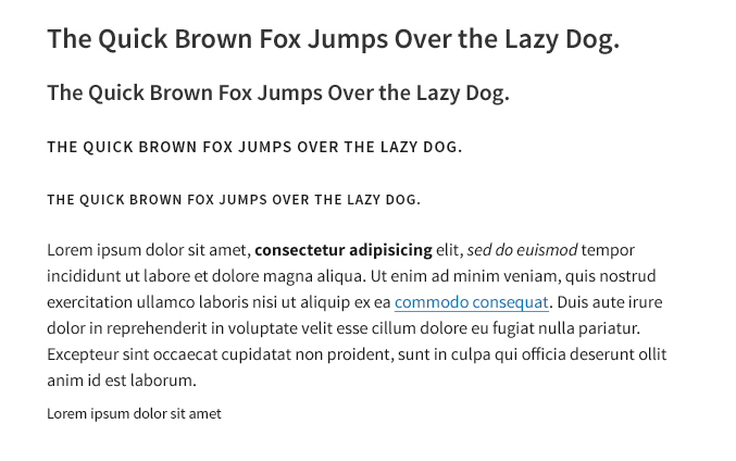
Note: Typography differs from the original guide in that Source Sans has not been added. There is an open issue with the licensing working group to add Source Sans. See the original draft guide for more information.
Text fields
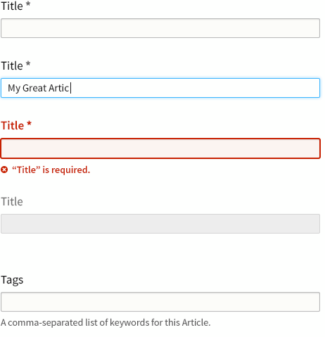
“Title” field, top to bottom: 1) normal text input; 2) hover state; 3) invalid state with the inline error message; 4) disabled.
“Tags” field, top to bottom: 1) autocomplete input with help text; 2) autocomplete in use, showing “tokenized” input, active spinner and dropdown menu.
Text inputs are styled to be recognizable but not garish, with a subtle background tint (#fcfcfa). A slight softening of text inputs is achieved with a 2px border-radius; this is a subtle refinement that we use throughout form elements to subtly soften otherwise harsh corners. For consistency, we propose changing the D7 “throbber” to a “spinner” styled similarly to the progress bar component (see below) for consistency. To reduce UI clutter, the spinner would appear only while awaiting a response from the server.
Note: The required field marker is no longer red, both to reduce UI clutter (without removing information) and to allow red to be reserved exclusively for error states and danger actions.
Basic Form Controls
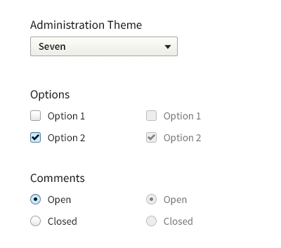
Customized controls for <select>, <input type="checkbox"> and <input type="radio">(disabled state on the right)
There are challenges associated with customizing these particular form controls, especially around accessibility. However, we feel there are a number of ascetic gains that can be made if we choose to implement this.
Similar to the text fields we use slightly rounded corners on these form elements to capture the softness we wish to express. We additionally styled the checkbox/radio’s somewhat special to accommodate the idea of brand consistency across platforms.
Buttons
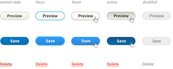
Row 1: standard button;
Row 2: primary button;
Row 3: danger button
Buttons should be clearly identifiable as such, with normal and primary actions inviting interaction. At the same time – for visual conciseness – graphic effects are limited to a subtle gradient (and border, where necessary for contrast with a background). For an informal, friendly appearance, identifiability among other UI controls, and for continuity with Drupal 7, discrete buttons have a fully rounded “pill” shape.
As with input fields, focus is communicated with a blue halo. The hover state brightens the button (optically, light colours ‘advance’) and adds a small shadow beneath, causing it to ‘stand up’ and invite a click. Primary buttons – the save button on a node form, for example – are emphasized using Drupal blue. This carries through the main brand colour, and, since blue is a calming colour, the added emphasis remains respectful, not yelling or rushing the action.
Delete buttons – those that perform a destructive action such as deleting a node – are colored red, since they must call attention and signal caution. However, they should not draw the eye away from more common actions, so their border and background is removed, appearing instead as a plain link. An underline provides an affordance since danger buttons have neither the standard link colour nor the standard button style.
Note: All button colours pass WCAG 2.0, except for the primary button’s hover state, which warrants some consideration.
Dropbuttons
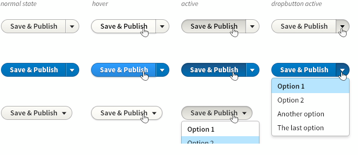
Dropbutton, a single button that discloses a dropdown menu. Note: The image above is not consistent with the current implementation of dropbuttons.
Small Controls #

Left to right: small button (with icon); small dropbutton button; small select element (with the left-aligned label).
Sometimes tight spaces recommend the use of smaller controls. Such situations include WYSIWYG toolbars, filter forms and table rows.
When touch support is detected, this guide proposes small controls revert to their full-size counterparts to improve touch-target sizes.
Progress
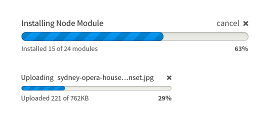
Note: The compact version of the progress bar has not yet been implemented.
To appear more cheerful – for the same reason a lobby or waiting room should make an extra effort to be pleasant – progress bars are fully rounded. The progress bar retains much of its current values, e.g. always animated to be scrolling and clearly outlined activity and percentage on each side of the horizontal axis.
File Field
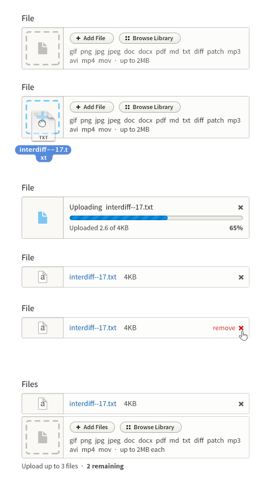
Note: The above design of the upload widget is not yet implemented. Progress is on this issue.
Fields in Drupal 8 new appearance and a new interaction design:
- Files can be added from the local filesystem using drag-and-drop or using the traditional click-browse-attach workflow (which hands the action off to the OS and back)
- Files upload automatically once added by dropping or browsing.
- Uploaded files provide a preview where possible (images) or a file-type-specific icon where not.
- File fields with multiple attachments use progressive disclosure to reveal each additional slot in turn. They should support dropping multiple files onto a single dropzone to upload multiple files at once.
- The “Browse Library” functionality is speculative at this time but designed to accommodate contrib.
An important reason to encapsulate much of this functionality is that it tends to scale much better amongst many items and especially if placed between forms it can serve as a clear visual landmark.
Fieldset

Summary and Details
The file and image fields, fieldset, details, and accordion are all container elements to some degree, having a number of sub-elements in relation to one another. They all use a background tone and slightly darker border to contain these sub-elements and visually signal their grouping. They do this with as light a touch as possible while remaining distinguishable. To soften them slightly, a 2px border-radius is applied to the outer corners.
Navigation Tabs

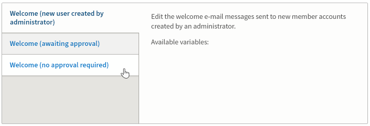
Horizontal tabs in Drupal 8
- Primary and secondary tabs are left aligned
- The negative space created where two rounded tabs have been removed by “extending” the tabs underneath one another.
- Secondary tabs well differentiated from primary tabs and separated from the following content with a horizontal rule.
Mobile nav tabs
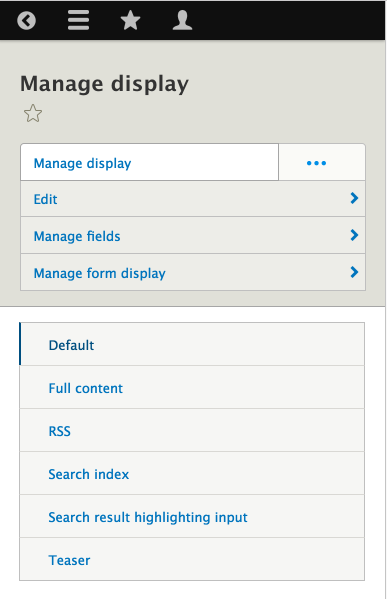
Below 600px the primary and secondary tabs convert to vertical navigation tabs with a trigger to expand and collapse the primary tabs.
Vertical Tabs
Vertical have not changed from D7, apart from inheriting Drupal 8 color and type changes.
Table
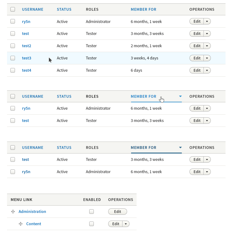
To reduce visual noise we have removed zebra striping, using thin rules to separate table rows. There is now a subtle highlight on the hovered table row, allowing the eye to more easily move horizontally along the row, even with large stretches of whitespace between cells. (Note: does not need to pass WCAG contrast standards, since it's an added affordance.)
The sort-active table header cell style is carried through to other elements, such as secondary tabs and pagination to enforce consistency.
Pagination

To simplify the UI, we have removed the “first” and “last” links from pagination, as well as the text labels for “previous” and “next” links.
Note: This style is not yet implemented as designed.
Nav List
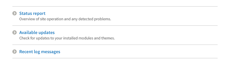
The Nav List is used on “hub” pages to provide an on-page navigation menu with help text.
Messages
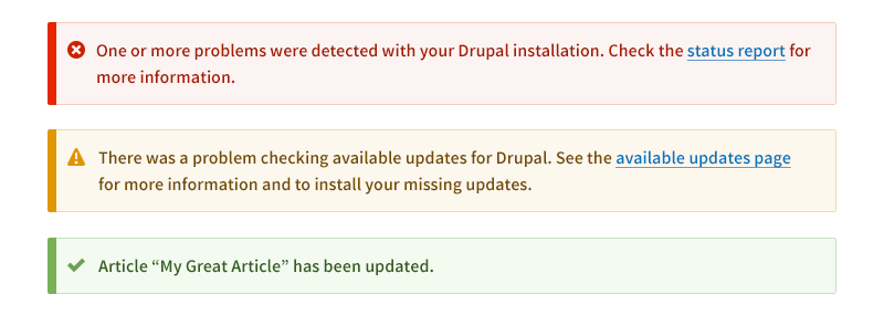
Messages follow closely from a style proposed for D7 to make messages very noticeable (with a bright colour bar and icon(s) at the left margin). In Drupal 8 message colors have been optimized for contrast and to distinguish one from another.
In Drupal 8 messages now have flat, single-color SVG icons.
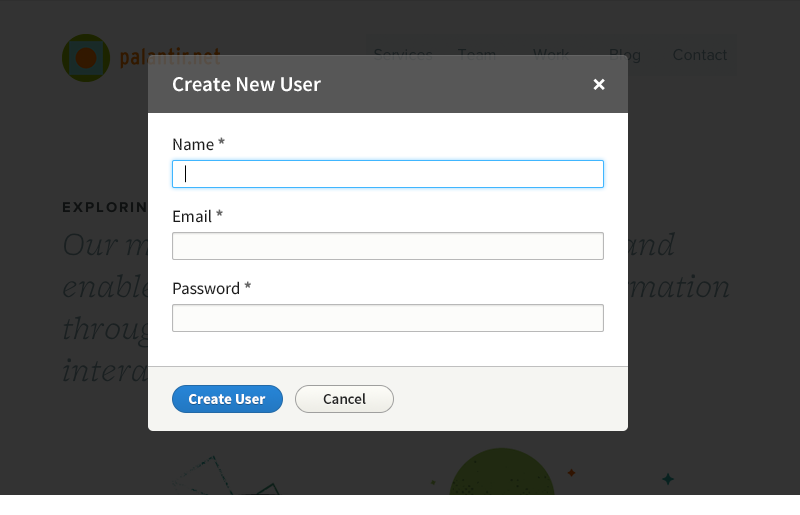
Modal Dialog #
Source File
The Source file is PSD (Photoshop CS6 recommended). This can be useful to designers of interfaces for contributed modules. Since it is too large to attach here, you may download it here:
Seven Elements (23MB): https://drive.google.com/file/d/0BwPrMtcLgOljZkxiek05ZU5adnM/view?usp=sh...
Help improve this page
You can:
- Log in, click Edit, and edit this page
- Log in, click Discuss, update the Page status value, and suggest an improvement
- Log in and create a Documentation issue with your suggestion
