
On the Views list / overview (admin/structure/views), participants had difficulty determining where the view/display showed up.
If it’s a Page you can see the path. If it’s any other display type, you have no way of knowing where those displays appear on the site.
Possible solutions:
- Show on the views listing the region where the block appears
- Show in the views ui where the block appears (Attachment does this!)
- Show when there’s an attachment in the Views listing (Block, Feed, Page appear in alphabetical order)
| Comment | File | Size | Author |
|---|---|---|---|
| #29 | views-listing-d8.png | 92.91 KB | yoroy |
| #24 | views-listing-design.jpg | 262.78 KB | yoroy |
| #7 | views-listing-2a.jpg | 169.93 KB | lisarex |
| #7 | views-listing-2b.jpg | 168.75 KB | lisarex |
| #5 | views-listing2a.jpg | 119.48 KB | lisarex |


Comments
Comment #1
dawehnerThis idea is great!
I totally agree that it makes sense to describe it for attachments/feeds to which display they have been attached to.
Regarding blocks: It doesn't seem to be obvious how to handle multiple themes/layouts (in the future)
but lisa promised to bring some ideas down.
Comment #2
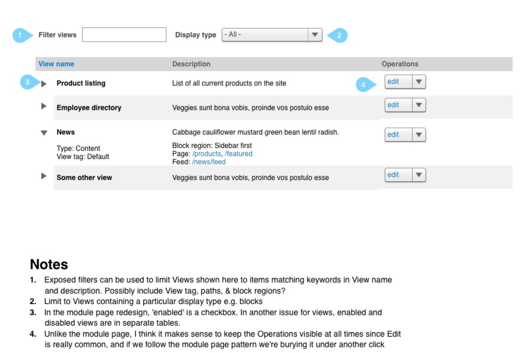
lisarex CreditAttribution: lisarex commentedAttached is a wireframe showing an improved Views listing details. I deprioritized Tag column and replaced Path column with a Displays column. This covers items 1 & 3 in the issue summary. Path column is sortable in D7, but I'm not sure how useful that is, given that some views can have multiple paths
Please review
Comment #3
yoroy CreditAttribution: yoroy commentedShould modules page redesign make it in I would love to see the same pattern applied here and collapse most of this noise away from the initial view :)
Comment #4
yoroy CreditAttribution: yoroy commentedTo clarify: I think it's a *good thing* to show a list of all displays per view. But it will also make for horrible layouts in the 5+ displays per view use cases. Hence the suggestion to look into making each row expandable, starting with the basic info that lets you identify the right view, then to expand it and get all the details.
Comment #5
lisarex CreditAttribution: lisarex commentedAfter chatting with various folks in IRC, couple rough iterations attached. The only difference between 2a and 2b is the placement of the collapse/expand triangle icon.
These were based on
1. design happening in #1790280: Module page redesign 2.0 (screenshot: http://drupal.org/files/module-page-redesign-proposal.png)
2. The idea of making this Views listing filterable.
There's also some design improvements around the filtering that appears when adding fields/ filters to views too #1832872: Fix broken Views UI search box/filtering
What's interesting about the module page is the 'Operations' are hidden in the collapsed area, but I do not think we should do that for Views, since Edit is such a primary action. Also, on the module page, Enable is a checkbox, but we have an issue to separate enabled and disabled views into separate tables: #1830822: Split the Views UI listing into two tables for enabled and disabled. I think this is the right decision; I don't think Views should follow the Module page pattern here either (because Views are independent of each other, so it makes sense to graphically separate enabled/disabled).
OK, thoughts? Ideas?
Comment #6
tim.plunkettThe exposed filters on the view page are dependent on an issue like #1846454: Add Entity query to Config entities, because we currently have no way to filter config entities.
Comment #7
lisarex CreditAttribution: lisarex commentedHrm, wrong screenshots were attached. Please review these!
Comment #8
dawehnerOnce we have a view we can make the fieldset closed by default but make it changable, yeah!
Regarding the filtering, I fear we are limited to either name or description based on the other issue linked by tim.
It seems to be that description might be a better fit, as it contains all the information of the name + some additional.
Regarding (3) The primary action here is for sure edit not enable a view, so using the operations pattern is fine.
Comment #9
dawehnerOnce we use views we need a dropbutton implementation in views: #1826604: Add a dropbutton field handler to Views
Comment #10
Bojhan CreditAttribution: Bojhan commented@lisarex I am wondering, isn't where it is at the really important information? I guess right now its a lot, making it hard to scan, but I dont think hiding it makes a lot of sense.
Comment #11
tim.plunkettWith absolutely no scientific reasoning to back it up, I vastly prefer 2a, where the arrow is closer to the extra information you are revealing.
Comment #12
Bojhan CreditAttribution: Bojhan commented@tim.plunkett I welcome you the Gestalt principle of proximity and the scientific research that accompanies it https://lirias.kuleuven.be/bitstream/123456789/128662/1/Kubovy%20et%20al.... .
Comment #13
Dave ReidI actually like 2b since it's very similar to a UX pattern we used for Meta tag admin UI and looks like the new modules page for D8.
Comment #14
DamienMcKennaI'd recommend expanding this UX pattern to cover all content lists where a portion of each line is hidden behind an expandable space, not just Views. If there's an existing pattern for this interface then it should be used, and then improve upon the general pattern, rather than taking each instance individually.
From a personal perspective, having it beside the field that is to expand makes a certain amount of sense, having it per row suggests that more than one cell may be hiding further information, which it does (type/tags are on the left in 2b).
At a general level, for 2a what would be the intended UX pattern were more than one cell per row to need to be collapsed - more arrows? What if the title wrapped onto two lines, how would the UX adjust?
Comment #15
lisarex CreditAttribution: lisarex commentedThanks for the feedback, folks.
I meant to add, 2b (as you can see) also includes additional information under the title. This is just to reduce the height of each expanded row.
@Bojhan, aside from the title, I suppose the most important information in a view listing is it's location. If we don't collapse them, does the information layout in 2b work? I agree, collapsing does interfere with scanability!
It would be worthwhile to learn what we can about current usage of views (average # of enabled views, average # of displays per view). Not sure the best way to do this though.
But in the meantime, assuming the filters are achievable, and the collapsing isn't implemented, is the detail & layout correct?
Comment #16
Bojhan CreditAttribution: Bojhan commentedJust wondering, do we really need type and tag? Tag should only be exposed if you have a custom one?
Comment #17
LewisNymanI think now that views in in core, we should be using tags to differentiate between front end views and admin views. We could keep the ‘default’ tag to signify views that come bundled with core, if we think that is useful information.
Comment #18
klonosI think a "core" tag makes more sense than "default" that is too vague.
Comment #19
dawehnerSo core_admin and core_default?
Comment #20
LewisNymanIn my mind it makes more sense to have more tags rather than concatenating them, so other Views could use the same tags.
This would mean:
I'd much rather replace default with something that signifies Views that are used on the front-end instead of admin facing. I don't think front-end is the correct term.
Comment #21
Bojhan CreditAttribution: Bojhan commentedI have never really believed in using tags for this, it seems like a tool to handle a usecase better solved by advanced filtering - given that this is an expert use case. However its clear we are down this road.
I would avoid using three tags, they all kinda have the same meaning to many users, default - to me doesn't mean anything. If I change that view, its not default anymore - standard provides a tag taxonomy, do we need to label that as default? It seems like something that was introduced by Views, but not a pattern across core, for that reason I would remove it. For lewis his usecase, the only thing I would opt for is adding "admin" as a tag to views used in /admin/*.
Comment #22
klonosThe point is that -at least from my personal experience- more and more sites rely on views to display most of their content. Now with views in D8 core and the conversion of the admin listing pages to views, there'll be a growing number of views in the views listing page.
I believe that soon we'll be facing more or less the same issues of the overwhelming modules page and we need to provide ways for people to quickly find the view they are looking for. A filter-as-you-type search field would be most welcome (#1475204: [META] Provide a generic search/filter UI interface pattern for listing pages / #1757618: Add Instant filter functionality in D8 core. anybody?) as well as a way to filter the views based on very basic criteria, for example whether they provide admin listings or content listings. The only relatively easy way I see this being done at the moment is using tags.
Comment #23
dawehnerI think having a tag to explain that this view is provided by Drupal itself, feels helpful, just to be quickly scan the list.
Comment #24
yoroy CreditAttribution: yoroy commentedInstead of discussing the usefulness of tags are, we should be reviewing the design proposal as a whole:
- I think this design could work well even when not collapsing things.
- The info for where blocks are used I'm not so sure of, reads a bit abstract. Maybe just the number of blocks created for this view would be enough here?
- Maybe the type can be used as the prefix for the description: "Content: list of all products on the site" ?
Comment #25
lisarex CreditAttribution: lisarex commentedMeant to unassign myself a long time ago
Comment #25.0
lisarex CreditAttribution: lisarex commentednumber solutions
Comment #26
jibranThere is nothing to review here.
Comment #27
yoroy CreditAttribution: yoroy at Roy Scholten commentedComment #29
yoroy CreditAttribution: yoroy at Roy Scholten commentedI think we took care of this in #2574767: Views listing page displays too few items on a page