
Hello,
I just installed the module and already noticed a UX problem.
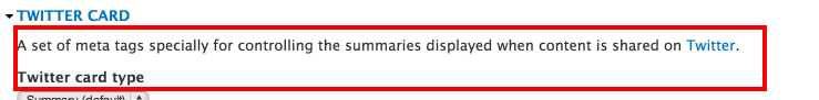
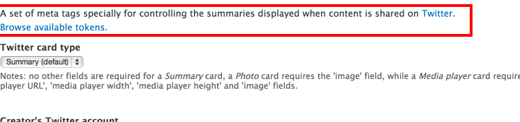
The link "Browse available tokens" is listed all the way down the page when I actually needed to access the token list,
this doesn't to be a bit of concern to some but at the same time this can be highly improved.
Initially:

It can be here instead:
Suggested solution
Thoughts (if I may)
The following code:
  if ($form['metatags']['#access']) {
    $form['metatags']['tokens'] = array(
      '#theme' => 'token_tree',
      '#token_types' => $options['token types'],
      '#weight' => 999,
      '#dialog' => TRUE,
    );
  }
Since we have several groups based from metatag submodules and each has it's own #access parameter passed in from the parent,
wouldn't it be more relevant to move this element up to the actual metatag group?
This way, we can also be a bit more flexible when it comes to token types (not sure how many there are atm) if/when necessary.
Either way, I firmly believe this suggestion would produce a better experience.
Patch coming up!
| Comment | File | Size | Author |
|---|---|---|---|
| #17 | metatag-n2037677-17.patch | 1.79 KB | DamienMcKenna |
| #7 | metatag-n2037677-7.patch | 2.58 KB | DamienMcKenna |
| #3 | metatag-remove_whitespace_error-2037677-3.patch | 996 bytes | adnasa |
| #1 | metatag-userinterface_available_tag_per_group-2037677-1.patch | 2.31 KB | adnasa |
| 003-suggested-solution.png | 40.41 KB | adnasa | |


Comments
Comment #1
adnasa CreditAttribution: adnasa commentedPatching and changing status.
Even if this patch won't be able to pass the test, the idea is planted. I hope that you proceed with this and take it with you when you update the module.
What is needed now
Comment #2
adnasa CreditAttribution: adnasa commentedWoho! :)
Comment #3
adnasa CreditAttribution: adnasa commentedRemoving white space error from the patch.
This patch is a continuation of #1
Comment #5
adnasa CreditAttribution: adnasa commentedI suspect that patch from #3 will fail.
Comment #6
adnasa CreditAttribution: adnasa commentedAnyone?
Comment #7
DamienMcKennaThis version is tidied up a little, and adds the token list to the top of the form too.
Comment #8
adnasa CreditAttribution: adnasa commented@DamienMcKenna
Patched #7 on my install and checked the code. looking good!
this patch is ready providing that $options['token types'] isn't dynamic based on which entity we are editing the metatag for,
which is the case atm.
(format patch &) RTBC! :-)
Comment #9
tsvenson CreditAttribution: tsvenson commentedNot sure its good practice for the main patch author to change to RTBC?!
Gave it a spin and seems to work fine. Having the link to available tokens available for each fieldgroup is handy and a good UX improvement.
However, I am not too sure about it being a plain text link. It doesn't really give me the feeling this is a help tool because of that, and it also makes it kinda faded out. I would suggest moving the link to be right adjusted instead of left. That would make it stick out more and also tell me it is something different.
Could it also be turned into a button? Maybe something like: [Available token list]
Its the first time I see the token list as opening in a modal. While that is hand to move around, this implementation also means the modal scrolls out of the viewpoint of the window and that is not so good UX. Is this coming from the Token module or something that Metatag is doing? Is it possible to prevent it from being scrolled off the visible part of the page?
Comment #10
DamienMcKenna@tsvenson: Thanks for taking the time to do a review.
The popup and link come from Token, just not many modules use it instead of the legacy inline table.
Comment #11
tsvenson CreditAttribution: tsvenson commented@DamienMcKenna: My pleasure, always fun to chip in with what I can.
OK, had a hunch it was so. Not entirely fond of the modal to be honest. It opened above the fields so the first thing I had to do was to move it. Then spend a few moments scrolling to adjust the view part and position of it to be able to see both the fields and browse the tokens. This was on a 22" 1920x1200 monitor so I imagine it is even more tedious on a smaller screen.
Also taking into count that some of these fieldgroups have quite a few fields, Twitter Cards for example, I believe we need to do some more usability testing of this.
An alternate solution for this would be to revert back to the inline table and then have a "popup" option in there for those who want that. Does the inline feature offer such option?
The best solution would be if the token browser could open in its own separate window. I think that most likely is needed to avoid the scrolling/moving exercise I described above.
I take it those changes has to be made in Token to...
Comment #12
tsvenson CreditAttribution: tsvenson commented@DamienMcKenna: I've filed #2053005: Combine inline and module token listing and modal in separate window for the token module with a more detailed UX review of this and some ideas about how it can be improved.
Comment #13
adnasa CreditAttribution: adnasa commentedLOL
Very interesting discussion you've posted, @tsvenson. Let's see if I find the time to help out on that too!
In the mean time, should we still put this issue on hold?
Comment #14
tsvenson CreditAttribution: tsvenson commented@adnasa
Since the UX issues I mentioned are all from the Token module I don't see any reason for putting this patch on hold. Especially since it does improve UX by making the token browser available where they are needed.
Comment #15
DamienMcKennaCommitted, thank you both!
Comment #16
DamienMcKennaBTW I made a tiny change prior to committing it:
The !empty() bit is new, just to save some processing effort.
Comment #17
DamienMcKennaDoh, that should have been lower down.
Comment #18
tsvenson CreditAttribution: tsvenson commentedNice, yay for UX improvements :)
Comment #19
DamienMcKennaOk, committed.
Comment #20
adnasa CreditAttribution: adnasa commentedwell done, all :-)