In some of the early issues filed against this module, it's clear that user's are expecting to be able to do multi-series charts like the one exported in #2051807: Notice: Undefined index: #type in charts_pre_render_element(). I think what the objective of that chart was a column chart with the number of users of a particular age on the primary axis, with two columns per age: one for male and one for female.
Making this chart in Views is practically impossible. Not because Charts module is limited, but merely because doing multi-series queries (one for female and one for male) in a single SQL query is extremely difficult. Formatted as a table, you'd need the results to look like this:
-----------------------------
| Age group | Male | Female |
|----------------------------
| 0 - 5     | 10   | 12     |
|----------------------------
| 6 - 12    | 23   | 16     |
|----------------------------
| 13 - 18   | 49   | 48     |
|----------------------------
| 19 - 25   | 25   | 18     |
|----------------------------
| 26 - 45   | 12   | 35     |
-----------------------------
This assumes one field on a user for "Age group" and another field for "Gender". Getting a table with COUNTs executed for a single gender group is a piece of cake. However getting *both* columns at the same time into a single view formatted on the same row is not possible (as far as I know).
So to solve this problem, I propose that we alleviate the need to attempt to assemble multi-series queries by using multiple queries to do the job. Each series of data could be retrieved via a separate query, each query being generated by a separate display. This would be similar to attachments, where the same query is used (but slightly altered) and then "attached" to the parent chart. Then you could make one display for the "main" chart (say the "male" series in my example), then make a separate display for each additional series ("female" in my example). The data from both charts would rendered together, making a multi-series chart significantly easier.
Better yet, this approach could be used to make fairly complicated combo charts. There'd be nothing stopping you from using a line chart on top of a column chart. You could even configure the Y-Axis separately for each type of chart.
To do this, we need to create a new display plugin (similar to "Attachment" or the "Pane pane" display type provided by CTools).


Comments
Comment #1
quicksketchHere we are, this patch is really neat. Now with the ability to combine displays into a single chart, assembling complicated data is *much* easier. Additionally the ability to combine different chart types and have secondary axes is a nice touch, but the overall improvement to assembling a chart with multiple series is the real winner here. I also updated the README.txt file with instructions on this more complicated setup.
Comment #2
quicksketchCommitted. I'll make another beta release (beta4) with this new functionality.
Comment #3
skyredwangIs this what "chart add-on" meant to do? Nice!
Comment #4
skyredwangBug 1: If an add-on chart is empty, then the main chart will throw "All series on a given axis must be of the same data type"
Bug 2: The add-on Chart fields PROVIDES LABELS is greyed out (great), but instead of being empty, should we inherit the label from the main chart?
Bug 3: Although "Use primary Y-axis" is the default setting for the add-on chart, but I had to update this setting manually in order to really use the same Y-axis from the main chart.
If you think I should break up those issues up into new threads, please let me know.
Comment #5
quicksketchHi @skyredwang, thanks for testing this new feature. This feature definitely gives users a tool to shoot themselves in the foot. If the child charts don't line up with the parent chart, you'll definitely get errors.
Yep, I added a section in the README.txt on how to use them.
We could fix this one pretty easily by ignoring charts that don't generate results.
This one is harder. Views doesn't allow us to enforce that different displays have the same fields configured. Even if we could, what we'd need to do is enforce that the field used for the label is always in-place, but other fields still need to be allowed to be changed. I'm not sure how to make this more fool-proof.
This shouldn't be happening. We specified a default of having it inherit, I'm not sure why you'd need to resave the form.
Thanks for all your feedback and testing on this new version, I really appreciate having the extra set of eyes/hands on things.
Comment #6
quicksketchI've fixed the 3rd problem with this patch. The first two problems are kind of related: you'll run into problems if the configured fields for both displays aren't compatible (e.g. you remove the field that was providing labels). Maybe we should keep a separate issue for fixing that problem, since I don't know a way to fix it.
Comment #7
skyredwangwith more testing, I have problems to line up add-on X-axis label with the main display X-axis label.
For example, If main chart has X labels: A, B, C, D
the add-on has X labels: X, Y, A
I would imagine the combined chart to have X-axis labels: A, B, C, D, X, Y
But, instead, the add-on X overlays A, Y overlays B, A overlays C.
Am I doing something not supported here?
Comment #8
quicksketchThanks for testing this @skyredwang. I think you're right that the expected thing to do would be to merge together the results on the x-axis, but I'm not sure that this would be easily doable, I haven't checked it yet. I don't think Google charts supports "holes" in the data set, everything always has to have a value (even if it's 0). If possible, a work-around is to construct your view in a way that both series will always have all labels.
Comment #9
dmurray commentedHi All,
I'm having this same issue. My X Axis is a series of dates (Node creation time) and my Y Axis is a count of the nodes created on those dates. I am trying to plot the number of nodes created for 2 different content types on each day.
On some days a node was created of one content type but not the other. This is the "hole" in the data. When overlaying these two graphs on top of each other I get the same unexpected behaviour as @skyredwang.
Is there any way to work around this?
Comment #10
MickC commentedHi - thanks for adding this valuable feature.
I have 2 series - no 'holes' - but the x axis and in fact whole display width does not line up.
The first series spreads over 3 pages with display width set to 800px, and the 2nd series bunches up into about 300px and appears on every page.
I wondered whether the data could be just common to both, whereby we simply select which series to display on the main and add-on charts.
Even if the data was duplicated, but somehow 'joined' on the X axis series.
Might having the same data in both but just selecting which to display be helpful for #7 and #9?
Is the fact that the X axis is greyed out on the add-on of any significance? Also that there is no display settings.
*UPDATE*
I think the issue might be pagination - as I'm using aggregation based on date, the graph lines up if I reduce granularity to Month, which only gives me 1 page.
The add on offers no 'pager' option - only number of items to display or display all.
So I now have the chart display all, but added a filter for 'between' time periods with default values -60 days to 0 days.
This at least gives the user a choice as to how much data to display in a single 'page'.
Comment #11
stella commentedSpun out ticket #2203421: Ignore chart add-ons that don't produce results to deal with the first issue
Comment #12
stella commentedHere's one approach to attempting to address the problem of "holes" in the data. It's not an issue Google Charts could actually fix, as there is no "labels" sent to Google Charts for the chart addons for it to recognise gaps in the data, as far as I can see anyway.
The attached patch works under the assumption that any chart add-on has the same labels as the parent chart. If it finds a parent xaxis label that isn't in the subchart, then it adds in a 0 data item for that label.
I don't know if that assumption is a step too far, but it's the only way I could think of to address the problem.
Comment #13
quicksketch> The attached patch works under the assumption that any chart add-on has the same labels as the parent chart. If it finds a parent xaxis label that isn't in the subchart, then it adds in a 0 data item for that label.
I'm afraid this could cause some unexpected issues once we have completed #1237096: Graph node input over time (support date formatting on a continuous axis). Though in that case, we eliminate *all* labels on the primary axis because a continuous axis doesn't have any discrete labels. So perhaps it wouldn't have any effect at all...
@stella: Is this issue actually causing a problem for you? It's been so long since I looked at this problem I don't have any data available to test this particular issue. Perhaps some before/after data sets and screenshots might help.
Comment #14
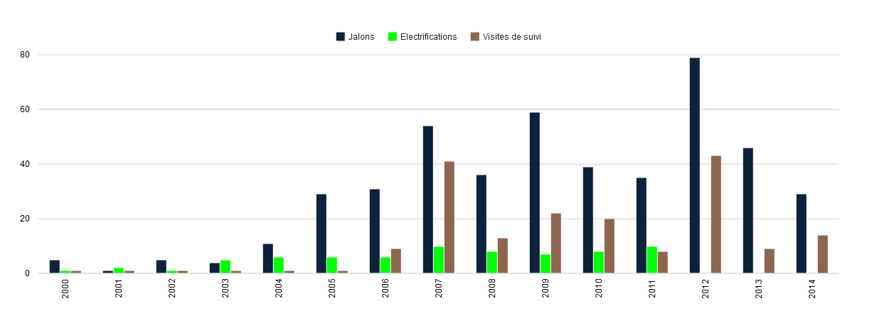
benovic commentedquicksketch: it affects me currently.
I have holes in the "Electrifications" column.
I think i'll apply the patch since it is exactly what I need ... I guess.
Comment #15
quicksketchExcellent, thanks @benovic, that's an excellent example. Does this patch work in the event that "Electrifications" were the primary chart and the other two were the add-on charts? Or would the columns for 2013 and 2014 disappear entirely?
Comment #16
cateye commentedI can't get Chart add-on working. No matter what I try, I get the error: "This chart add-on must have a parent chart selected under the chart settings."
When I choose "Parent Display= Master", the error goes away but then it doesn't show the Chart add-on.
(The parent page and the Chart add-on does separately show the correct charts, but I can't get them combined.)
Is this a bug or am I doing something wrong?
Comment #17
dalearyous commented#16
any luck? same issue here.
Comment #18
quicksketchThe combined charts will only be shown when viewing the "parent" chart. If the "master" display is the parent, you may need to enable the "Always show the master display" option under admin/structure/views/settings so you can view the master display. Using a page or block display as the parent would also work.
Comment #19
Roensby commentedPatch in #12 works to solve the issue of using chart add-ons with gaps. Thank you #12!
Comment #20
robcarrI had the same problem that @benovic illustrated at .
.
I've also tested the patch at #12 and it has solved the issue of overlaying add-on charts when there are null values in the child chart. Thanks @stella
Comment #21
Pierre.Vriens commentedComment #22
Pierre.Vriens commentedComment #23
heylookalive commentedThe patches in this issue work nicely for me, thanks to all involved!
Comment #24
Pierre.Vriens commentedIt's always nice to get this type of confirmations, so thank you Alli!
Comment #25
heylookalive commentedHas this code been committed?
I seem to be having trouble with exposed filters over multiple displays. In my case I've got a master and 3 chart displays which are all display on the master.
The displays have the following filters:
Content type
Date (between, exposed)
Each display has overridden filters (but the same ones with same machine names) so that a different content type is displayed per display to be combined on master. It would seem that the exposed date filter isn't being shared across the displays as expected despite having the same machine name. Will dig in to this but wanted to validate my thinking in that any child displays should inherit the exposed filter values from the master.
Comment #26
heylookalive commentedLooks like this was committed so I created a separate issue for my query which can be found here: #2475153: Allow for exposed filter and argument inheritance on child Views chart displays
Comment #27
TygrLili commentedI just wanted to chime in and say that #12 has fixed my problem, as well. Thank you!
As a side note: I had found #1237096: Graph node input over time (support date formatting on a continuous axis) and had searched that issue for a solution to my problem, which [I believe] is the same problem being discussed there, but this is the fix I needed. So I'm not sure whether that helps inform @quicksketch's comment in #13, but...there's some input.
Comment #28
dqd@quicksketch #12: sadly ONLY if Master display has been chosen the error of missing parent goes away. Choosing page or other already set up chart display is impossible and the error won't go away and the view keeps being unable to be saved. #2233089: Parent style plugin check of the chart add-on display doesn't respect default
Comment #29
zephirus commentedHi. Tried #12 but it didn't solve my problem. I already asked at stackexchange here: http://drupal.stackexchange.com/questions/175174/drupal-chart-x-axis-pro...
Can someone tell me If I'm doing something wrong?
Comment #30
Pierre.Vriens commentedNote about #29: refer to my answer at http://drupal.stackexchange.com/questions/175174/how-to-create-a-combina..., which includes:
Next up: re-roll the patch (any volunteers?), and get it committed ...
Comment #31
WorldFallz commentedHere's a reroll of the patch from #12 against the current 7.x-2.x-dev.
Note, this doesn't fix the same exact issue occurring when using the "grouping field" option (the simplest way to do a chart as described in the stackexchange post) in the chart settings.
I have submitted some patches to #2146927: Add 'grouping field' option to handle that related case there.
Comment #32
Jorge Navarro commentedpatch #31 worked for me!
Comment #35
bluegeek9 commentedThank you for your contributions to this issue. As Drupal 7 has reached its End of Life and is no longer supported, we are closing this issue. We encourage you to upgrade to a supported version of Drupal.